Project: Grant House
Architects: Austin Maynard Architects
Project team: Andrew Maynard, Mark Austin
Builder: Sargant Construction
Engineer: Perret Simpson
Building surveyor: Code Compliance
Energy Consultant: Efficient Energy Choices
Location: North Fitzroy, Melbourne, Australia
Site area: 278 m2
Total house area: 211m2 (ground floor 60m2, first floor 53m2, cellar 10m2)
Completion date: April 2018
Photographer: Derek Swalwell
A hidden cellar, a central garden and a secret room in the roof, Grant House is Austin Maynard Architect’s most recent inner city renovation. Playful, imaginative and future-proofed, it draws on fifteen years experience and experimentation solving the problems posed by dark, narrow and poorly-circulated old terrace houses.
THE WHAT
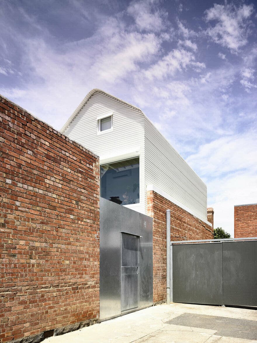
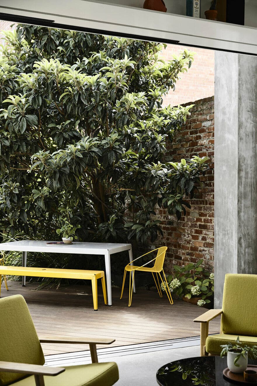
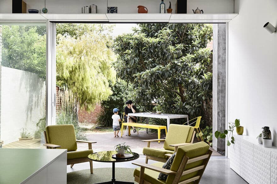
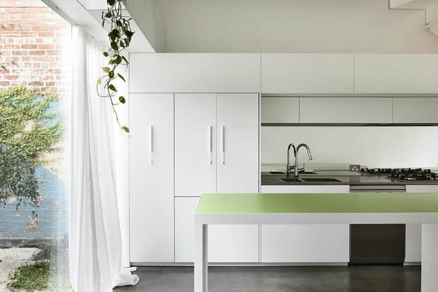
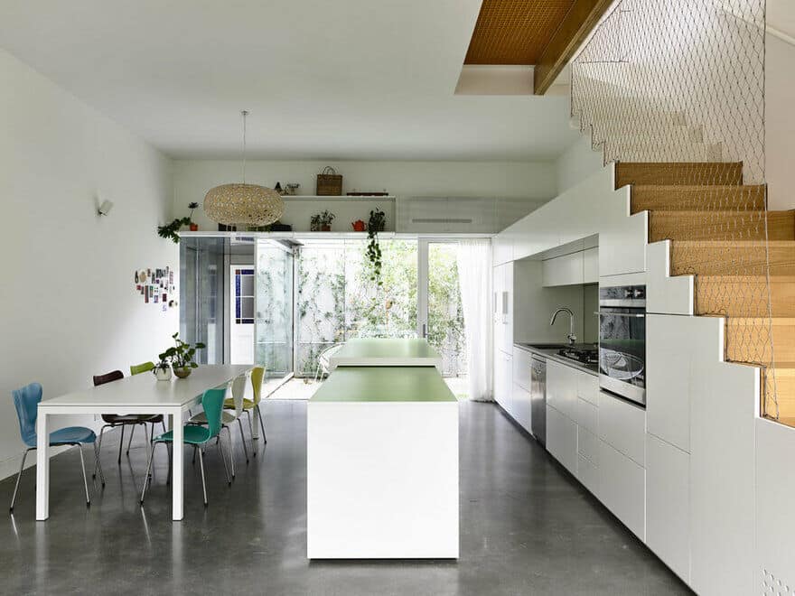
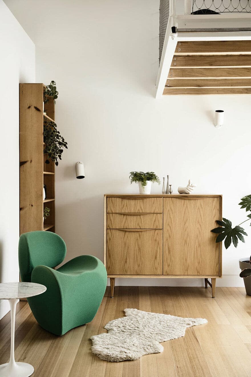
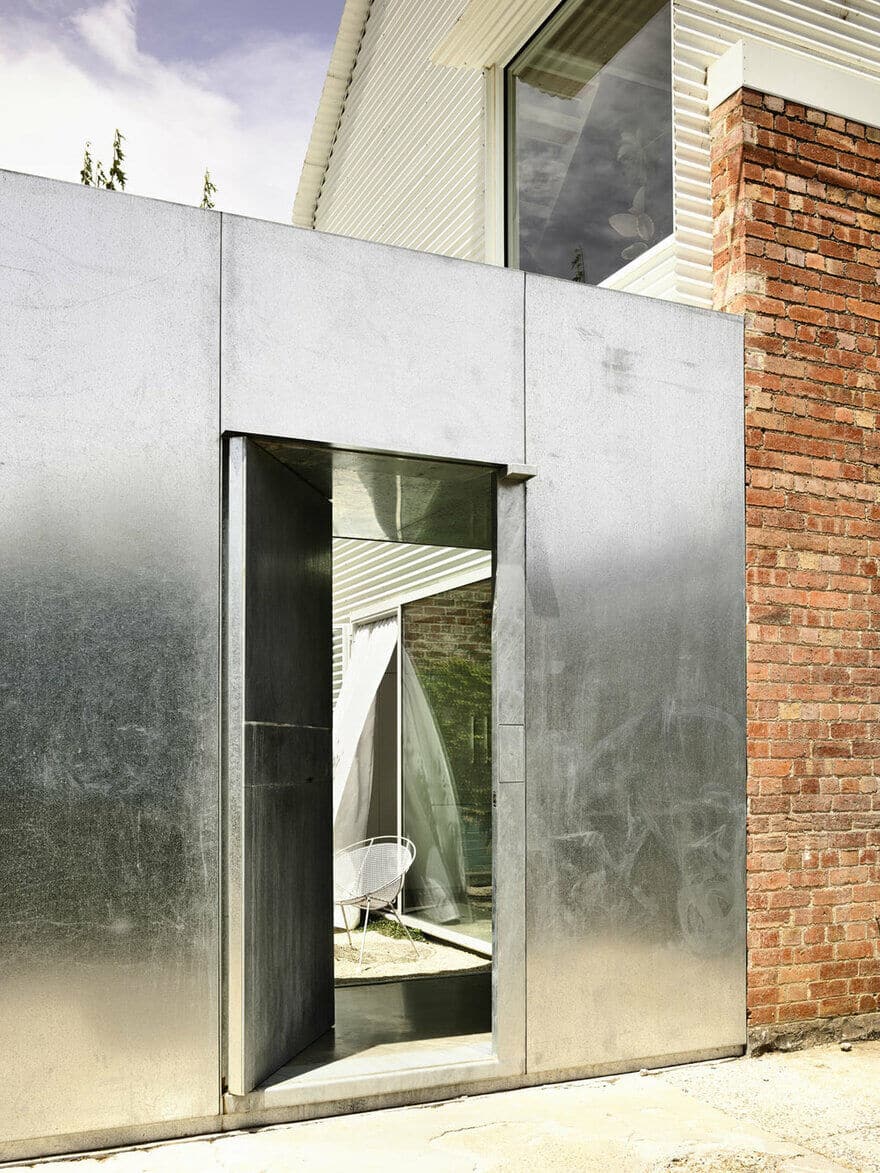
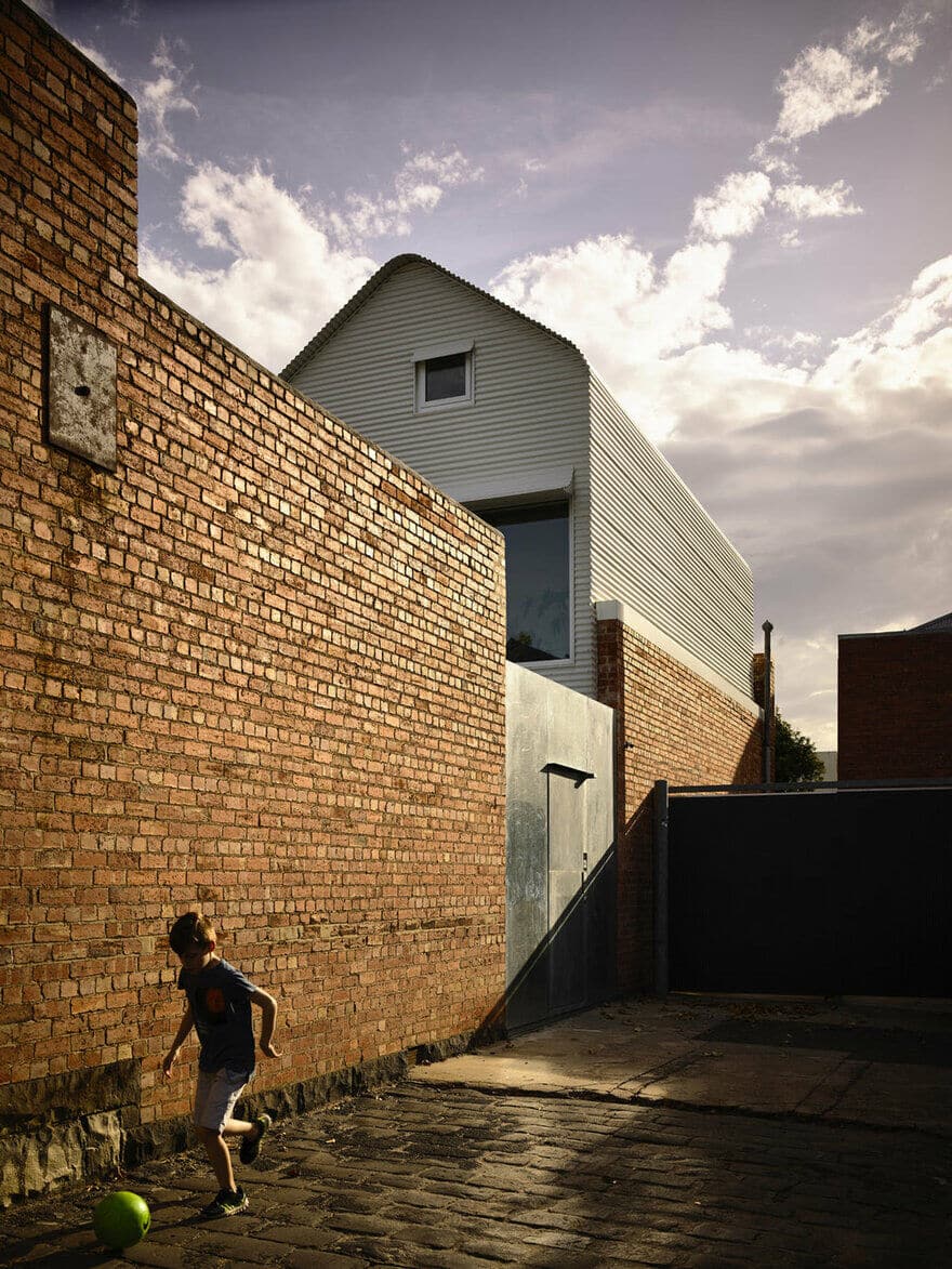
Grant House is the alteration and addition to a dark and narrow single-storey terrace in North Fitzroy, Melbourne. The old part of the house has been respectfully maintained and a new extension has been sleeved between original boundary walls. The new extension comprises kitchen/living/dining (and secret cellar), with parent’s retreat upstairs. Utilising the side laneway, the main entry is now in the centre of the house. A large and imposing galvanised steel door opens onto a light-flooded courtyard that separates the old house from the new addition.
IN BRIEF
In late 2014, the owners of Grant House decided to renovate their dark and poorly laid out terrace. Their brief focused predominantly on the living space – they wanted an entertaining zone that avoided the embarrassment of having to lead guests down a dark corridor, past bedrooms, a bathroom and through a dim, cluttered study. They shared the house with their teenage son and wanted somewhere self contained that was fun for him to live. Future-proofed to provide independence into adulthood. As a relocated Scot and an Englishman, the owners would often have family stay for long periods, so adaptable space and privacy was paramount on this small block.
THE BEFORE
The house had been renovated sometime in the mid 1980s, with a typical long rectangular addition stuck on the back. The rooms were completely internalised and the floor plan convoluted, with entry and exit point that cut directly through rooms which lacked windows and fresh air. The old addition stretched to the boundary, with light sourced from (thermally weak) polycarbonate skylights. The 1980s renovation failed to solve the big problem terrace houses suffer from; an entry way filled with junk, dark corridors past private bedrooms and windowless walk-through living zones. In these instances, the challenges are always the same. How do you adapt the old layout to modern living? How do you get light and air into the home and make it sustainable? How can you make all this work within the spacial constraints of a terrace house on a long thin block?
RESPONDING TO THE CHALLENGE
For the past fifteen years Austin Maynard Architects have been successfully battling issues of inner city living and regeneration of ageing building stock. Austin Maynard Architects have learned how to deal with dark terraces, with bad circulation and gained the experience and skills to address the challenges. Through development and experimentation designs that are economic and imaginative have consistently been realised.
Though dealing with the same challenges, Grant House has a prime advantage – laneway access. The bonus of a side laneway meant traditional terrace entry constraints could be subverted. Typically a dumping ground for bicycles, bags and bins, a narrow path leads from the front gate to the rear living space. In this case, moving the entry to the side allows the front to remain practical storage and the bedrooms to remain private, while the new entrance opens into a bright and welcoming living zone.
In rethinking the functionality of the house and how it is used, garden space has been protected and expanded. Reduction of the original footprint created more natural light, more garden and easier access. By stripping the 1980s extension, eight metres of brick wall was exposed and the character and history of an old sailing boat mural was discovered and celebrated. Our aim of creating vibrant architecture is never at the expense of heritage. Respecting the importance of heritage, we prefer to gently abut, sit beside or in the case of Dorman House, hover over. At Grant House we created a visual and spacial separation between the old and the new with a courtyard. Having that separation brings light and air into the back of the old house and into the new addition.
ARCHITECTURE MADE EASY
When you first begin to study architecture, in a naive way it seems easy, especially when you start model making. You grab a piece of corrugated cardboard, wrap it over and think that looks awesome. That was easy. I’m an architect! Then, when you begin to consider constructing the same form on a realistic scale, the simplicity all falls apart. Grant House is a homage to those university days. The design has been executed as if it was that easy. Reminiscent of a corrugated cardboard model, the roof form of Grant – though highly detailed and complex, relates back to that one simple gesture, that one corrugated sheet bent over, to make a simple extruded form.
THE ENSHROUDED HOUSE
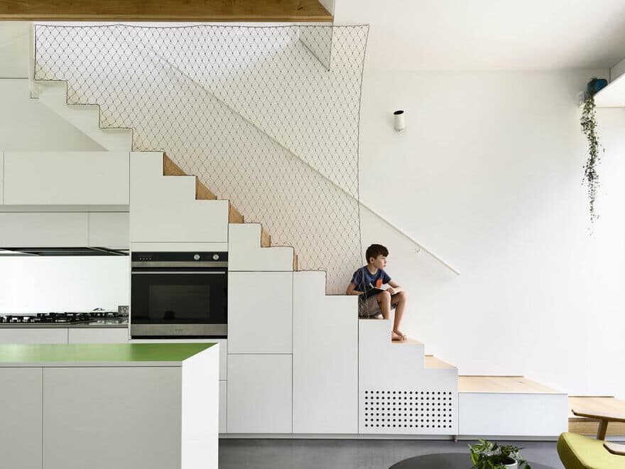
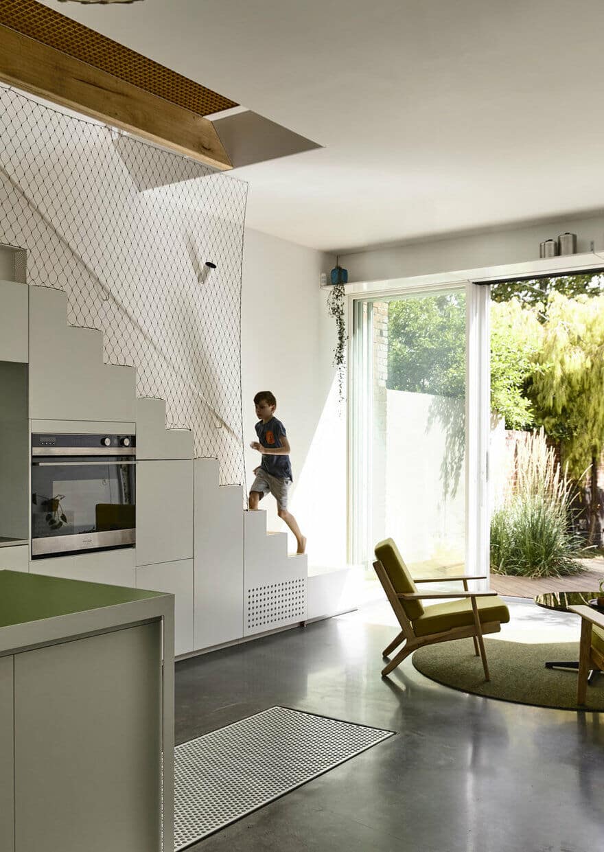
Austin Maynard Architects are known for playful spaces. At Grant House both fun features and practical surprising elements were created. In the initial brief the owner asked for a basement. On a narrow site, stairs take up valuable floor area. A creative solution was to hide the entrance to the cellar in the floor, under the sliding island bench. Like a train carriage, the storage section of the island bench rolls along tracks to extend the bench when the cellar is not in use, or nestle beneath when access is required. The cellar is completely hidden and secret, unless you are actually using it. A perforated aluminium sheet can be used over the entrance for safety and ventilation.
At 2×4 metres the size of the cellar was dictated by economic restraint and to avoid underpinning neighbouring property.
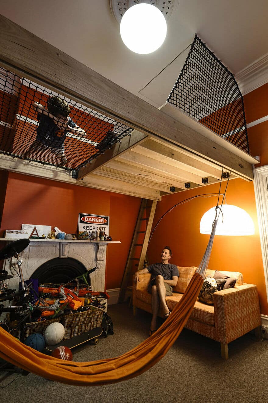
In the old part of the house the teenagers bedroom took advantage of the high ceiling with a suspended platform bed space and a lounging net. Above the bed a hatch leads up to a secret ply-lined roof space, a whole secret room his parent will likely never visit. Exactly what a young teenager needs?
BEHIND CLOSED DOORS
Deliberately imposing, the front door of Grant House sends a certain message – if you want to come in, you have to work for it. The owners had previously experienced a break in, they were home when it happened, an incident which had helped informed the brief. Though they wanted to avoid making a fortress, they did not want a similar incident to happen again. The galvanised steel door creates safety and security but behind it lies a generous and calming garden – an embracing welcome home. The contrast between the two is stark and joyful.
THE DECK
Designing a deck typically involves drawing a square or a rectangle. At Grant House we wanted something that pulled in the edges to allow for more garden at the sides. The answer was simple, what if the facade fell down? A core design principal at Austin Maynard Architects is – if you have something to solve try and borrow from what’s already been designed. Don’t add a new idea. Here we had the shape of the house, an asymmetrical roof, lower on the neighbours side, the deck directly relates, as if a slice has been cut and fallen down. It becomes part of the whole narrative, not a seperate design problem. Like the folded corrugated cardboard, it seems so simple, yet it is a result of time and tenacity in design.
FUTURE PROOFING
Grant House has been designed to deal with a multitude of probabilities and possibilities, such as how to co-inhabit with a growing child, maximise re-sale and be generous to your neighbours. By future-proofing with design forethought, multifunctional spaces can evolve as needs change without having to demolish and rebuild.
At Grant House the owners teenage son occupies the front part of the terrace. In the future this can become a more independent space, as it has its own front door, bedroom, living and bathroom.
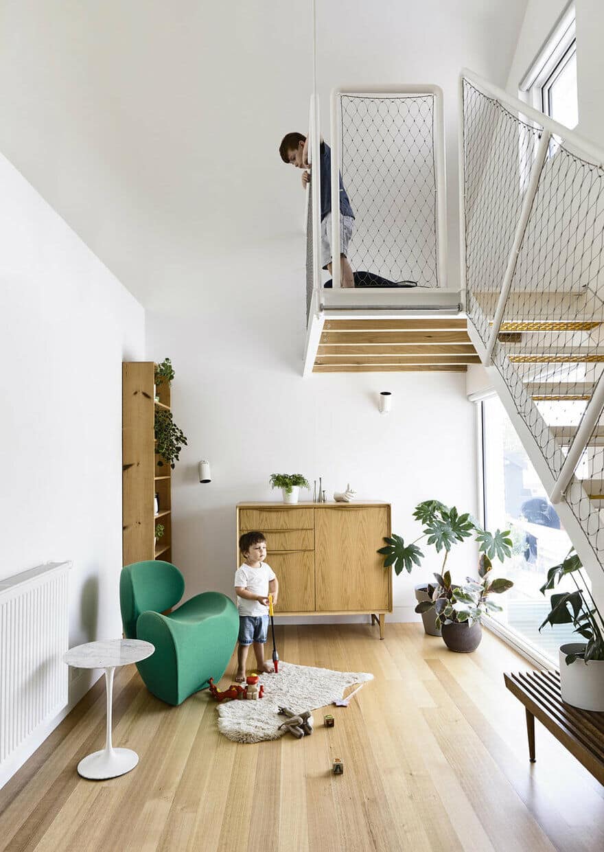
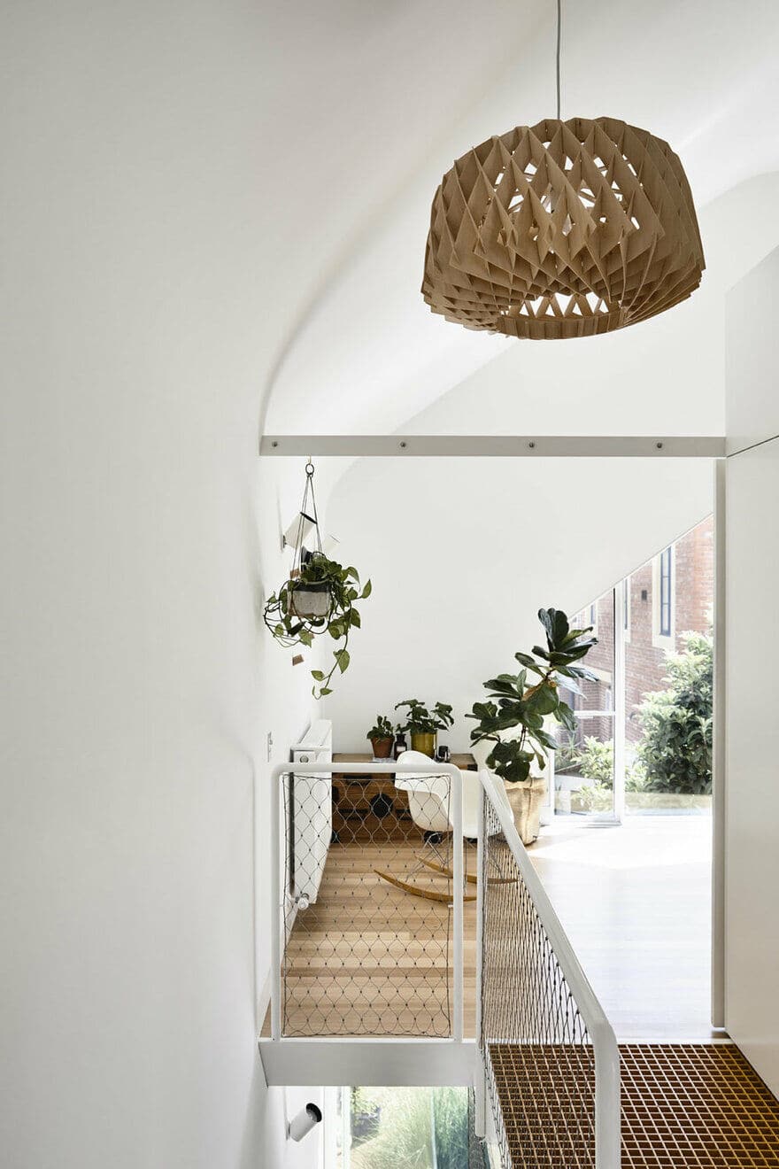
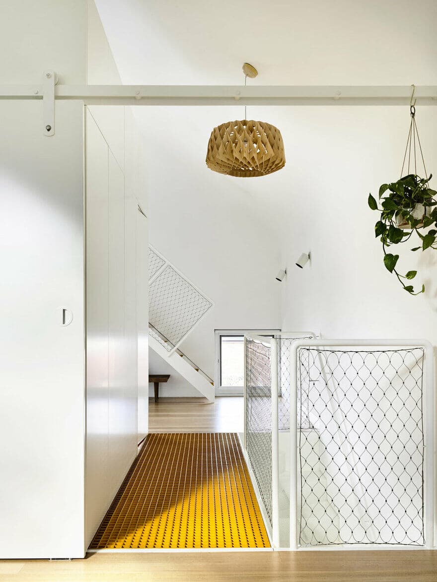
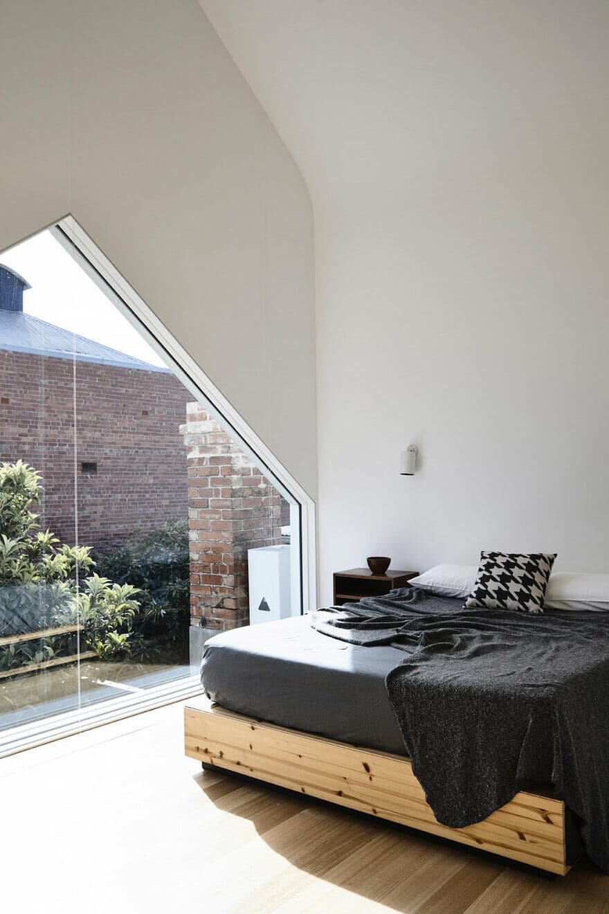
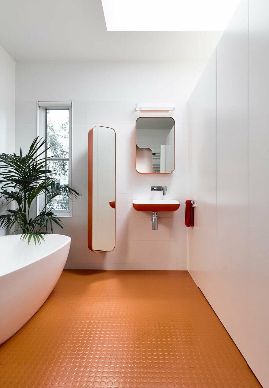
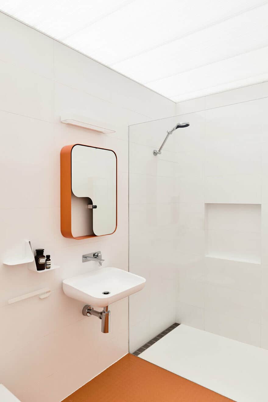
Upstairs the parents retreat is light-filled and open, with a bedroom at one side, a lounging area with mezzanine reading platform at the other and a bathroom ‘box’ at the centre. Divisional walls stop short of the ceiling to create volume and height which celebrate the curve of the ceiling. The open layout is dedicated parent space, not enclosed and therefore used for relaxation rather than a place to store/hide stuff. Should needs change, or to maximise resale, the retreat can easily become two bedrooms and a bathroom with the use of strategically placed partitions.
The asymmetrical roof is lower on one side to avoid shading the neighbours backyard in the morning. Though it would have been simple to go straight up (as they had built on their boundary), we aimed to future proof here too. To ensure we weren’t making the clients happy at the expense of their neighbours, we thought about the possibility of reciprocal development. Having a laneway on their side too meant, they could have an internal courtyard with silver birch trees that got sunlight. We didn’t need more height, so we could make that gesture and future proof for the neighbour. It seemed like the right thing to do.
SUSTAINABILITY
Preserving and maintaining is always at the core of our projects. Sustainability is not simply about using recycled materials and maximising passive solar gains. At Grant House we have continued to consider and tackle changing needs and design spaces that have flexibility, future-proofing the use of the house without demolition and re-construction. The house can evolve in the long term rather than the heavy carbon expense of re-building. Over time the house is designed to require minimal maintenance, minimal servicing and minimal adaption.
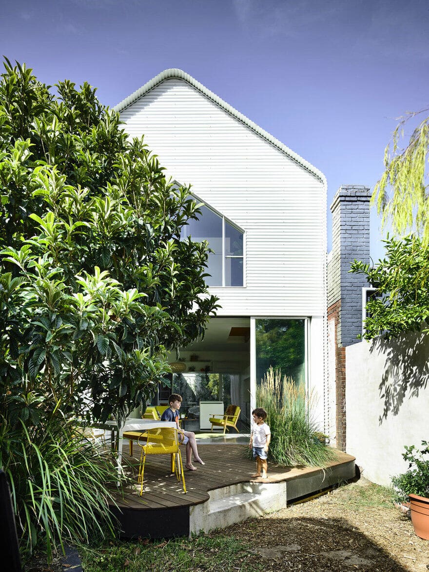
The materials used externally in the new addition are robust and low maintenance. White cladding was selected to maximise solar reflectance, drastically reducing demands on mechanical cooling. Although the site is constrained in width, natural light and air to all spaces has been maximised. All windows are double-glazed and the thermal mass of the exposed slab is utilised in winter to store heat from the sun. Solar panels are installed on the roof of the old part of the house and a water tank harvests rainwater which is reused to flush toilets and water the garden. High performance insulation is everywhere.

