Project: Gutenberg House
Architecture: Grizzo Studio
Principal architect: Lucila Grizzo
Location: Villa Devoto, Buenos Aires, Argentina
Area: 180 m2
Year: 2019
Photo credits: Federico Kulekdjian
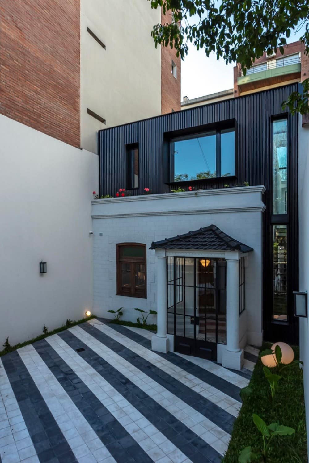
The premise of the Gutenberg House project was to maintain the old facade of the house. The existing house was only 70m2 with rooms that did not ventilate since the construction reached the bottom of the land.
When we began the demolition we noticed that the construction was quite poor, so we had to reinforce the façade, with foundations, columns and beams.
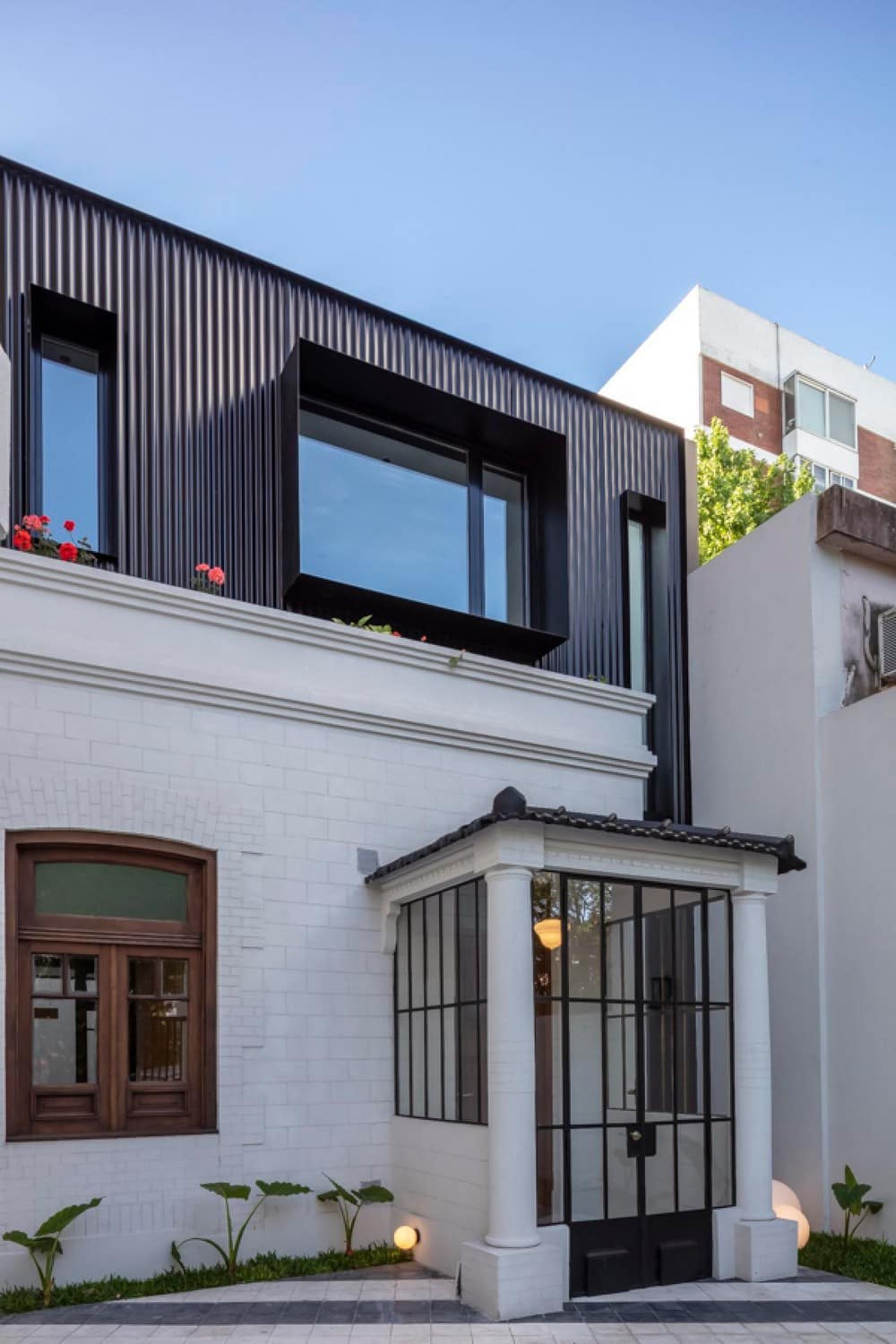
For the new volumetry we opted for black corrugated sheet metal to completely contrast with the existing façade. In order not to build on this façade, we delayed the new construction by 60cm, creating a flowerbed between the new and the old.
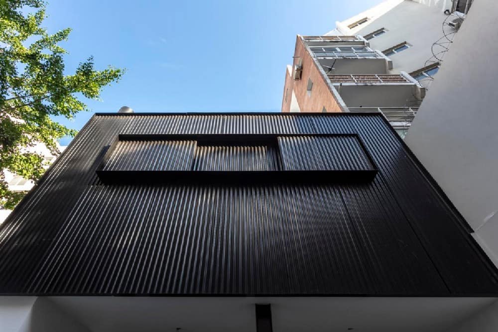
Sheet metal was also used in the quiet part of the Gutenberg House.
The idea was to generate a blind cube that can be closed or opened using shutters made of the same material.
The boys’ rooms generate the semi-covered gallery with a grill that overlooks the garden.
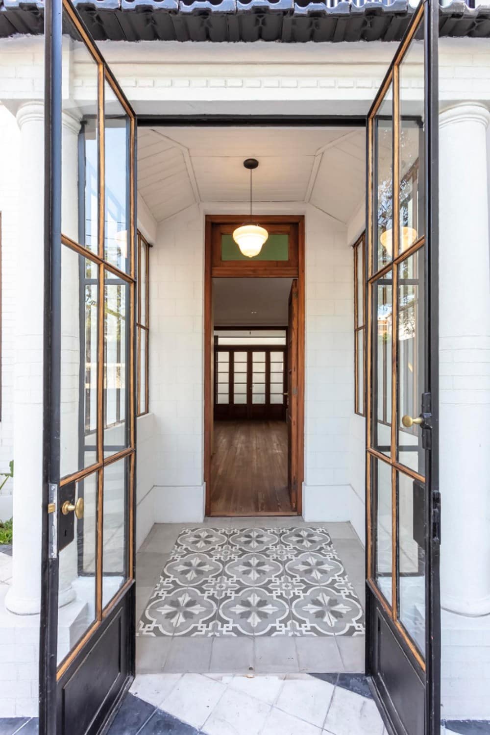
For the exterior floors of the front and the quiet part of the building, limestone was used that was ordered to be made with special colors.
In the gallery and hallway, limestone decorated with two tones of gray and white were placed.
On the sidewalk and entrance patio, smooth limestone in white and dark gray was used, generating a pattern of inclined stripes parallel to the angle of the municipal line that is not the same as the existing façade. This generates a visual effect between the municipal line and the house.
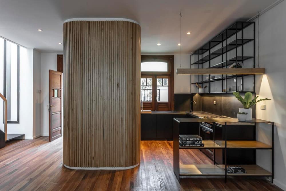
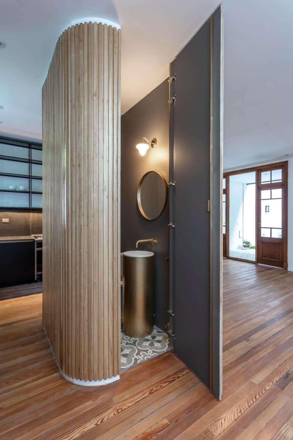
From the beginning it was sought that the ground floor be free, for this, it was decided to place the toilet in a wooden capsule that turned out to be the center of the construction, this volume has the complementary function of articulating the space, containing the concrete structure, the electrical and sanitary installations and became, without a doubt, the central axis of the project.
The basic idea was to build this element almost like a sheet of paper floating in the center of the house so that the space flowed around it, and created an interesting visual relationship between the spaces and their functions. By having curved edges, this element became the organizer of the circulation of the home, at the same time it gives privacy to the spaces without closing them and generates privacy between the kitchen and the living room.
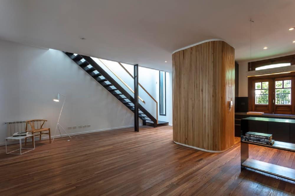
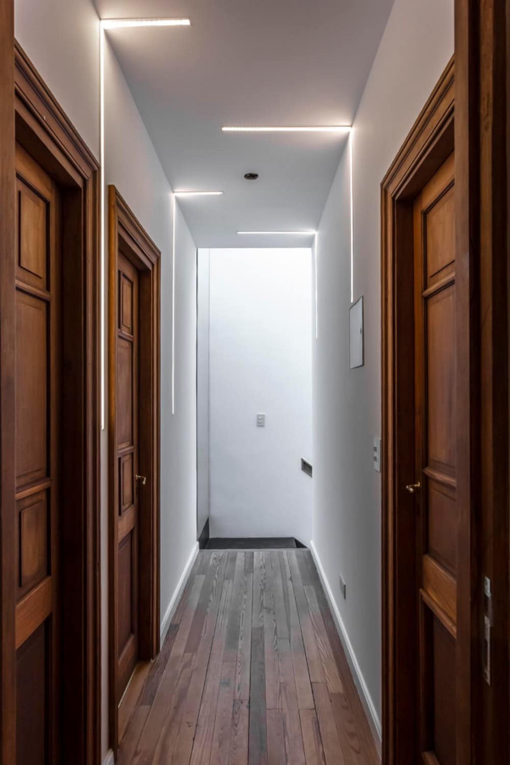
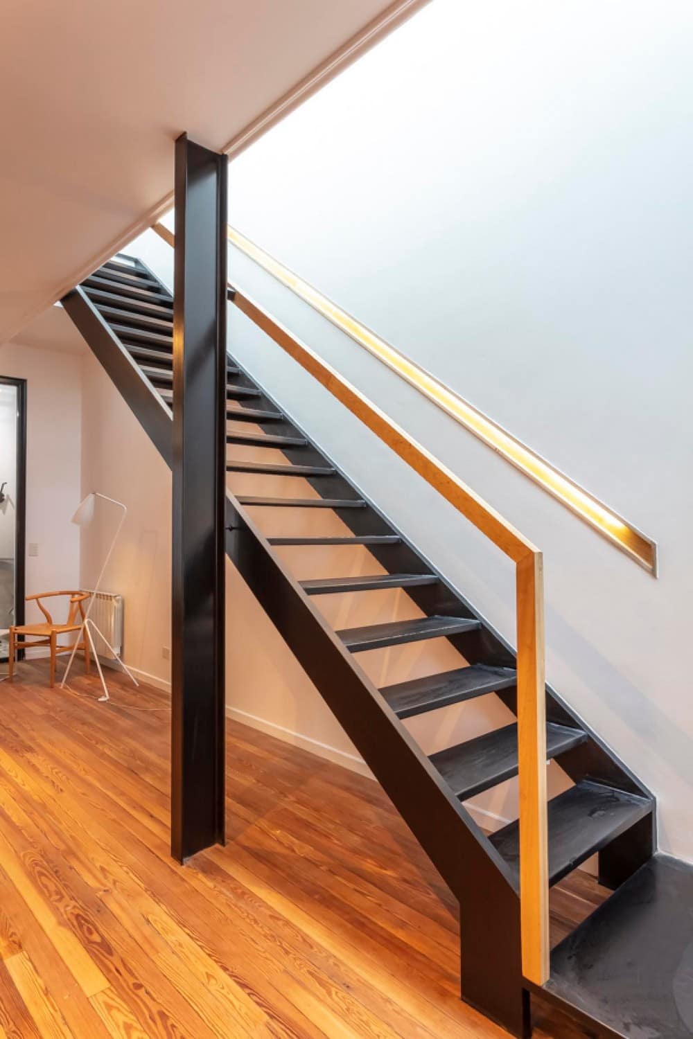
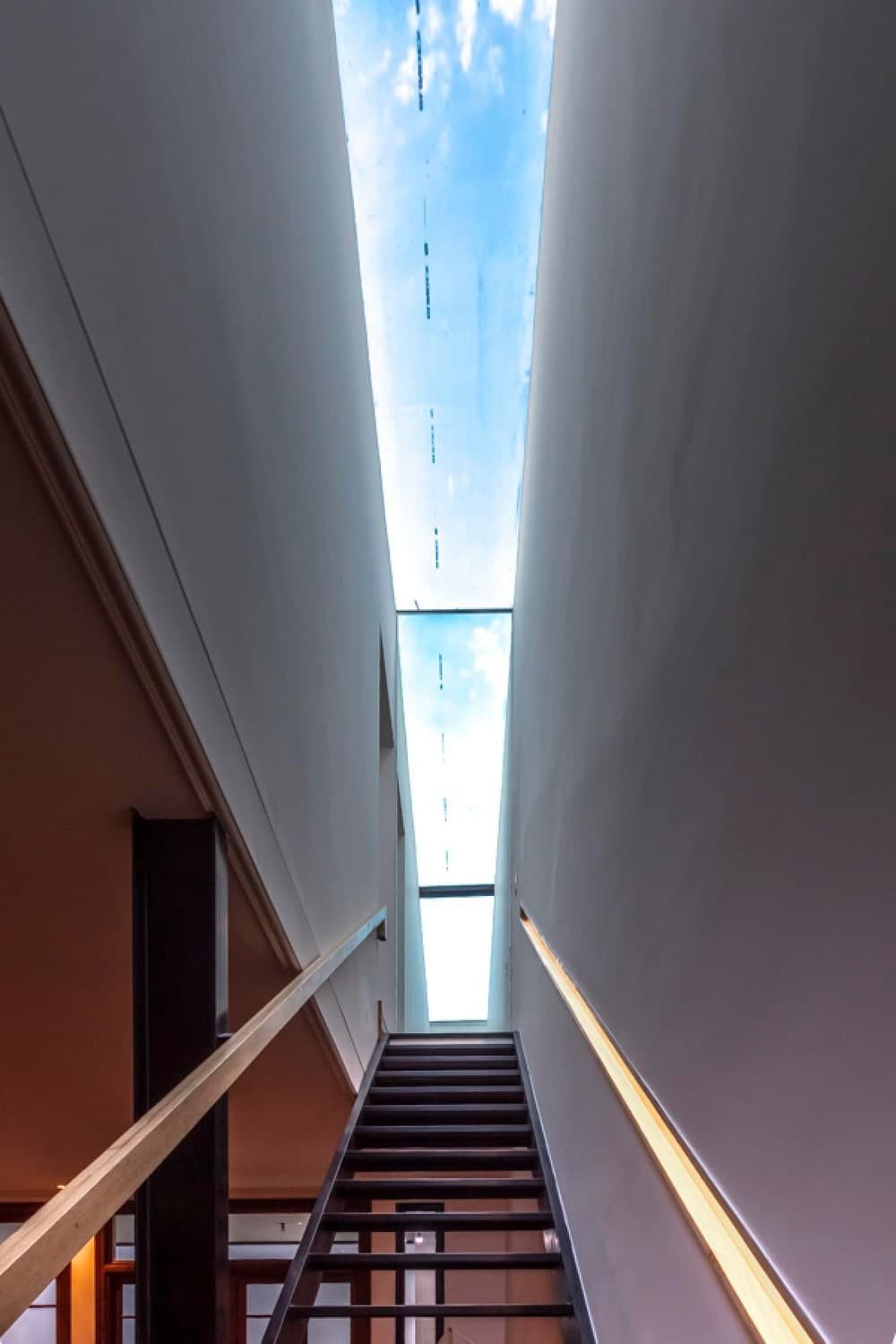
In the lateral retreat of the original home, the lightweight folded sheet metal staircase was located with a glass skylight that allows light to enter the ground floor.
Both inside and outside, a competition was sought between white and black, managing to give warmth with the wood of the floors, the carpentry and the cladding of the articulating central piece.
At the end of the staircase a mirror was placed that reflects the sky, creating a window where there is actually a wall.
Towards one side of the staircase one can see the sky and to the other the green.
In order to artificially illuminate this staircase, it was decided to embed the wooden railing and illuminate it internally.
The priority for the construction and restoration was to form a solid team of trades and experts with whom, sharing skills, materiality and experience, each construction detail would be jointly developed, achieving optimal solutions that exceeded the possibilities of the strictly conventional.
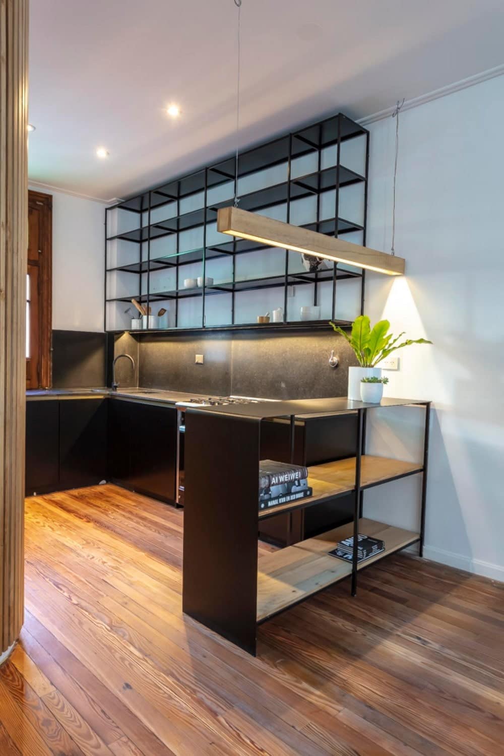
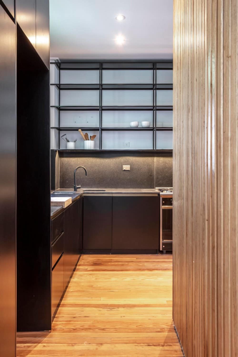
For the kitchen, the same tones were sought in black, white and wood. The under counters are black lacquered, the shelves and bar are made of oven-painted black sheet metal, the floors are made of pine wood, the countertops are made of honed Brazilian black since it was sought that nothing has a shine and the black taps so that they blend in with the background without knocking. the attention.
The pine floors were removed before the demolition, stored throughout the work and replaced, polished and hydrolacquered.
As it was not enough to cover the total m2, demolition boards of the same board width were obtained and mixed with the existing one so as not to notice the differences between the different shades.
The carpentry is also the existing one and was restored one by one. Many of them, such as the kitchen and living room, were modified so that the heights coincided with others or in the case of the kitchen so that the countertop could fit at 90 cm high. All rockers, hinges and latches were also polished and lacquered.
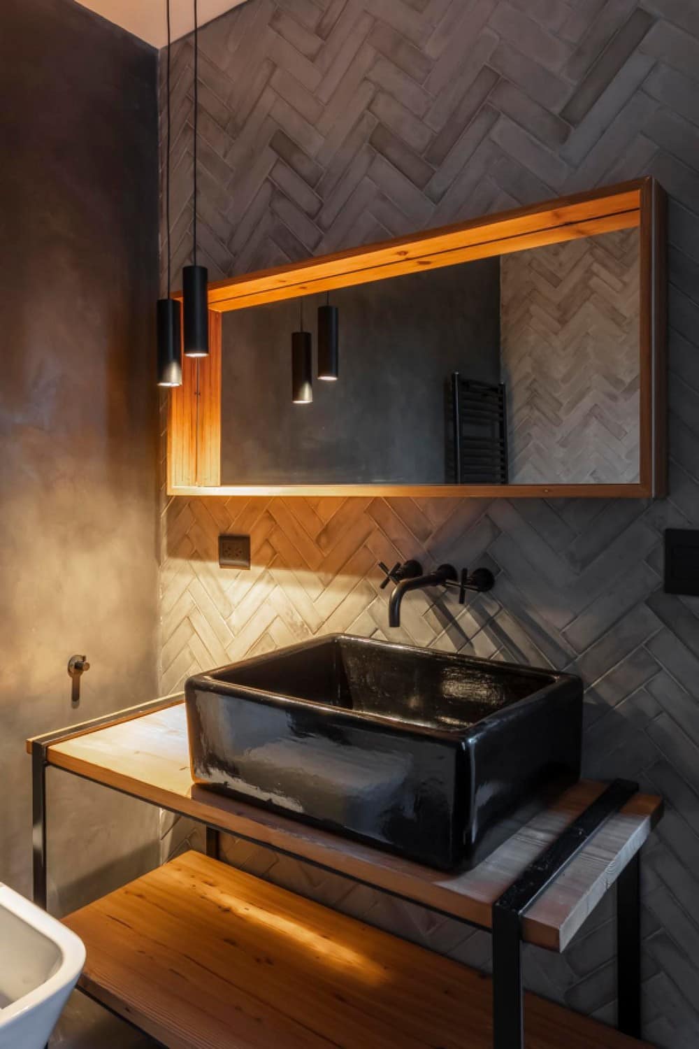
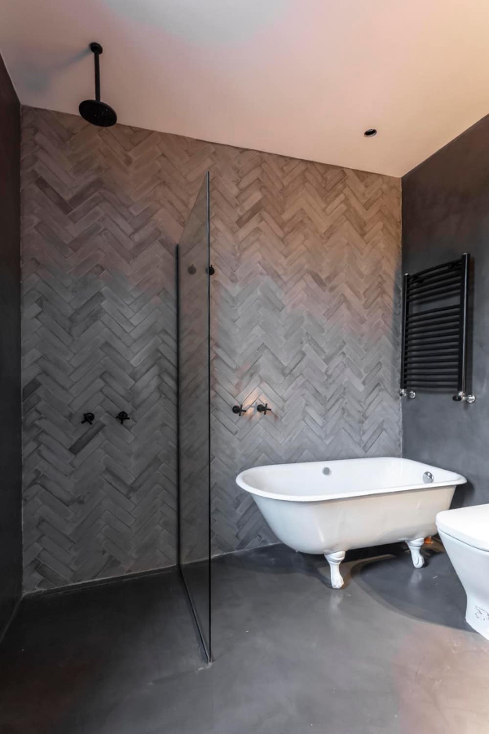
The tub and sink in the main bathroom were also original to the house. They were tiled in black and white, restored and relocated. The same tones were used in the bathroom as throughout the house, white, black, gray and wood, always seeking a contrast between old and modern.
The precise knowledge of what existed allowed us an adequate intervention. In search of an honest and careful architecture, we pay special attention to the details, the chosen materiality and the actors in the project and production processes.
