Project: H Apartment in Hod HaSharon
Interior Design: Maya Sheinberger
Location: Hod HaSharon, Israel
Year 2019
Photo Credits: Itay Benit
Text by Maya Sheinberger
A couple in their 70s purchased this 145 m² apartment in Hod HaSharon, Israel so they could be closer to their children and grandchildren. They fell in love with the large windows facing the park and the spacious master suit. However, the existing kitchen was too small, the public area needed to be adjusted to their needs and the overall design desperately needed an upgrade.
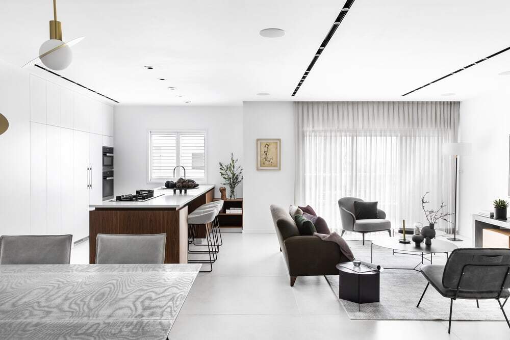
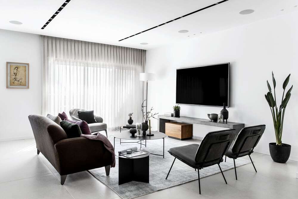
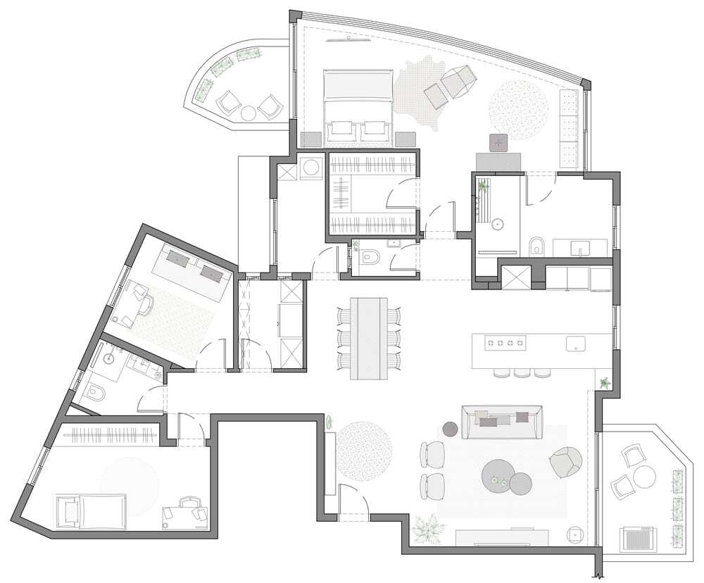
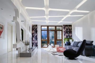
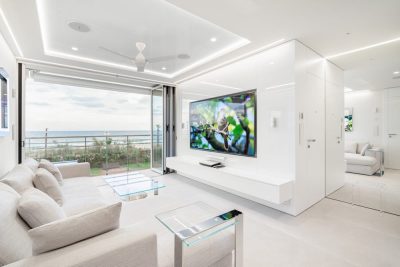
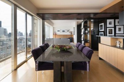
The public area was completely redesigned to fit the couple’s lifestyle, it includes a large and open kitchen, a comfortable living room, a dining area and a balcony. All of the major systems, such as electricity and plumbing, were changed and all existing materials were replaced. Large and bright floor tiles were chosen to cover the entire public area and a new plaster ceiling was planned to incorporate new lighting fixtures.
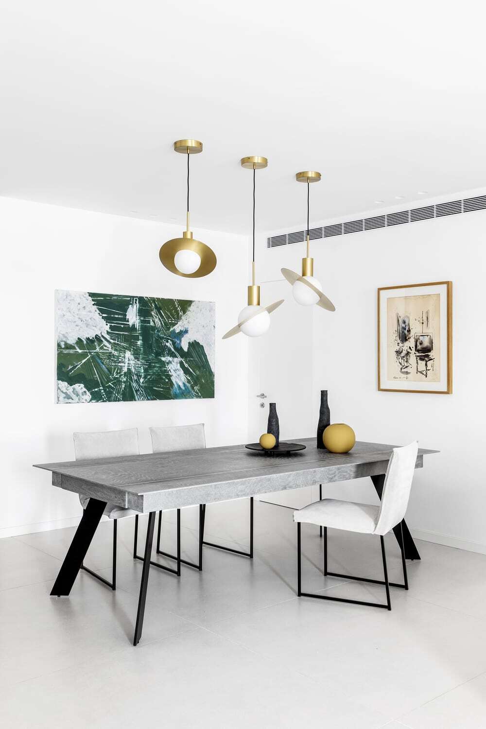
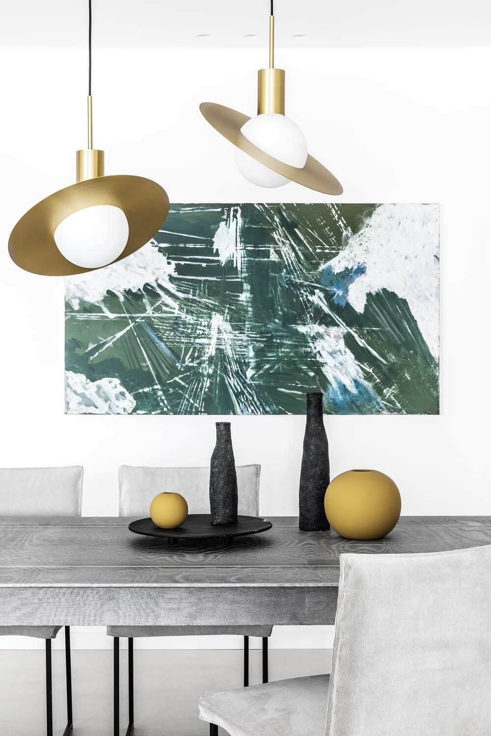
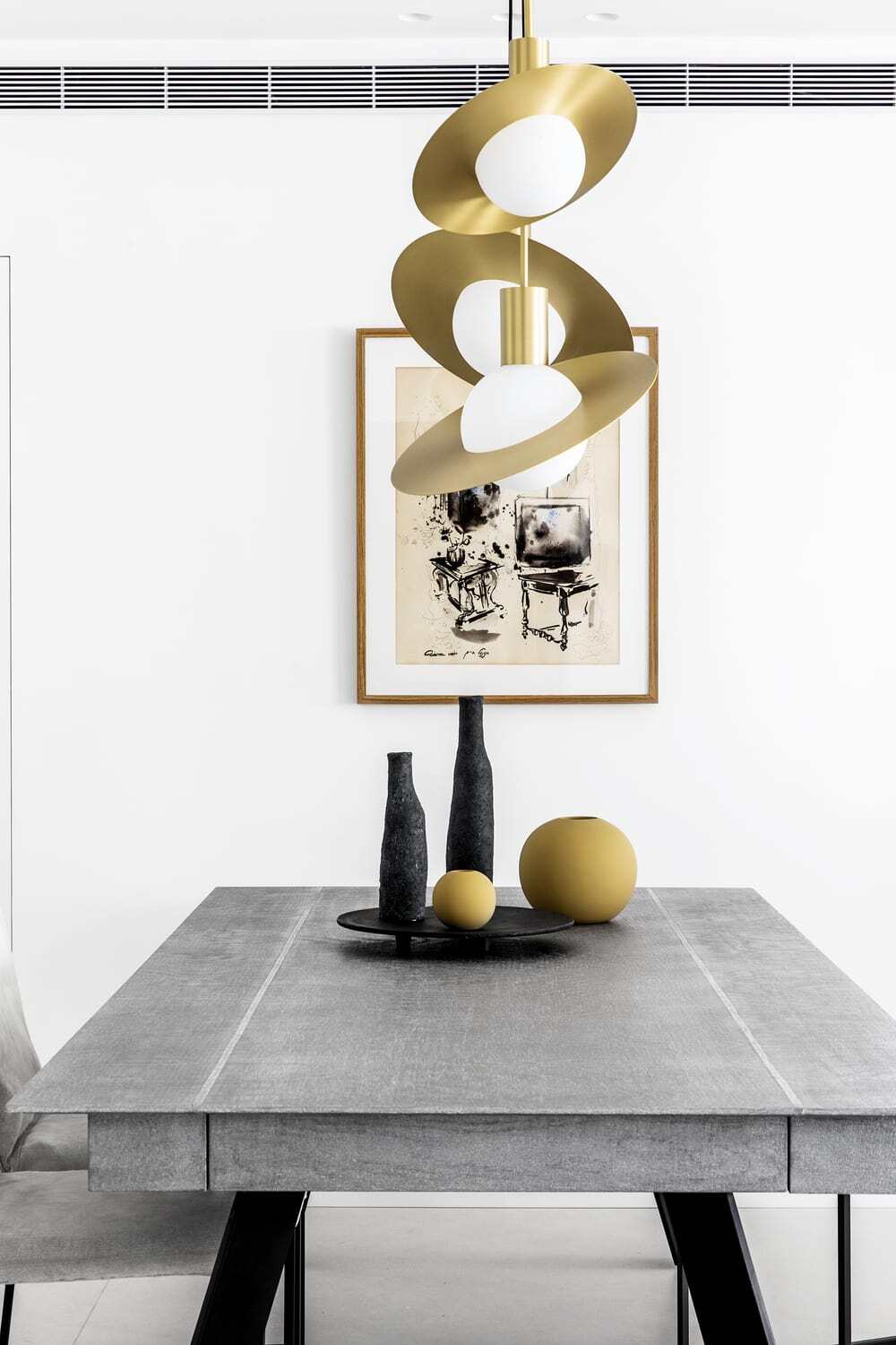
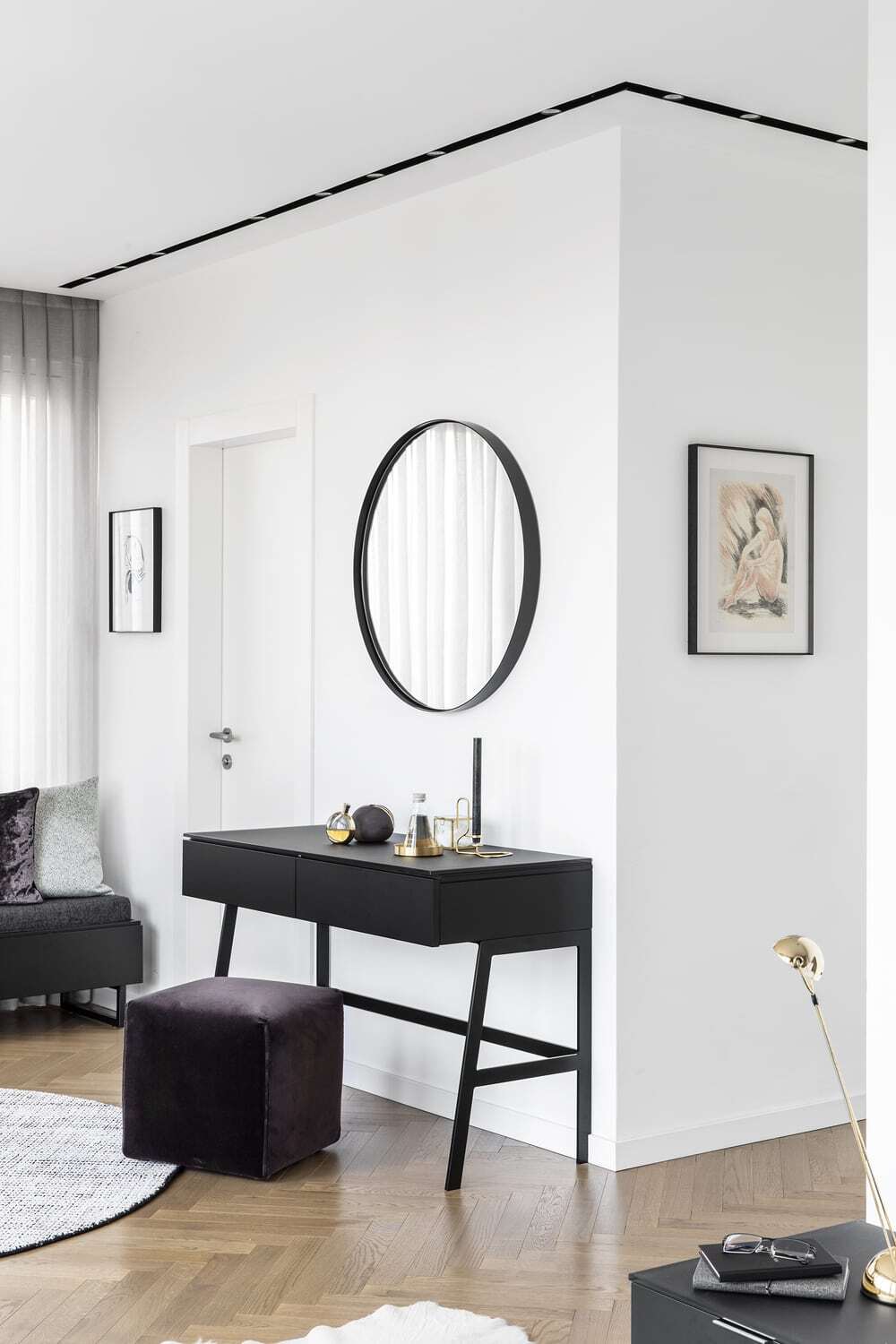
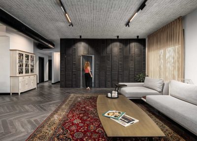
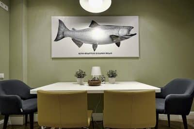
The existing old fashioned style was completely replaced with a contemporary and restrained design, incorporating natural materials such as iron, concrete, walnut and leather. An elegant console made of a steel frame and a brass surface defines the entrance, two circular mirrors with minimalistic frames hang next to it and on the floor lies a dark and round carpet. The dining area is directly in front of the entrance. It includes a dining table with a unique texture, created by a resin casting on fabric, light grey chairs, geometric and delicate lighting fixtures and two abstract artworks.
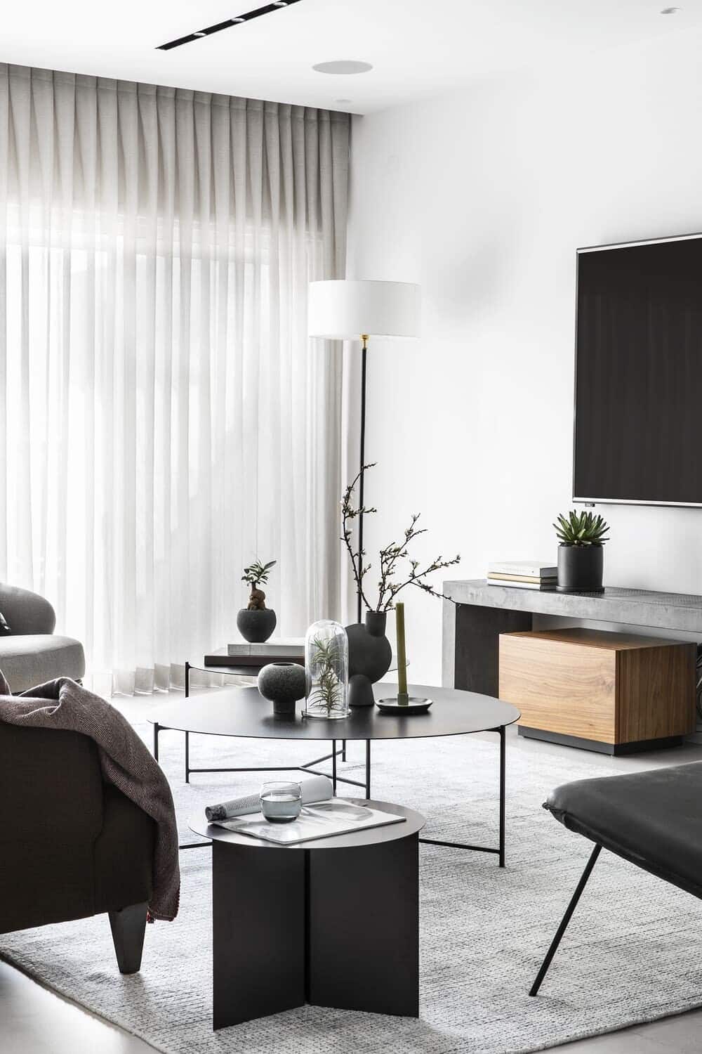
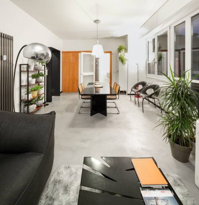
In the center of the living room stands an original vintage sofa, designed by the famous Israeli furniture makers “Kastiel”, which the couple owned prior to the renovation. The rest of the furniture and accessories are completely new and were chosen to create a cohesive and harmonic style. Alongside the sofa are three armchairs and round steel coffee tables, all facing a TV unit made out of concrete and walnut.
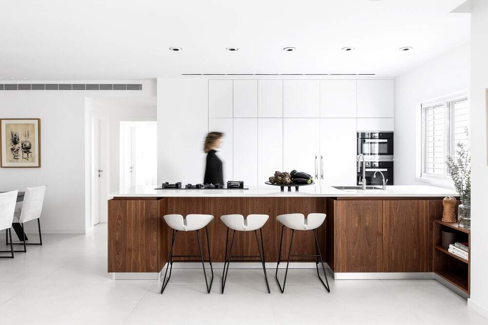
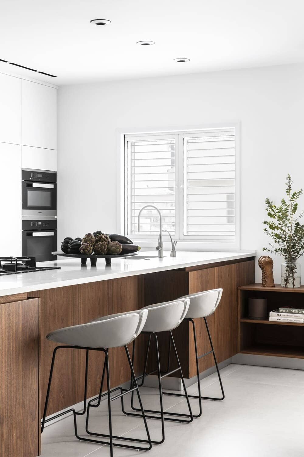
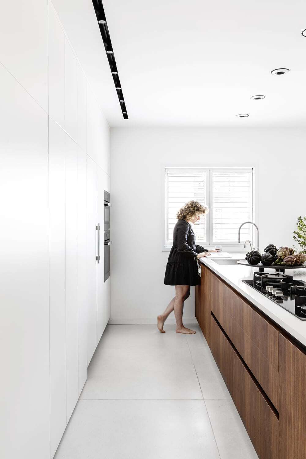
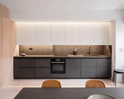
The kitchen was completely replanned and designed in order to allow an open plan facing the living area. Part of its previous location is now used as an additional pantry and two constructive columns, which were previously a part of the master bathroom, were attached to it to increase its size. The columns were integrated into the tall kitchen cabinets. which were designed in white to create a clean background to the open space. A kitchen island was designed in a parallel line, it is covered in rich walnut surfaces and includes an extra unit, designed to maximize the storage between the kitchen and the living room.
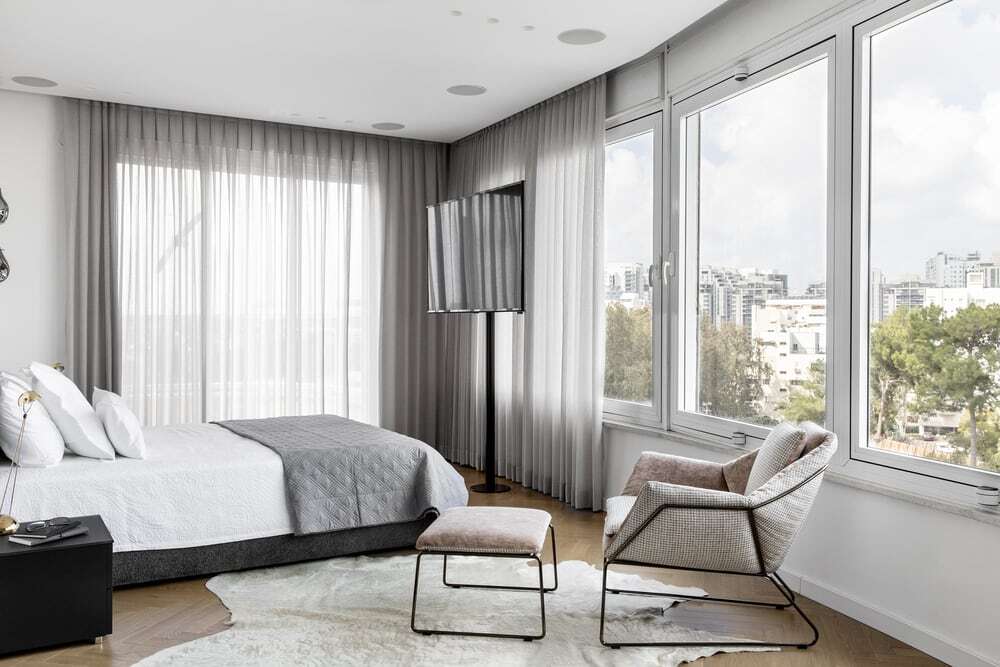
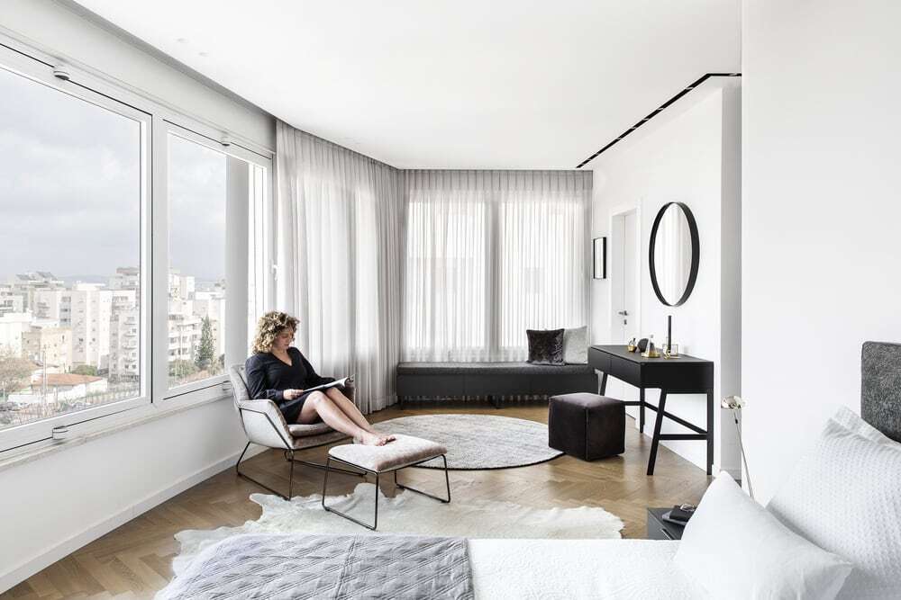
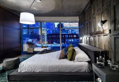
The layout of the bedrooms remained as it was before the renovation, but the materials and color palettes changed completely, including hardwood floors in a “fishbone” layout that flatters the diagonal existing walls. The master suite, which enjoys large windows with a view to the park, includes a bedroom, a walk-in closet and a bathroom. For the bedroom, a bed by Molteni was chosen, alongside two night stands in a matt black mirror finish. Two original vintage table lamps that were in possession of the owners before the renovation were placed on each side. An additional elegant lighting fixture hangs from the ceiling next to the bed and in front of it is a TV on a pole. The large and asymmetrical room was carefully planned – a makeup stand, an armchair with a matching footstool and a bench, which also includes additional storage – add style and function to every corner.
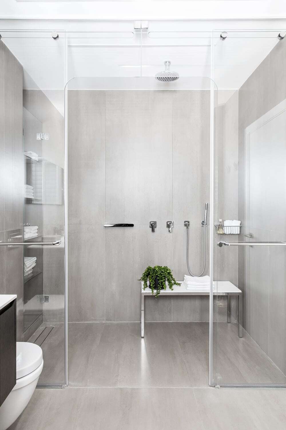
The walls of the master bathroom were covered with large tiles in a grey-khaki tone to create a relaxing and homogenic look. The spacious shower includes a custom made corian bench, used for sitting as well as placing different necessities. The cabinet by Antonio Lupi is covered in a black oak finish and a corian surface. In the ceiling are linear lighting fixtures, creating an asymmetrical pattern.
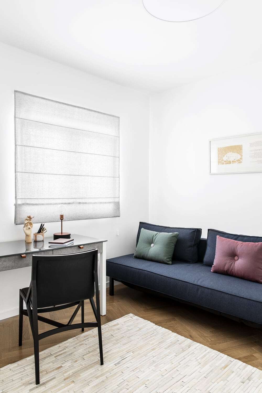
The extra bedroom is used by the children and the grandchildren when they come to visit. It includes a blue sofa bed, a table and reading light by Israeli designer Alon Dodo and a black leather chair. A patchwork leather carpet and a grey curtain add softness to the room.
The same floor tiles that cover the public areas were used in the guest bathroom, thus linking the different areas of the apartment together cohesively. A corner shower with a harmonica door allows for the space to be as open and comfortable as possible at all times. The cabinet is made out of walnut with a linear pattern and a corian surface, above it is another custom made cabinet that includes a mirror, storage and an open decorative unit.

