Project: Hipped House
Architect and Interior Designer: Oliver Leech Architects
Structural Engineer: Corbett & Tasker
Principal Contractor: Hirsen
Location: Epsom, Surrey, United Kingdom
Completed: 2020
Photo Credits: Ståle Eriksen
Transformation of a 1920s detached house for a young family who wanted more space to work, learn, live and play.
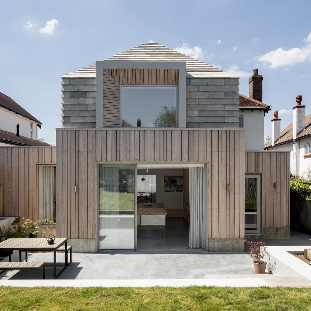
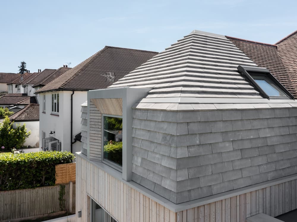
Oliver Leech Architects has given a detached inter-war house in Epsom a new sense of identity through the addition of a hipped-roof two-storey rear extension that reveals a depth of clean, intricate detailing throughout.
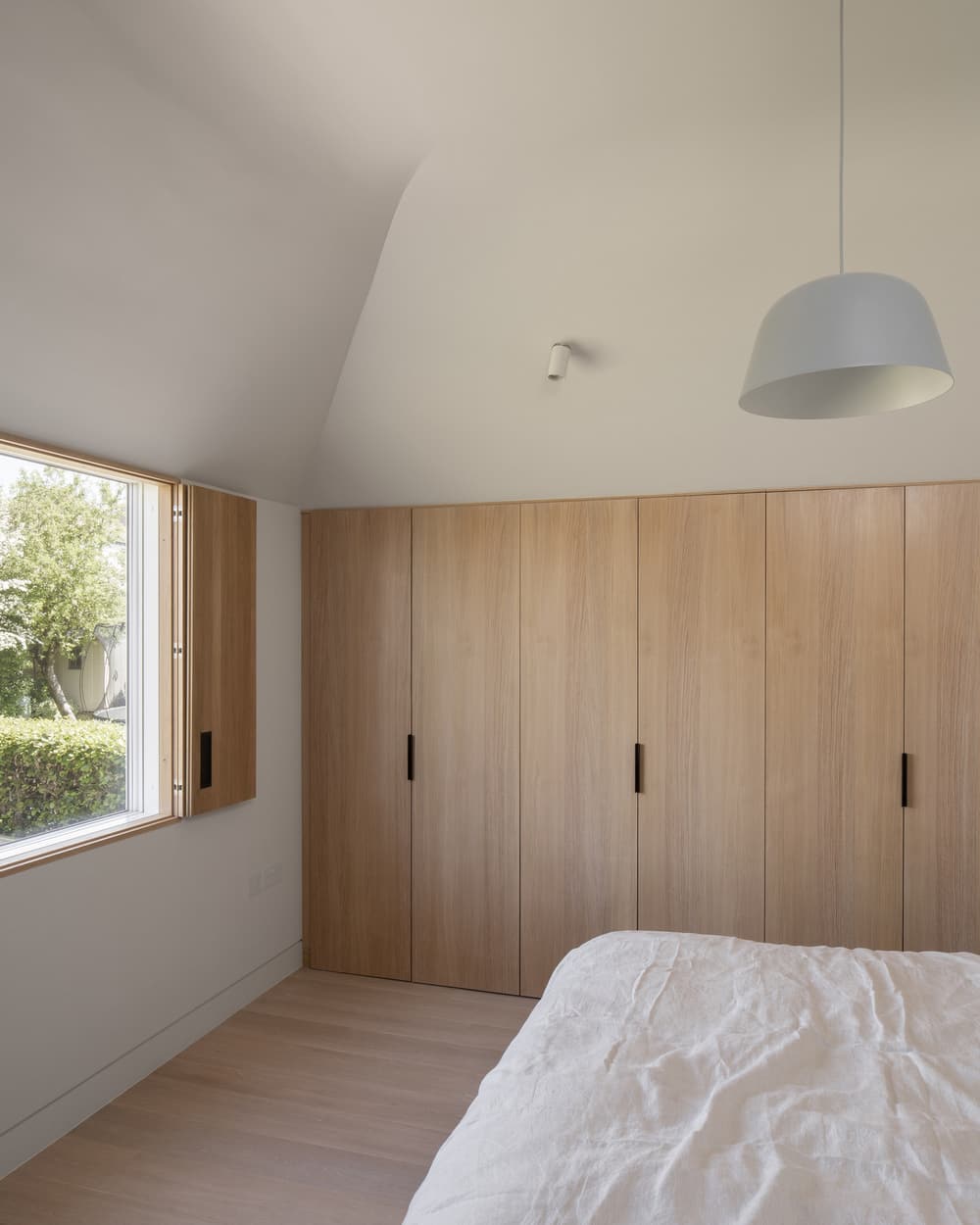
The clients, a couple with two young children, briefed the architects to redesign the home to include more spacious and open living areas in which they could spend quality time together. Despite contending with strict planning conditions at their Epsom estate, the clients asked Oliver Leech Architects to create a new modern identity to visually set the house apart from its neighbouring rear additions. The new extension accommodates a new master bedroom and bathroom suite on the first floor featuring vaulted ceilings and garden views. On the ground floor, the house has been opened up to allow for a large, flexible kitchen and living space with views and connections to the internal courtyard and large rear garden.
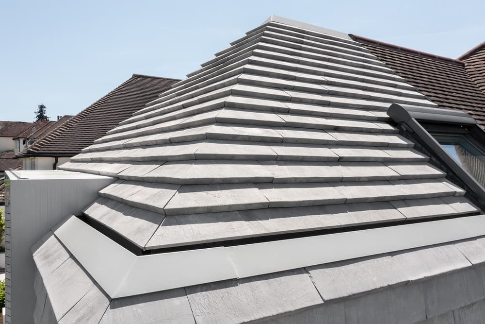
“I think the choice of the external materials was our biggest design challenge. We spoke to every tile company in England to find something bespoke, and ended up looking to the Danish company Petersen for the grey roof tiles. The Hipped House is one of the first projects in the UK to use these lovely handmade tiles, which add to the sense of calm that exudes throughout the interiors.” says Oliver Leech.
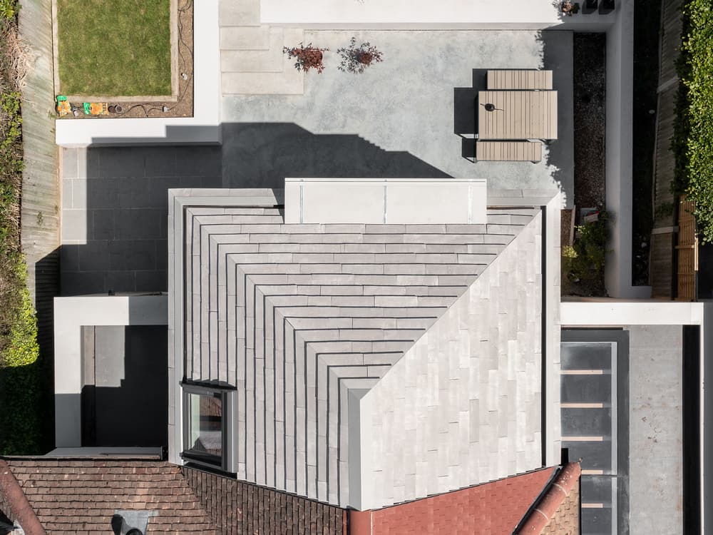
The form of the extension was defined by the existing house. Oliver Leech Architects designed a hipped form that mimics the original roofscape, featuring a large dormer window that punctuates the roofline. Planning restrictions meant that the external material palette was limited to what was previously on site, including dark clay tiles, timber, and render. The architects worked within these constraints to design a contemporary palette that gives the house it’s own sense of identity, using a handmade, grey Danish clay tile that is visually very different to the neighbouring red tiles more commonly seen on traditional Surrey roofscapes.
Considerable time was spent on sourcing bespoke tiles and finding an aesthetically pleasing way to cut and lay them. Various styles in a wide range of colours from across Europe were tested on site to achieve harmony with the original house. This is one of the first projects in the UK to use Petersen tiles; the chosen warm grey clay colour comes from earth pits in Eastern Europe, before they are transported to Denmark to be handcrafted into wide brick-format hung tiles. Beneath the clay tile roof a layer of corrugated roofing material acts as a water management system, allowing rainwater to flow off into a hidden gutter.
“We are most proud of the intricate and technically complex detailing in this project. We spent countless hours on site with our fantastic builders, lining up materials and ensuring each junction, line, and texture worked in harmony.” says Oliver Leech
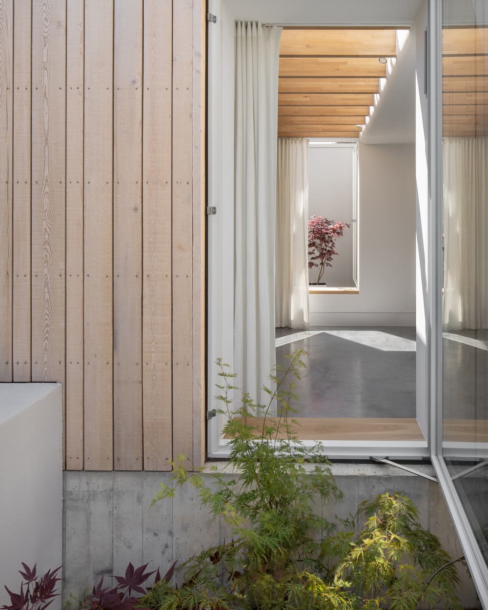
Complementing the soft, muted tone of the tile, the timber cladding also adds textural interest and displays the architect’s intricate detailing. The Siberian Larch is imbued with oil to naturally weather the timber to a silvery grey and is laid in an alternating pattern in terms of timber widths to give a playful appearance to the façade and offset the sharp lines of the hipped roof and dormer. The same timber was used as shuttering to cast the concrete plinth at the base of the extension, repeating the pattern and re-creating the grain that is now fossilised into the concrete.
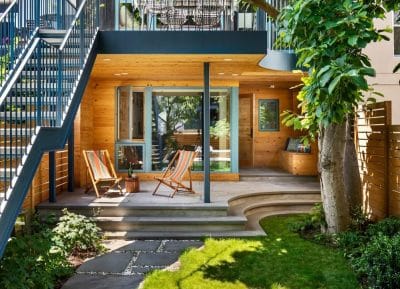
A north-facing aspect takes advantage of the natural light that enters through the rear of the house. To enhance its potential, the new plan incorporates two courtyards; one of which is internal to penetrate evening light deep into the home. A lone red acer tree sits on display in this light well, providing a place to pause and enjoy views to nature from throughout the house. The second courtyard faces the garden and is filled with soft planting that brings the luscious tones and textures of the outdoors in.
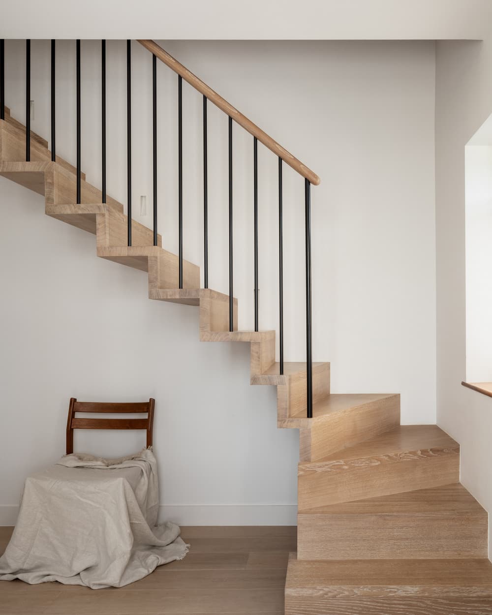
A modern architectural language directs a strong sense of continuity inside and out, with the modern additions feeling like a seamless part of the house. Oliver Leech Architects replaced the original staircase with a floating solid oak design featuring steel spindles and an oak handrail on the balustrade, which offers a contemporary lightness that sets the tone. The timber staircase harmoniously links the two levels with the same material used consistently for the flooring and also throughout the kitchen.
“The form of the house was very much led by the pushing and pulling of the client’s brief and the insistence from the planners on certain aspects. We’re very happy with the result and enjoyed working creatively to meet both parties’ needs.” says Oliver Leech
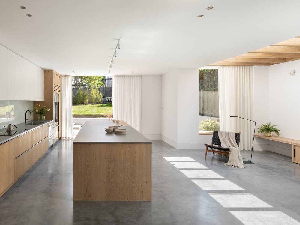
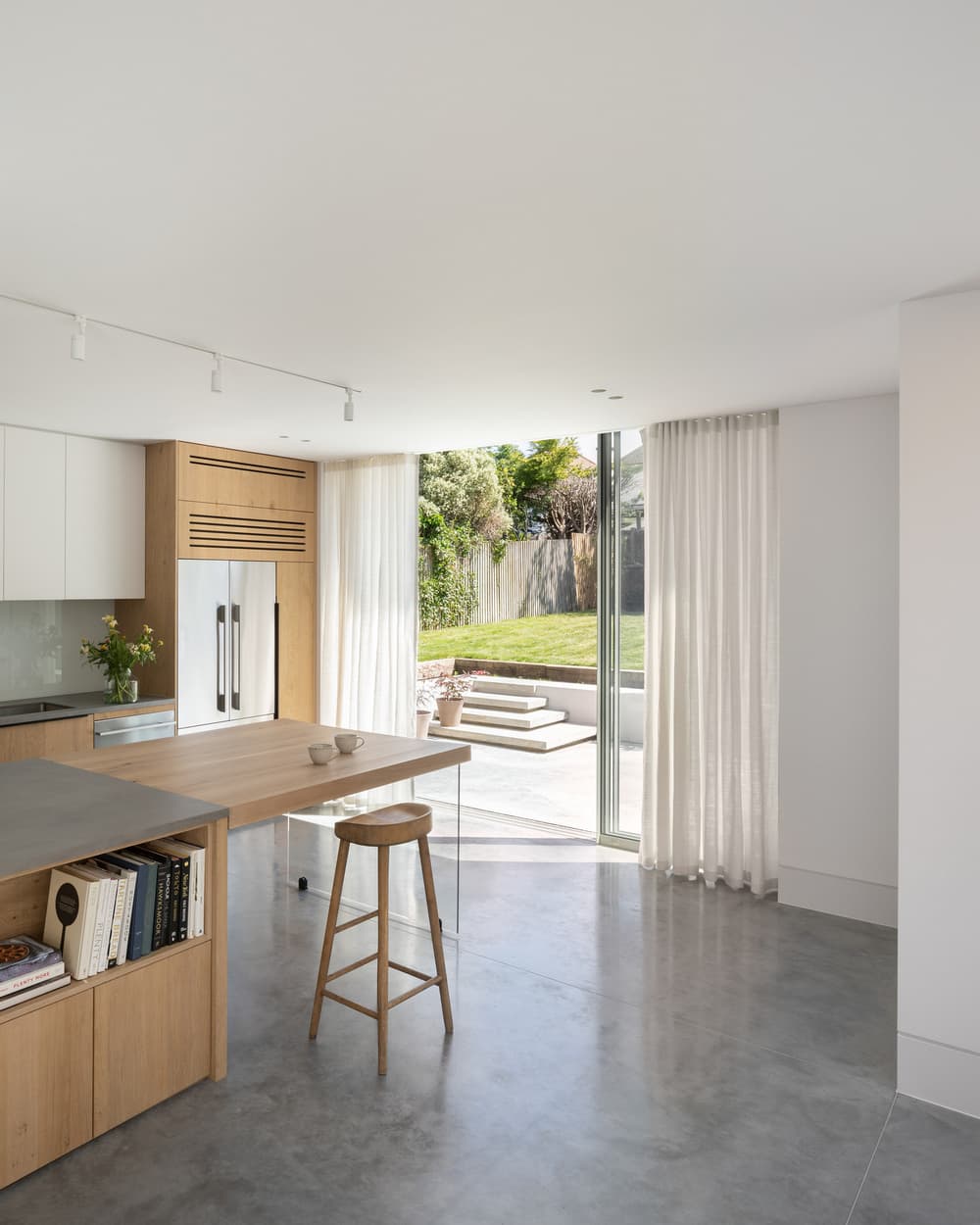
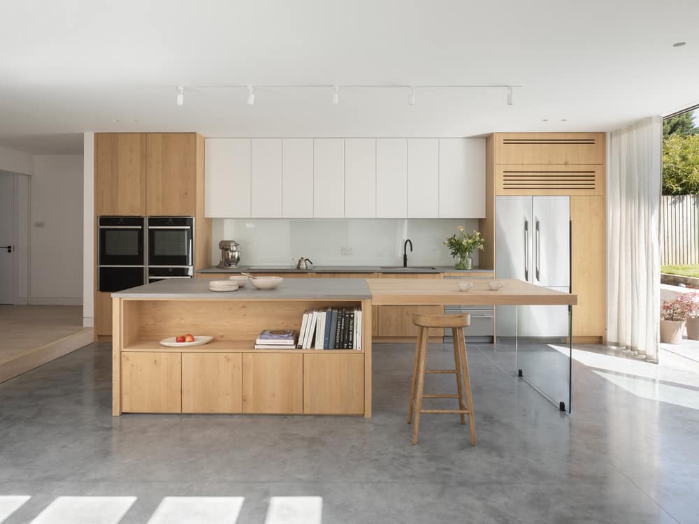
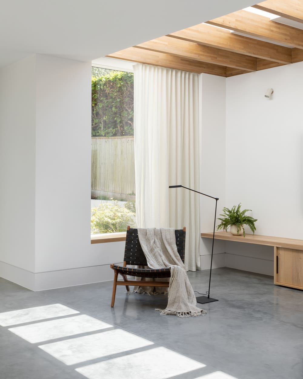
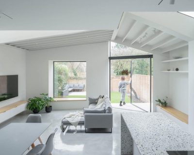
Small step changes create a journey through the house and subtly define the sequence of living spaces. A sense of arrival is achieved with the step down into the kitchen and dining area and this level change strengthens the connection with the garden, as the polished concrete kitchen floor extends outside to form the patio. Tall, glazed sliding doors open up to make the kitchen and garden one big space, with lightweight linen curtains offering privacy without blocking out the light. A double pocket door creates a flexible, formal dining room that can be closed off when not in use.
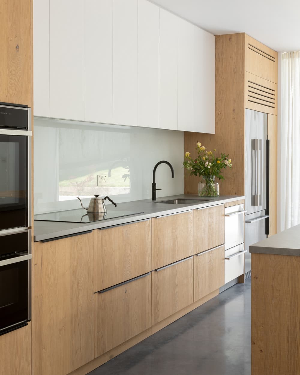
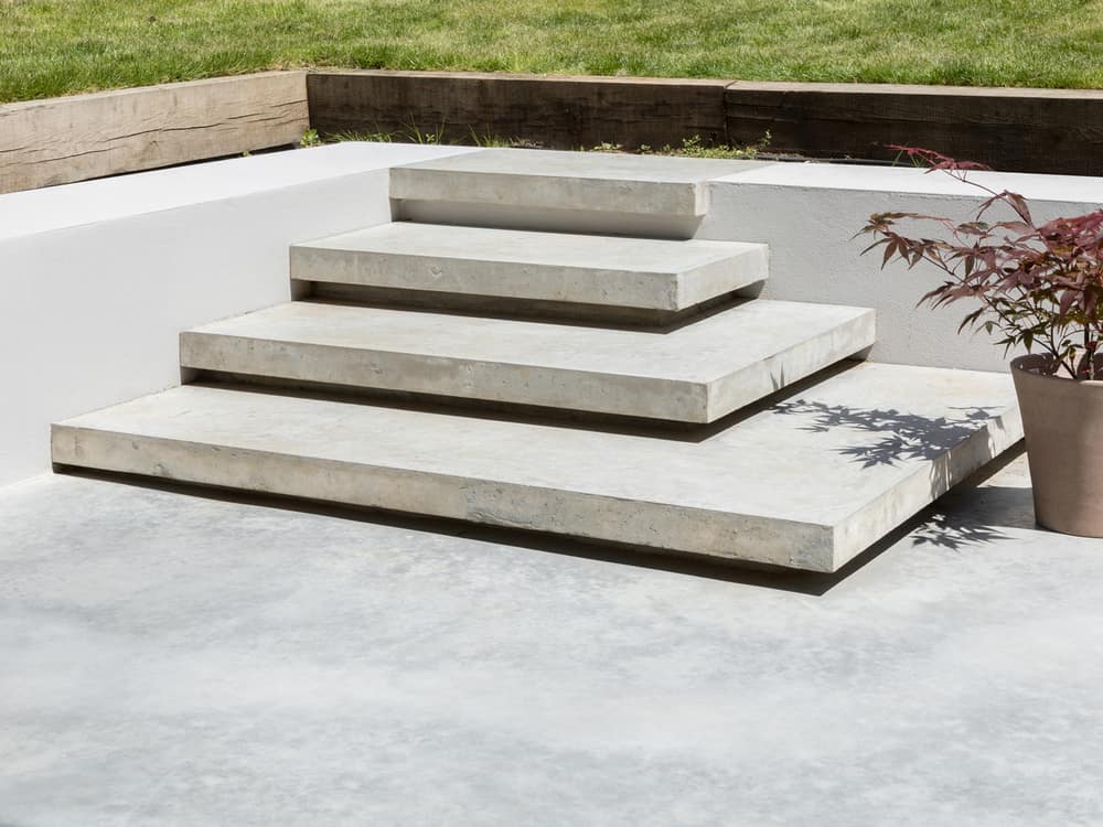
Texture and tactility present an expressive quality and a composed calmness throughout the interiors. In the kitchen, natural materials such as glass, polished concrete, white-oiled timber paired with a monochromatic off-white colour palette with black accents, create a balanced feel. The dark polished concrete flooring contrasts against the matt white walls and ceilings, and the durable porcelain worktop is a complementary grey to sit alongside the natural oak cabinetry. The use of glass at one end of the kitchen island creates a breakfast bar-effect with a floating effect that is mirrored in the steps leading to the garden.
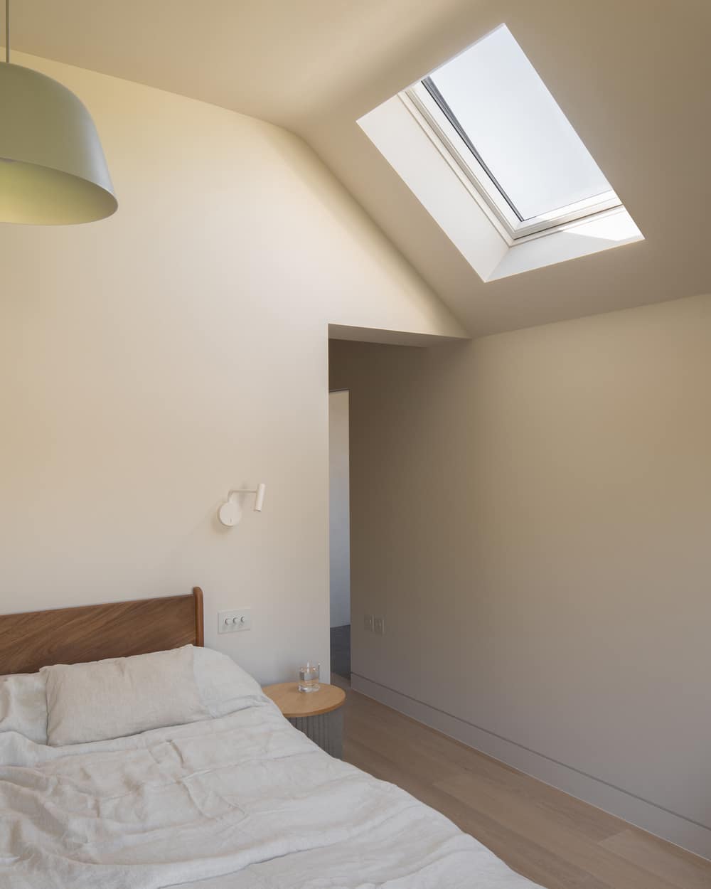
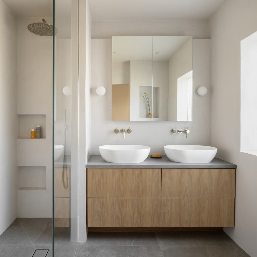
Oliver Leech Architects have made sensitive use of light to create small moments of joy throughout the house, particularly downstairs in the courtyard spaces and upstairs in the new master bedroom situated in the first-floor extension. The beautiful ceiling geometry formed by the hipped roof allows the ephemeral morning sun to shine in through the skylight, while the open oak shutters let warm light refract of their finish and bounce up the walls. The reductive material palette used in this room and the adjoining en suite, from the oak joinery to the polished concrete floors, is a reflection of the rest of the house, tying the whole scheme all together.

