Project: Long House
Architects: R2 Studio Architects
Location: Herne Hill, London, UK
Year 2018
Photography: Andy Stagg
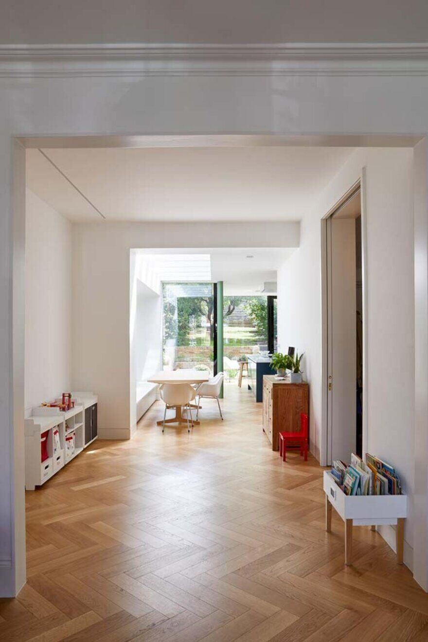
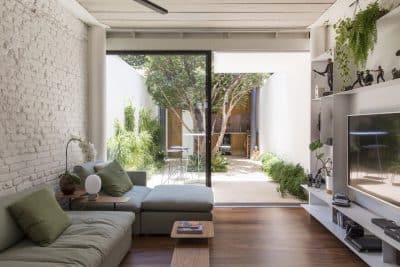
Everyday family life was at the centre of the brief for this home and as a result the spaces for cooking, eating and playing were placed at the heart of the house. They connect to the more formal lounge area at the front, outwards to the garden at the rear and upwards via a wide opening on the side.
The existing house, while of generous proportions, had a very long footprint alongside a drawn-out and narrow courtyard. As a result the rear part of a house comprised a series of rooms that acted as a barrier from the heart of the house to the garden. Long and complicated corridors without access to daylight made the Long house feel introverted and dark.
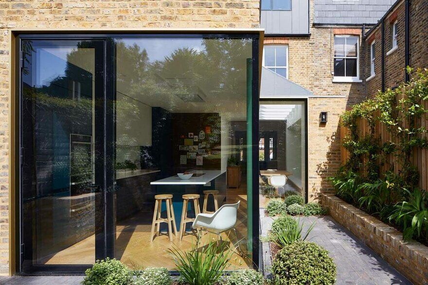
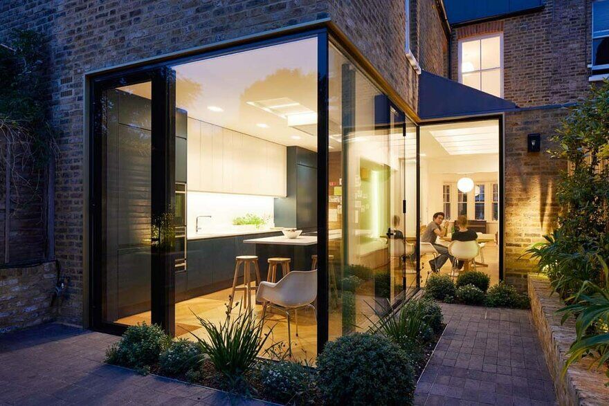
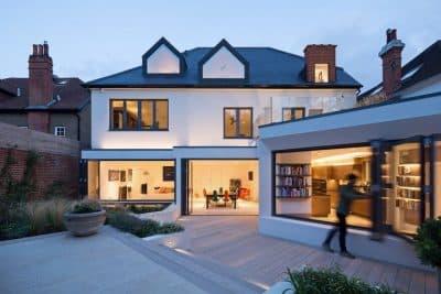
On the ground floor the design created inter-connected living areas, flipping sides as you move through the space, thereby visually shortening the space. A modest side extension was inserted to partially infill the narrow courtyard and locally widen the house to create a dining area. The extension stops short of the rear of the house however to allow the garden to intersect with the spaces and three sides, providing views out as well as letting daylight in.
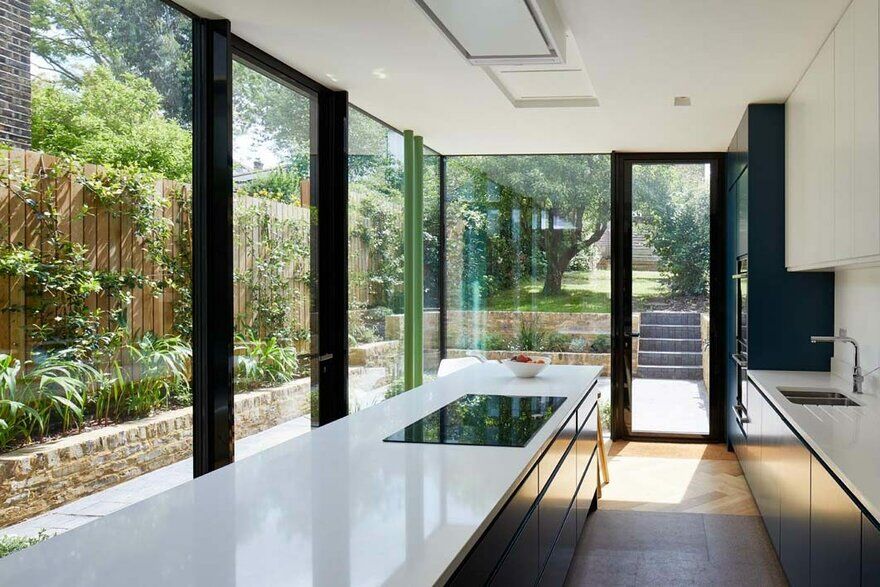
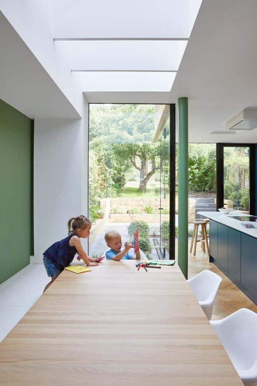
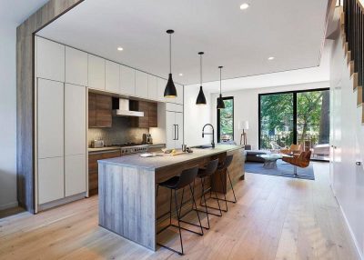
The kitchen is placed inside a “no hands” glass box with the upper part of the building seemingly floating above. The glass corner allows the terrace and garden to extend into the kitchen: While using the kitchen you have the feeling of being outside at the same time.
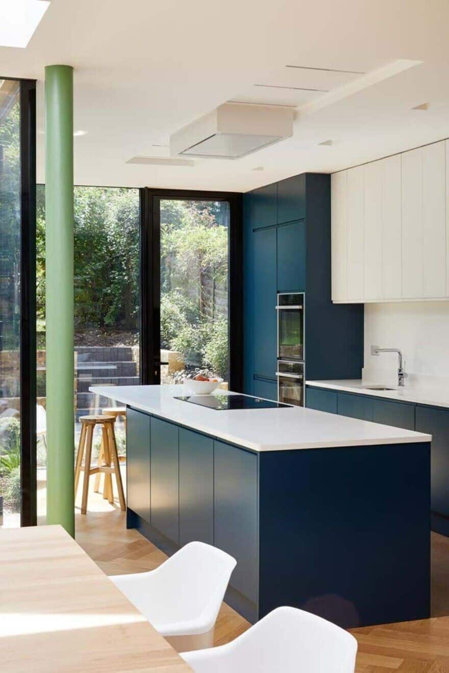
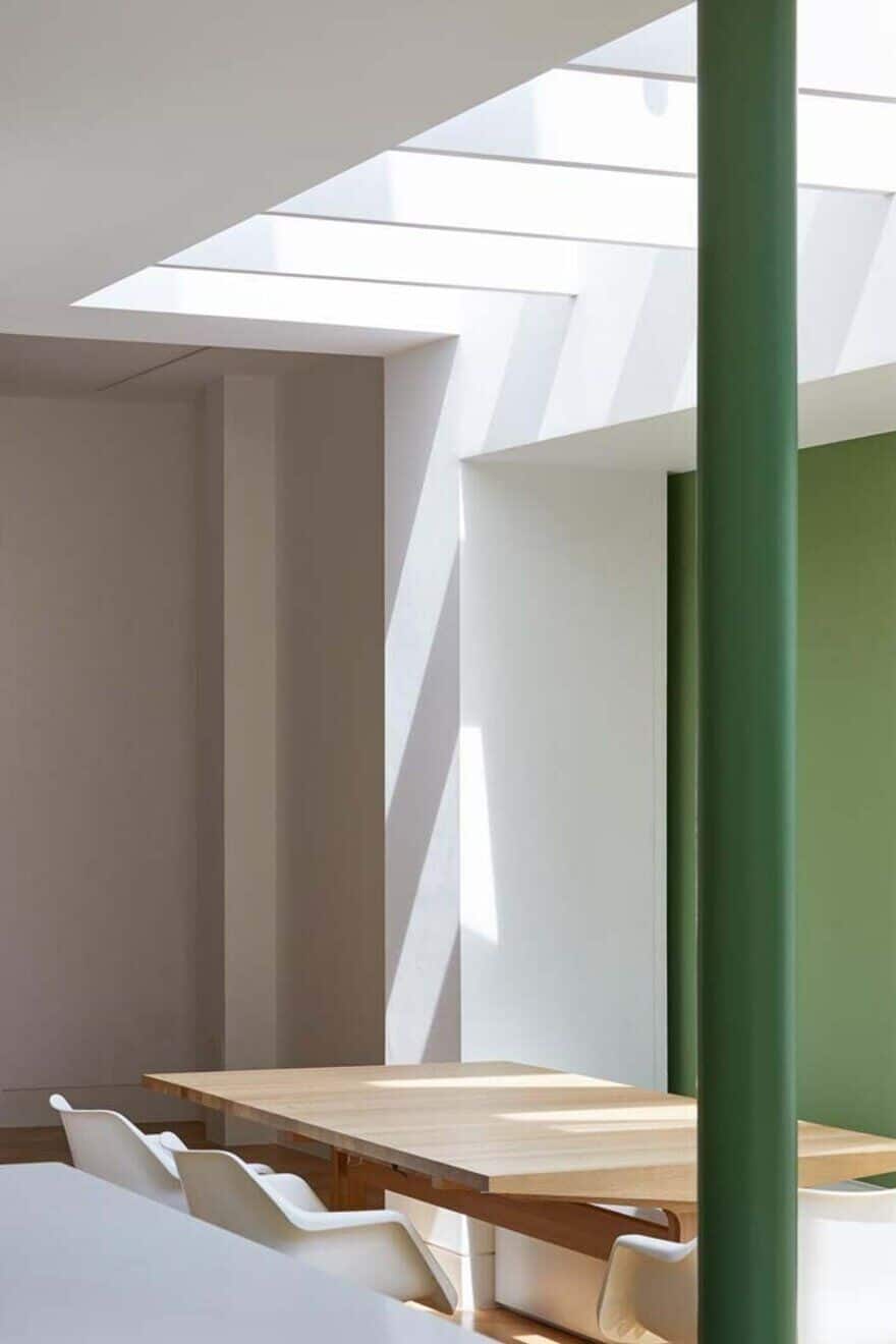
The columns are offset from the main structural points and read as an architectural expression of the garden marching inside the house with their green colour and various sizes, further pulling the outside in visually.
For the interior the family was after a peaceful feel, a home that blends modern ideas with classic elements. The connection to the garden was key, as was the idea of strong connections between the living spaces.
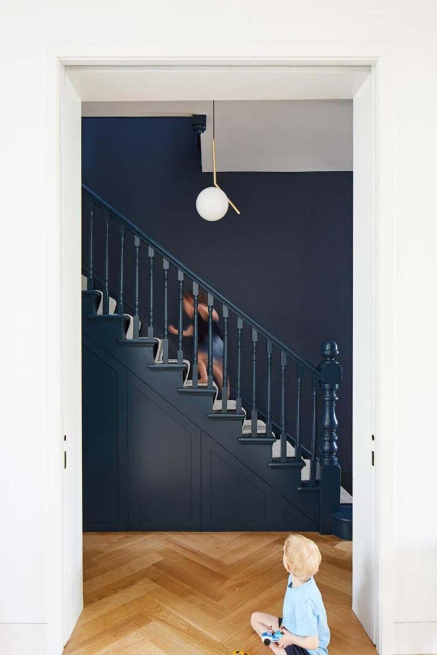
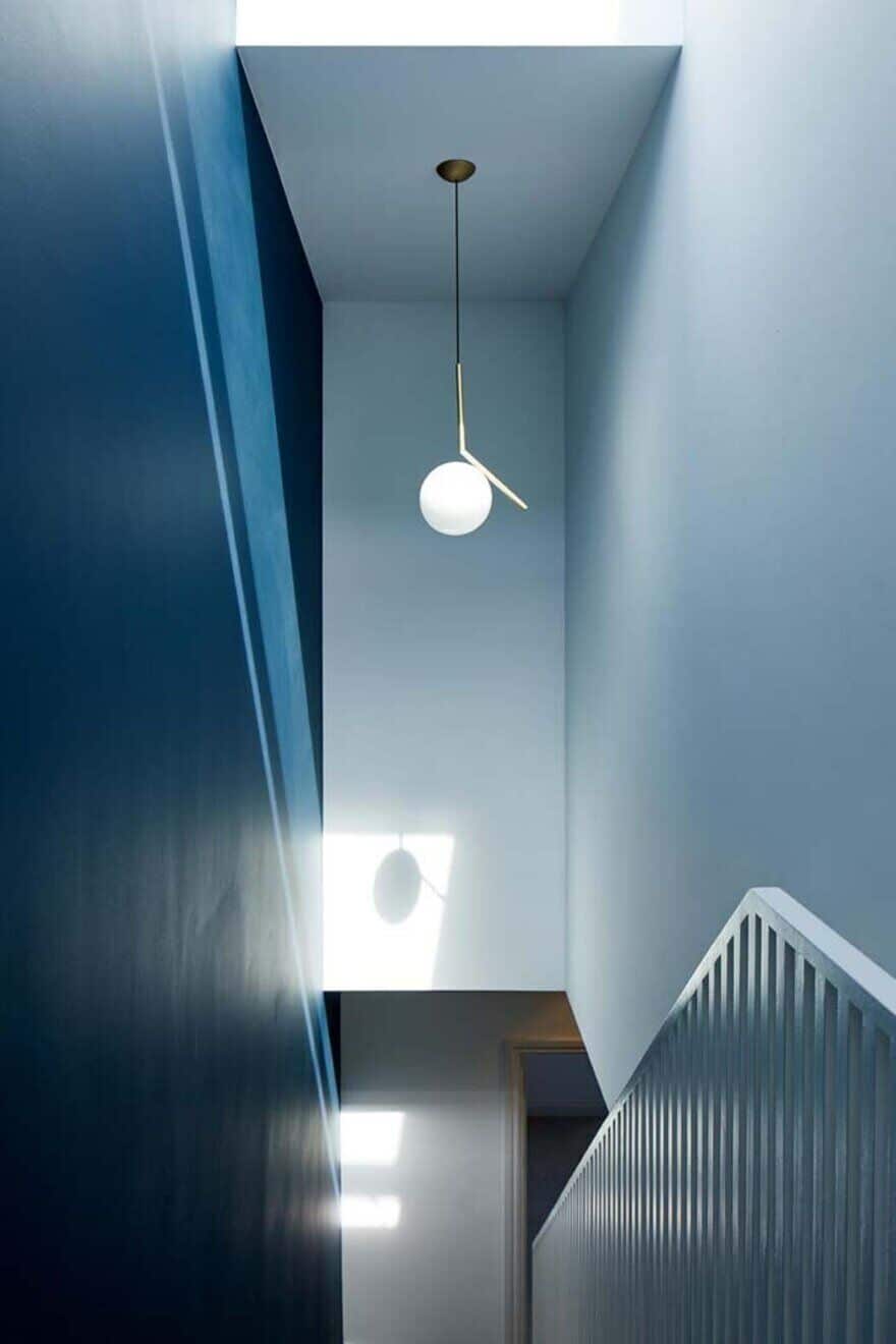
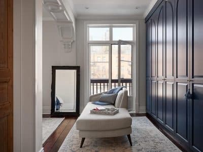
The colour palette in the Long house is deliberately refined to following a simple principle: A dark blue wall guides the space like a ribbon from front to back, along the party wall side. The colour (Farrow & Ball Hague Blue) provides a strong contrast which helps make the long spaces feel less narrow. When moving from the hallway into the ground floor rooms, the strong dark colours give way to brighter, naturally lit spaces. The light oak floor becomes more dominant in these spaces and guides you towards the garden. The green dining area then provides a transition to the garden.
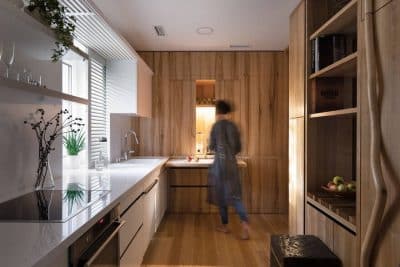
The colours are complemented by natural materials such as the light stained oak floor, cork floor and pin board, brass beading and ironmongery.
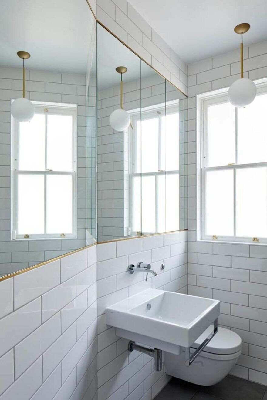
Additional bathrooms were inserted between the bedrooms to accommodate the growing family. The bathrooms are kept very simple in white and large mirrors are used to brighten up the tight spaces. Brass beading frames the mirrors, picking up the brass theme from the lower levels.
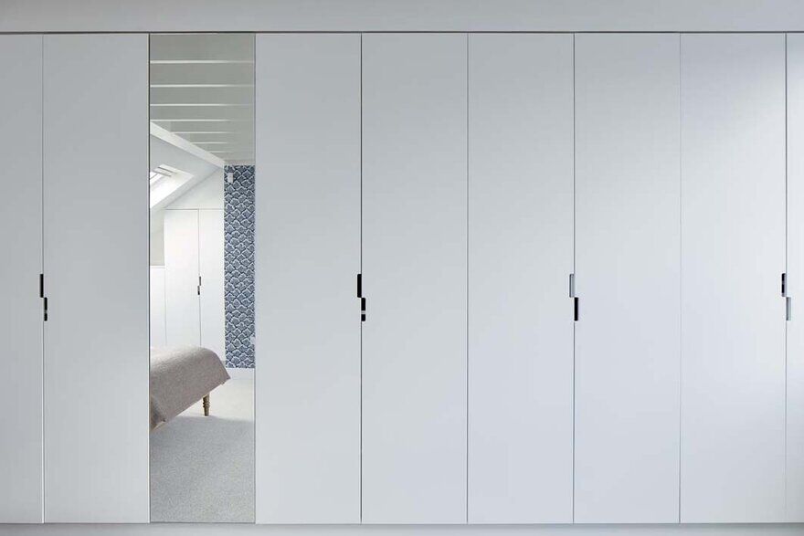
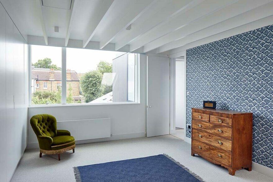
A generous master suite overlooking the surrounding area and onwards towards the city is located in the loft.
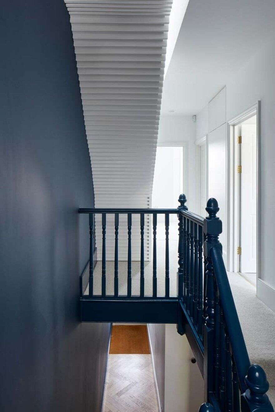
A modern stair provides access to the loft, still following the dark blue wall. At the top and oversized roof light throws daylight all the way down to the ground floor.
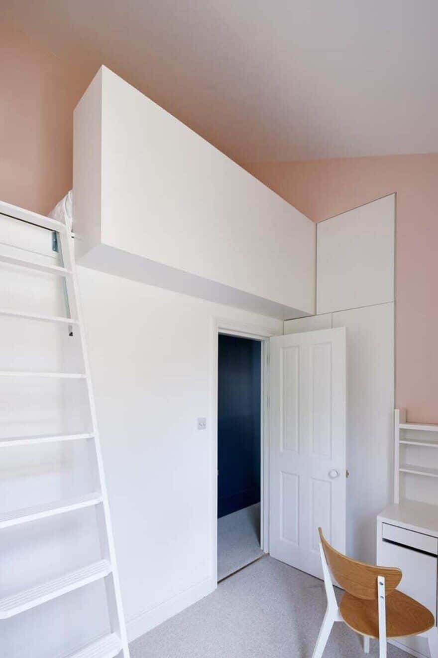
At first floor, the very small middle room was extended over the corridor with a sleeping mezzanine, making the room usable for an adult despite its small footprint.
The existing brick walls have been refurbished and repointed in natural lime. On the inside the walls were insulated to reduce the heat loss significantly.


