Project name: MAIMENG Corporate Space
Area: 500 m2
Location: Foshan, China
Design firm: Lucien Organization – Masanori Designs
Chief designer: Terry Xu
Designer: Zuanquan Huang
Construction drawings: AND DESIGN
Decoration design: Lucien Soft Decoration
Materials supplier: Grepoo Material Trade
Furniture supplier: Masanori Art
Main materials: cement paint (TOA), tiles (Florina, 90+), marbles, stainless steel, honeycomb panels
Completion time: 2020
Photography: Yujie Liu
Interplay of Natural Elements
Environment subtly affects people’s perception, sensory experiences and emotions. Human beings have been living closely with nature for hundreds of thousands of years, and such coexistent state has been rooted in our genes. Later, we created built environment, but our attachment to nature hasn’t been changed. It’s our innate desire to live in built environment with natural elements. Researches also show that interior spaces with a natural ambience enable people to better perceive information and enhance concentration.
The project is a working and exhibition space of MAIMENG, a clothing brand based in Foshan, China. It’s situated beside an urban arterial road, which endows it with convenient transportation. However, the noisy surroundings are easily to interfere with activities in the space, which in fact needs a tranquil atmosphere and media to convey the brand image.
The space is inclusive, which brings in plants, daylight and rainwater while also accommodating the sounds and activities of users.
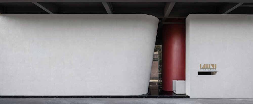
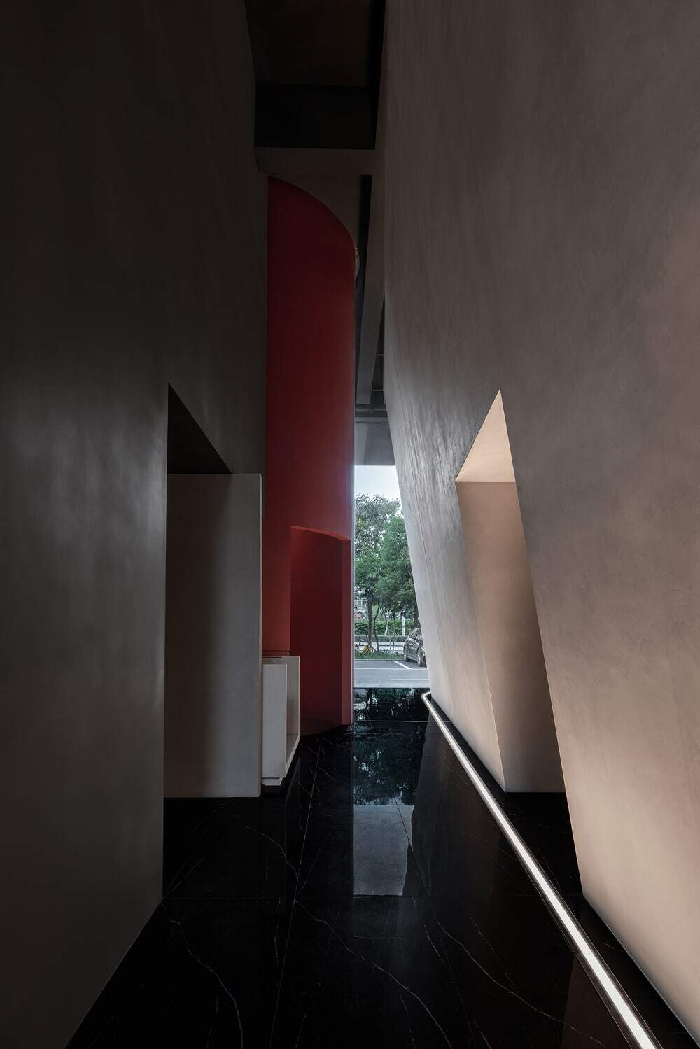
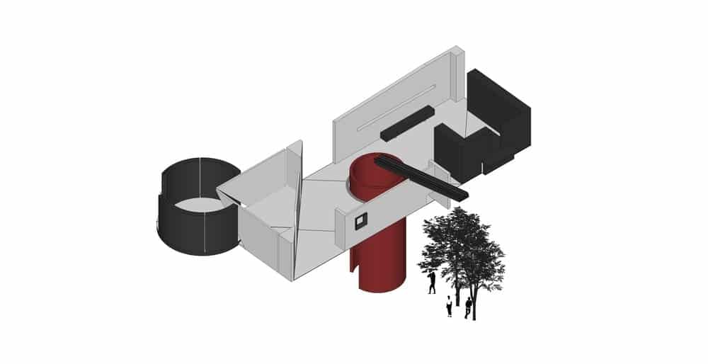
The transition of space requires a gradual process that triggers the changes of sensory experiences. At the entrance, the designers created a long and twisting bridge-like passage, which slows users’ footsteps and opens up a new environment.
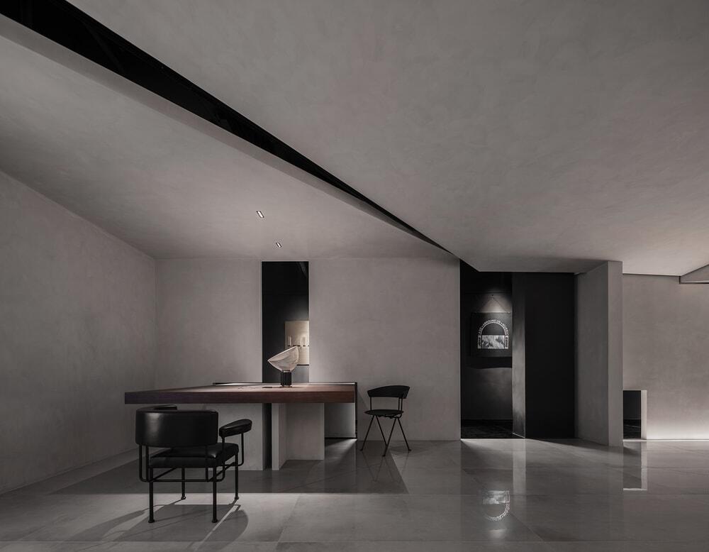
Blocks of different shapes including stairs, square and round structures are set at staggering heights. The entrance is hidden beside the rectangular block. The white tone of the simplistic cement finish creates a calming atmosphere, and shows a low profile.
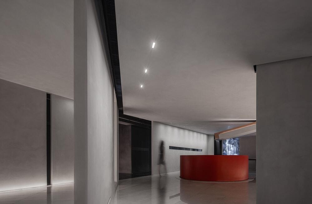
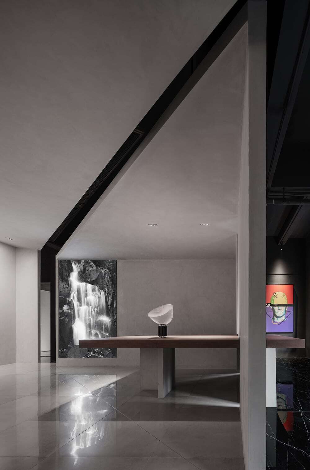
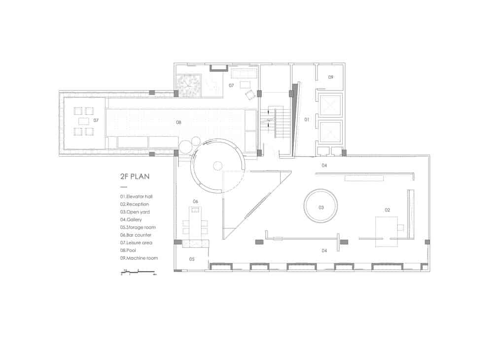
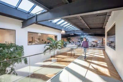
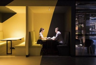
On the second floor, discrete walls enclose a hollow-square-shaped corridor. The alternation of solidness and void as well as the separate yet connected relationship of walls produce a serene spatial ambience, and isolate the space from the hustle and bustle of the outside world.
The circulation route in the space forms a loop, and people can freely pass through the gaps between screen walls. In this way, interior structures create a sense of fluidity within the space.
The hollow-square-shaped corridor is connected to the circular passageway surrounding the pool on the outdoor terrace, together forming a long art gallery. The overall interior design realizes shared and diversified functions, whilst endowing the space with infinite imagination and possibilities. It serves multiple purposes, including socializing, meditation, working, exhibition, new product release and more.
Natural elements nourish the space and artistic inspiration. Water, light and winds move in the space freely, and offer varying experiences. Those dynamic elements not only activate the space, but also help stimulate inspiration. The interior design brings people and nature closer, and at the same time embodies the care for human and life.
Light
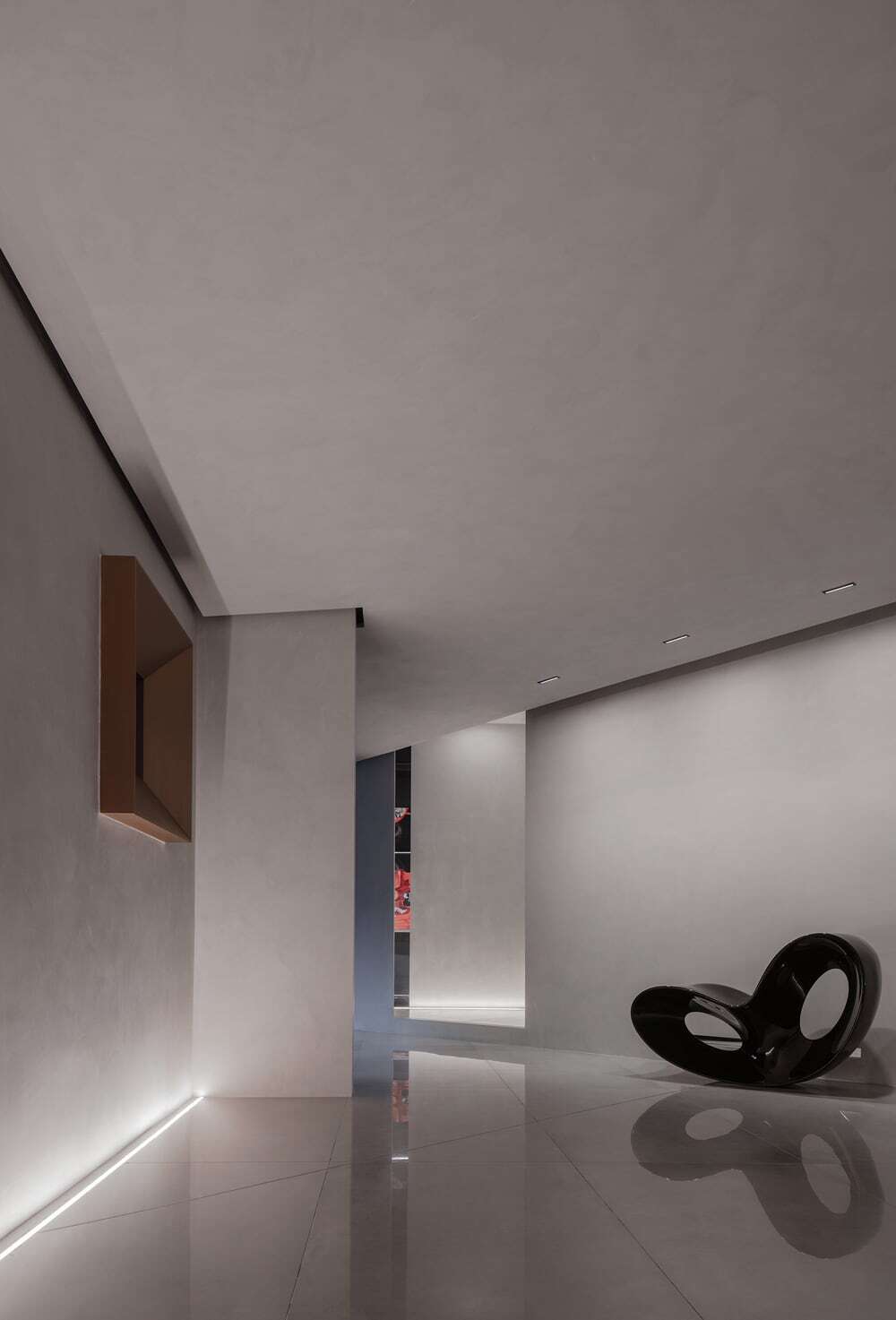
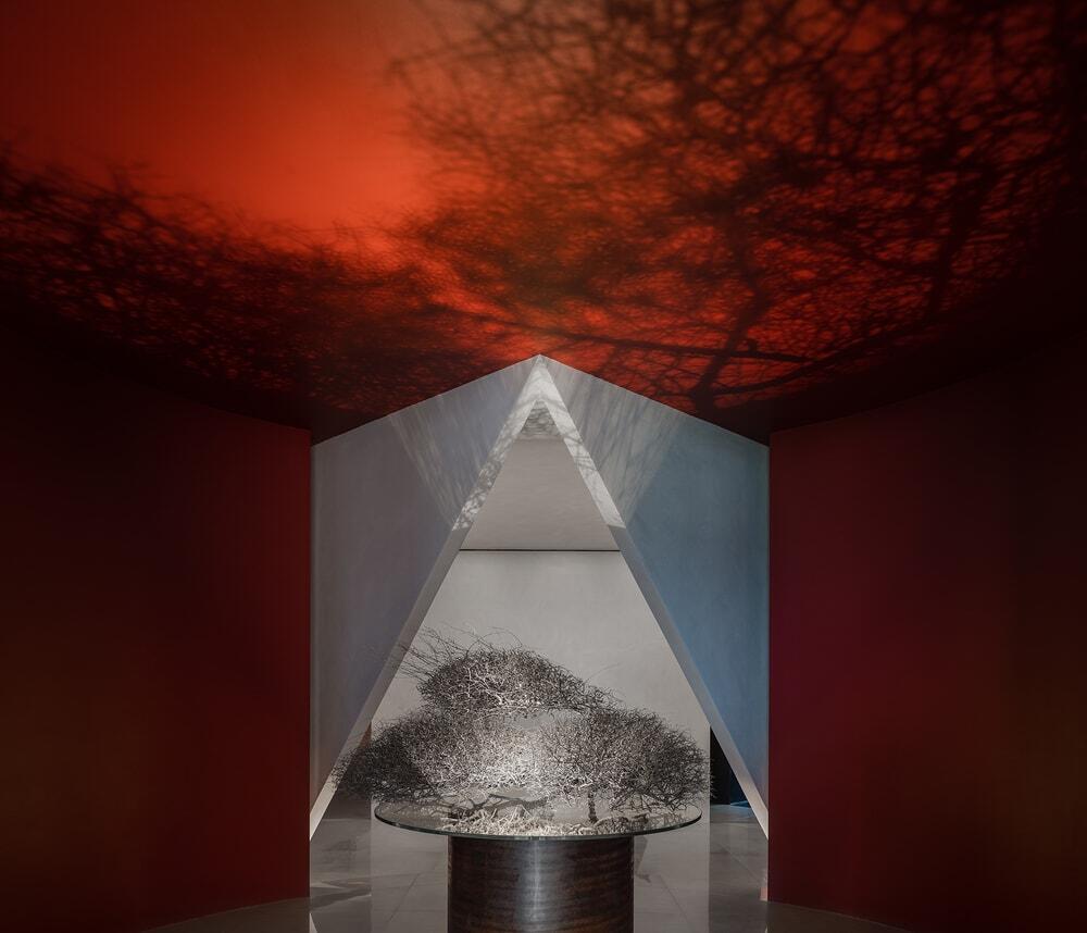
In the morning, sunlight penetrates large windows and cast onto discontinuous walls, hence generating irregular light fragments. Several openings were carved out on the exteriors, to let daylight filter in. With different angles of projection, natural light produces varying mottled shadows on architectural and interior surfaces.
Water
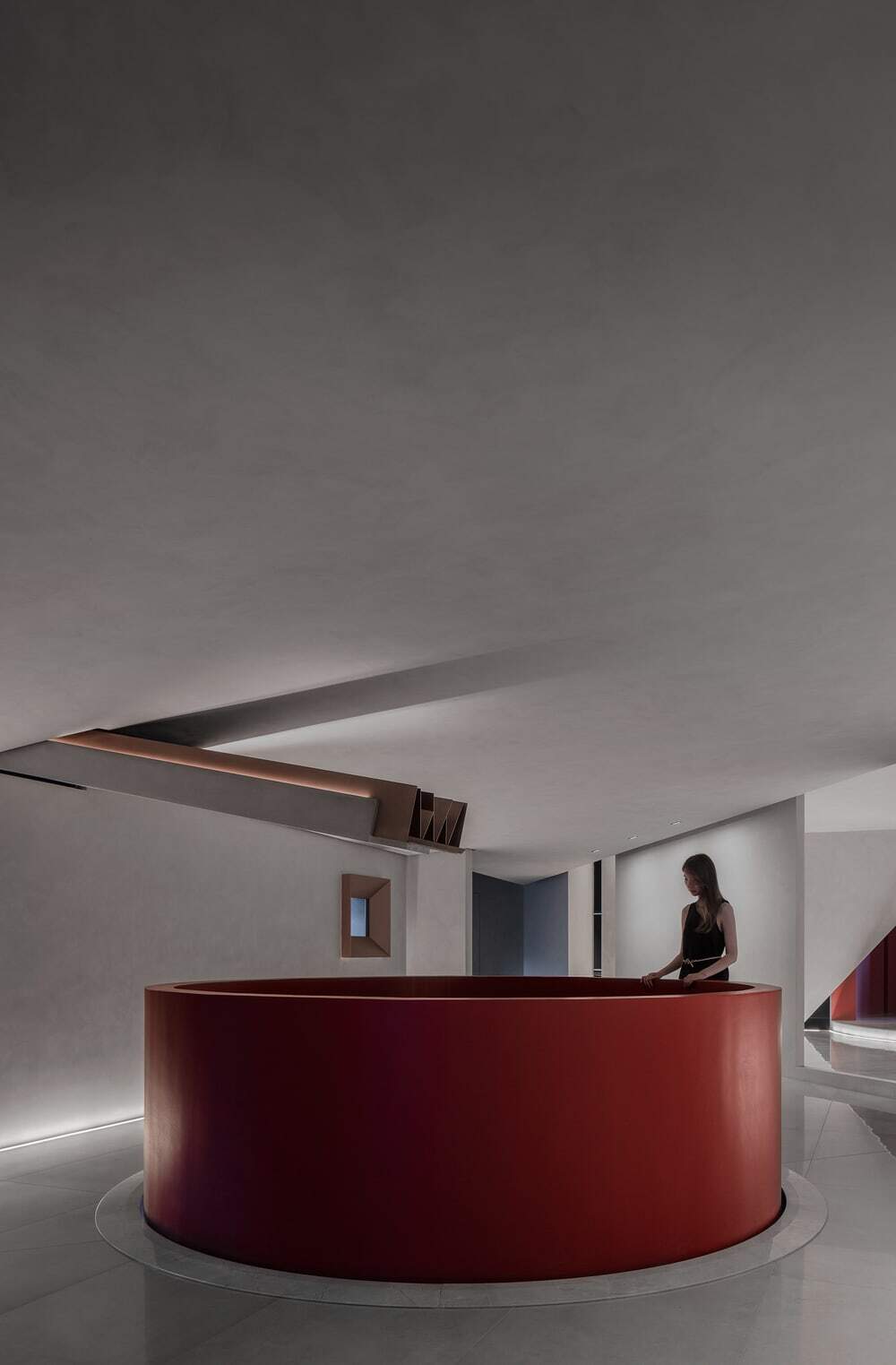
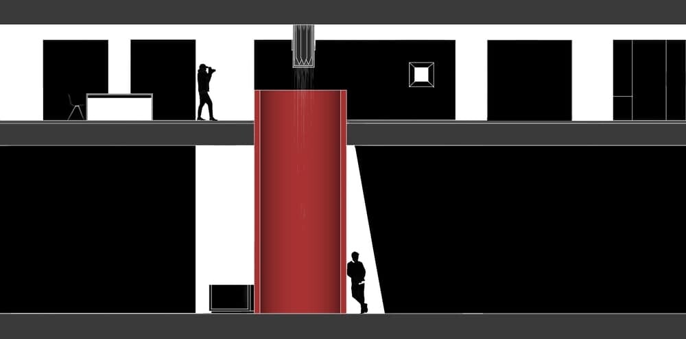
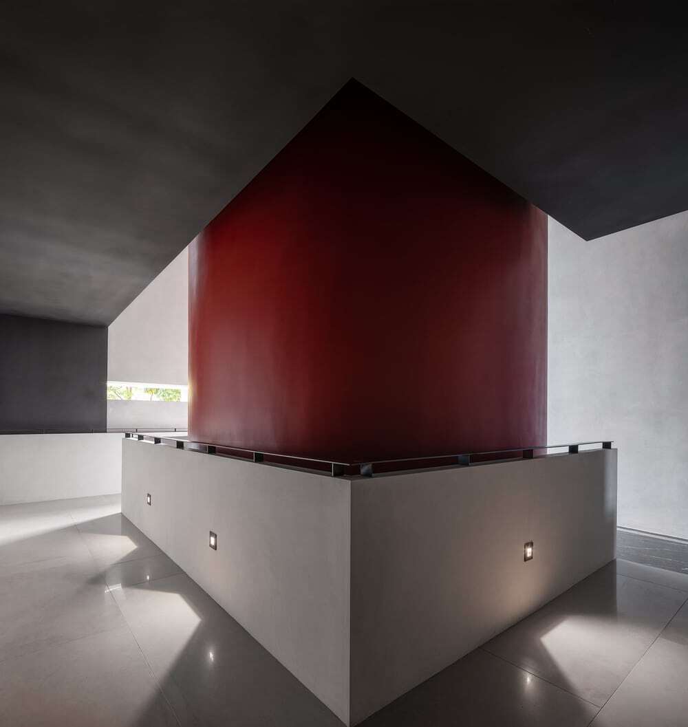
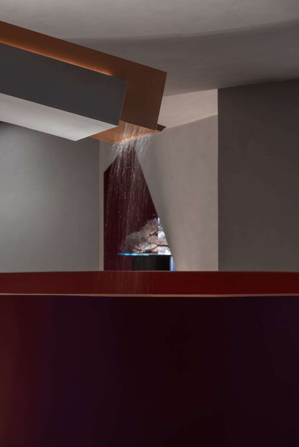
A large red cylinder erects in the space, connecting the two floors. And the basin above it brings rainwater into the interior space. Water falls down from 2F, with its sound echoing in the cylinder. Sounding like gurgling waterfall in a valley, the flowing water is pleasing and refreshing.
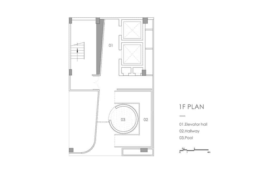
The pool set at the open-air terrace area helps form a circular corridor, which echoes with the one in the interior space. It’s extended to interior, hence blurring the boundary between the inside and outside. With a large area, the pool is a part of the eco system of the interior space, contributing to enhancing its humidity and comfort.
Wind
The space is oriented in north-south direction. Winds can pass the two openings on south and north sides of the cylindrical structure, and move upwards to 2F. The second floor is like an enclosed “box”, but people can feel cool winds when standing near the cylinder, which offers fantastic experiences.
The terrace offers cross ventilation, and enables winds to pass freely. Besides, the pool makes winds visible via the rippling water surface. Under the lighting of the ceiling, the sparkling water seems to dance with winds.
The designers extracted geometric elements such as triangle and trapezoid from the logo of MAIMENG and applied them to interior structures. Besides, they studied the features of the brand and tried to find the most appropriate way to show the brand image. Finally, the team created an “art gallery” which breaks the conventional image of manufacturing enterprises, realized diversified spatial functions, and expressed the brand values in a subtle way.
This corporate space is an expression of MAIMENG. The design takes into consideration user groups, and pays attention to showcasing brand features, offering a tranquil environment and spark inspiration.
The outlet of the rainwater sink incorporates brand elements, with its interweaving triangular structures resonate with contours of triangular patterns on the floor.

