Project: Micro House
Architecture: Elizabeth Herrmann Architecture + Design
Location: Huntington, Vermont
Photo Credits: Jim Westphalen
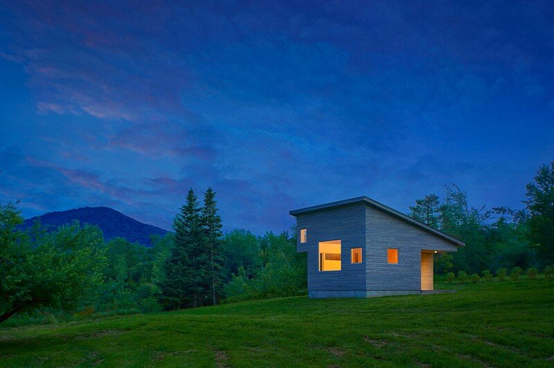
This micro house was designed by Elizabeth Herrmann Architecture + Design. The house has an area of 40 square meters.
When an artist approached EH with the ambitious goal of creating a beautiful, tiny, energy-efficient house on a tight budget, she jumped at the opportunity. The project had all the ingredients of a good challenge along with many aspects of residential architecture she’d been eager to combine in a single dwelling. EH was particularly interested in creating a high-performance, micro house that took the dialogue to the next level and didn’t appear to be driven just by size and performance. Rather, she wanted to design a home that was first and foremost a lovely place to be, with all the variety and interest of a much larger home. It had to feel spacious in spite of its size (a mere 430 finished s.f. plus loft), and never feel like a claustrophobic box.
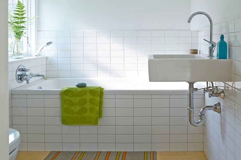
The program was simple: a bathroom (tub, no shower), sleeping area, kitchen , clothing and household storage, dining/work table, living space that could double as guest sleeping, and a sleeping loft. So that the upstairs wouldn’t be cluttered, the program also included a full basement to store additional items, mechanical equipment and laundry machines. (A hatch door camouflaged to blend with the floor opens up easily for basement access.)
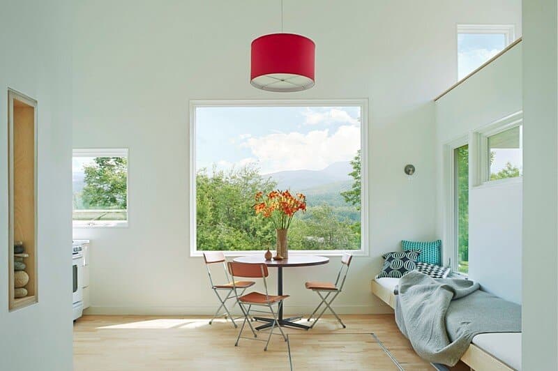
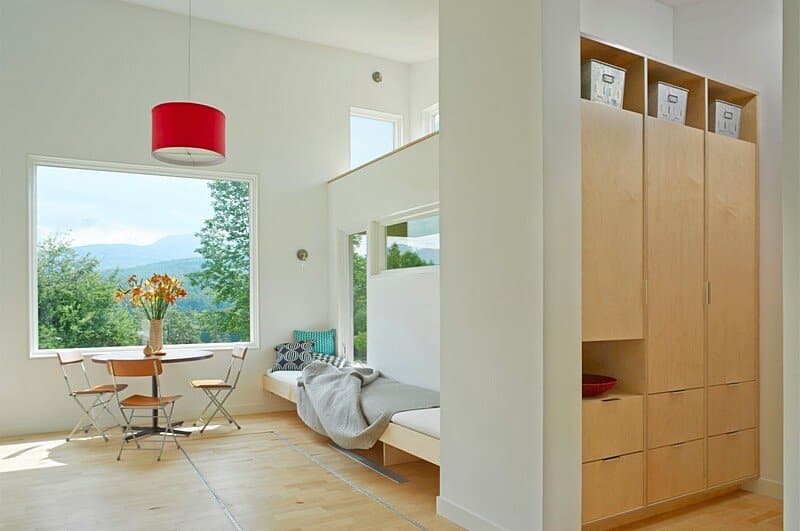
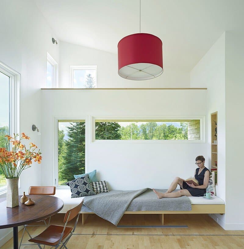
Though open in plan, the living level was sculpted so that each of the different areas of use have definition and a sense of place, without being static or confining, and so that the house could comfortably accommodates visitors. Framed views help define interior spaces and give each “room” a distinctive focus with plenty of daylight and ventilation. The primary view at the heart of the house is Camel’s Hump, a Green Mountain peak, framed by a large, picture window.
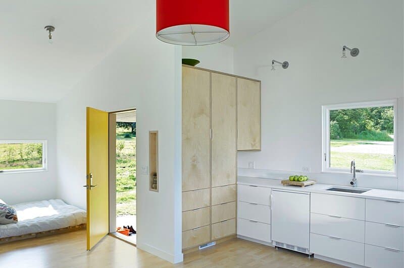
The intimacy of spaces called for a level of finish that could stand up to close scrutiny and heavy use, and like a boat, the house has a designated place for everything in order to maximize space and keep the interior uncluttered. The materials palette was kept simple and light in hue in order to make the interior feel fluid and spacious. Local maple floors cut in short lengths and laid perpendicular to the view give the floor a shimmering, water-like texture that makes it feel expansive and tranquil. Windows have a wood, shadow lined surround, a subtle detail to punctuate the openings without detracting from the view.
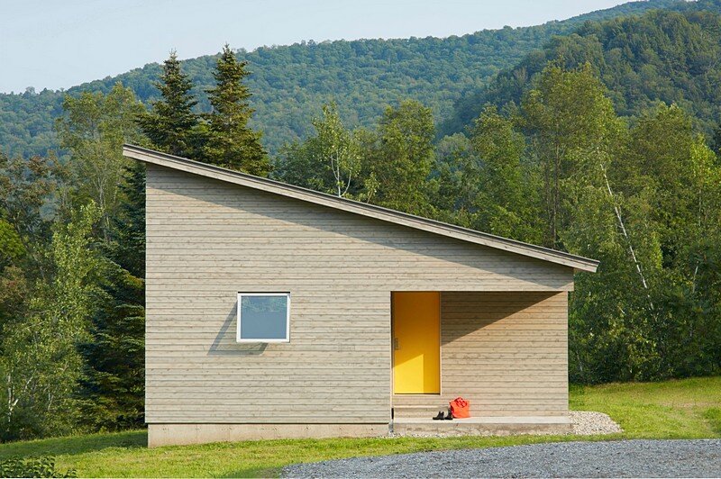
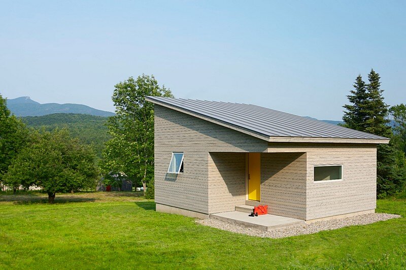
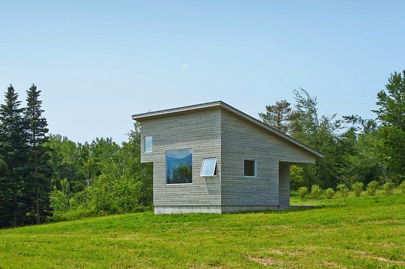
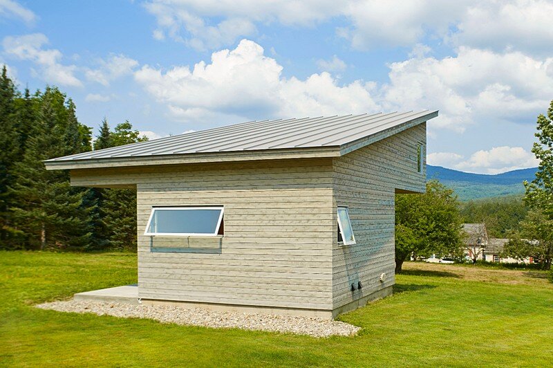
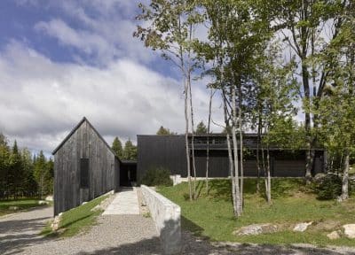
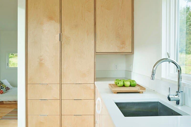
Custom cabinets are white for the kitchen, birch plywood with expressed edges for wall storage and built-in daybed. The counter top and a bath ledge are white concrete. Outside, a light gray-stained, cedar rain screen milled for a shadow line wraps the house. The bright yellow door and red light fixture add pops of color in pure geometric shapes.
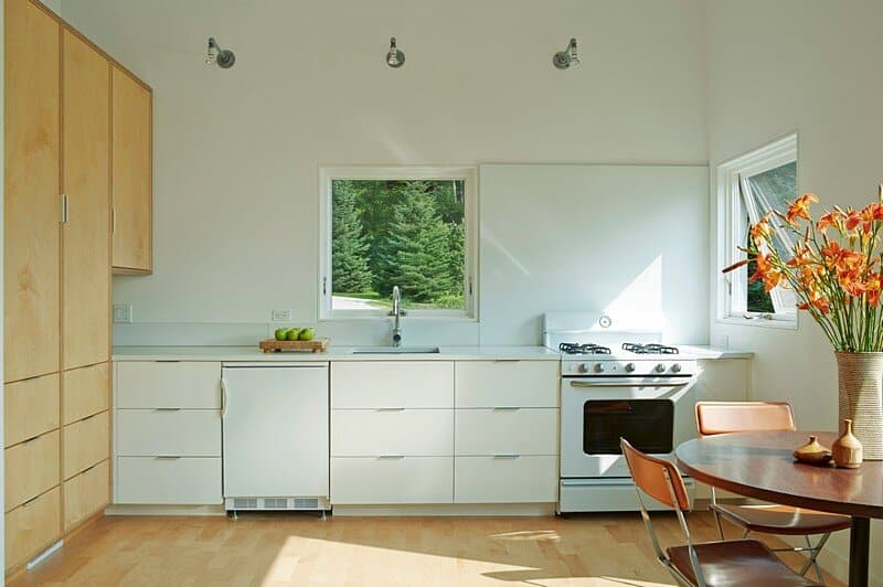
It was important that the house, in spite of its size, contain those important transitional spaces that give one a sense of privacy, arrival, or simply a change in scale appropriate to use. For example, the bathroom does not open directly onto the living spaces but is approached through the built-in storage area. A corner was subtracted from the house footprint to form a welcoming front porch while also helping to shape the sleeping area on the inside, and the roof shape slopes so that the more private and intimate spaces, the bath and sleeping area, are contained under the lower part of the slope.
Outside, the house is a kind of shape shifter. The subtracted corners at opposite ends– one to form the porch, the other the loft–create a playful sense of movement and interplay with people and landscape. It is an unpredictable house, but is also the logical and whimsical expression of its contents, its function, and views.
Thank you for reading this article!

