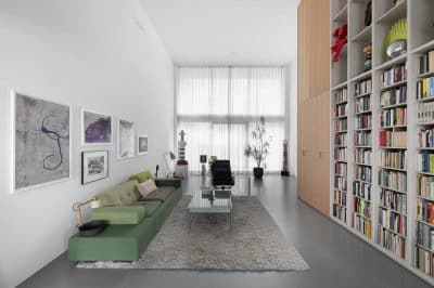
Project: Moscowska Apartment
Design Studio: PAINTIT
Autors: Juliy Cherevko, Tanya Filipenko
Project Area: 120 m2
Project Year: 2018-2021
Location: Kyiv, Ukraine
Status: completed
Photo Credits: Shurpenkov Andriy
Courtesy of PAINTIT
Moscowska apartment is one of those projects in which you can tell if it’s render or the result. This outcome cost three years of hard work and more than 100 visualizations. Did painting walls white take three years? As well as during other projects, we worked closely with contractors to give the client exactly the atmosphere they fell in love with from the beginning. It cost a lot of unscheduled edits, finding and changing contractors, painstaking work on individual details: furniture, decor, doors. This apartment is one of our favorites, because here the idea was realized one hundred percent, and we know for sure that all efforts were not in vain.
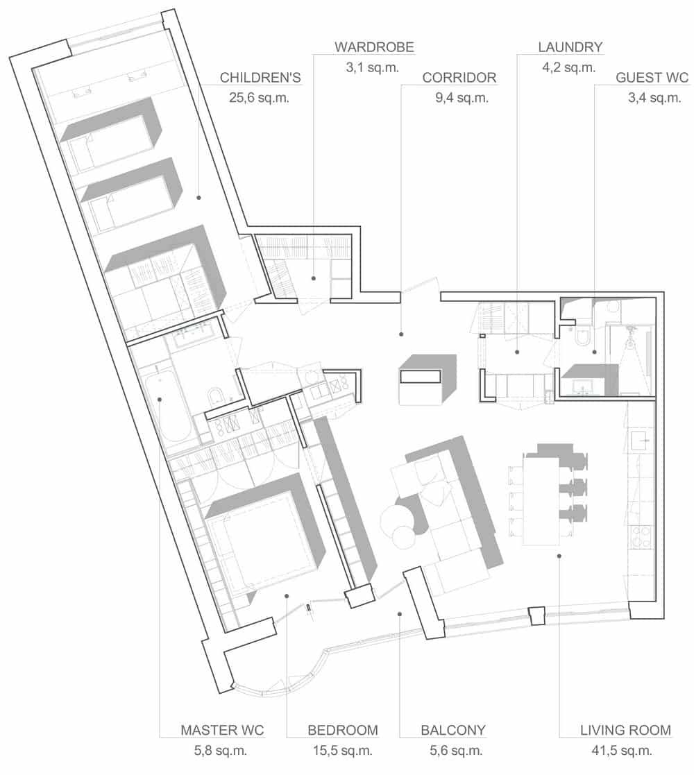
The main feature that defined this project is that it consists of two apartments in a house with a radial layout, so the main issue from the beginning was the use of non-functional areas. The deaf corners with complex shape (left over from the previous planning) turned into spacious closets designed specifically for the needs of the owners, one of them even has a kennel for the dog they plan to pet.
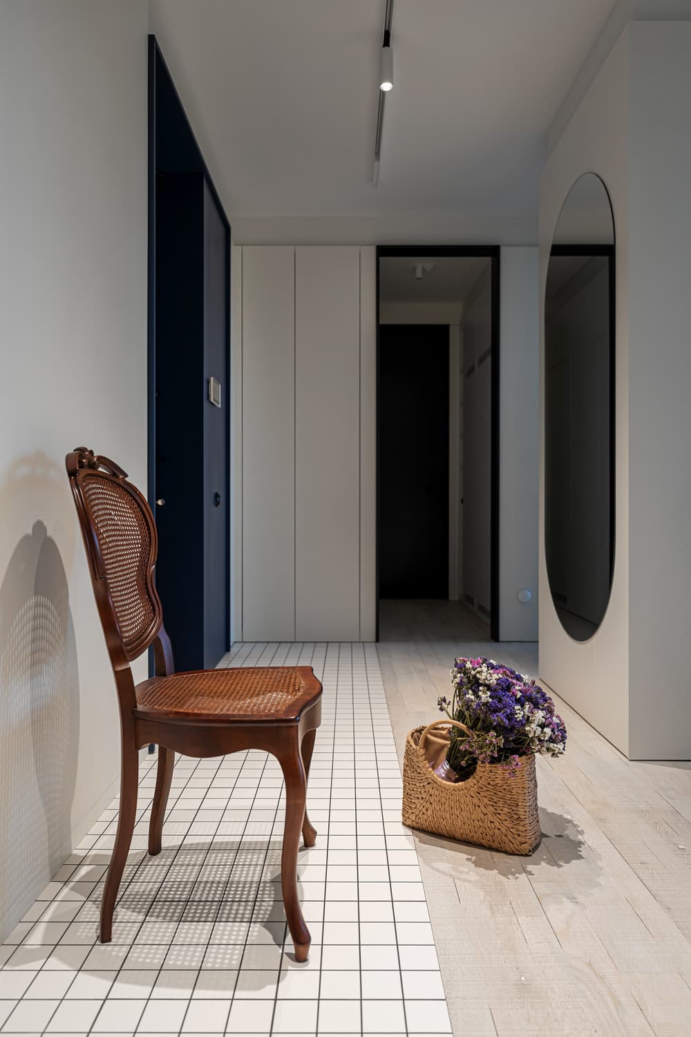
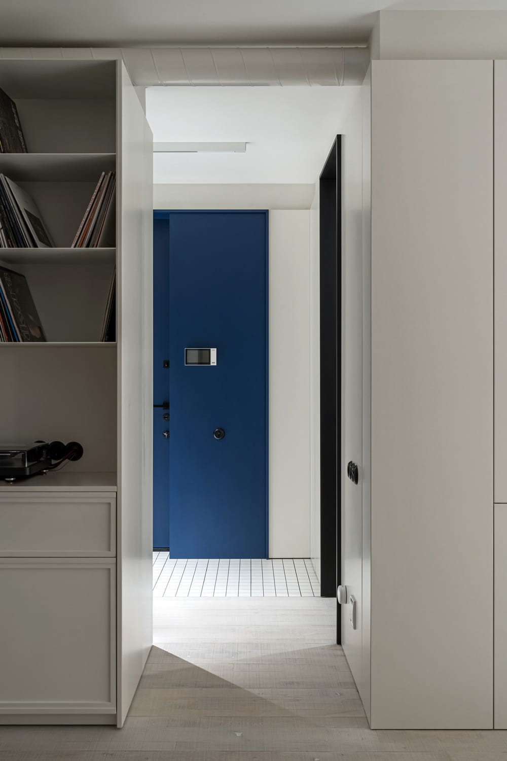
The style can be described as reasonable minimalism. White walls with bright accents fitted many pleasant and significant things related to personal hobbies of residents, antiques and custom furniture, which have already been mentioned (and which we will mention more than once). It is felt literally from the doorstep: the front door, painted in blue, gives the impression that minimalism is not equal to asceticism.
Studio
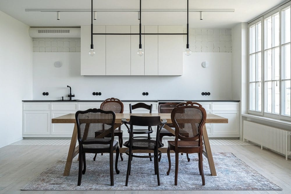
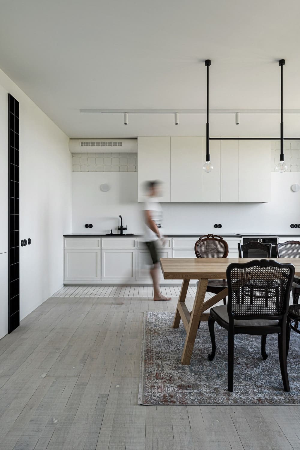
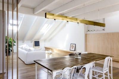
The studio is made entirely in white, which clearly outlines the two semantic centers of the room: the kitchen and living area. When we talk about unforeseen changes, we mean exactly these zones. Already at the moment when the drawings were ready and walls dismantled, we realized: these zones need to be swapped. This decision led to changes in half of the project, but still, the main thing was a result.
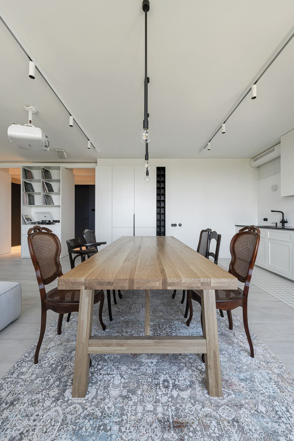
Although the apartment is new, many things here have a long history. Antiques were bought for nothing, but their restoration was expensive: the most painstaking work required chairs in the kitchen area, but they also attracted the most attention. This area also stands out due to the table that was individually designed for this project. It is simple, almost rough, and looks perfectly, complementing the plastic and richly decorated chairs. Lighting here also plays the role of decor: a black lamp with three light bulbs without domes looks restrained and concise, completing the composition – it was also designed for the project.
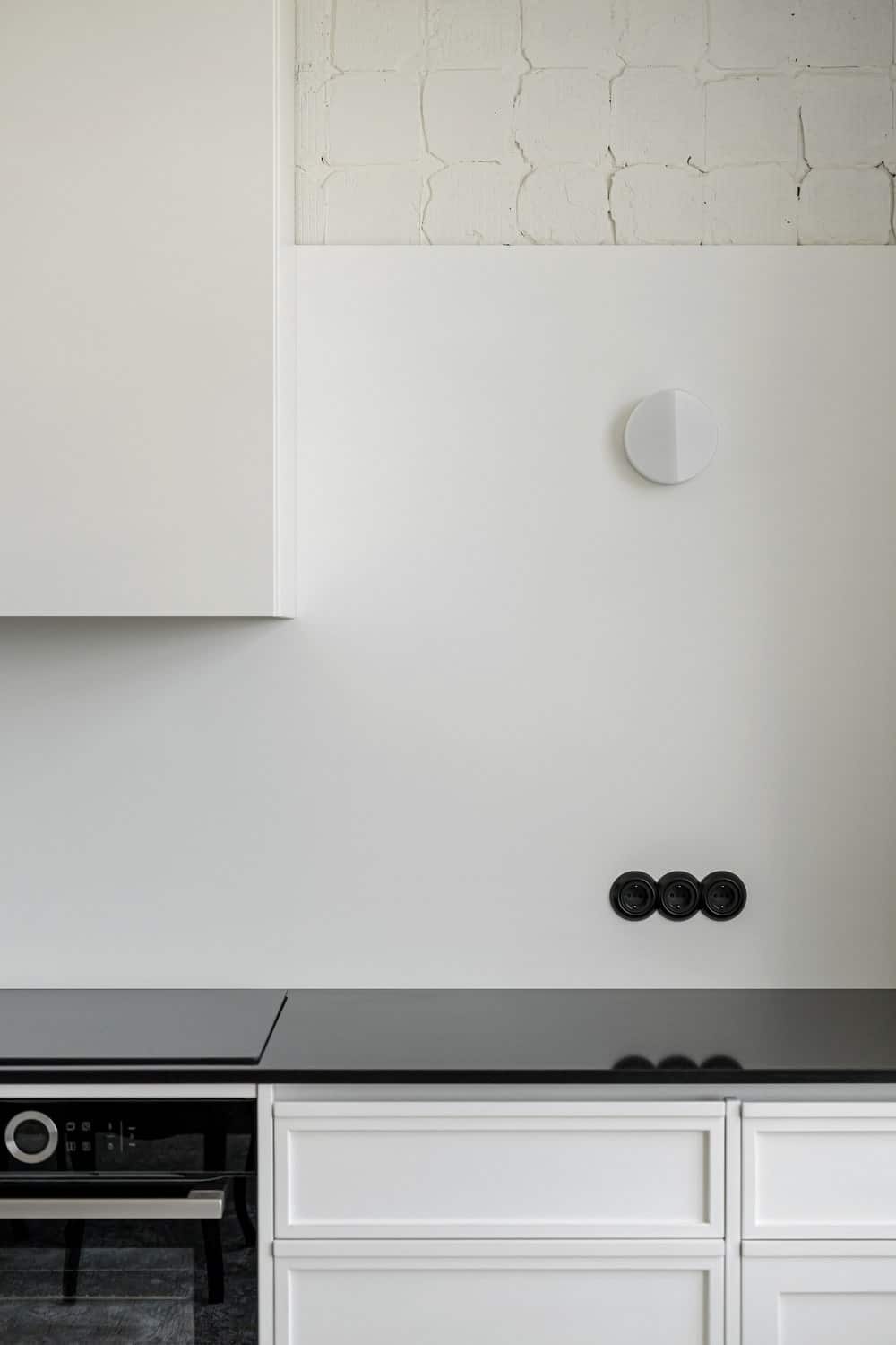
Details speak most eloquently about Moscowska apartment. In addition to restoration work, new things also “got older”. For example, the facades of the kitchen were specially painted, buffed and repainted, otherwise they stand out from the overall impression of the “apartment with history”. The wall above the backsplash was treated according to the same principle: we put an old soviet tile there and immediately beat it off. Such deliberate incompleteness suggests a special aesthetic of imperfect things.
The semantic center of the living area is a sofa, it is designed in accordance with the planning, so oriented on both sides: the projector and the kitchen. The Moscowska apartment should hold 47 meters of books, so one wall of the studio is set aside for a rack, it also has a door to the bedroom – and to the second part of the library. From the beginning we planned to find antique doors, but none of them fit, so they, together with the bookcase, were designed by us and made by our contractors.
A crucial component of a minimalistic interior is natural light. We decided to lower the window sill to make sure it was enough, and, in addition, to expand the view. Unlike most projects, we choose wooden frames with slats, because plastic ones would destroy the whole image. Can you imagine it in the same room with vintage chairs? We couldn’t.
Master bedroom
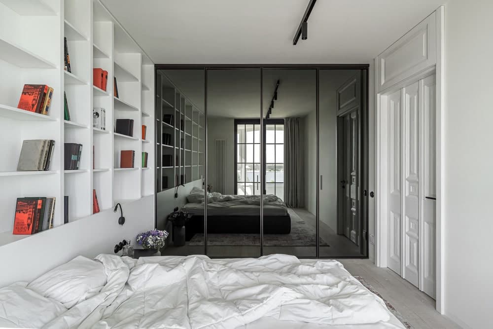
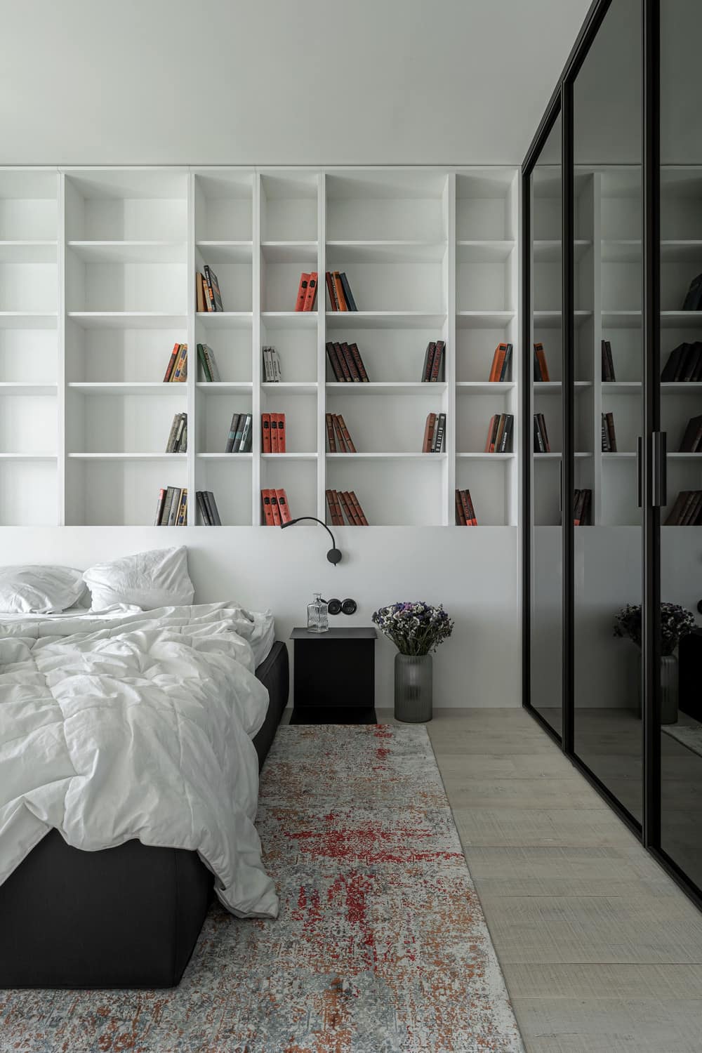
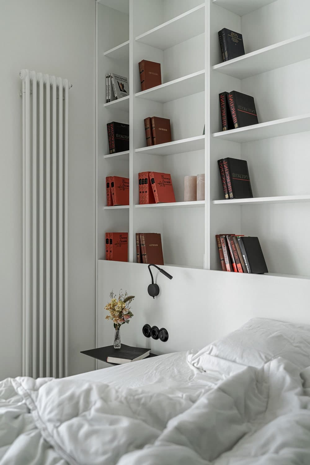
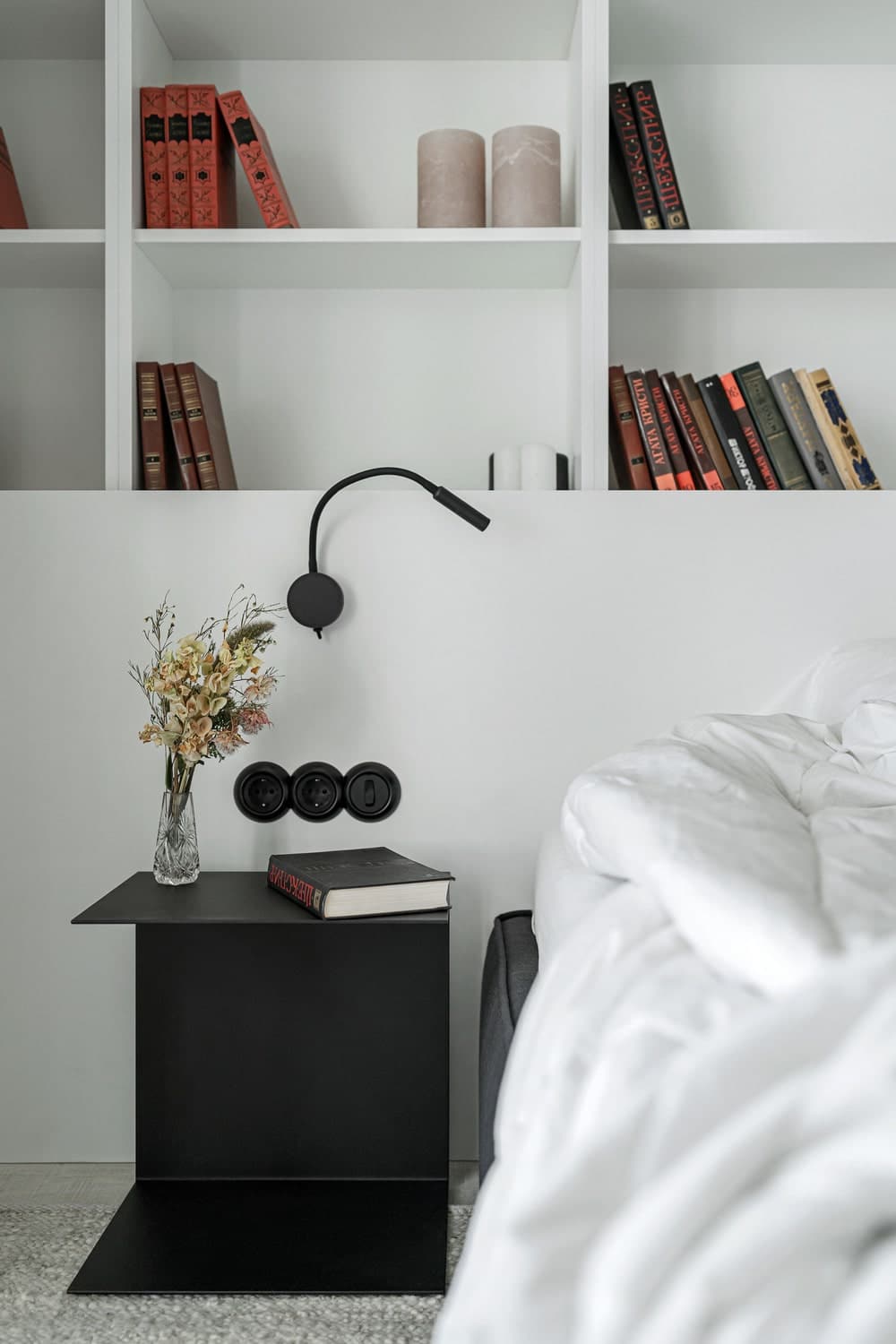
The lifestyle of the owners allowed us to realize in their bedroom idealistic ideas of minimalism: white walls, only necessary, simple furniture, personal and significant things of the inhabitants instead of decor. It is intended exclusively for recreation, there is no TV or workplace here. So, the room contains the necessary minimum: part of the family library, a low black bed, and thin, laconic tables made of metal sheets. Wardrobe visually enlarges the space due to the glass on the facades, in addition, it can hide everything that does not fit into the idealistic-minimalist picture 🙂
Children’s bedroom
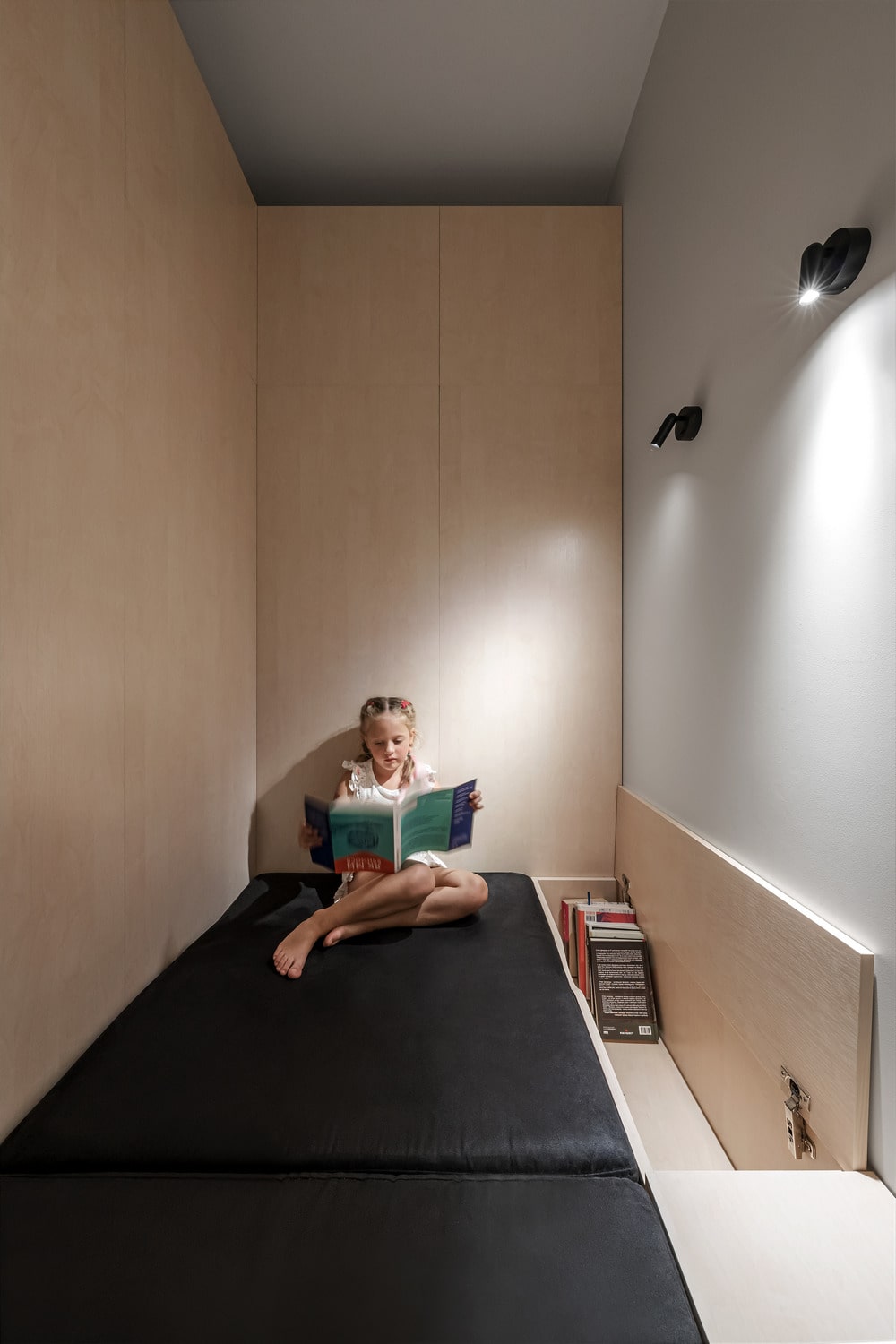
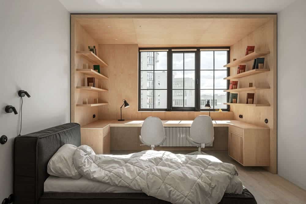
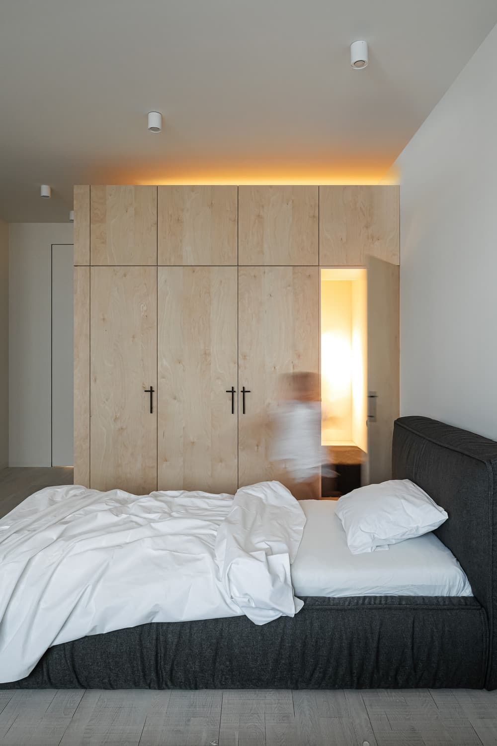
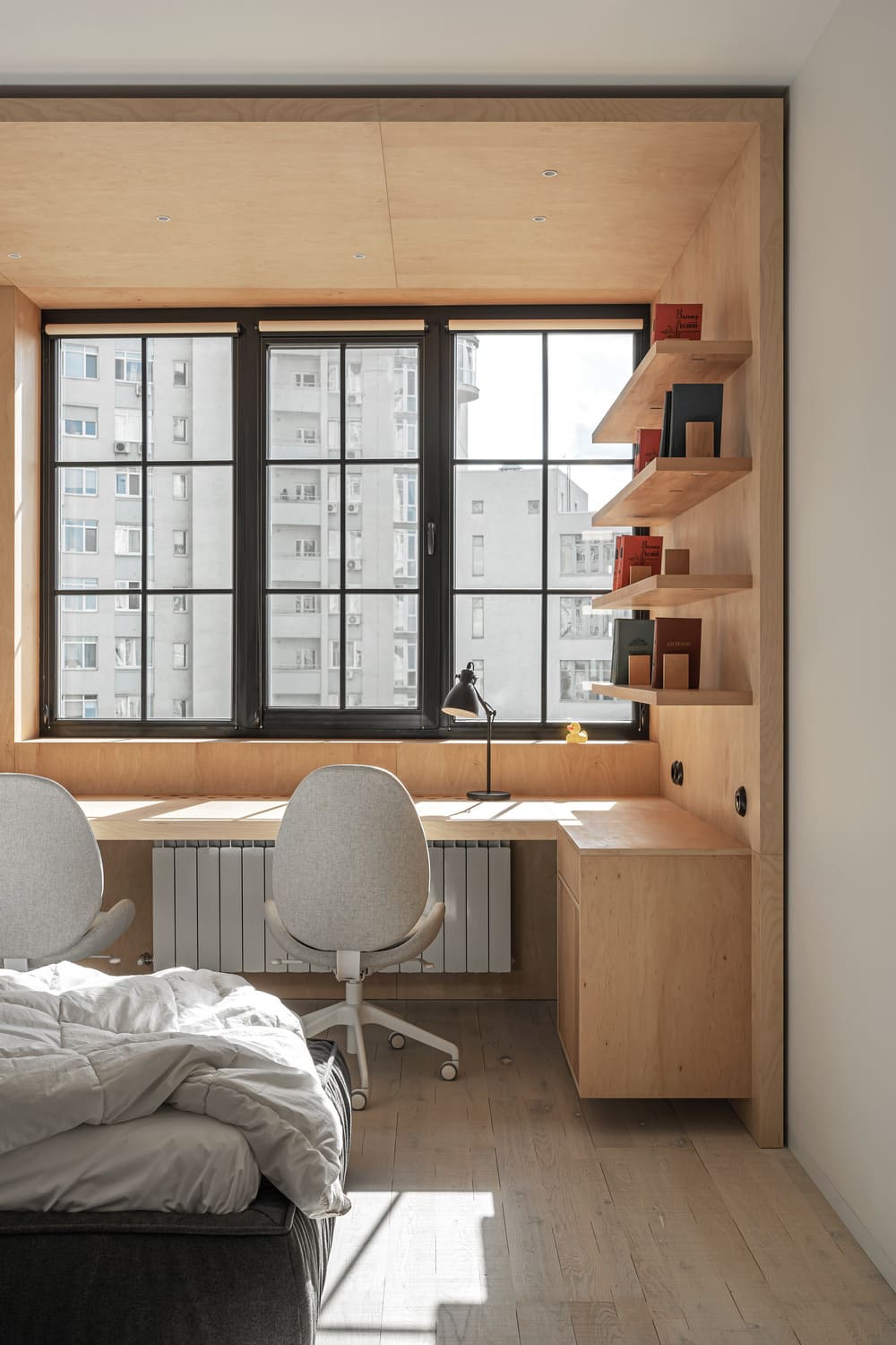
We do not know how to keep the intrigue, so let’s start with the most interesting: there is a secret pocket in the closet. Now we can start from the beginning. There are two children living in the room, the main task was to rationally divide it into recreation and work areas, this was done with the help of white paint and light wood – the only room where two colors appear on the walls. The bedroom has awkward elongated proportions, which, however, had their advantages: due to this we managed to arrange in the bottomless closet containing a secret pocket with a mattress, sconce and space for storing books. It was the idea of the children, they wanted to have a hiding place that could not be found if you don’t know where to look. An important detail, its walls do not reach the ceiling, because such a closet requires ventilation.
Bathroom
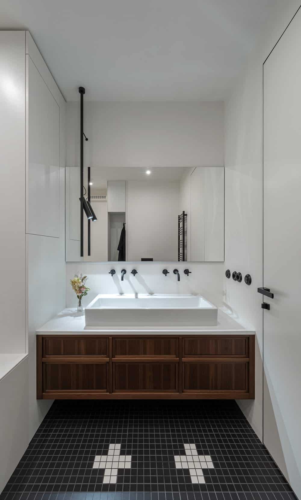
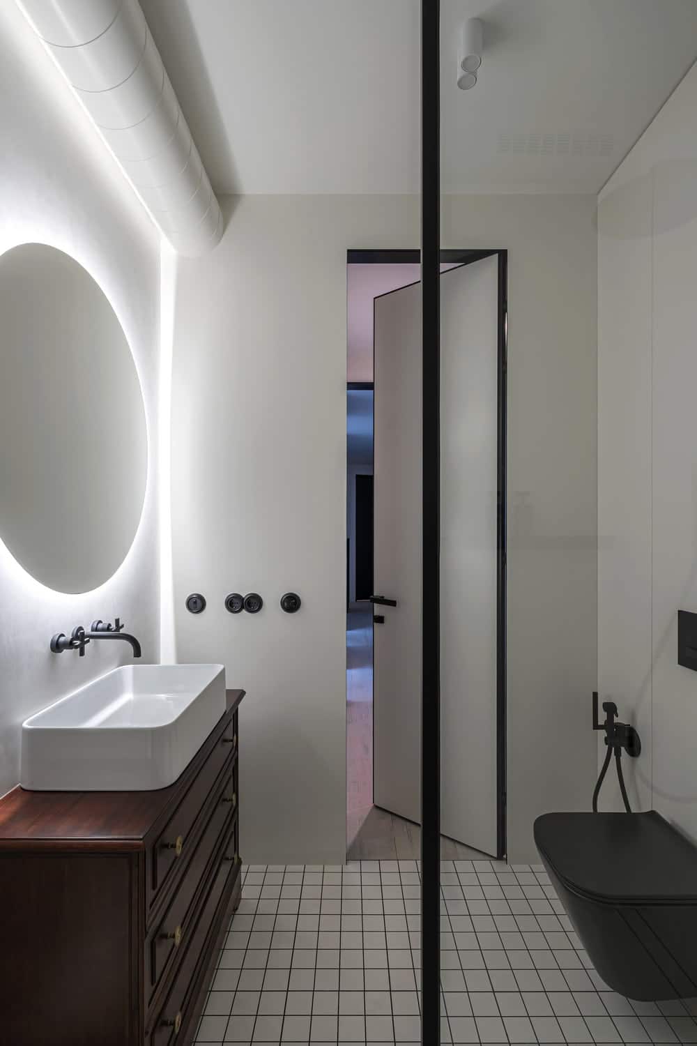
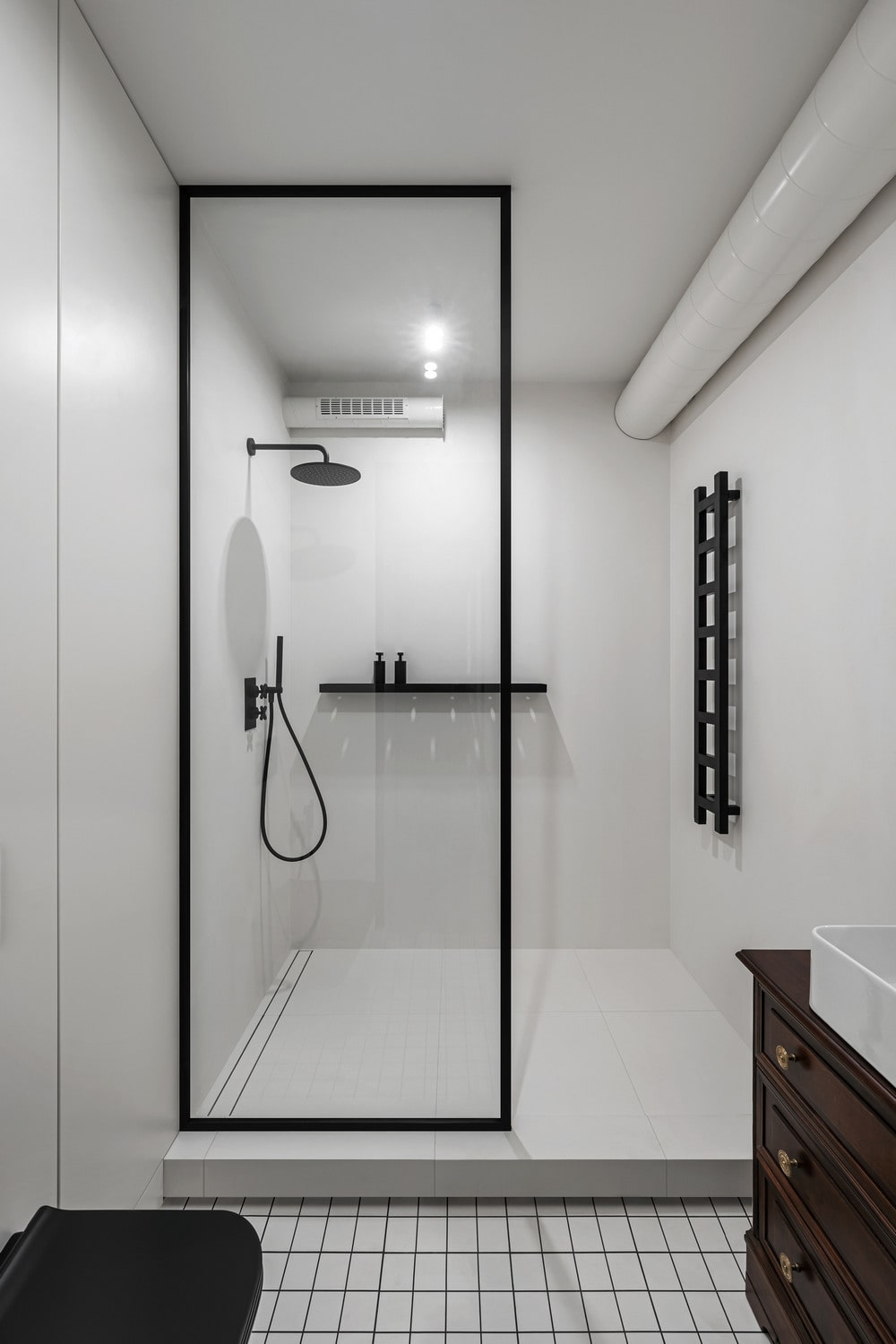
The bathroom is maintained in the general logic of the project: white tiles, black details, antiques. The main accent here is a black mosaic on the floor, white crosses mark two washbasin faucets. Wood looks appropriate in the contrasting interior, we choose the cantilever antique cabinet for the sink, it also has been restored.

