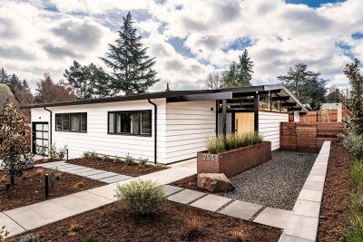
Project: Mullet House
Architects: Matt Fajkus Architecture
Project Manager: Alberto Rodriguez
Design Team: Matt Fajkus, David Birt, Audrey McKee, Jeff McCord
Structural Engineering: Smith Structural
Interior Design: McCray & Co
Location: Austin, Texas
Completion 2018
Photography: Charles Davis Smith
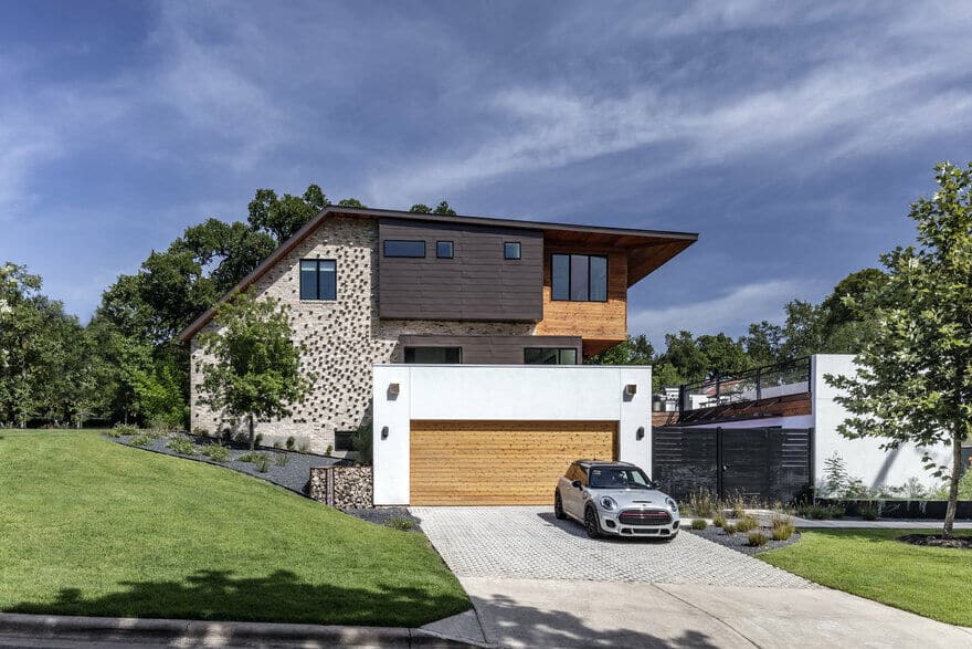
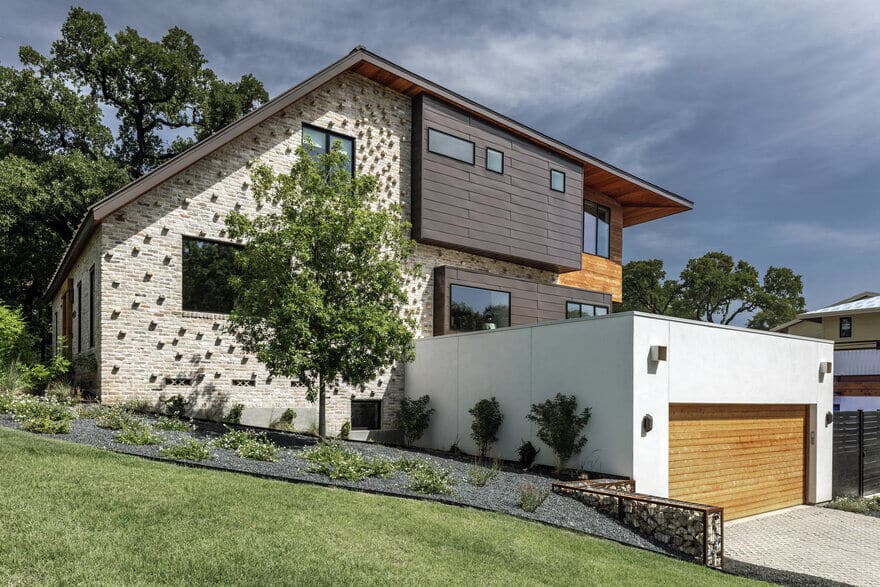
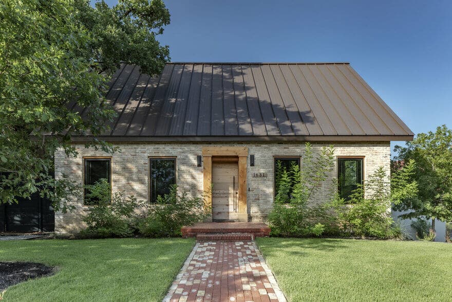
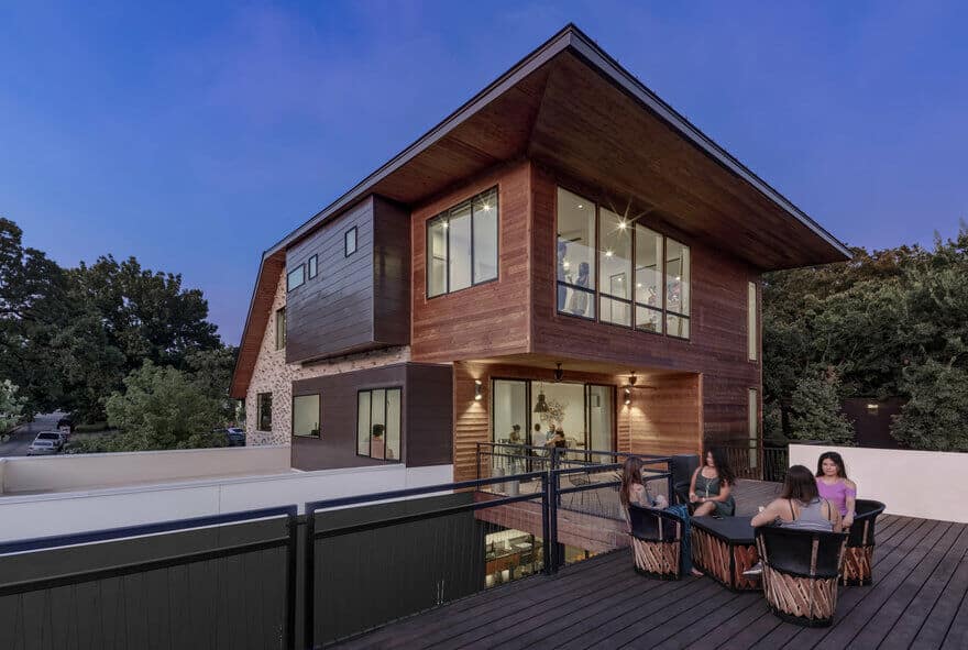
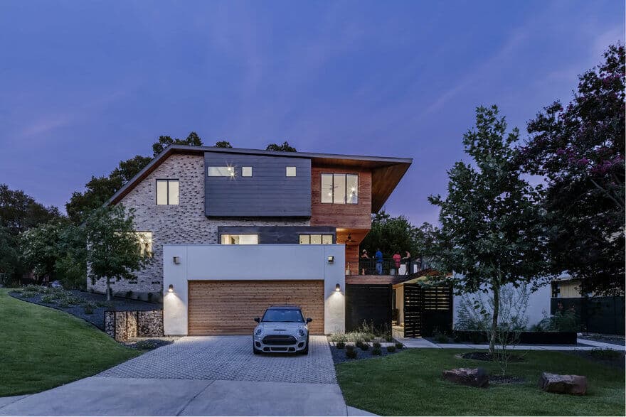
A remodel of an existing 1938 bungalow in an historic central Austin neighborhood, the design aims to preserve the character of the context with a humble front facade, while unfolding and transforming in the back to accommodate small and large social gatherings. The design of the remodel and addition negotiates a 12-foot drop from the front of the lot to the back with considered landscape design, in concert with modified roof form that allows for three stories in the back. Thus, the Mullet House has its name for being modest in the front, with a figural and literal “party” in the back.
The Mullet house and lot are in the heart of Clarksville, founded by Charles Clark, a freedman, in 1871. It’s the oldest surviving freedomtown – a post-Civil War settlement founded by freed slaves, and as such, is on the National Register of Historic Places. The original house was deemed a contributing structure this historic place, and therefore could not be removed, even though it was in severe disrepair.
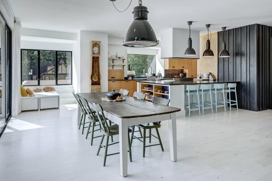
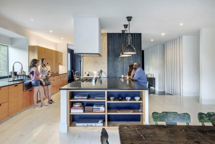
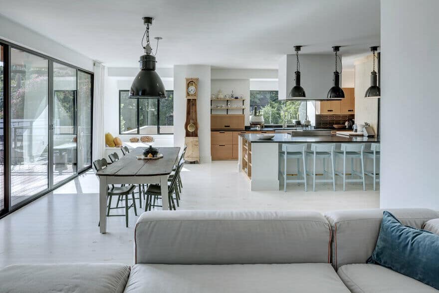
The symmetrical historical front facade was preserved in its entirety, as approved by Austin’s Historic Landmark Commission, and workshopped in collaboration with the Old West Austin Neighborhood Association. Bricks from other portions of the original house were salvaged and reused on the exterior, and framing lumber was reclaimed from the original house and repurposed as an interior finish material in unexpected and refreshing ways on the main level of the house. A dead tree on the lot was milled to construct the dining table, increasing the connection of the newly-designed intervention to its original surroundings.
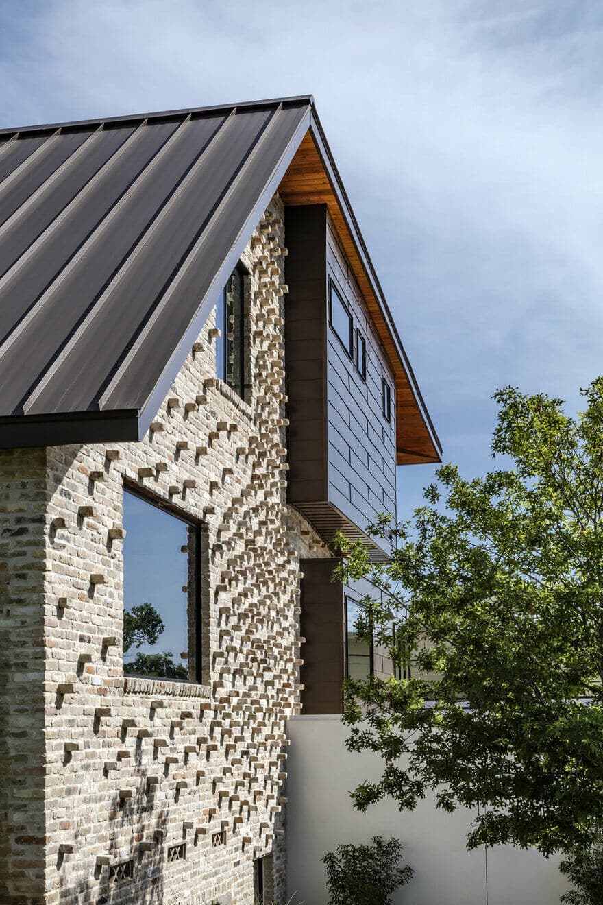
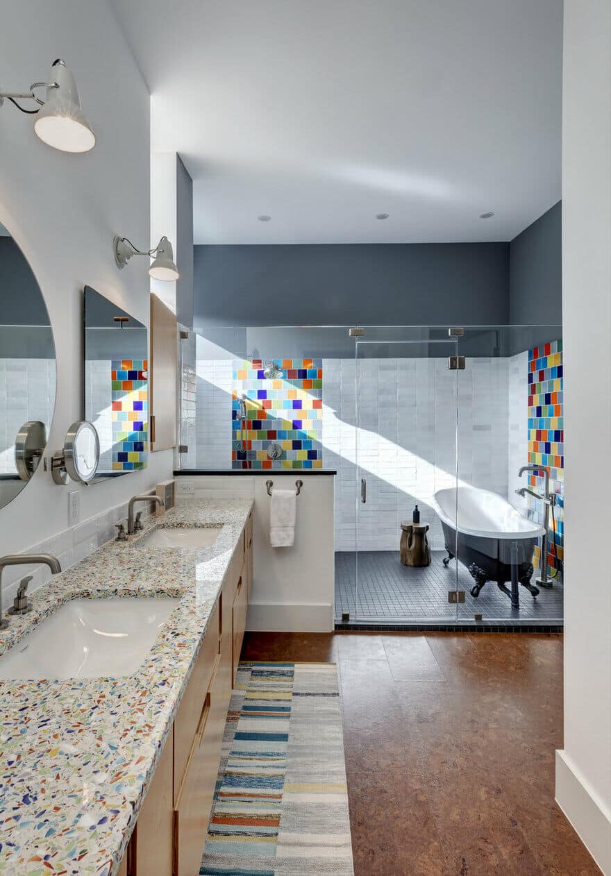
The west facade, facing a prominent corner in the neighborhood, has minimal openings for solar modulation, but is broken up by the unique brick coursing strategies and extruded metal-clad boxes expressing functions within. A reading nook is one of the expressed cantilevered boxes, as is the vanity in the master bathroom suite.
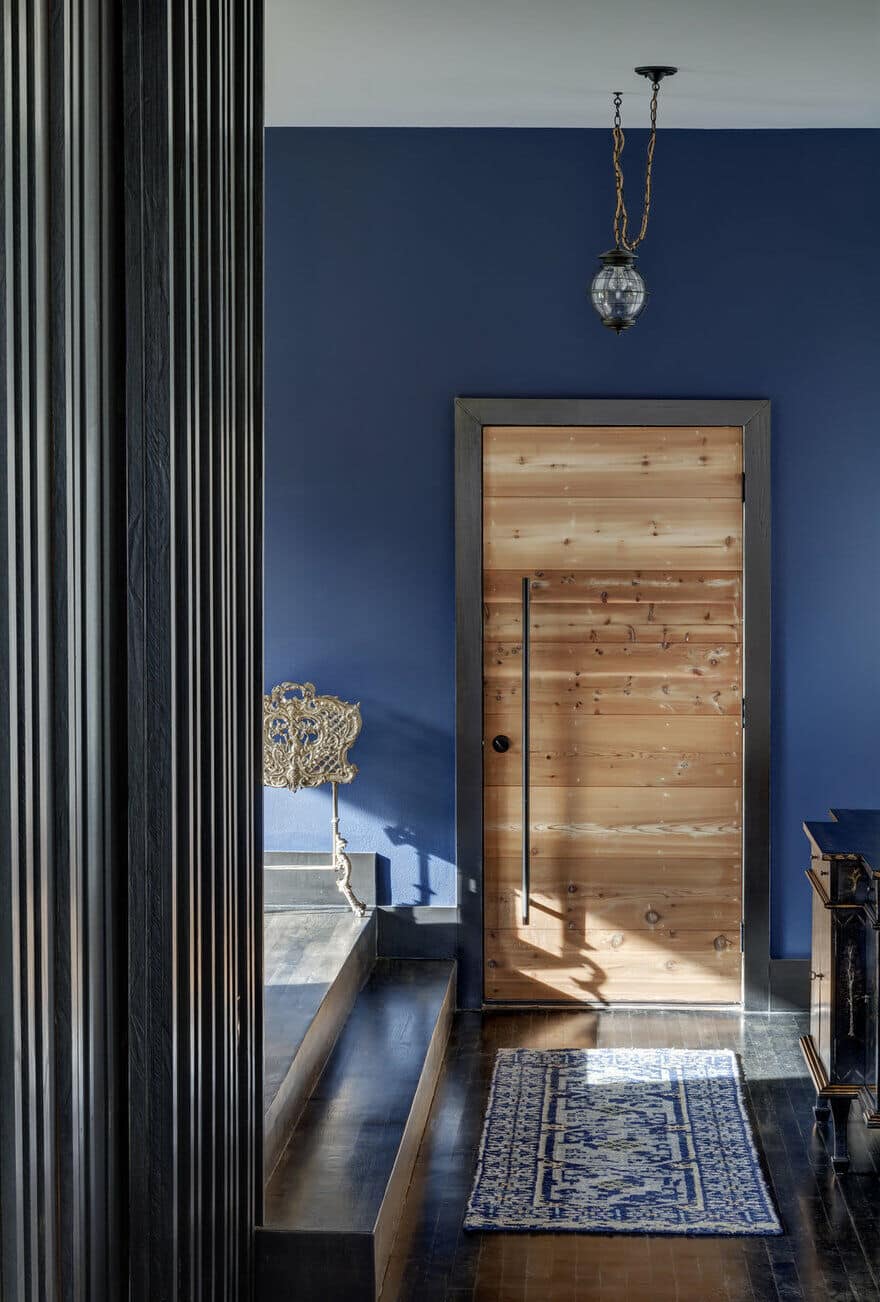
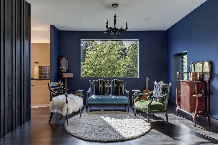
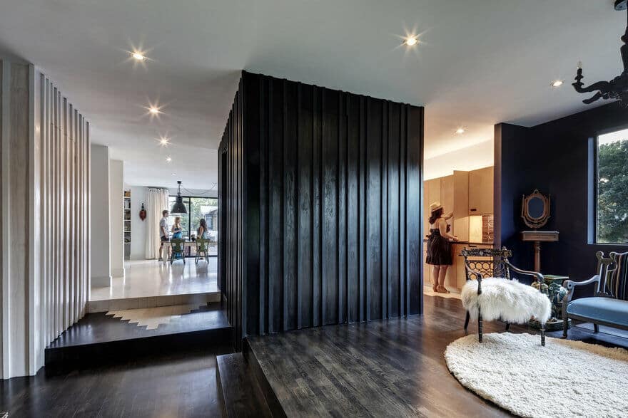
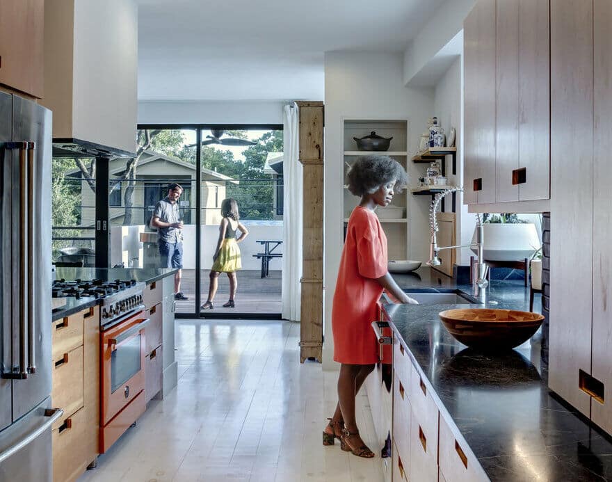
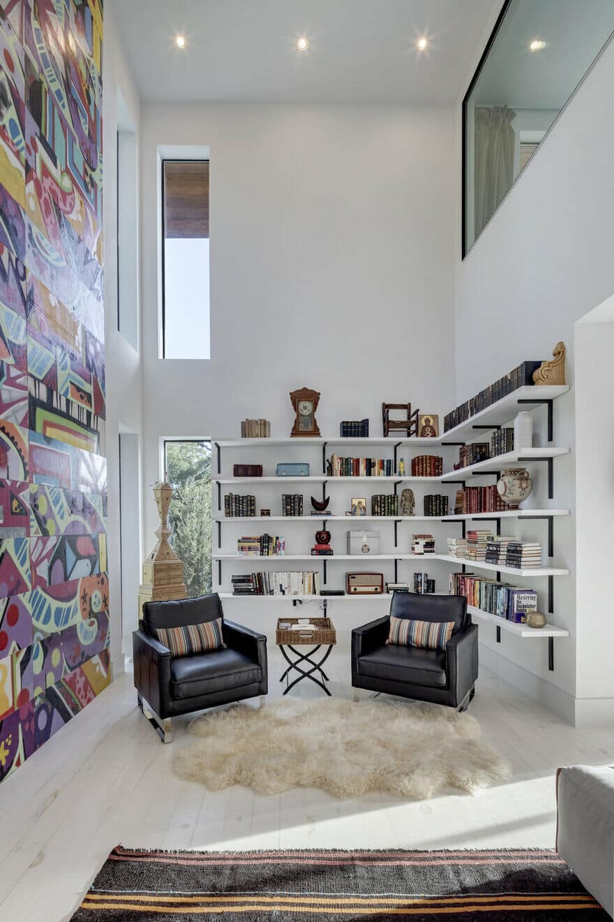
The design choreographs a scripted procession, as the entry sequence starts with a humble and compressed space, finished out with darker wall surfaces and heavy antique furnishings. Continuing toward the back, larger spaces are accentuated with lighter colors, materials, and furnishings, as well as a 2-story graffiti wall – all bathed in natural light from expansive modern openings. The floor level for the kitchen, living, and dining areas extend to an exterior deck which bridges to the roof of the flat-roofed guest house at the very limit of the lot.
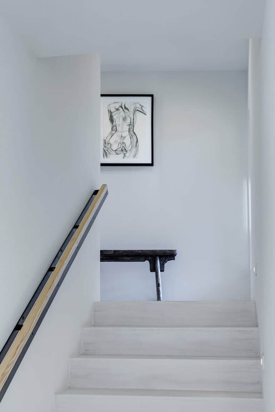
The staircase is at the center of the scheme and is the functional and symbolic connector of all three levels. The end of the staircase volume breaks away from the orthogonal grid with a diagonal cant that breaks up the east facade and captures unique light and views, all while connecting the old and new in a meaningful home for a young family.

