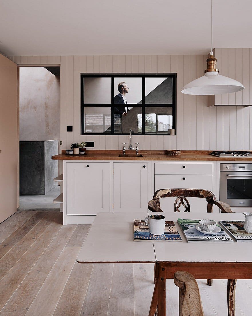
Designers: Chan + Eayrs
Location: London, United Kingdom
Photography: Michael Sinclair
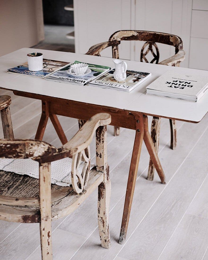
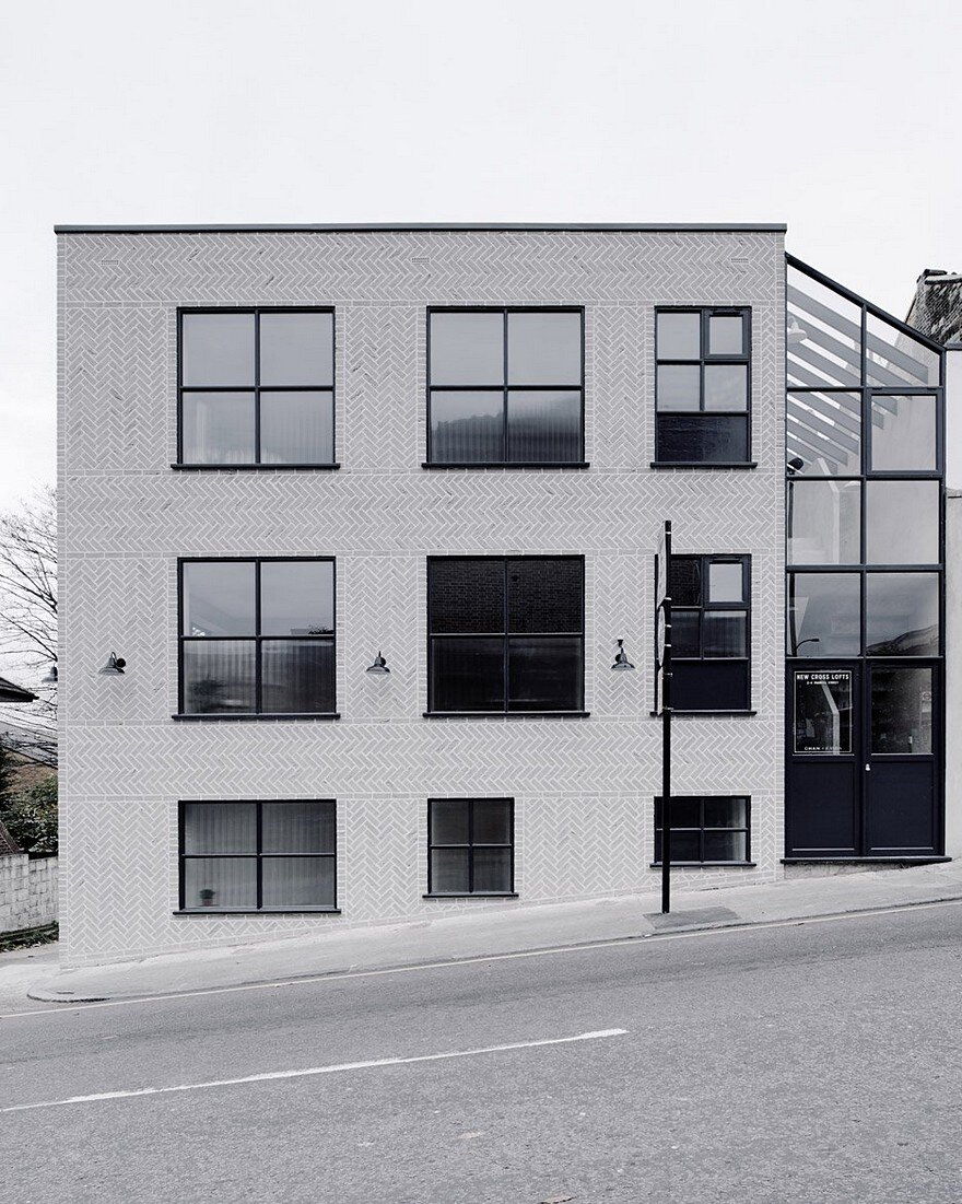
A new build replacing a derelict car workshop on a sloping corner site facing Deptford Park and set behind a row of Victorian terraces. Its grey monolithic massing responds to the tough urban context. Inside, however, is a different story: a calming palette of tactile materials and textural layers establishes a grounding quality; a sensory respite from the city outside.
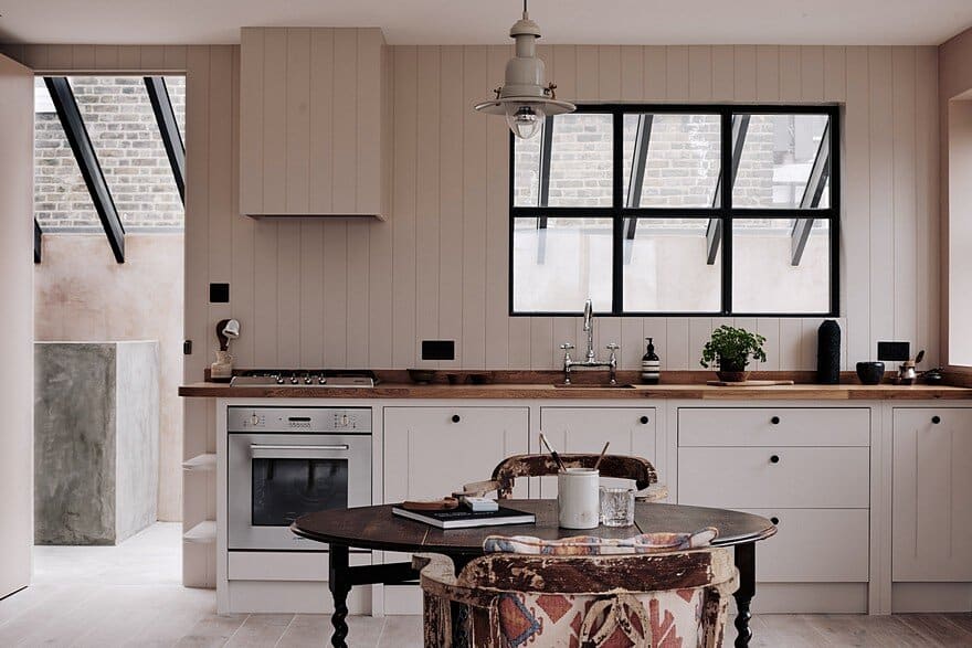
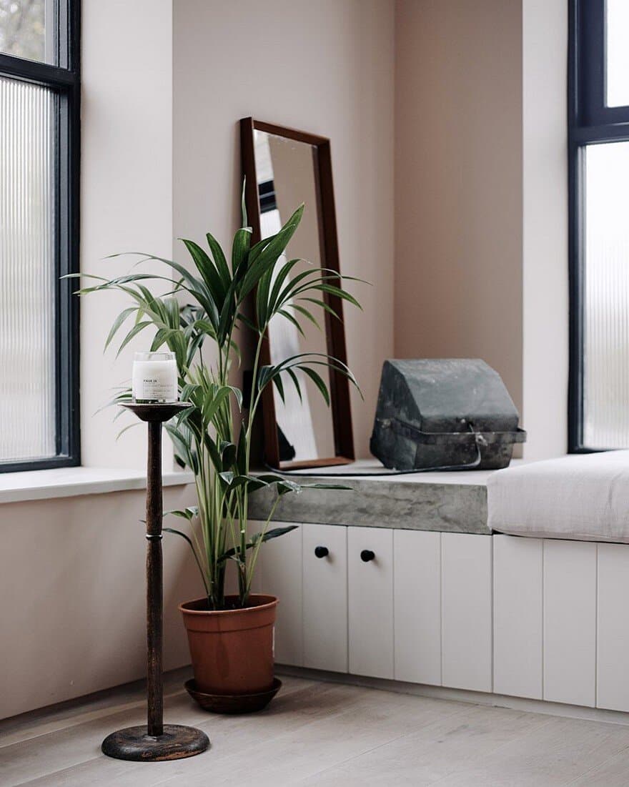
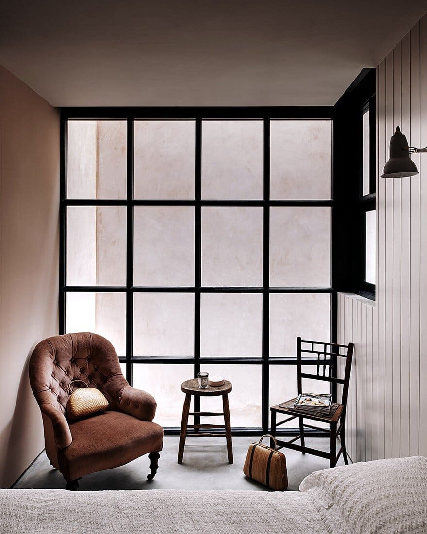
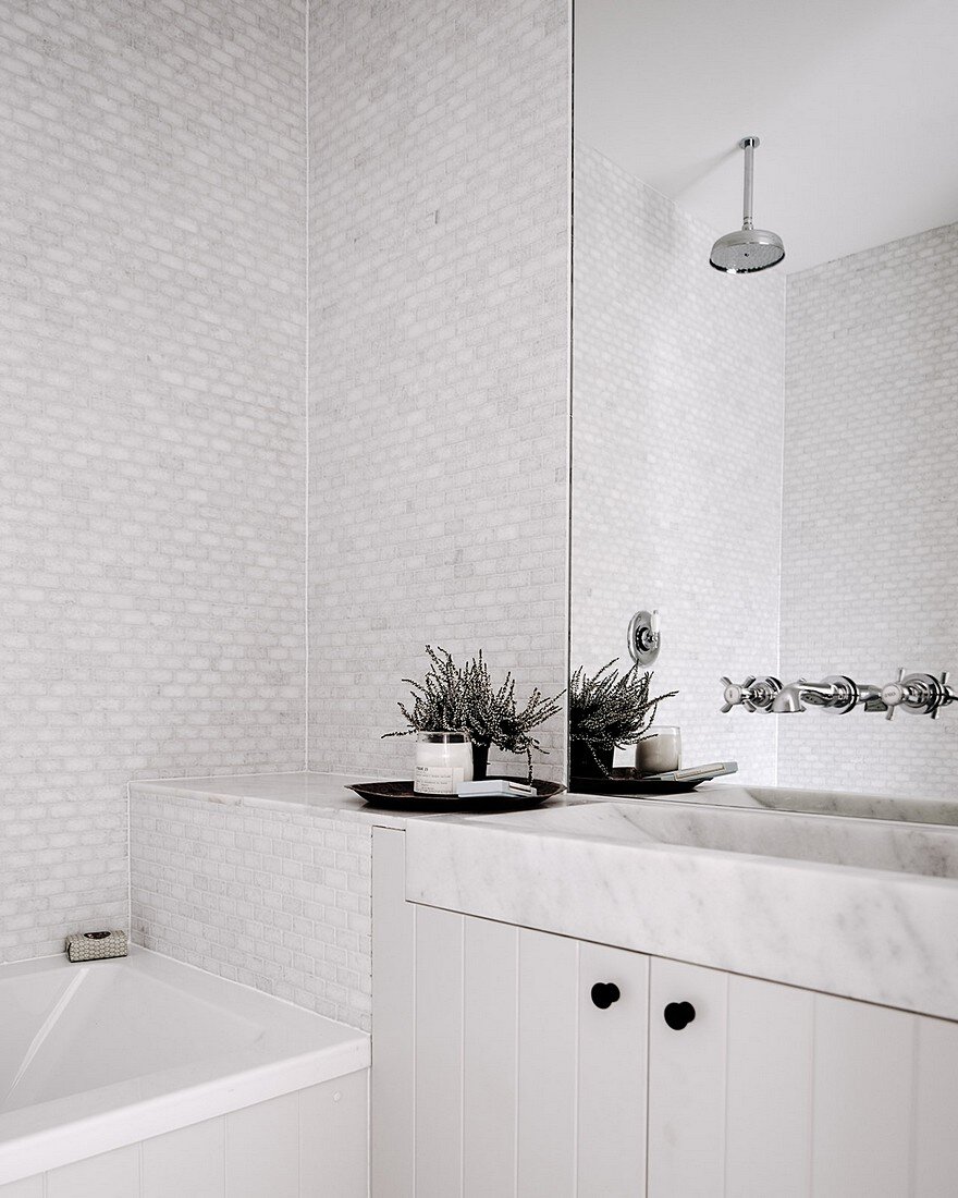
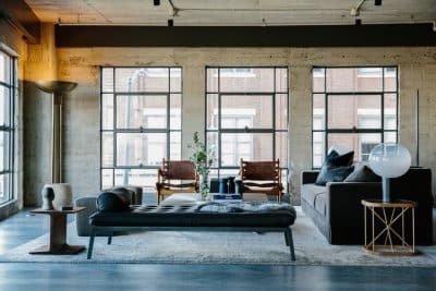
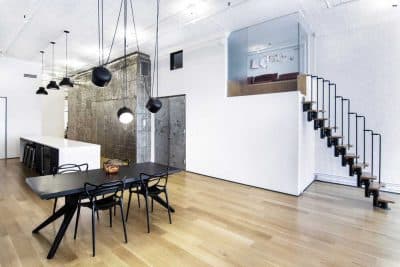
New Cross Lofts consists of 2 bespoke lofts and 2 work studios designed by the team at Chan and Eayrs. The lofts are flooded with natural light, complemented further by the limed natural tones of the panelled interior and white washed walls. The feature herringbone brickwork exterior creates a striking presence in the heart of the the creative quarter of New Cross.
The crafted building is excellently located, 15 minutes to central London (Shoreditch and the City) via the newly built East London Line, which is just a minutes walk from the building (New Cross Station) and very close to Goldsmiths University too (1 minute walk). The local neighbourhood is home to some charming independent shops, cafes and restaurants and is filled with young creatives, musicians and artists.
How did New Cross Lofts come to be?
We were attracted to New Cross because of its creative energy. Goldsmiths has long made the area synonymous with students and artists, and, like Dalston, those communities bring a real sense of creativity.
At the time, Peckham, New Cross and Deptford were still emerging as places to be, so there was a rawness to the area.
What was the site like?
Like the surrounding area, its appeal was that it was quite gritty. It was a two-storey brick shell of a building with ceilings that had caved in due to a fire.
We knew that we would essentially have to propose a new building, rather than trying to work around what was already there.
The thing that we were really drawn to was the fact that the site overlooked the nearby park. Also, because it occupied a corner plot, the space was flooded with light.
How did your design respond to the site?
Unlike our previous project, The Herringbone House, where the design was about getting as much light into the space as possible, this was about controlling the light. When you have a building that is entirely outward-facing, the challenge is to create a sense of airiness and openness, while also making the space feel private.
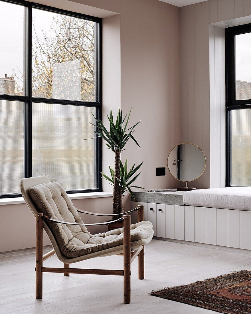
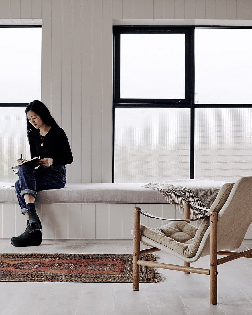
So it was about, on the one hand, defending the building from its surroundings a little bit, and, on the other, about opening it up to light and the views. We used fluted glazing for the lower parts of the windows to bring light in while also ensuring people outside couldn’t look in from the street.
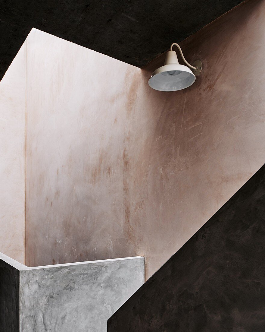
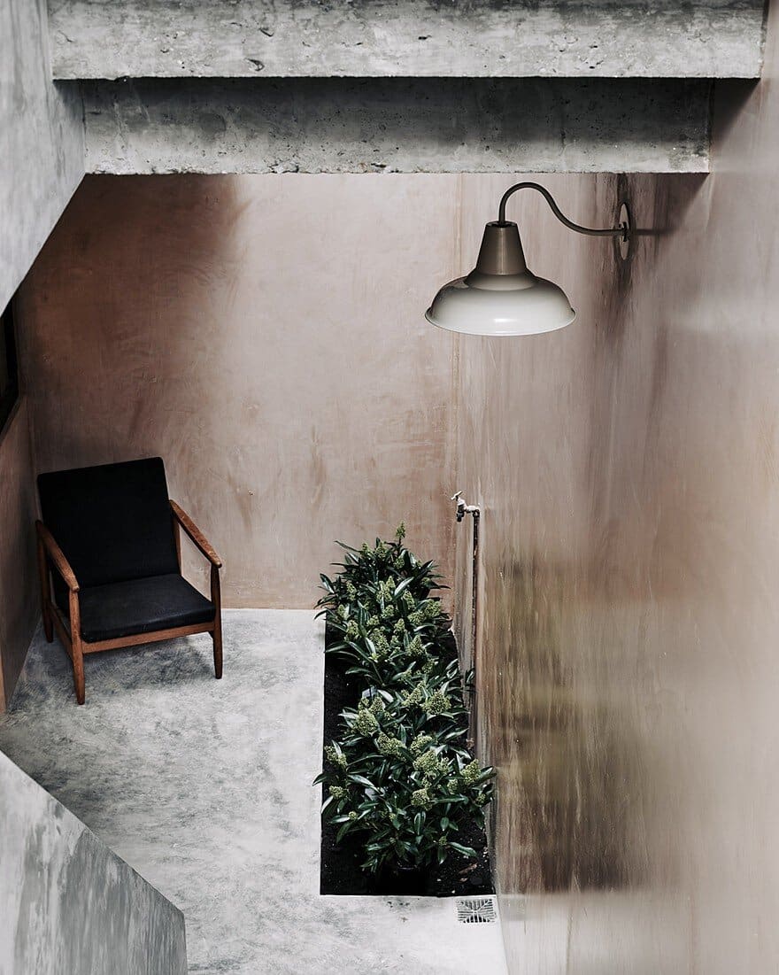
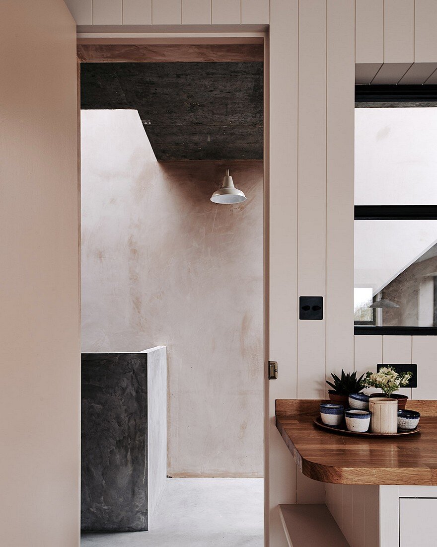
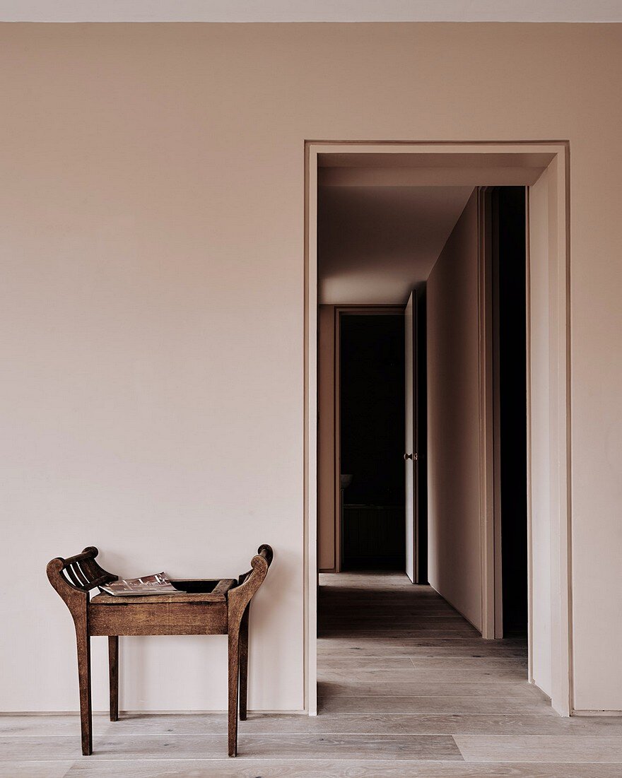
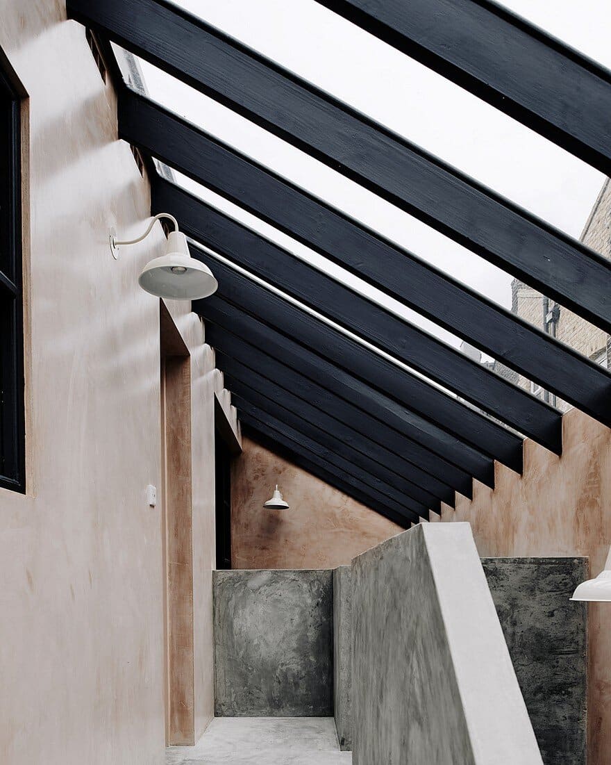
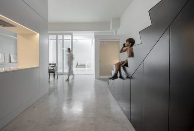
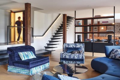
Inside, there is a cast concrete staircase in the communal area, which is south-facing. We wanted to make the most of the position, but also create a sort of sheltered feel. As such, the staircase’s sculptural form has a severity to it, but it also offers a pleasing contrast to the soft pink polished plaster walls.
Externally, we used ornamental brickwork to draw attention to the building from the street. We wanted to embrace and celebrate the fact that the building appears quite monolithic from its visible position, just off the high street.
Was there a sense of creating an oasis?
Yes, all of our projects carry through a sense of home being about safety, and of removal from the outside; its the contrast of the external and the internal that we love.
The interior palette softens as you move up through the building. The loft spaces are light and open, with generous windows opening onto the park.
A calming balance of pink shades and raw plasterwork was inspired by our travels to Morocco, which is also where we got married. Marrakesh is referred to as the ‘Red City’ because it has this beautiful pinky earth hue, and for the use of tadelakt plaster in vernacular architecture. We applied it to the space, but blended it in with off-whites and textured linens.
How was working together for the first time?
In the beginning, we tried to do everything together. As designers, we both have quite strong ideas and, at the time, we were eager young architects who wanted to prove ourselves.
Over time we learned that Zoe is good at hashing out an original idea and concept; she’s the one in her own little world, constantly dreaming.
Merlin takes that seedling idea, improves it and turns it into a reality. He makes the idea work, connects it and collaborates with neighbours, planners and craftspeople on getting it off the ground.
What bonds us is that we have very similar tastes and a crossover in terms of our vision. Out of that comes a mutual trust in each other that we will do our roles well.
How do you reminisce about this project?
We get better at what we do with each project, because of practice. When we look back we see an organic growth from one project to the next.
New Cross Lofts was about our progression as architects, but its enduring legacy is that it made us see each home we make like creating an artwork. As with any artists, we continue to build and develop our craft, enriching each new work with the lessons learned before.

