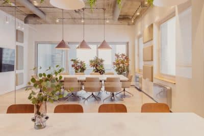
Project name: New Offices of E-goi and Clavel ́s Kitchen
Architecture Office: Paulo Merlini Architects
Main Architect: Paulo Merlini, André Santos Silva
Location: Avenida Menéres/ Matosinhos, Portugal
Year of conclusion: 2020
Total area: 2800 sq.m
Architectural photographer: Ivo Tavares Studio
Text by Paulo Merlini Architects
The customers already owned the warehouse adjacent to the intervention area where the companies are based, but with its exponential growth the need to increase the physical space of the company became perennial.
The main challenges of this intervention were the interconnection of the two warehouses, in order to be able to seam the original space and the new space in the most fluid and natural way possible, and the creation of dynamics between the two companies, which although distinct, work synergistically.
One of the most important issues in designing a company’s headquarters is to create a space that expresses and is in line with the corporate culture.
In this case, both E-goi and Clavel’s kitchen, present a rather informal type of management, although extremely professional, and asked us for a space that would express that, a fluid, equal, heterogenous and unpretentious space.
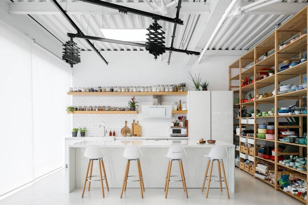
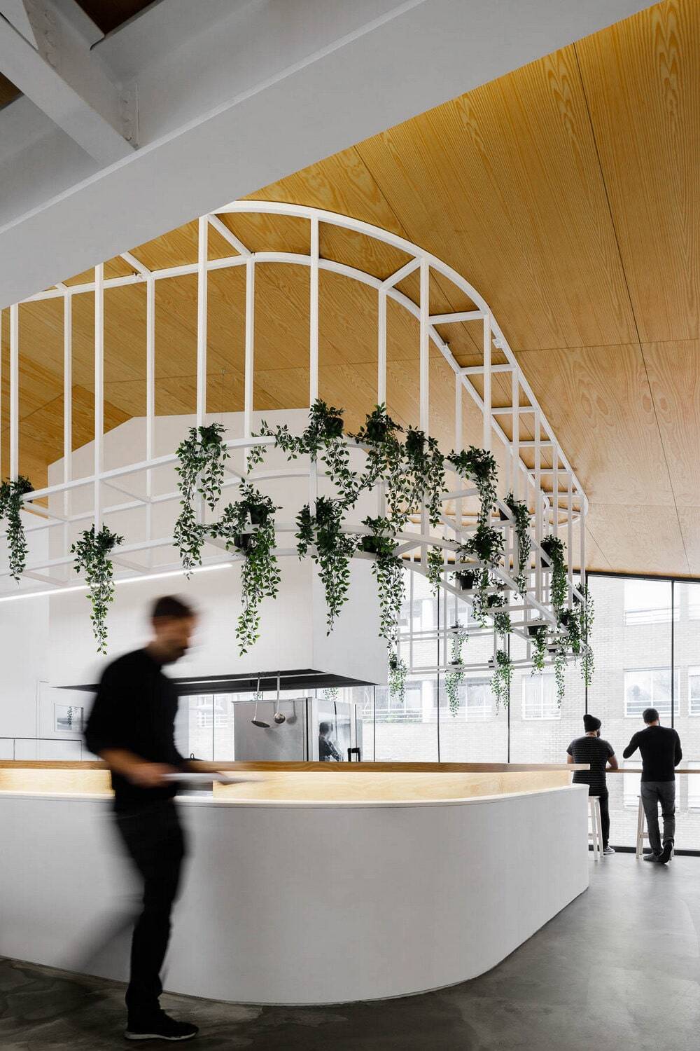
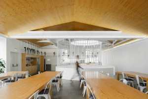
In terms of functionalities the new space should guarantee a lot of spatial flexibility, to respond to the company’s growth, include a new photography studio, several meeting rooms, some formal, some informal, video-call booths and a dining space that could accommodate at least a hundred people at a time.
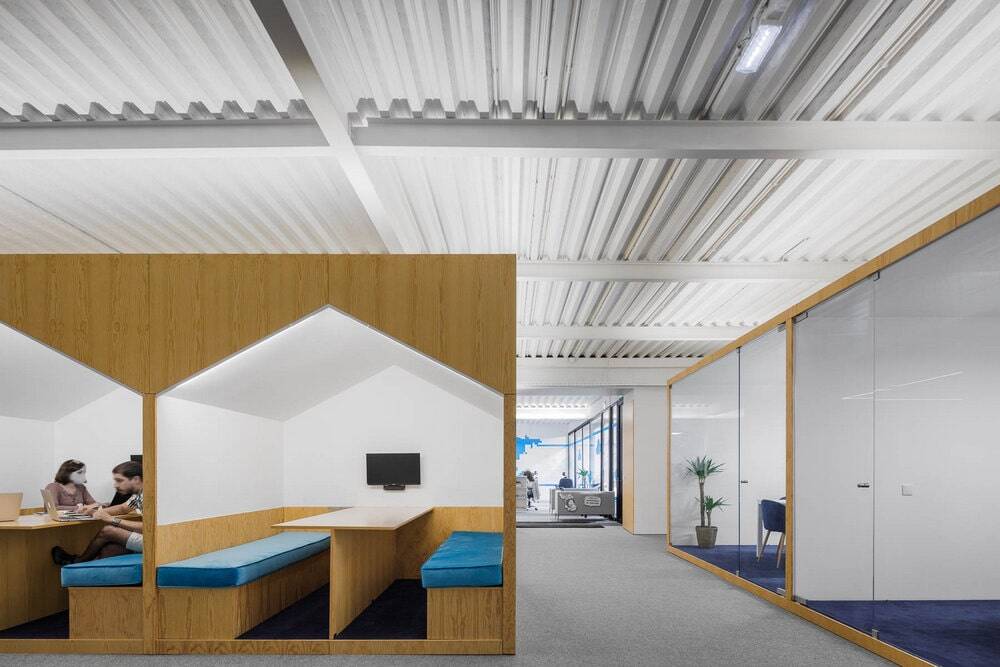
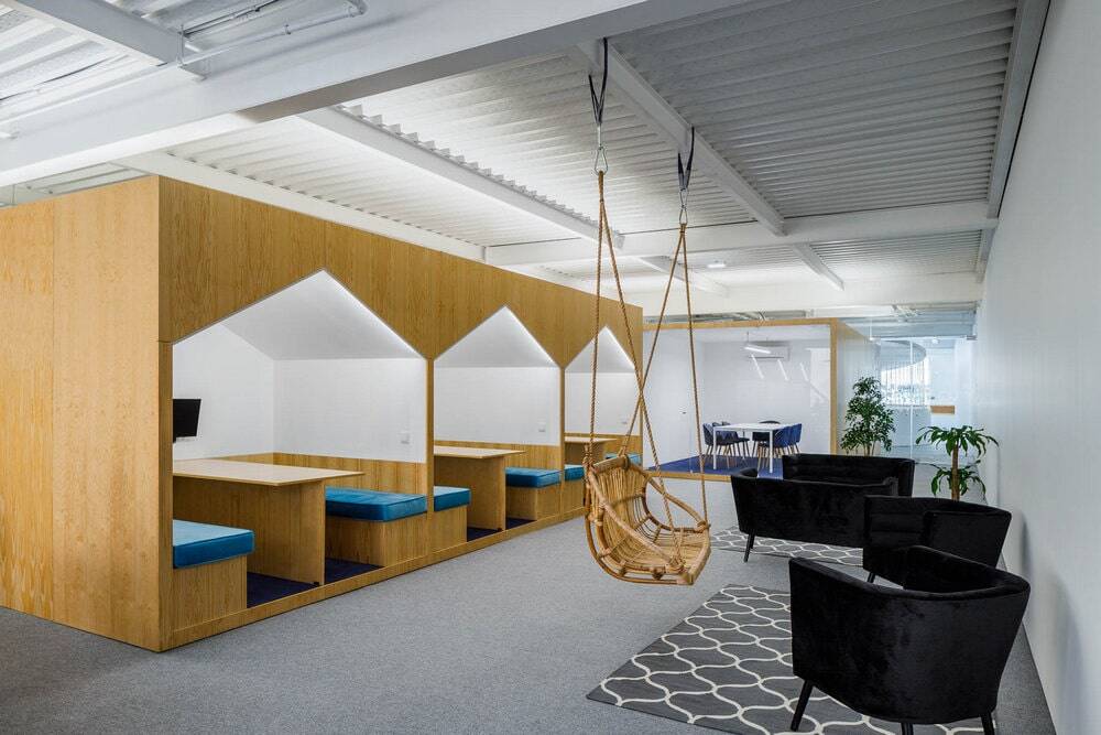
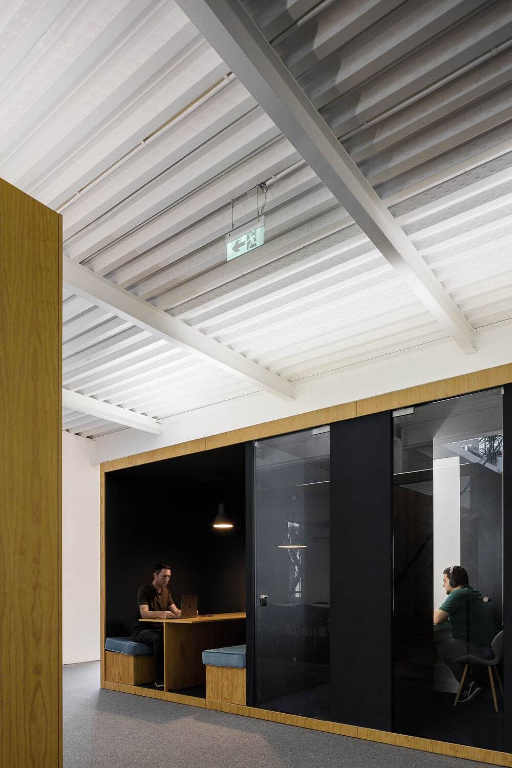
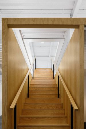
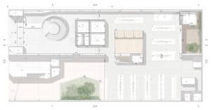
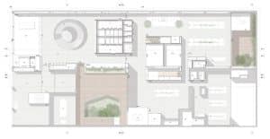
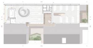
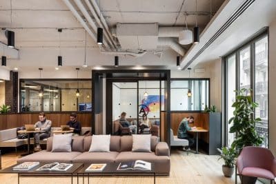
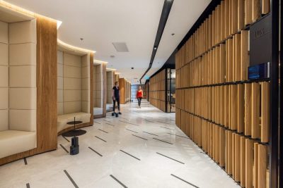
In order to achieve all the intended functionalities, we distributed a series of wooden boxes, where we integrated all the enclosed spaces, meeting rooms, bathrooms and video room booths.
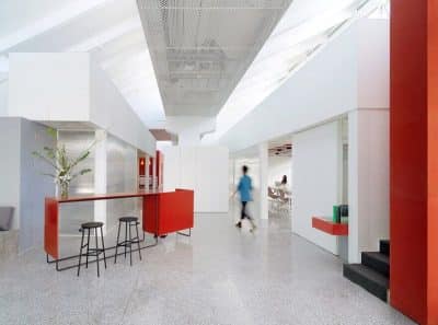
It is the distribution of these boxes throughout the space that defines all the spatial dynamics. By distributing these functions, in a heterogenic way throughout the space, and by mismatching these elements, in a kind of organized chaos, we guaranted spatial versatility, and created a series of nooks and crannies that allow several kinds of appropriation, assigning each one of them a distinct personality. We guarantee ample spaces, where the interaction between co-workers takes place with great naturalness, and more discrete spaces, where you can read a book, relax, or even have a more informal meeting.
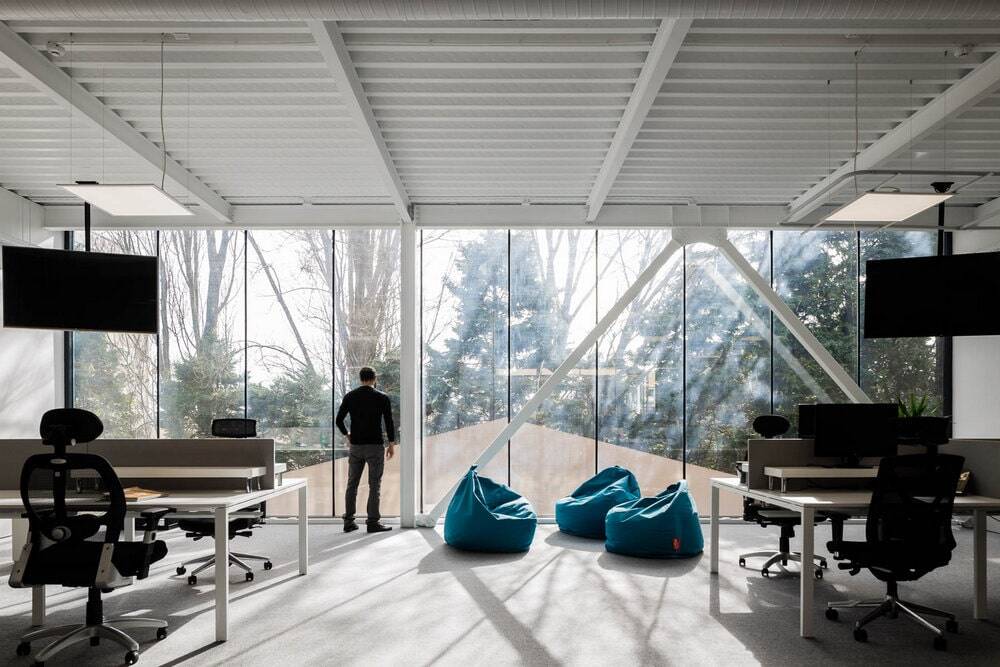
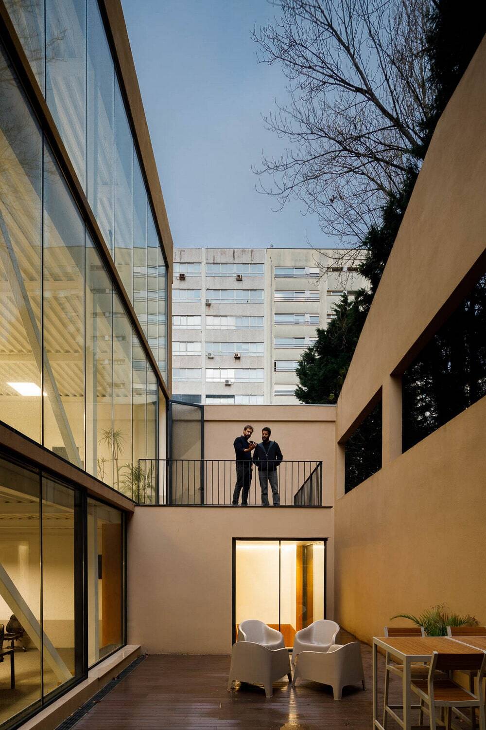
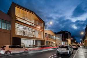
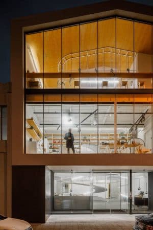
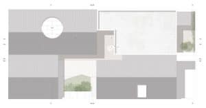
Another basic concern was to ensure that all spaces had plenty of natural light. With the shape of the façade defined by legal restrictions, we designed it completely glazed. Adjacent to the façade we located the photo studio on the second floor and the restaurant on the third. This way we guaranteed a strong visual relationship with the main avenue, attributing a scenic effect to the company’s daily life. The photo studio takes advantage of the northern light, the best light for the type of function it offers, since, reflected by the sky, offers low-contrast lighting, remaining relatively constant during the day.
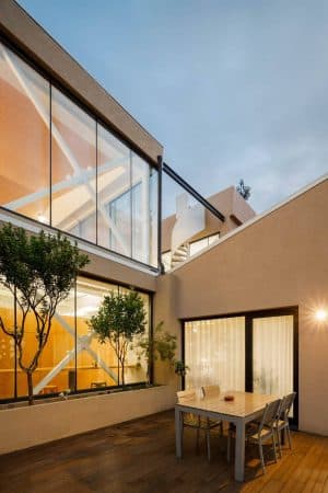
In the rear elevation, to the west, we open a series of glass windows that reinforce the presence of natural light throughout the day.
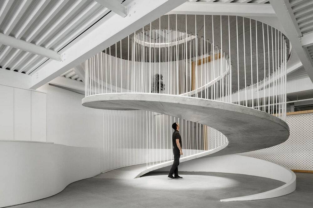
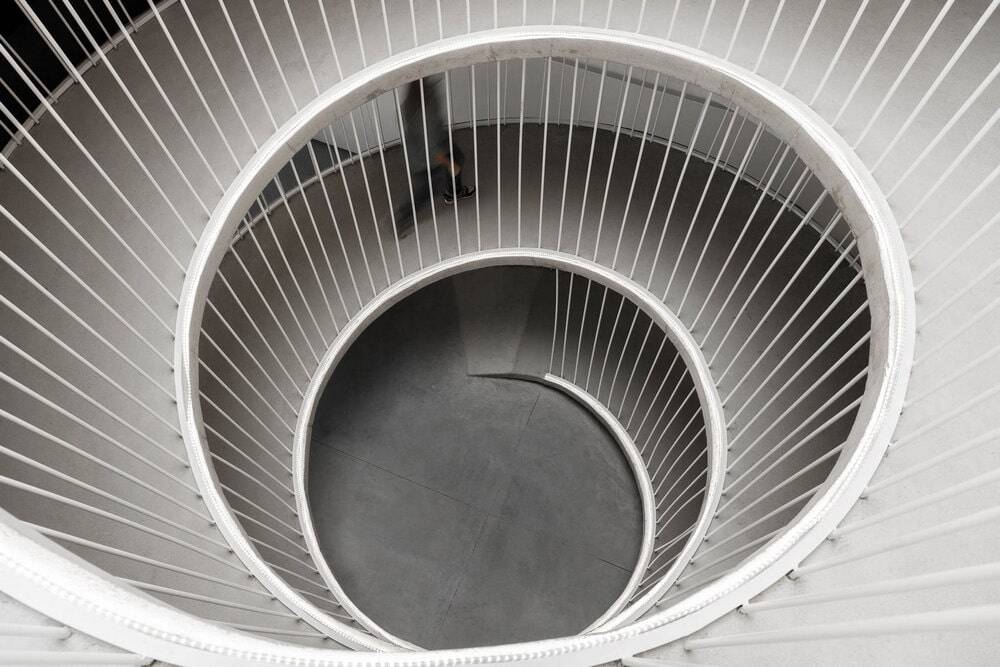
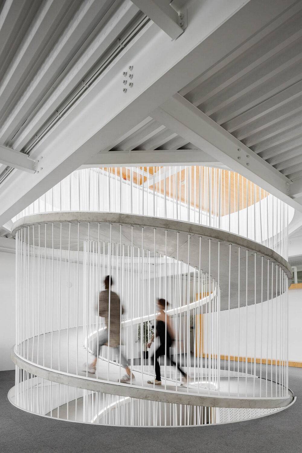
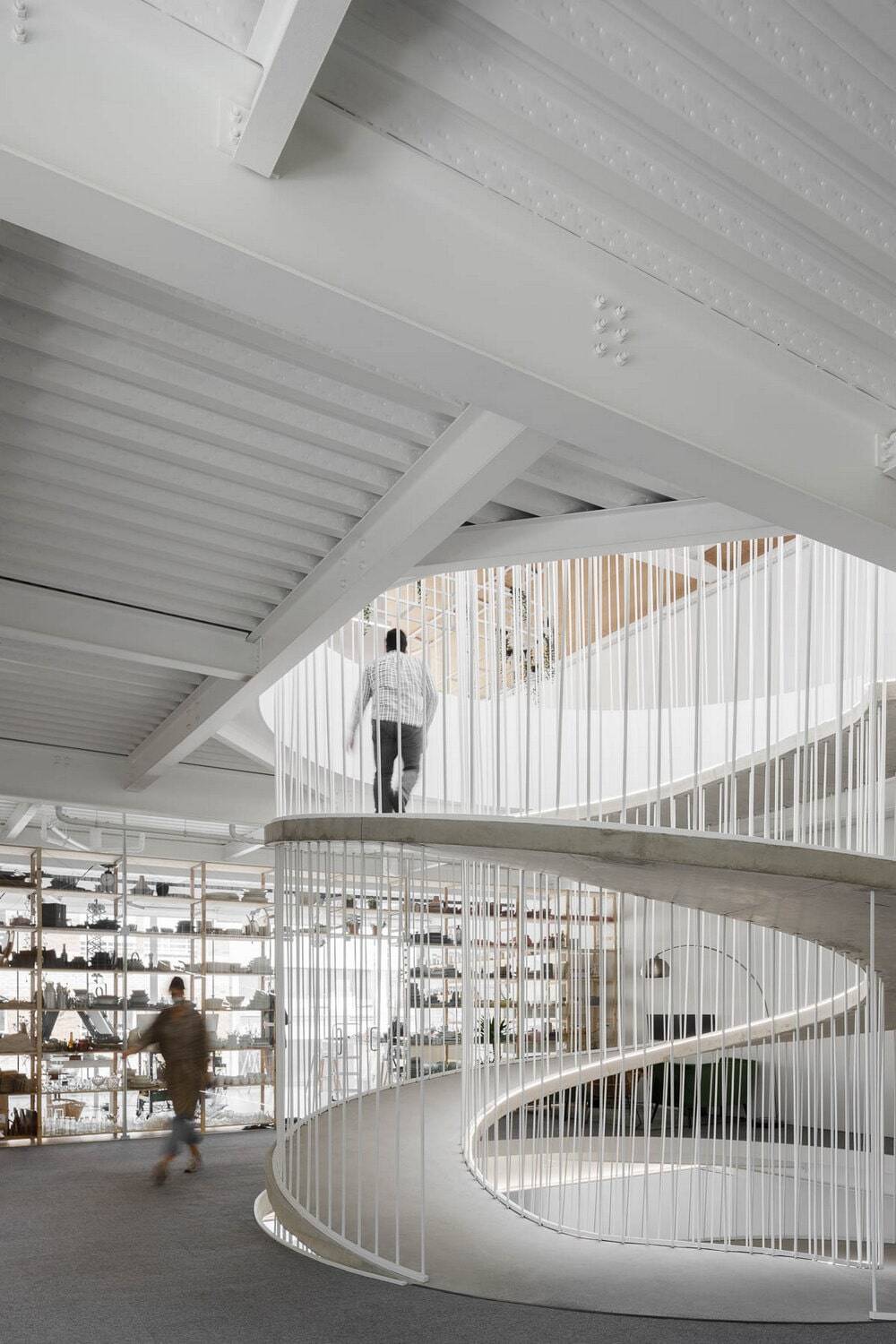
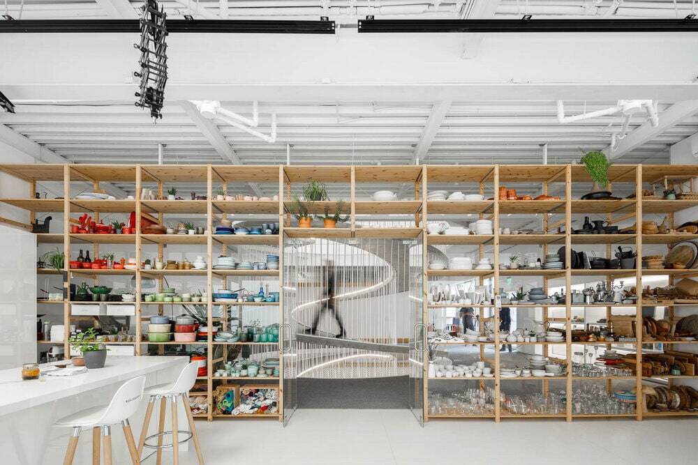
In order to guarantee a fluid and natural relationship between floors, we have designed a concrete spiral with a strong sculptural character, which interconnects the three floors and by its presence characterizes the whole space. At the top a skylight illuminates the three floors and leaves uncovered the structure of reciprocated bars supporting the ramp, elegantly proposed by the engineer.

