Project: Ozernaya Apartment
Designer: Buro 108
Interior design: Ekaterina Gritsan
Location: Moscow, Russia
Area: 60 m²
Images courtesy of Buro 108
Derived from the word ‘ECO’: ECOlogic and ECOnomic. A small apartment that has it all.
This small apartment in Moscow has been designed according to this principle. Interior project was created by Ekaterina Gritsan for Buro 108 for young man and covers an area of 60 m².
Every her new project, designer begins by imagining how it would be to live in the apartment that needs to be set up, only then she thinks up the interior. Since every detail is important: how high to put the shelf, where to keep the keys, and where should sleep the beloved dog.
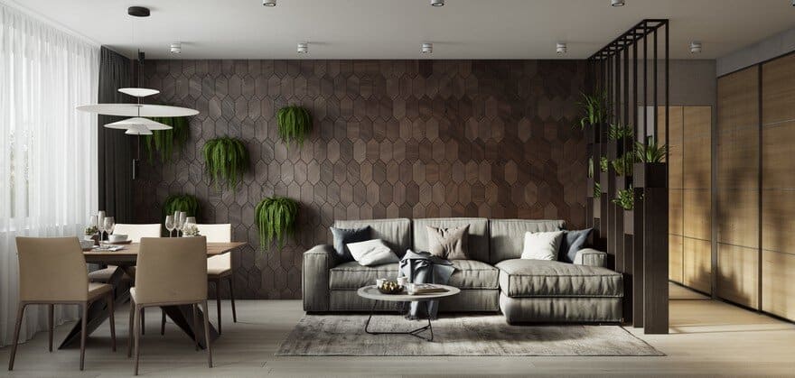
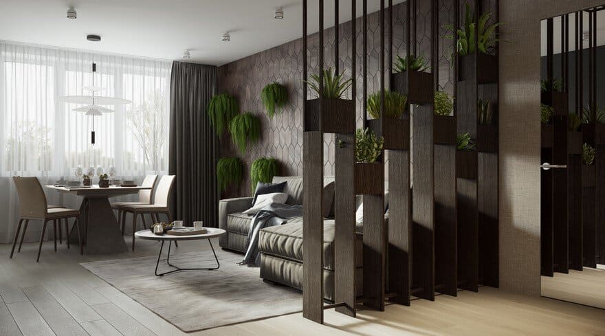
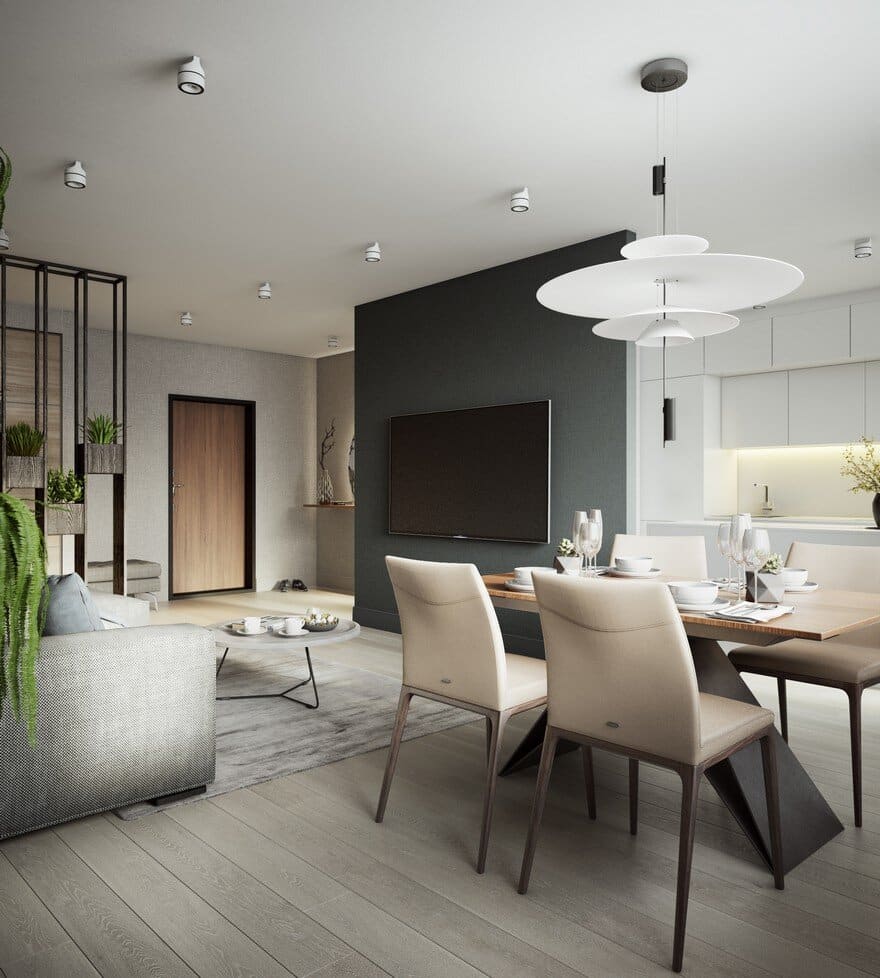
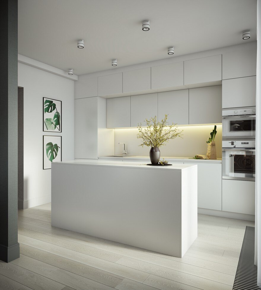
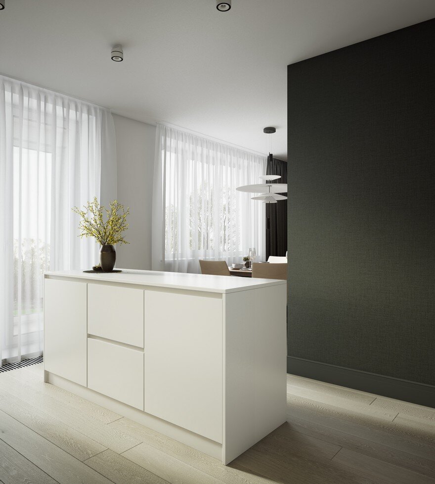
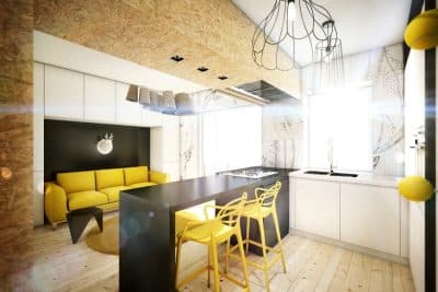
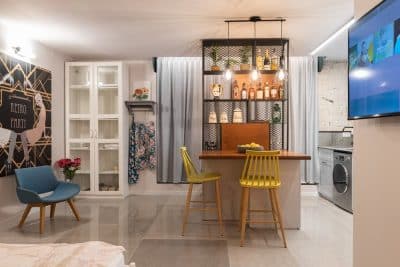
To visually increase and make maximum use of the available space, the septum that divided the hallway from the living room and kitchen was disassembled. As a result, the spaces now seamlessly blend together, so that 40m² appears to be significantly more.
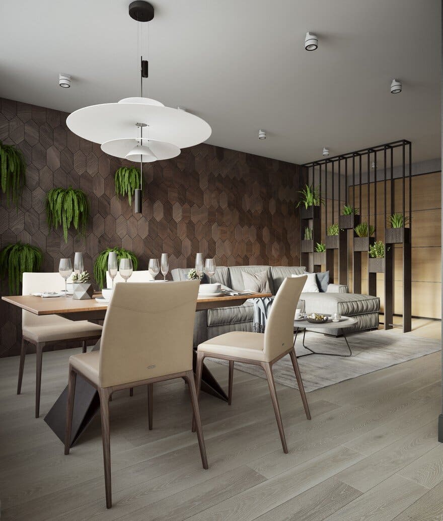
Plants were placed onto the wall, it adds to the apartment’s cosiness. The wall is made out of oak from a Russian manufacturer, which turned out to be highly economic; one of the conditions that the new interior had to measure up to.
One of the main objectives was the interior lighting. Since the Ozernaya apartment faces north, there’s a little sunlight. It’s a lot of white color in the interior to make it looks lighter and bigger.
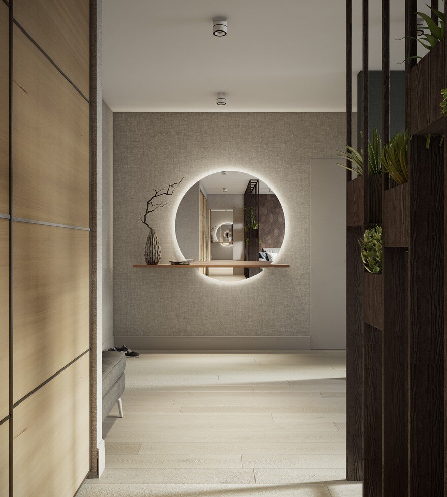
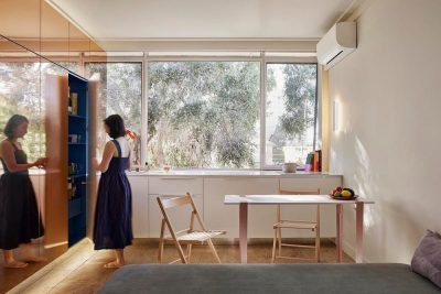
For instance, the door that leads to the bedroom has been made into a mirror. It simultaneously carries out a double function: transforming the overall space by concealing the bedroom door, while at the same time carrying out its primary function next to the wardrobe.
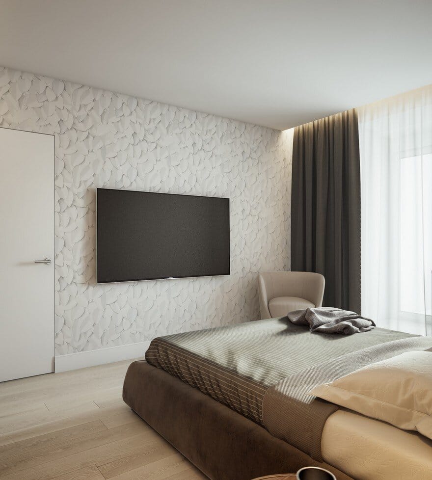
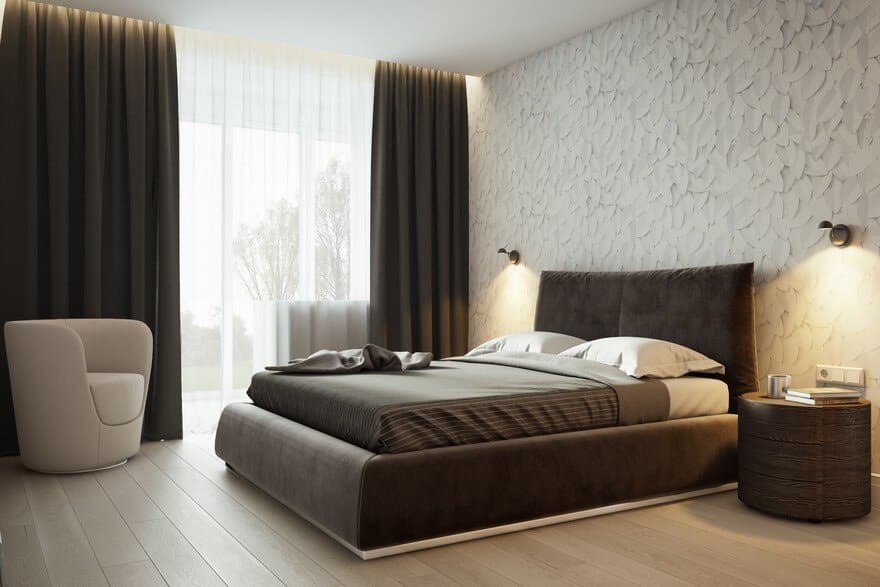
Within the bedroom, another big wardrobe was installed for other items. Since it’s about three meters in width, it offers enormous space for keeping all kinds of things. The bedroom itself is rather compact and has been created solely to carry out its primary function – to relax and to sleep.
Wallpaper – with a pattern that looks like handmade sketches of leaves – was used to finish the bedroom walls, which gave the room an even more pleasant feel. The client was quite sceptical about the idea to use wallpaper at first, but instantly changed his opinion once he saw the wallpaper. It was an unmistakable ‘yes’!
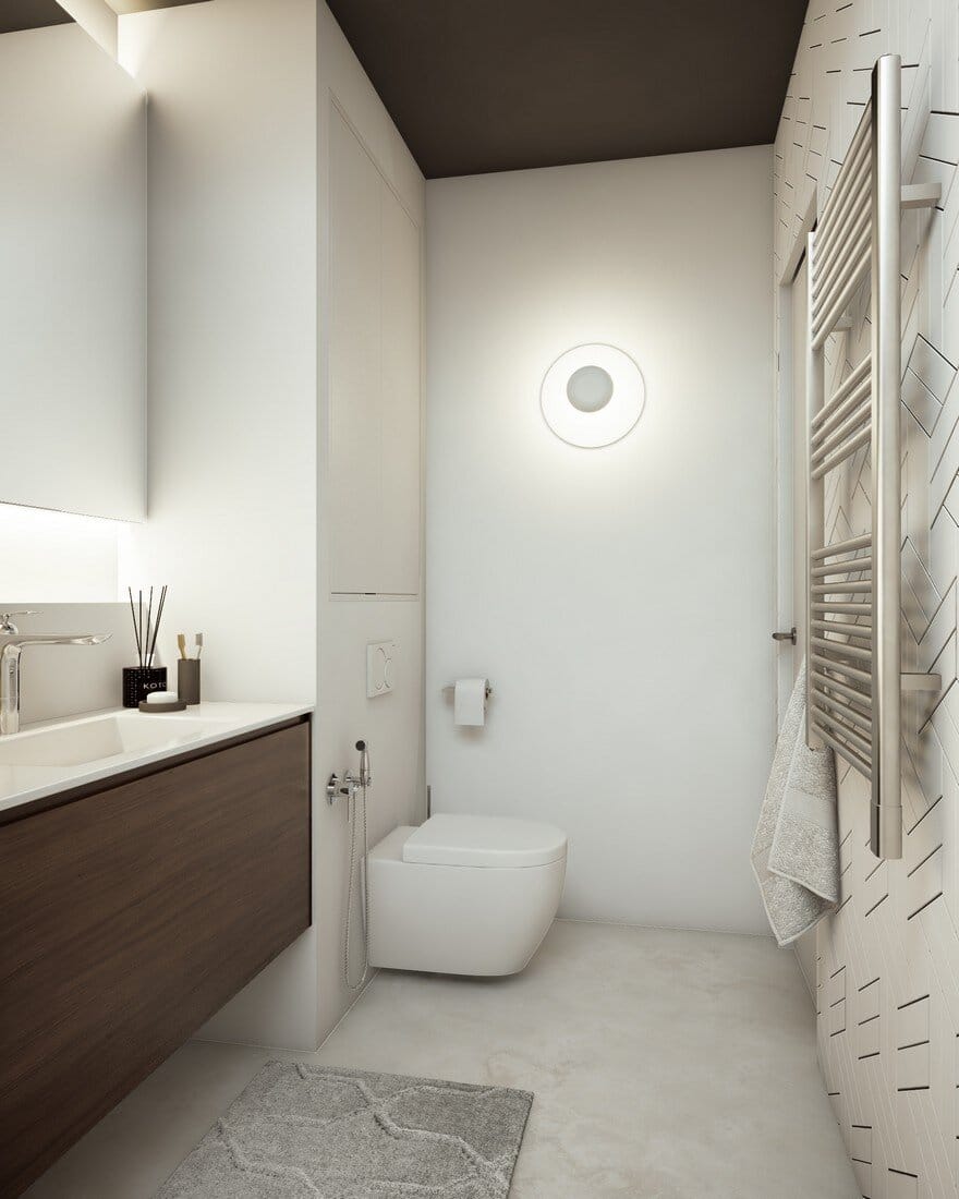
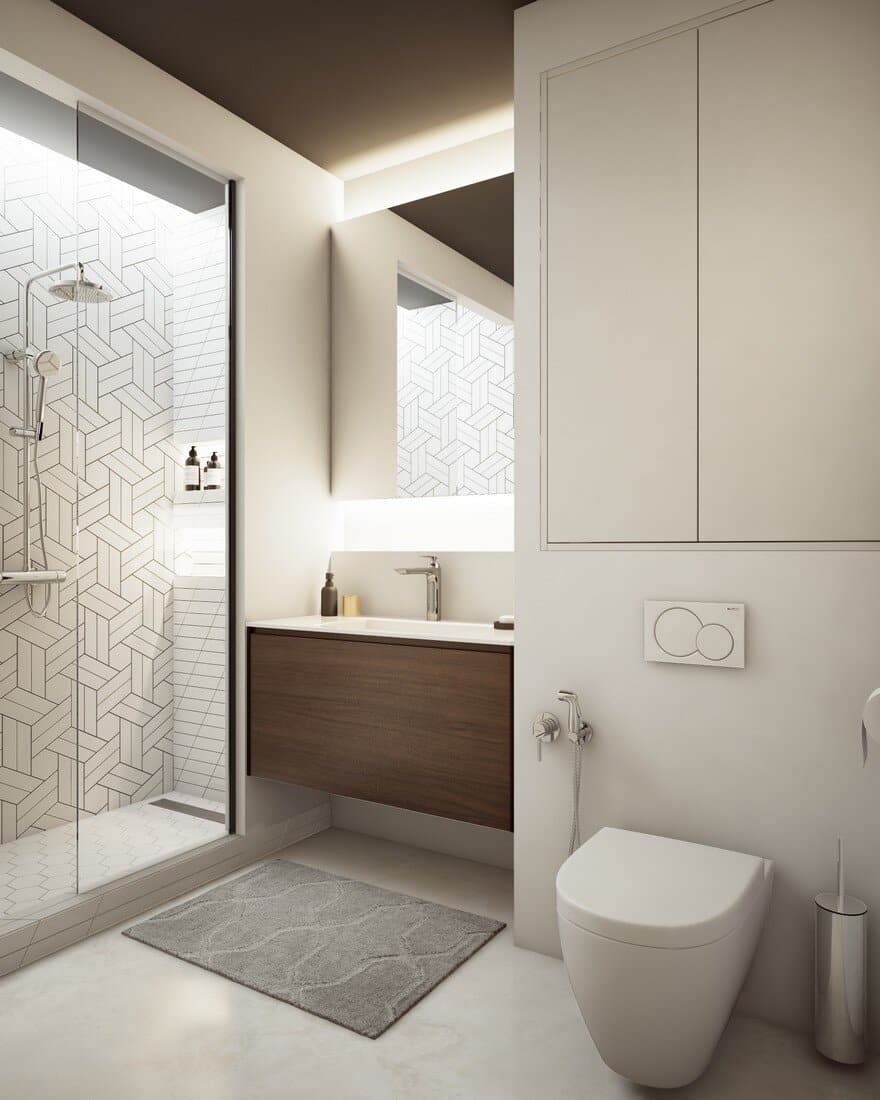
Much attention has been devoted to the bathroom. A wide sink with storage below was installed. Behind the sink, on the wall, a mirror was placed with hidden illumination above and below. The mirror makes the bathroom feel significantly bigger, whereas the soft, reflected light creates a calm and comfy atmosphere.
An uncovered shelf was mounted behind the sink. In the space above the hanging toilet a shallow closet was placed for storage. In the shower a few shelves have been installed with a hidden decorative lighting along the wall. The bathroom worked out looking elegant, convenient and compact. It contains everything necessary and has nothing excessive.
This project is one of those cases where the proprietor puts full faith in his designer, and only needs to make clear to her his wishes. Furthermore, details are scrupulously worked out. Since it’s important that things do not only look good, but that they are functional too. Taking into account small space, lifestyle and preferences of the proprietor, in this particular case everything came together exceptionally well. Despite the small budget, the Ozernaya apartment has its own chic and charm…

