Project: Peckham Courtyard
Architect: Unagru Architecture Urbanism
Structural Engineer: Structures Made Easy
Location: Camberwell, England, United Kingdom
Project size: 140 m2
Site size: 140 m2
Project Budget $150000
Completion date 2020
Building levels 3
Photo Credits: Sara Moiola
We first met the clients several years ago to discuss potential works for the flat they resided in at the time; although that particular project didn’t happen, we established a strong relationship. Since that time they have now moved to a beautiful, traditional end of terrace Victorian house in Camberwell. They still had two cats and one child, but now with a second coming!
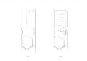
The Peckham Courtyard house had good bones but needed some adjustments to make it work for the growing family, alongside a contemporary overhaul to deliver a home that suited the owners’ style. The first floor was practical and straightforward, which suited the family, and the top floor was incredibly bright thanks to a recent extension. However, the ground floor was more problematic; the kitchen was constrained by a small side garden and internally dark because of a wide chimney stack on the rear facade. The ceiling was low, the storage was insufficient, and there was hardly any space for even a little dining table. The large chimney breast also negatively affected the relationship with the garden. The rest of the ground floor was likewise fragmented and dank, with two additional rooms and a tight corridor between the entrance and the kitchen.
Given their current family situation, the clients stressed the importance of having a utility space, generous storage (among other things, to fit an unfolded buggy!), and an ample, social dining kitchen area on the ground floor. They also wanted the house to feel airy and bright and improve the relationship with the garden.
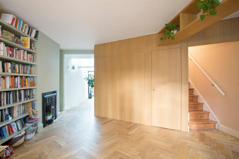
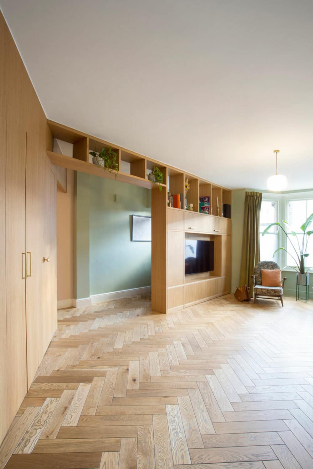
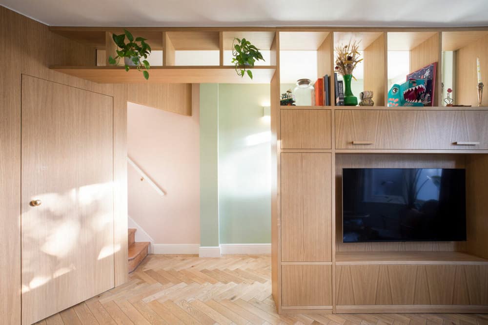
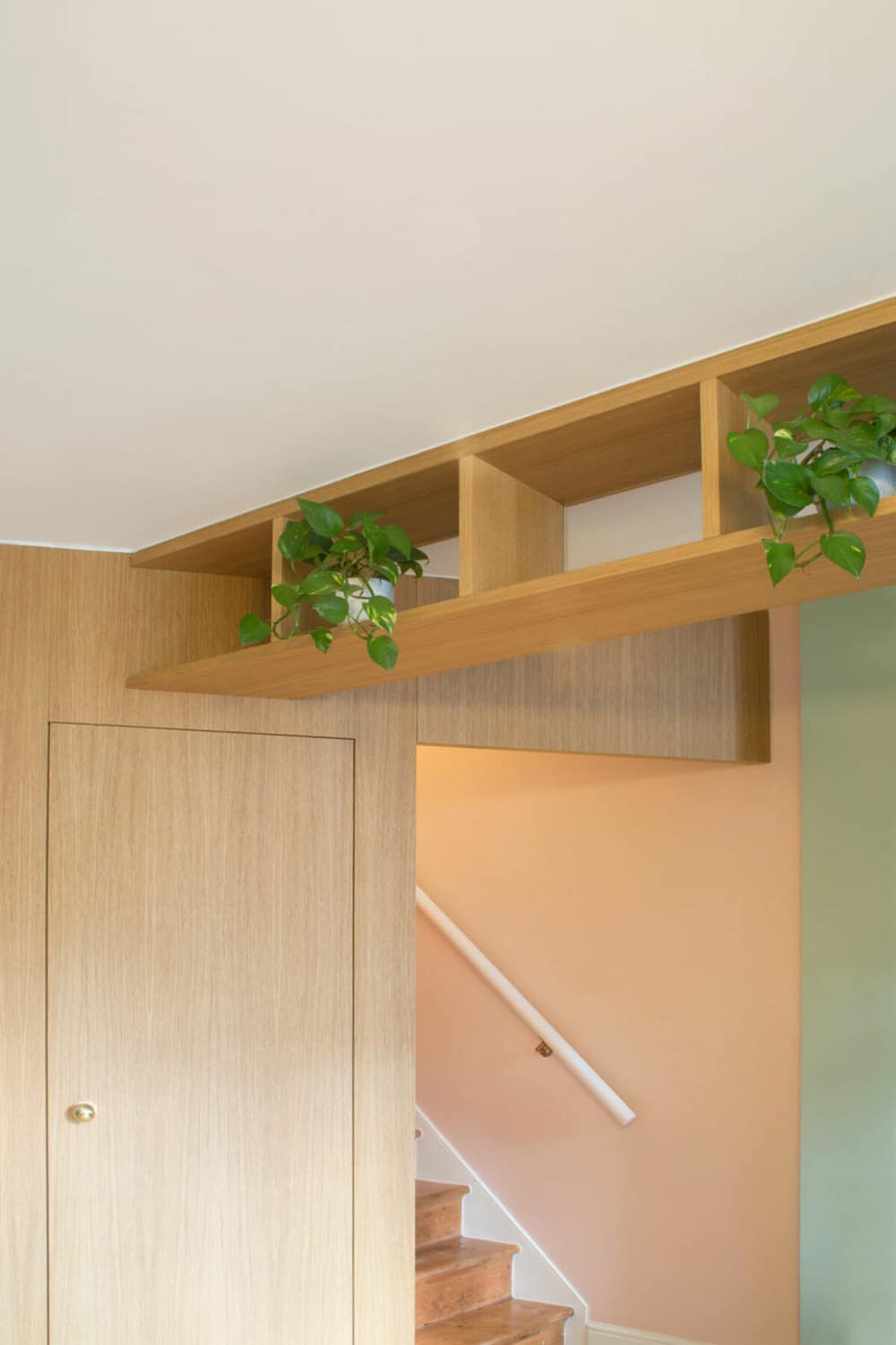
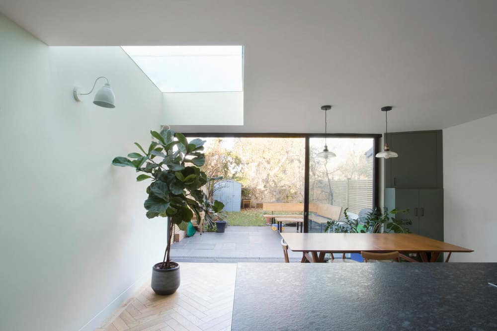
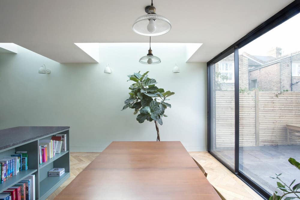
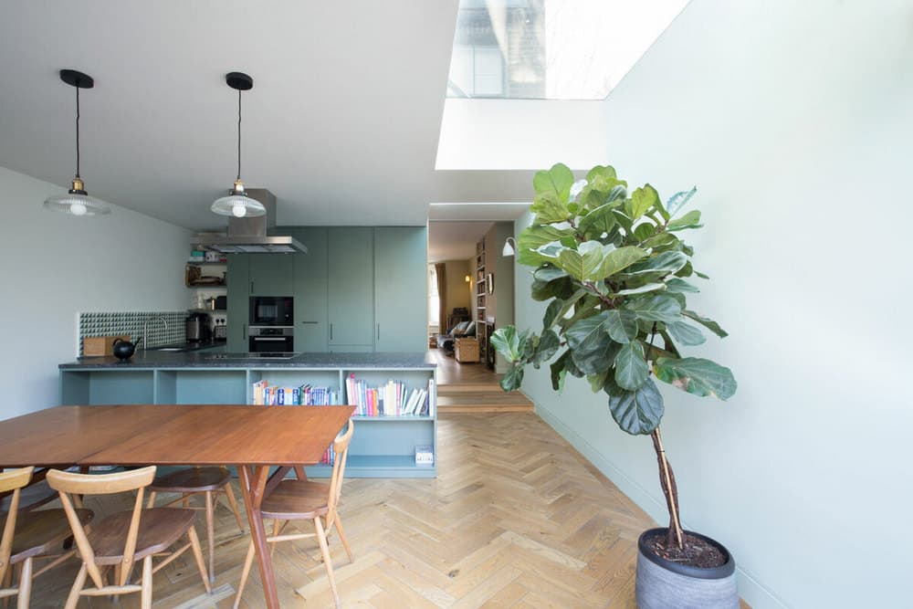
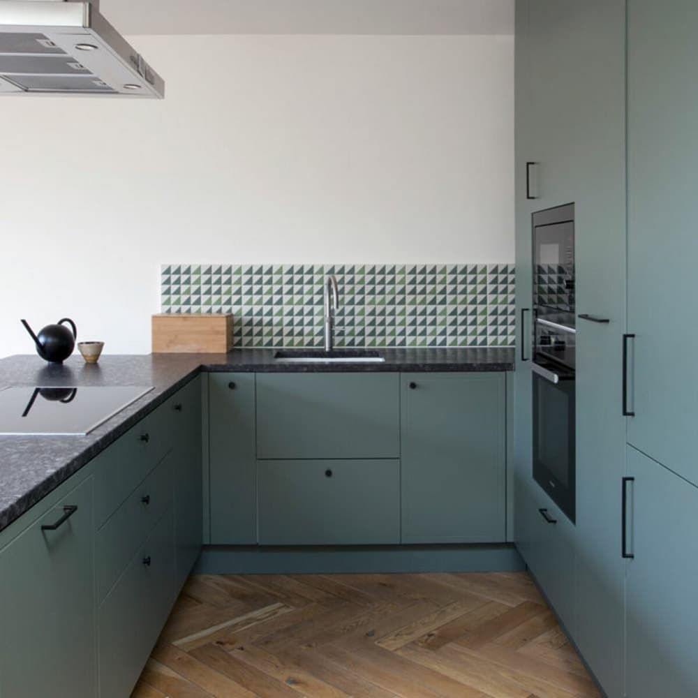
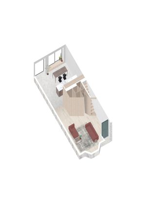
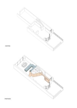
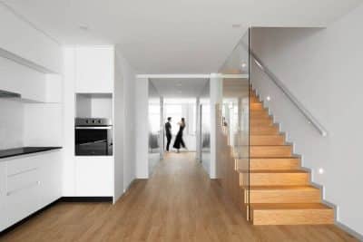
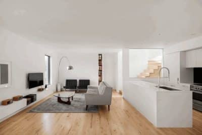
We created a bright open planned ground floor wrapped around a service and storage space. A bespoke, continuous strip of joinery runs from the front door, guiding you to the garden. We introduced bespoke joinery as a critical interior feature, including the kitchen, the worktop and a wall of joinery running from the front door and guiding us to the garden. This wall of joinery has been created as multi-functional, the cut thoughts allow dappled light to penetrate through, with shelving for the owners to showcase their art and personality.
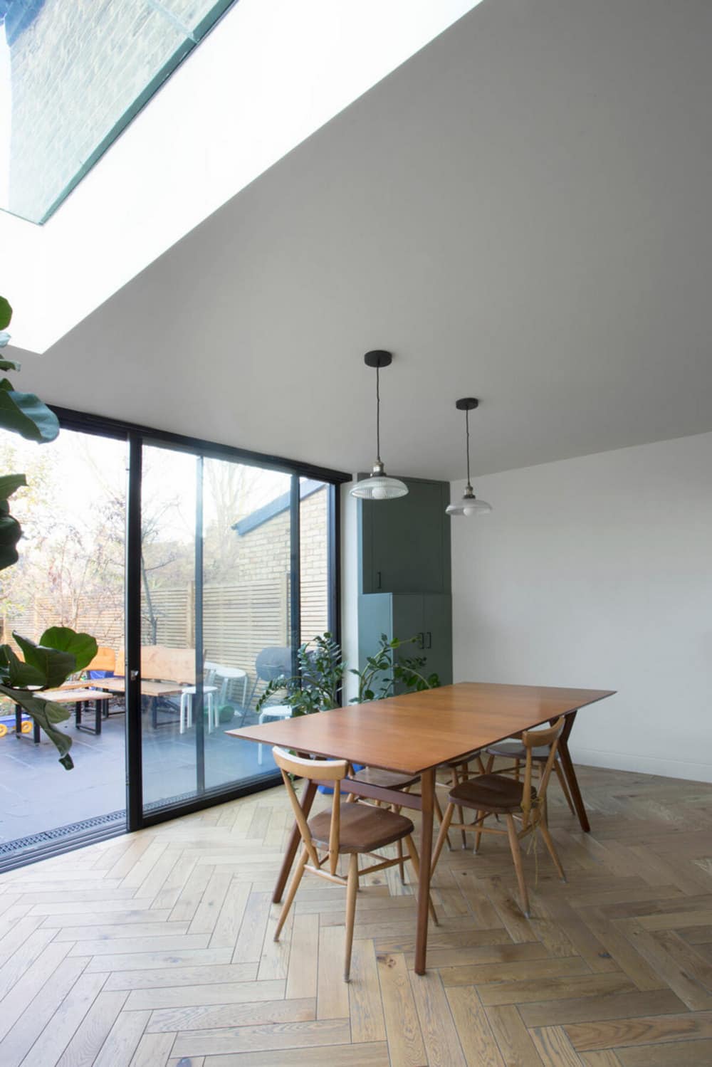
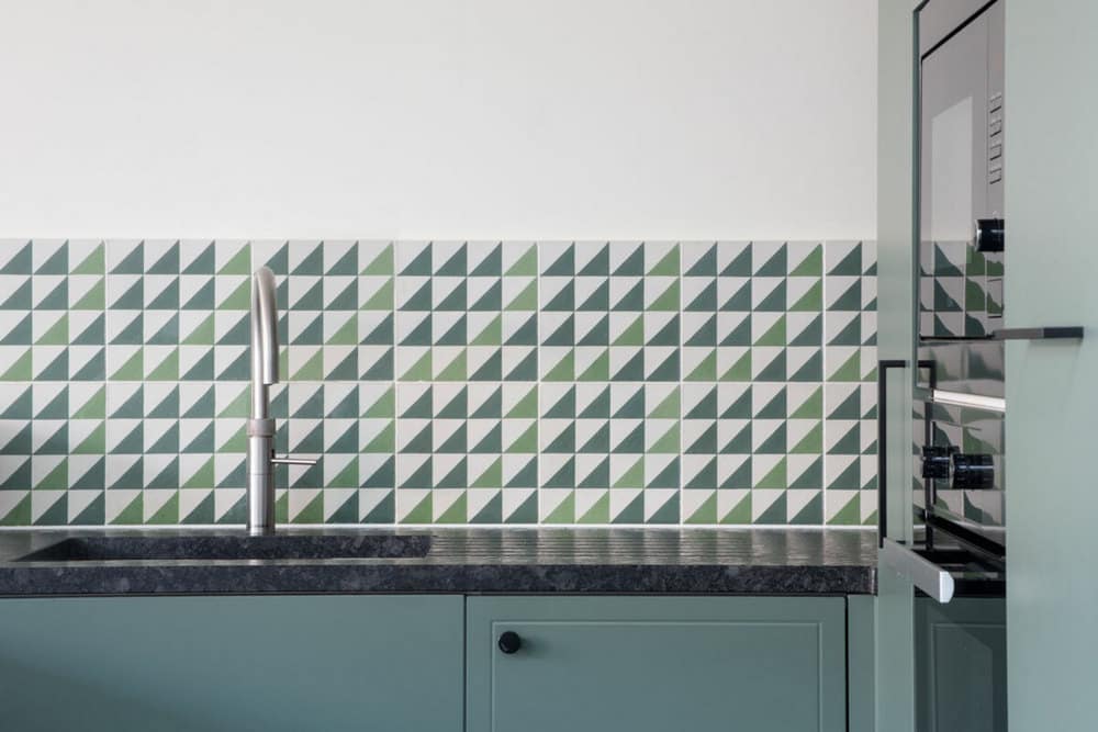
We used a neutral colour pallet for the interior, with a fresh mint green highlight, to work with the beautiful patina of the wood in the joinery and parquet flooring and connect with the views over the deep garden.
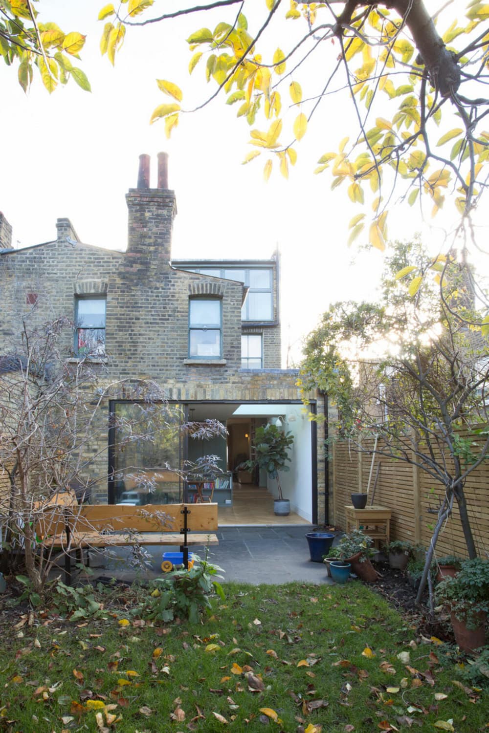
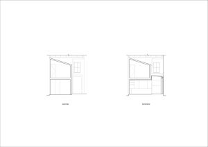
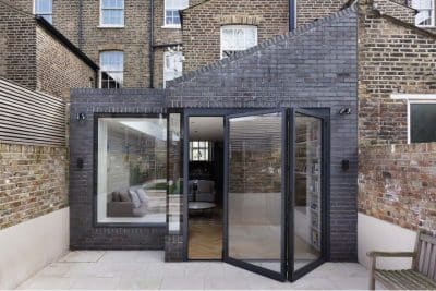
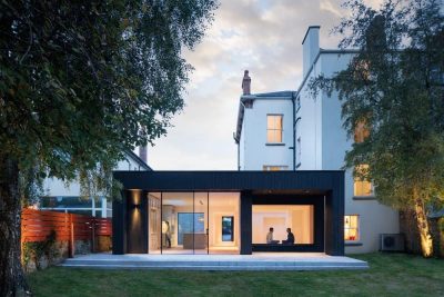
To bring a new relationship between the house and the garden, we introduced extensive glazing across the rear of the property, framing the garden and bringing in natural daylight. Additional skylights are placed at the junction of the side extension, drawing light deep into the home.
The process
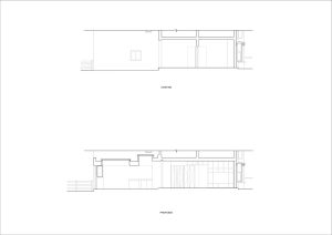
At the start of our design journey, we prepared a set of layout options revolving around the balance between storage and an open layout. It soon became clear that the clients and we aligned on the idea of a fluid open space wrapping around a generous service and storage space, placed in the middle and darkest area of the house. The services area would contain a WC, shoes and coat storage, a laundry room, and at least one unfolded buggy with accessories.
Once we had found the right concept, we worked on modelling the service area to avoid it becoming too overbearing. We all wanted the people living in the house to feel free to move., so the shape of the services area started to change while we addressed the other areas of the large open plan. Slowly, the project developed into a sequence of spaces (no doors and no corridors was one of our rules) designed by a continuous strip of joinery that guides us from the entrance to the garden. Now we had a design strategy, a concept and a programme we were all excited about! The joinery included the new kitchen, the worktop, the crockery cabinet on the back wall (with a hidden cat flap), the semi-transparent entrance bookshelf and the TV cabinet. Working with joinery allows us to play with colours, transparencies and relations. The clients chose the colour palette to match their preferred wood finish.
The planning and tendering stages were relatively smooth. We found a builder that matched the budget and the project needs; however, we had two issues to resolve before work proceeded. The first was with the neighbour, as they objected to our proposal for the side wall at the end of his garden. Our clients listened to their neighbour’s requests to solve this problem, resulting in us designing alternative finishes. Once the design was agreed upon, the client instructed the builder to consult with the neighbour at every step. As a result, the construction could finally progress swiftly.
The second issue was a global pandemic, disrupting supplies and labour. The contractor did all he could to keep the site running, at times carrying on working alone, but it was clear the agreed timeframes would not be met. The clients were very patient and incredible at juggling the complexity of moving between parents’ and friends’ places (while expecting!) and made decisions on the fly when we had to make changes to speed up the construction. With their help, the works were practically complete when their second child was born. The family are now happily settled into their home, which has given them the space to enjoy living in.

