Project: Reconstruction of the villa from 1906
Studio: Karnet architekti
Author: Michael Karnet, lead architect
Project location: Pod Pensionátem 154, 252 29 Dobřichovice, Czech Republic
Completion year: 2021
Built-up Area 136 m2
Gross Floor Area 544 m2
Photographer: Petr Polák
Courtesy of Karnet architekti
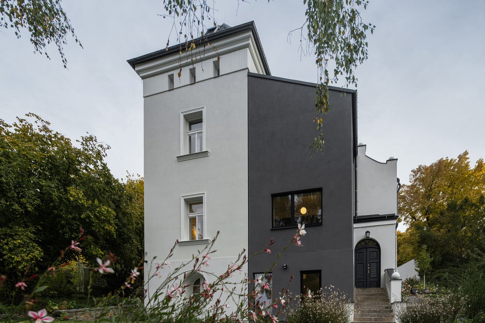
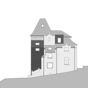
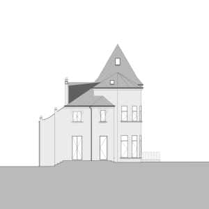
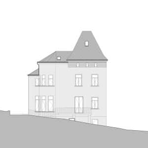
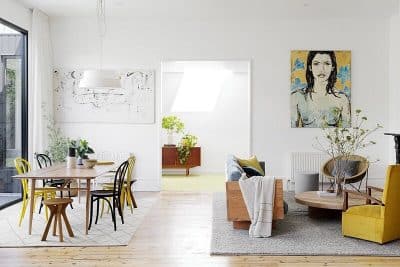
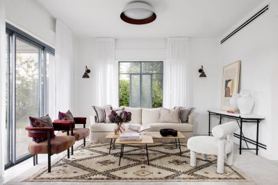
We present you modern living in a bourgeois villa. For the new owners, we design a contemporary layer, redraw floor layouts, organize the flow of spaces and tune up the combinations of materials to preserve the original elements of the villa and meet the requirements of contemporary living.
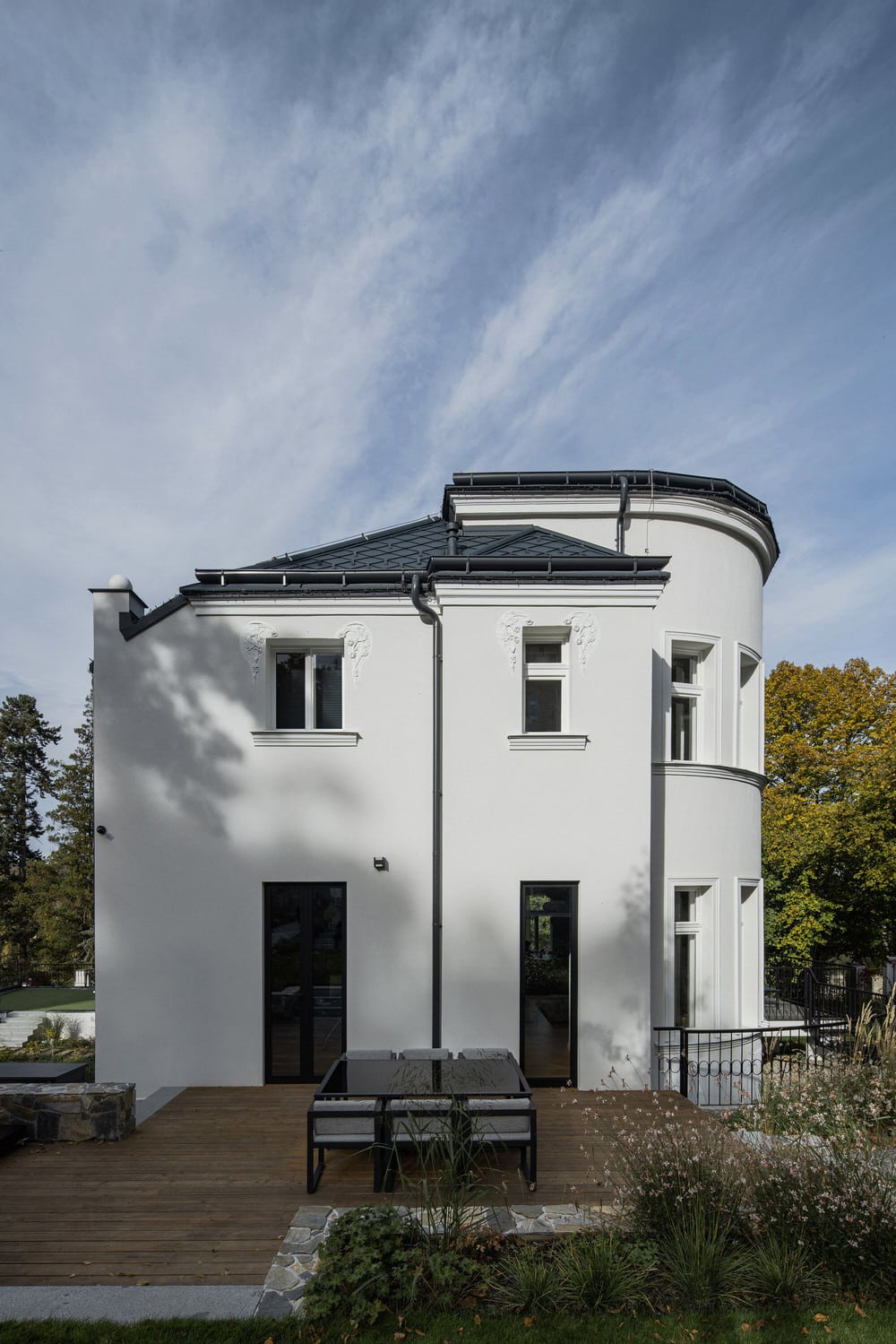
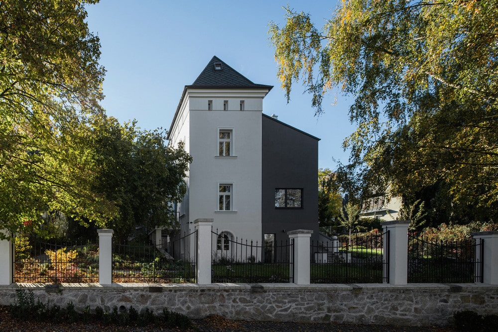
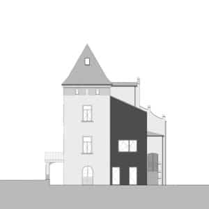
The villa’s history dates back to 1906 when the building was completed by architect Mr František Buldr. Since 1934 the villa was inhabited by the writer F. X. Šalda. In 1939, the villa went through a significant reconstruction by the design of Mr Karel Šťastný. A complete modification of the facade was carried out, including constructing a tower with a tent roof. Cast-iron railing and the entrance gate were elements, which have been preserved to this day. At the end of 2018, the villa came to our table. Due to the fact that life is different today than at the beginning of the last century, it was necessary to adapt design of the villa to fit new requirements.
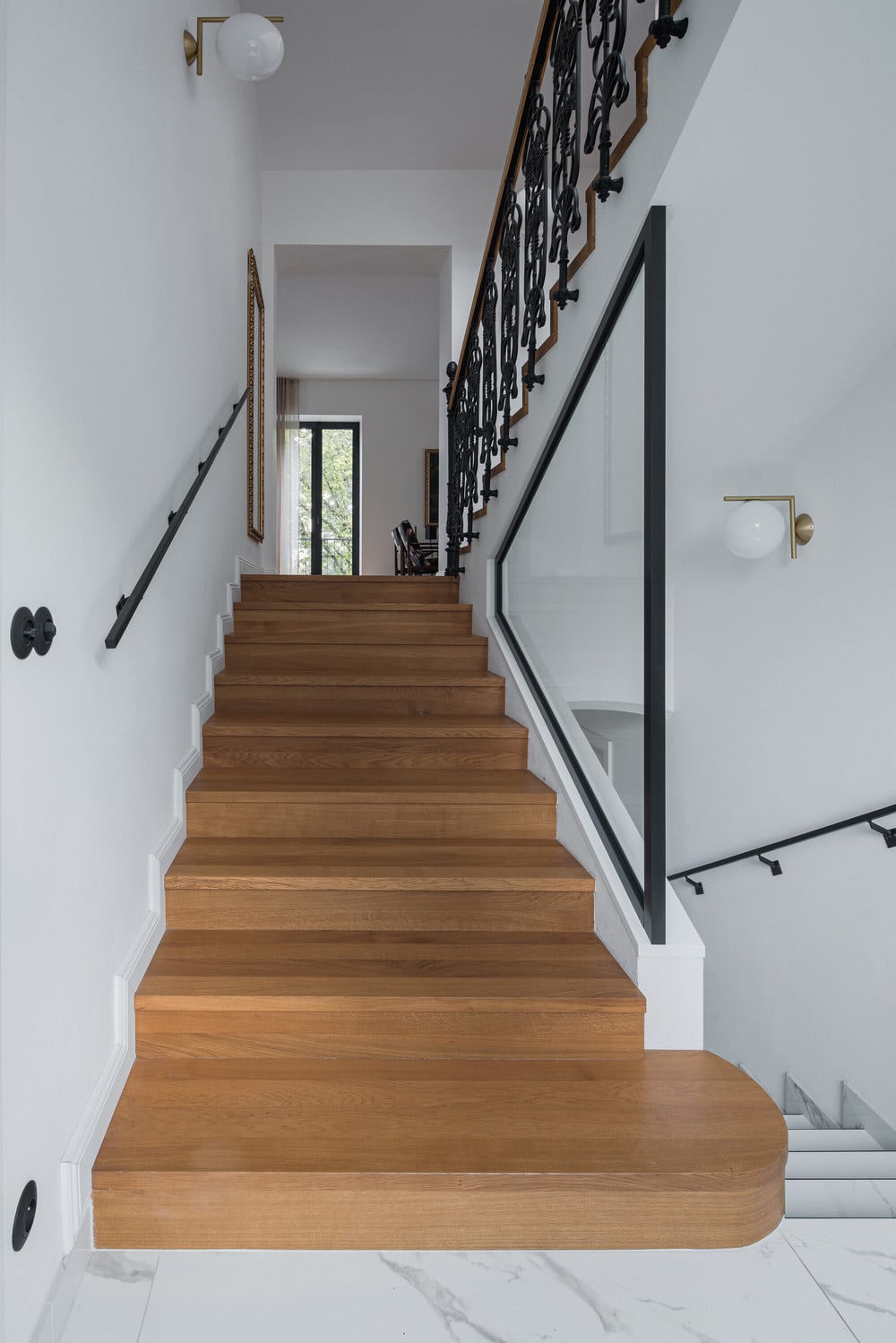
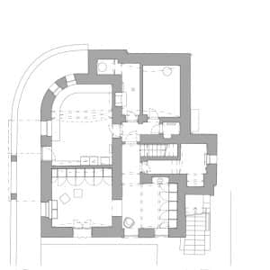
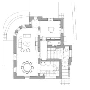
Our main goal was to differ the new from the original. An essential step for the entire designing process was to move the original main entrance to the ground floor. We gained much more space for wardrobes and shoeboxes and overall space in the entrance hall. Also, there were created associated rooms, such as an utility room or an extra cloakroom. The original layout led the entrance hall to a stair landing, which limited the storage space. But at the same time, the entrance created an authentic atmosphere and a beautiful view through the living room to the balcony. Therefore, we decided to keep the original landing as an entrance for guests. We chose materials so that everyone who enters the villa will feel its grandeur and exceptional atmosphere. Floors are tiled by marble, and its drawing seamlessly follows the walnut veneer of the built-in cabinets. Lights are kept surface-mounted due to the low ceiling. Thin rays of light pervade from behind the wardrobes, highlighting the contrast of the new with the original.
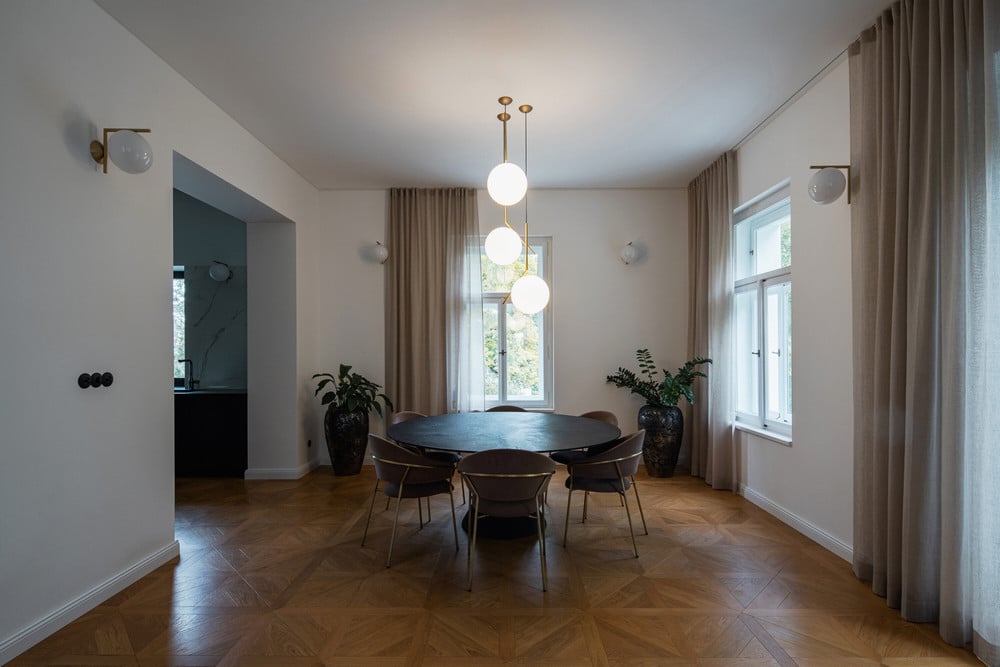
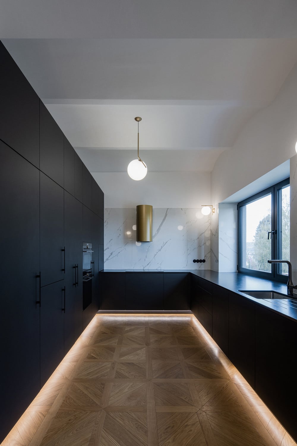
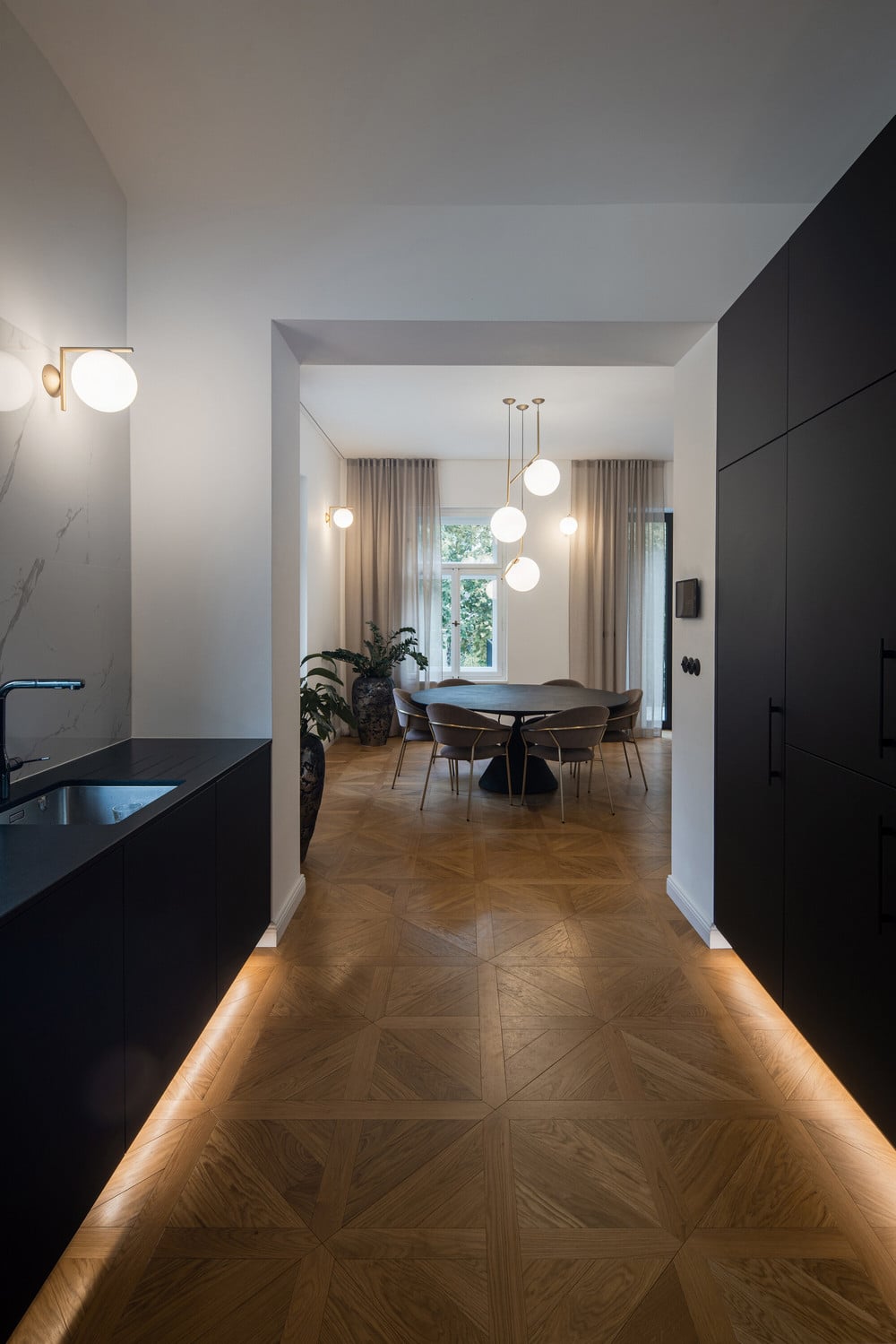
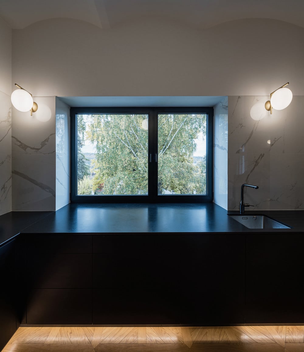
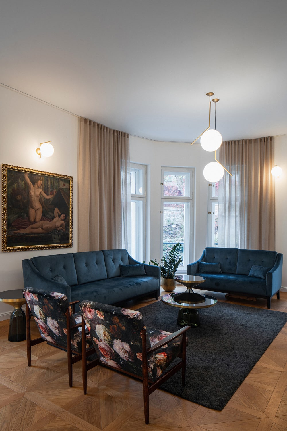
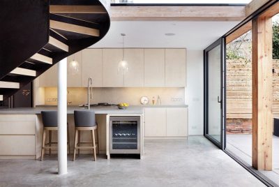
We oriented the kitchen on the first floor to the north, while the new large window provides a view of the valley and the entrance gate. The owner’s wife has an overview of arriving guests, and thanks to a smart tablet, she may unlock the entrance and turn the lights on. The whole storey is made of wooden cassettes folded into a Viennese cross. The lights are hung in a cluster, and the curtains merge from the ceiling to the floor to emphasize the height of the room.
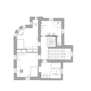
On the second floor, there are children’s rooms with a master bathroom. Due to the fact that, we had to place them on the same storey, meant to convert the original terrace into a new room. This intervention in the original solution gave rise to a whole new contrast mass. At the same time, it simplified and unified the original, very fragmented and complicated house layout.
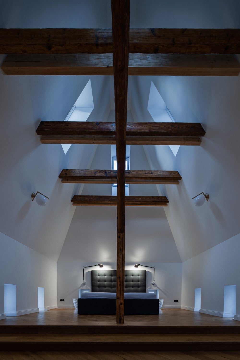
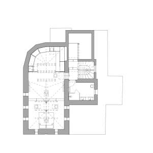
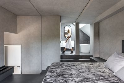
On the third floor, you will find a master bedroom with a bathroom and dressing room. The ceremonial atmosphere breathes from this space. You come to the bedroom by a steep black staircase, walk through a passage under the rafters, and suddenly a whole tower opens up in front of you. Right below the top of the tower is the original wooden podium, where is the bed now. We left collets and columns visibly on purpose. There are twelve windows in the tower, which bring a sufficient amount of light into the space. At the same time, they are set in such a way as to protect the bedroom from the unwanted attention.
We tried to keep the maximum of the original details. We designed replicas of wooden casement windows for the openings, which remained in their original form. The railing posts were cast into moulds created according to a preserved sample. Despite the objections of all participants, including the owner, we have kept the facade friezes, which are a characteristic authentic element of the building. In maximum contrast to these original elements, we designed modern interventions to meet the requirements of contemporary living without functional compromises. In addition, we also fulfilled the owner’s hobby in smart home technologies.
Materials
walnut veneer – atypical furniture according to the author’s design
marble tiles – underground floor, bathrooms
wooden floor – first, second, third floor
cast iron railings – staircase
aluminium windows
casement windows
Products and Brands
dining chairs Jazz — Pedrali\www.pedrali.com
dining table Clay — Desalto\www.desalto.it
wooden floors — Extori\www.extori.cz
sidetables Bell — Classicon\www.classicon.com
electrical switches and sockets 1930 — Hager\www.hager.cz
kitchen hood — Sirius\www.digestoresirius.cz
roof — Prefa\www.prefa.com
lights ICT — Flos\www.flos.com

