Project: Croft Lodge Studio / XVII Century Cottage
Architects: Kate Darby Architects and David Connor Design
Location: Leominster, Herefordshire, United Kingdom
Area: 115 sqm
Photography: James Morris
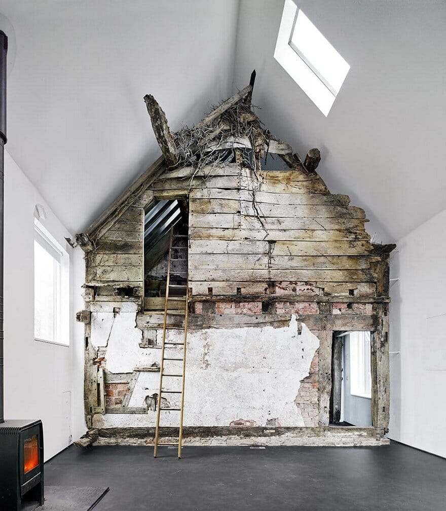
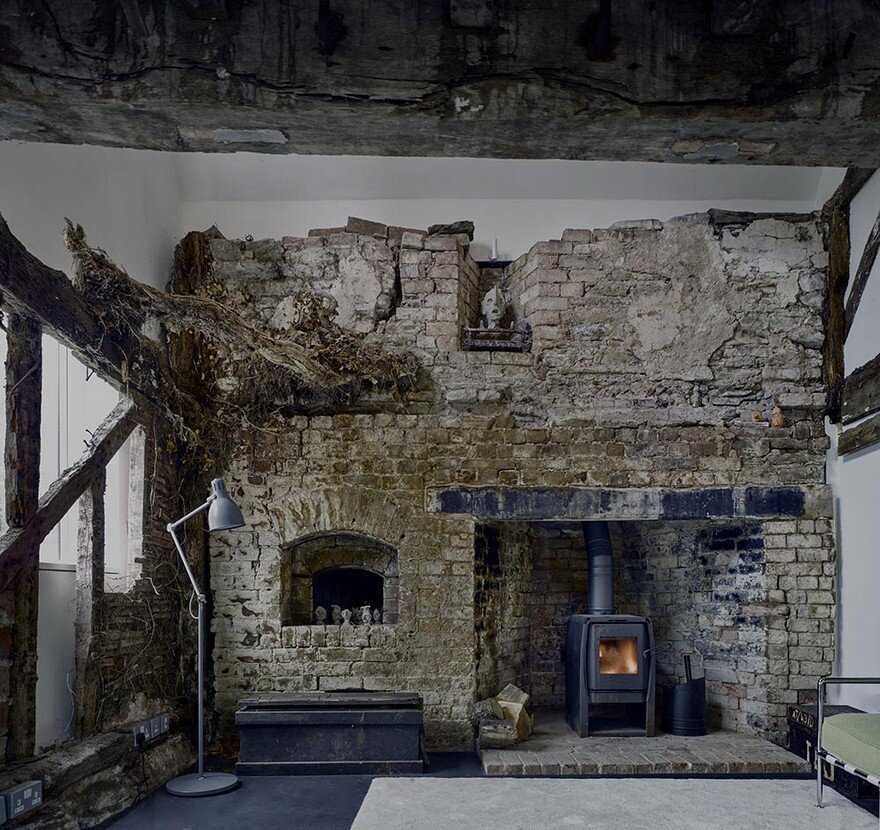
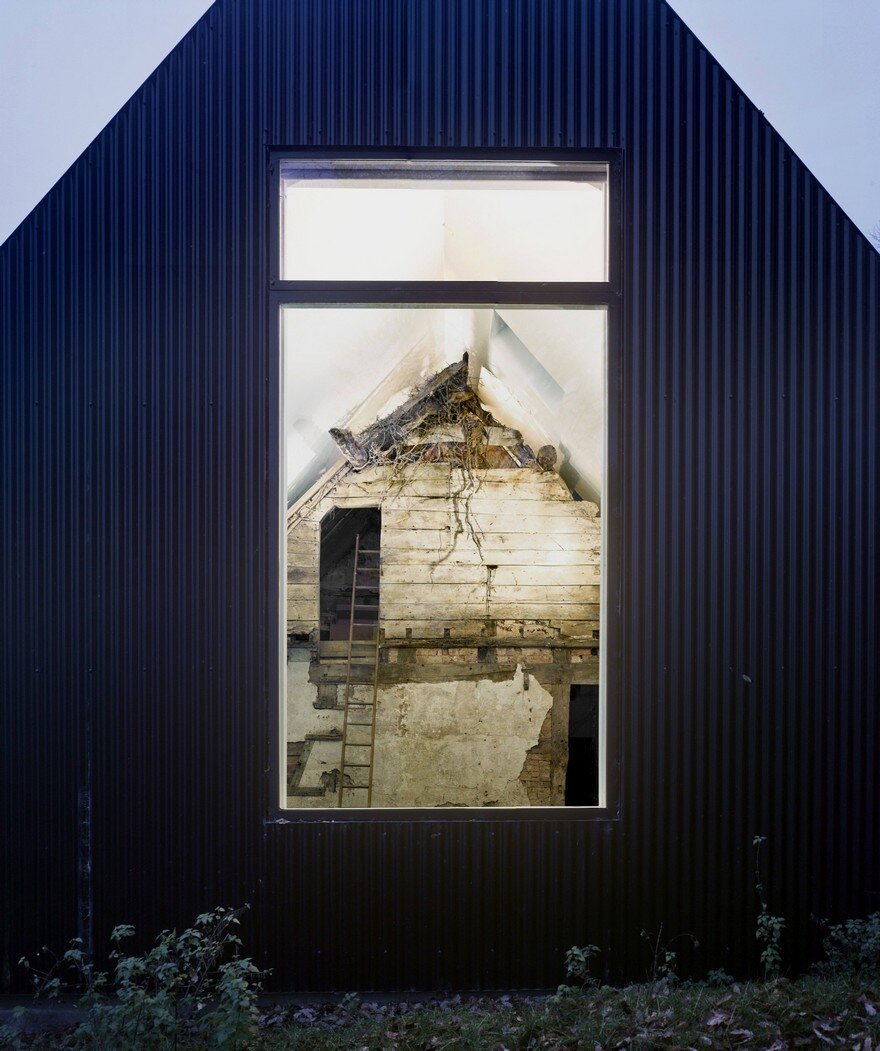
The Croft Lodge Studio is a striking and imaginative project full of small delights and skilful solutions. The decision to encapsulate the remains of the 17th century cottage with almost everything left intact, including the dry ivy branches and the trimmings, in a modern house is both bold and brave and is successfully carried out by the project team.
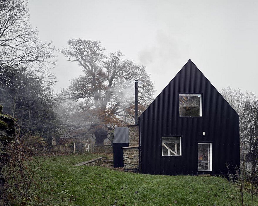
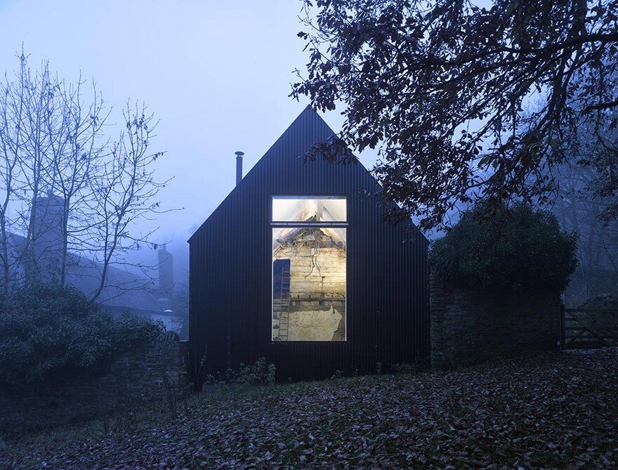
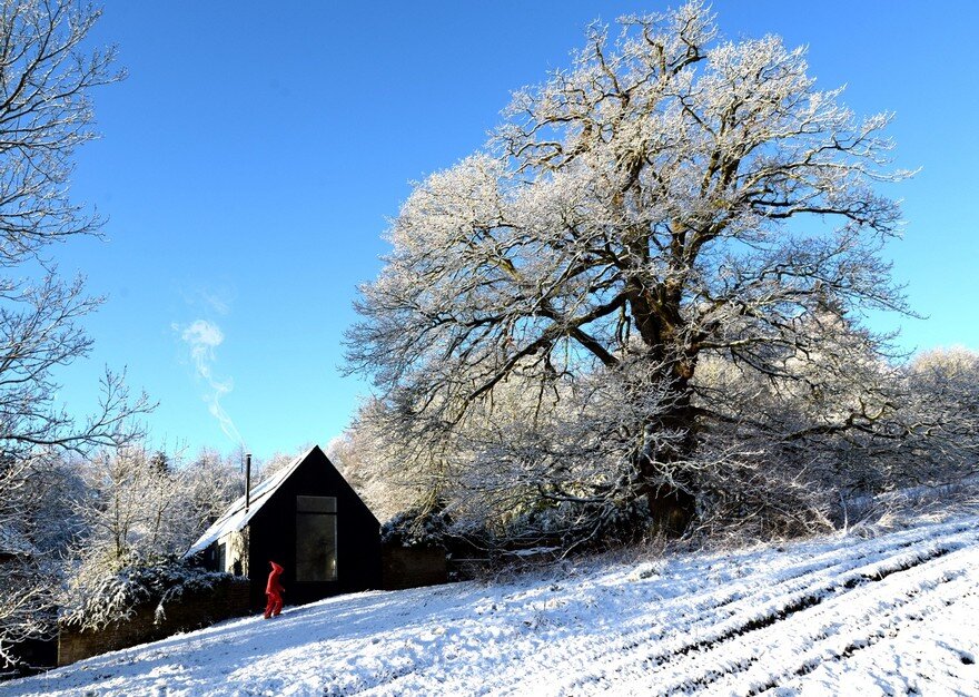
In part hidden behind Tolkien-scale giant trees, the building is the complete opposite of a Hansel and Gretel gingerbread house – not one jot of pastoral sweetness or prettiness. As a minimalist black box clad in corrugated metal with large clear openings, it is a photographic negative of its vernacular neighbours. Nevertheless, it sits really well within its surroundings and the site topography, principally by following the scale and form of the adjacent family home.
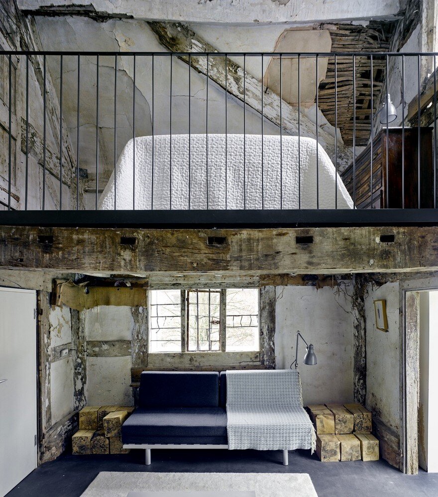
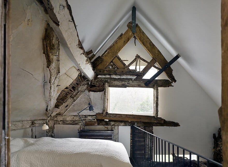
The composition of the façade is well-balanced and is driven by the location of the original timber structures behind and the functionality of the studio rather than random pattern-making. Once inside, the spaces are surprisingly welcoming and comfortable, contrary to an original concern that the preservation of the badly dilapidated old structure would make the interior too precious and stiff. The old parts add richness and an element of theatre and poetry to the interior but do not dominate it. The new building wraps around the old house with care and imagination and has merits of its own including an airy studio space with beautiful views and a quality of light and details.
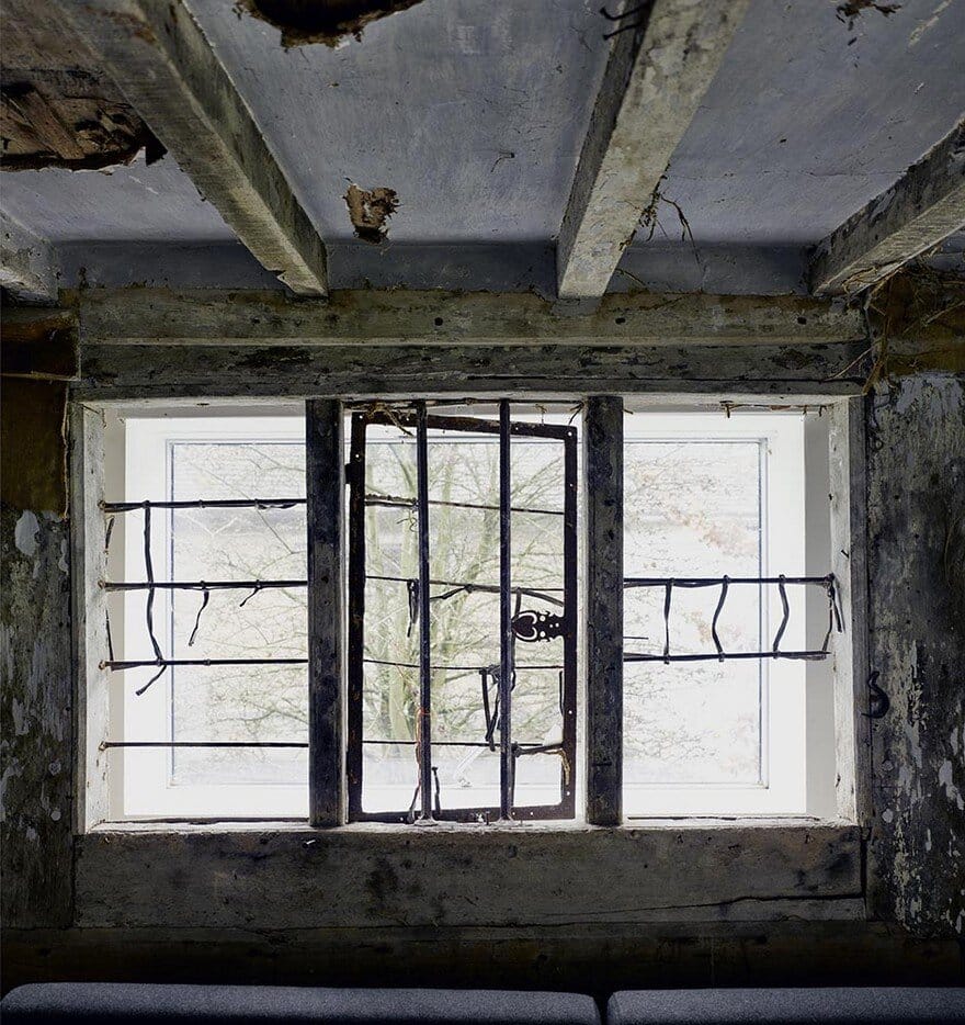
The contrast between the heavy texture of the old house and the simplicity of the new is very enjoyable. The project demonstrates architectural confidence and maturity. The take on conservation is unusual and challenging and its bluntness might be questioned by some but overall, it is stimulating and intriguing. Little discoveries such as original joiner’s timber marks next to the pencil notes and calculations left by the new builders create a beautiful dialogue between the past and the present.
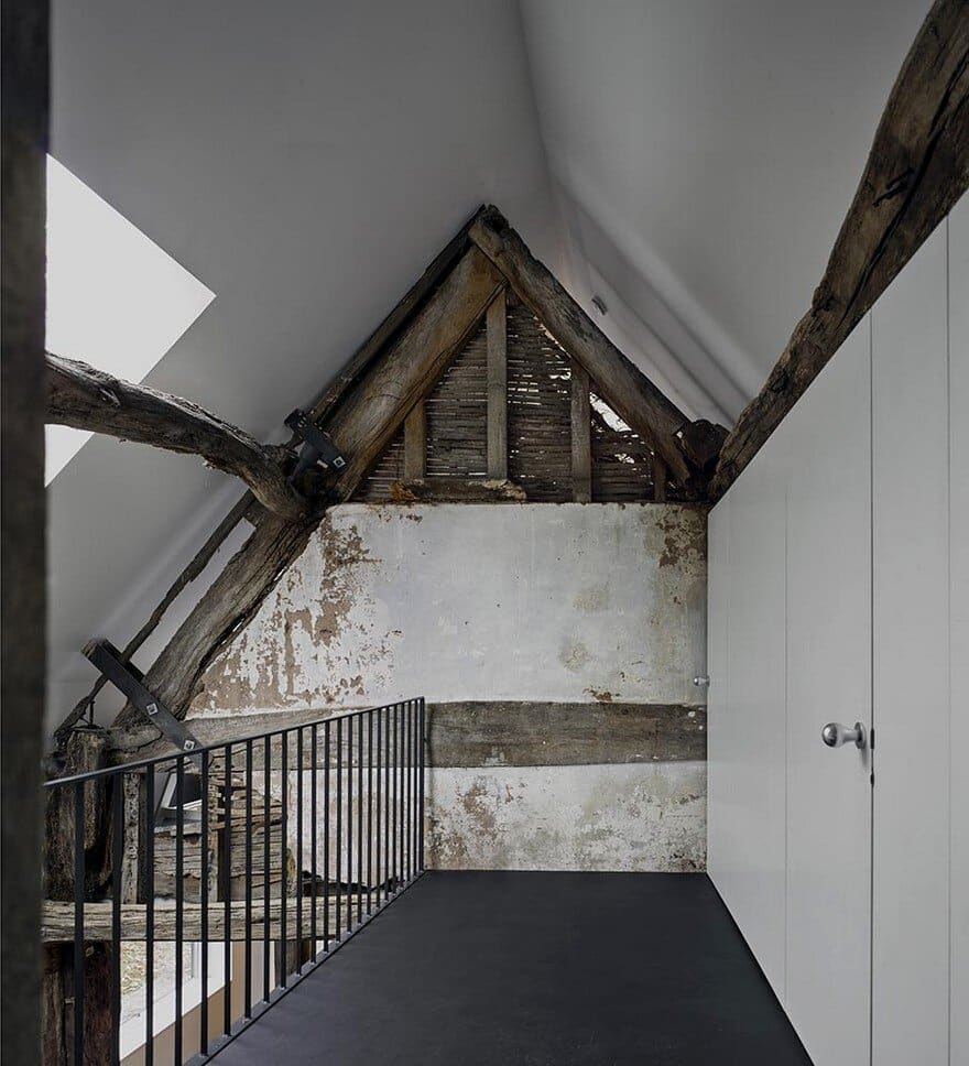
The minimalist steel balustrades are both beautiful and appropriate, while no doubt presenting challenges to local suppliers and building control. Storage and toilets are tactfully hidden behind simple white panels. Indeed, the architects have actively sourced local products and deliberately employed local builders, even though they may be more familiar with big agricultural sheds rather than shadow gaps and silicone joints, to stimulate a diversity of construction skills and trades in the area.
A sustainable approach is applied not only to the local employment but also to the design of the building fabric itself, as much as possible. A well-insulated external envelope, natural ventilation, a stove-heated interior, an array of photovoltaic panels and a self-invented water heating system running along the roof under black metal panels all contribute to a reduction in energy use without breaking the budget.

