Project name: Return Restaurant
Location: Haicang District, Xiamen, China
Area: 250 square meters
Design scope: interior design
Design firm: Return
Completion time: 2021
Photography: Xu Yiwen
Text: Atong
Main materials: paint (Man Qing Xi Se), tile (Jianghong Space), wooden veneer (Fanpin)
Lighting design: Bobbi
Living in the urban concrete jungle, we yearn for ocean and have portrayed different versions of underwater worlds. The sea is abstract yet concrete, stimulating infinite imagination. It’s like a metaphor, connecting with our emotional perception as architecture does.
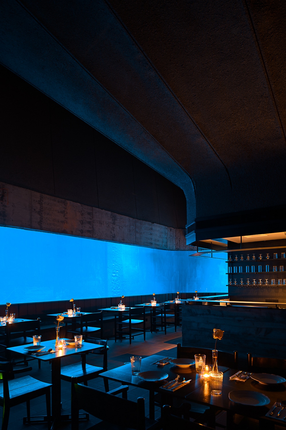
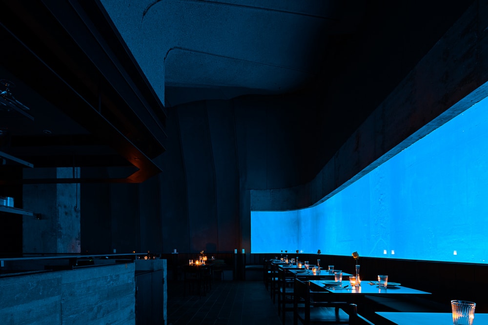
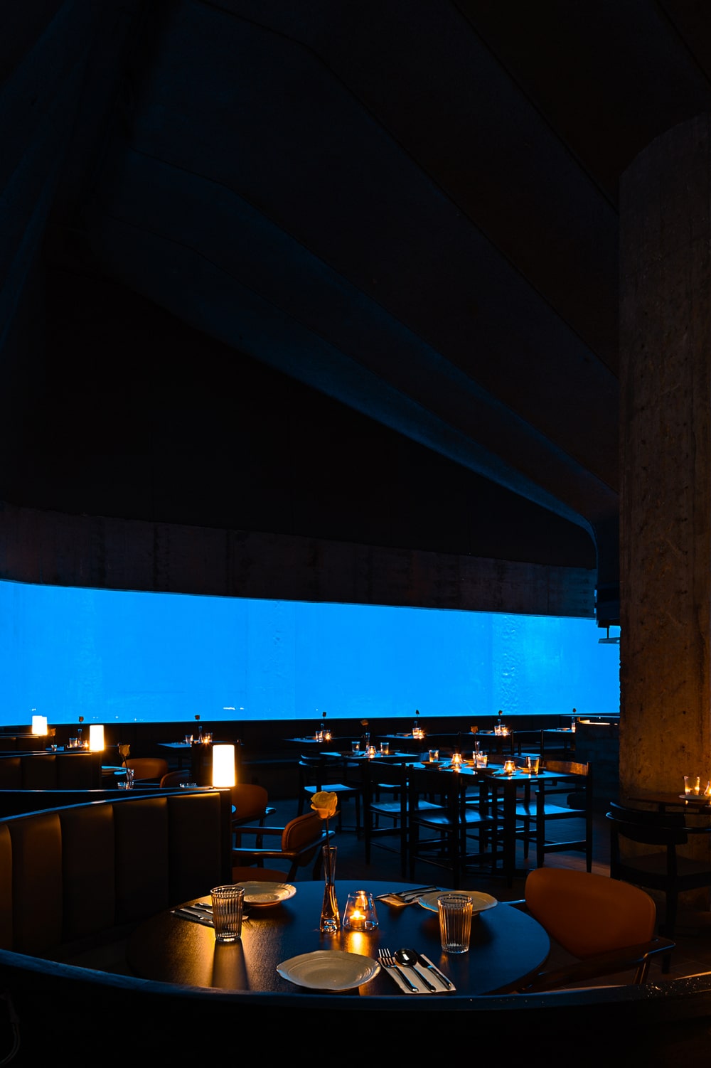
The endless coastlines in the earth divide two totally different worlds between reality and imagination. As approaching this restaurant space, the design team brought in a large area of blue as the highlighted visual element. It’s like an invitation that the sea sends to people, conveying calmness and restraint under the dynamic ocean surface.
The overall spatial expression is intended to invite people to “slow down and stop for a rest”.
In this underground space, the design team wanted to create a dining environment that naturally trigger emotional reactions. The combination of visual elements, local context and architectural space brings unique experience. This is an imagined space where sea flows, and a place which reflects daily life.
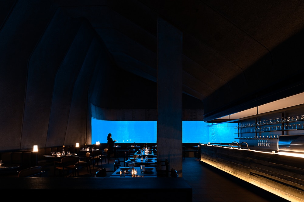
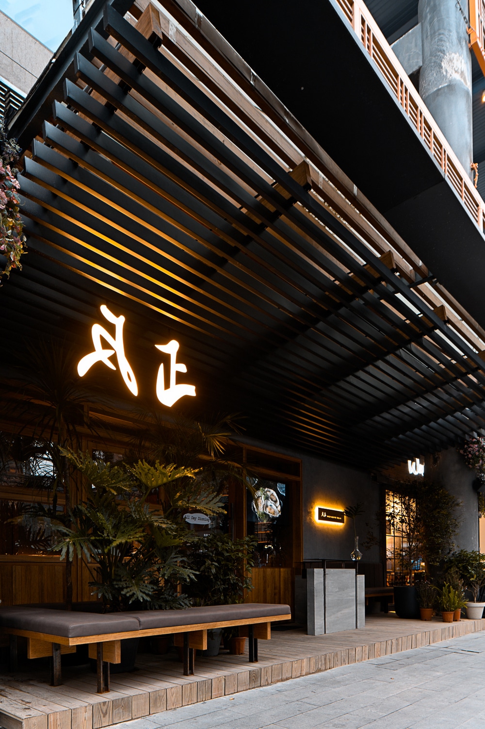
The Return restaurant is located in the first underground floor in a shopping mall, and it has an independent entrance. The space was formerly an aquarium. The original cast walls and structural beams, columns formed a large, dark underground hollow space.
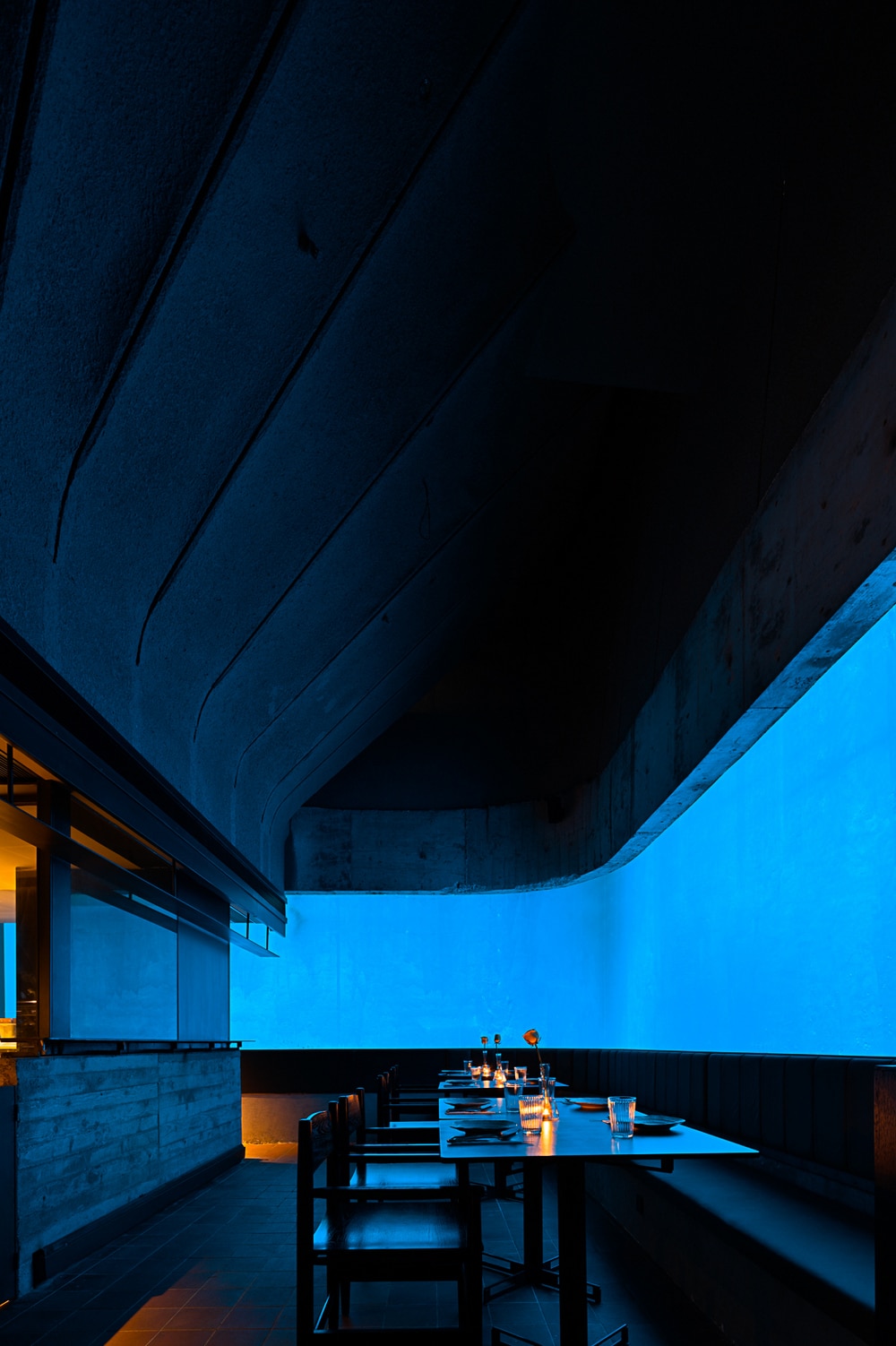
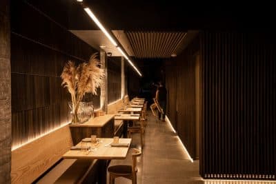
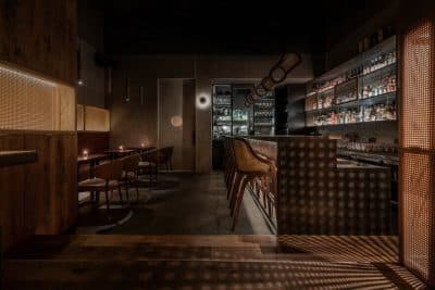
After site investigation, the designers decided to retain the existing temperature and textures of this underground space, dismantle the decorative components on the surface, and maintain the two existing large fish tanks. The team intended to create a deep sea-like natural, mysterious, pure, stifling and calming atmosphere. Here, the diners can experience ocean and feel like they’re surrounded by it.
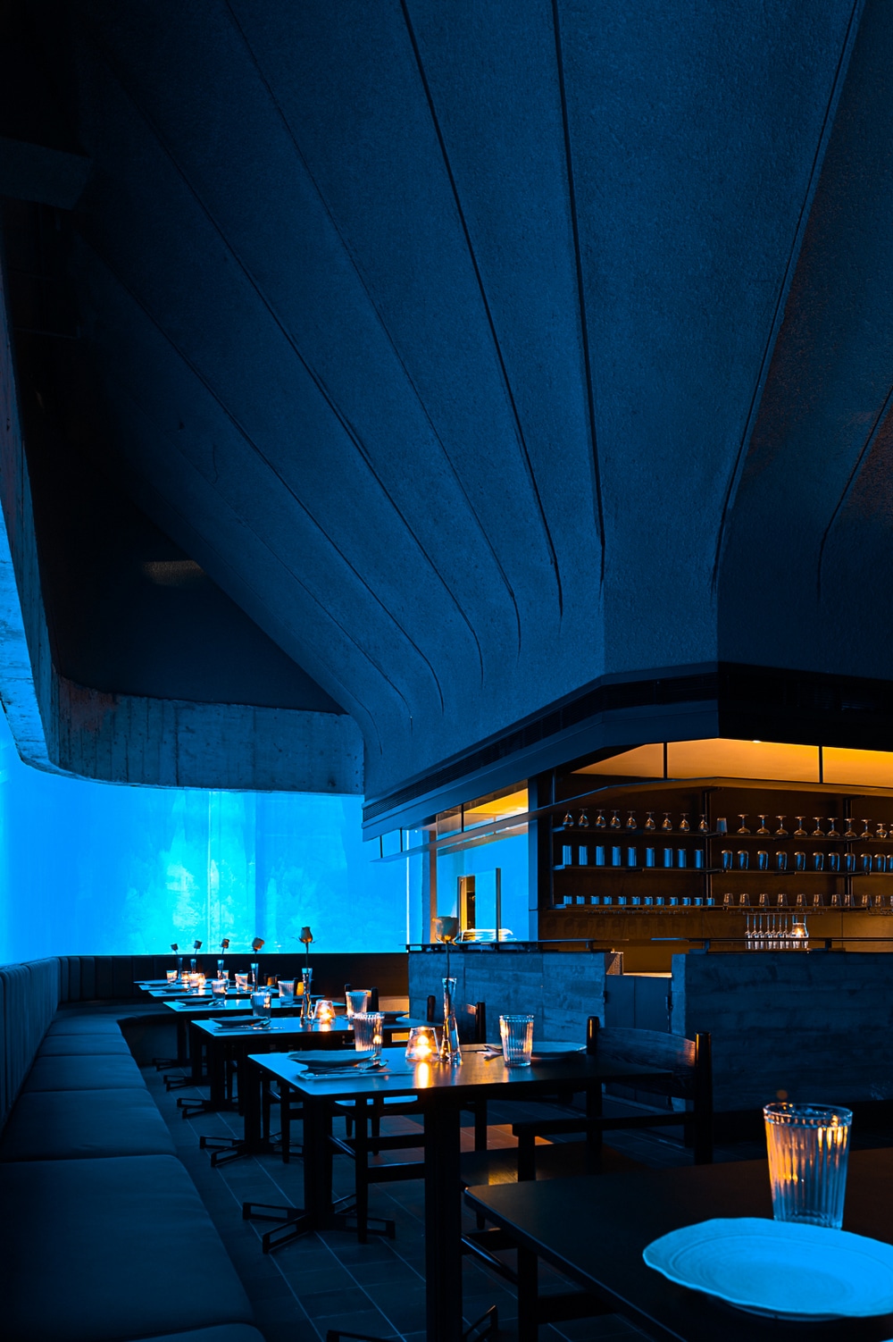
The bar counter is the center of this rectangular space. Apart from the water tanks, it’s the only main light source in the space. Filled with dim and warm light, it’s hoped to be the guests’ company for resisting the feeling of loneliness in the “deep sea”. The top of the bar counter extends upwards, and connects to the ceiling and interior facades, forming a curved structure. The structure creates a primitive cave-like space, where only a part of the “cave wall” is exposed. The more inside area where light doesn’t reach is almost in empty darkness.
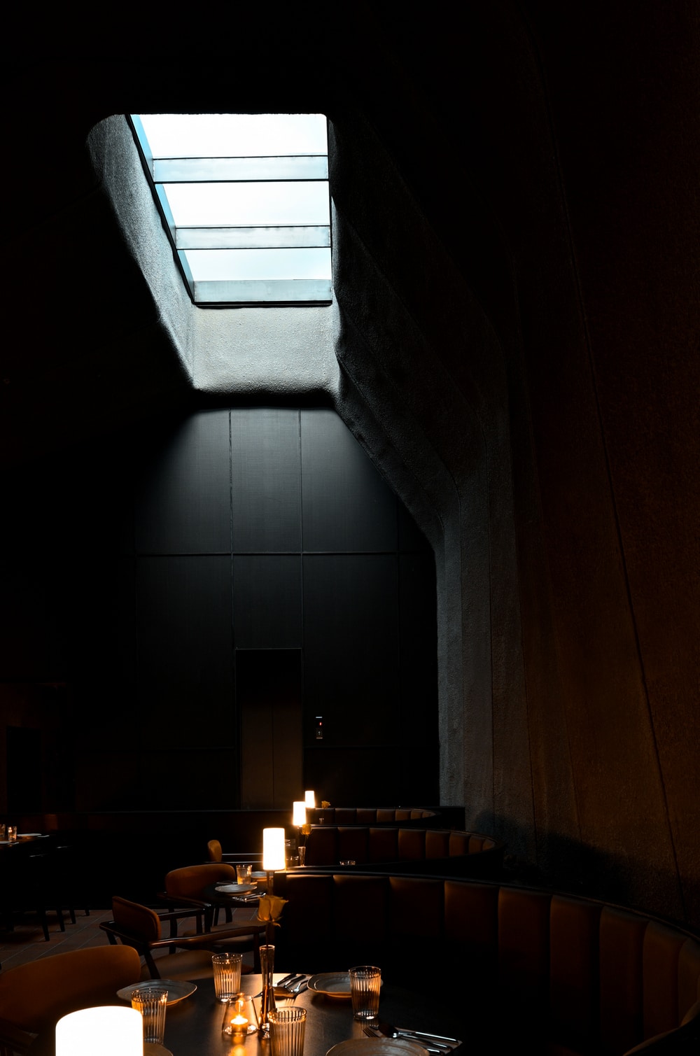
The design team created a skylight on the top, so that natural light can filter in through the entrance on the ground floor, thus strengthening the three-dimension effect of the space. It offers intriguing visual experience as diners look upwards. The space is full of bold imagination about ocean.
The exposed rocks form the structural textures, revealing calmness and restraint. The structural textures connect rational spatial order with an ocean-like ambience where humanity and divinity coexist.

