Project: Remember House / four-story San Francisco Home
Architects: Edmonds + Lee Architects
Location: San Francisco, California, United States
Photography: Joe Fletcher
Text by Edmonds + Lee Architects
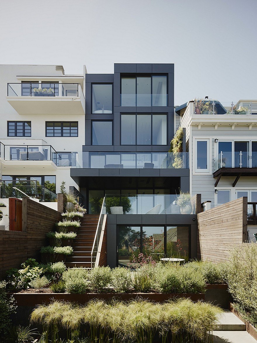
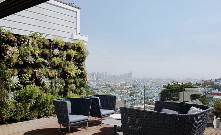
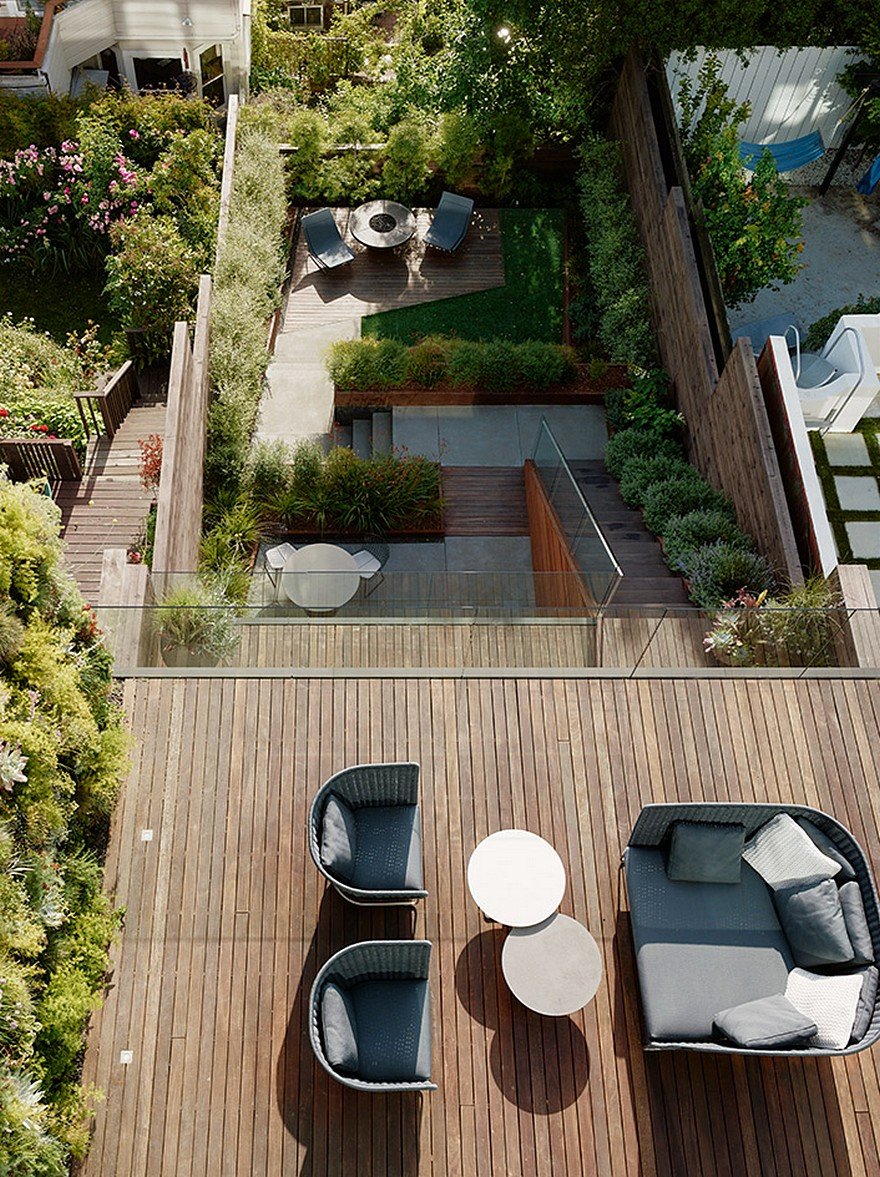
For this four-story family residence, the architects experimented with vertical circulation and crisp white materiality to create a spacious, vibrant, and geometrically engaging house. Organized around a singular central spine, the project is an exploration of fluid continuity and volumetric adventure. On a down-sloping hillside parcel of land in San Francisco’s Noe Valley sits this four-story project that embraces vertical stacking and crisp materiality for a tightly-knit family unit of three.
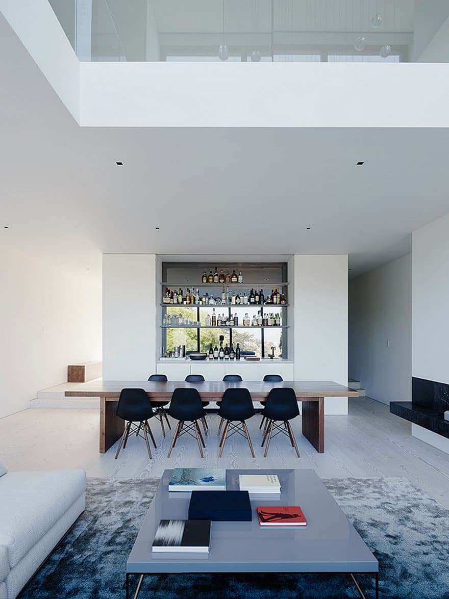
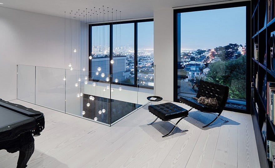
Four-story massing usually leads to a space that feels tight or repetitive, so the architects worked to make the vertical circulation both evocative and valuable, forgoing the pancake-style San Francisco home, and instead opening the house in section, maximizing a feeling of spaciousness and a sense of architectural adventure. That meant a small sacrifice in terms of physically usable space, but a huge gain in terms of enjoyable architecture. Double-height spaces and a staircase centered within the central spine of the house encourage the clients and their visitors to engage with each level.
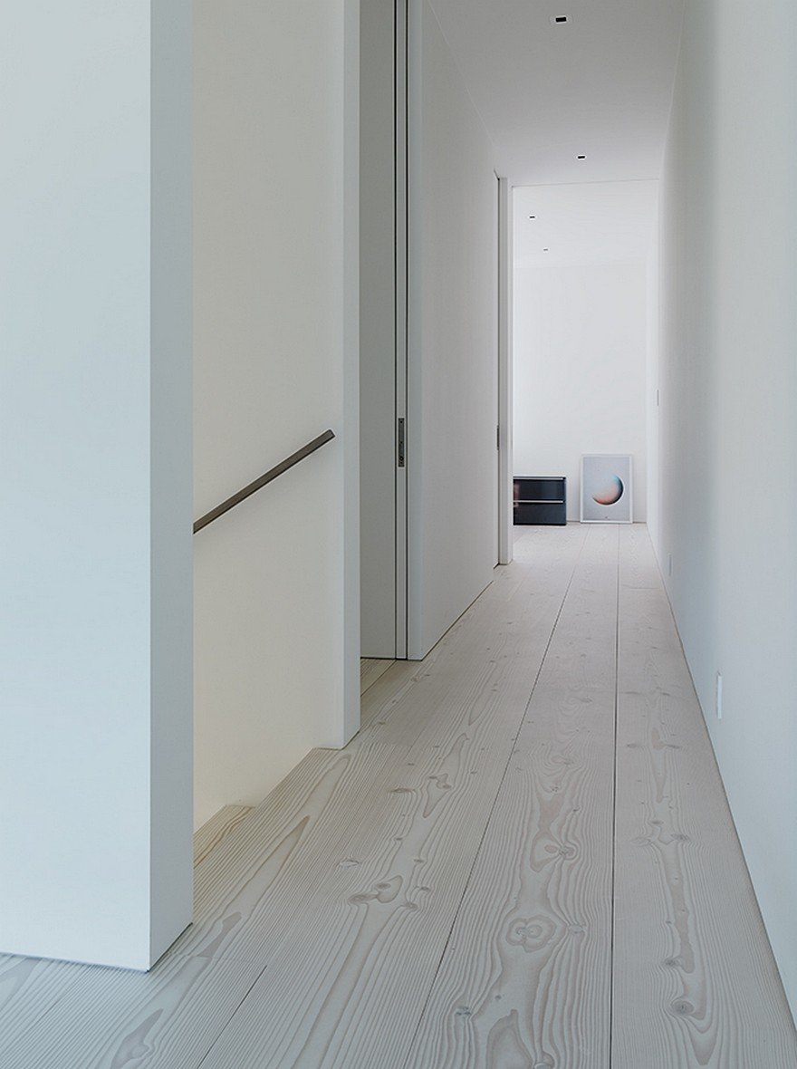
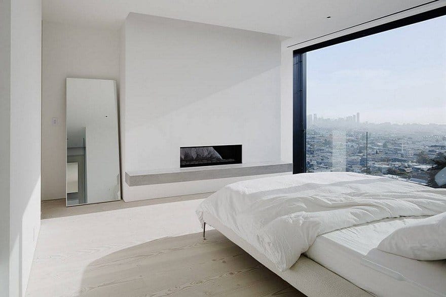
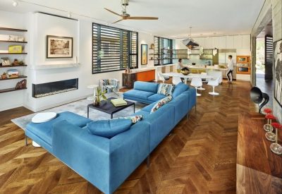
On the interior, the architects started with materiality first, working within the inherited geometry of the project, and from an all-white palette that began with the very first design choice, white Douglas fir floors from Dinesen. Because of the clients’ general aesthetic focus—on white, spare, minimalism—and their enthusiasm for treating interiors the same way Edmonds + Lee do: like galleries or museums where the main visual interest pops from the decor, the art, and the furniture.
The architects explore how a house could operate similarly to a gallery, as a neutral canvas – and that neutral canvas became seamless, with spaces that flow from end to end, and with a continuity of materials that favor fluid transitions over the sharp disconnects so often found in modernist projects.
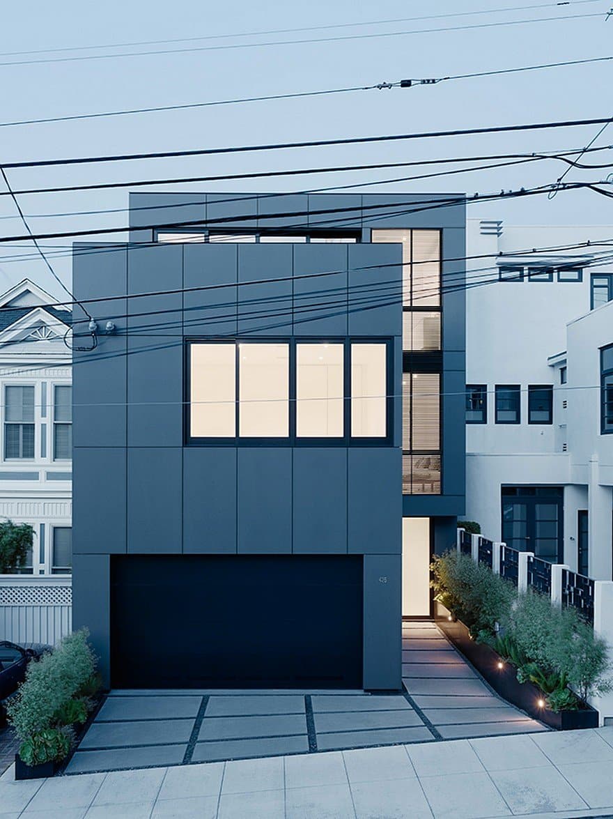
The sharpest moment is in the choice of exterior palette. Because the project was a renovation that required working within existing bones and an existing ground parcel, the street-side massing needed to remain consistent. Offering a counterpoint to the interior’s spreading white-ness, and to the two neighboring houses, both of which are white, the architects chose to wrap the front in a dark cladding, differentiating the house from its neighbors and also from what it contains.
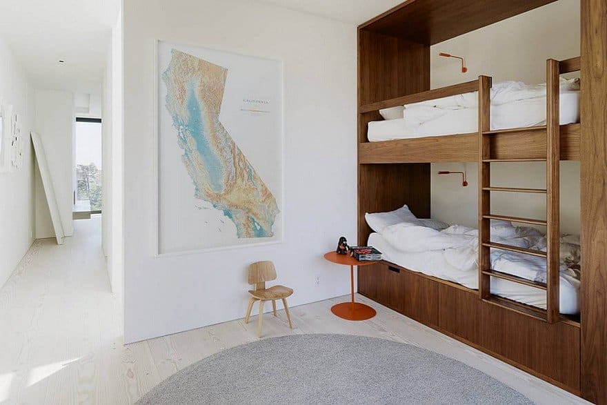
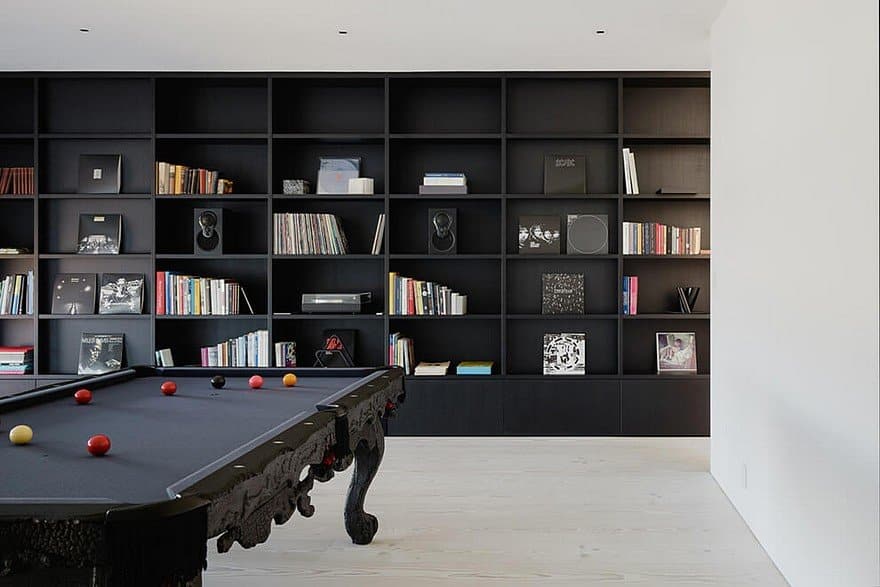
The architects also designed the interior furnishings, working with an ongoing notion of seamlessness all the way though the project. Working on a schematic level, the architects thought about materiality and space, (the big ideas of capital-A Architecture), but also furniture and interior design.
Their aesthetic focus explored everything from the greatest mass to the smallest detail – which allowed for a precise and vibrant spatial, material, and architectural choreography, like the sliding doors, for which the architects introduced a large window frame to bring a sense of solidity, history, and heft, or those Douglas fir floorboards, two-inch thick pieces of wood that create what the designers and clients see as an incredibly haptic experience.

