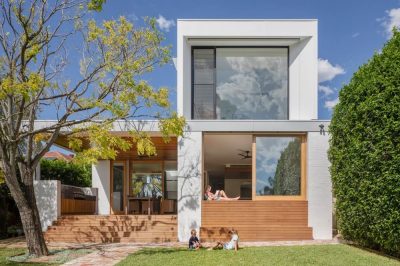
Project: Sandringham House
Architects: Techne Architecture + Interior Design
Interior design: Doherty Design Studio
Area: 83 sqm
Location: Sandringham, Melbourne, Australia
Photographs: Derek Swalwell
Modernization and extension of Sandringham house is the result of collaboration between Techne Architecture + Interior Design and Doherty Design Studio.
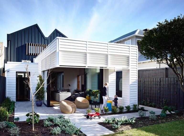
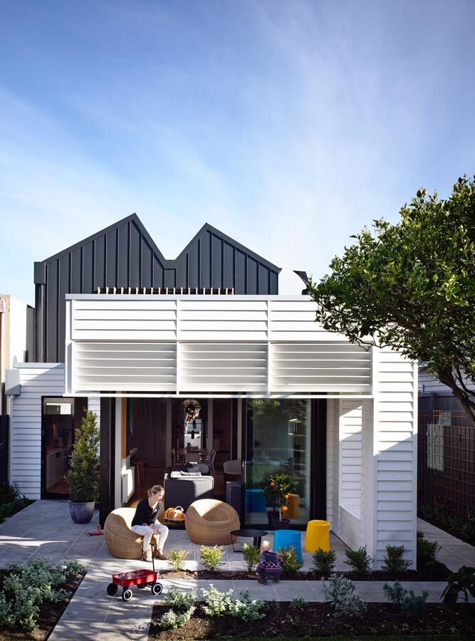
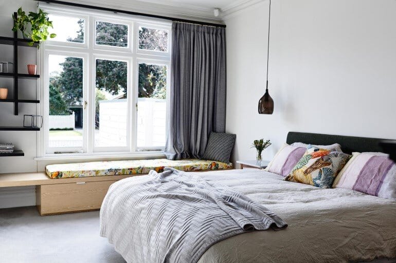
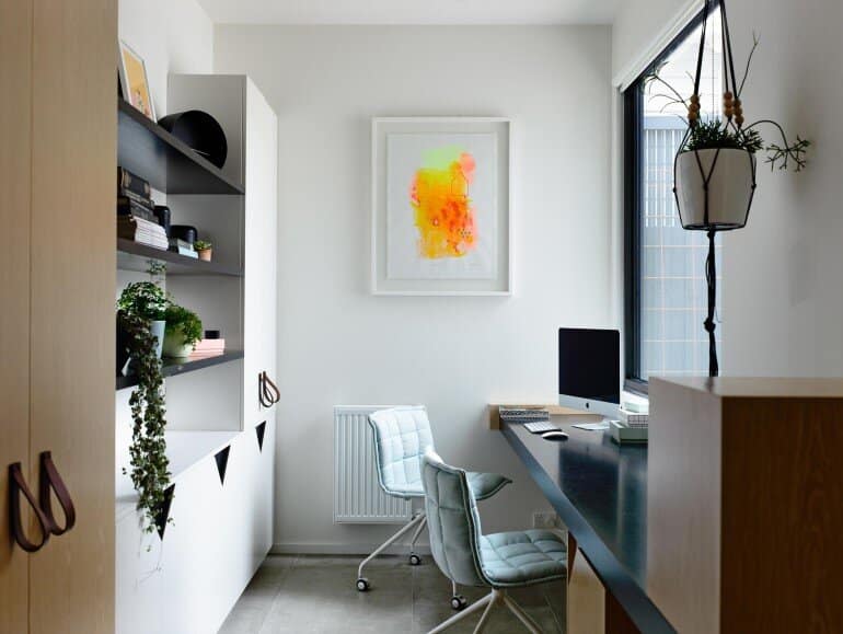
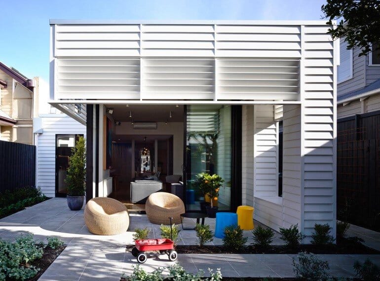
The brief from the client was to convert the double-fronted weatherboard into a fun, energetic home with more space and lots of colour that enabled the growing family to remain in their home for years to come. The renovation extended the existing home to include 4 bedrooms, a study and open-plan living area.
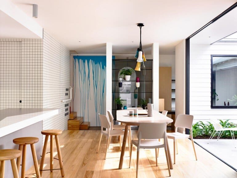
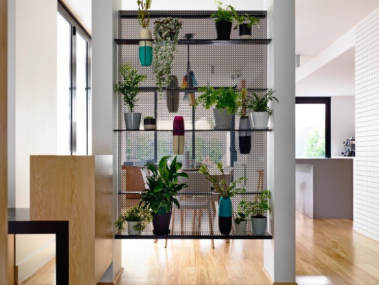
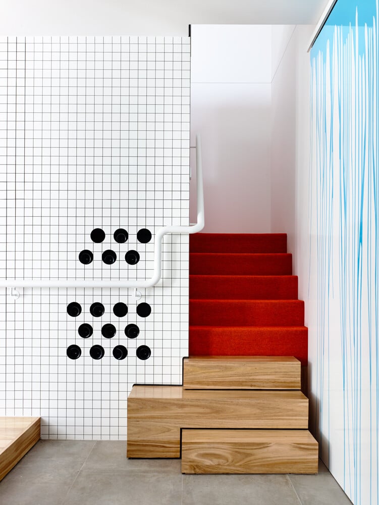
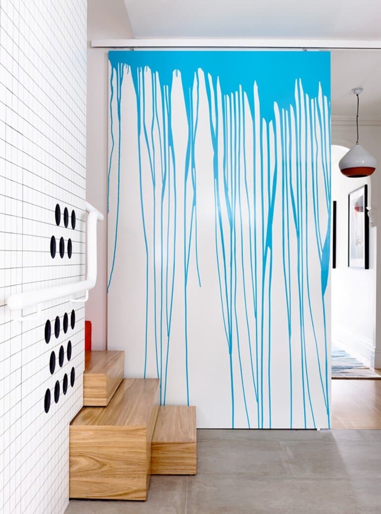
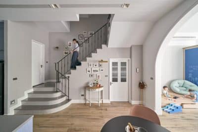
The two areas – original front and new extension – are separated by a perforated black folded screen that acts as not only a visual separation, but also an interesting feature. Cutouts in the screen are designed specifically for colourful Dinosaur Design vases. A mid-grey tile separates and defines the step up from old to new, while three irregular sized box-like timber steps lead to the upstairs, then solid messmate flooring flows through the new extension.
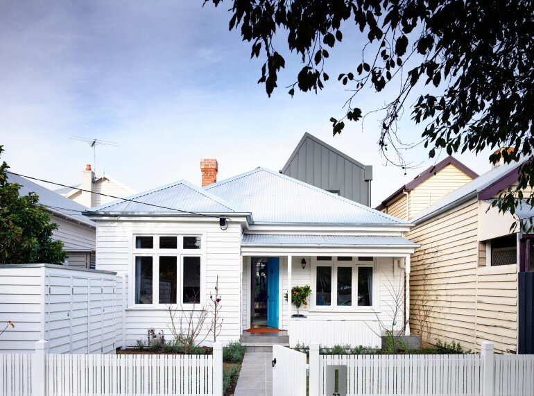
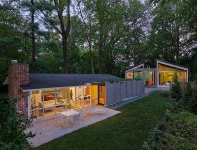
High rear windows are shielded by fixed louvres that continue the rhythm of the weatherboards. Paying respect to the original facade and surrounding streetscape was crucial, with only a touch of metal cladding visible from the street.
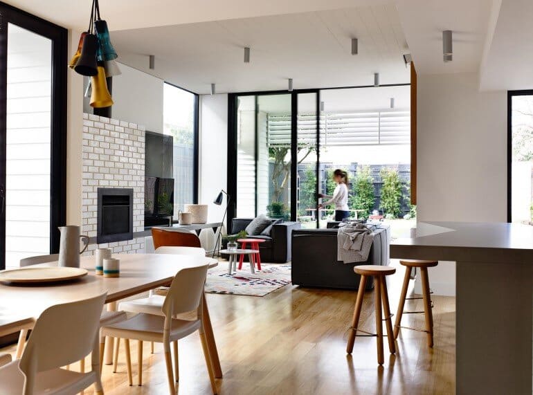
The inspiration for the interior design was to reflect a simple, utilitarian aesthetic that plays with materiality and bold graphic shapes in robust finishes injected with strong blocks of colour.
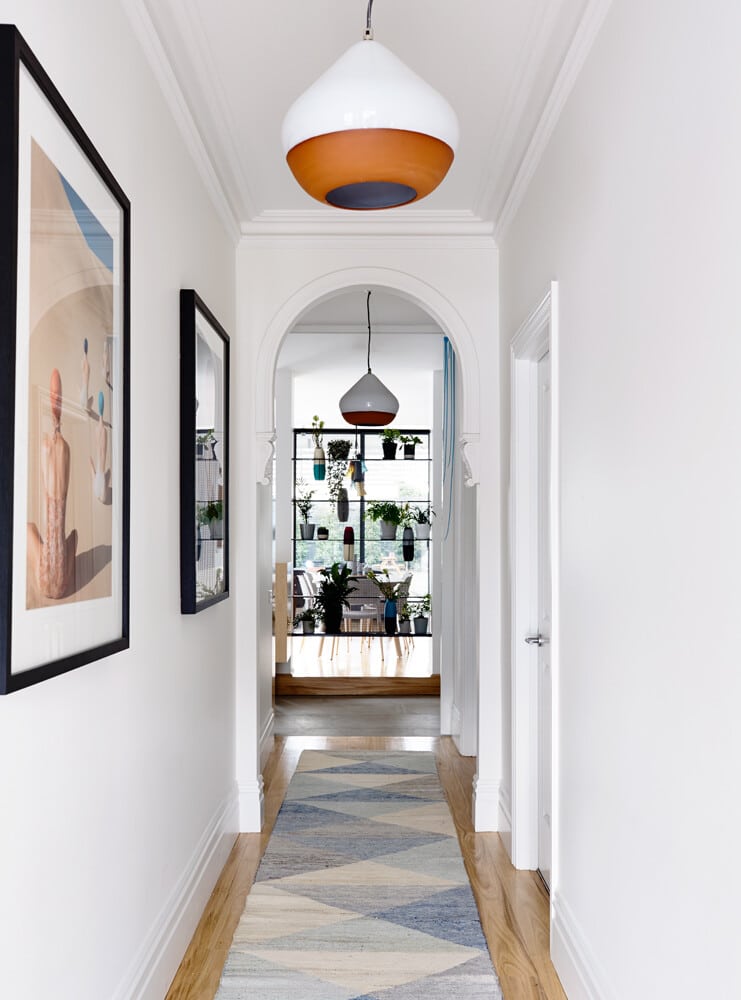
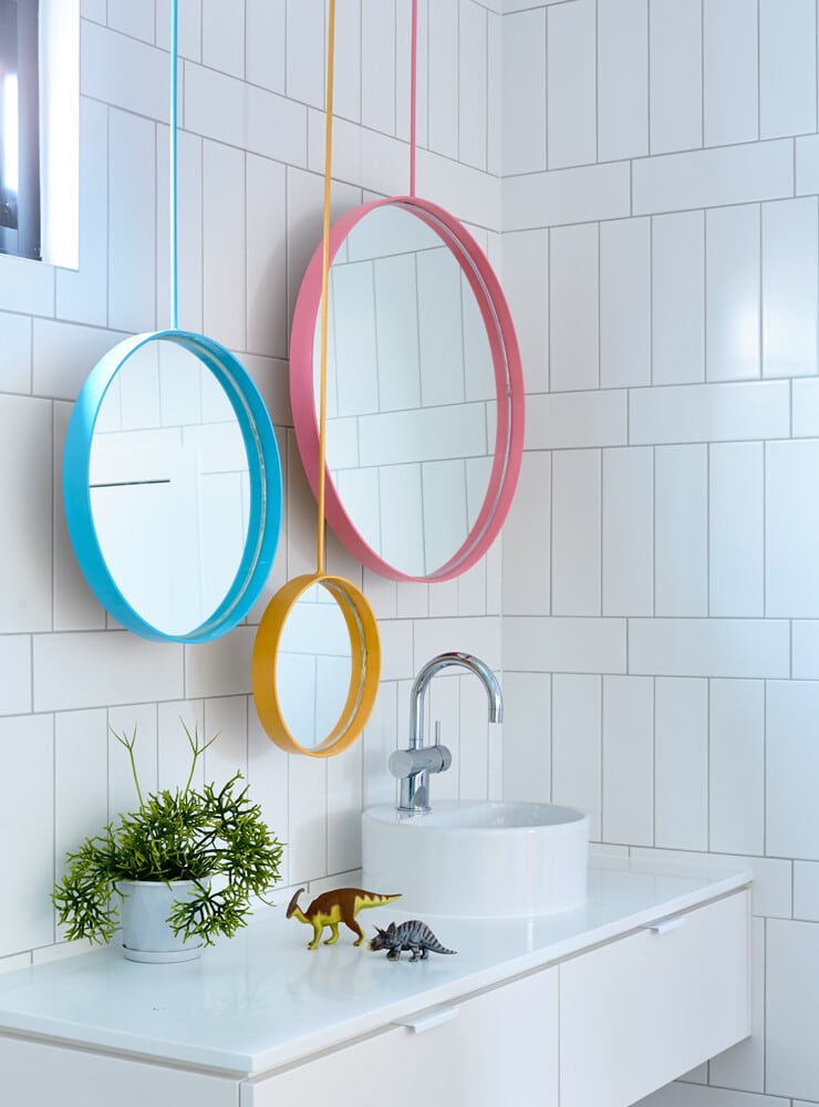
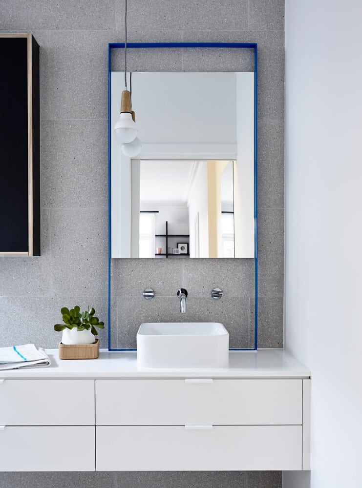
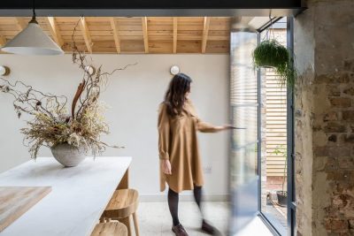
Painted timber lining boards extend from the living room ceiling into the undercover outdoor area to give a continuous detail and block of colour. Bringing more colour into the home are pendant lights, stairs in bright orange carpet, a large sliding door with a bespoke paint-drip feature and unusual powder-coated mirrors (three different colours in the kids’ bathroom and a large bright-blue mirror in the ensuite).
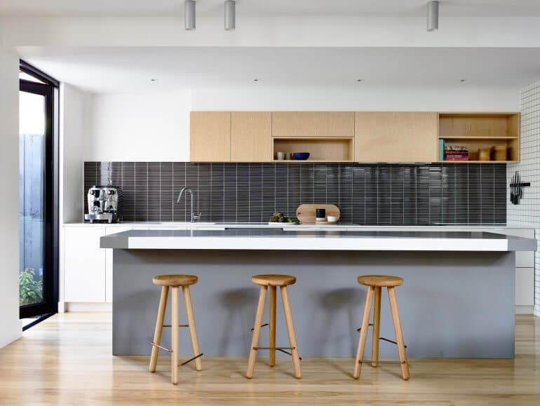
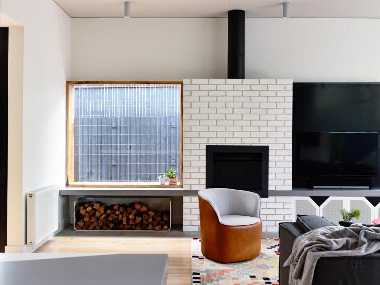
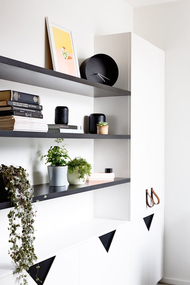
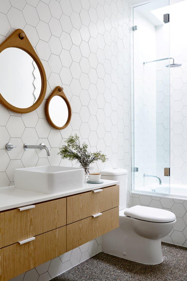
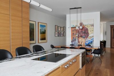
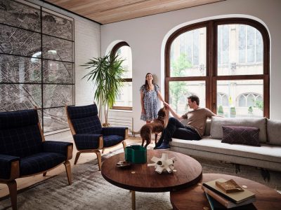
Further enhancing the interior’s robust, graphic appeal, is the perforated steel mesh paneling, white brick finishes on the fireplace, the deep boxed timber framed window in the living area, terrazzo and graphic tile patterns in white/grey tones and exposed edge detailing. Pale woodgrain used on the joinery throughout softens the look, while folded leather handles and custom cork mirrors in the bathroom add an element of interest and raw luxury.
Checkerboard black-and-white wall paneling is a strong graphic detail that not only adds the playful element the client wanted, but also a personal touch. The client owns pubs in Melbourne, so wanted a display solution for his wine and beer. The checkerboard feature is a laminate box that surrounds the pantry and features 14 circular cutouts for wine, which can be accessed only from behind the pantry. The garden was designed by Annabel Drew as a lush green garden with grassed areas and old railway sleepers.
Thank you for reading this article!

