Project: Skylit House
Architects: Downie North Architects
Location: Sydney, Australia
Size: 170 m2
Year 2018
Photographer: Felipe Neves
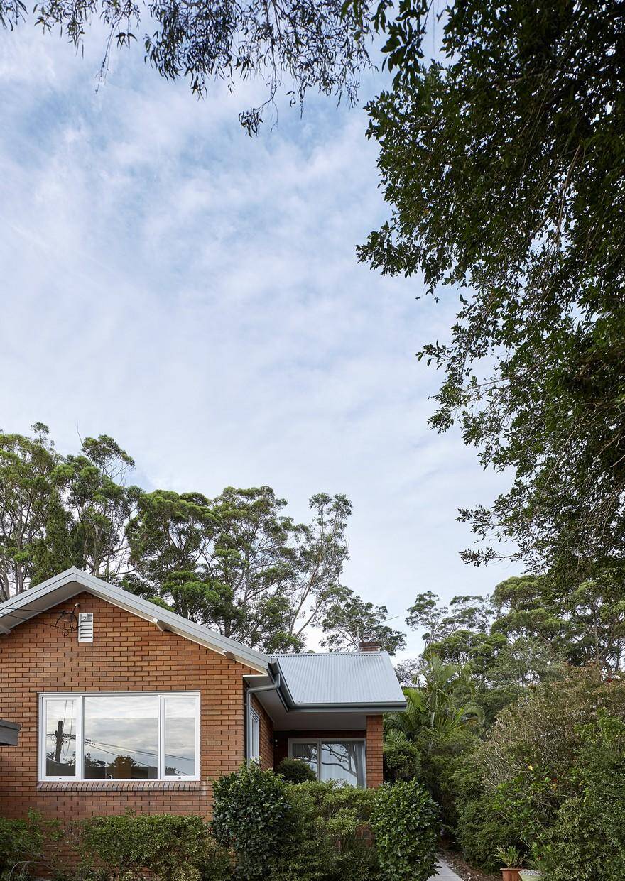
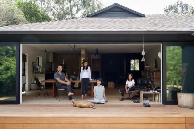
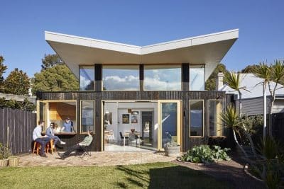
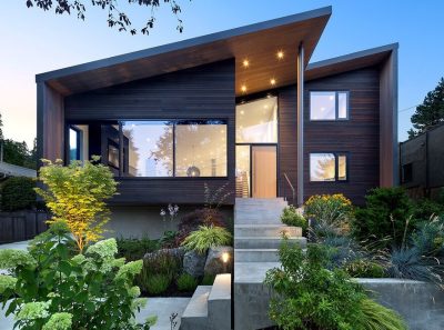
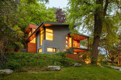
A discreet, robust and light-filled renovation of an existing 1950s bungalow for an active family of five, Skylit House is a simple and deft alteration to a mid-century suburban bungalow in the bushy lower north shore suburb of Castlecrag.
Developer driven suburban sprawl throughout Australia has generally given rise to houses that have little or no relationship to their site and are a product of market driven forces, built to sell, objects that have landed indifferently on terrain. The result is a housing stock that is insular and claustrophobic, referring only to their own internal mechanisms, ignorant of family relationships. Landscape, natural light, cross ventilation and site specific conditions are secondary, arbitrary or irrelevant.
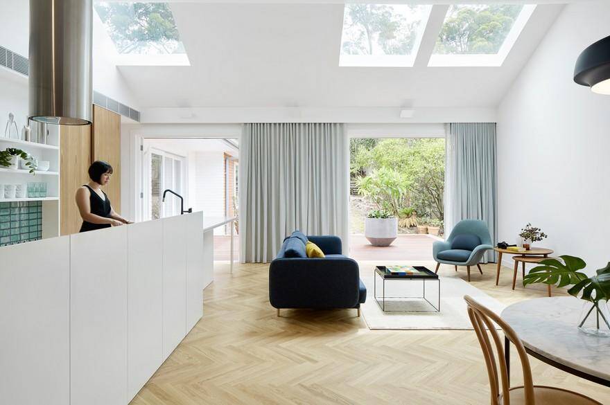
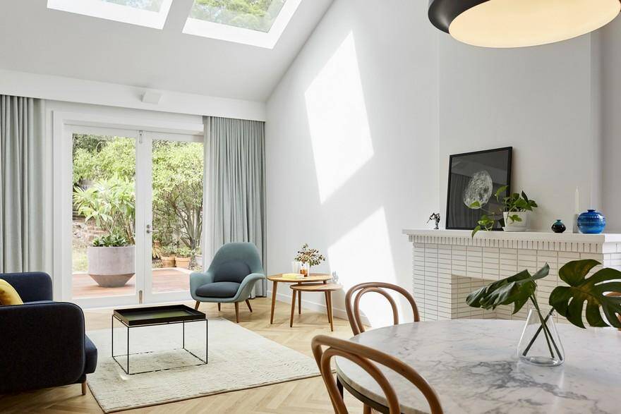
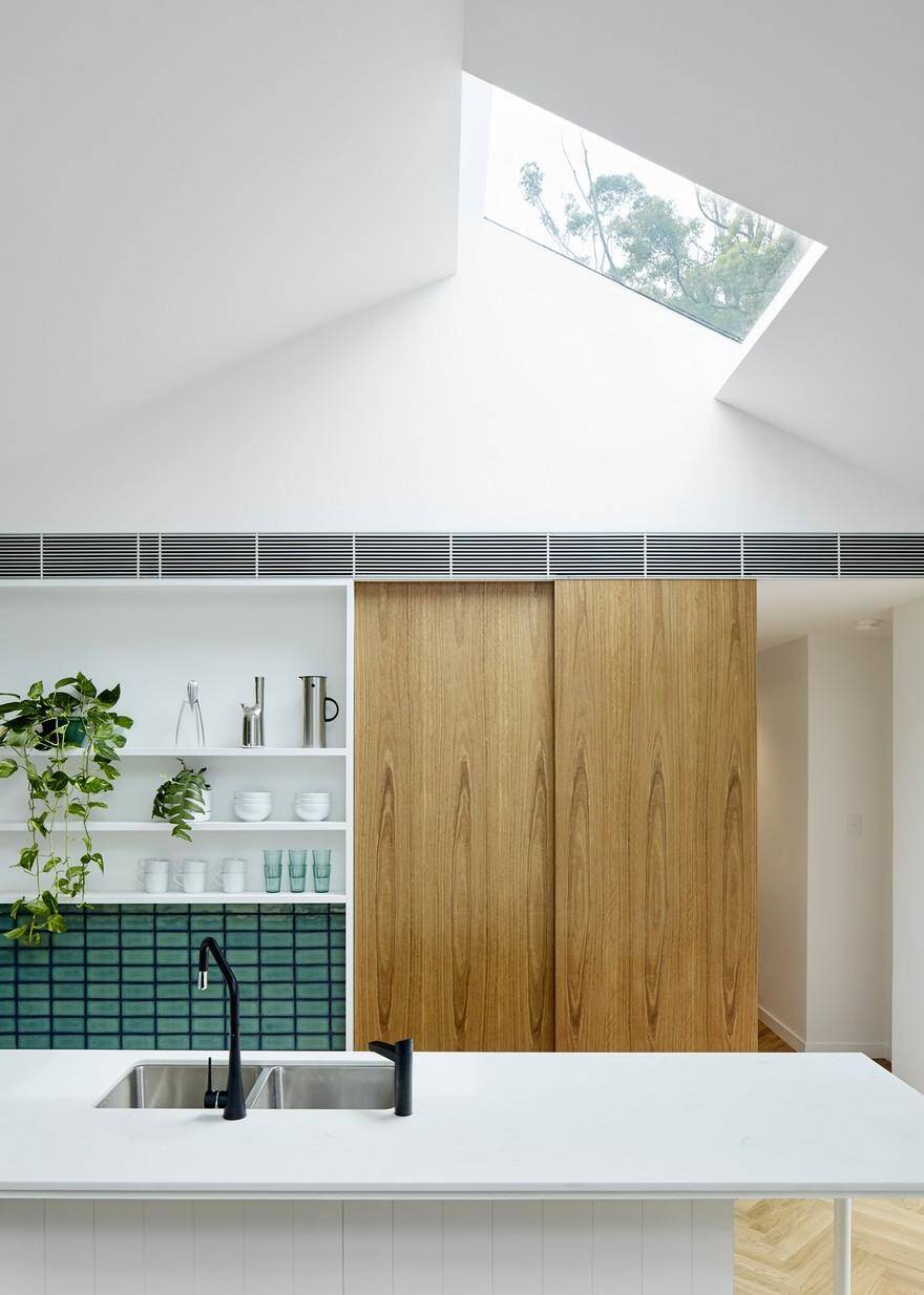
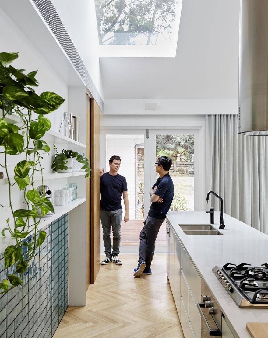
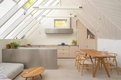
Skylit House offers a strategy to remedy this standard housing stock by simple gestures of internal reconfiguration without requiring enormous expense or increased building fabric. By a process of removing, rather than adding, Skylit House brings natural daylight deep inside shared living spaces that open out to the surrounding landscape. Conceptually it is simply a ‘coming together’ space- both of people and site. The program is open and robust, offering space for families to share, enjoy a good meal and discuss the day.
Having previously lived in a large family home, our clients were apprehensive about ‘downsizing’. We believed with some minimal but adept modifications all brief requirements could be accommodated within the existing building footprint. Building less, not more. The design focused on removing what was unnecessary in order to determine a natural place for each space, whilst elevating those functions and creating an awareness and connection to place.
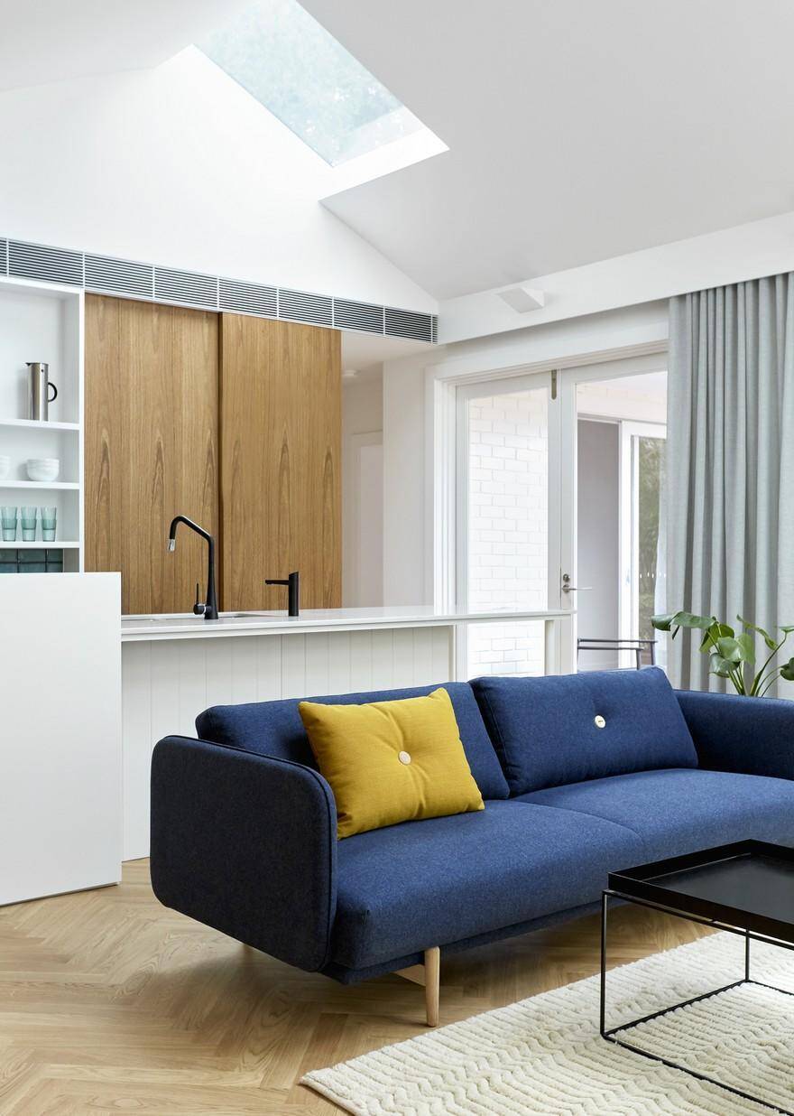
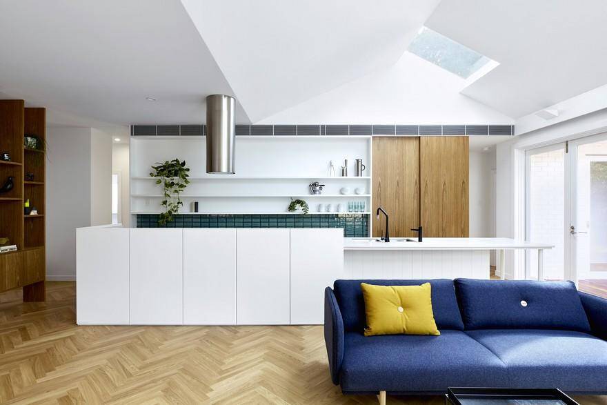
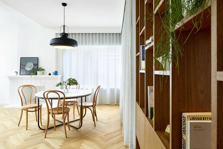
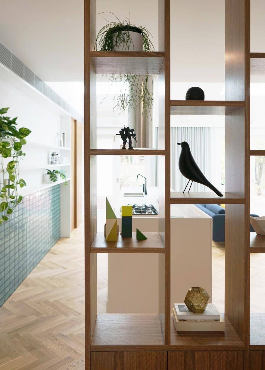
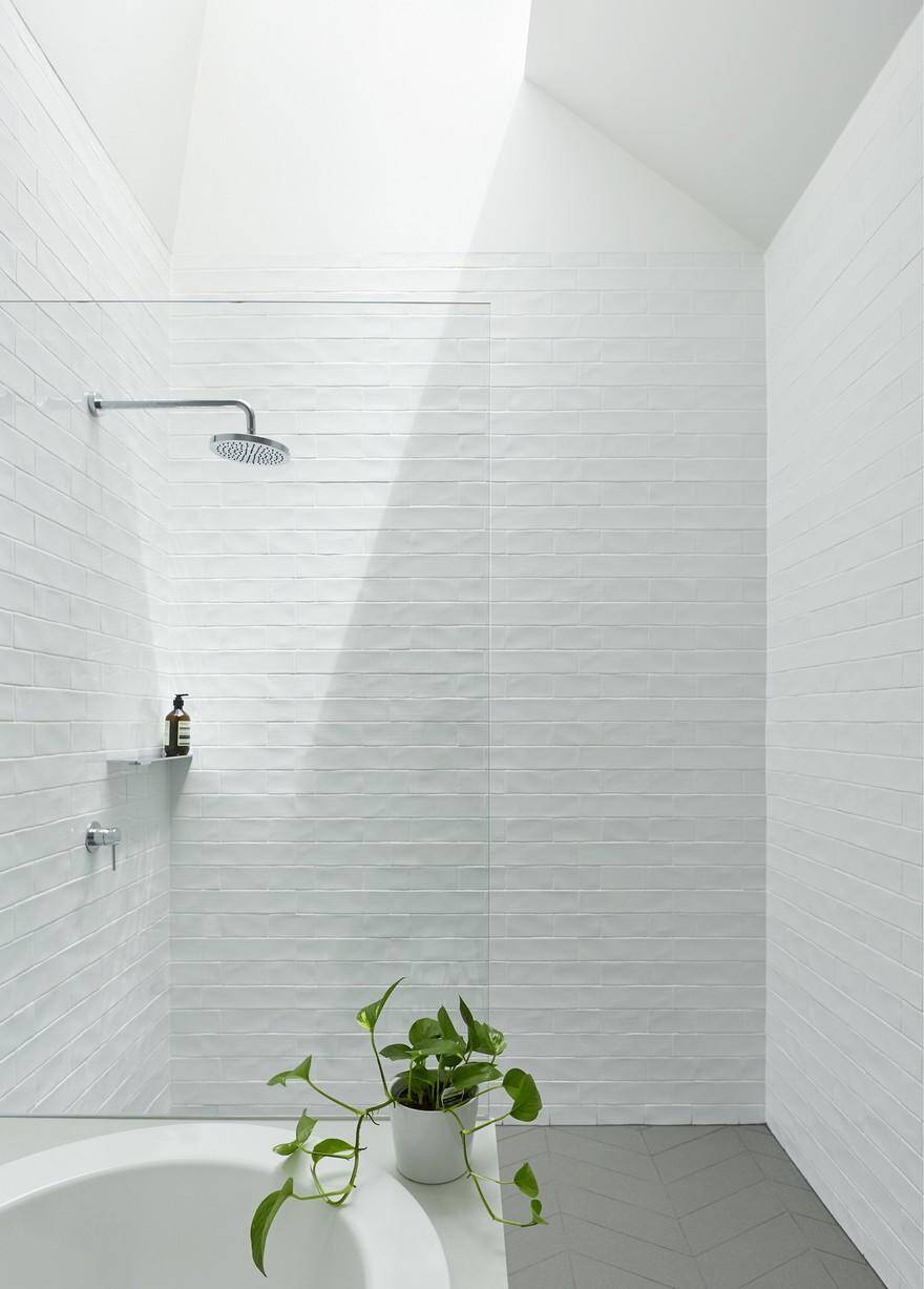
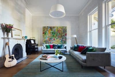
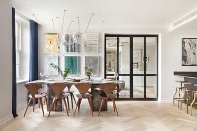
The alteration focused on creating one large open plan space, housing kitchen, living and dining, which employs key pieces of joinery to create distinct zones and implied thresholds defining foyer, kitchen, dining and living, butler’s pantry and study. New north facing skylights simultaneously illuminate and connect the interiors to its bushy context. With a three storey shopping centre and carpark to the north, this required strategic placement of skylights and openings to the north which careful curates the view and links these views to the settings within.
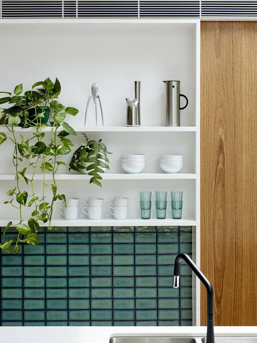
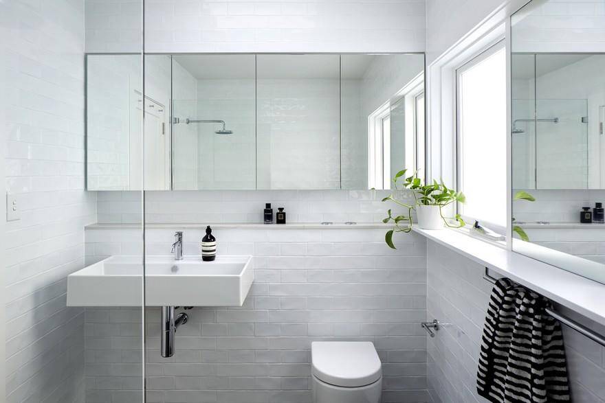
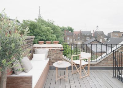
The material palette draws from the natural and built environment of Castlecrag: a clean palette of white, grey and spotted gum veneer references the various species of gum dotted throughout the headland, the irregular glaze of the ceramic tiles create reflections reminiscent of Middle Harbour and the reclaimed red brick edging the deck references the house and its neighbours.
The new architectural composition is highly efficient, dynamic yet serene. It has transformed the occupants’ everyday experience, yet sits lightly within the site, demonstrating the value of simplicity.

