Project: Starting from Scratch
Interior design & home styling: Odelia Barzilay
Architecture: Hava Gendelis
Owners: a couple in their 40s + three young children
Nature of the project: New build
Property: 350 sqm + garden
Location: a town in central Israel
Photography: Ilana Brilovich
The new home of this 40-something couple and their three young children is the epitome of a successful blend of modern design with cozy warmth. Interior designer Odelia Barzilay, in collaboration with the architect responsible for the structural planning, created an immaculate, well-balanced, and sophisticated property these owners are proud to call their home.
Occasionally, architectural challenges are those that yield the best results when it comes to improving the quality of living. This is exactly what happened to the owners of this plot, purchased in a central Israeli town, home to an existing yet old property that was intended for renovation. The couple hired the services of interior designer Odelia Barzilay, and together, they discovered countless challenges. Most notably the realization that it would be very difficult for them to renovate the existing property in a way that would truly meet their family’s needs. “We put our heads together and eventually came to the conclusion that we would need to demolish the current structure and build a brand-new property in its place”, recalls Barzilay.
“The couple dreamed of a home with high ceilings, large openings, and a large garden abundant in fruit trees. One that is modern and clean whilst still exuding warmth. and so, we went back to the drawing table and started from scratch”, says the designer. “The new house, planned in collaboration with architect Hava Gendelis, met the family’s needs down to a T – both interior and exterior. A beautiful home that is also practical and comfortable”, she adds.
The main challenge Barzilay faced was concealing the different systems throughout the property. “We had to identify design solutions for the various systems, and luckily, we designed aesthetic solutions that blended harmoniously with the rest of the space”, states the designer. According to her, the project was characterized, throughout, by ego-free collaboration and alignment between all the craftsmen, which is not a given. “We all had a shared goal: we wanted the project to be a success and to be carried out in the most pleasant and efficient way. I have learned that this was the only way to overcome any challenges or problems along the way”, she continues.
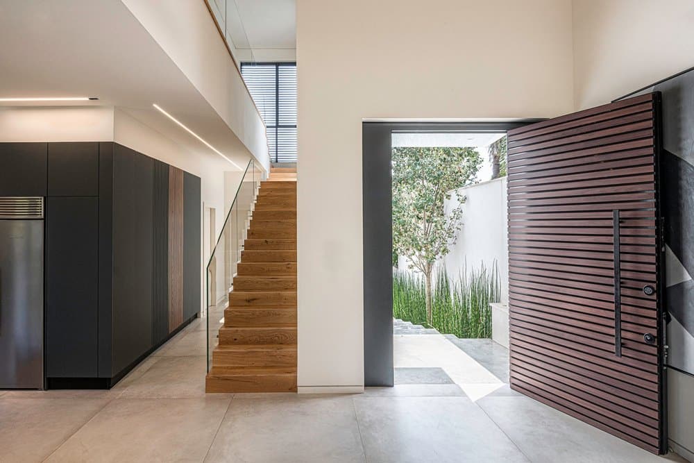
Since the property is modern, both inside and out, the designer chose to incorporate wooden panels around the front facade of the property and those reappear inside the house too. Olive trees and wide concrete steps, adorned with plants, welcome guests into the property and lead to a wide and impressive wooden panel front door. “We wanted to create as many openings around the property as possible to maximize natural daylight”, she adds.
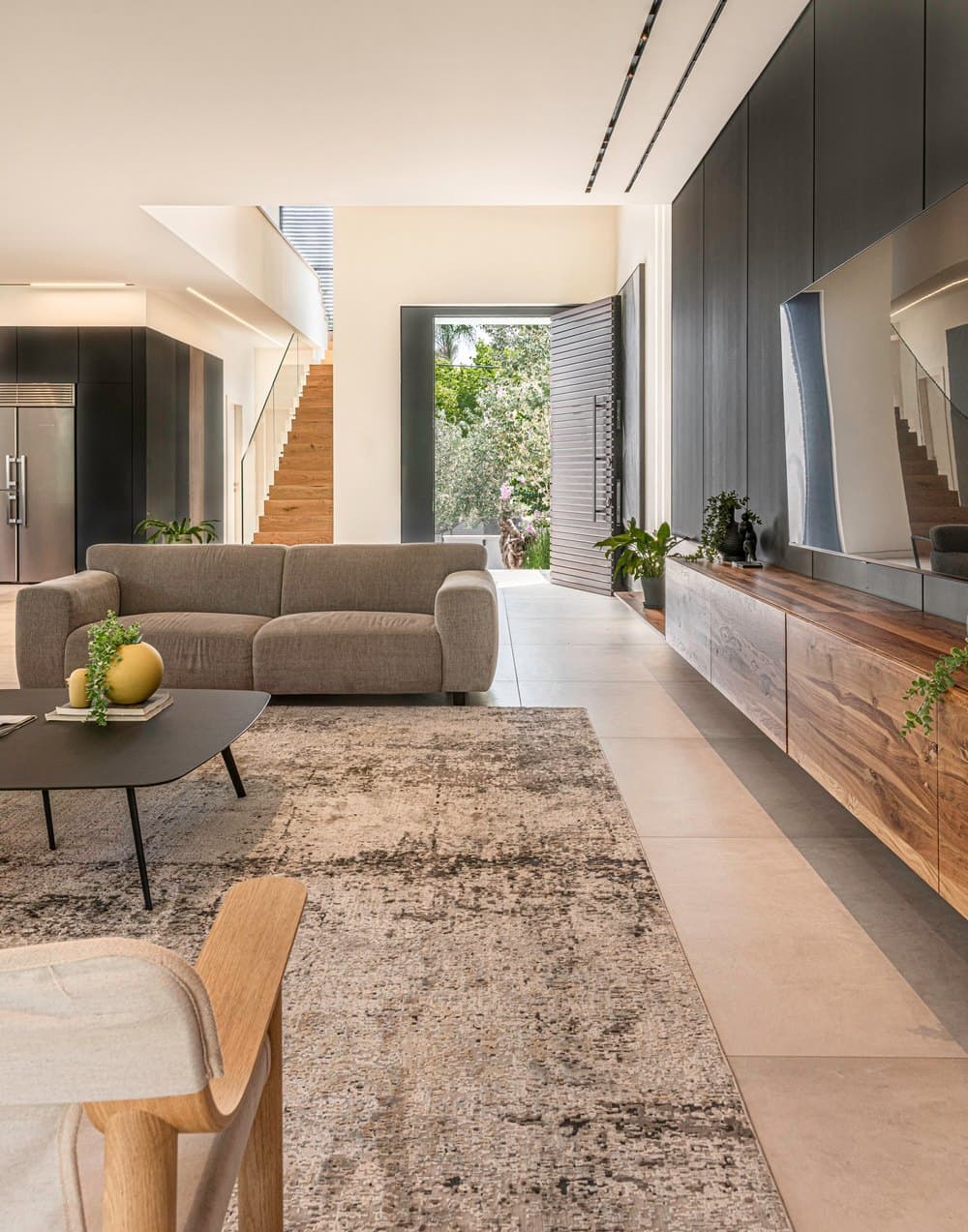
An eight-meter headroom entrance hall and two large windows that overlook a glorious garden contribute to a unique and spacious feel.
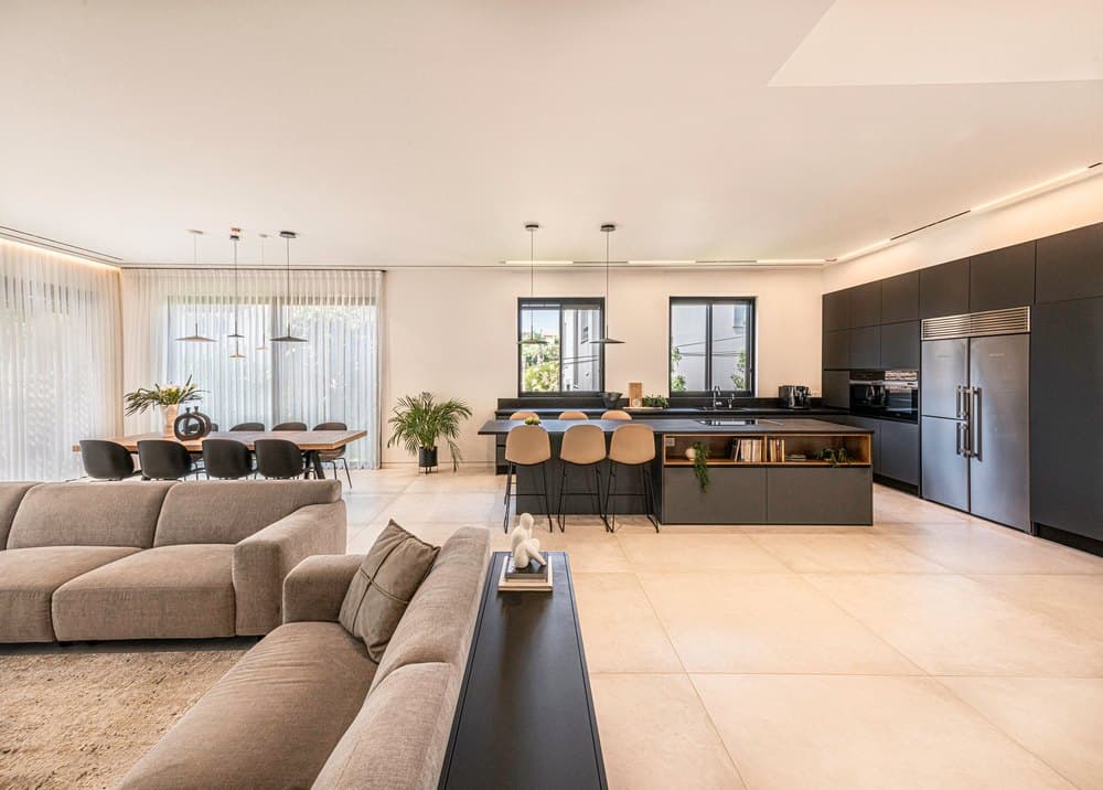
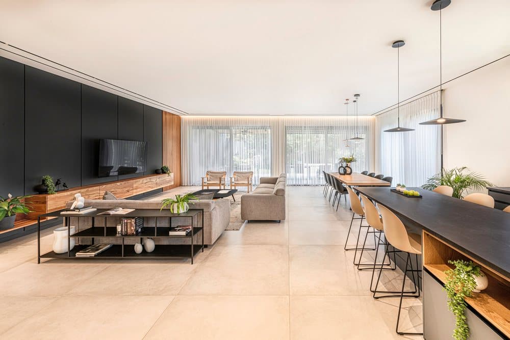
A sizable central open space dominates the ground level and includes a living room, a dining area, and a kitchen. Further along the level, we planned a home office/guest room, a bathroom, and guest toilets.
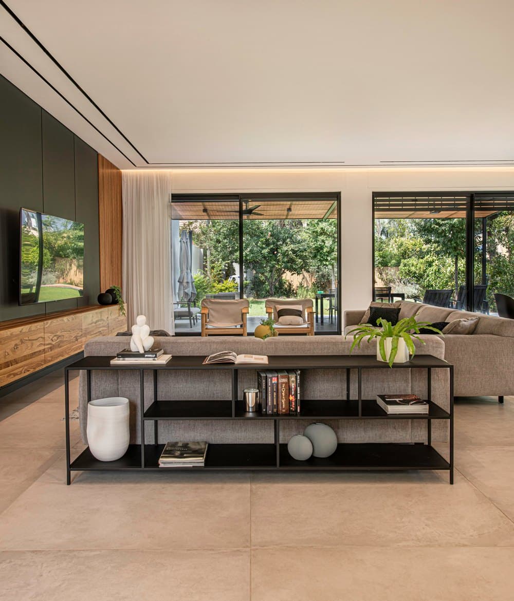
“The house enjoys a modern color palette with dominant shades of graphite gray and wood”, explains Barzilay. “We used large granite porcelain tiles for the floors that create a sense of space and serve as a beautiful backdrop for the furniture and kitchen”. The living room sofas are gray too and an iron console unit used for decorative items was positioned against the back of one of them. To avoid the banality of a standard sofa set, the designer added a variety of furniture pieces such as two light fabric armchairs with wooden legs.
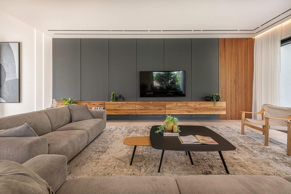
Both coffee tables are also different from each other – one in a graphite color finish and the other in an oak finish.
Barzilay planned an especially large and dominant 10-meter-long power wall in the living area, on which the tv was mounted. At its lower end, the wall is 3.5 meters high and is covered in wooden panels. At its highest, where it meets the entrance hall, the wall is eight meters high. The carpentry unit was also made of oak and is used for storage. The rest of the wall was covered in graphite-colored plaster cladding that combines decorative profiles, and a skirting board that creates the illusion of a suspended wall. Two sunken light strips were fitted above the sideboard and run along the ceiling all the way up to the second level.
Abstract artwork that matches the design color scheme and was custom-made for this project by Barzilay, was hung between the power wall and the entrance hall. Barzilay chose to work with soft curtains made of natural fabric that create partial shading and prevent the sun from overheating the space during the hottest hours of the day. “I believe that every home needs curtains and rugs that add character and contribute to the general ambiance”, she emphasizes. “As a rule, home styling is very important as it cements the soul of the property. Without it, a property can seem ‘naked’ and soulless. Having said that, it is important not to over-style or over-accessorize. The secret is in striking the right balance. This is how we can create a comfortable and holistic space”.
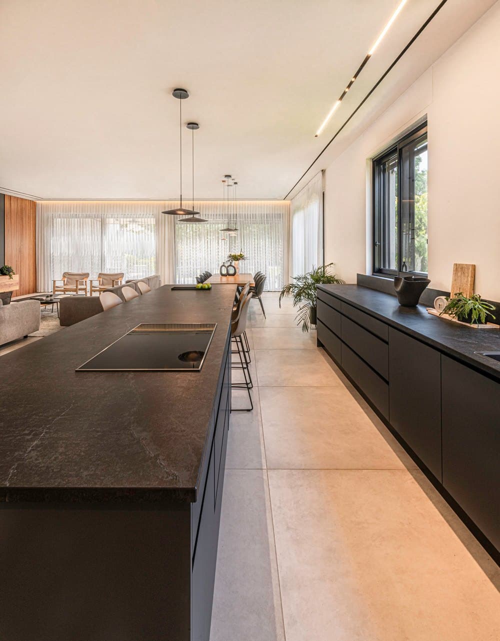
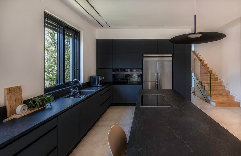
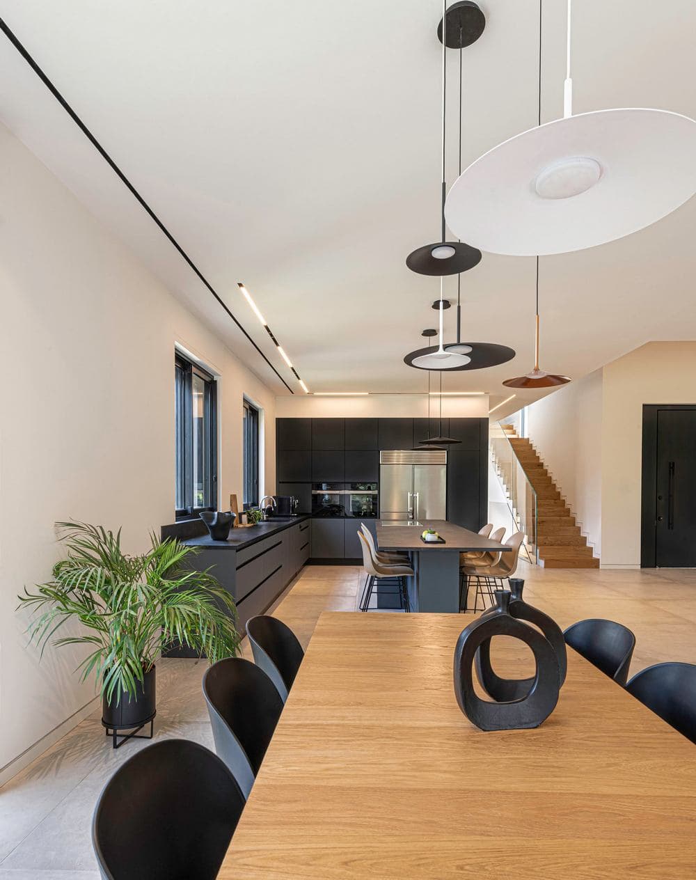
The formal dining area, which overlooks the garden, is sizable and includes a dining table made of an oak plate and iron legs. The L-shaped kitchen was planned across from the dining area and is clean and modern in style, in graphite gray with nano finishing for durability and ease of maintenance.
“We designed plenty of storage space, especially in the high cupboards and the three-meter-long graphite island”, says the designer. “I incorporated a wooden shelf into the kitchen island to balance the dominant gray mass. It injects warmth into the space and displays green plants and warm decorative elements that, along with champagne-colored chairs, liven up the long gray Dekton top unit”.
It was important for Barzilay to maintain a clean ceiling and as such, all the light fixtures in the property were designed with ultra-thin magnetic strips that decorate the property and run parallel to the narrow aircon outlet strips. Together they create an elegant, smooth and impressive look. Above the dining area and kitchen, the designer incorporated decorative white, gray, and copper light fixtures that light up the dining room and kitchen island.
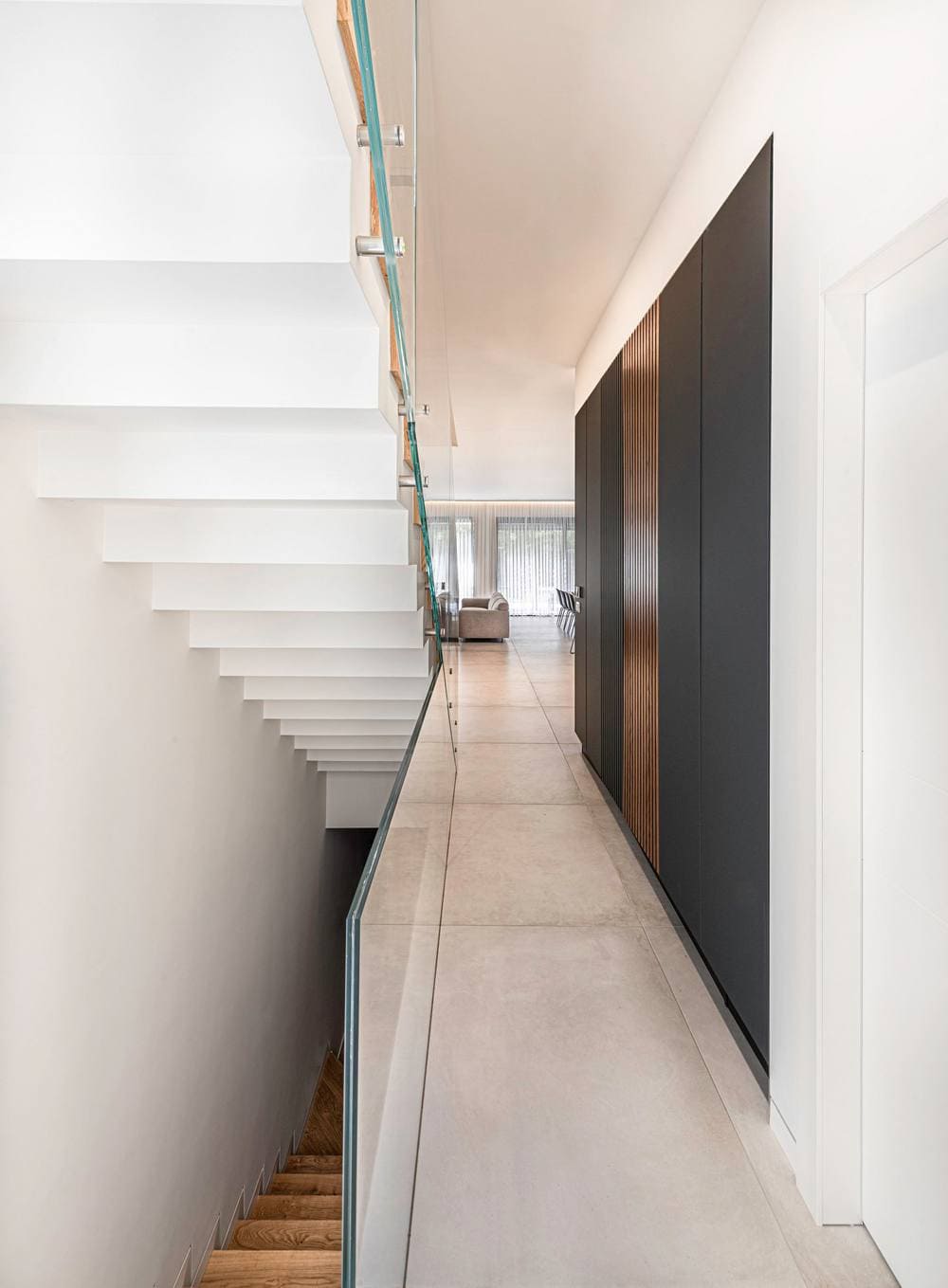
Adjacent to the staircase, Barzilay designed a cupboard that stores all the tech systems, including a large electricity cupboard, a/c and intercom units, and an underfloor heating system. “In large properties, all these systems need to be taken into consideration, and pleasant storage solutions need to be incorporated”, she explains. “The systems’ cupboard requires ventilation, and it was important not to use the air conditioning grill. The ideal solution was to incorporate wooden panels that have ventilation gaps, and visually correspond with the wooden panels used for the power wall and entrance door”.
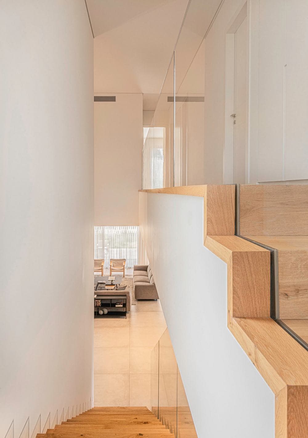
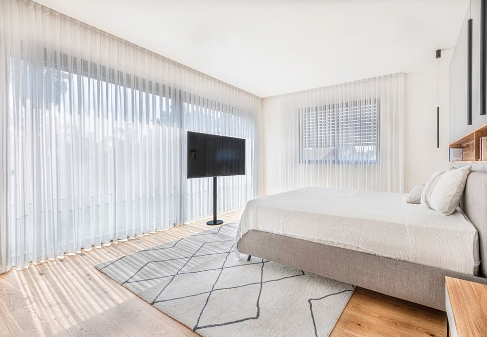
The concrete steps, which were fitted with wood treads and a glass banister, lead to the basement and the top level. A long light strip was embedded in the ceiling above the staircase, lighting up the corridor and utility cupboard. The master bedroom is minimalist and yet incorporates a variety of elements that create a cozy feel. “We chose a neutral parquet for the master bedroom and designed a glass door and large window which overlook the garden. Since the clean feel was important to the owners, the tv was fitted on a pole. A wooden bookshelf/display niche was fitted against the back of the bed and elongated black light fixtures dangle from either side. The bedroom leads to a walk-in wardrobe and a luxurious en-suite bathroom”, summarizes Barzilay.
Partial supplier list:
Regba kitchens
Negev Ceramics
Mizug Plus – air conditioning
Aluminum – A. S Aluminum
Carpentry – WEWOOD

