Project: Studio 73 Workspace
Design and project: nihil estudio
Execution: Suite 9
Technical lighting: Onok
Furniture: Ondarreta
Location: Ontinyent, Valencia, Spain,
Area: 517 m 2
Year: 2020
Photography: nihil estudio
Text and photos: Courtesy of nihil estudio
“73 is the 21st prime number. Its mirror, 37, is the 12th and its mirror, 21, is the product of multiplying 7 and 3. In binary 73 is a palindrome, 1001001, which has got seven (7) digits from which three (3) are ones. In the octal system, 73 is 111 which is a palindrome.” (Sheldon Cooper, 73rd episode of The Big Bang Theory ).
Some years ago, the strategies of major companies to reach the top gave way to a sense of self-interested behaviour. All companies wanted to be the strongest, the most efficient, powerful and extraordinary (… and less human). As time went by, this failed since it caused a rift between the corporations and the worldly life; it caused a rift between the brands and the average citizen. That is the reason why nihil estudio has been working from the very beginning with a 360º branding and design-focused strategy based on the humanisation of the brand Studio 73.
This was one of the greatest concerns of the founders of the computer consultancy: customer perception, since they were sure they wanted to position themselves as a close company, as the hero of a Tarantino’s film who is there when needed to solve your problems. A company with human and tangible values.
The conception of projects for workspaces like Studio 73 offices helps to bring to life social changes and new conceptual forms of work which are demanded by the present labour market, thus fostering better communication within the company and also establishing interpersonal ties between the members working in different areas.
The new space for offices in Studio 73 is a 360-degree project which comes from the clients’ need to find a new and larger workplace compared to the previous one. A place where they can develop their growing work at full capacity and also show the market the way they see and understand the world.
In the context of this quantum leap, nihil estudio conceives the project through a branding strategy so as to carry out the renovation of their brand identity which includes a new corporative manual and a new visual identity with different graphic features.
The new Pop culture references are the basis to start developing the brand concept: Netflix series/streaming platforms, film icons and references to the gaming world coexist in the memories of the different generations which make up Studio 73. Taking these elements to the material plane provides the enterprise with a unique identity and a very particular personality.
As for the project, the team worked from a design perspective which is very far removed from the conventional and traditional office concept. Assuming the changes in labour patterns of the last decade, the space in offices must join work, leisure and the welfare of their users. Moreover, the different spaces of these Studio 73 new offices are meant to reflect their workers’ personality.
Behind the slogan Smart is the new sexy cult series and film references can be found: subtle and fine details which, as well as the global design of the brand and the space, make Studio 73 offices unique and real, spaces where everything is customised.
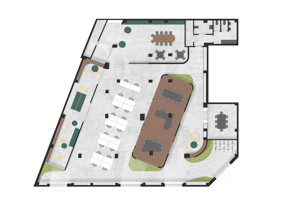
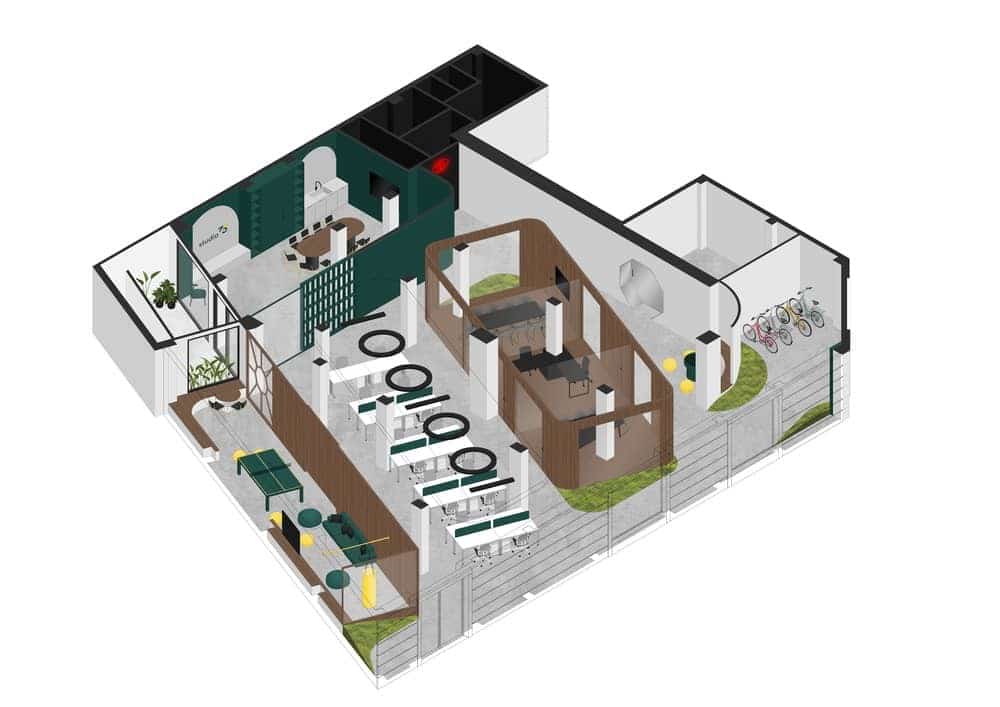
The interior design project starts from a ground floor on a trapezoidal plan, full of pillars with an undefined reticle between them. Nihil estudio opts to avoid these architectural elements and appropriates the space.
The execution of their proposal consists of enhancing open spaces thanks to a design with soft and round shapes with corners and geometries which are pleasant to look at. By doing this they aim to change the existing space with consistency,rearranging the areas based on their needs and uses, creating vanishing lines calling the visitor or user’s attention and therefore making the pillars go unperceived.
Nihil estudio is aware of the current labour paradigm shifts and the changes in the workflow; collaborative spaces are now more relevant and the working environment becomes “democratised” so workers have the possibility to choose where and how to work depending on the kind of activity they are going to carry out.
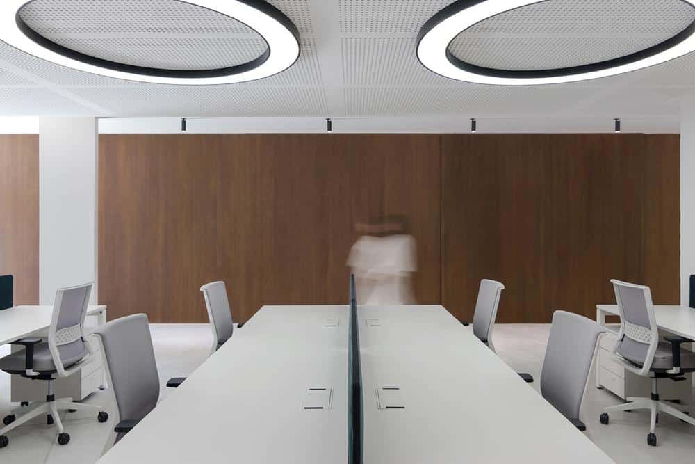
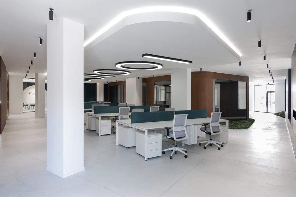
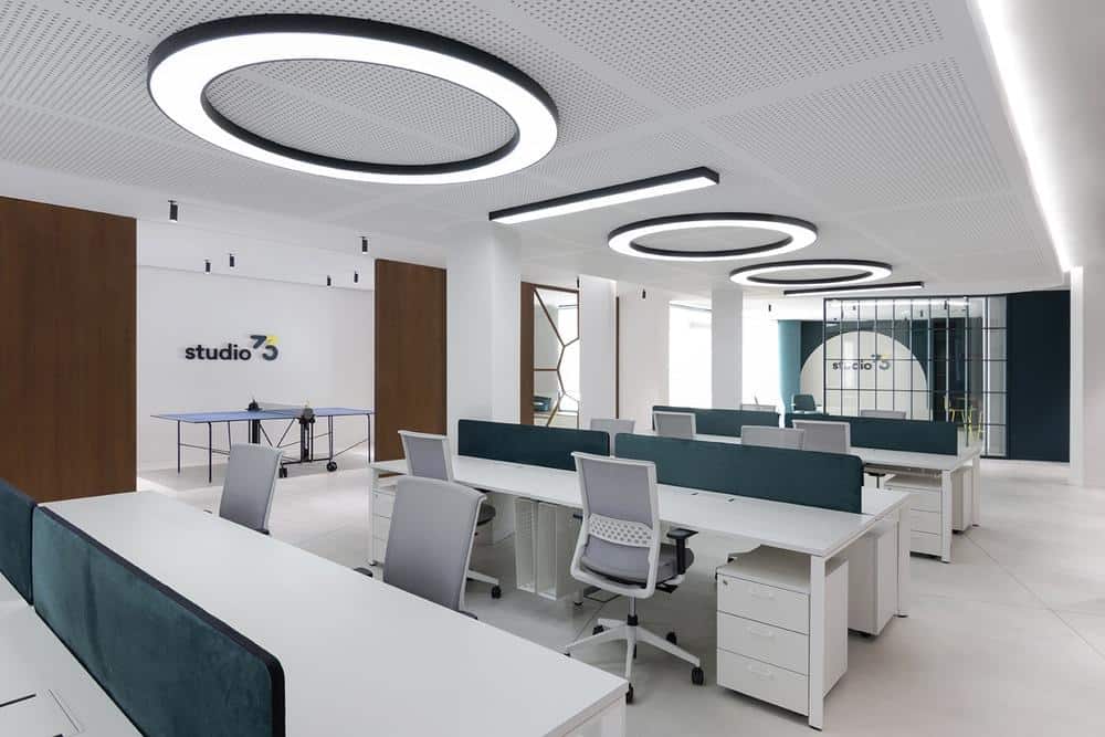
For this reason, and based on the humanisation of the space, the team plans an open working area that consists of a series of bench desks which create a new working environment, thus creating synergy between the workers, leisure and common areas, and spaces for small or informal meetings where the employees can talk placidly.
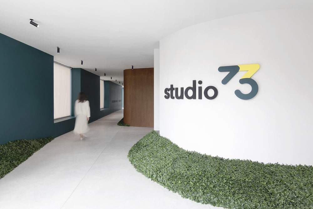
The main entrance is designed as an entrance hall with bicycle and electric scooter parking.
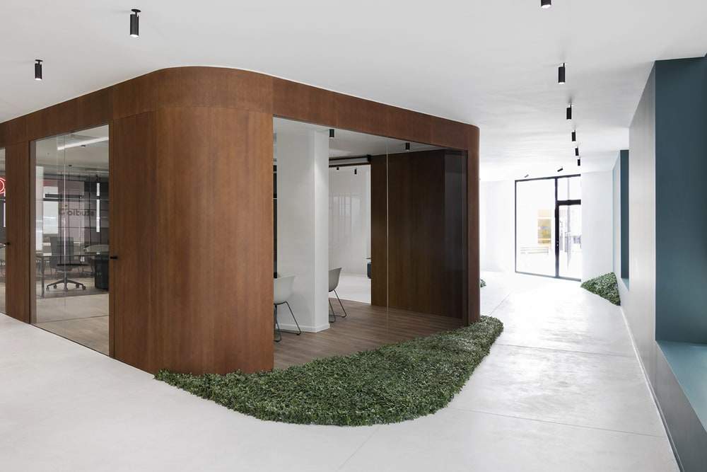
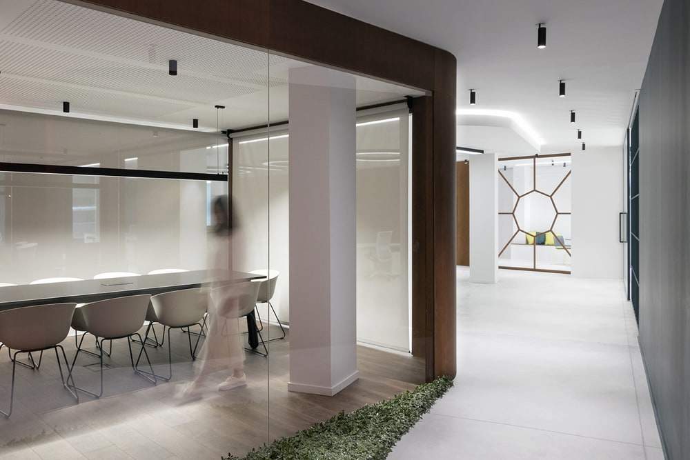
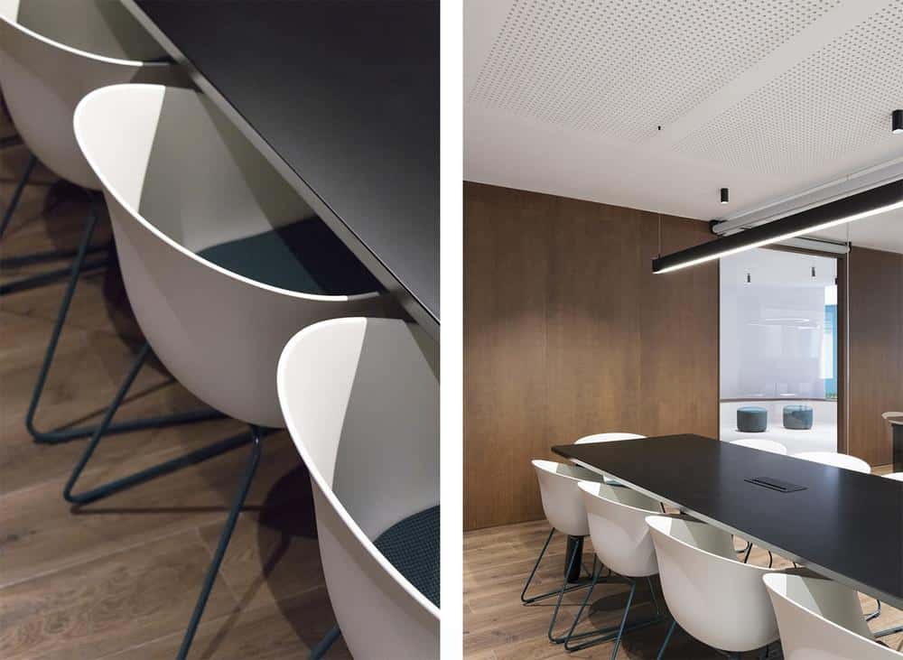
The rectangular prism for the administration office is located in the centre of the room (whose longitudinal axis is rotated in order to break the orthogonality) and has two board rooms (one of them with video conferencing equipment).
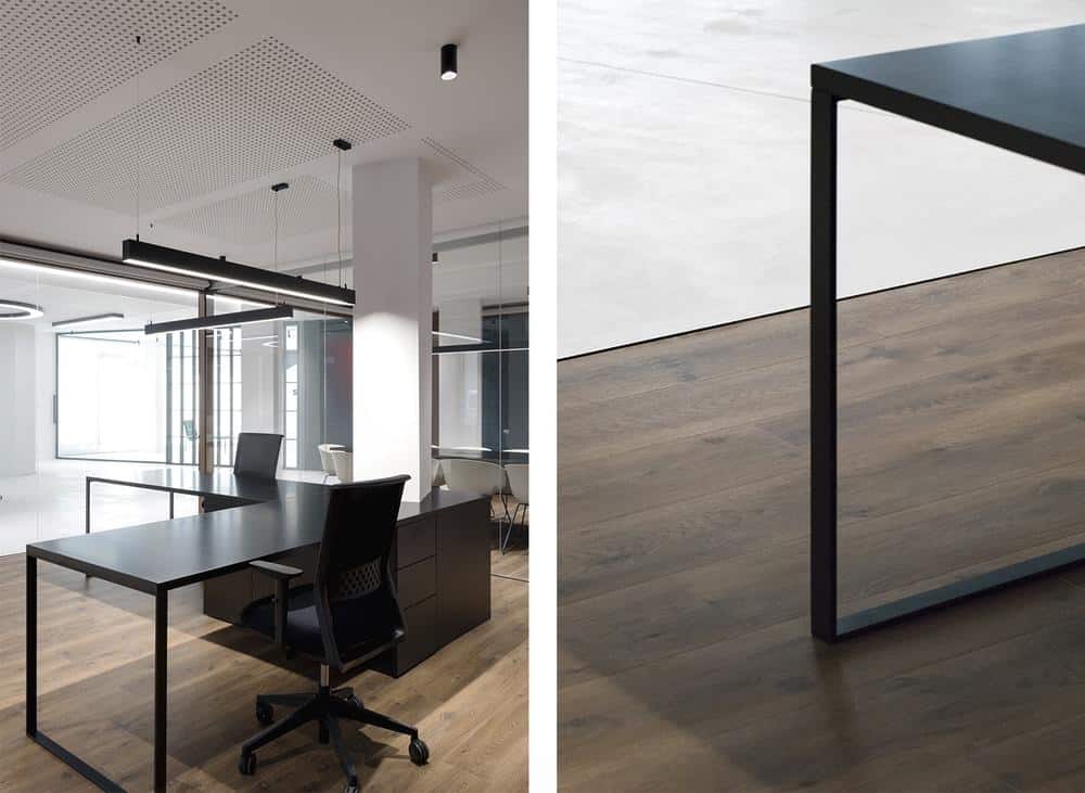
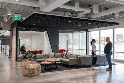
We can find the administration office, parallel, with two workplaces. The open workplace, also parallel, is delimited by an acoustic false ceiling with cove lighting, emulating the rectangular prism of the administration office.
The leisure and rest area, with a table tennis table, a punching bag and benches for relaxing and amusement, is connected with the work area by a sliding door system creating a visual connection between one of the ends and the court.
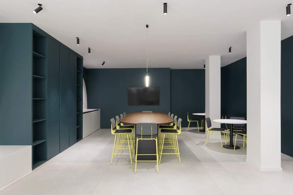
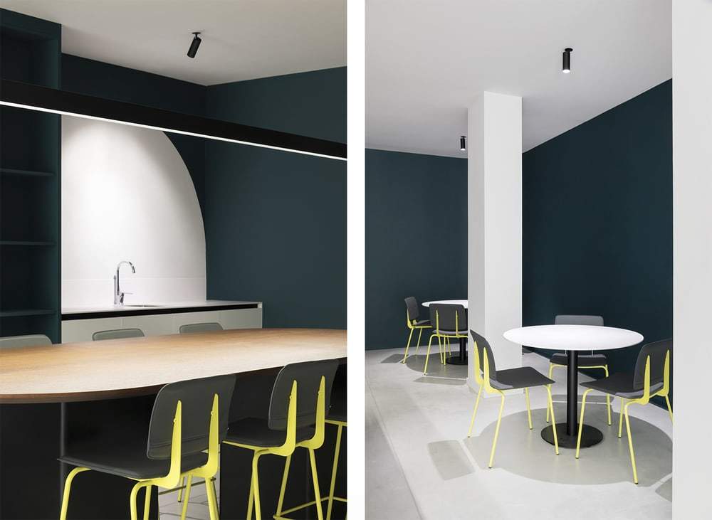
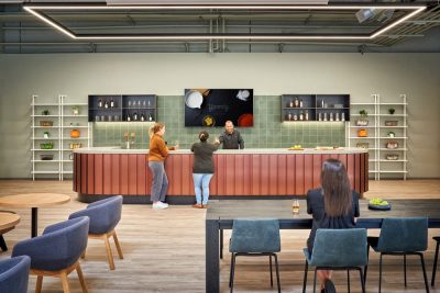
Two huge arches become the dominant feature of the kitchen and dining room/scullery areas, for which a big oval table beside the kitchen cabinets is designed as well as two more round tables and some armchairs for the most relaxed moments.
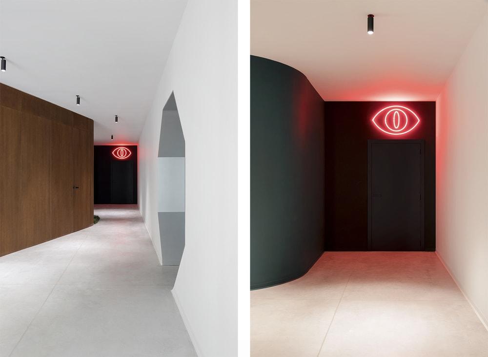
Bathrooms and a storage area are arranged in one corner of the space. The entrance to this area stands out because of a big red neon sign on the anthracite wall.
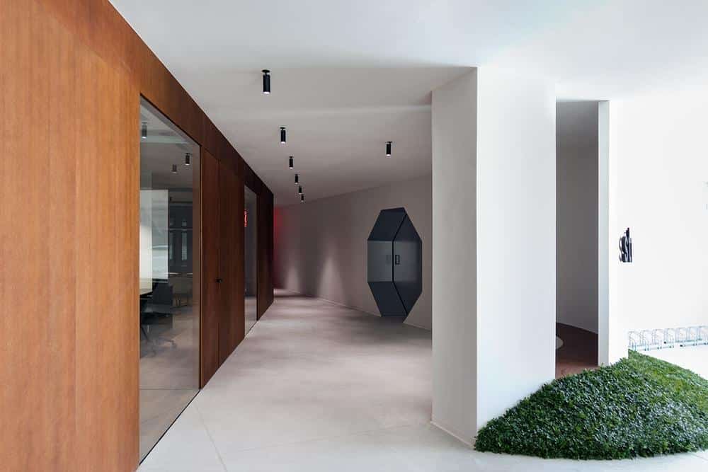
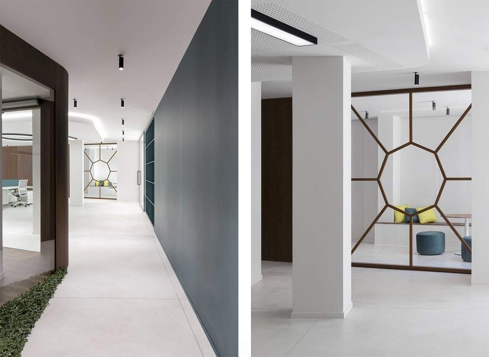
Since it was very important for the client to have a workshop or a space for repairing hardware components and electronic devices, nihil estudio plans an octagon-shaped access for this room, emulating the doors of a spacecraft from a well-known science fiction film series. Once inside, we can find a table in the middle and perimeter storage shelves.
The space is completely filled with personal lockers for the employees placed between the large windows on the façade, on one of the perimeters.
It is possible to get a natural flow thanks to this layout with open access, avoiding long and narrow corridors.
Eliminating the barriers helps the workers to communicate better with their colleagues. In addition, the traditional isolation of departments or offices is avoided.
Trowel-finished concrete is used over the whole flooring. In contrast, noble materials like oak wood, with walnut stain, are used to coat vertical surfaces, panels and the floor of the administration office.
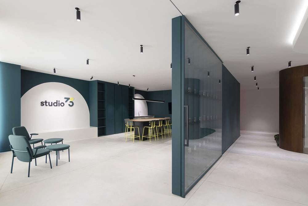
In order to delimit the flow of people, green spaces with plants with a look of small hillsides covered with plants are included. The corporate green of the Studio 73 brand can be found not only on the cushion covers or the upholstery of desk chairs, but also on perimeter elements such as lockers, kitchen/scullery, walls and the shelf which is split from the rest of the office.
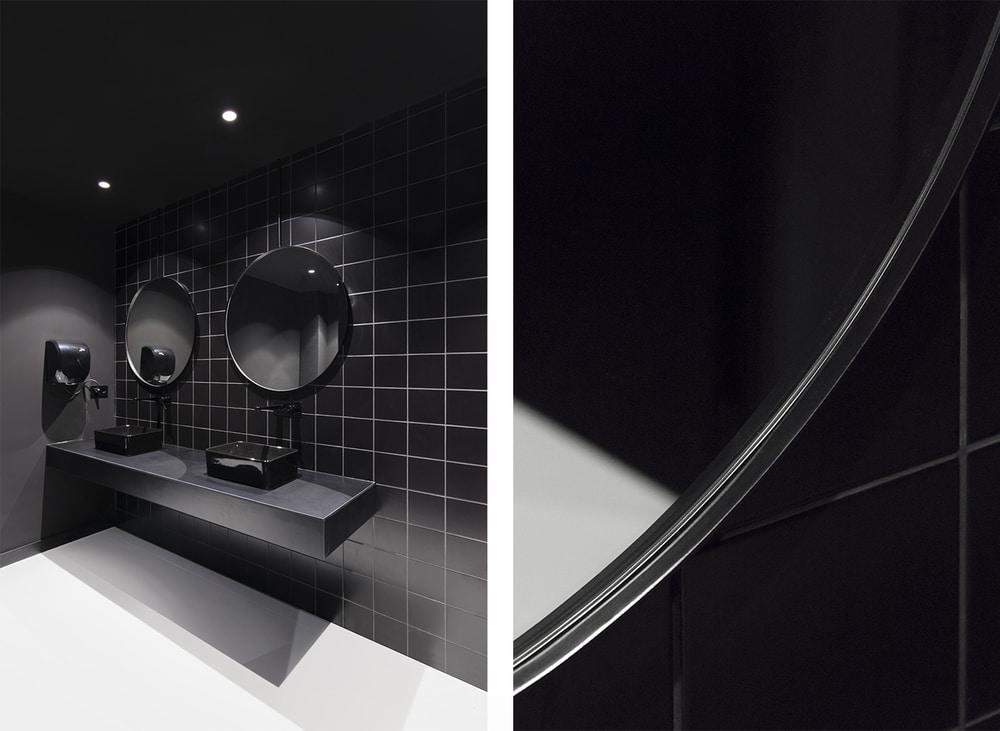
White is applied on columns, walls and false ceilings for neutralising the space and emphasising the contrast between the different materials. Furthermore, anthracite is used to zone the wall which gives access to the bathrooms as well as the ceramic walls in them.
To connect the different areas, nihil estudio looks for visual permeability by playing with the existing relation between the planned spaces through big glass windows in the administration office, the kitchen/scullery and the leisure area or court.
As for furniture, companies like Actiu and Ondarreta are chosen. They are in charge of completing the global design proposal by selecting the finish and upholstery for the elements so that they can blend with the projected space with harmony and homogeneity.
Given the features of the space, it was very important to work on the entrance and make the most of natural light. For this reason, they played with divisions, alternating panels with glass doors. They worked on how they could project the wooden cube and its openings, which is positioned to face the façade and the inner court, thus making the light get in transversely.
As a complement, artificial light is obtained thanks to Onok’s products for ceiling lighting, in open spaces, and recessed downlights in the false ceiling of isolated rooms.
In order to get indirect lighting, lightness and an extra stage factor are obtained by means of false ceilings with cove lighting.
Nihil estudio designs some more sculptural or iconic illuminations. In the work area we can see the large number 73 represented with ones and zeros “I00I00I” placed on the workers’ tables and symbolizing the muscle and the spirit of the company. For bathroom signs (with a touch of humour): a big red neon sign representing the Eye of Providence, making a direct allusion to the dark side of Middle-earth, since the bathrooms are the furthest point.
These particular allusions revitalise the space and supplement the global design. They are a true reflection of the personality of the Studio 73 staff. It is about turning the offices into a real and customised place for the client.
Since the branding is a planned process with a variety of factors taking part which must interact with each other in complete harmony, the team’s aim is that Studio 73 can reflect the essence and values of its workers, achieving a result exuding coherence between its different applications.
In order to make 73 work as a logo, it is accompanied with the first nomenclature which makes up the wordmark “studio”. The word has the same height as the circle forming the number three. The symbol is just a summarised schematization of the logo, changing the initial letter of the wordmark for its small letter.
On the basis of the colour palette provided by the company, nihil estudio plays with three neutral colors, two for the surface (greens) and complementary colours (yellow). This palette provides the brand with youthful and bold attributes that creates a major visual impact.
In the words of nihil studio’s team: “ It is an immense privilege to have the opportunity to be a part of a social change as well as a change in labour patterns through the design and execution of projects like the offices in Studio 73. It is clear that spaces evoke emotions; if society changes and evolves, our responsibility is to meet the expectations. It makes us feel part of that change to be able to share our perception of new collaborative spaces focusing on people instead of intangible organisations; it makes us believe in a better tomorrow ”.

