Project: The Beauty in the Details
Planning and design: Karen Maimon
Location: A town in Israel’s Sharon region
Plot: ½ acre
Property: 300 sqm
Owners: A couple + three children
Photography: Elad Gonen
In a pastoral neighborhood in the Sharon region stands one of the most stylish homes in Israel. This private property, owned by a couple in their 30s and their three young children, underwent a significant renovation planned and managed by interior designer Karen Maimon. The designer masterfully preserved and revived various original elements of the property whilst introducing new pieces and accessories that give it its unique look.
This 1980s property was built on a long and narrow rectangular plot and was recently fully renovated by interior designer, Karen Maimon.
“Prior to the move, the family lived in a standard apartment and wished to find a private family home that would meet their needs and would include a spacious garden for their children”, recalls Maimon. “Since the entrance to the property is located on its narrow facade, it feels very spacious despite being built on a narrow rectangular plot”, she adds.
The original property had wonderful features, but with time it had gradually worn down. Thus, the designer preserved and renewed many of the existing elements and adapted them to the new overall design theme; for example, the existing travertine marble floors on the ground level were renewed by being polished and lightened, allowing them to blend more homogeneously with the newly introduced design elements.
The result is a modern-eclectic property, rich in unique furniture and accessories that add soul and character to the home. “As a designer, I generally believe that without the right furniture and accessories, the property is left underdressed”, states Maimon. “However, I warmly recommend doing so in good measure, to avoid over-accessorizing and overloading a space. Done stylishly and in moderation, it can tell the unique story of the home and its owners”, she shares.
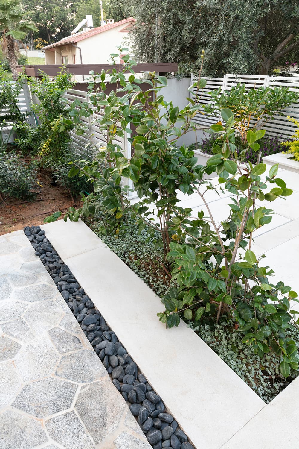
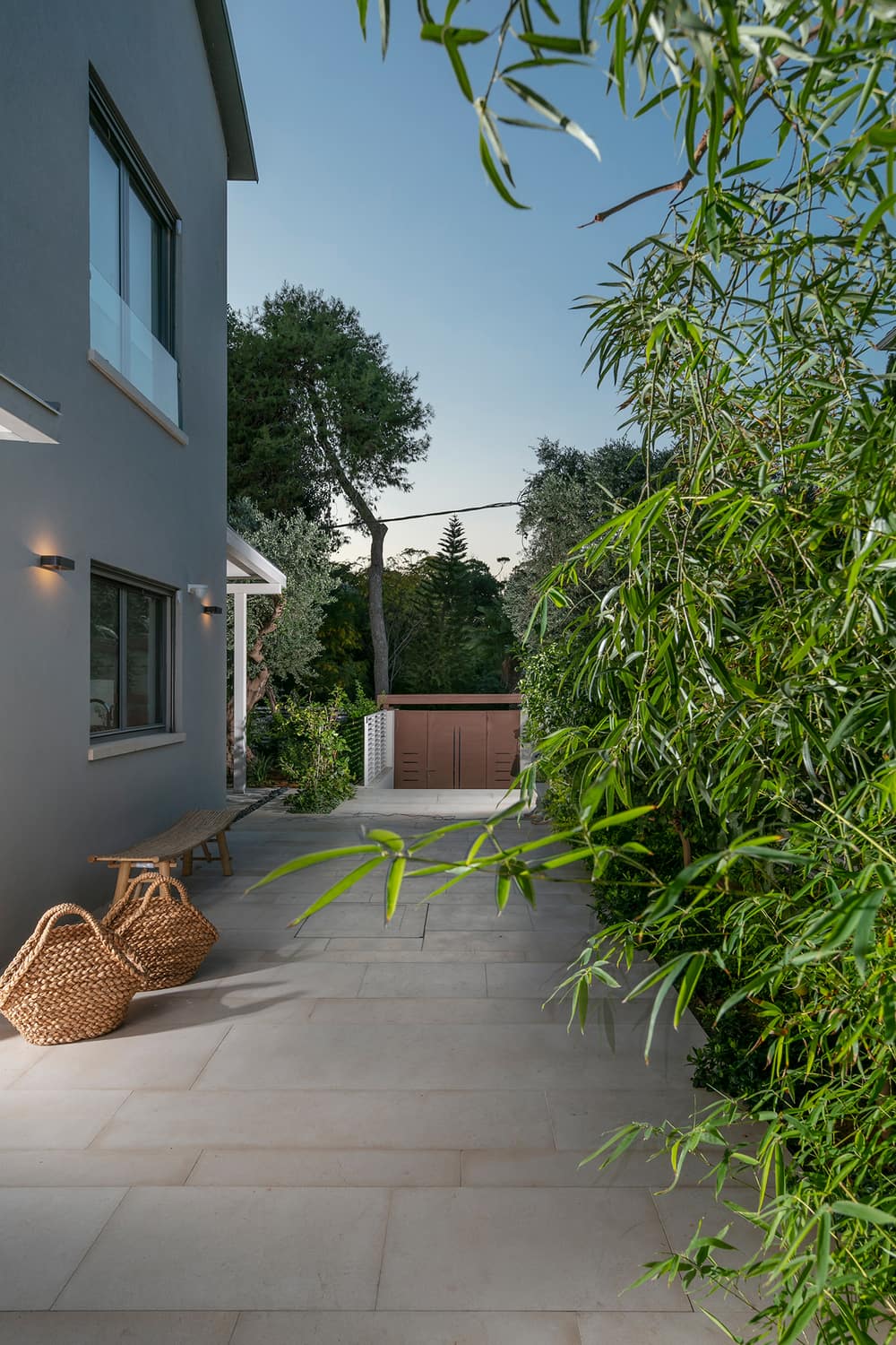
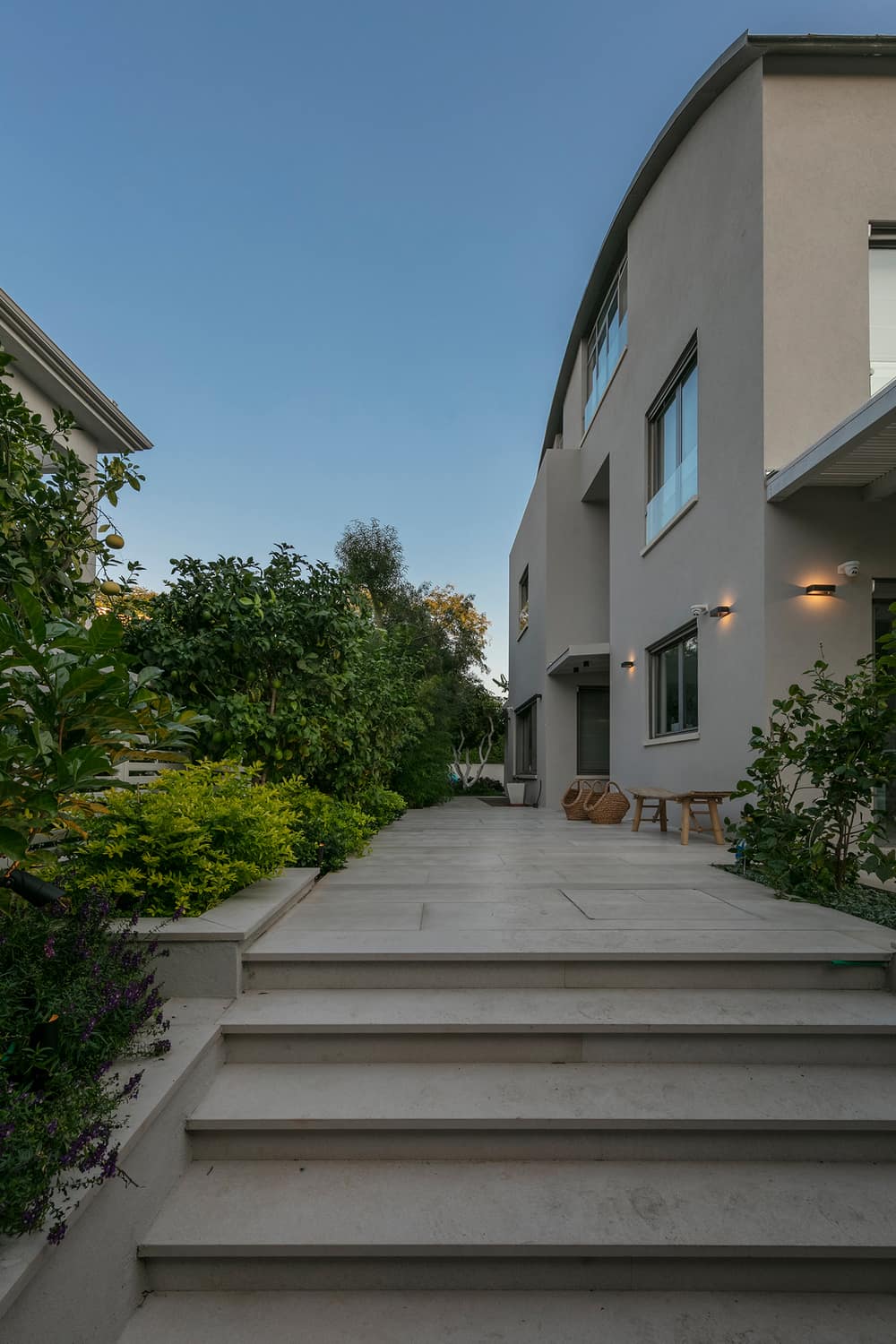
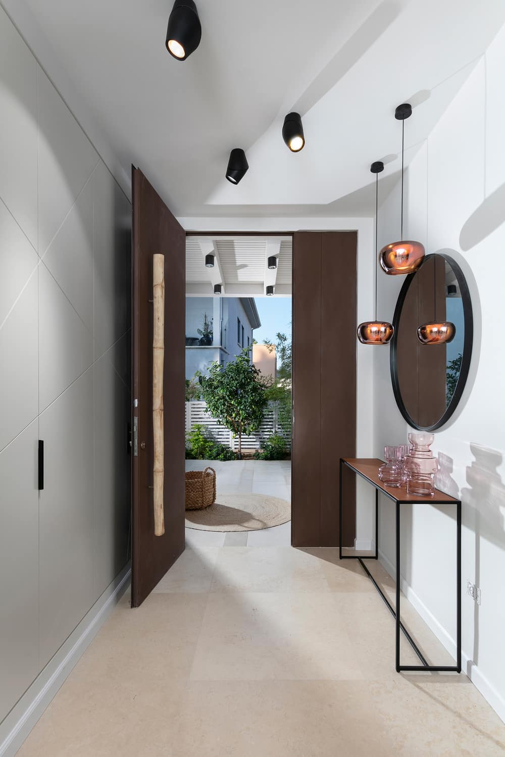
The property, as well as the outdoor spaces, were all renovated. The original garden was dug out and the front yard was completely renewed. The designer chose shay gray marble stone for paving and the entrance gate was replaced with a modern copper-colored iron gate. The same material was also used for the entrance door along with a unique bamboo door handle custom-designed by Maimon herself in order to match the various bamboo elements dotted around the garden.
The original layout of the ground floor (which includes a spacious lounge, a kitchen, a dining area, and guest toilets) remained intact, although Maimon better defined each of the areas with the use of partitions and accentuations. “It is important to define the various functions within the greater open space”, explains the designer. One of the partitions that were added was a wall that separates the entrance from the lounge, thus creating a visual pause between the entrance and the rest of the ground level, which is exceptionally spacious and very well-lit.
The space was fitted with a hallway cupboard that is used for coats and conceals the electric mains. The cupboard doors were painted Chantilly-cream, similar to the walls, with asymmetric geometric grooves; a pattern that repeats itself in various corners throughout the ground level, such as the fireplace wall that is situated between the lounge and the dining area. “On the other side of the entrance hall, I combined a stylish console with a modern mirror. The same wall serves the lounge too, on the other side, by concealing the air conditioning and audio systems”, states Maimon
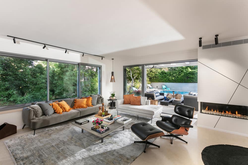
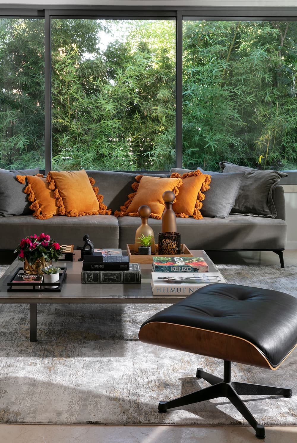
Maimon also designed the carpentry unit in walnut wood – a material that repeats throughout the property in different variations. The eclectic furniture includes a thinned iron chaise lounge combined with leather, alongside a classic sofa. Despite the size of the space, the vibe is cozy and inviting.
In addition, the designer created a fireplace wall in the center of the open space and softly defines the lounge and the dining area: “The wall is powerful and can be seen from every corner of the level”, says Maimon. Asymmetric patterned Iron profiles, in an identical design to that of the entrance cupboard, were embedded into the plaster wall, giving it a unique and modern look.
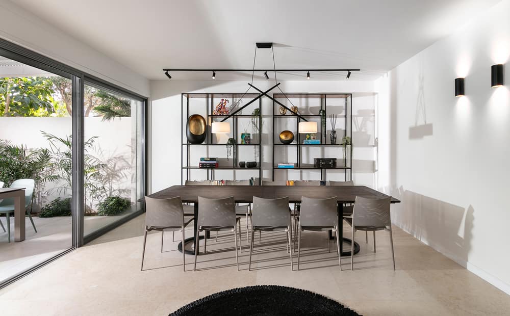
The dining area was designed in perfect symmetry and includes a duo of iron units for the display of books and various ornaments. The main dining table is made of an oak plate and iron legs and can seat 10 diners. A modern light fixture was fitted above the table, framing the area. “I was looking for a light fixture made of one solid piece, that would embrace the table”, the designer explains. “The geometric motif created in the entrance as well as by the fireplace wall reappears here”.
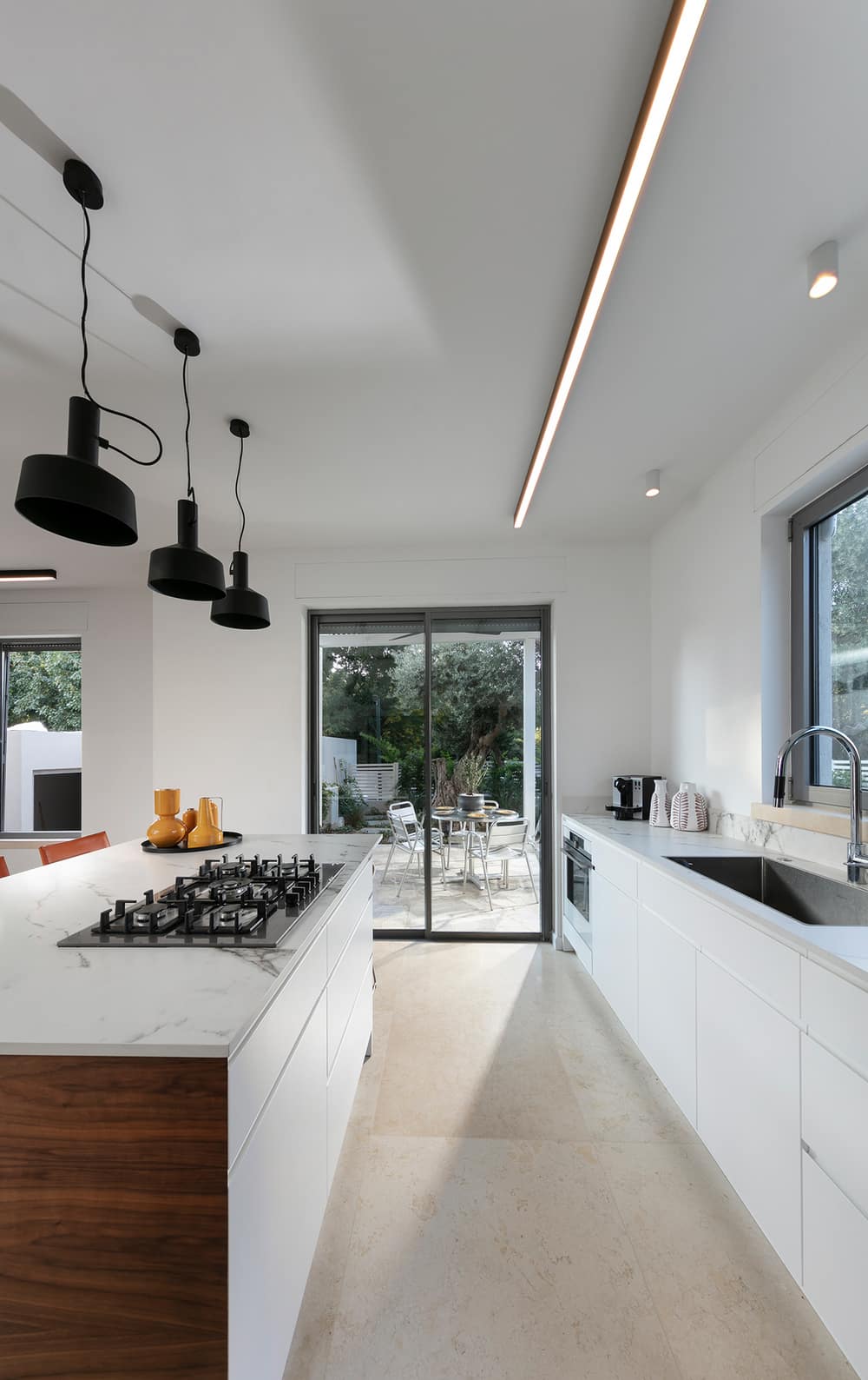
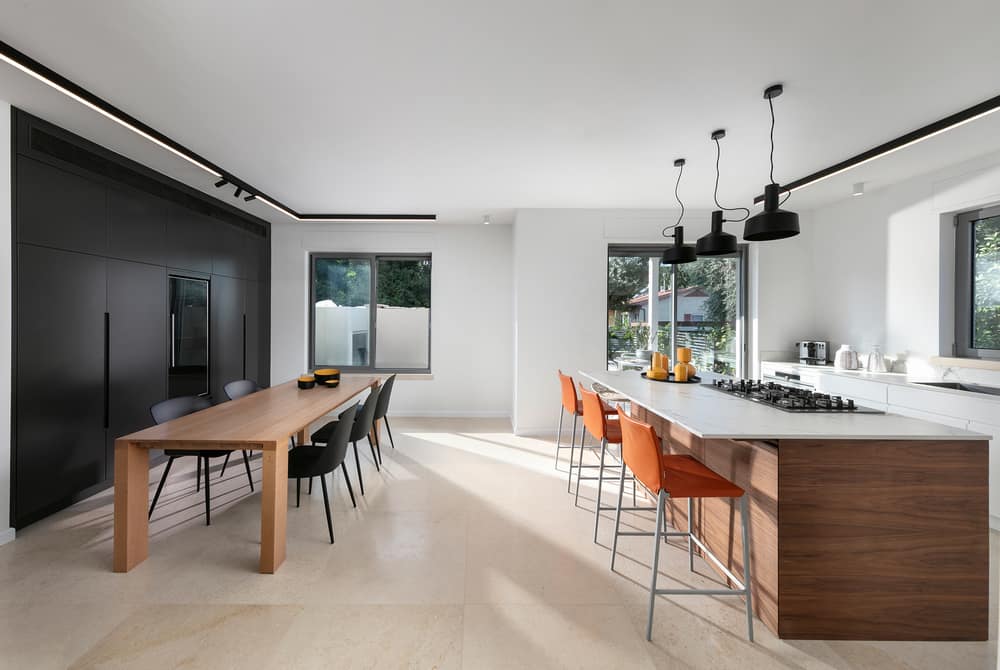
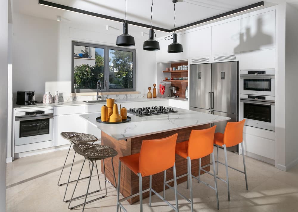
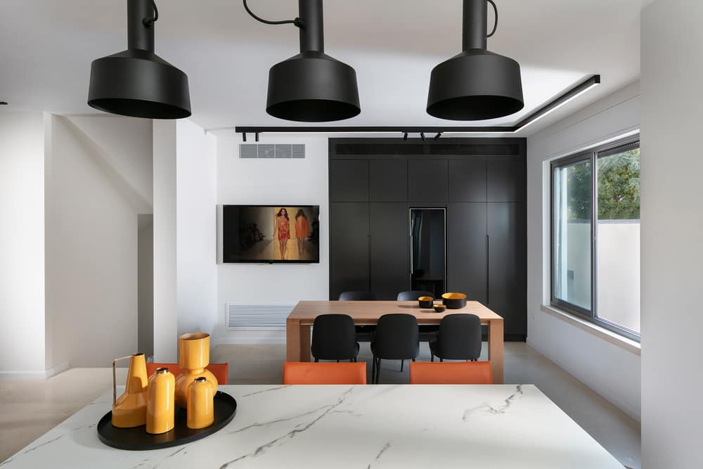
The kitchen is unusually large, which allowed Maimon to divide it into two areas. One side was dedicated to a large family dining table, behind which is a large graphite-shade utility cupboard that includes a VRF air conditioning unit, a wine fridge, and plenty of additional storage space. The other side was dedicated to the kitchen with its white facades and Dekton countertops. To break the kitchen cupboard mass, the designer created an open coffee corner with oak shelves.
The front of the kitchen island was covered in walnut veneer. “Since the travertine stone has a somewhat brown shade, some of the accessories I used around the house, and specifically in the kitchen, are in shades of orange that add touches of color and liven up the space”, says Maimon. “The island is surrounded by orange bar stools as well as two polymer backless stools to allow for an optimal view of the intimate garden, often used by the family for breakfasts”.
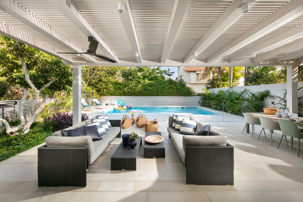
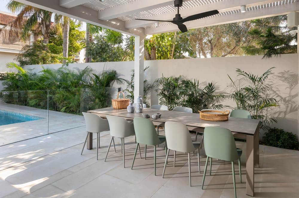
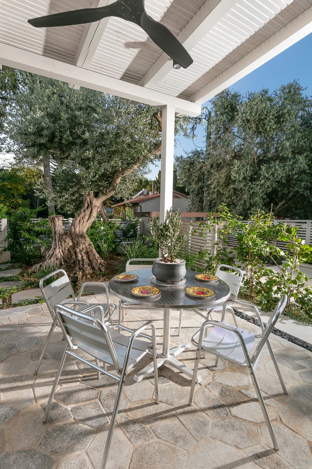
Amorphic iron-like stone with pebble contours was used for the exit from the kitchen to the garden. “We placed a seating and dining area under a large pergola, overlooking the swimming pool, as well as a BBQ station”, adds the designer. “Soft pastel tones of green and gray were used as part of the outdoor design, maintaining a classic yet contemporary feel”.
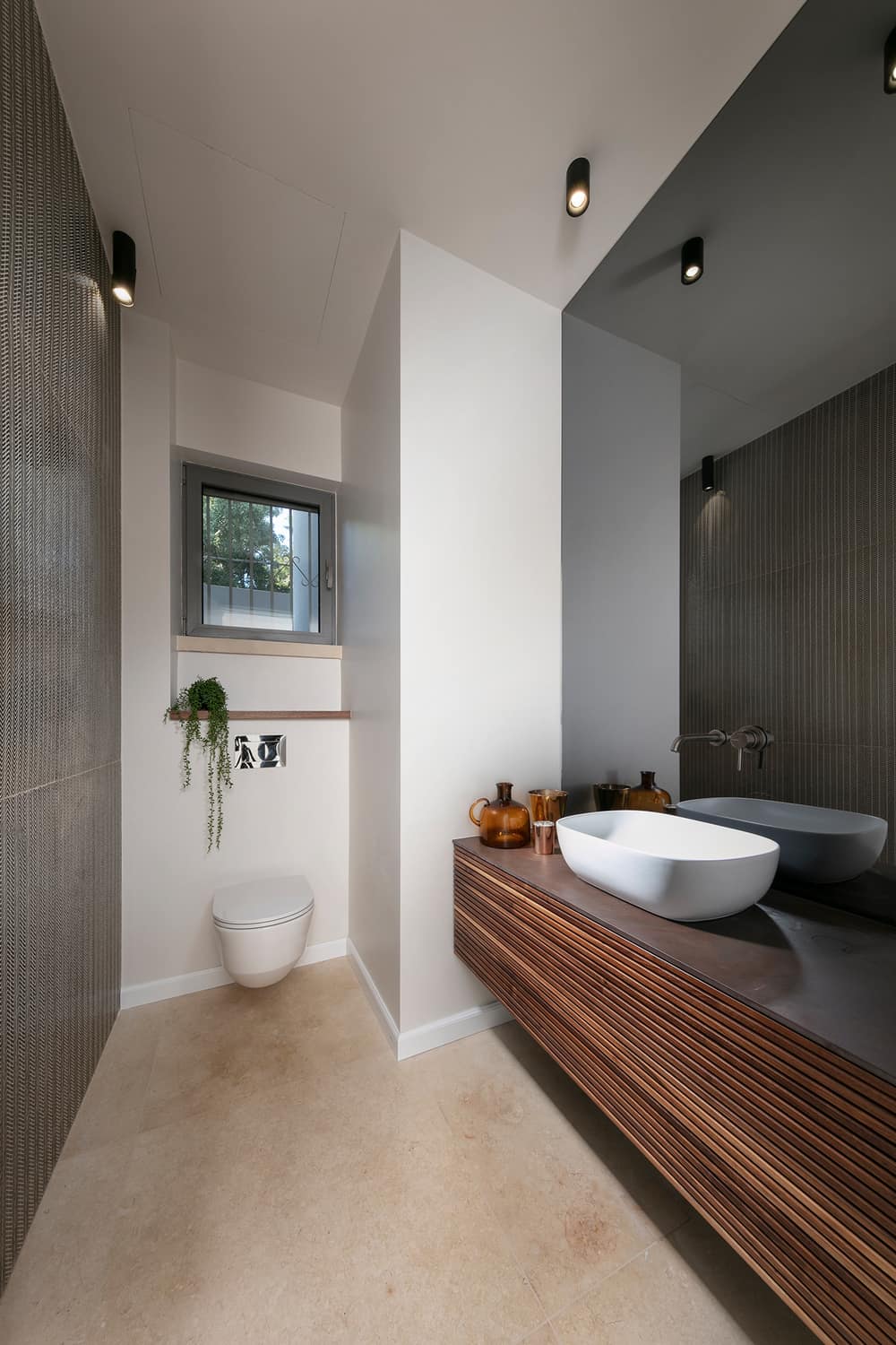
The guest toilets, which were completely redone, are located on the entrance level. The carpentry unit was custom designed by Maimon, and similarly to the unit in the lounge, it was made of walnut veneer. The unit was fitted with a brown Dekton top that blends harmoniously with the wood front. One wall was tiled in gold, whilst another was covered with a large mirror that doubles the sense of space.
The two top levels were redesigned. The bedroom level was redesigned to include a master bedroom and three bedrooms for the children. One of the children’s bedrooms has an en-suite, and the other two bedrooms share a joint bathroom. On the top level, Maimon planned a guest room with an en-suite bathroom that is used as a home office on a day-to-day basis.
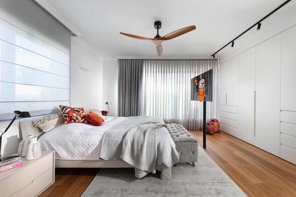
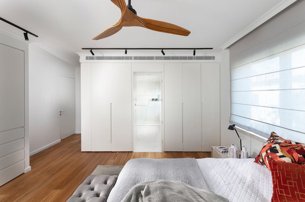
At the entrance to the parent’s master bedroom, Maimon planned a shoe cupboard fully fitted with a mirror that creates a greater sense of space. The bed was positioned in the center of the room along with a TV on a rotating mount. “The owners didn’t want a walk-in wardrobe, so I split the storage into two sections”, she explains.
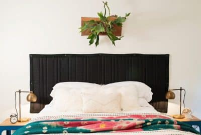
“I designed a cupboard across from the bed, and an additional cupboard alongside the bed that frames the transition to the bathroom. In order to maintain the ceiling height, I avoided lowering the ceiling and instead created cornices that resemble gaps in the plaster”, explains the designer. “Similarly to the rest of the level, walnut parquet was used for the bedroom floors. The overall effect is bright, with touches of color created by adding gray, brown, and orange textiles that blend beautifully with the parquet”, She adds.
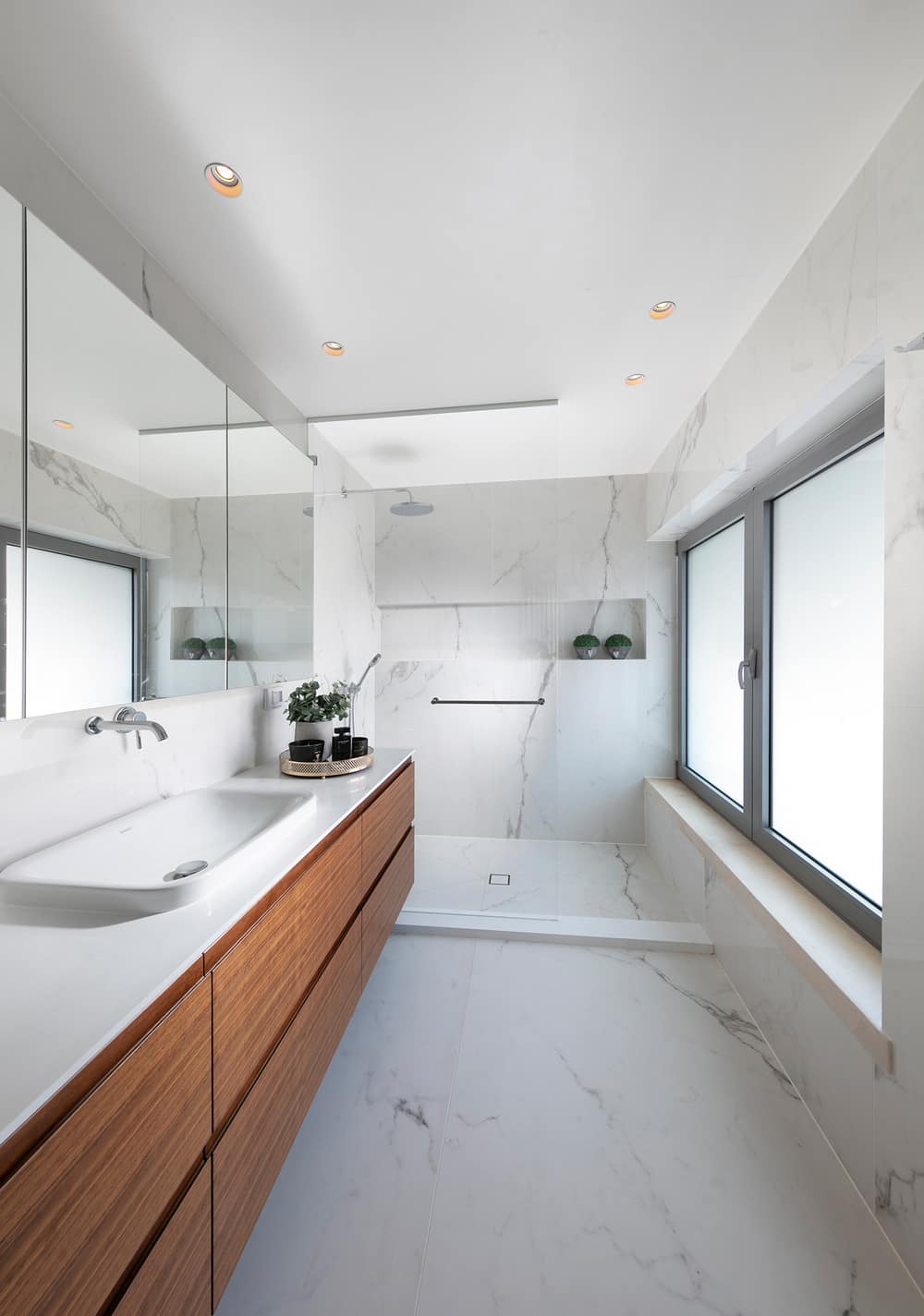
The designer also maintained the neutral color palette in the couple’s bathroom where she used large thin porcelain tiles that create a homogenous continuous look. The bathroom was fitted with a large and spacious walk-in shower with large niches for products, and the cupboard doors were also made of walnut wood.
The children’s bedrooms were designed in a young and playful manner, whilst maintaining a thread of continuity from the property’s eclectic style, and their bathrooms were decorated with gray and white terrazzo tiles.
