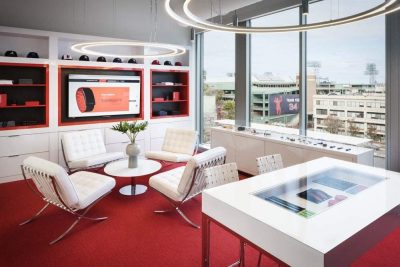
Project: Trask Solutions Office
Architects: Studio Perspektiv
Authors: Martin Stára, Ján Antal
Collaborators : Vojtěch Hasalík
Location: Prague, Czech Republic
Completion 2018
Project size 2 800 m2
Photography: Jakub Skokan and Martin Tůma / BoysPlayNice
High-class punk
Studio Perspektiv, a Prague based team of architects, designed a brand new office for the technological & consulting company Trask solutions a.s., a long term innovations partner of big companies and institutions.
In the beginning, there was a demanding, courageous client with a vision, and a challenging building in Prague’s developing business district Pankrác. In the end, there is an experience. Difficult to describe. A perfect storm of raw materials, a high-class punk.
Good breakfast is everything
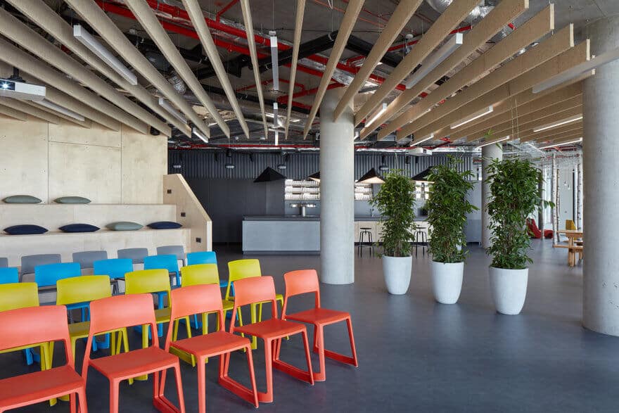
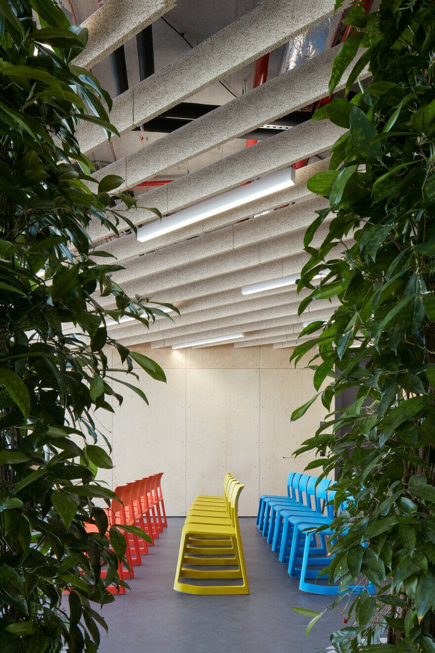
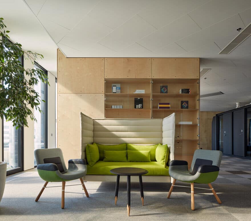
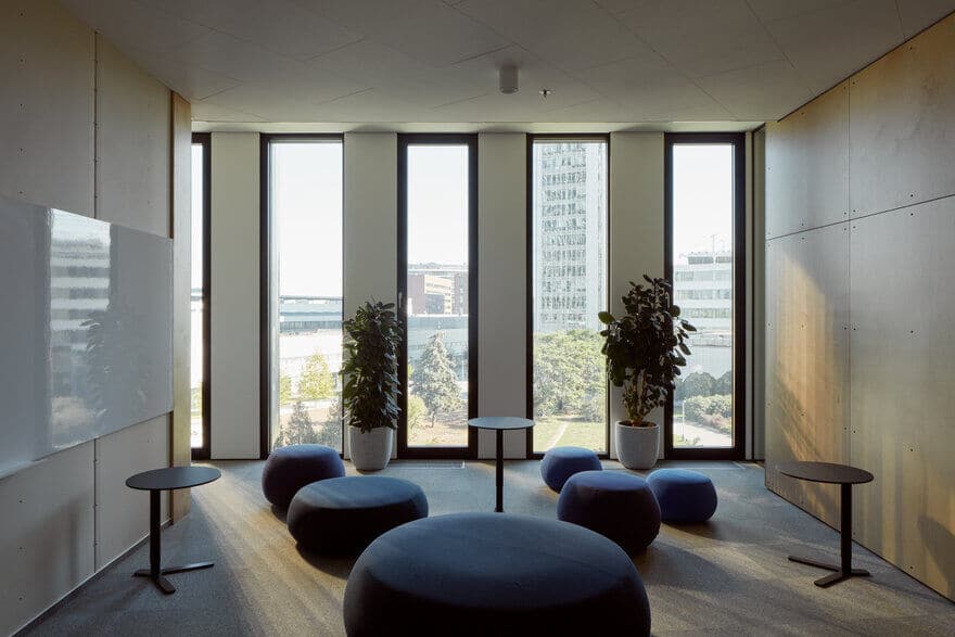
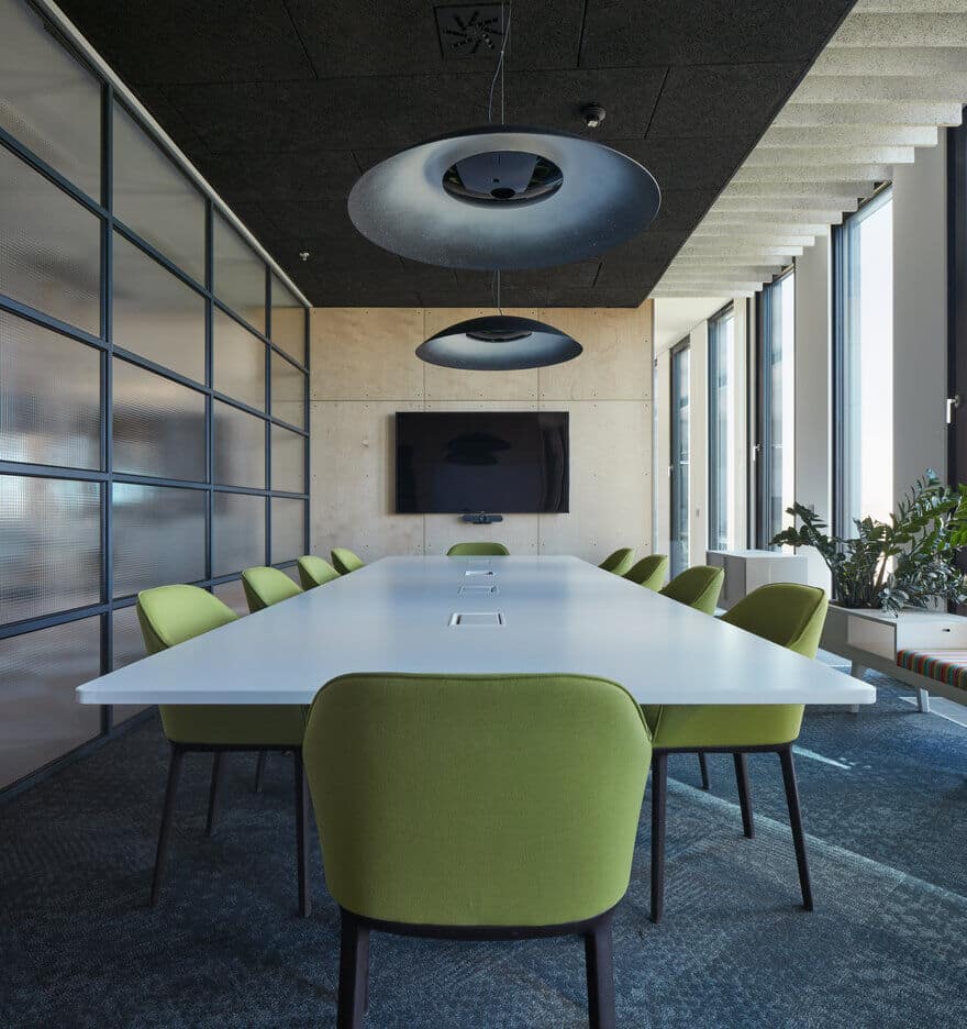
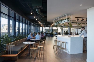
Trask’s rich company culture directly influenced many important decisions in the course of the project. The power of tradition and community is clearly visible in the arrangement of lounges and common spaces. Both the colorful conference area and the main community “living room” spanning over several hundred square meters prove that Trask takes good care of its employees.
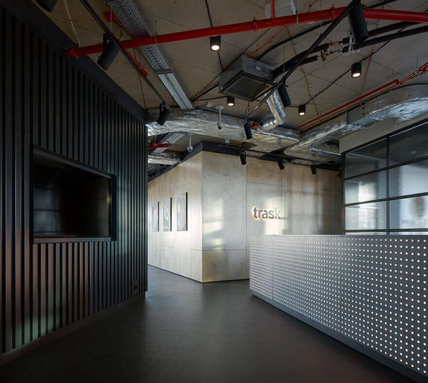
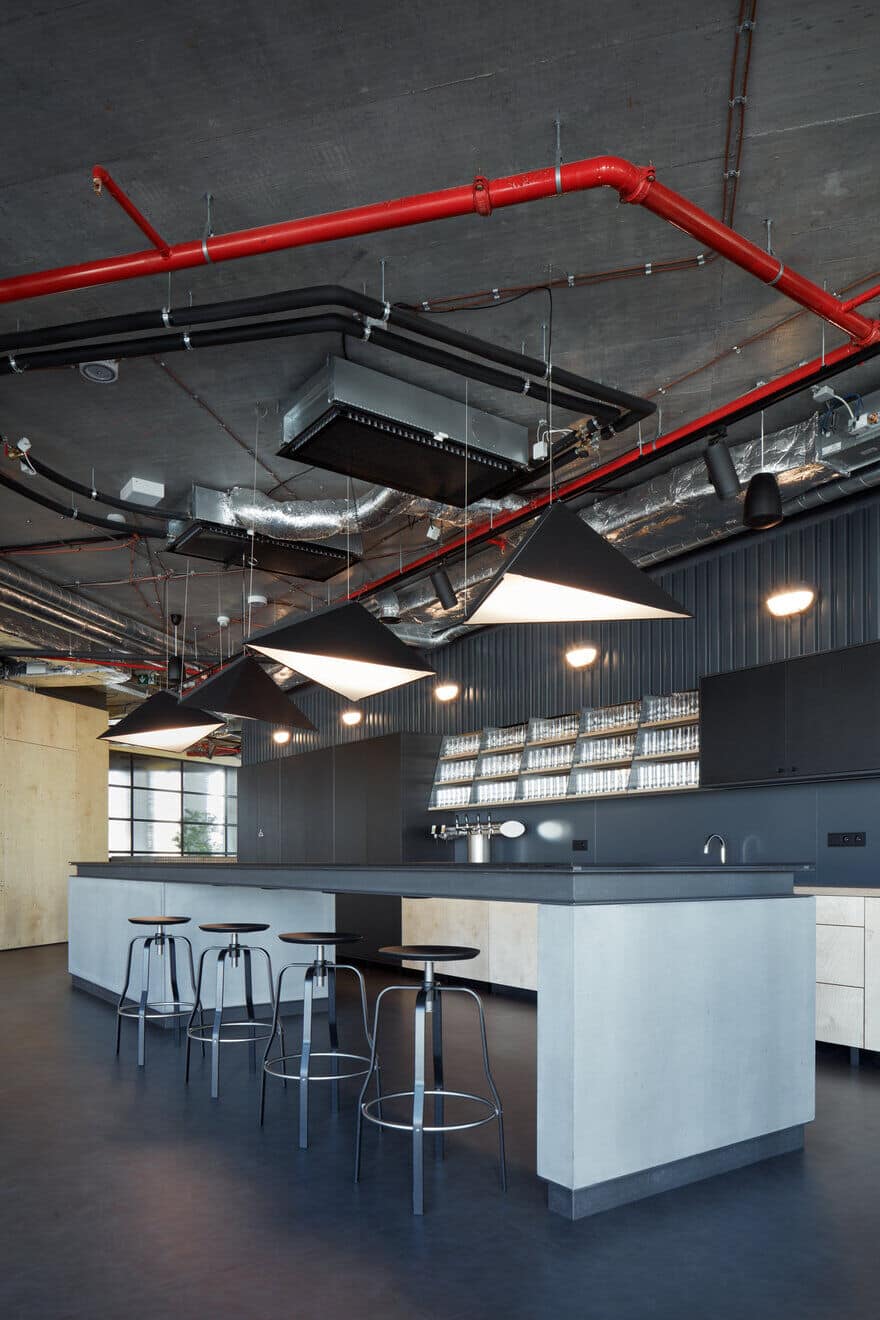
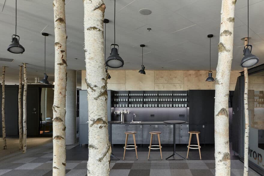
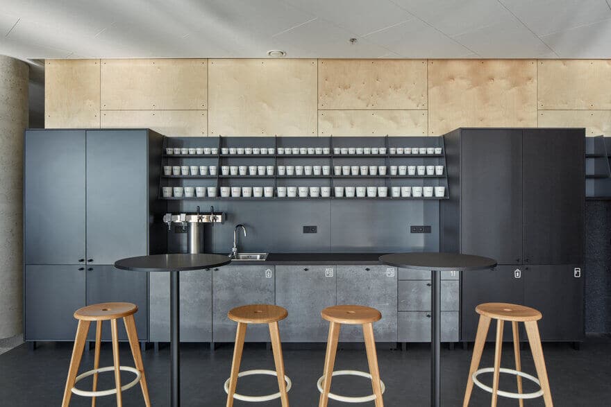
Together with Gravelli – a luxury concrete products manufactory, Studio Perspektiv prepared a literally solid ground for company breakfasts, a six meter long bar made of steel and concrete. With all dear guests in mind, the entrance area doesn’t fall behind either. It provides a little sneak peek of the spatial arrangement and the juxtaposition of raw plywood, corrugated sheets and wired glass on individual walls. The massive reception desk, made of translucent LiCrete(C), will not leave you indifferent.
It is easier to go through the difficult stuff on a swing
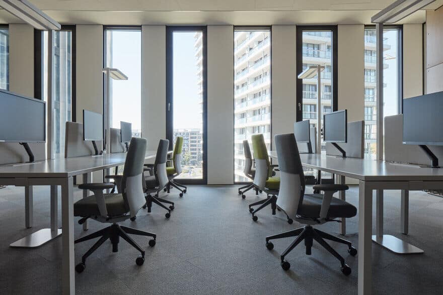
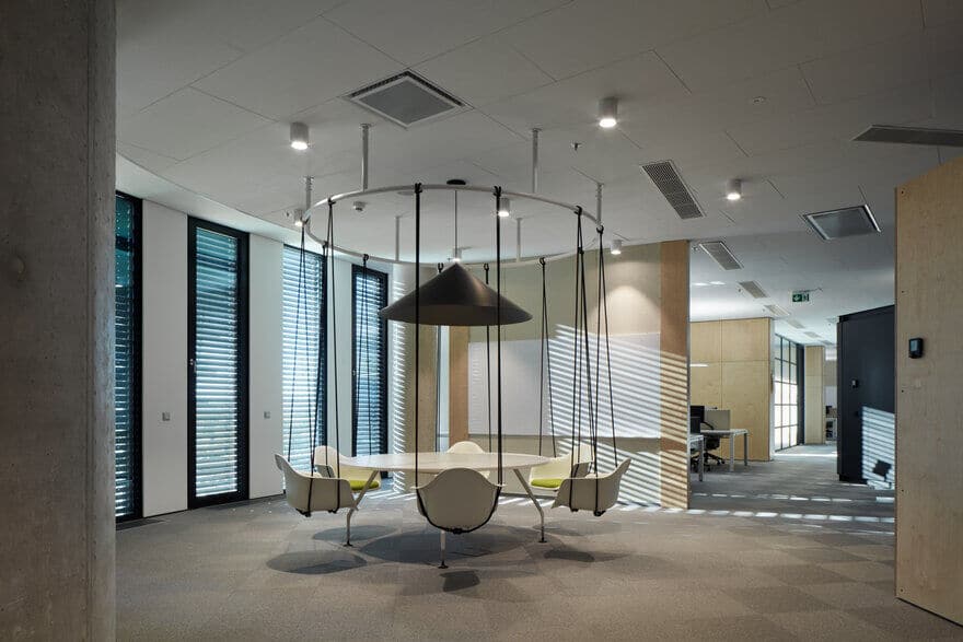
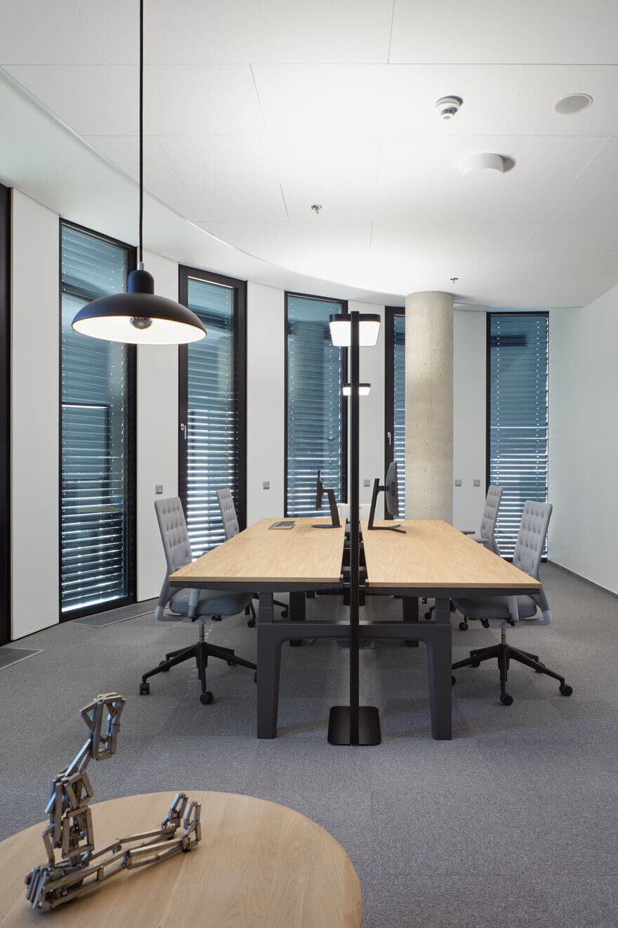
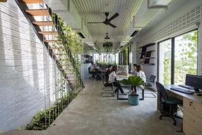
Separated only by whiteboards, the bays of work desks follow the organic shape of the building. No one is isolated. Everyone is able to find their way even though there are no corridors. In between work bays the authors located study room with a library, lounge nests to relax and chill, a focus room for tasks demanding extra concentration. Would you like to swing a bit and go through the project with your co-worker? Sure you can. Or would you rather get a stretch and remind yourself of the elementary school? Old PE equipment is at your service. Do you have to bring your child with you? Yup, there’s a children’s corner (with swings included).
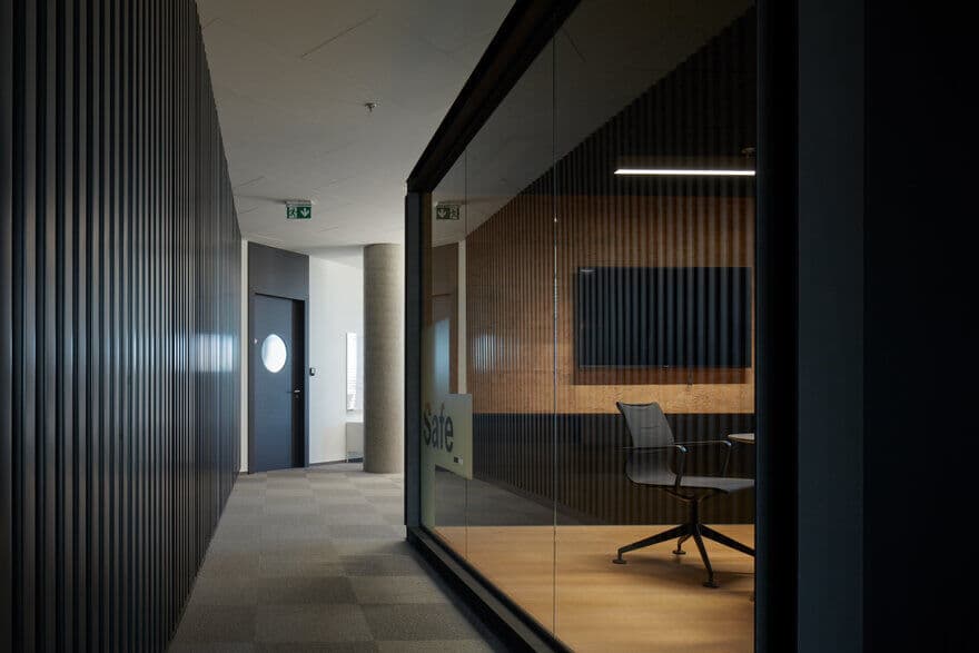
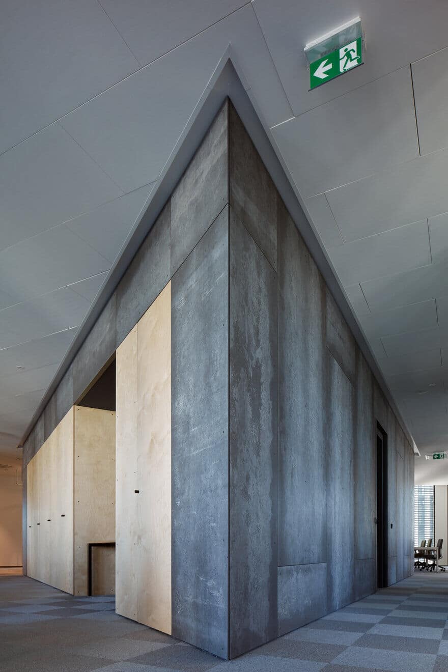
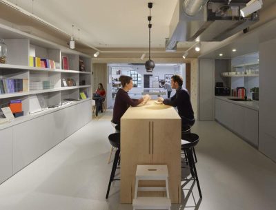
Old fashioned walls are… well, old fashioned. Meeting rooms are defined by high, custom made cabinets and separated from the common space by wired glass panels encased in a robust anthracite grid. Cabinet walls define individual spaces, hide columns and serve as storage space – always exactly where you need them to be. Collaboration doesn’t happen solely behind the closed doors of meeting rooms. The fundamental decisions are often made in improbable places. That’s why there’s a birch grove with a round high desk in it, a fully equipped game room and a dedicated gym (that’s called Beach for some reason – could it be because of the sweat?).
Don’t draw on the plasterboard
Trask’s office interior is the result of the rare symbiosis of design, courage and obsession with detail. Everything is natural, nothing is a lie. The area is dominated by raw and genuine materials – birch plywood, large format sheet metal, concrete, glass and wired glass. Since the raw plasterboard is used as a decorative surface, one of the less expected challenges for the authors was to assure its quality. It was complicated to explain to the workers that they cannot draw and write on the gypsum panels. The walls are decorated by paintings of emerging Czech painters and graphic artists. Every single pictogram was carefully considered. Every last flower has its place and meaning. Because in many cases, quality seems to be the cornerstone of sustainability.

