Project Name: Galley House – Victorian era home extension
Architecture & Interiors: Reigo & Bauer
Design Team: Stephen Bauer, Merike Bauer, Fabian Grieco
Structural Engineer: Blackwell
Construction: JH Reynolds Contracting
Location: Toronto, Ontario, Canada
Area: 2,150 sf ( 200 m2)
Completion: 2018
Photography: Tom Arban
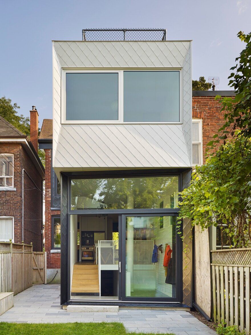
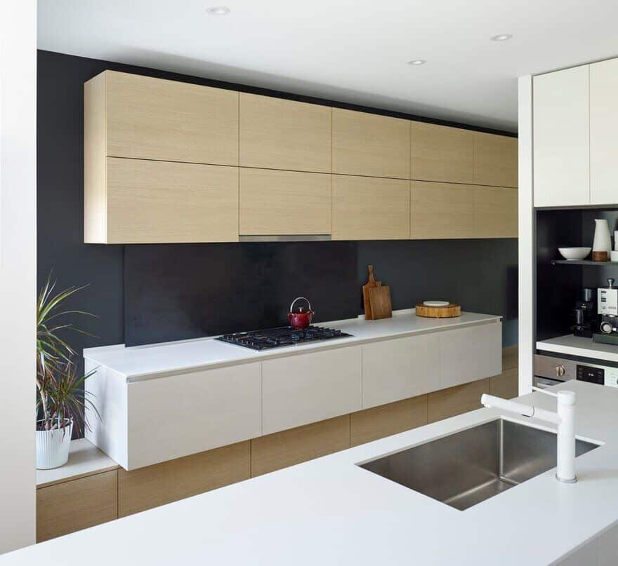
Located in Toronto’s Roncesvalles neighbourhood, the Galley house challenges conventional notions typical of a semi-detached, Victorian era home, by providing a new rear entry hub, internal connectivity, and abundant natural light within a two-storey volume addition.
The client’s desire was to convert their home into a more livable and beautiful space that would suit their family’s lifestyle. Merike Bauer, a founding partner of the firm along with Stephen Bauer, explains “We approached that brief by reconsidering two primary elements: the pattern of circulation into the house and access to natural light.”
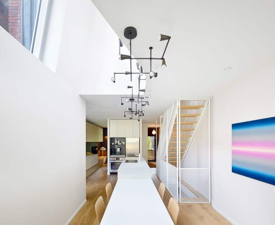
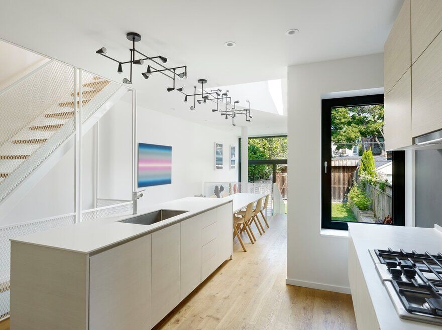
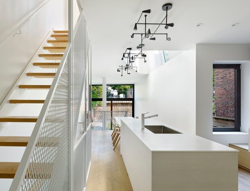
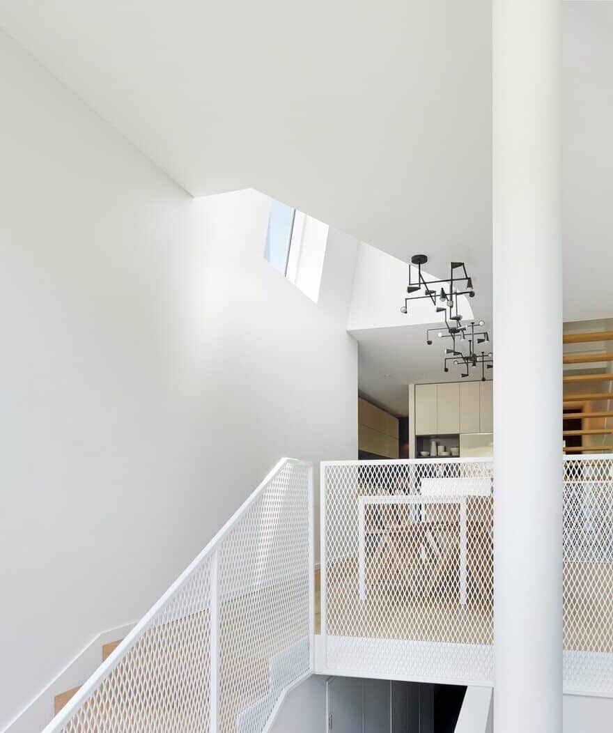
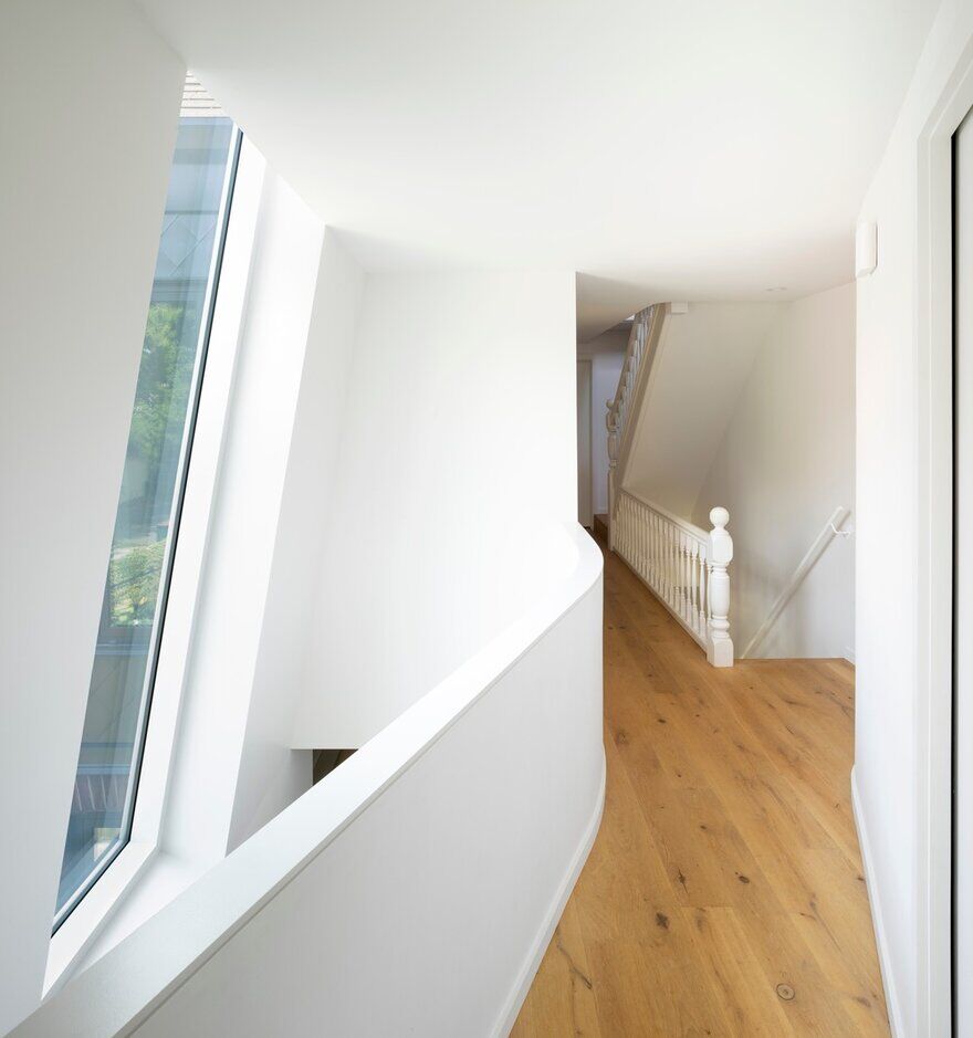
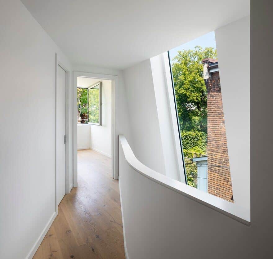
A key feature in the project speaks to Reigo & Bauer’s ongoing studies of daylighting all parts of a home. Above the dining room, the subtle tilt of the east facing upper wall, and a cut-away in the second floor, permits the large window above to act as a skylight, flooding the centrally located dining area below with natural light, whilst connecting the upper and lower levels–– an unexpected condition in Toronto’s Victorian era homes. Courtesy of slight offsets and subtle sculptural design elements, the natural light reflects off smooth, curved matte white walls throughout, while the upper floor benefits from the newly expanded views afforded by the tilt of the wall & window.
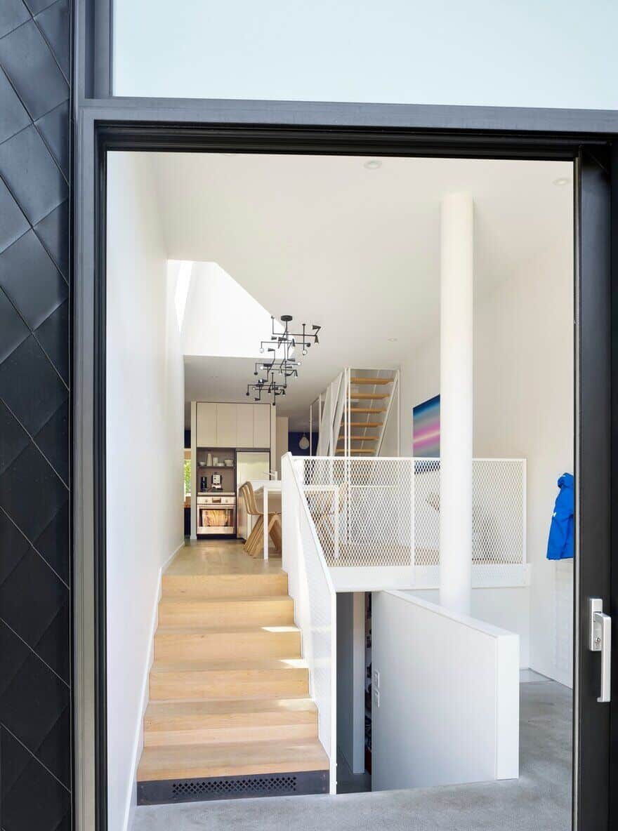
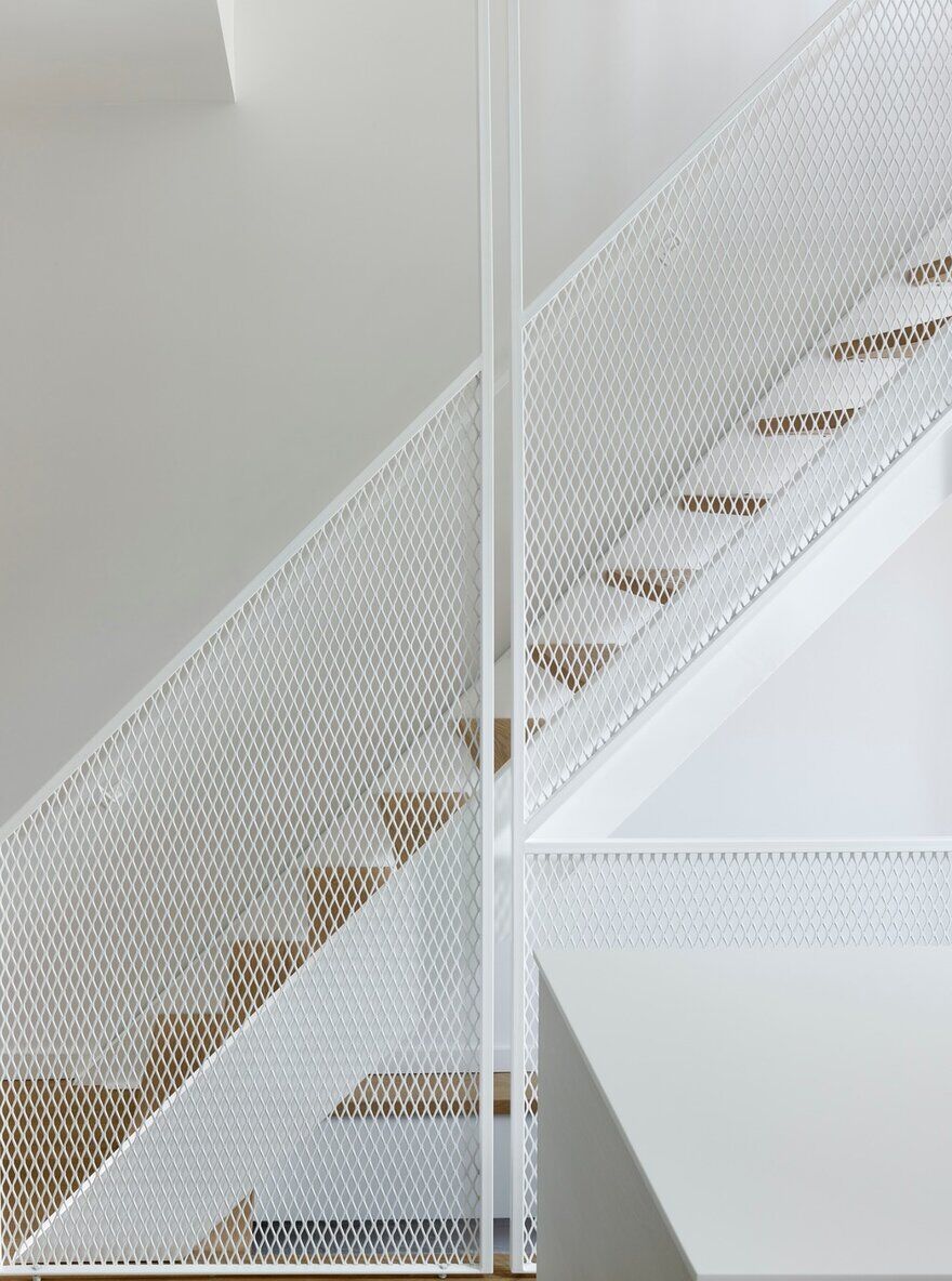
Only freestanding volumes of wall divide spaces on the main level, providing a sense of inter-connectivity throughout the project. Unconventionally, the back of the main level has been given over to a dropped oversized landing, connecting main level, grade and basement. Serving as the primary entry hub to the home, an open concept mud room is tucked in beside the stairwell, where Reigo & Bauer used diamond mesh railings to discretely obscure the coat storage from the main floor space, without obstructing outside views. The extra three feet of height gained from the dropped level has provided the main floor with expanded views to the backyard through floor to ceiling glass.
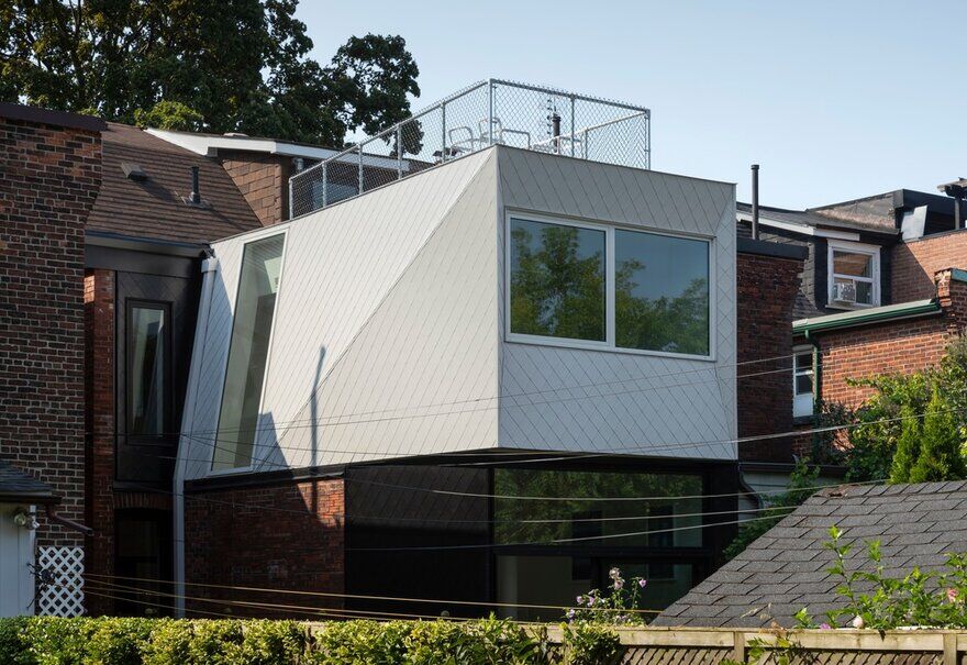
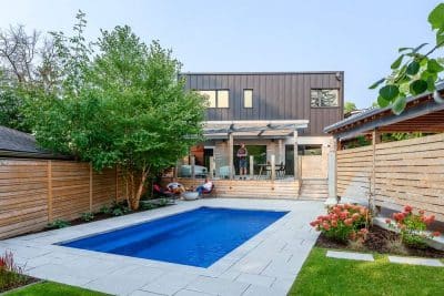
In addition to addressing core elements of the home’s internal redesign, the partners’ use of innovative materials and architectural design elements ensure the addition’s external façade both contrasts and compliments its neighbouring environment. “At its widest point, the house is only 20 feet across, which narrows to 16 feet for the extension at the back,” explains Stephen Bauer. “Given those parameters, we put a lot of thought into architectural elements that would not only achieve a modern look for the extension, but would also capture sunlight efficiently while mitigating shadows and reflections cast on and from neighbouring spaces.” For the exterior cladding, Reigo & Bauer sought a contemporary complement to the traditional brick façades of the existing home and its surroundings, opting for a unit-based cladding that would serve the same principal, but in the form of black and white diamond-shaped metal tiles. The two-tone cladding effectively distinguishes the volumes as stacked layers, rather than giving the impression of a single overarching façade. The upper and lower volumes are distinguished not only by the contrasting colours, but very subtly by their geometry. A slight 10º degree slope of the upper side window wall is echoed below in a surprising variance from square in the side and rear walls; the offset reinforcing the reading of two stacked volumes.
On the roof of the extension, a sundeck completes the addition, with light industrial fencing that embraces the quality of transparency found throughout the project.

