Project: Jaffa Holiday Apartment
Planning and design: Keren Niv Toledano
Where: Andromeda Reborn project, Jaffa, Israel
For: A holiday apartment for a family with 4 adult children
Area: 160 sq.m. built-up + 22 sq.m. balcony
Photo Credits: Itay Benit
The year 2022 can already be summarized as one of the most fertile ever in the local design industry, and at the start of the new year, we have chosen to present to you one of the most beautiful projects created during the year: A Jaffa holiday apartment to which you cannot remain indifferent. With wisdom and sensitivity, the interior designer, Keren Niv Toledano, selected items and elements that show enormous respect for the environment and the local culture, with contemporary and modern adaptation. And the result? Precise, exciting and inspiring.
In recent years tiny Israel has provided several perfectly designed projects which, together with meticulous planning and attention to every detail, have succeeded in striking a chord of emotion. An example is the holiday apartment designed by interior designer Keren Niv Toledano for a family with four adult children in one of the most sought after locations in Israel – the Andromeda Reborn project in Jaffa, constructed by the sea. As with other projects by Ms. Niv Toledano’s studio, the design of this charming apartment is clearly also uncompromising: It does not have any main and supporting actors; the entire space was treated as a holistic unit and each layer was reviewed in the finest detail and implemented with love and care.
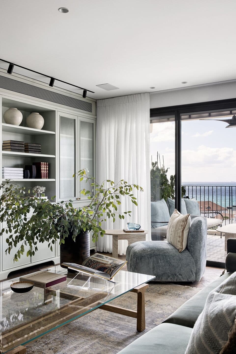
In this way, the designer succeeded masterfully to combine the old with the new: While state-of-the-art technology and systems and meticulously designed custom-made items were integrated throughout the apartment, it also includes several masterpieces that show plenty of respect for the original Arabic architecture and art that characterizes the area, alongside eye-catching and heart-warming ancient ceramic pots and museum pieces that enrich the spaces and make them multi-layered.

“The couple bought the apartment as a shell with the aim of converting it into a holiday apartment to be used during holidays, festivals and weekends”, recalls Ms. Niv Toledano. “Originally, it was planned as a 5-room apartment, but we converted it into a 4-room apartment to create a large, spacious public space. For an almost direct connection with the spectacular view from outside, we replaced the standard planned kitchen window with panoramic window. As part of planning the apartment infrastructure, all layers were addressed and now it includes the most advanced systems such as underfloor heating, sophisticated air-conditioning systems, smart electricity, security and alarms, sound and audiovisual system, and more”.
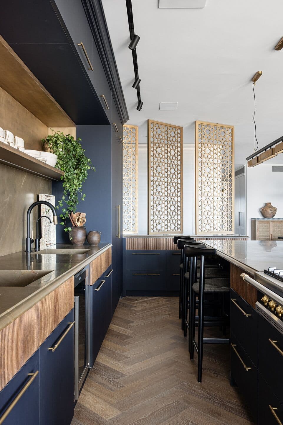
The apartment is spacious and bright, and upon entry, an impressive public space is revealed. To create a break and a dimension of intimacy at the entrance, the designer planned a partially visible and partially hidden entrance hall so that the public space is not revealed all at once, but rather in stages: “We produced a wooden wall to hide the electrical cabinet and the other side, which faces the kitchen, was designed as delicate partition with a piece of furniture in the lower part and latticework above on a rotating pivot axis that allows positioning it diagonally. At certain angles, the latticework appears to be a screen and by moving slightly allows enjoying the view from the panoramic windows and the public space. This latticework is the product of carpentry painted with liquid metals for an antique brass appearance. The choice of this specific design is part of the narrative throughout the entire project as part of a real attempt to create an exciting, modern and eclectic residential environment containing original Arabic elements that link the apartment to the area. We combined items of art, accessories, latticework and other decorative pieces that match the location. We cladded the floor with dark oak parquet in a fish bone pattern that creates depth and serves as a wonderful medium for the elements and items incorporated in the wings.”

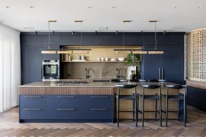
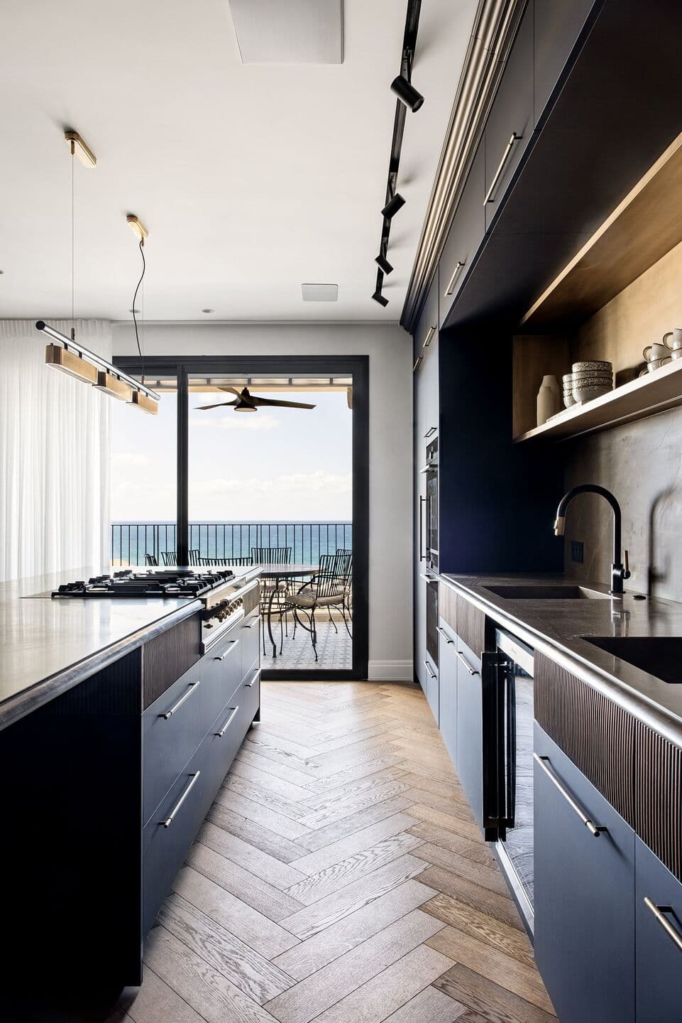
The use of liquid metal by the designer in the entrance hall is repeated in various areas of the apartment in various interpretations. In the kitchen, for example, where Ms. Niv Toledano used a unique technique to clad the facade of the island seating area and the high facade, this time with a brass finish. “The kitchen was planned as two linear lines; an accent wall and an expansive island that incorporates a cooker top and a seating area for 6 diners. The facades were clad with nano and brass sheets with innovative painting combined with corrugated oak on the drawers. We installed an integrated refrigerator and freezer and as the apartment owners keep kosher, we designed 2 dishwashers, 2 sinks and 2 ovens for them,” adds the designer.

For the high facade, Keren chose a dark deep blue and brass handles: “They fit together with the deep dark oak and the liquid metal that is present in the hood and island area. Two linear light fixtures that emphasize the length of the island, are made of a combination of metal rods and natural Armani Gold marble. The sink niche is clad with a brown veined countertop that emphasizes the deep dimensions of the entire space.
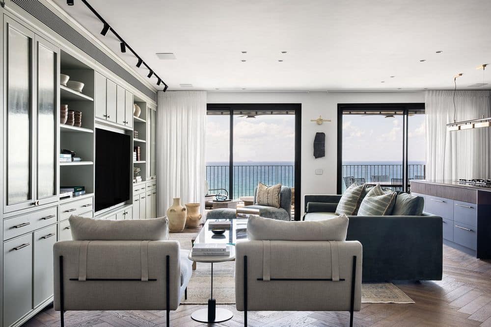
Opposite the accent wall of the kitchen, there is a perfectly symmetrical accent wall in the living room outlining the space. Ms. Niv Toledano wisely created a scale of colors from the dark kitchen facade, though the brown marble countertop to the living room sofa upholstered in velvety sage colored fabric, the original vintage aqua carpet and the actual wall that features a light blue-green designed carpentry piece. “The color scale fits well with the view of the sea that penetrates the panoramic windows in all its glory. The accent wall contains the air-conditioning, sound and multimedia systems as well as sealed storage compartments, a bar and openings to display books and decorative items. To balance the material mass, the living room table that I chose is made of a transparent glass plate with oak legs in a pagoda design. On one side, I placed two pale floating lightweight armchairs decorated with leather straps that contrast the massiveness of the elements present such as the sofa and kitchen island. I placed a stone slab resting on an iron leg next to them. On the other side of the living room, I incorporated an armchair and ottoman upholstered in deep sky blue at a diagonal angle. This way, the outdoor lounge furniture on the balcony can be seen through the panoramic window.
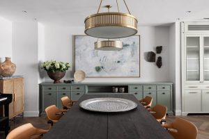
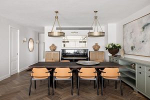
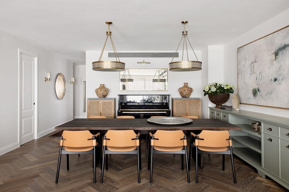
To preserve the longitude and latitude grid in the public space, the designer incorporated carpentry items in the dining area that maintain the perfect symmetry. “In order to create a conceptual separation between the living room and dining area, I placed an antique wooden bench along the back of the armchairs, creating a visual barrier and on the other hand, providing a view of their impressive backs made of iron rods and leather straps. The dining table chosen is made of chocolate colored brushed oak surrounded by cognac colored leather armchairs imported from Italy. We emphasized this space by a pair of brass light fixtures that are a hint of the Jaffa style we sought to create”.
“Artwork in delicate sea tones hangs above the deep sage carpentry item. There is a black piano parallel to the dining table with oak colored rattan dressers on either side for storing musical instruments with inlay trays in shades of blue and white on them bearing archaeological pots, another example of the authentic, artistic museum items that we incorporated in the space”.
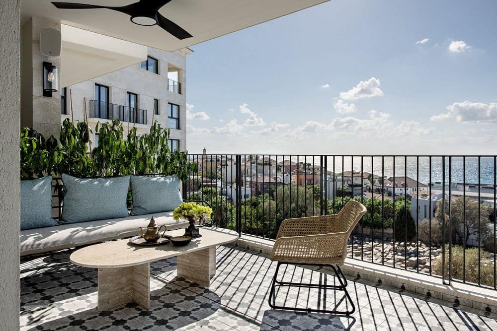
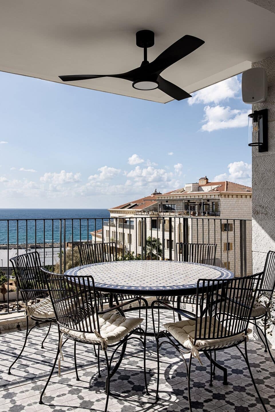
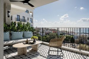
The view from the intimate balcony is unique. Ms. Niv Toledano chose to tile the charming area in Jaffa stone and due to the proximity to the sea, she used heavy iron furnishing to deal with the winds, sun, humidity and temperature changes. The family members enjoy dining and living room areas that offer spectacular views of the authentic low buildings, the beach and the Mediterranean Sea
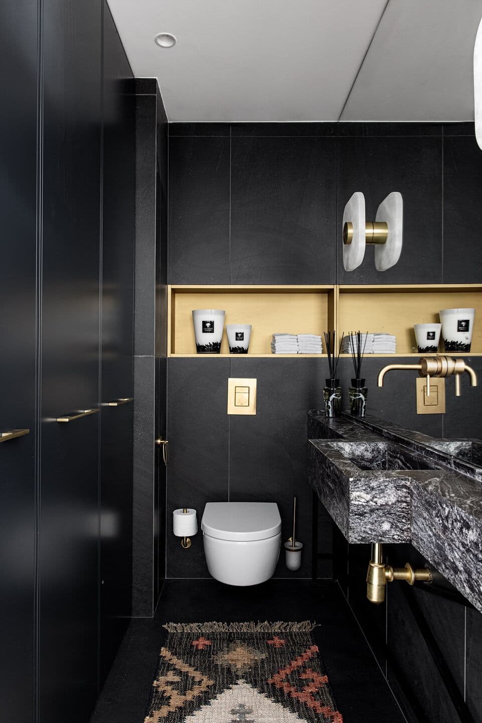
The guest bathroom in the public wing was not included in the original plan. It was added in respect of the new program and is located on the other side of the carpentry item in the entrance hall. Its ambiance is different to that in the public space – dramatic and dark with a black and brass theme: “I used dark flooring and tiles and chose a floating black and white marble sink. The mirror was installed along the length of the wall, doubling the space. Two ornate alabaster and brushed brass light fixtures emerge from it. Above the toilet, I created a niche clad in brushed brass-colored liquid metal, which is a kind of jewelry.”
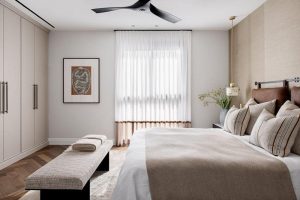
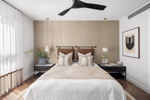
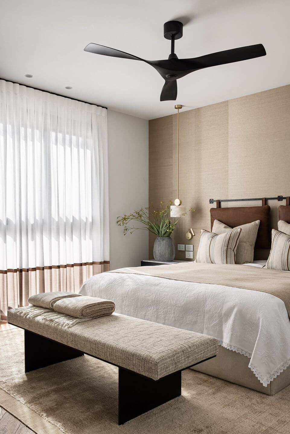
And from the public to the private, the planning there included a master guest suite, a bathroom and a study that can be converted into another guest room when necessary. For the couple’s master bedroom, Ms. Niv Toledano chose a natural desert brown color palette to create a Sahara ambiance. The wall behind the bed is clad in weaved linen wallpaper and the bed is also upholstered in linen fabric. The headboard is made of an iron rod integrated with two leather cushions. The large wall wardrobe and sleeping area are separated by an iron bench with the seat upholstered in rich fabric. Next to the bed are nightstands of different sizes in iron and lilac stone – a natural white stone with gray-purple veins. Two light fixtures of brushed brass combined with alabaster stone are suspended from the ceiling and to complete the soft and inviting ambiance, luxurious and pampering textiles, a silk carpet, artworks and a curtain with a hem and belt have been incorporated.
The couple’s bathroom was designed with a darker, more dramatic atmosphere: “Here too, I chose to work with the same liquid metals, this time in rose gold and copper tones,” explains the designer. “I incorporated a carpentry piece made of oak with a blue-stone countertop and integrated sink. All bathroom accessories are in rose gold and as with the guest bathroom, also here I used a large mirror starting from the sink countertop up to ceiling height. A blackened brass light fixture emerges from it.”

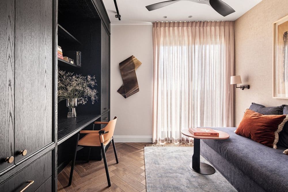
At the end of the public space is a passage leading to the guest suite, home office and bathroom. An impressive authentic Moroccan tray and mirror hang on one side of the communication cabinet and on the opposite wall. The carpentry item in the work room, which also includes a desk at the end of the wardrobe, is made of black oak that emphasizes the natural texture of the wood. Opposite it is a sofa that opens easily into a double bed. The room was designed in brick and terracotta tones and also here, monumental museum artworks were incorporated, this time in brass.
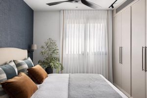
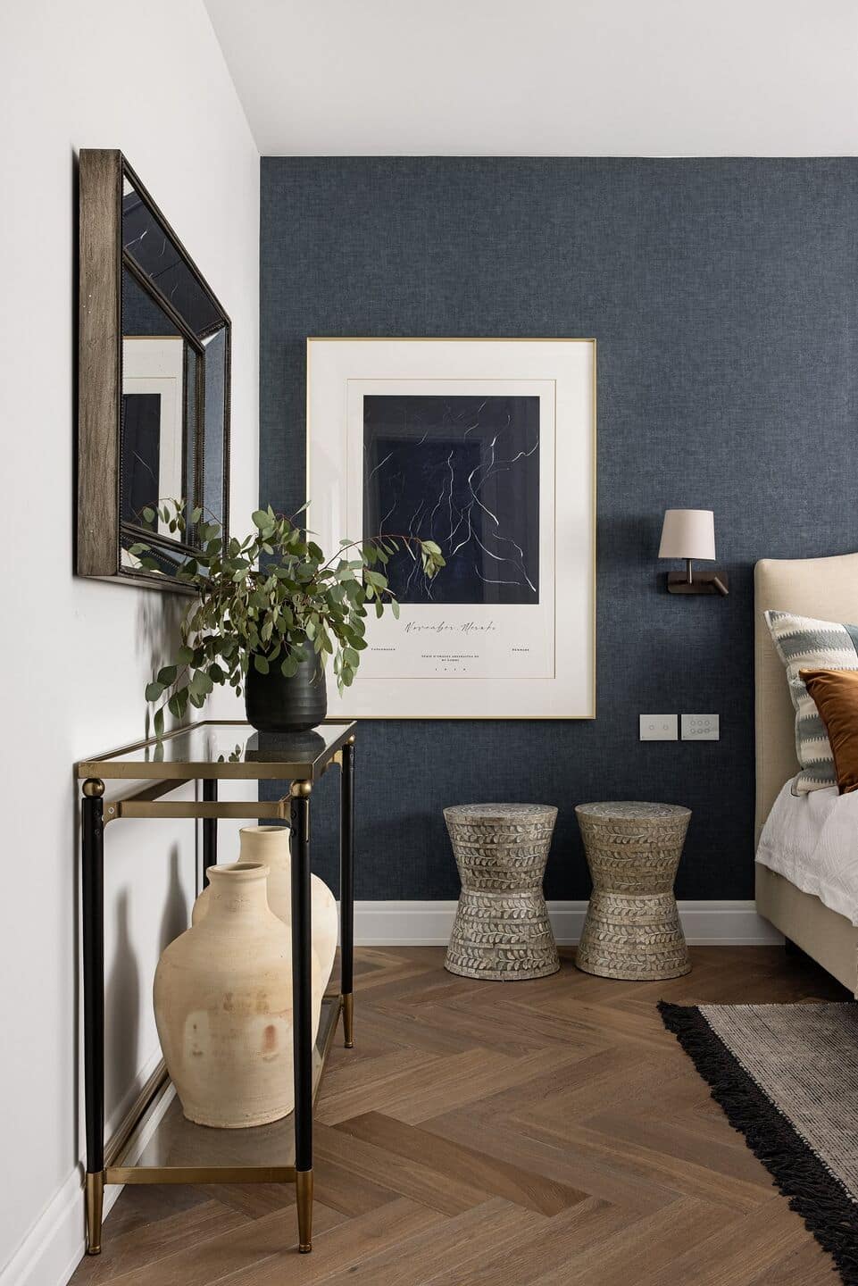
The guest suite feathers a slightly different color palette; here Ms. Niv Toledano chose to use denim blue wallpaper and matching artwork together with elements in shades of nude and aqua. In the ensuite bathroom, earthy brown tiles were used together with rose gold elements and a black oak carpentry item. The designed large mirror creates a double-space effect in this space too.
