Project: A House with Thai Resort Vibes
Architecture, planning & design: Halel Architecture and Interior Design
Location: Sharon Region, Israel
Property size: 270 sqm (four split levels)
Plot: 380 sqm
Owners: a professional couple and their four children, aged 11-21
Photography: Oded Smadar
These owners chose this property based on its fantastic potential and carried out an extensive renovation project that transformed it inside and out. The original property was stripped down to its basics and was built back bigger and better. A spacious entertaining space on the ground floor, luxurious bedroom suits, a garden that could compete with any spa resort and a pampering pool, all turn this house into a true gem.
The owners of this property, a couple who love to travel and have an eye for aesthetics, have purchased and renovated several apartments and houses in the past. They chose this property as they valued the potential of its original architecture, and they loved the fact that it had several split levels as opposed to a standard 2-storey property. The house was built in the 1980s as part of a development that characterizes the street, and its biggest advantage was the fact that the ceiling in the main living area could easily be raised to create a large open space.
The aim was to create a cozy home that would include a large open-plan ground floor with a large kitchen and a spacious living room, a lower level with a guest unit and entertaining area and bedrooms on the middle and top levels. Since the couple’s kids are grown, the preference was to plan the master suite on the top level and four kids’ en-suite bedrooms in the middle level.
The original house was too small to accommodate this, and thus once the plan was finalized, a building permit was processed to approve the build of an additional level, along with changes to the front facade and the roof, and an introduction of a swimming pool.
“Our focus when planning a home is to consider the best ways to maximize the sense of space throughout the property, both indoors and outdoors. On this occasion, emphasis was placed on planning the outdoor spaces as it was expected to have significant influence on the indoor living experience”, says Arch. Shira Muskal.
The detailed planning process took five months to complete, followed by a year-long building permit application process. The renovation itself was completed within eight months. During the renovation, the property was stripped down to its skeletal form and underwent significant changes, including the addition of another level. The process was similar to building a property from scratch but since most of the skeleton was already in place, it sped the process up quite a bit.
A House with Thai Resort Vibes – The building structure:
A dark bluestone paved pathway leads to the property’s main entrance, which is rich in detail and materials such as a small ornamental pool with beautiful aquatic blooms, an authentic Indonesian bench, and a variety of plant pots.
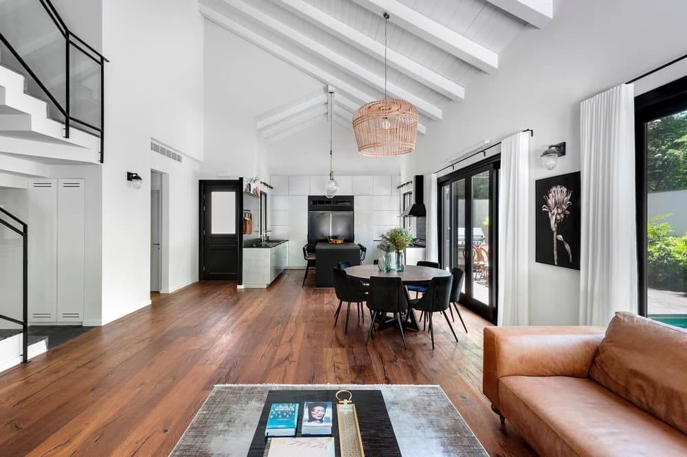
A classic black door with a fitted window leads us into the property. Upon entry, the most noticeable features are the high ceilings that immediately draw the gaze upward.
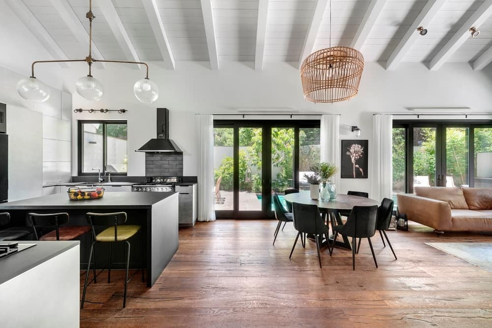
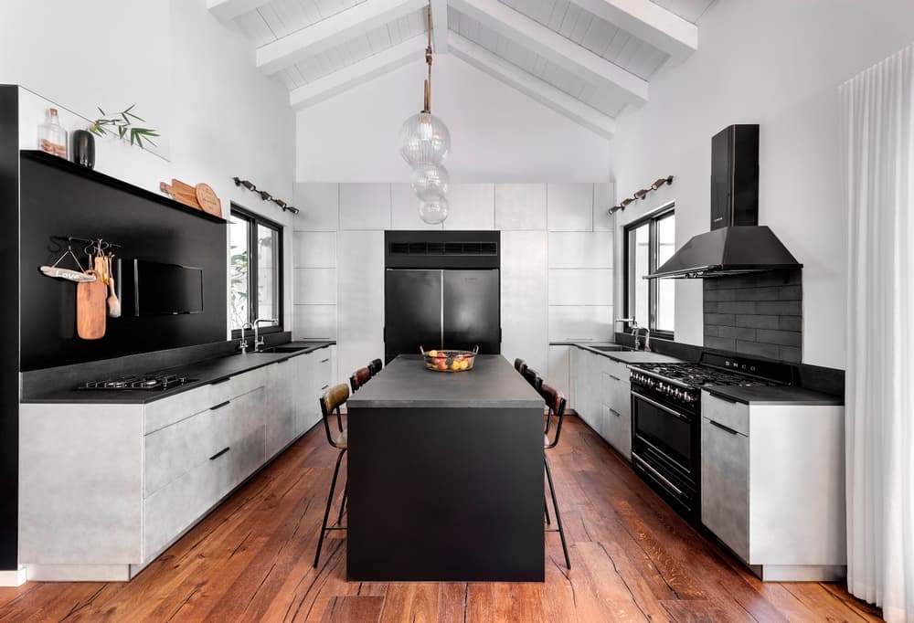
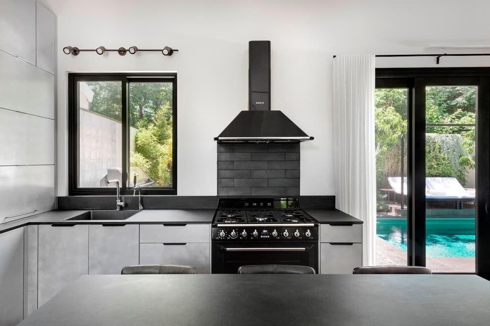
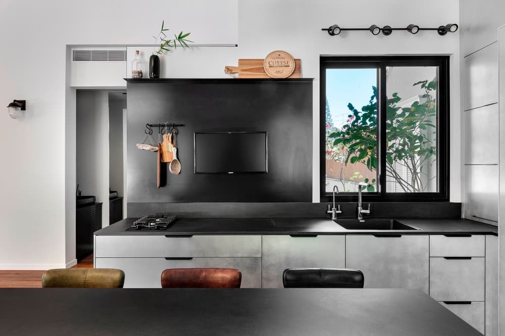
The main space includes a u-shaped kitchen with an island that is used by the family for daily meals. The fridge and pantry define the kitchen whilst cupboards along the walls offer ample storage and make the most of the ceiling height.
Worktops with sinks were fitted on either side of the island. One contains a retro-industrial oven and stove used frequently on weekends, and the other is fitted with a stove-top for daily use, and a TV screen.
The kitchen was fitted with high-end appliances and a unique finish. A light metal gray was chosen as the dominant color, giving the kitchen a sophisticated industrial look. Black Laminam surfaces fitted with dark granite sinks, along with two black mat fridges, complete the look.
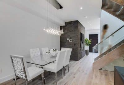
The dining corner is adjacent to the kitchen and a round table that can easily be extended from an eight-seater to a 16-seater, was positioned in its center. “We love to place round tables in open spaces or corners as their presence in the space is relatively light, which serves us well when the space isn’t very big”, says designer Hadas Roth.
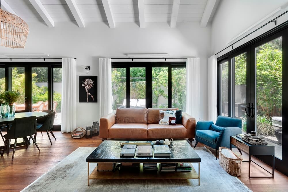
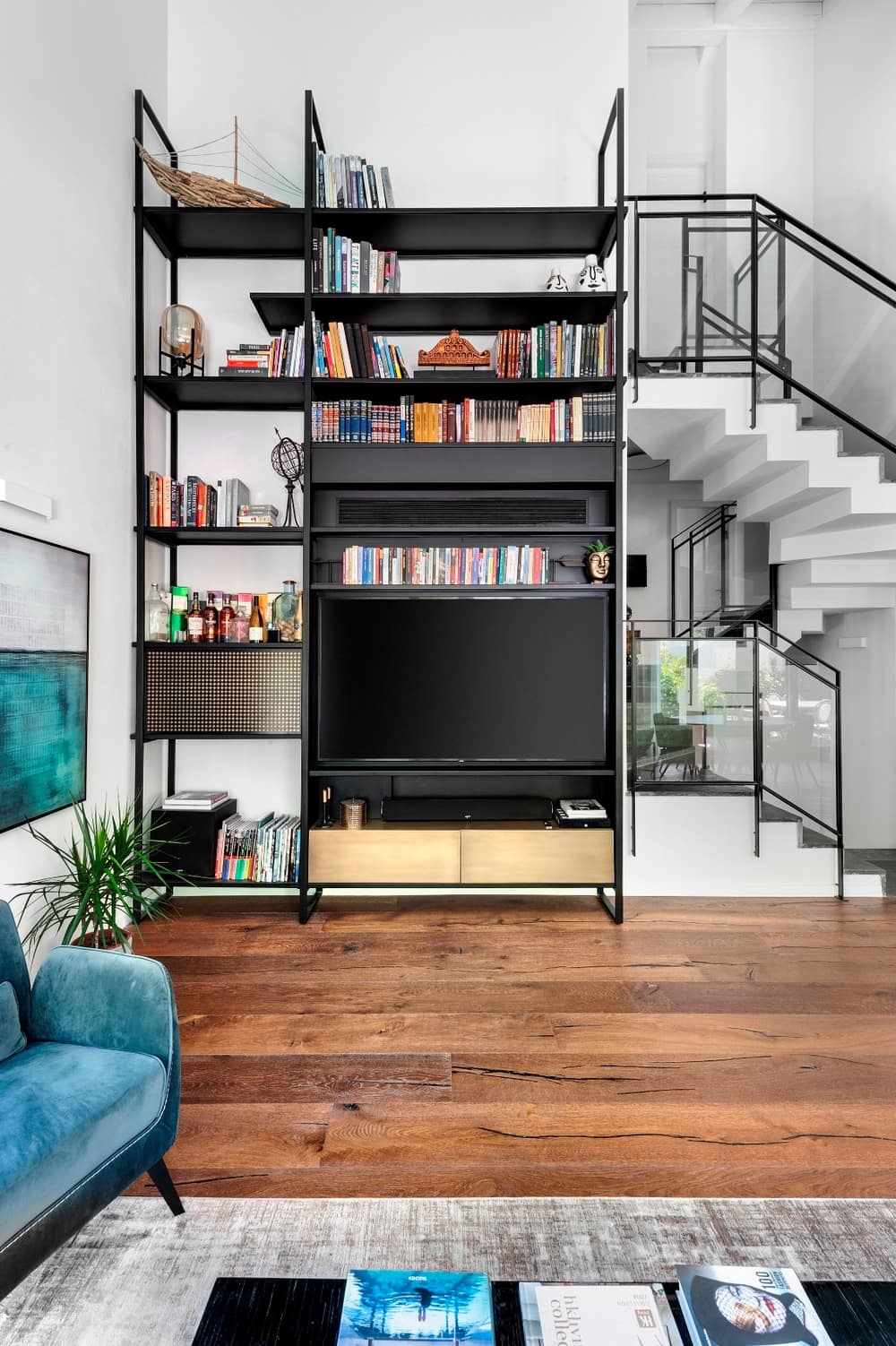
The living room is surrounded by large openings that lead to the garden. A large iron library was positioned against the living room corner wall and displays a variety of the family’s favorite books and art pieces, as well as a large TV screen, and elegantly concealing an air conditioning unit.
“When it came to designing the light fixtures in the main living space, we needed to find solutions that would work best for the high ceiling. In order to create a clean but well-lit space, we chose to fit wall washing lights above all the openings. Additional light fixtures above the kitchen island and the dining room emphasize these areas and their unique design adds richness to the space”, adds Roth.
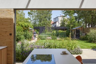
One of the first decisions that needed to be made in this project was around the choice of windows. Made of wood on the interior and aluminum on the exterior, these windows are known for their durability and their insulating and noise reducing properties, something which was of great importance to the owners. The black profile windows emphasize the openings and serve as elegant frames for the beautiful garden view.
An additional and important feature is the staircase. In the original build, the stairs were concealed by a wall with a small peephole. One of the obvious choices was to open up the staircase as much as possible, which resulted in the planning of a brand new staircase leading all the way to the new top level.
The unique location of the staircase gives the top levels better exposure to the ground level. One of the most pleasant experiences in this property is coming downstairs in the morning and immediately soaking up the beauty of the garden and swimming pool.
The materials used throughout the property are a blend of different styles. This is especially noticeable in the main living space where the modern industrial kitchen was fitted alongside solid wood parquet by Etz & Etza company. Combining materials such as brass and black metal alongside classic leather couches created an interesting contrast, whilst the staircase treads were fitted with very dark gray bluestone that works beautifully with the authentic parquet floors.
“The garden feels like an integral part of the ground floor and compliments the indoor experience. We believe that no matter how much we invest in the interior, when the garden is done well, it will always be the star of the show”, states Roth.
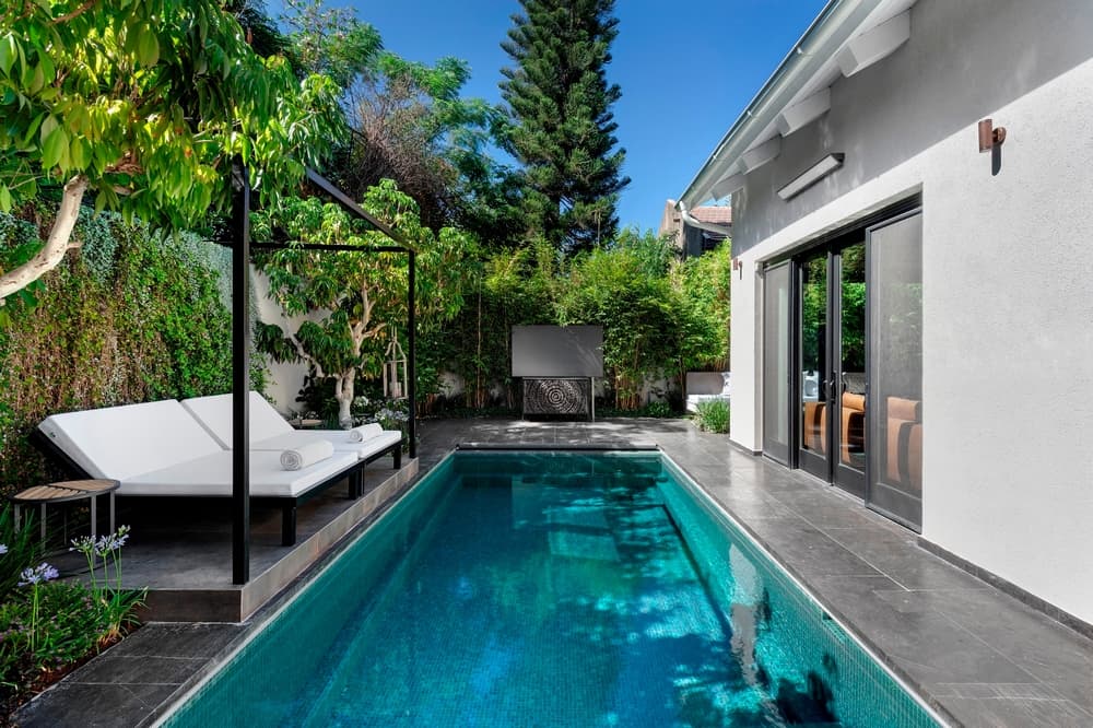
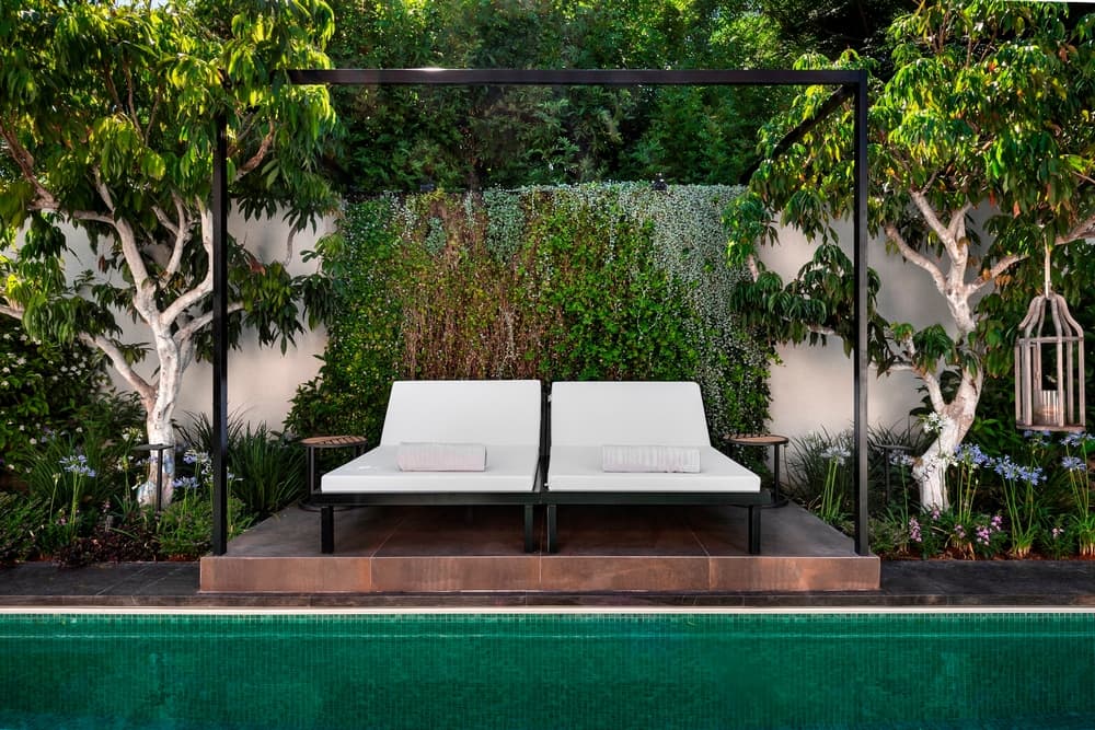
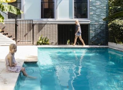
The garden was inspired by Thai resorts with the intention of recreating a far-east style haven of calm. The design concept is reflected in the planning of the garden, especially the raised deck adjacent to the pool where a canopy and pampering sun loungers were positioned. A beautiful garden planned by Danny and Shlomi at “Gardens & Landscape Design” completes the picture, with two beautiful Lychee trees on either side of the deck and tall bamboo plants giving it the perfect finishing touch.
The garden is the main leisure and entertainment spot and includes a luxurious heated turquoise pool, a firepit lounging area, a large dining table, a well-equipped outdoor kitchen and a large projector screen.
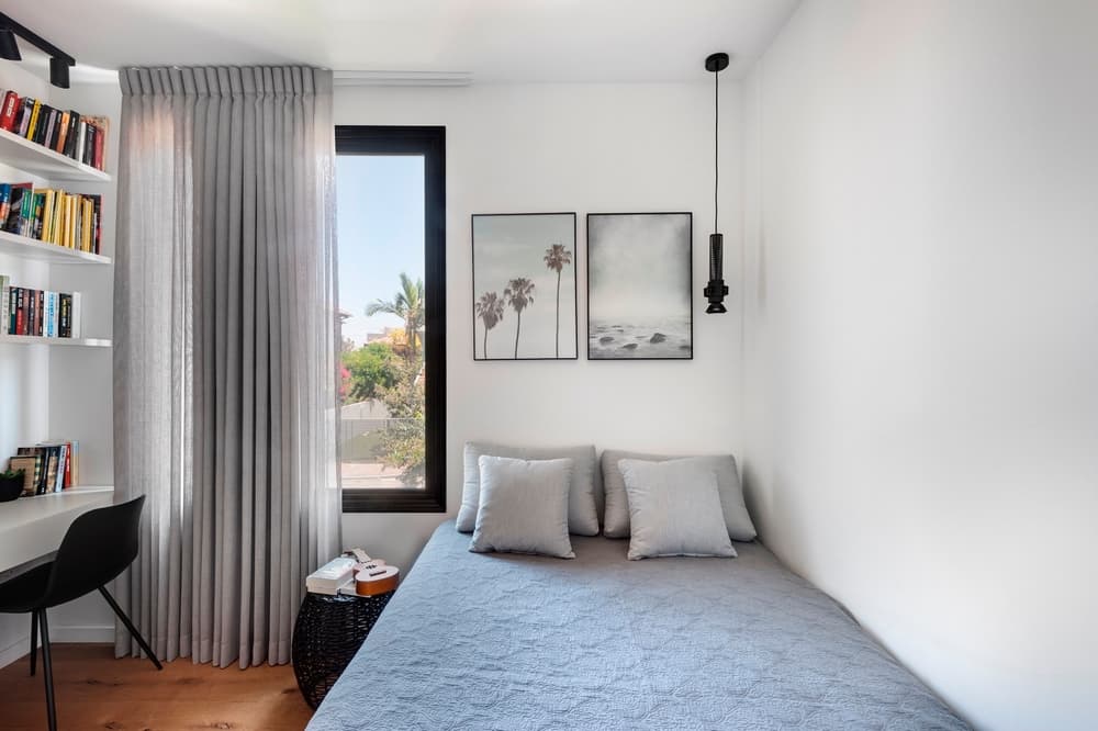
The lower level is designed as a guest unit and entertaining area and includes a bathroom and a utility room. The next level up from the lounge includes the four children’s bedrooms. The girls each have their own en-suite and the boys share a bathroom that can be accessed from each of the bedrooms. A pleasant hall with a small workstation is located between the rooms.
“All carpentry work was planned by us and produced in an elite Italian carpentry through the Israeli company Ultima”, adds Roth.
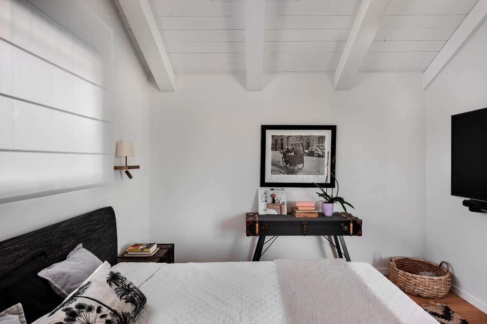
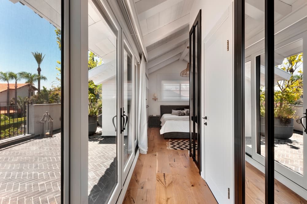
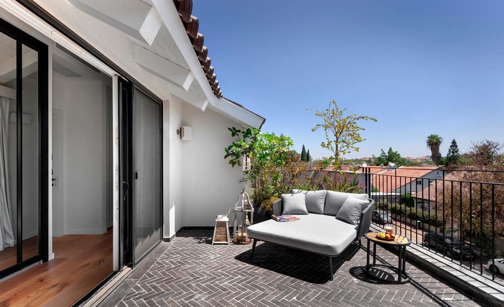
The master bedroom is located on the top level, the loft. Since the property was designed with split levels, the loft is only 1.5 storeys above ground and so even though it isn’t very high up, it still seems sufficiently detached from the activities on the ground level and main street. The level is spread across 40sqm and opens up to a large side balcony. Similarly to the ground level, the balcony was designed as an integral part of the interior, defining and amplifying the space and vibe. The room includes a pampering sleeping area abundant in textiles and fitted with a mini bar, coffee machine and an audio system. The sloped beam ceiling adds to the room’s uniqueness with the low headroom optimally used for cupboards and storage, as well as to conceal the air conditioning unit.
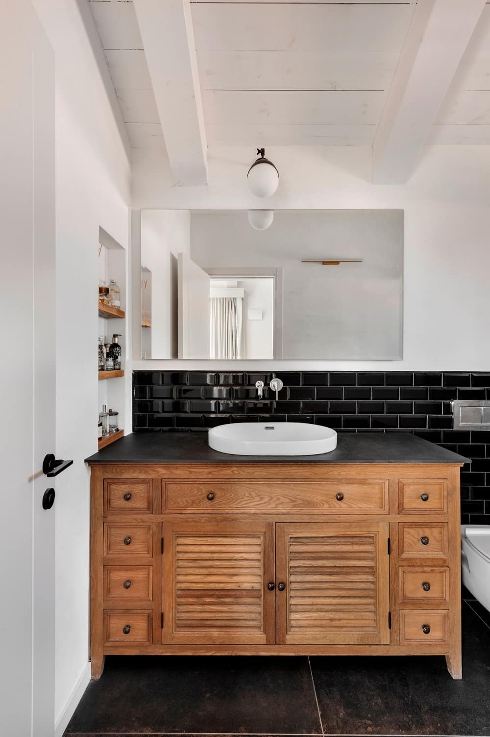
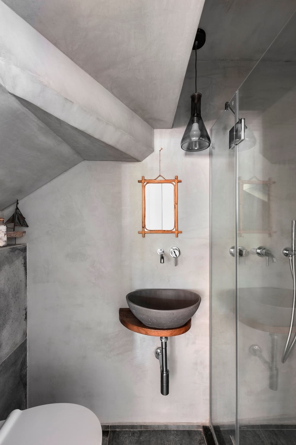
A walk-in wardrobe with two parallel cupboards is located further down the room. A floor-to-ceiling mirror fitted between the cupboards gives the area the sense of a never-ending space. The eclectic and spacious ensuite bathroom was fitted with an authentic wooden cabinet and glossy black wall tiles, whilst distressed black tiles were used for the floor.
The room is divided into the sleep area, the wardrobe area and the bathroom in a way that allows comfortable and undisturbed use of each of the spaces.
Large doors open up to the balcony and are fitted with electric blackout blinds for maximum control over daylight levels.
Contrasting black and white materials were used throughout the en-suite, softened by the wooden floors. The windows in the bedroom allowed for design flexibility and are white on interior and black on the exterior. The inspiration for this room was taken from the far-east colonial style that blends various contrasting elements in a classical and minimalist fashion. Dark fishbone balcony floors, a large sun lounger, and surrounding plants complete the distant holiday vibes every time you enter the room.

