Project: Apt.13 Fashion Boutique
Design: Yurij Tereshchenko – SCHEMA bureau
Floor area: 165 sq. m
Project cost: $1200-1500 / sq. m
Date: 2018
City: Kyiv, Ukraine
Photo credit: Sergiy Kadulin
Technical lighting: Viabizzuno, Italy
Store equipment: custom-made, Ukraine
Interior lighting and furniture: antique shops and flea markets, Cape Town and Europe
Apt.13 is a fashion boutique placed in the heart of Kyiv in a modern Business Centre. There is the unique view from “Apartment 13”: the famous catholic cathedral placed just opposite the new store. Actually, the retail concept, still unusual in Ukraine, has become for an architect Yurij Tereshchenko the main cause to take this project. Here one may buy everything, ranging from fashionable clothes to furniture and home décor.
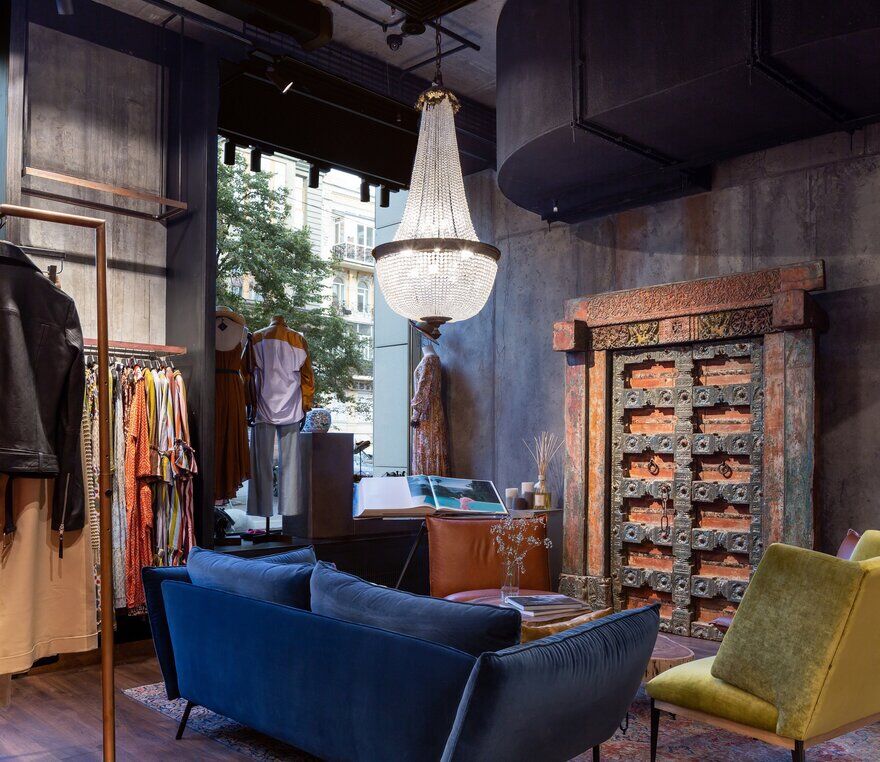
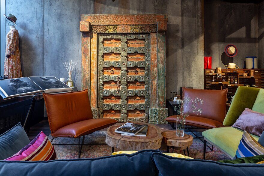
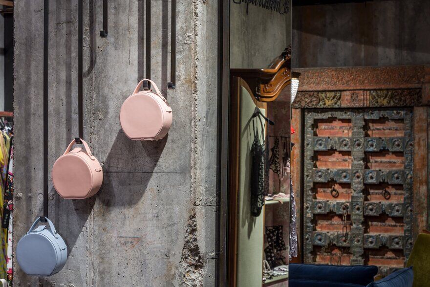
The owner’s ideas and stylish artifacts for interior decoration have resulted in filling the space with rare things, such as carved wooden Indian door from Cape Town antique shop, or antique commode from the Portugal flea market. The architect has taken the challenge considering it an interesting puzzle due to be solved urgently – in three months.
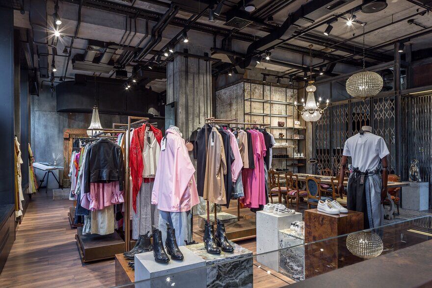
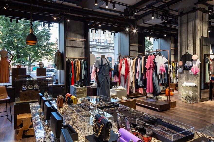
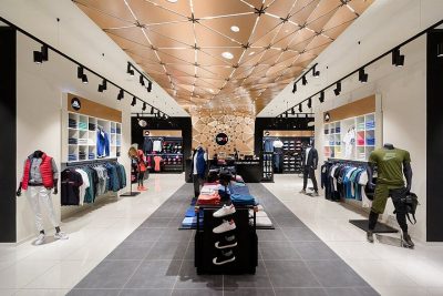
The space seemed to be a naked canvas – there were just bare concrete walls and pillars, open cable wires. The colour palette for the painting had been already set by the boutique owner: there would be clothes and antiquities. Being an experienced retail architect, Yurij Tereshchenko has placed at the first place functionality. He has developed the logistic scheme for the space, dividing it into three main zones: an entrance group, the reception with a cash point, and a sales room with a lounge. The only dividing walls in the project are for two dressing rooms. The overall concept holds to open space with zoning via sale equipment and furniture placement. The point is to make an adaptable interior, which can be easily transformed into pre-party room, a literary salon, or podium for a private fashion show.
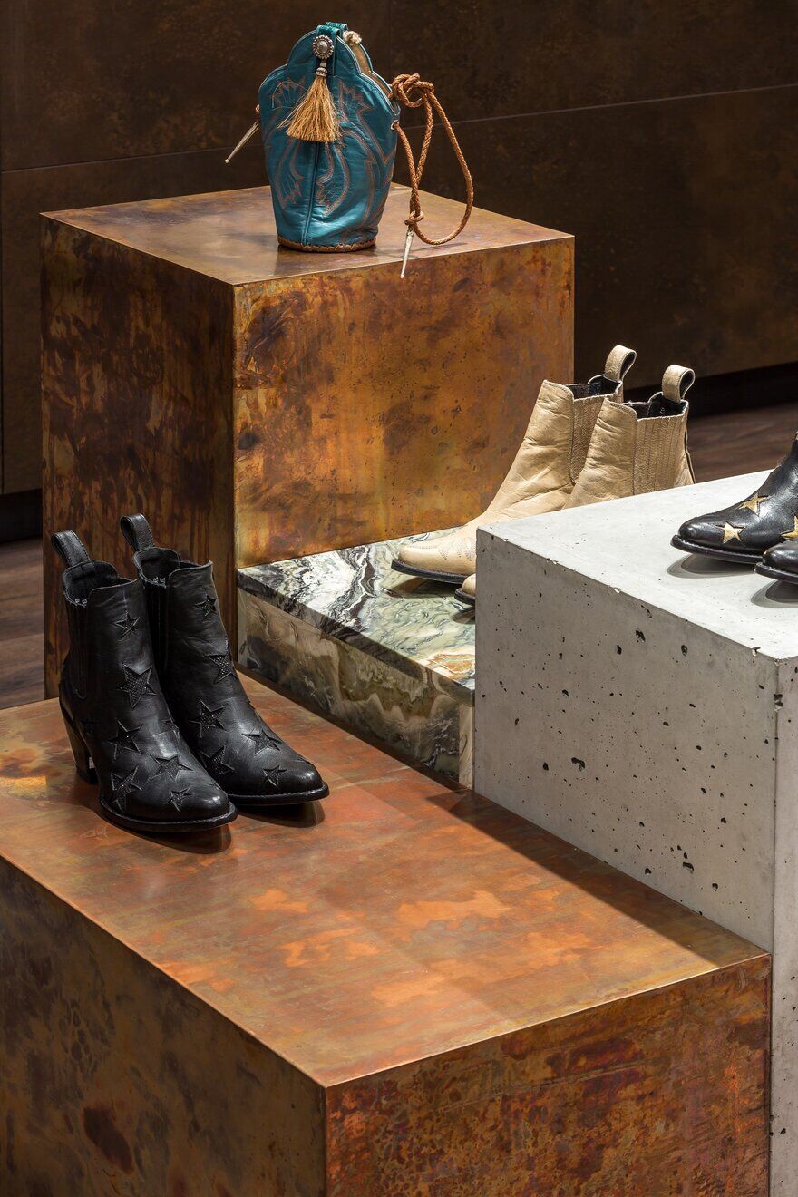
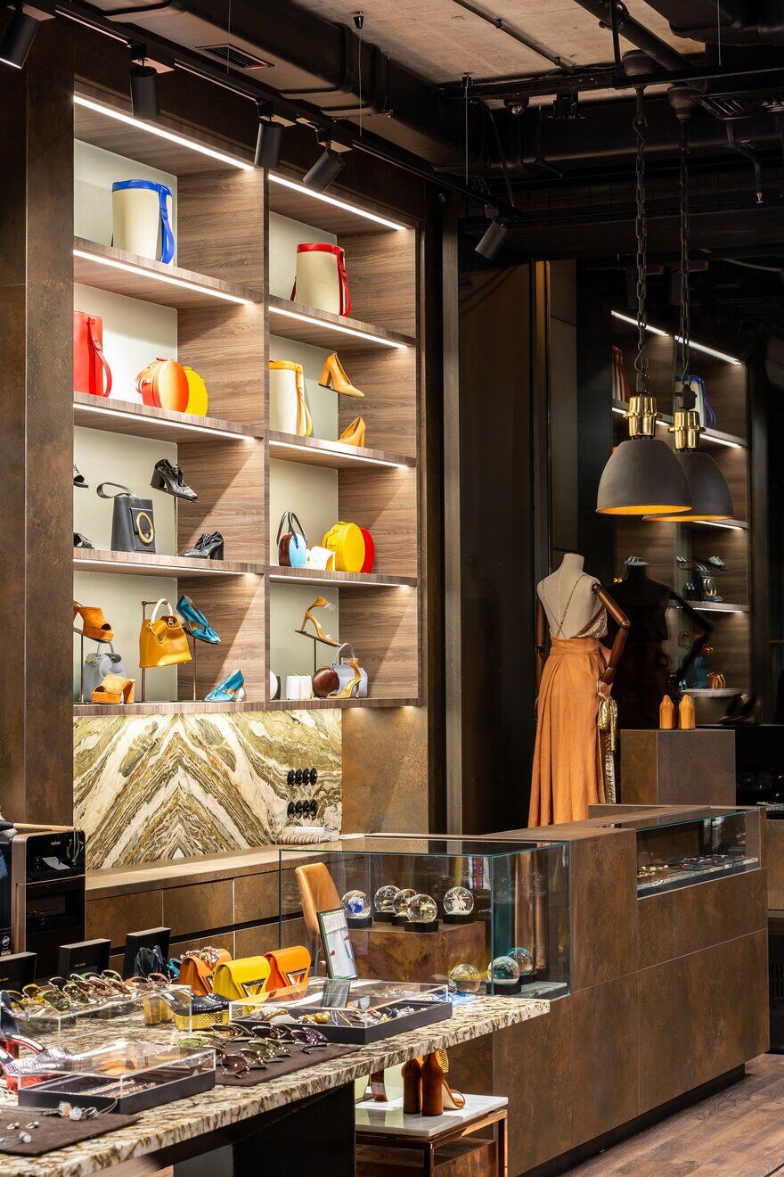
Materials selection and their colour scheme followed the main interior concept – creation of a neutral background for a rich and colourful assortment of the boutique. While selecting, the architect and the owner worked as duo: among chosen modest materials can be found metal, natural stone, concrete, and laminam – thin ceramics. There were chosen several harmonic combinations, which formed the core of the interior color concept: black metal, green quartz rock, brass, antique bronze, natural wood.
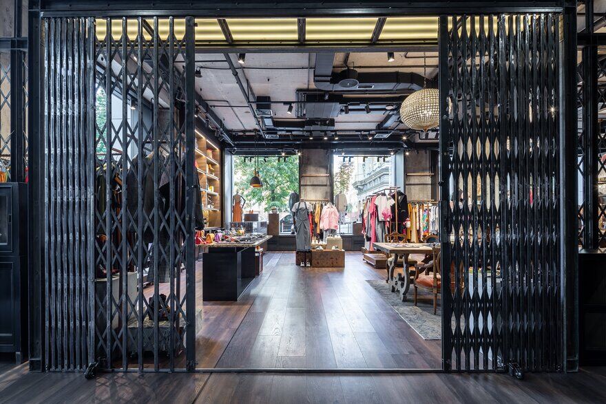
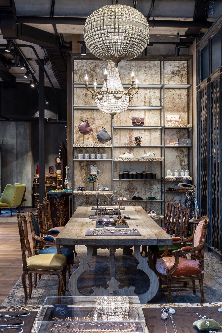
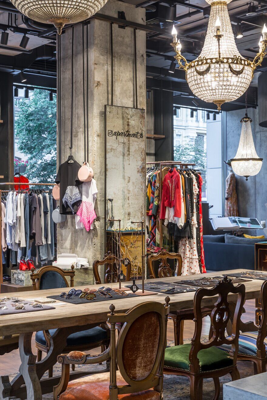
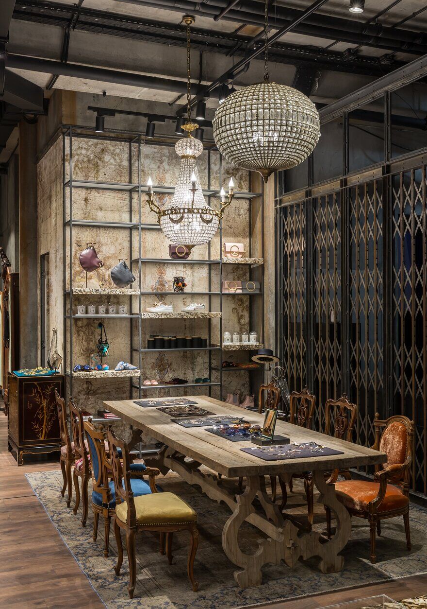
The equipment, consisting of the reception desk, carcass shelves along the walls, cubes, mobile dress-rails, storage systems, was designed by the project author and realized by Ukrainian craftsmen. The focal point of the entrance group – a spectacular extendable metal grate inspired by the one from Parisian underground – was also manufactured in Ukraine. A table with a tabletop made of Brazil granite 2.5 meters long was brought to life with the help of the boutique’s owner. The natural stone slab had been chosen for its beautiful texture and had been bought long before. Finally, it became a tabletop in this interior: here the décor and fashion accessories would be exhibited.
High window apertures, which make a show-case, were clad inside in 5mm hot-rolled steel plates, so they could turn into portals. Thus was created a neutral background for clothes and accessories on display, and the industrial look of the Apt.13 interior was highlighted. As the floor space of the boutique was rather small for the expected amount of exhibits – there were only 165 sq. m – so one of the tasks was to create as much storage space as possible. Thus there emerged capacious hidden storage units between the windows, besides the heaters. These storage units were equipped with pull out mechanisms and various inner sections for different goods.
Great asset proved to be the system of metal hangers for bags on the walls, creating a graphical pattern of parallel lines on the gray background of the walls. This designer’s solution appeared thanks to the architect’s desire to diversify standard shop equipment. A mirror, placed on one of the pillows, became soon a selfie-zone popular with the boutique guests: one could catch endless interesting reflections thanks to the mirror lucky placement. A ceiling was left unchanged, the only design intervention was to paint black air and wire channels.
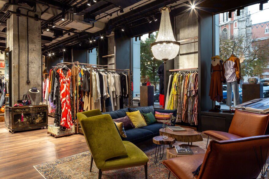
Technical lighting as an important part of any retail project was given particular attention. There were chosen lamps by Viabizzuno due to their colour range and their capacity, designed especially for the boutique space. Crystal chandeliers were brought by the owner from overseas and complete décor concept. These chandeliers create a playful eclectic atmosphere, mixing up elements of different styles and epochs. The same could be said about furniture in Apt.13 . Your glance would slide over a big wooden table with a long history, vintage chairs from Parisian antique shops – restored and reupholstered in different textiles; and an antique Austrian library case, and modern sofa with armchairs, and coffee tables of log saw cuts, and an old cashier register – the present by owner’s husband to the boutique opening. Here every object would tell the owner’s story, reflecting her beliefs and aesthetical preferences.
Having solved functional matters, inner logistics organization, and different creative things, the architect Yurij Tereshchenko has successfully created a constructive base for a coherent workflow of the boutique Apt.13 .

