Project: Architecturally Revived Haven
Interior Design: Yoko Kloeden Design
Location: Richmond, London, United Kingdom
Completion date 2021
Building levels 4
Photo Credits: Brent Darby
Text and photos provided by Yoko Kloeden Design
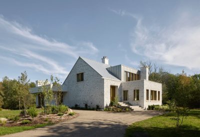
First built in the 1930s, this stunning detached home in Richmond dates back to Interwar Britain and in the 70s went on to become home to British singer and actress Bonnie Langford.
With original architectural features still intact, Yoko transformed the outmoded home to an elevated, contemporary design to suit the young family’s busy lifestyle and to echo their effervescent style.
The result is a laid back and eclectic family home, where the original architectural features, modern and vintage furniture happily coexists to create a space that both reflects its heritage and the homeowners.
What was the brief?
The house had not been fully refurbished since the 70s or 80s so a redesign and full refurbishment was long overdue. The previous interiors were very dark and heavy, with mock Tudor wall panelling.
The client wanted to make it their own by reflecting their personal aesthetics and lifestyle while modernising all of the services – such as electricity and plumbing.
What was the design inspiration behind the project?
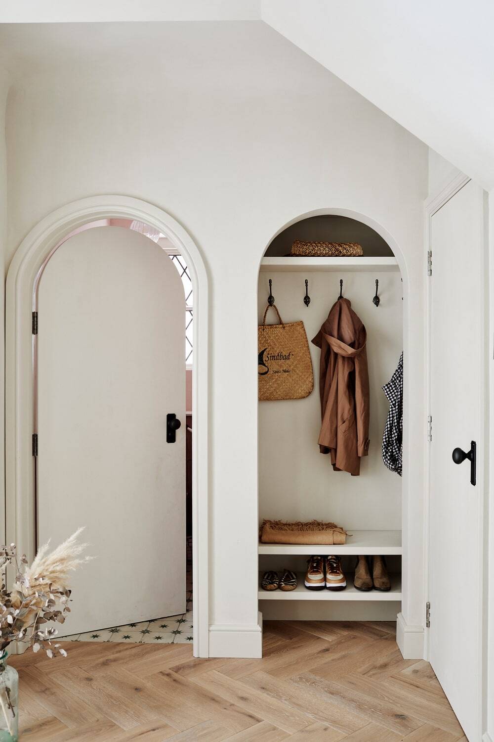
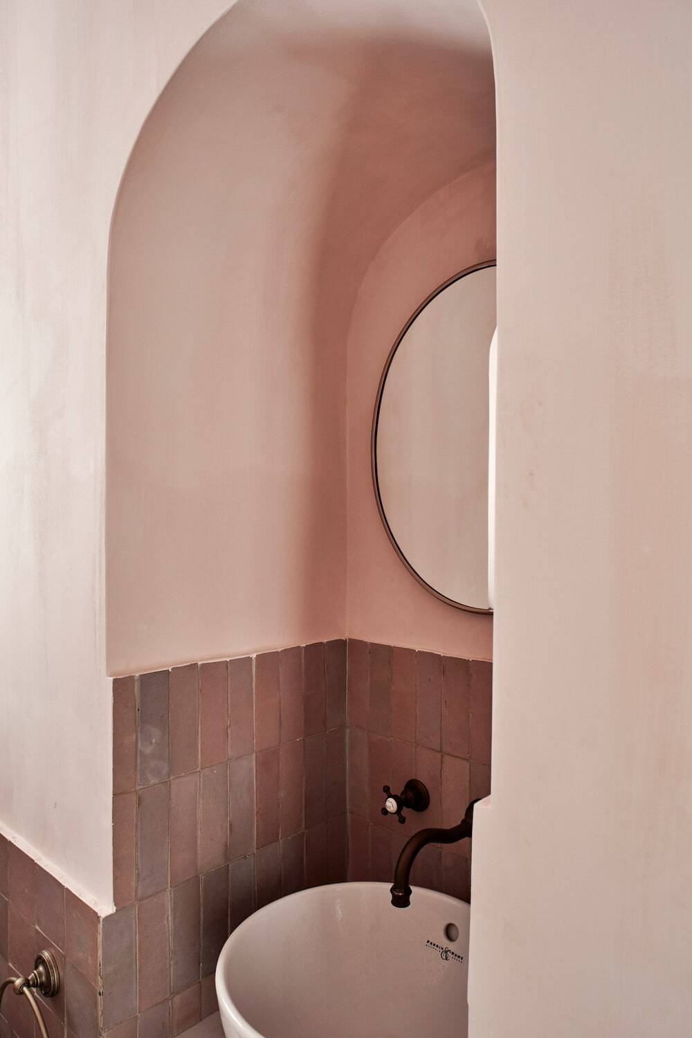
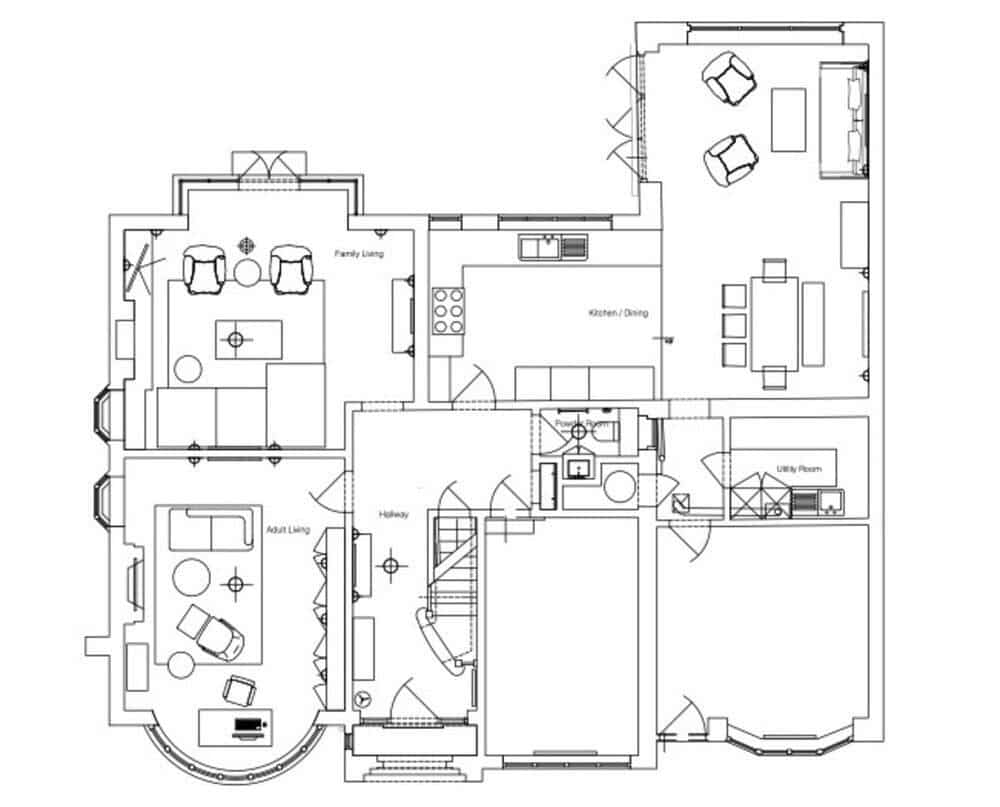
Inspired by the preceding rounded corners through the house, where ceilings and wall meet to create curvature, we suggested to emphasise these arches to honour the original architecture and keep character in the home.
By removing the very dated features, such as archived window, excessive wall panelling and picture rails which divided the walls and ceiling visually, we were able to bring out the more desirable features while reflecting the original architecture when it was first built.
What was the design concept behind the hallway?
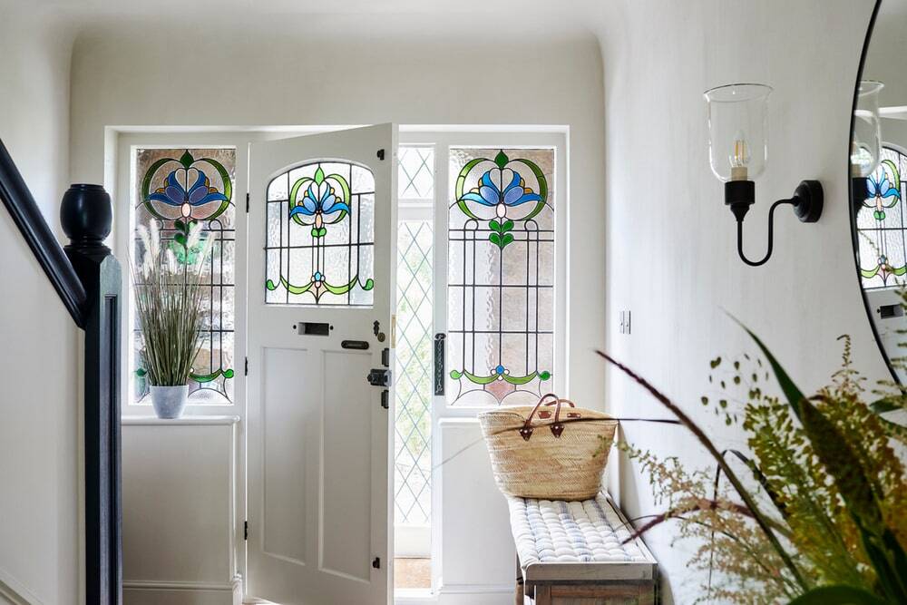
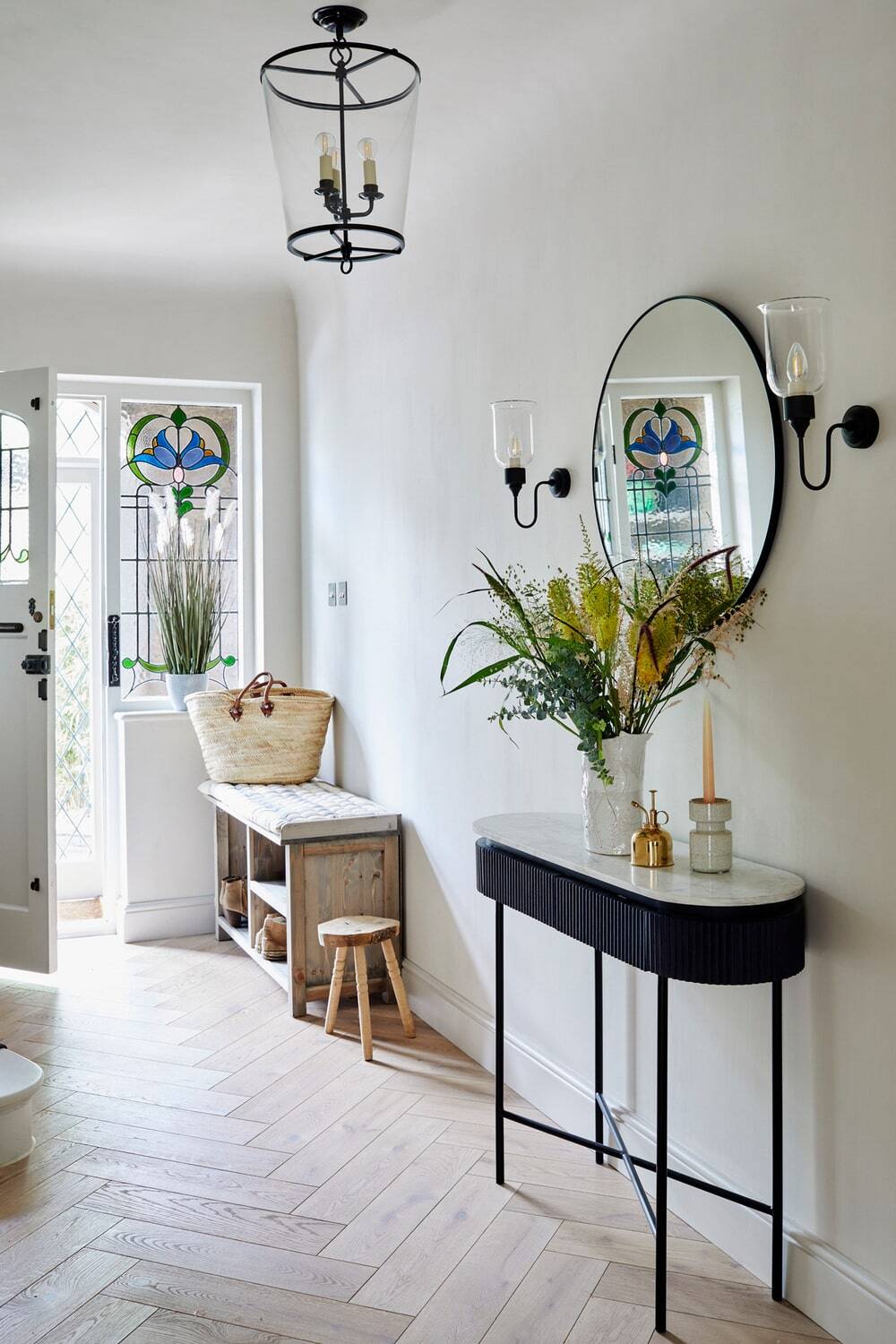
To uplift the entrance, lime-wash paint was used on both the walls and ceilings to create a continuous cocooning effect – emphasised by the curved corners.
Embodying Yoko’s direct-from-nature ethos, the colour palette was kept minimal and varying natural textures of lime, oak, steel, and marble were used. Offset against this neutral colour palette, delicate hints of colour flood into the room via the original stained-glass door and side lights.
What was the design concept behind the kitchen & dining area?
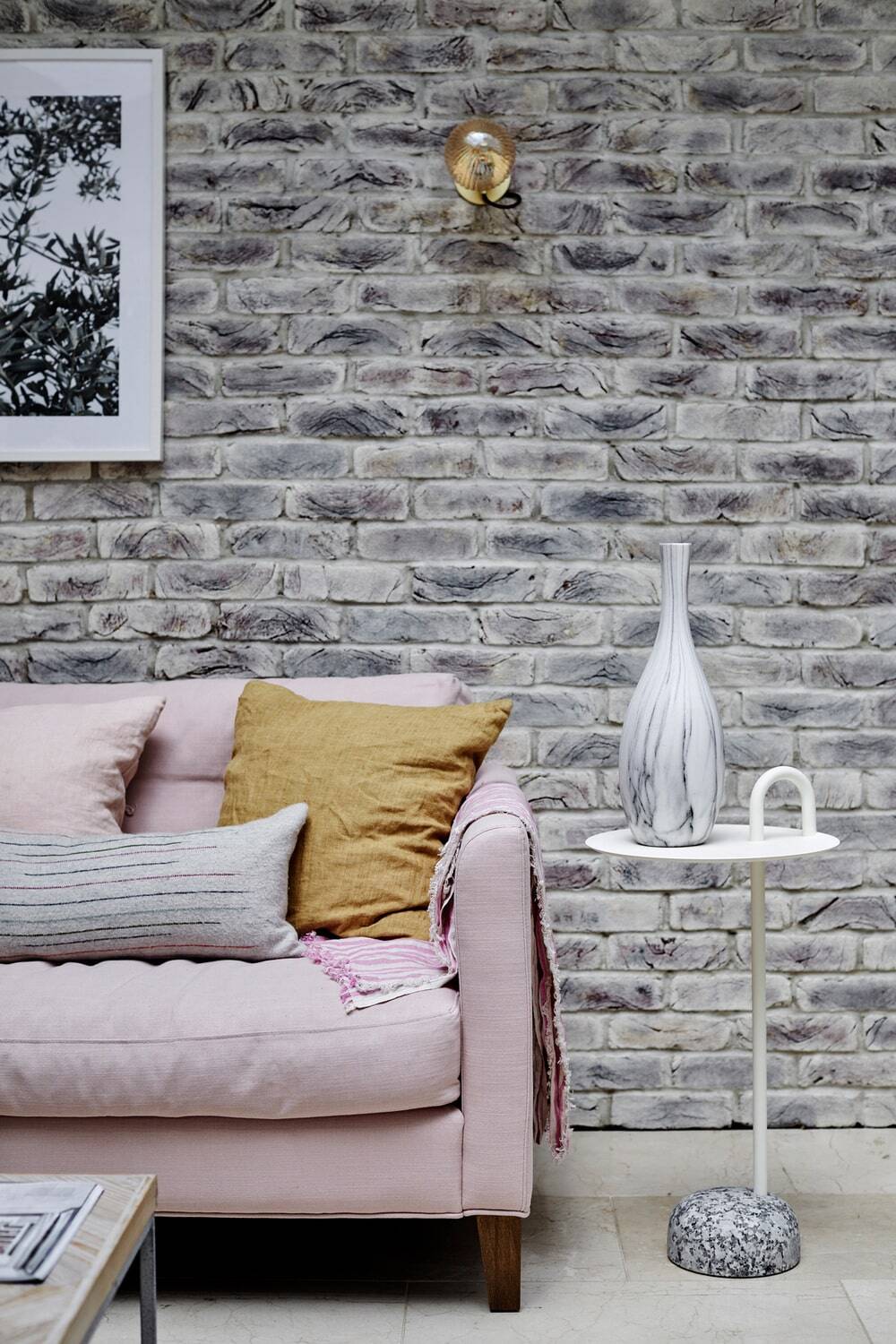
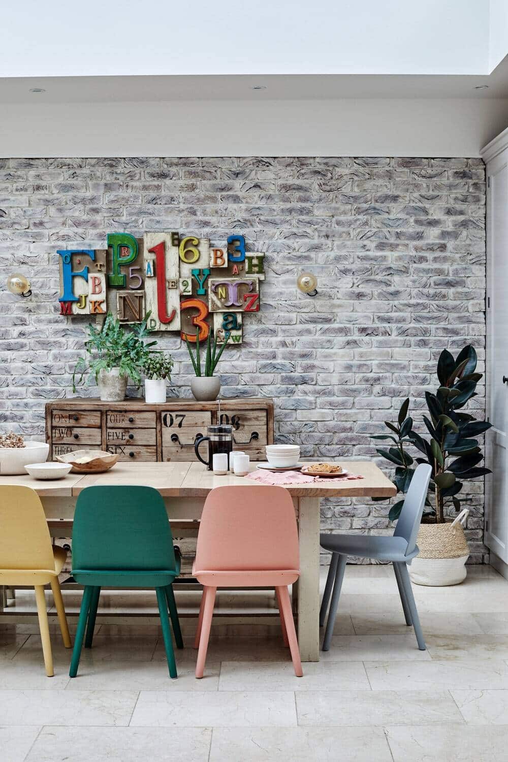
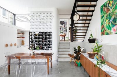
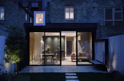
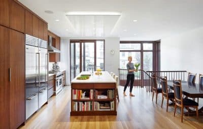
To keep within budget, the existing exposed brick walls were whitewashed to provide a more muted backdrop to the more colourful décor and furnishings.
Inspired by the vintage signage the clients bought from an antique shop, the colour scheme was born – centring activities for the children, where they spend most of their time after school.
What was the design concept behind the family living room?
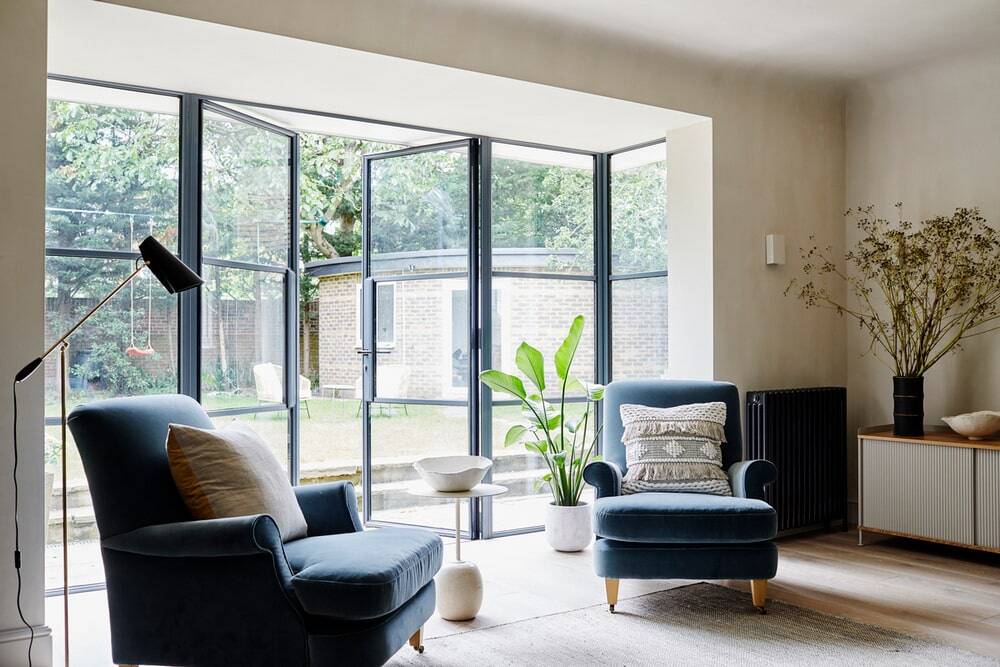
Previously a dark and dingy area of the home, the design team decided to enlarge the door opening and install Crittall style doors to frame the view of the large garden – flooding light into the room.
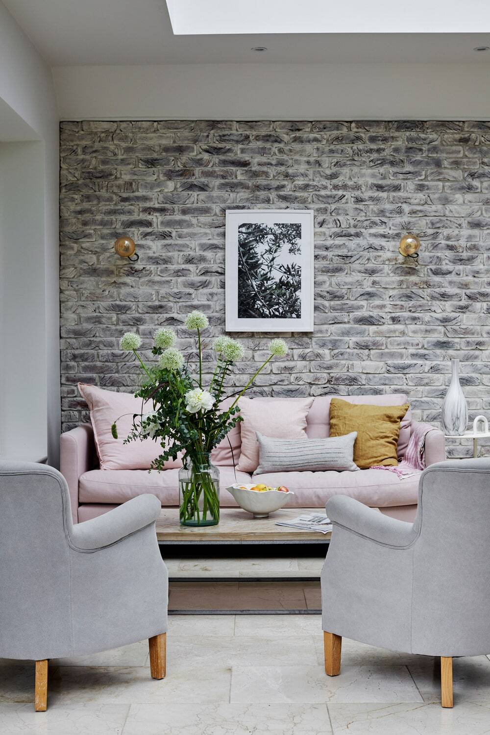
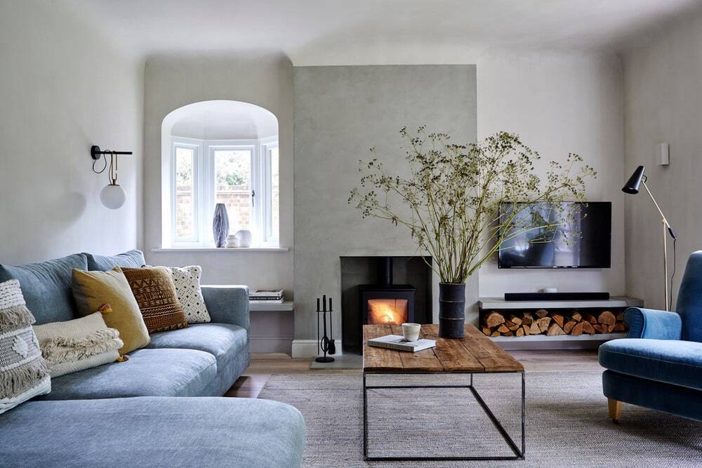
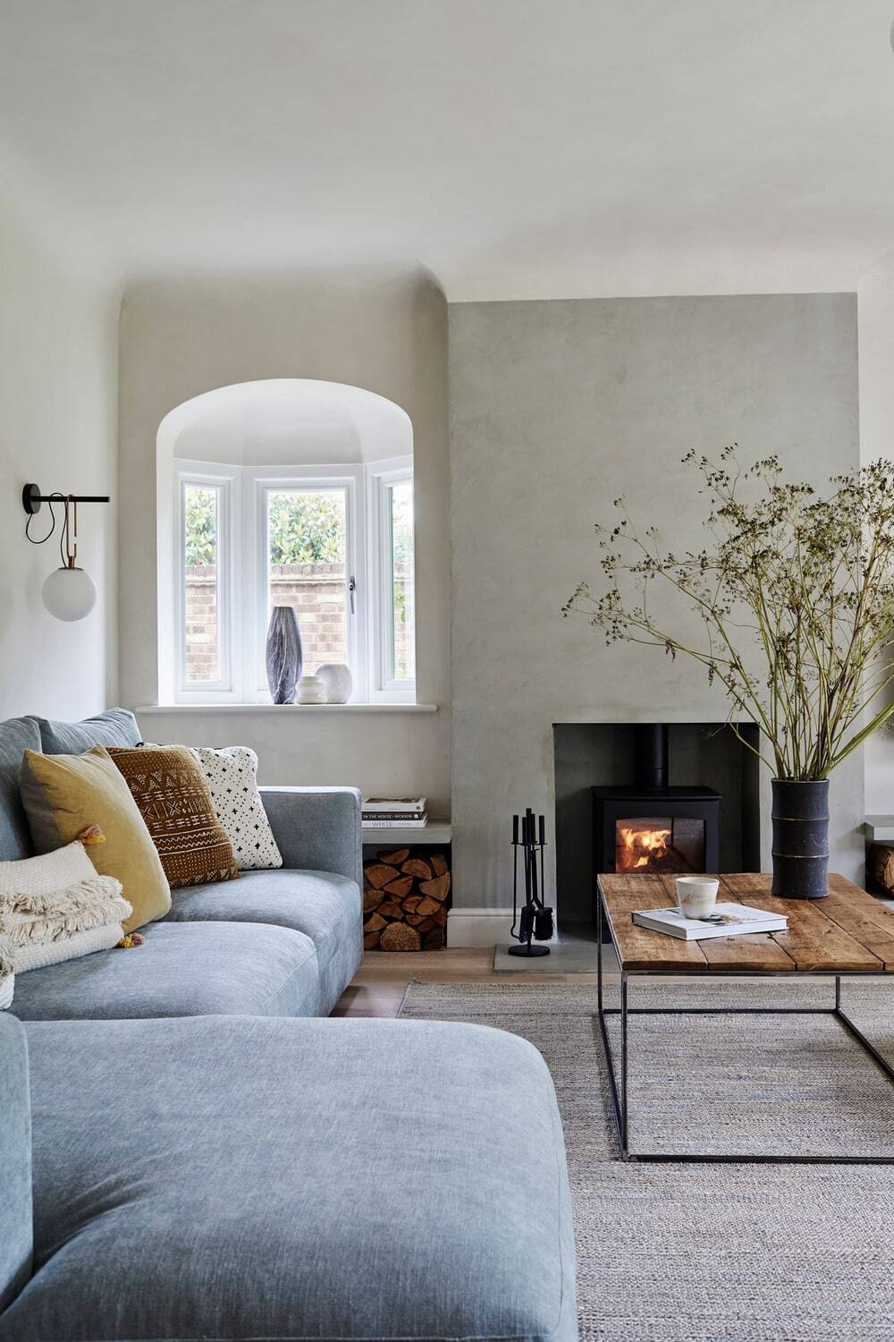
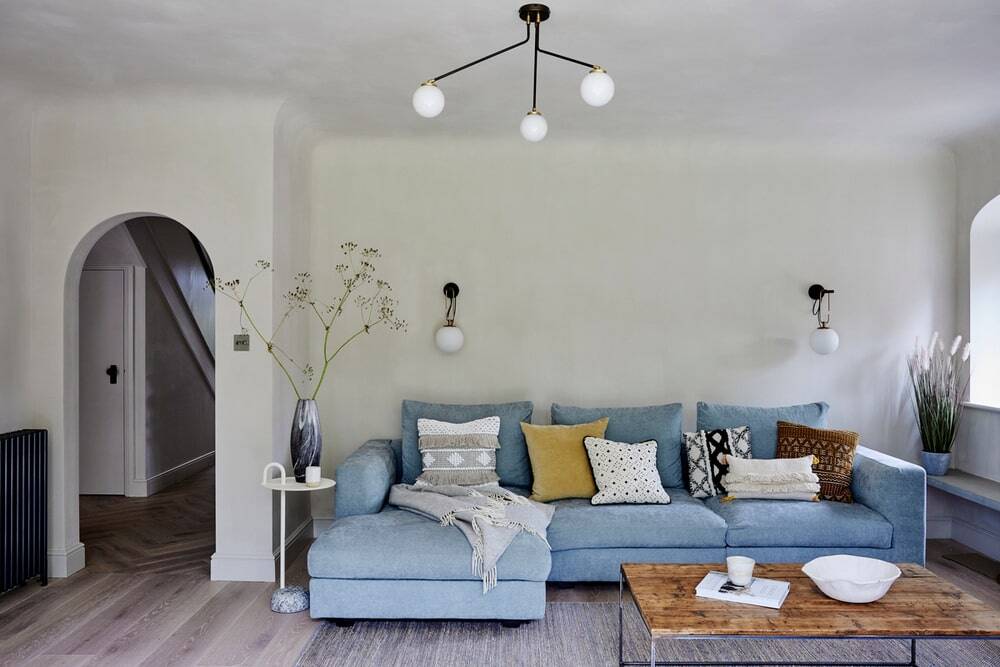
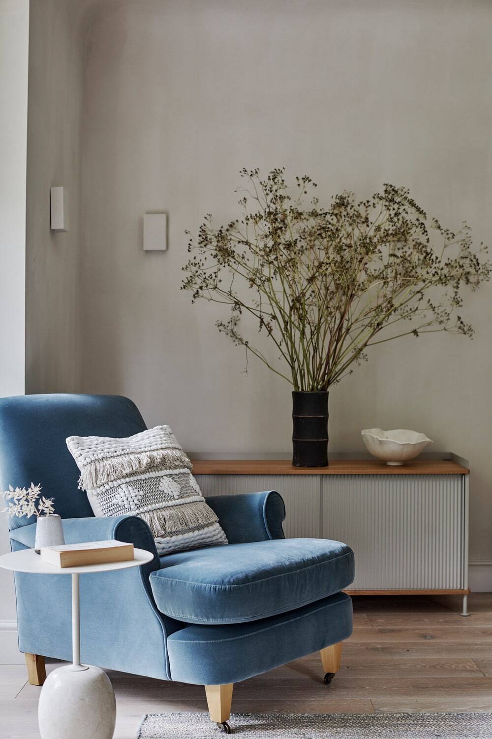
A pair of armchairs were picked in synonymous tone to the Crittall and calming colours were used to evoke comfort while embracing the curved corners of the room – a common thread throughout the home. To elevate the cosy ambience a contemporary chandelier and wall lights were chosen to emit a warm glow, while in winter the wood burning stove adds physical warmth.
What was the design concept behind the front living room & office?
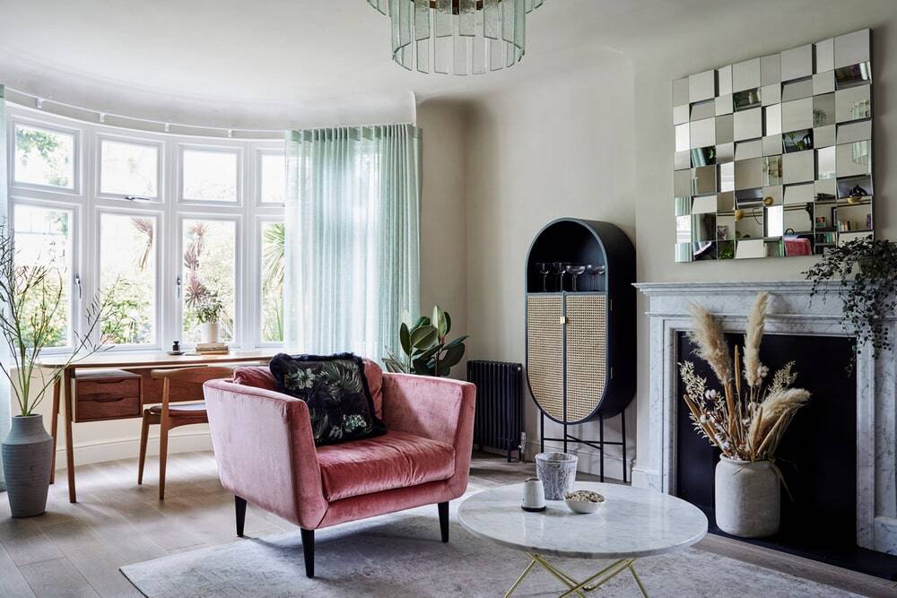
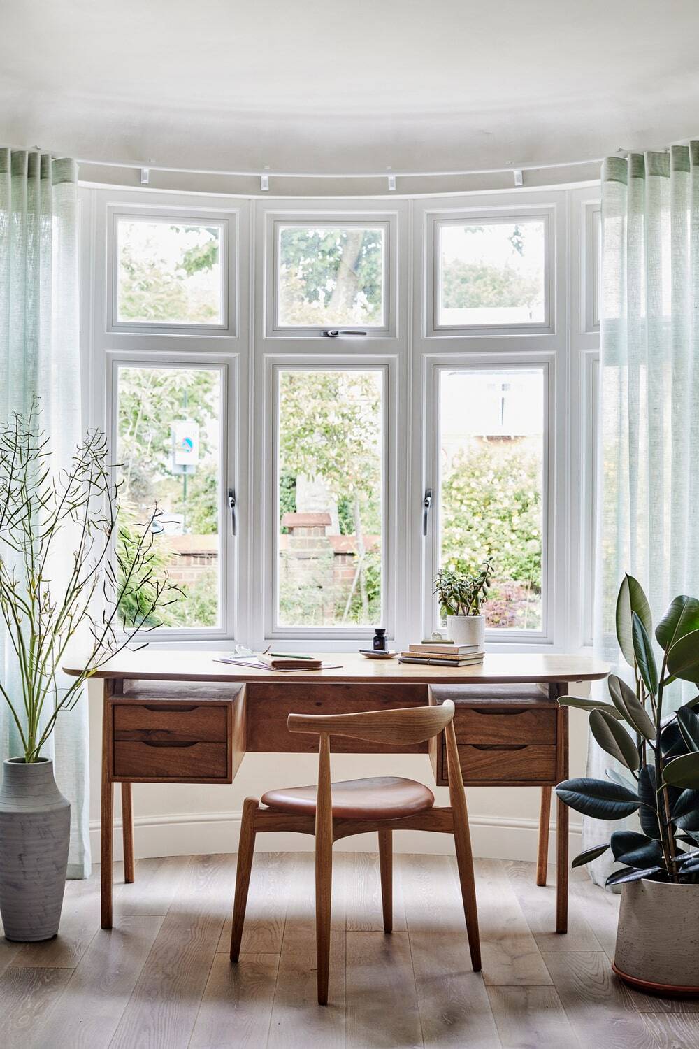
Challenged to balance two very different functions and purposes – a sophisticated living space and home office – Yoko’s ambition was to allow the space to be productive by day, and chilled by night.
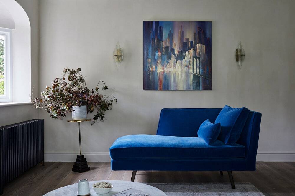
By keeping the tone personal and bringing in varying vintage mid-century furniture, the room can be effortlessly adaptable. The colour palette – inspired by the client’s artwork of a New York cityscape at night – adds elegance and charm, while the desk was positioned in front of the window so neither function is compromised.
What was the design concept behind the bathroom?
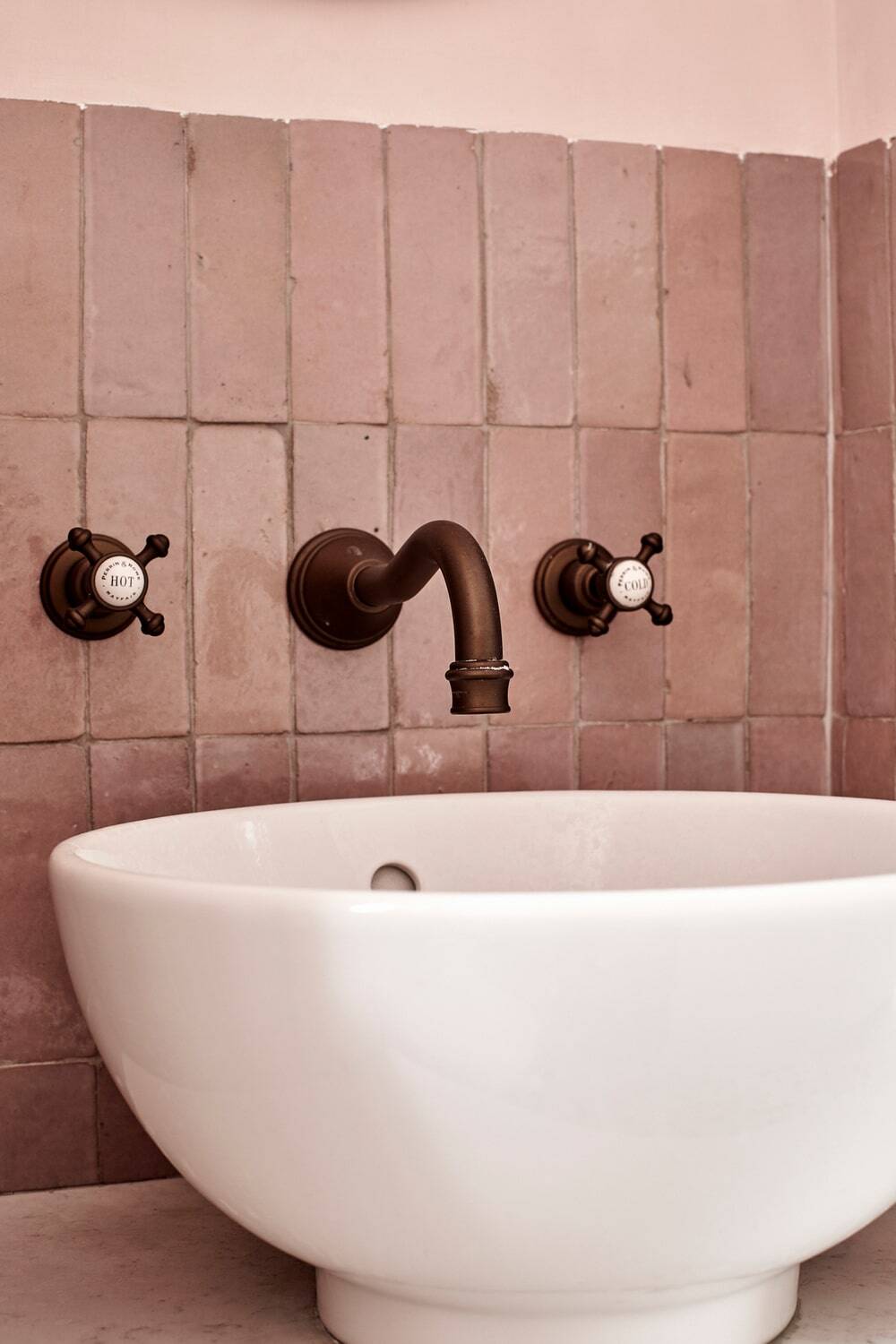
Admitting the clients wanted to incorporate pink on the walls of the home, Yoko decided upon a muted tone that complemented the accents within the rest of the project.
Hand glazed Moroccan Zellige tiles were married with vintage motif cement tiles to inject an artisanal style, while complementing the clients’ more eclectic aesthetics.

