Project: Beer Yaakov Penthouse
Planning and Interior Design: Daniel Michaeli
Property: A penthouse apartment with an area of about 140 square meters and a terrace of about 170 additional square meters
For: A couple in their 30s with 3 children
Location: Beer Yaakov, Israel
Photography: Lior Teitler
The fact that terraces have become the stars of Israeli homes is well known, but in the case before us, it was the reason this couple acquired the new penthouse apartment. Together with interior designer Daniel Michaeli, they created an experiential and intense living environment for their family, with meticulous attention evident in every detail, inside and out.
Welcome to the home of a couple in their 30s with 3 children, honoring the modern, skilled design and, no less important, the expansive terrace that serves as an important and central axis in the family’s life—a significant portion of their leisure hours are spent there. Responsible for its planning and design is interior designer Daniel Michaeli, who shares his process.
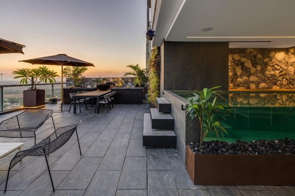
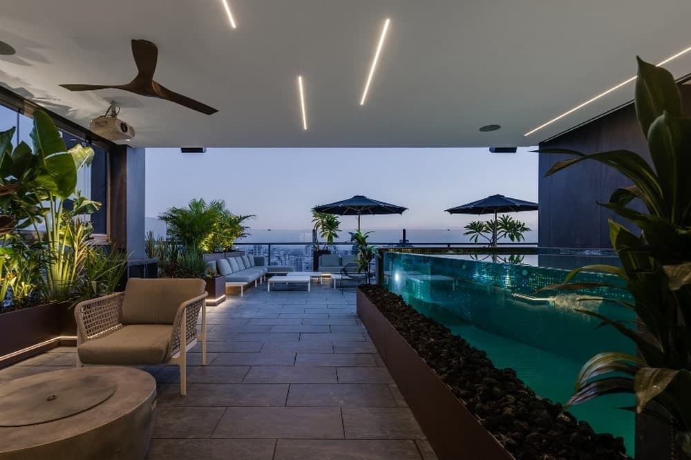
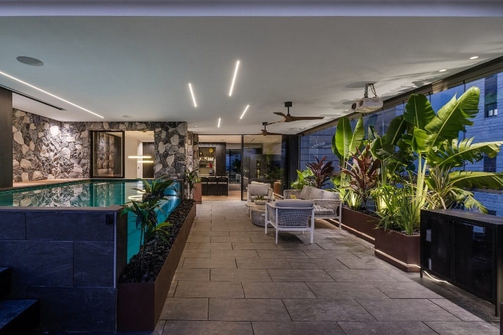
The Beer Yaakov penthouse apartment, located on the top floor of a new residential building in Beer Yaakov, was the couple’s first choice primarily thanks to the fantastic terrace overlooking the urban landscape and open spaces. Throughout the entire process, we focused on its design, working with the project contractor to make structural changes to integrate unique features, such as a transparent swimming pool. Every detail in the spacious area was meticulously planned and designed, with a focus on ensuring the outdoor environment serves them faithfully throughout the year, even during cold and rainy weather. We created gypsum ceilings and integrated technological gadgets, a choice trusted by the family’s tech-savvy father.
They purchased the apartment when the project was still ‘on paper,’ allowing us to design the interior according to our vision. After conducting a needs and desires assessment, understanding each family member’s standards, the process took about 3 years until receiving the keys, followed by around 4 more months of adjustments.
The couple gave me freedom in the design, yet they were involved in the process. The family’s father made sure to incorporate technological features and sound systems in each part of the apartment, elevating it—ranging from a kettle activated by a ‘good morning’ blessing to pleasant music played at the guest bathroom’s door opening, and a lighting system programmed for various scenarios, allowing complete control of illumination.
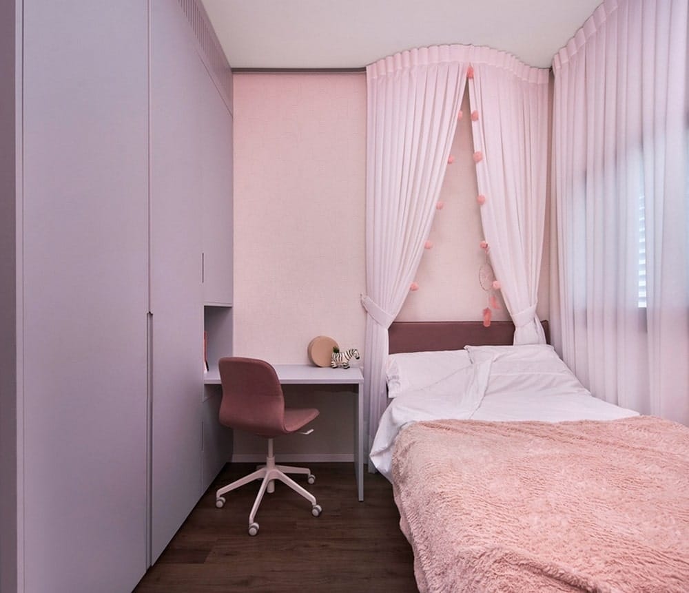
As part of the program, we defined a spacious common area comprising the entrance from which the kitchen, living room, and dining area overlook the infinity pool on the terrace. We created an open space blending seamlessly with the window threshold, visually connecting the two areas. In the private wing, we planned the master suite, two spacious bedrooms for the younger son and daughter with a shared shower, and a suite for the eldest daughter with a private bathroom.
The design is clean and modern, yet we included eclectic elements to bring warmth and color. Many wall coverings and carpentry details are dark, creating an urban and dramatic look—there are almost no exposed walls in the apartment, most covered with carpentry, including concealed doors. Transitioning between public and private spaces is through sliding doors with a mirrored finish.
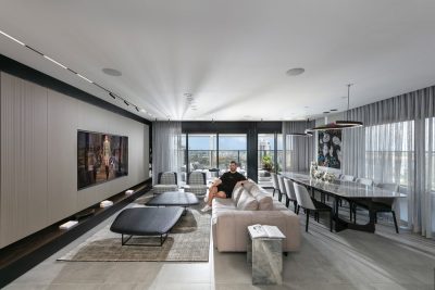
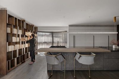
The kitchen fronts are made of black-painted oak veneer, used also for the dining corner’s buffet and the TV wall in the living room, creating continuity between various functions. Porcelain surfaces in stone shades were used extensively, accompanied by meticulous woodworking and carpentry, almost on the verge of art. For instance, in the power wall of the living room, we combined dark porcelain slabs with wood elements and granite countertop, creating a three-dimensional look. We combined natural materials such as stone surfaces, fabrics, and adorned hides, some with patterns. Another contributing material to the cozy atmosphere is the various types of wood, like the parquet flooring and furniture details.
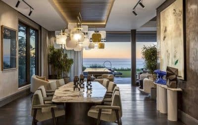
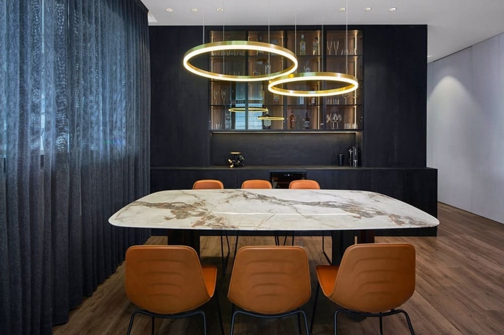
The proportions of the living room intentionally exude intimacy and comfort, serving as a family space primarily. Most gatherings happen on the terrace, even on cold and rainy days since we ensured winter closure. In the dining area, we created a buffet with ample storage for entertaining items and a beverage bar. Above the table, made of specially patterned granite, hangs a pendant light ordered from Italy, made of polished brass. Curtains are an inseparable part of the public space—starting in the living room and concluding in the dining area with divisions allowing them to shift in relevant areas.
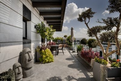
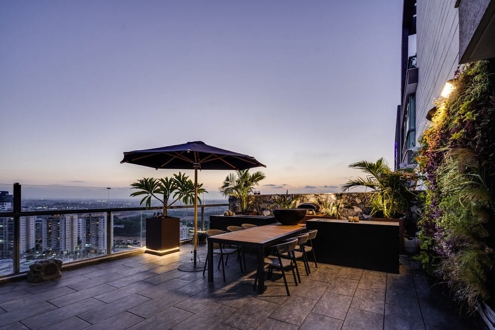
The terrace is the highlight, designed as a luxurious resort rich in natural materials or a natural look. We planted mature trees around it, created plant-filled planters, and incorporated lighting strips extensively. Authentic awnings surround the seating area, and around the pool, a steel-made element combining waterfall structures serves as a powerful feature.
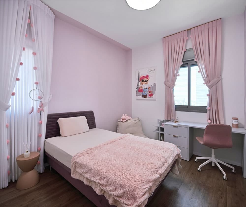
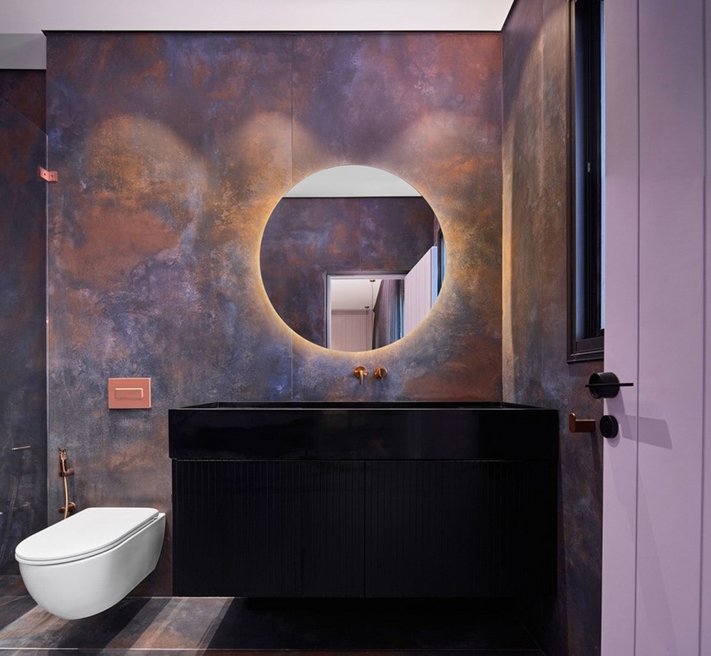
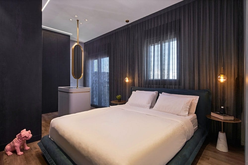
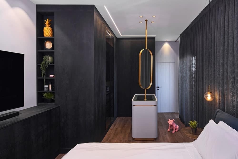
The children’s bedrooms were planned and designed according to their ages and tastes. In the parent’s suite, we created a large space combining the sleeping area with an open closet, all adorned with wall coverings and carpentry details. At the center of the closet area, we designed a jewelry and lingerie island, topped with a rotating oval mirror made of brass. In the children’s bathroom, large, intricately designed porcelain granite coverings were installed, resembling weathered iron.
