Project: Blend Labs
Architecture and Interior Design: Studio O+A
Team: Primo Orpilla, Dan Kretchmer, Tari Pelaez, Brianna Bernstein, Nikki Hall, Olivia Ward, Amy Young, Sean Houghton
Location: City San Francisco, CA
Size 53,000 sf
Year: 2017
Photographer: Garrett Rowland
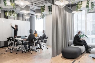
One of the intriguing developments in business over the last few years is the speed with which tradition-bound industries have been reimagined in new technological contexts. O+A’s challenge at Blend Labs in San Francisco was to bring the nimbleness and comfort of a modern tech office to a financial services company eager to take the angst out of mortgage transactions. Blend needed to convey the dexterity of a new approach while maintaining the sense of weightiness that buying a home entails.
Space to Put the Client at Ease
Home lending is an industry in which the customer is often under stress. Blend wanted an office that would work with their employees (and their business model) to put the client at ease. While comfort is a factor in every workplace O+A designs, here it is embedded in the project’s underlying theme—specifically the comforts of home.
Informality You Can Trust
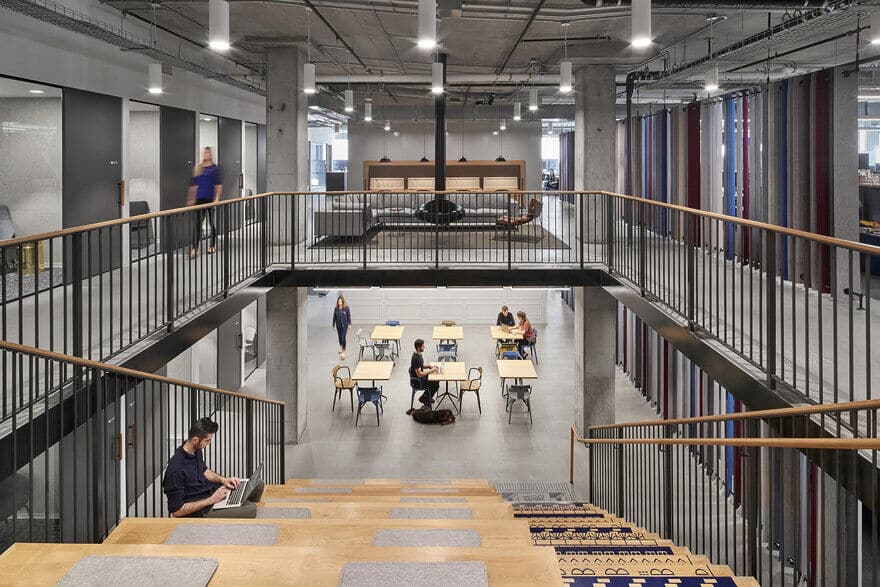
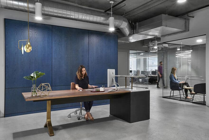
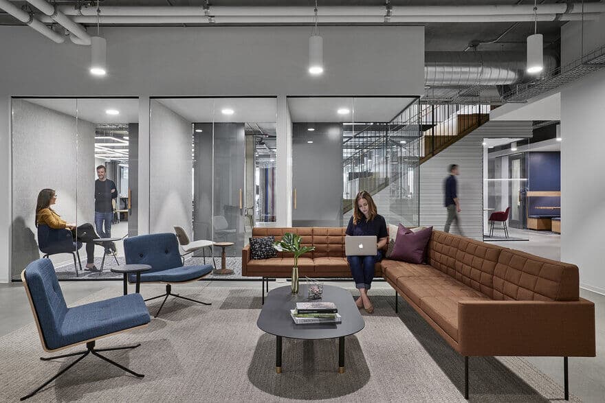
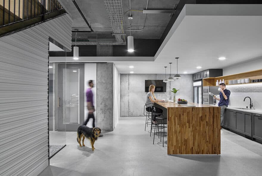
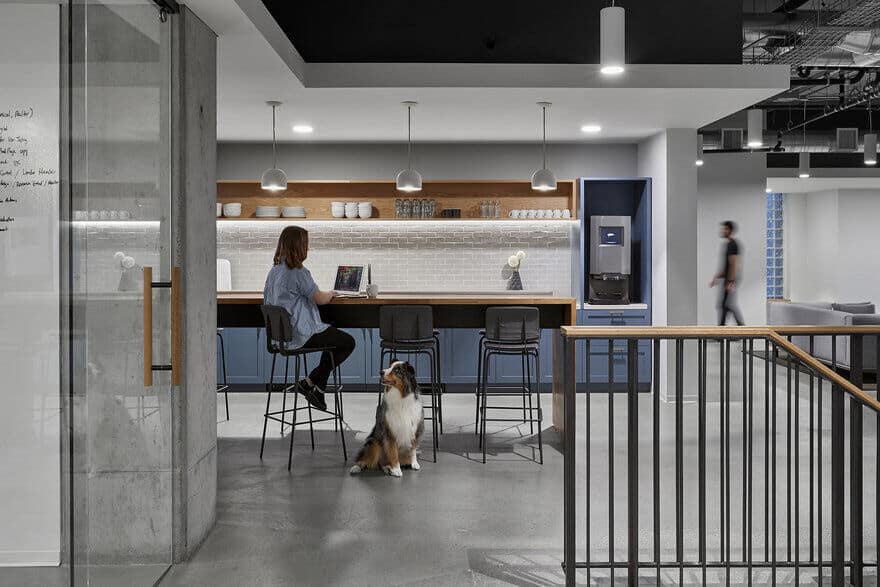
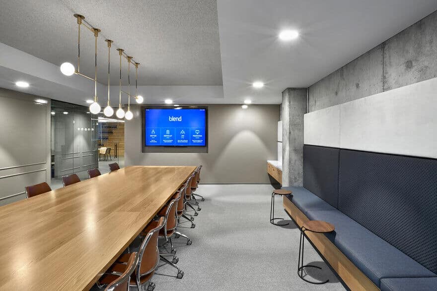
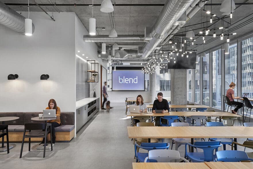
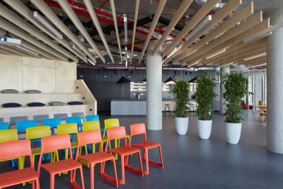
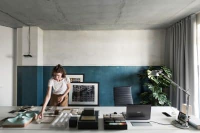
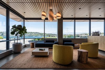
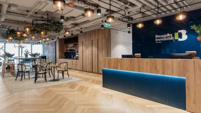
O+A’s design deploys the interior infrastructures commonly associated with tech—raw concrete, exposed ceilings, open plan work configurations, stairs you can sit on—but clothes them in a “banker’s suit.” The palette and finish selections at Blend combine shades and textures of gray, black, navy and white to create a unique visual impact. On the one hand, a transparent airiness that removes the overhang of intimidation financial transactions often evoke and on the other, a reassuring tonal profile calculated to communicate steadiness and trust.
A Staircase with Tattoos
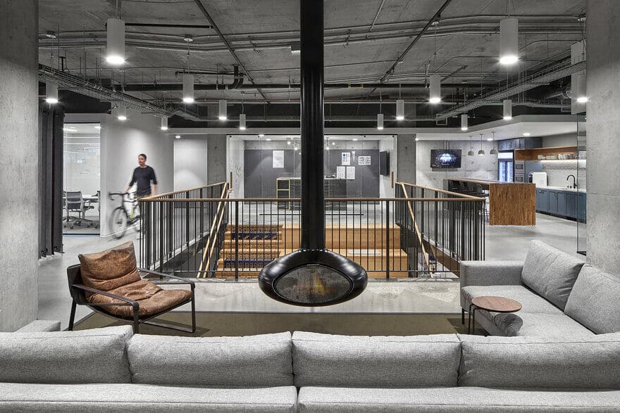
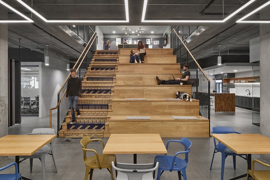
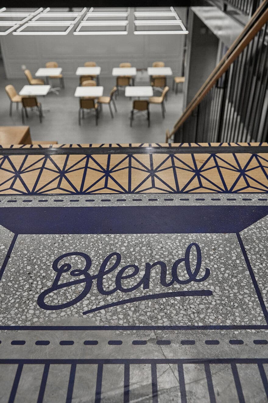
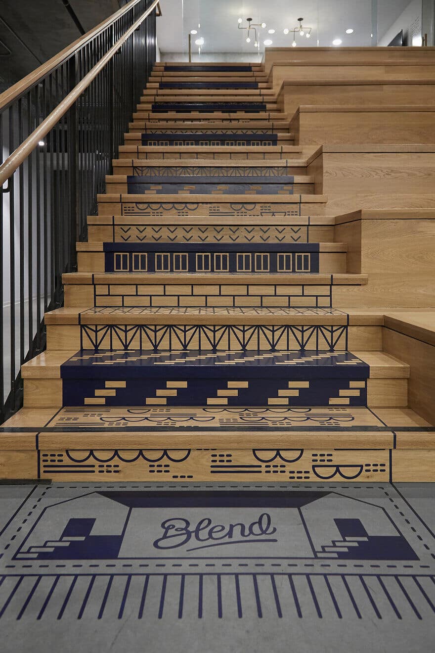
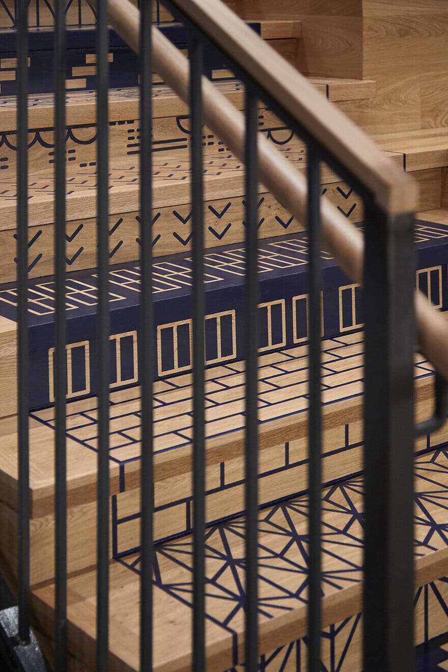
The centerpiece of the design is the staircase that rises to a lounge area and fireplace. These stairs, which double as a lunch destination or stadium seating for all hands meetings, demonstrate the personalization all of us bring to our favorite spaces. Each step and riser is tattooed with a custom pattern abstracted from some builder’s detail—windows or tile or patterned brick. The effect is of a functional architectural feature transformed into a personal object.
Residential Echoes
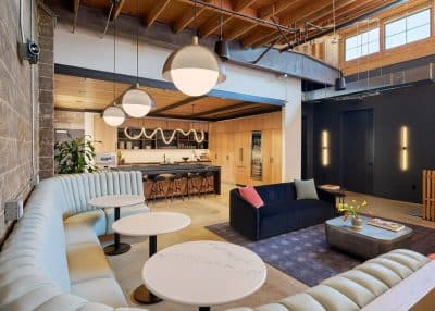
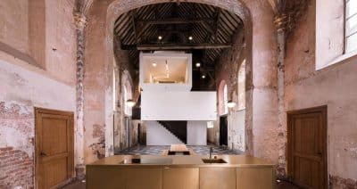
The larger message here is “home.” Finish selections, materials and details echo styles of home building from different eras in American real estate, capturing the many ways we turn our habitations into homes and at the same time making this office that facilitates that process a cozy space itself. With a kitchen that would not be out of place in a modern loft apartment and warm details throughout the space this design achieves a perfect balance of tradition and innovation, analog and tech, gravity and that feeling that comes when the weight of the world (or mortgage) is lifted from your shoulders.

