Project: Bright Apartment
Interiors Designers: HAO Design
Lead Designer: Ivan Chen
Location: Kaohsiung City, Taiwan
Area: 110.0 m2
Project Year 2017
Photographer: Hey!Cheese
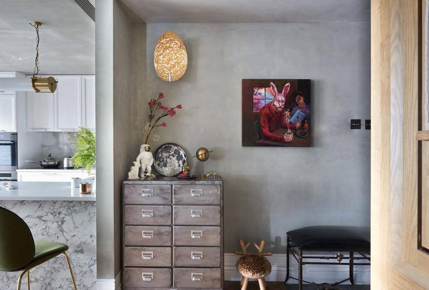
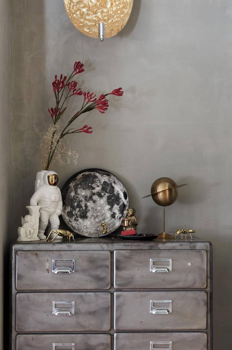
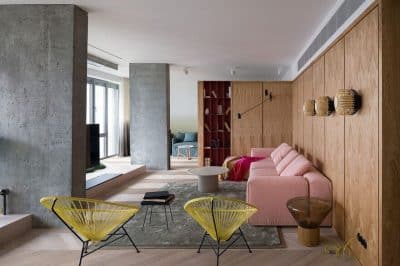
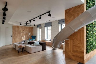
Bright Apartment overturns preconceptions about what a family home should be like; it shows that, even when you have children, your living space can still reflect your own personal taste and style. Bright Apartment by Hao Design combines “industrial” fundamentals with classical elegance, and the living space is planned to suit the lifestyle of each family member, with design aesthetics and circulation routes within the living space interacting to achieve the best possible effect.
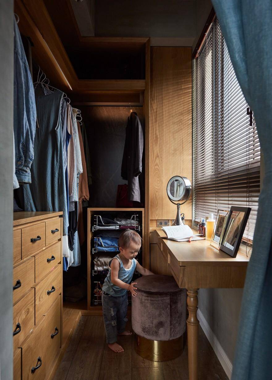
Once couples become parents, they start thinking about how they can add elements to the circulation routes within the home that will contribute to their child’s development. Because the wife would otherwise have to spend a lot of time clearing up after the child, the couple wanted to make sure that the living space would have plenty of storage areas. After extensive discussions, they decided to move away from conventional room layout and rethink the whole structure of the living space.
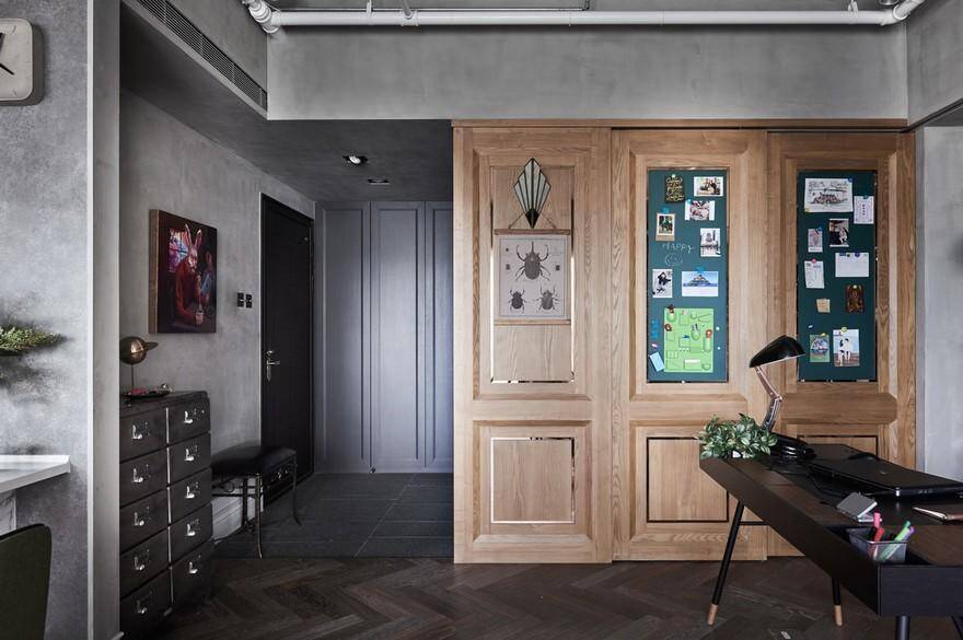
The design for the entrance takes account of the differing habits of each member of the family by adding shelves at different heights in the closet in the vestibule, and by incorporating recesses in the wall that can be used to hang things up. The existing kitchen was repurposed as a small storage space, with a dedicated platform for the mother to use. A two-way circulation approach has been adopted, using a sliding door design to facilitate more convenient movement between the vestibule and the platform.
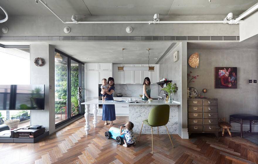
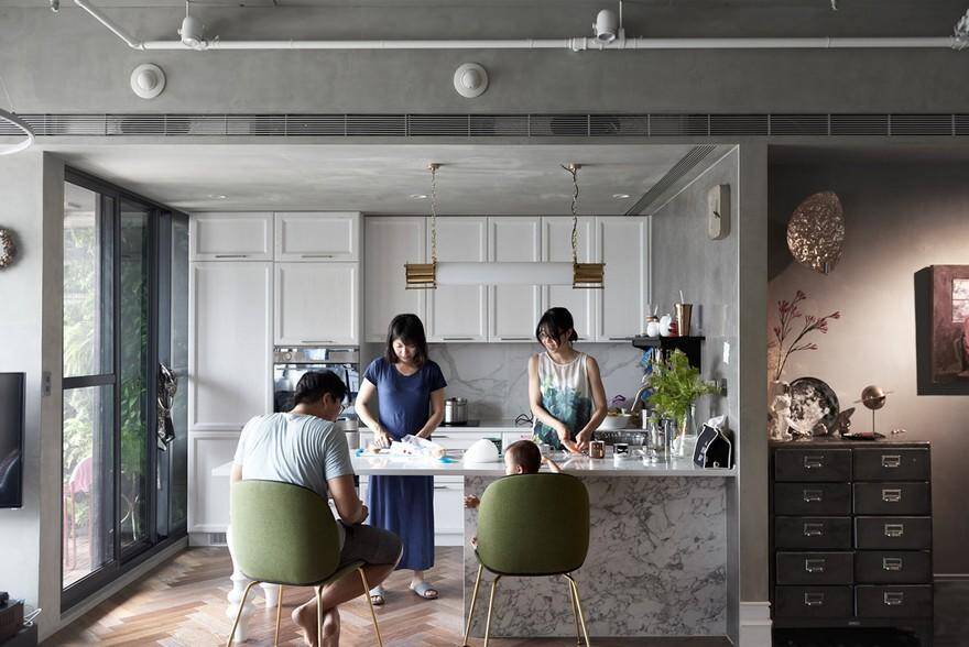
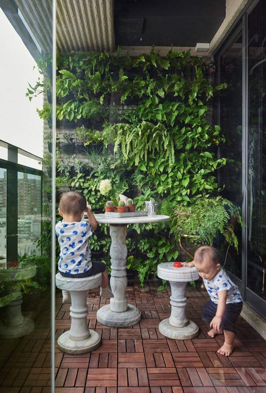
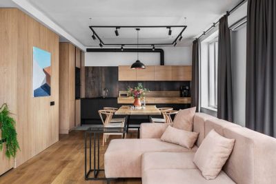
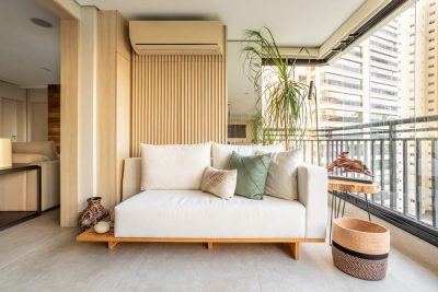
What was originally an enclosed kitchen has been relocated to a location adjacent to the balcony, with a large central island that gives the wife plenty of space for cooking, while also enabling her to keep an eye on the children while she is preparing food. The balcony has a glass wall extending right down to floor level which helps to bring more sunlight into the house, with an area for growing flowers and plants outside, so that the sight of father and son growing fruit and vegetables together can add an extra touch of happiness to the family’s daily life.
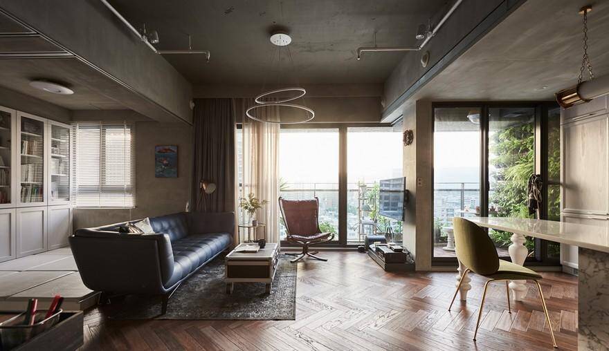
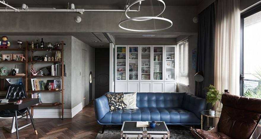
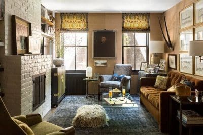
Creating an ideal home involves more than just building a safe, comfortable environment for children to grow up in; it is also important to preserve your own aesthetic sensibility, taste and lifestyle preferences. This attitude is reflected in the husband’s decision to have an “open” study design, with low-key wood grain textures complemented by metal surfaces; the key elements in the study are the District eight heo-wall-unit-with-medium-shelves and Boconocept’s Cupertino series streamlined writing table. Every aspect of the study reflects the husband’s love of industrial-style design, which combines wonderfully with the herringbone wooden floors used for the shared areas of the house to generate an air of classical elegance. The wood-grain pattern is extended into the living room, where the visitor’s eye is immediately struck by the ROCHE BOBOIS leather sofa and the Sigurd Ressell “Falcon” winged armchairs, which help to give a unified thematic feel to the house’s shared areas. Behind the sofa, a small study has been partitioned off using a sliding door. Rather than using old-fashioned floor puzzle mats, this area has been designed with a wooden floor covered with synthetic foam, making it a safe place for the baby to learn to walk; once the child is older, the foam matting can be removed to create a reading and study room for the child.
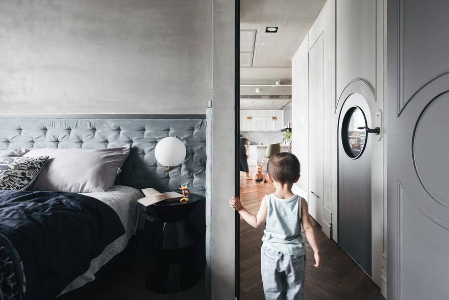
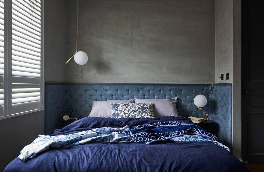
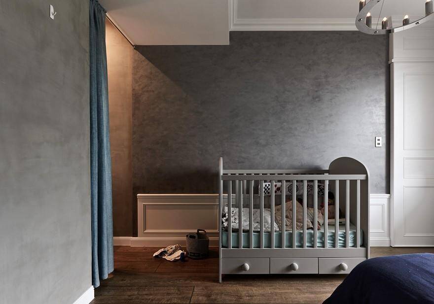
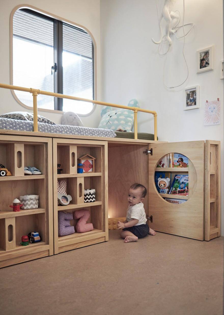
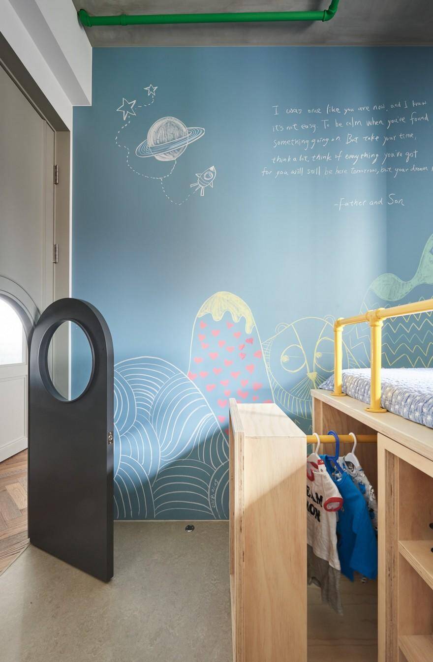
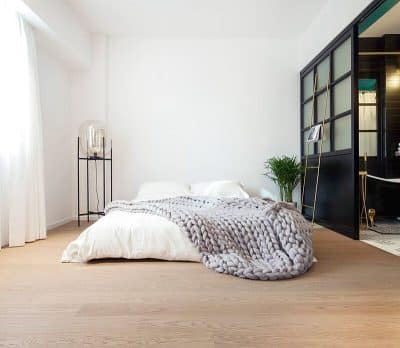
Moving from the core living area to the main bedroom, the overall feel is calm and relaxed with a layered use of blue color tones that represents a continuation of the classical style of the main living area. The child’s bedroom has its own child-sized door, an innovative feature that is fun while also enhancing the sense of unity of the living space as a whole. Within the bedroom, the bright keynote color tones and the special “blackboard” paint material make this a space in which the child can develop his or her creative potential. The bunk bed is designed to get the child used to putting things away after use, with cabinets and handles at just the right height for a child to use; the aim is to encourage the child to develop good habits in terms of putting their own toys away and keeping their clothes neat and tidy. The Seletti Monkey Lamp above the bed was specially chosen for a child whose Chinese Zodiac sign is the monkey. Thanks to careful spatial layout and furniture selection, every aspect of this house embodies a sense of mutual consideration between each family member and the others, every part of the house is able to retain the traces of their past life together, while also contributing to steady forward progress into a bright future.

