Project: Broadmoor Residence
Architects: David Coleman Architecture
Landscape Design: Alchemie Design
Builder: Newtown Builders Inc.
Location: Seattle, Washington, United States
Area: 6058.0 ft2
Photo Credits: Steve Keating
Text by David Coleman Architecture
Our design explores the notion of merging building and landscape. The original house, designed in 1956 by a prominent Seattle architect, is located in the private enclave of Broadmoor.
It was conceived as a meandering, one-story structure on a pastoral, ½ acre site. The original plan was rather ambiguous, gesturing toward the landscape but never fully embracing it. A 1970’s remodel further eroded the integrity of the plan, resulting in a muddled house with little coherent spatial integrity.
Our goal was to clarify the plan, add on where needed to improve livability, merge interior and exterior space where possible, and elevate the feeling-tone of the building. To accomplish that we set in motion a series of interventions that had the effect of better defining access to the Broadmoor Residence, movement through the house, and the relationship between interior and exterior space. This resulted in a transformation of the whole, elevating the overall quality of the building and landscape, allowing the promise of the original structures and site to be fully realized.
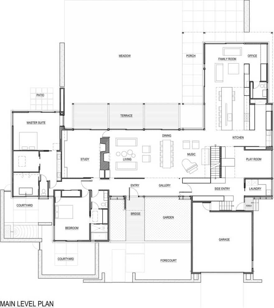
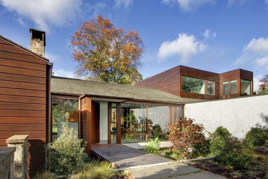
From the street, one ascends the original, meandering stone stair from the sidewalk to a new courtyard, defined by building and stone landscape walls. A portion of this courtyard was excavated 30” deep to create space for a long, low window opening into the lower level yoga room, and to allow construction of a bridge between garden and home. This bridge acts as a threshold, a point-of-arrival, and a clean demarcation between public and private space.
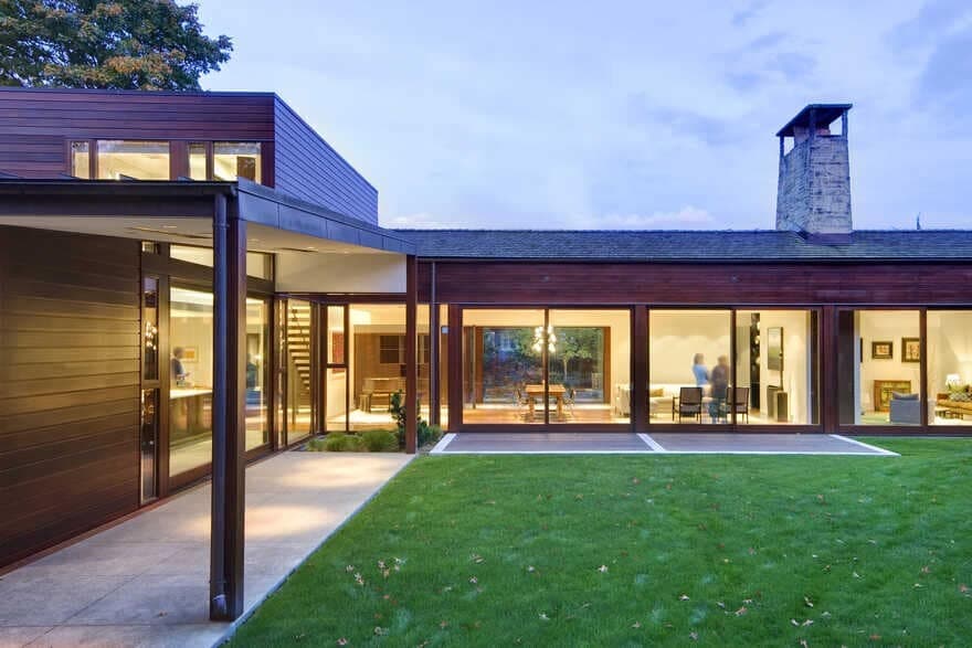
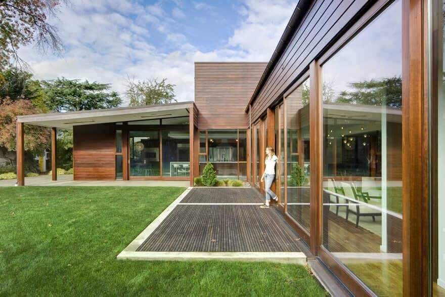
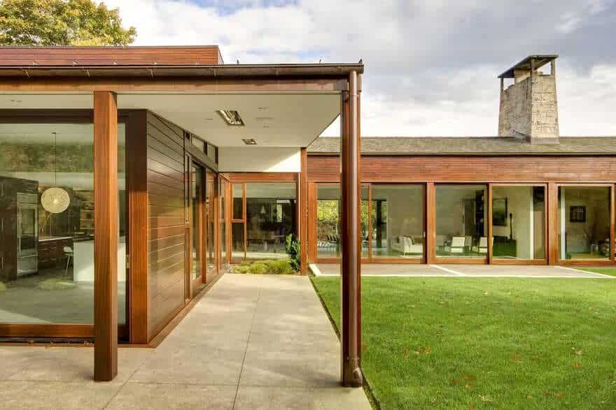
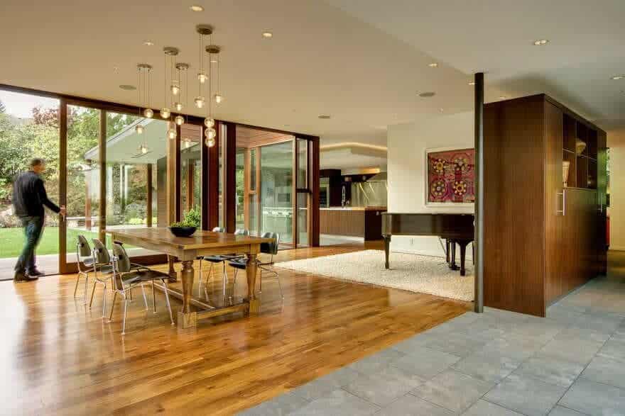
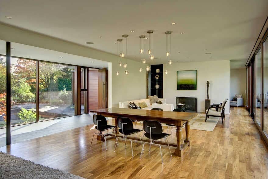
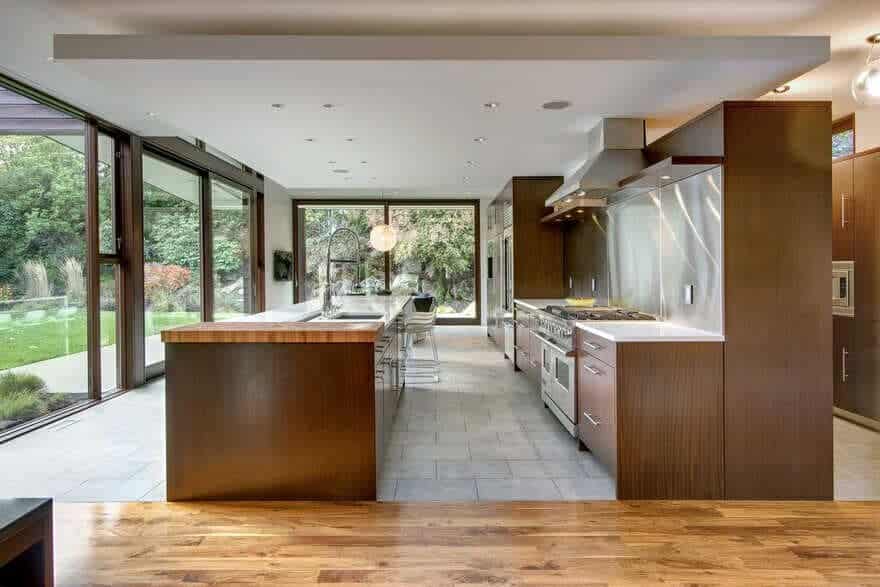
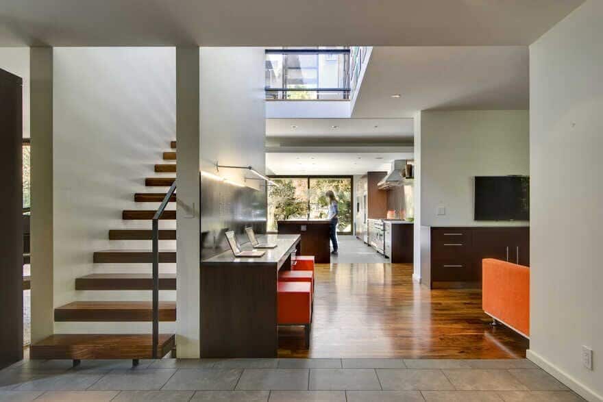
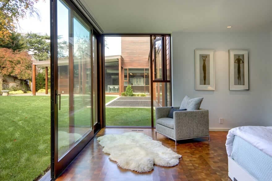
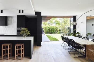
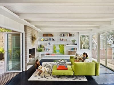
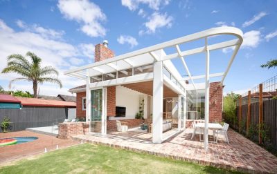
The interiors are organized around a gallery on the street side of the building. The rooms have a processional quality, opening to one another and to the great outdoors. Most rooms overlook the meadow, located in the back yard. Oversized lift-slide doors and large planes of glass dissolve the line between inside and out and allow free movement, physically and visually.
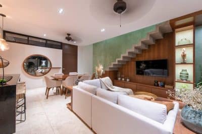
The plan retains the openness that one expects in a modern home, but also contains a semblance of intimacy that is not expected in such a large, open building. This is accomplished by the insertion of subtle yet effective architectural devices, all lending a more human and approachable scale. Changes in ceiling height, changes in wall and/or flooring material, the insertion of free-standing cabinets, a floor-to-ceiling wall here, a twist and turn in the plan there, all help to create this quality of intimacy.
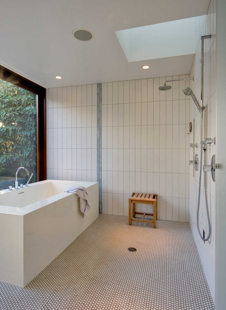
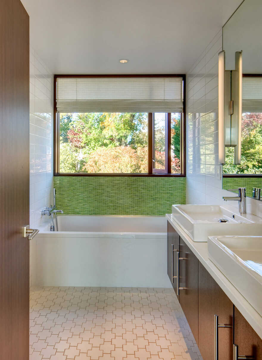
The master suite retains the openness characteristic of the rest of the plan. One enters rather uniquely into a dressing room, complete with vanities, access to the bath, walk-in closet and sleeping chamber. The bath is conceived as a wet room, and contains a free-standing bathtub that opens onto a private courtyard. The sleeping chamber opens on to the meadow.
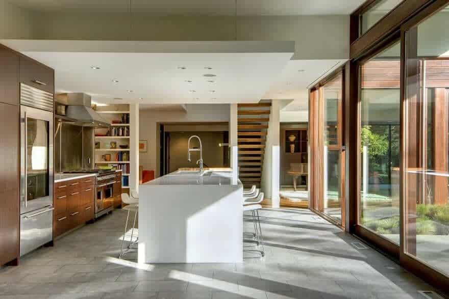
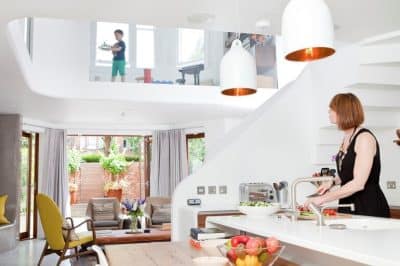
The children’s wing is located in a 2-story suite, the lower level containing a play/art/work space that opens onto the kitchen and side-entry, complete with a laundry/mud room. An open stair ascends to two bedrooms and a bath, all wrapping around a two-story, light-filled atrium overlooking the play room.
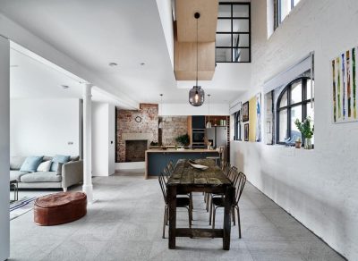
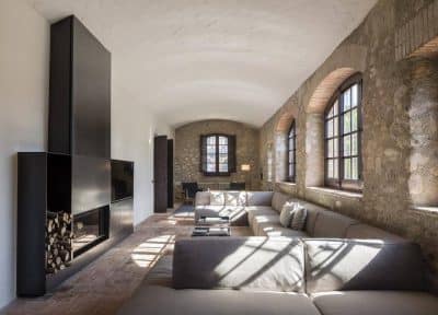
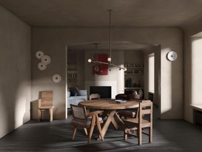
The material pallet was kept decidedly simple to create a unified ambiance, reduce visual noise, and minimize distraction to the outdoor views. Sapeli windows and doors provide a warm frame for those garden views; complimentary dark wood floors create continuity, warm gray ceramic tile recalls the concrete slabs on the exterior; clean white plaster ceilings and wall partitions help to maintain brightness on the bleakest days; blackened steel hardware and trims provide contrast and visual interest.
