Project: Carnegie Hill Apartment
Architects: Michael K Chen Architecture
MKCA Project Team: Natasha Harper, Project Lead, Robinson Strong, Andrew Matia, Braden Caldwell, Justin Snider, Cristina Sonneman, Michael K. Chen
MEP Engineering: ABS Engineering
General Contractor: IA Construction Management
Location: Manhattan, New York, USA
Area: 4,000sf
Year: 2020
Photographs: Max Burkhalter
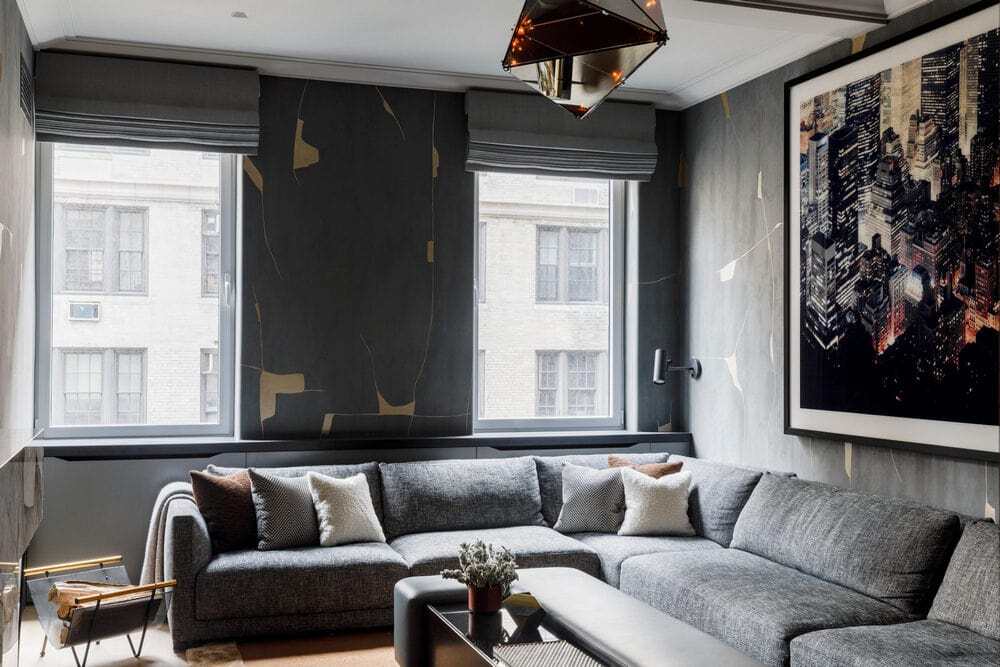
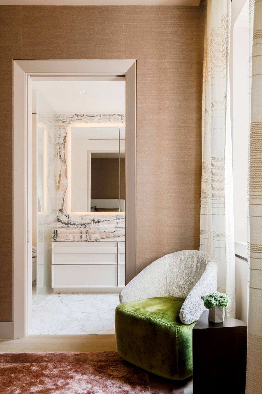
The New York family of five who approached us to reimagine a 4,000sf Carnegie Hill apartment came to MKCA with a strong desire to explore new aesthetic territories, and to move away from recognizable codes and traditional design approaches to Upper East Side apartments.
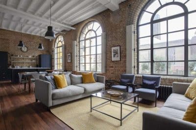
Our approach takes advantage of the generous scale and inherent grandeur that are a hallmark of prewar Park Avenue buildings, but re-thinks them spatially and aesthetically to be both more forward looking in their design, and more conducive to togetherness, allowing the entire family to make use of all spaces – formal and informal – and greatly increase the connectivity across and movement throughout the apartment.
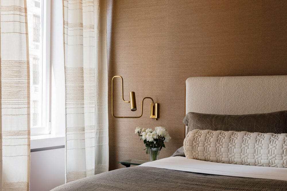
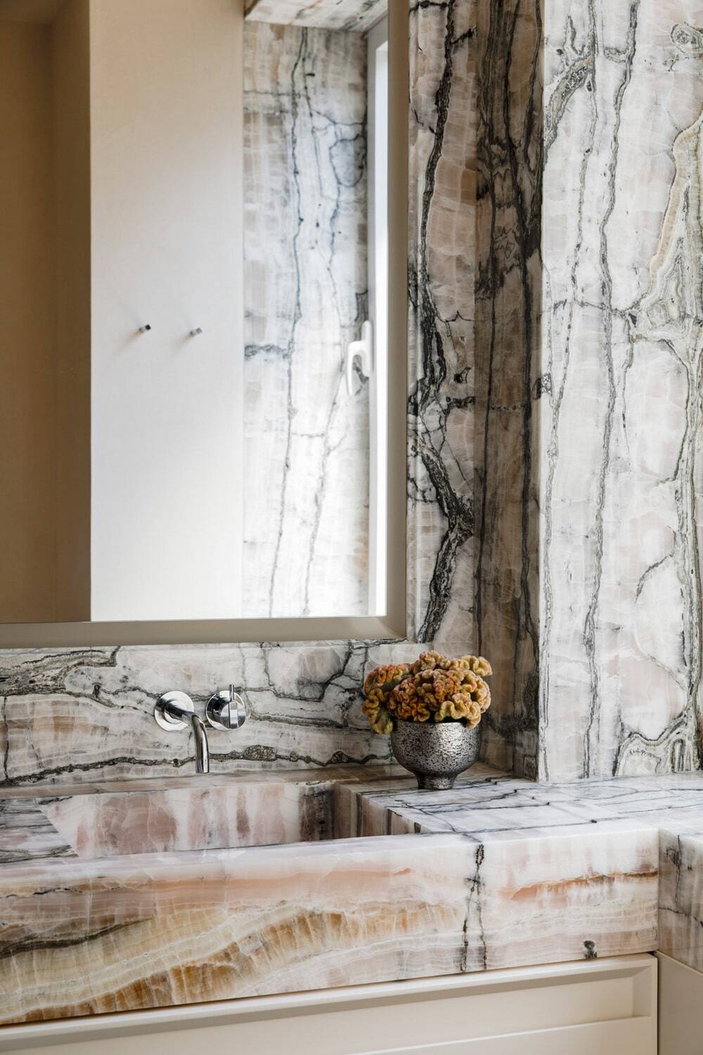
A hallmark of MKCA’s work in historic contexts is a studied appreciation for craft and detail that can communicate an understanding of a building’s original time and place while charting new design directions. Here, our approach was to play with spatial porosity, connectivity, texture, and mass as strategies for organizing the apartment coupled with an elevated approach to craft that informs the architectural detailing and materials and the furnishings.
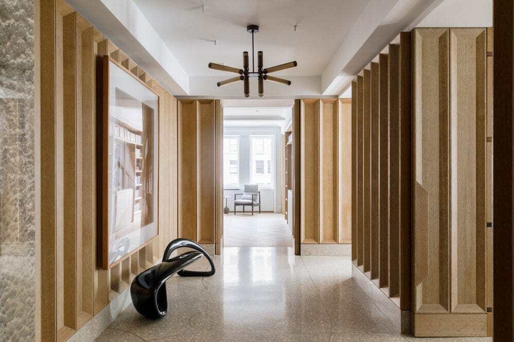
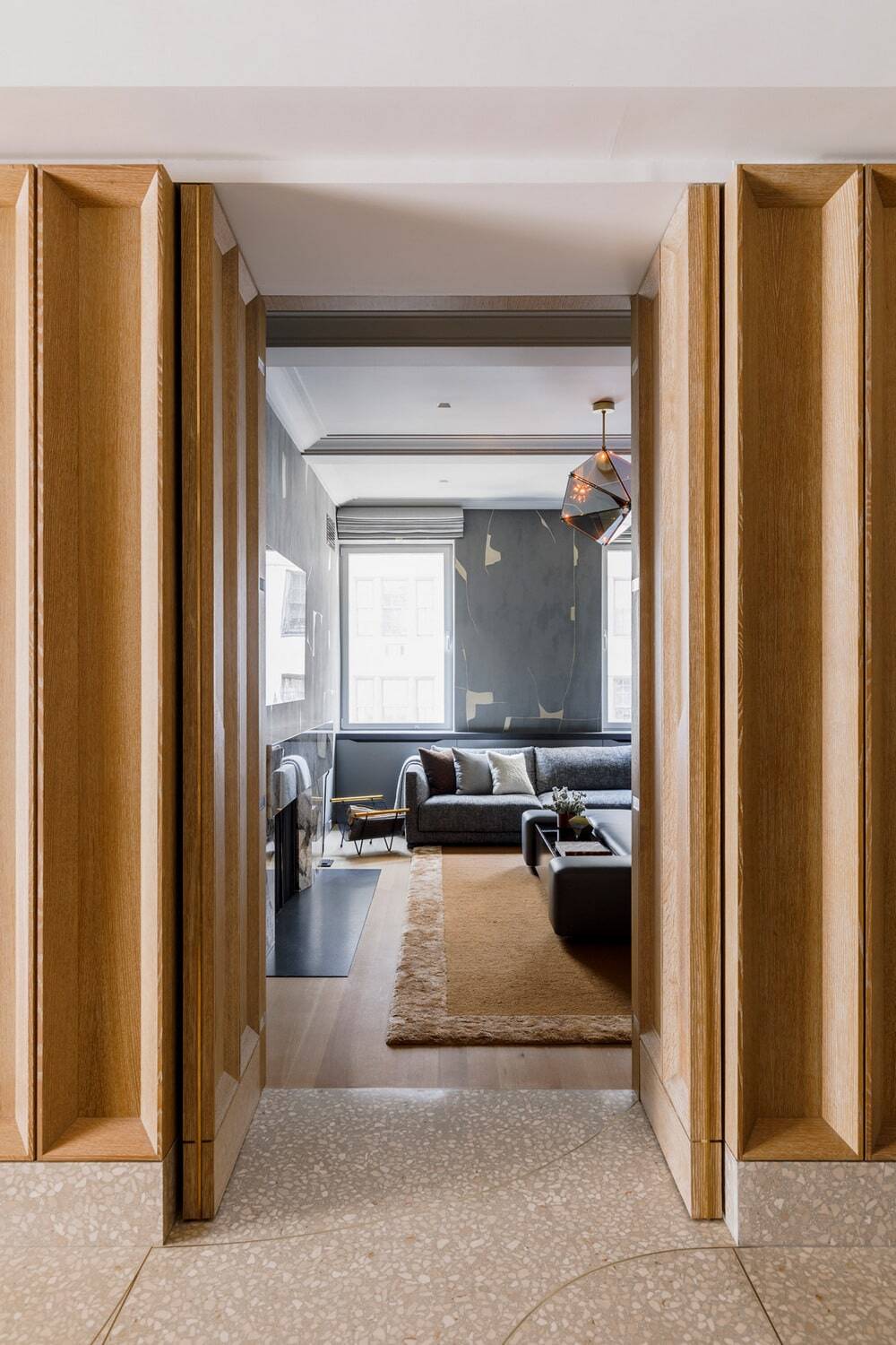
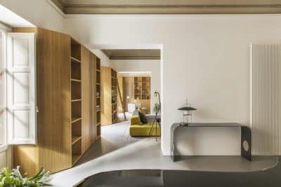
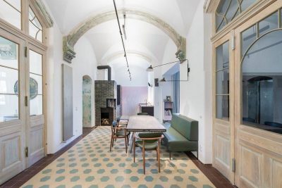
A case in point is the apartment’s central gallery, a functionally ambiguous and generous spatial hallmark of large Park Avenue apartments. We sought to augment the graciously formal aspects of the space by adding spatial and textural mass to the perimeter, reconfiguring a series of punched doorways linking adjacent spaces into a series of three-dimensional volumes that define the space. The entire gallery is enveloped in rigorously regimented coffered millwork in cerused white oak that accentuates the volumes around the porous perimeter, conceals pivoting salon-style doors that close of individual spaces, and incorporates an integrated art hanging rail above. One moves between the volumes to enter the living, dining, den, and bedroom hall through the newly thickened perimeter that is at once a dematerialized expression of the original room that was the gallery, and an ultra-material expression of light and shadow that provides a backdrop for the family’s collection of contemporary photography.
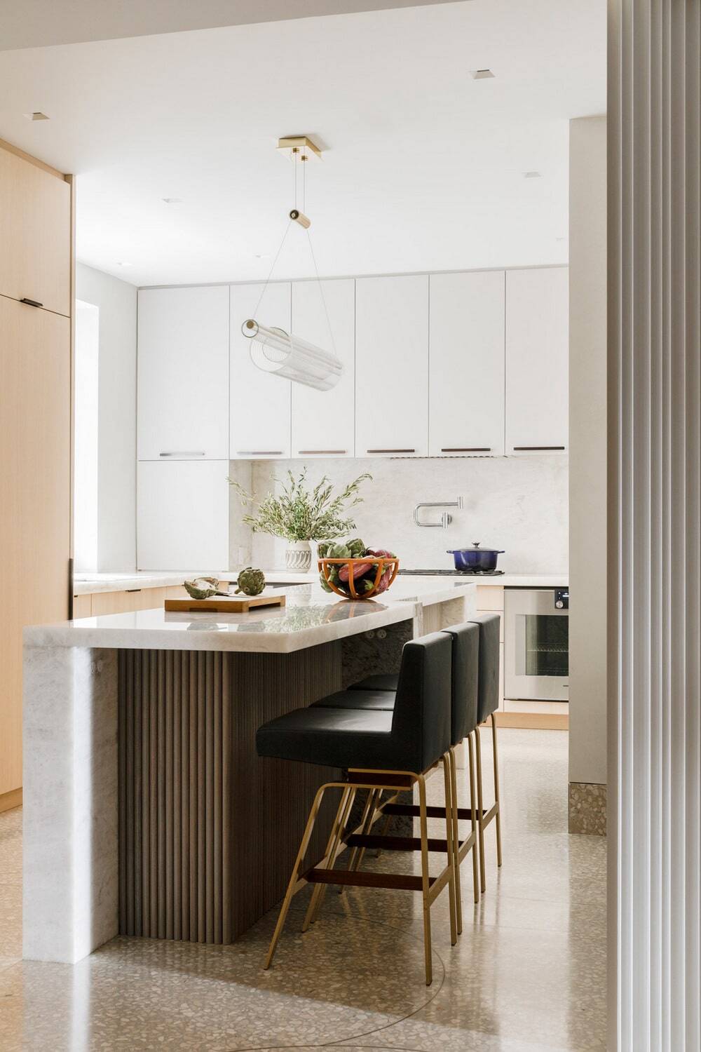
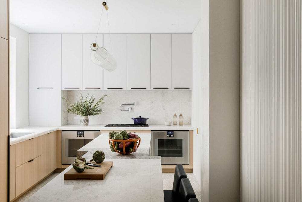
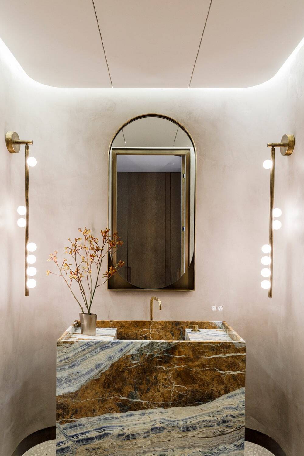
The overarching sense of fluidity is accentuated by the thoughtful application of materiality and volume across the residence, beginning in the entryway. A poured terrazzo floor greets visitors in the elevator vestibule, and continues through the kitchen, adjacent pantry space, mud room, rear bedroom hall, cloak room, powder room, and back to the gallery where it leads into the living, dining, and media rooms. Embedded with a custom pattern of curving brass spacers, the floor literally draws connections from space to space, through a playful and expressive pattern.
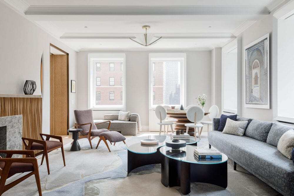
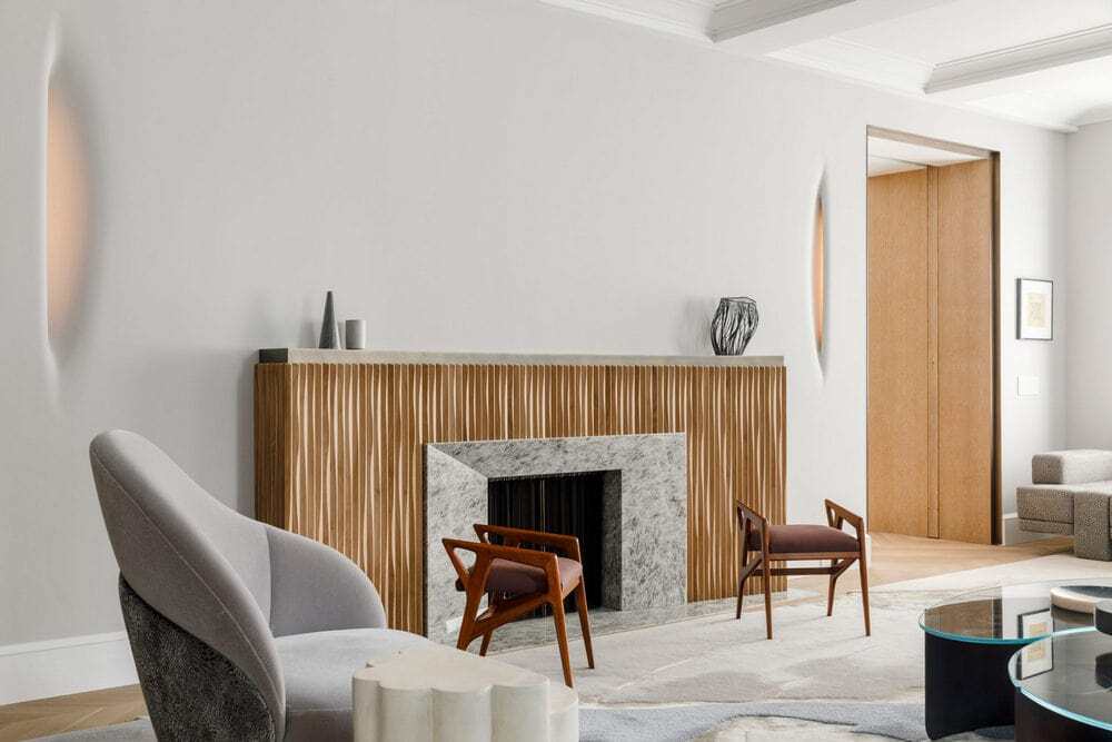
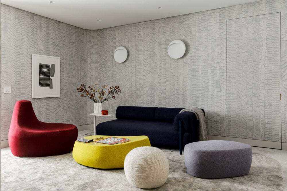
The decoration and interior design were conceived through a series of custom commissions from artists, other independent designers and galleries, and MKCA’s own custom pieces. Each is a case study in collaborative design. We always begin interiors projects by thinking through the spatial parameters of the project, and some of the unique opportunities that might exist to build a collaborative working method where many different individual voices communicate and mingle.
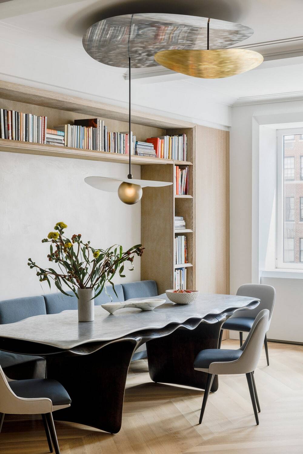
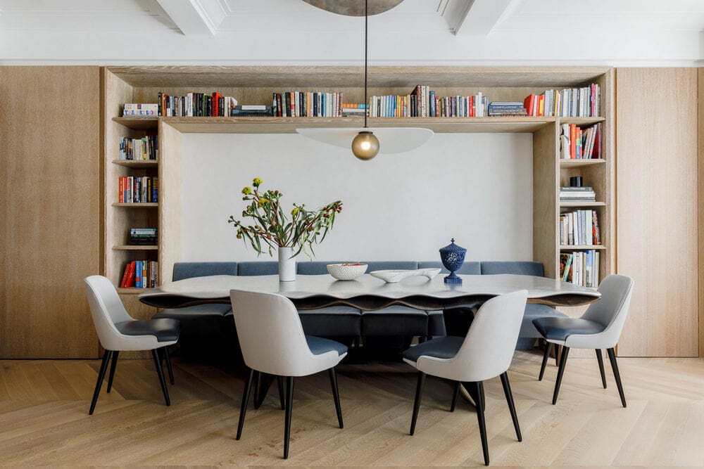
In keeping with MKCA’s overarching practice, the studio has designed and commissioned custom furniture across the home, with each piece bolstering the project’s emphasis on mutability, tactility, and elegance. The latest result of an ongoing collaboration between MKCA and Christopher Kurtz, the Hudson Valley-based sculptor and designer’s striking 12-foot-long dining table anchors the dining area/library. The piece features an undulating, carved aluminum top fused to a rippling underlayer and base in oxidized cherry, while a custom chandelier by Ladies and Gentlemen Studio hovers above, rotating softly on a custom mechanism. These pieces and many others reflect the clients’ admiration for detail and workmanship, and unexpected and forward leaning formal expression.

