Project: Bořislavka Centre – Commercial Building
Studio: Aulík Fišer architekti
Author: Jan Aulík, Leoš Horák
Co-author: Jakub Fišer, Jakub Hemzal, Gabriela Králová, David Zalabák, Alena Sedláková, Petra Coufal Skalická, Eva Mašková, Jan Dluhoš
Design team: Ondřej Černý, Petra Měrková, Oleksandr Nebozhenko, Vojtěch Štamberg, Kristýna Zámostná
Project location: Evropská 866/65, 160 00 Prague 6, Czech Republic
Completion year: 2018-2021
Built-up Area: 10 780 m²
Gross Floor Area: 69 735 m²
Photographer: BoysPlayNice
Context
The building site is located directly over a metro station, right next to one of the city’s major radial roads, Evropská, which connects the city centre to the airport. The site has an elevation difference ranging from 7 up to 14 meters and is immediately surrounded by heterogeneous development, with a neighbourhood of family villas followed by mid-rise apartment buildings and even a socialist housing estate further away.
In 2012, conscious of the significance and complicated character of the site, the KKCG REG investment company held an international architecture workshop to find a suitable solution for its development. The main challenge posed by the workshop was the inadequacy of a sizable vacant plot, close to tram and metro stations, with a prominent place in the Prague panorama and views to the Prague Castle.
Vision for the Site / Vibrant Urban Environment
A tight functional linkage between architecture and public space, serving both local citizens and visitors, was envisioned by the client. A complex, unique and respectful solution was required. The design had to be confident and conscious of the urban context at the same time, responsive to the surrounding development. Public space improvement, pedestrian access routes, urban design and landscaping were all emphasized as main aspects of a successful solution. A requirement for sustainable building operation went hand in hand with the A-rated office space requirement.
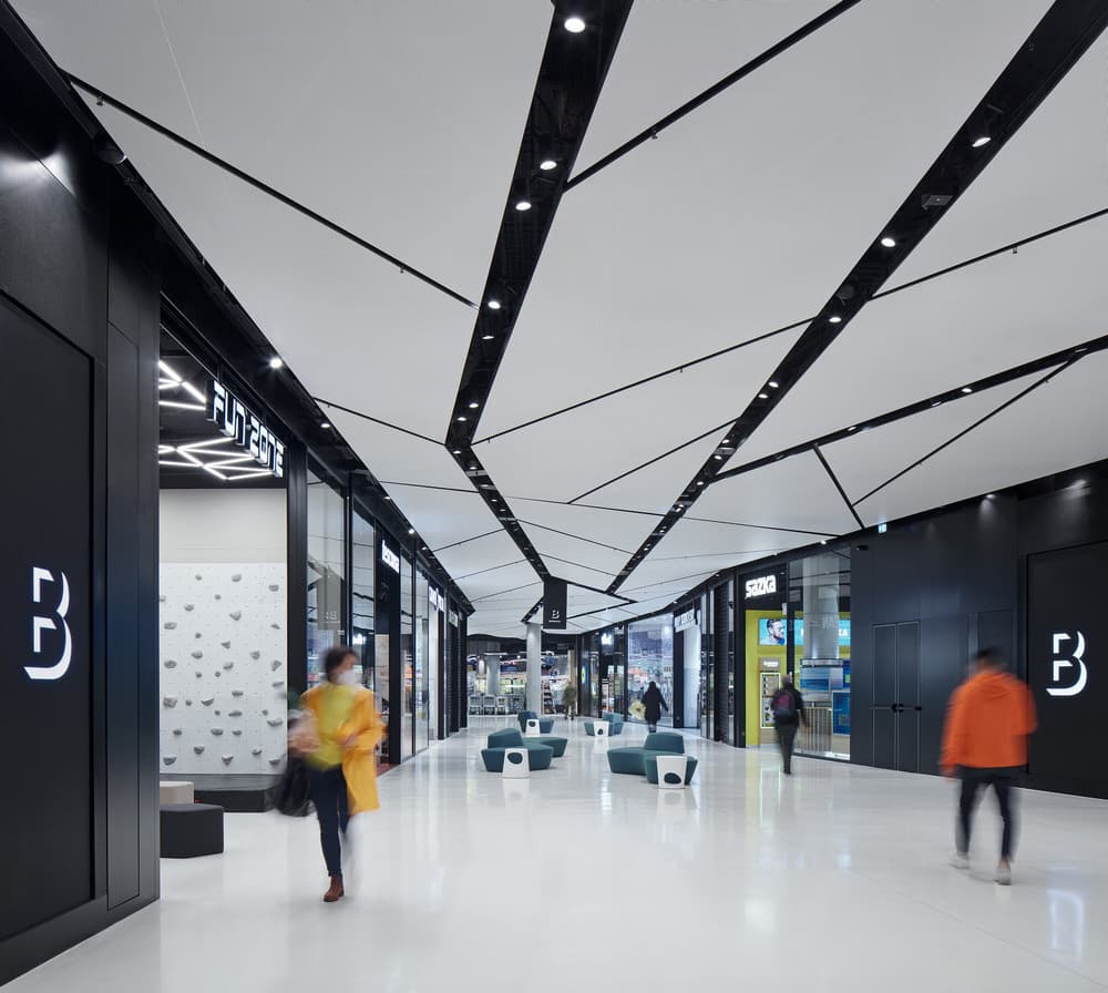
The main assignment of the architecture workshop was to take advantage of the existing topography – and to do so in such a way that a small local shopping centre (approx. 9,000 m2) is created in the underground part of the project (on Kladenská street level) and then several (minimum three) individual volumes are added on top of this platform, providing office space (approx. 26,000 m2).
“Our entrepreneurial vision doesn’t end with good investments, we want to consider our projects from a much broader, and above all, a long term perspective.” (Petr Pujman, CEO, KKCG Real Estate Group)
Significant urban development was happening all along the Evropská street during the 20th century. Company headquarters and other imposing commercial buildings were being erected here. Unfortunately, most of these only strengthened the streetscape character, but did nothing for the residential development further beyond the street. “What we considered the greatest strength of the design brief was the ambition to reach out and help improve the neighbouring areas.” (Aulík Fišer architekti)
For both the developer and the architect it became a common goal to provide local residents with a vibrant urban complex offering amenities, cafés, restaurants and shops – in the form of a refined public space.
“Besides the office and business functions of the complex, our main goal was to supplement public services and amenities in the catchment area, and improve access to the metro station.” (Petr Pujman, CEO, KKCG Real Estate Group)
Architecture Corresponding with the Site / Fractal Self-Similarity Principle
“While studying available historical maps, we realized the irregular shape of the building site, resembling an elongated triangle, is actually a record of old roads leading to the Prague Castle. Their acute angle makes sense due to different elevations. We used the existing geometry, developed it further, and reopened passage through the site. Then we subdivided the site into self-similar fractal segments.” (Aulík Fišer architekti)
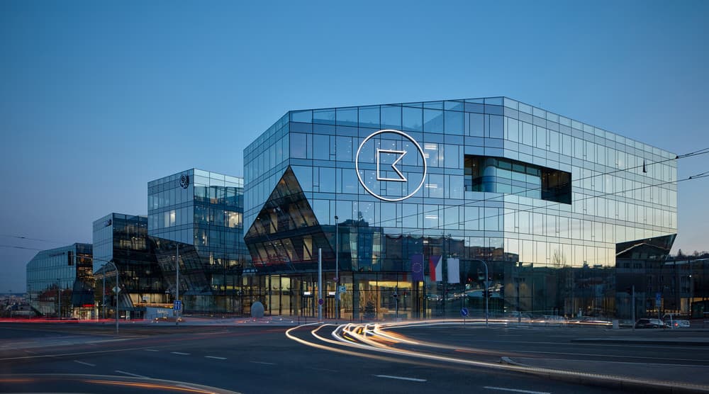
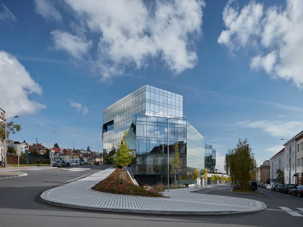
The four individual volumes of the commercial building are shaped according to the fractal self-similarity principle and derived from existing site geometry. This approach generated a responsive building shape changing with the character and elevation of the perimeter streets, while still meeting the demands of the office space typology. The irregular shapes of the volumes are not arbitrary external design features, in fact they match closely the interior layout and the building function. Each of the four volumes is similar to the other ones, and all are bound together in one composition. Carefully assembled from the irregular “crystals”, the form of the permeable city block emerges.
Permeability and Connectivity
“We drew on our ongoing research of new urban fabric types for the contemporary city. Our goal is to reinvent the traditional city block so that it would evoke the same quality of public space as the historical centre, but would meet our current requirements for indoor environmental quality and allow individual architectural expression at the same time.” (Aulík Fišer architekti)
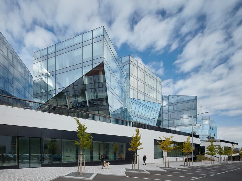
The scope of the design went beyond just individual buildings’ aesthetics and rational floor layout – the space around and in between buildings was equally important. The four crystalline volumes stand on a low two-story plinth. The purpose of the plinth is to address the different elevations of neighbouring streets. Narrow alleys and small open spaces are formed between the crystals, reminiscent of the public spaces typical for compact historical city centres.
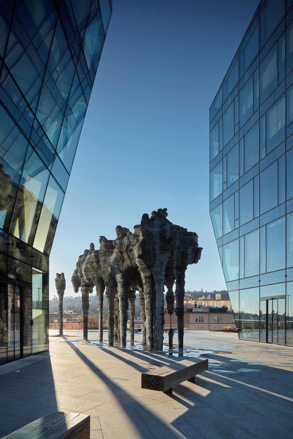
The design also introduces a small “piazzetta”, located at the site of a similar pre-existing historical square. “Compared to many large-scale, low-activity public open spaces built since the second half of the 20th century, small city squares usually have a much better feeling.” (Aulík Fišer architekti)
The piazzetta also provides barrier-free access to the whole commercial building complex and the metro station vestibule. A Federico Díaz sculpture underscores the place’s significance. For both the interior and the exterior, the scope of possible movement through the complex could be likened to that of an anthill.
Glazed Façade – Expressing the Block Composition
The technologically complicated, fully-glazed curtain wall system represented the best option for formally expressing the block composition – it was not an end in itself, nor was it meant to demonstrate the sovereignty of the office typology.
Sufficient accuracy of the crystalline shapes could only be achieved with a structural glass façade. Specifying the light transmission characteristics for the glass used for the project made it possible for the outside observer to take in the complex geometry of the buildings, while avoiding, to a large extent, any strong reflections or sun glare, undesirable in the given urban context. The final design strikes a delicate balance between the technical solution and the emphasis on natural daylighting, even for workspaces located deeper into the plan.
The solid and more traditional formal expression of the two-story plinth helps to integrate the commercial building with the surrounding urban context of the Kladenská street. At the street level, solid walls of light stone cladding are punctuated by large display windows.
The more regular, vertical parts of the glass curtain wall use a prefabricated modular façade, while the more complicated, angular and three-dimensional parts use a stick system façade. During the project development, full scale 3D printed models were made to test some of the most complex structural elements. An extraordinary part of the building envelope features a glass ceiling stretching between buildings I a II. The three-dimensional steel load-bearing structure includes a service cavity for peripheral wiring at the steel profile bottom flange.
Public Space and Vegetation / Balancing Built-Up Surfaces and Green Spaces
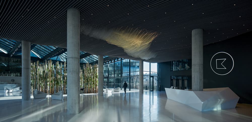
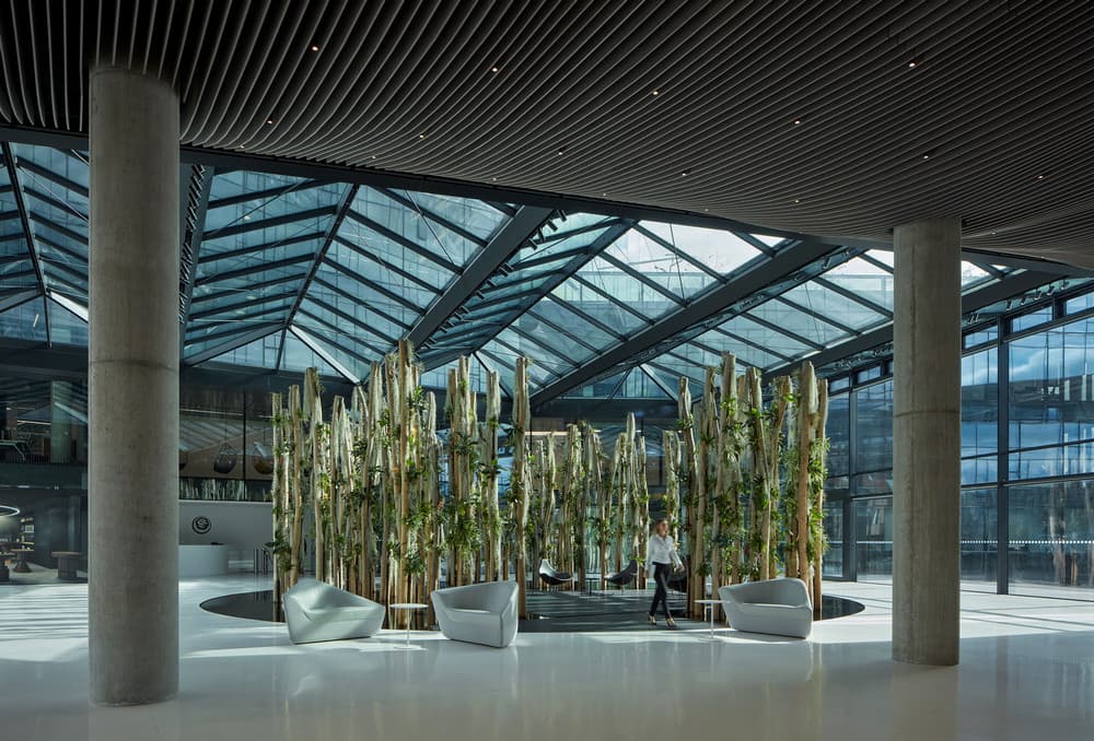
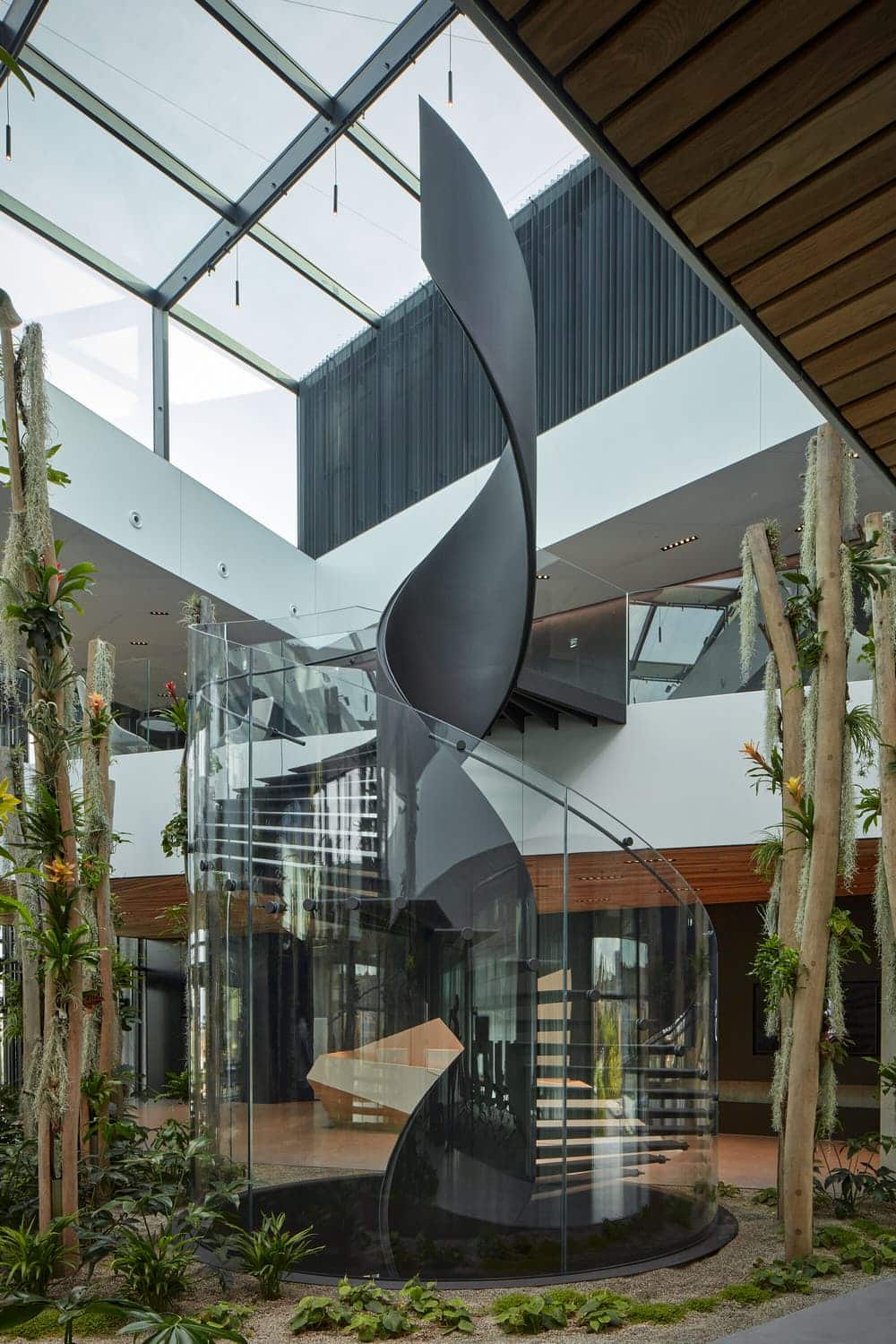
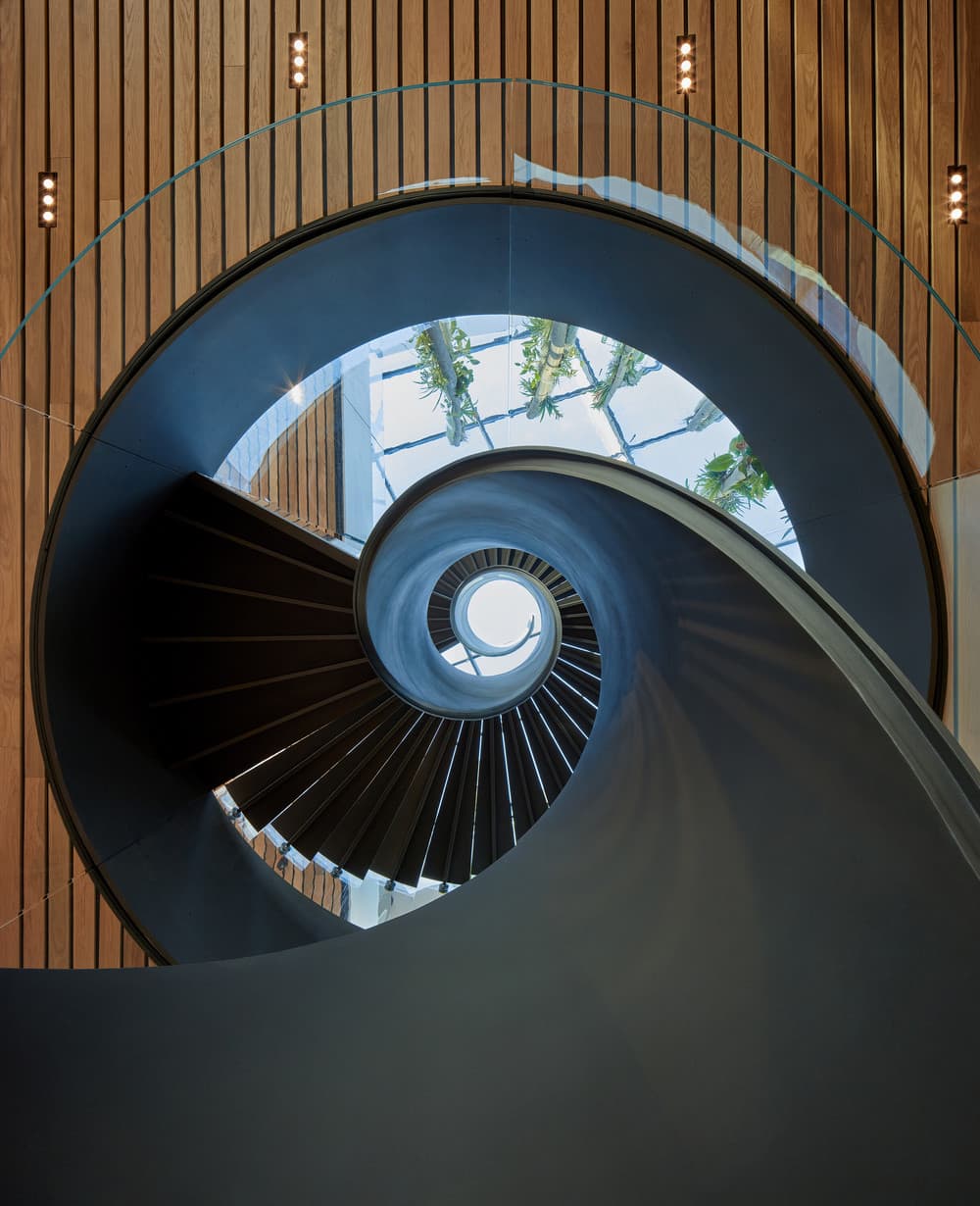
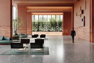
For the most part, new public spaces receive ample daylight and are sufficiently shielded from the noise of the Evropská radial road. Individual buildings – crystals – are set into stepped green gardens, their entrance lobbies and courts filled with lush vegetation, with creepers growing up through the buildings. An experimental form of indoor vegetation, quite unlike the typical green wall, was designed for this project. Several large, three-dimensional structures from rough-hewn wooden posts were erected to carry epiphytic plants. Following that, an open green park with grown trees was designed in the eastern part of the site, balancing the built-up surfaces and the green spaces.
“A more significant use of greenery would, in the case of Bořislavka, go against the architects’ vision. Individual volumes symbolize crystals and crystals tend to be clean. In the Bořislavka project, the scale of the greenery is in a harmonic relationship with the overall design. The “Epifyt” (Epiphyte) forms the focal point, arrived at after a thorough search for a unique way of utilizing interior plants. The singularity of this solution is in the form of the installation itself, but also in its close connection to architecture. It is not just vegetation, but an artwork that is alive and changeable.” (Zdeněk Sendler, landscape architect)
Integrating Art in the Architectural Program
From the beginning, the architects of the Bořislavka Centre envisioned several unique artistic interventions as integral parts of the design concept. For their realisation, two possible stages in the project development were considered.
First group of artworks would be finished at the time of the building’s completion and installed at predetermined locations (in the piazzetta, in front of the main entrance, or in specific interior positions).
The artworks were always understood to freely express the artists’ vision, the only thing the architects specified was their location. There was no brief asking for a common theme or a starting point for the intended artworks, and no indication as to how they should be integrated or juxtaposed to the architecture of the building.
“Since the design and development of these artworks preceded the completion of the building and the surrounding public space, in consultations with the artists, a certain timeless quality was preferred to contemporary social commentary. The long-term effects these artworks would have on individual public spaces had to be taken into consideration, too.” (Petr Pujman, CEO, KKCG Real Estate Group)
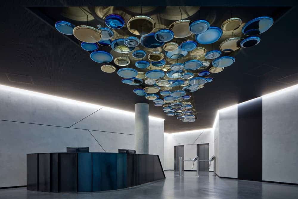
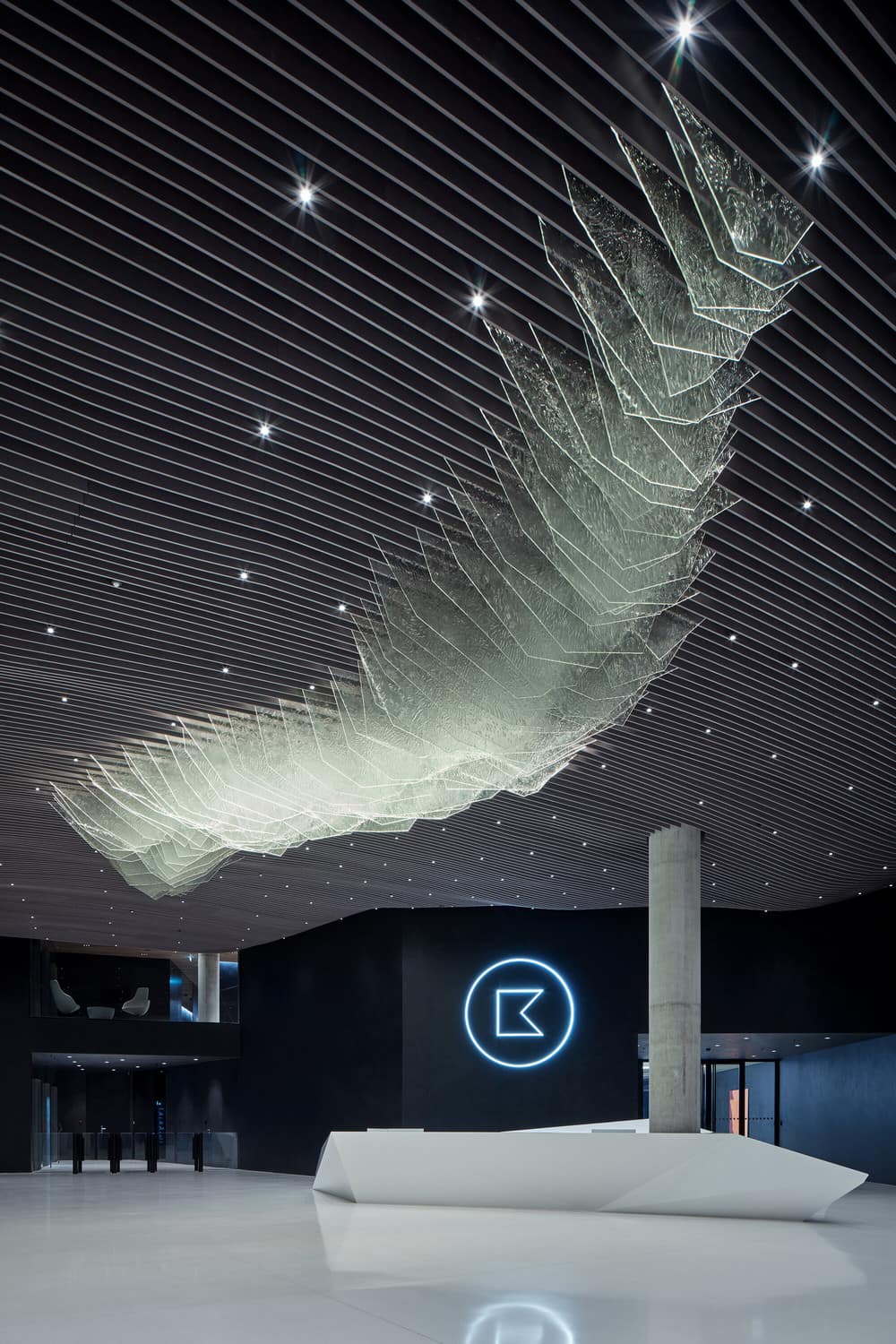
However, all the sculptures in the first group (Aerial by Federico Díaz, Ledovec (The Iceberg) by Maxim Velčovský, Planeta (The Planet) by the architects of the Centre Jan Aulík, Leoš Horák, David Zalabák and the sculptor Pavel Filip, and Proudění (The Flow) by Jan Poupě) were finally conceived as closely relating to basic natural principles, thus manifesting an unintentional, but all the more remarkable synergy between the artists and the environment they entered, and the artists among themselves.
“I was tasked with designing a piece for the main lobby, serving as an entrance hall to one of the crystals. The several hundred square meters space posed a great challenge, when striving to create an artwork that would become an integral part of the building and its architecture. In fact it was a piece of gesamtkunstwerk, which means the connection of all artistic and design disciplines in such a way that the entire building works in harmony. Working with the whole and having to constantly consult other professionals on the project was a very interesting and important design process.” (Maxim Velčovský, Art director, Lasvit)
A second group of art interventions will continue to be commissioned and installed in the public open space after the building’s completion. The interventions will be selected and positioned contextually with the existing artworks from the first group, reacting to existing spatial relationships. Both long-term installations, co-existing in the given space, and short-term installations or exhibitions are acceptable, opening the doors for current art pieces as well.
Indoor Environment – Office Space
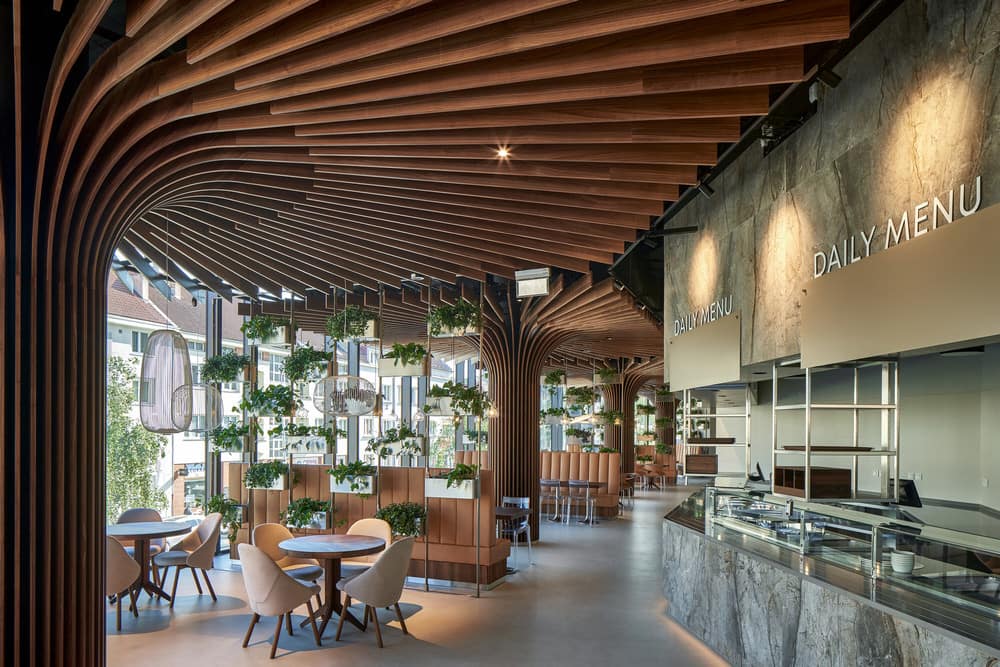
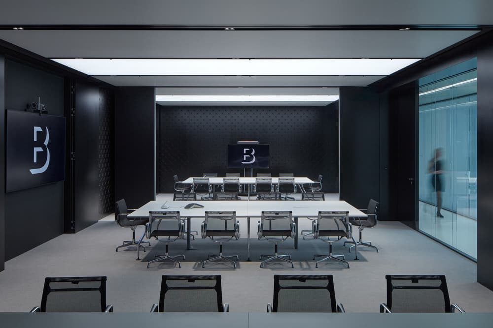
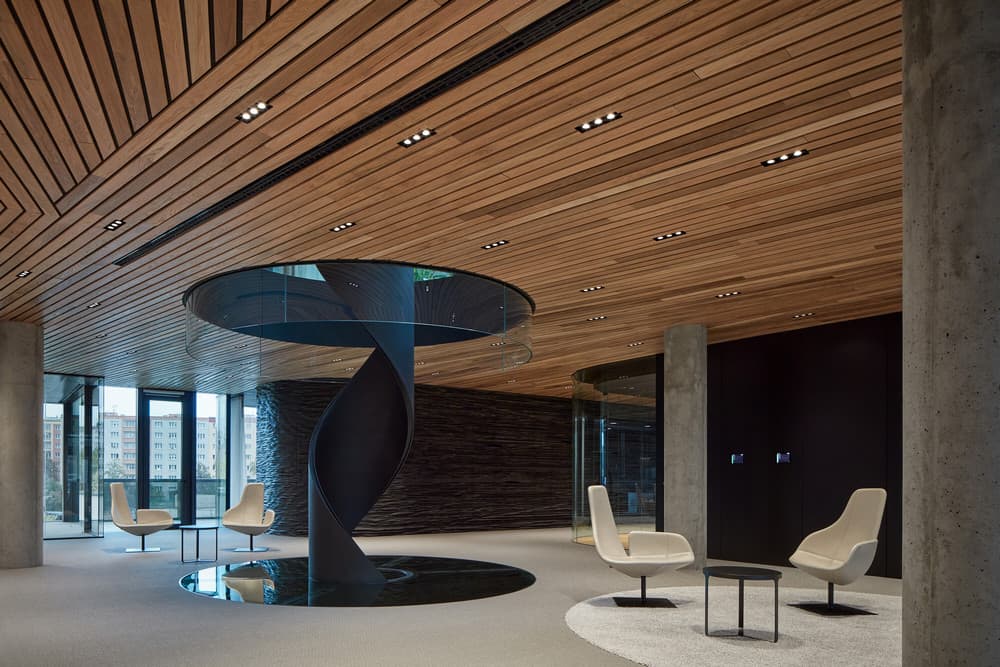
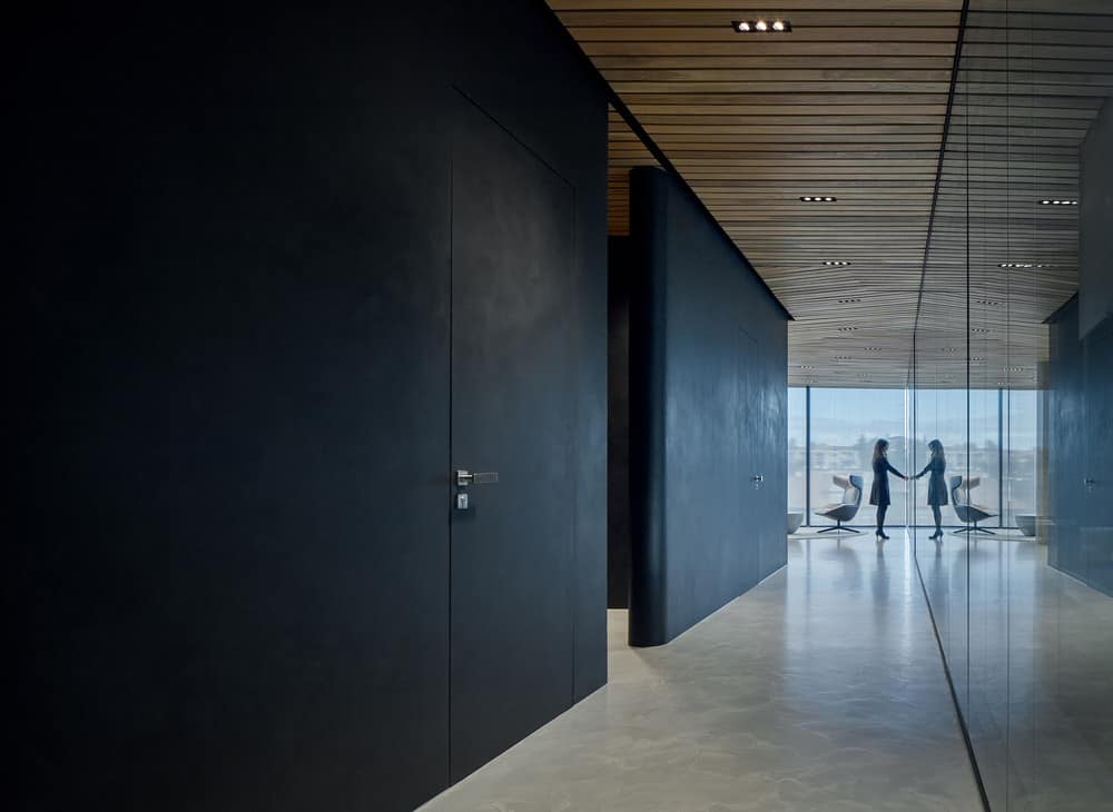
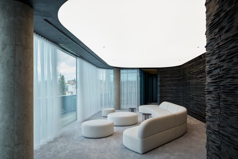
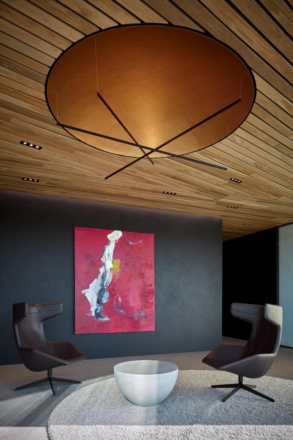
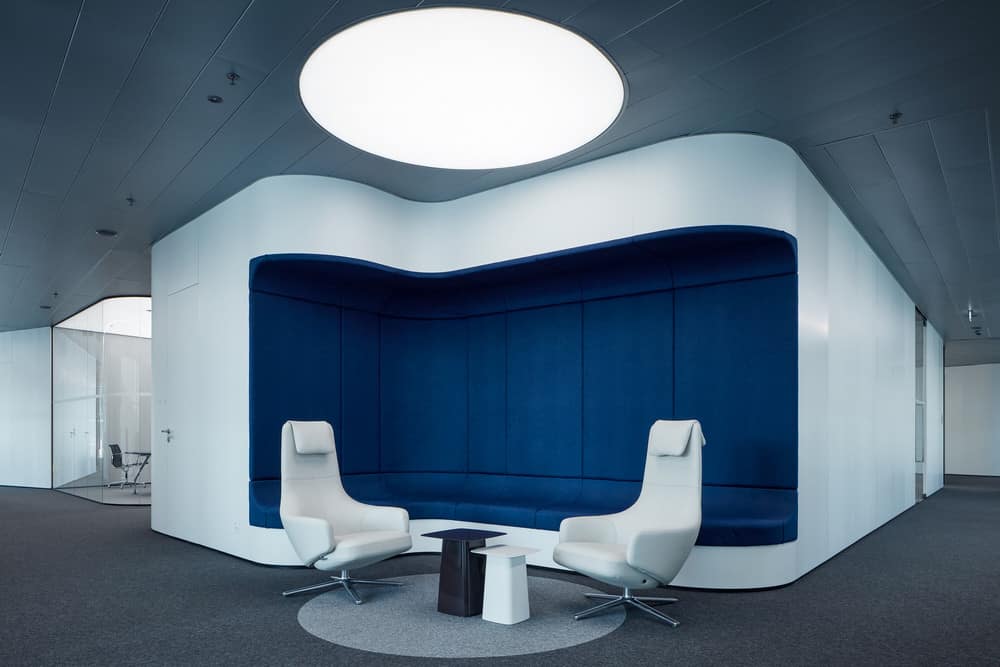
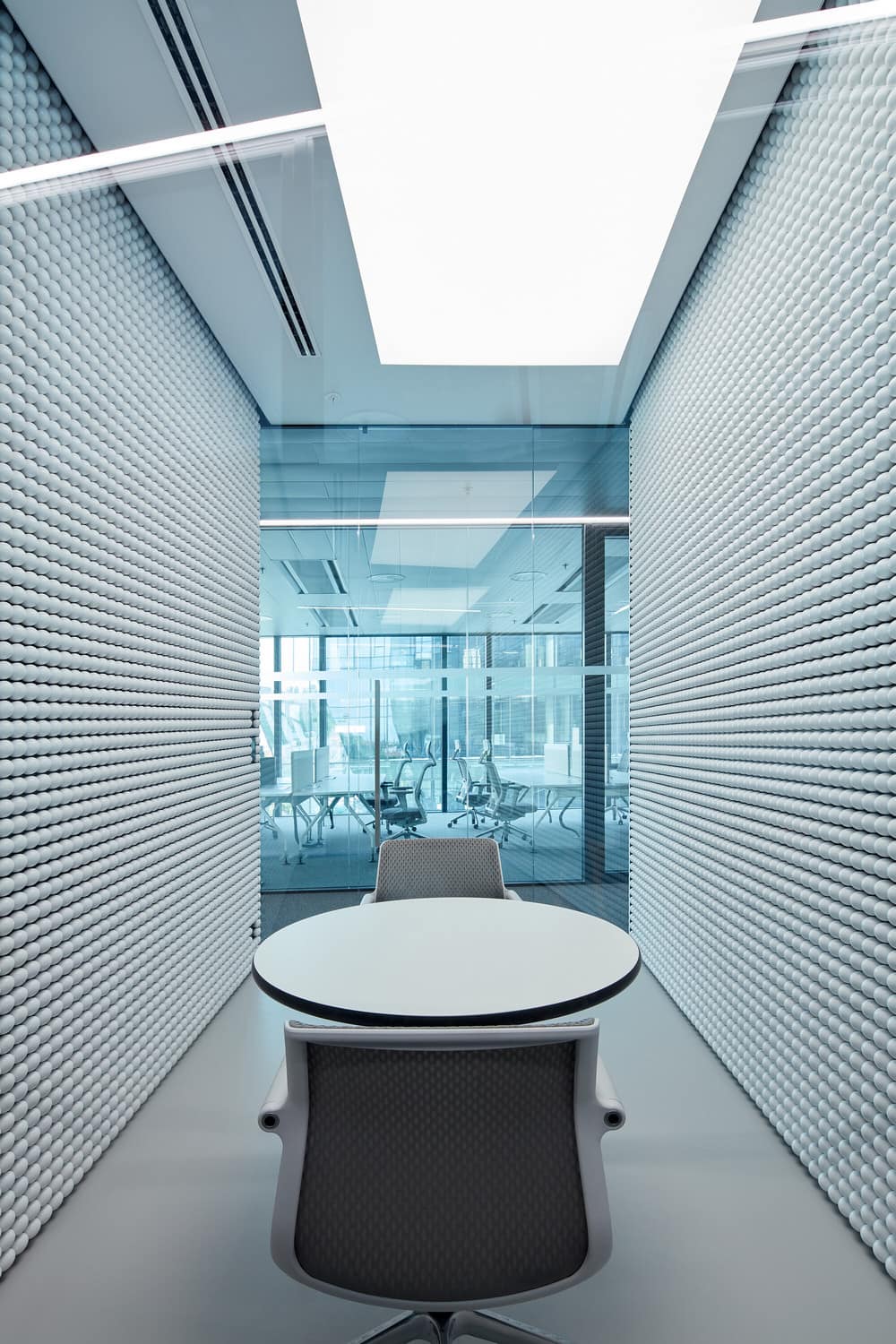
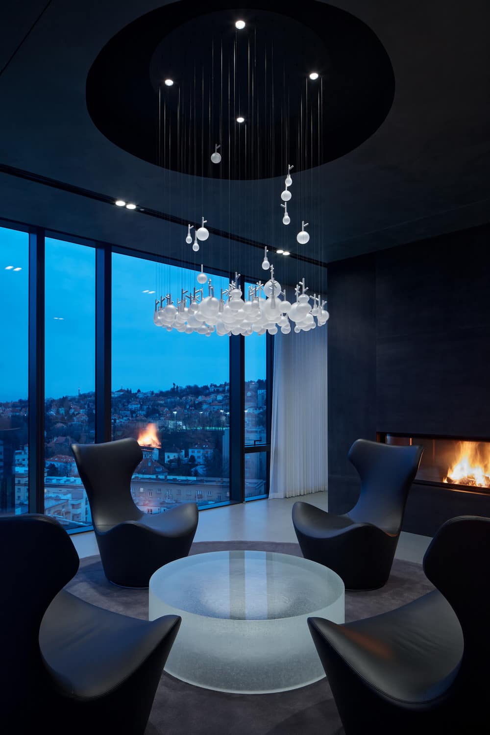
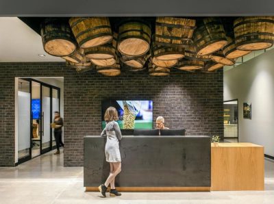
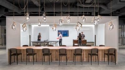
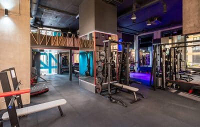
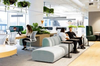
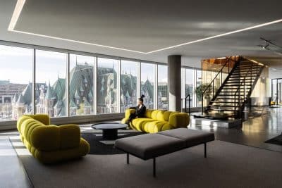
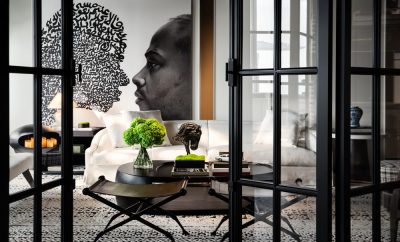
Contemporary office interiors are inevitably filled with unified products, for a comfortable everyday use it is therefore very important to supplement them with individual, custom-made, and craftsmanship solutions. The individual and the unified elements work together in a strong, natural and balanced composition. Colors and textures of raw substances and natural building materials also serve as important interior design tools.
Sustainability
For its rainwater management solution, extensive green roofs and the building energy management system (energy recovery from elevators, heat exchanger), among other things, the commercial building complex has been awarded the internationally recognized LEED Gold environmental certificate.

