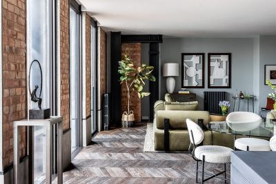
Project: Ramat HaSharon Duplex Apartment
Architects: Pitsou Kedem Architects
Architect in charge: Rotem Segev
Design Team: Irene Goldberg, Rotem Segev ,Pitsou Kedem
Location: Ramat HaSharon, Israel
Year 2017
Photography: Amit Geron
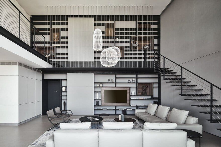
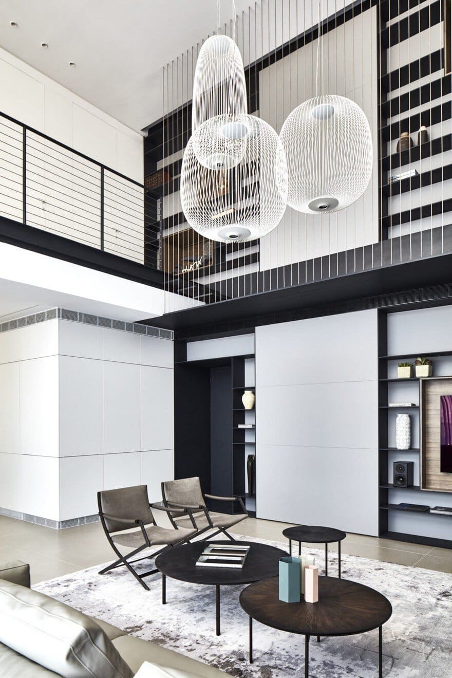
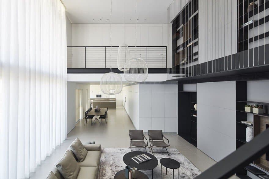
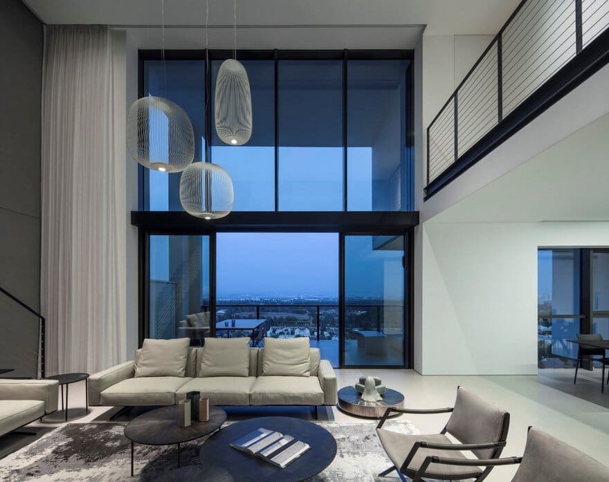
A contemporary duplex apartment in a new, residential building. The central idea behind the design was the creation of visual link between the floors (15th and 16th), to reinforce the vertical relationships and transform the cross sections of the spaces into more important and significant elements. Using two, typical floors, the designers created a powerful cross section, one that reunites all of the structure’s spaces. The double space and the relationship between the floors created a new feeling of space that forms a connection between the homes different spaces and creates a dialogue between the floors.
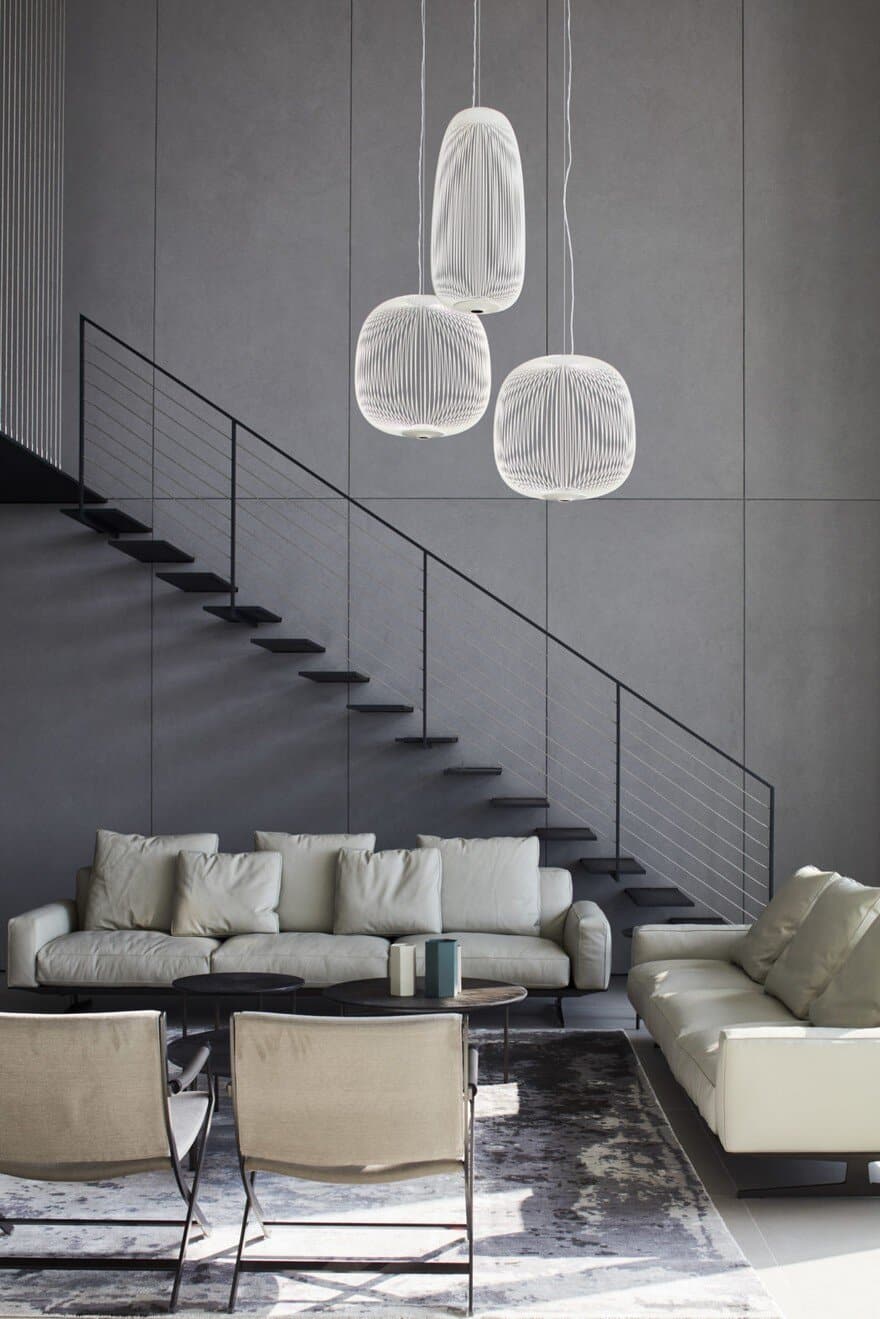
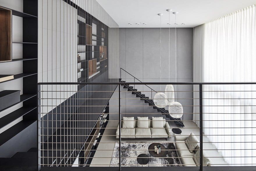
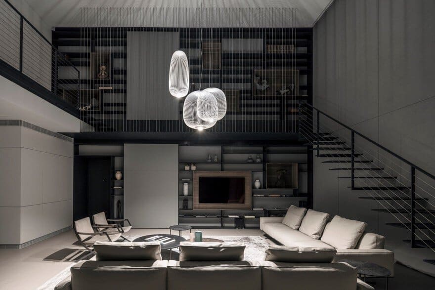
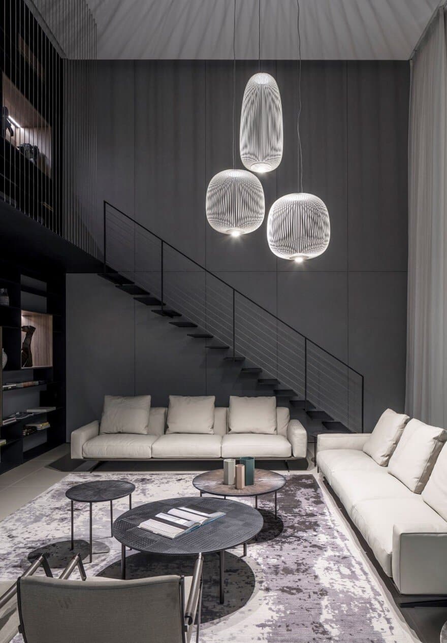
The contemporary duplex apartment was designed around a high public space that constitutes a connecting and vantage point for the home’s wings, the study area, the staircases, the living area and the view. In order to increase the strength of the space, it is clad with wooden panels painted in a special concrete paint. The large, 2 story tall display window allows light to penetrate deep into the space creating an effect of movement and dynamism on the wood clad wall, forming a connection between the spaces. Through the use of artificial light, the vertical axis and height is also emphasized when it’s dark.
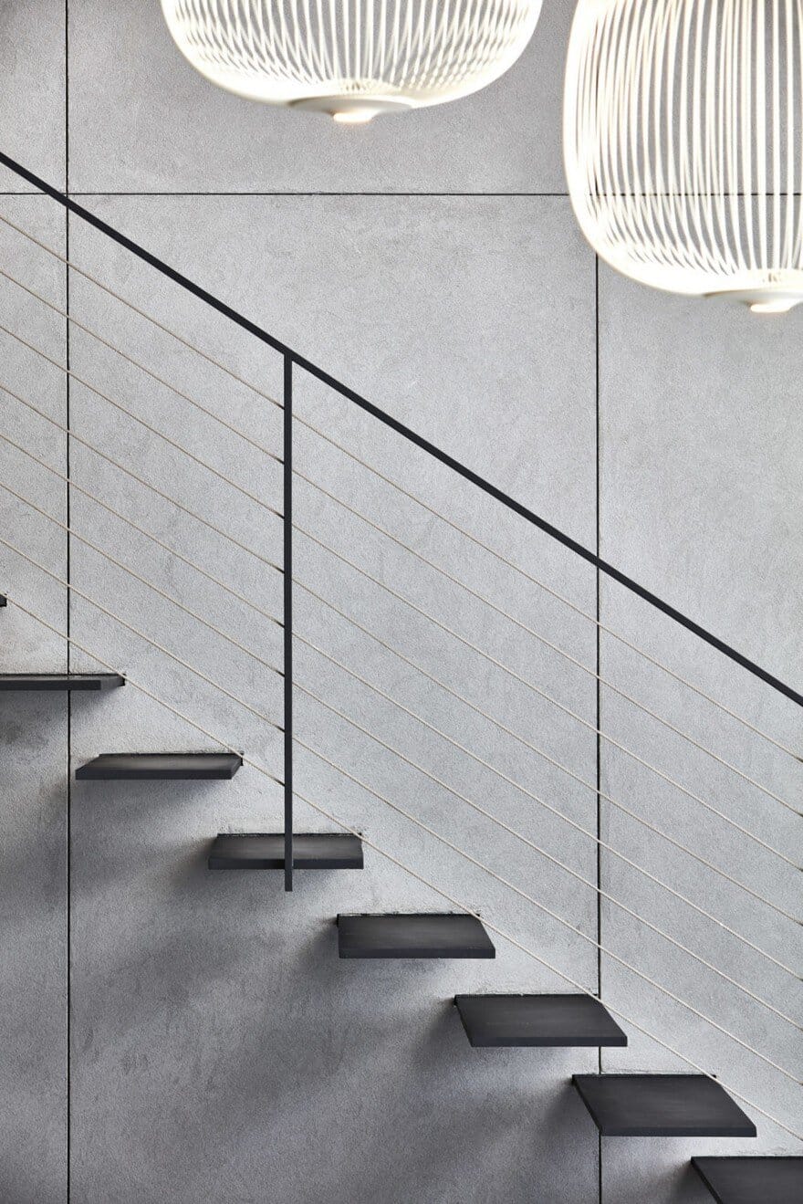
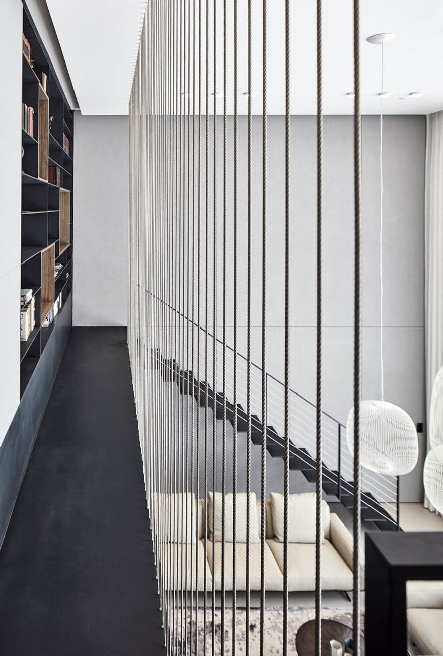
A slender, metal bridge spans the space and leads the user to the second floor via a library of art and books that lends an additional layer of culture to the minimalistic design. The bridge’s handrail is made from stainless steel cables fastened to the space’s ceiling creating a sort of screen between the horizontal (the bridge) and the vertical (the open space).
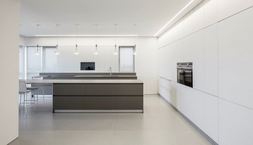
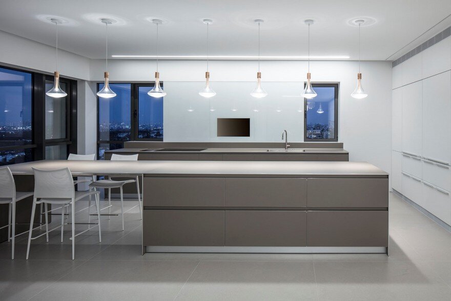
By opening the spaces and the creation of vertical relationships a continuous space is formed. This is achieved by light, sight and movement whilst placing secondary spaces around the one, large, open and central space. The architect succeeded in creating a feeling of spatial continuity in relation to the central space and all this without detracting from our overall understanding of the structure. An interesting play between perspective, high and low, between horizontal and vertical and between opened to the sky or closed spaces creates contrasts that strengthen the experience of the space’s users. All the different functions, such as kitchen, dining table and the master bedroom are located around the open space forming what could be considered the heart of the home.
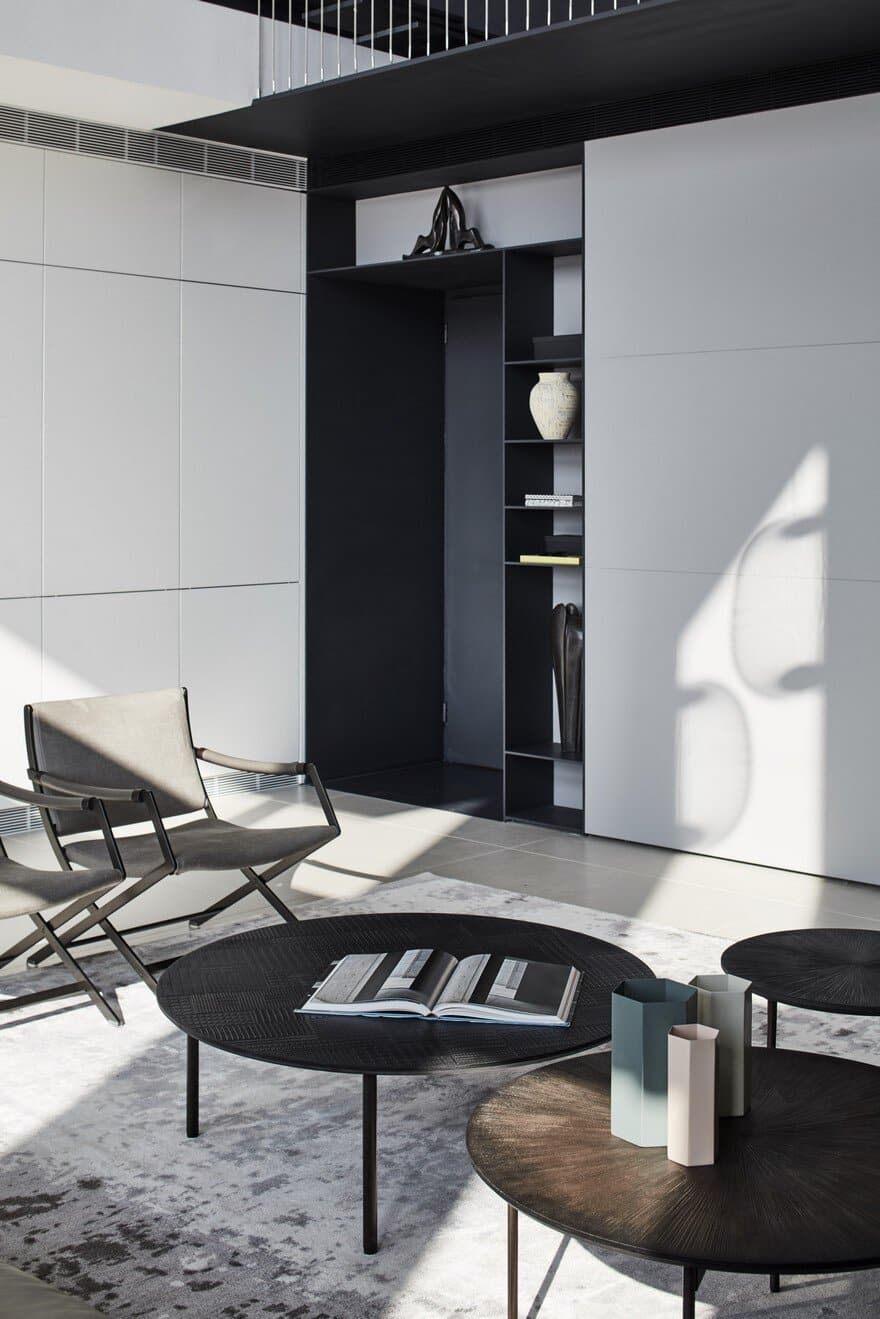
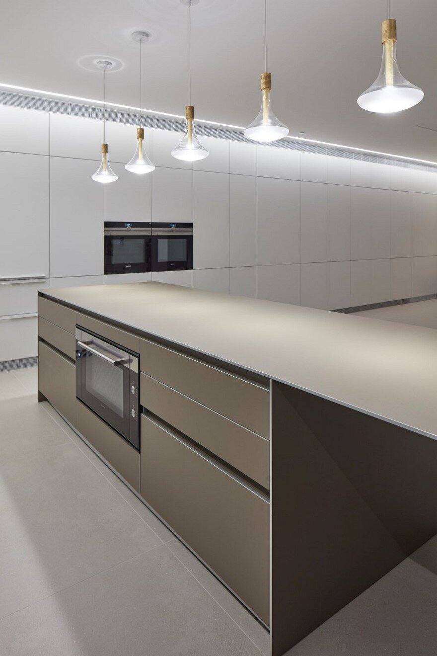
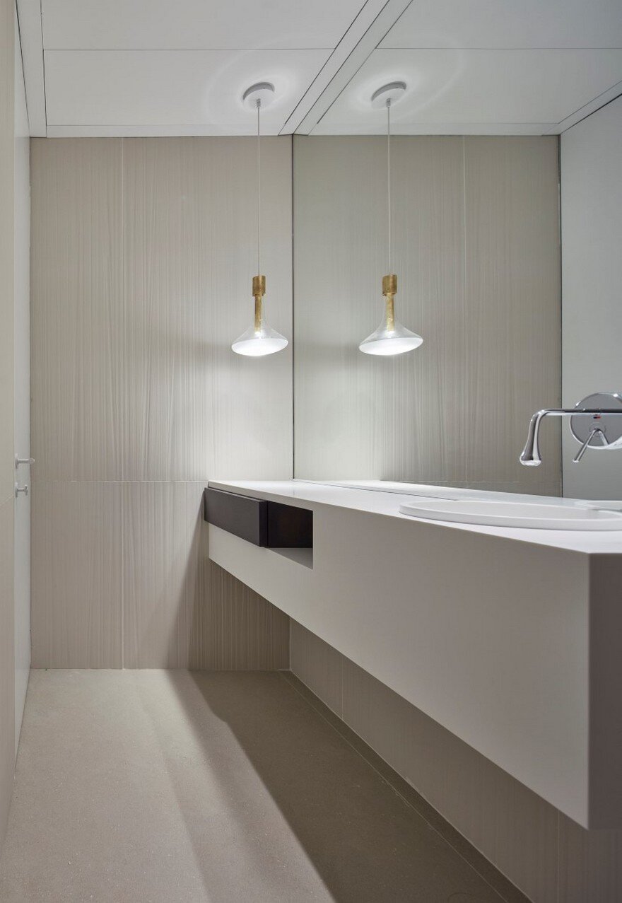
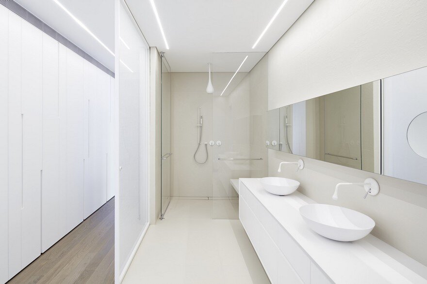
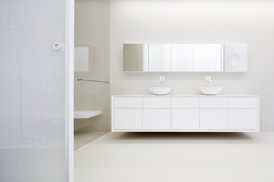
The materials and paints chosen are, for the most part, monochromatic and raw and include blackened metal, stainless steel, concrete, oak parquet and a white background.

