Project: Cultivate
Architecture and Interiors: Kripper Studio
General Contractor: Masiello
MEP FP Shepperd Engineering
Lighting Consultant: Reflex Lighting
Location: Worcester, Massachusetts
Size: 1,970 square feet
Photography: John Horner Photography
Courtesy of Kripper Studio
The Worcester, Massachusetts location for Cultivate represents the second collaboration with Kripper Studio following architect Amir Kripper’s design of the Framingham, MA location. The directive for the company’s newest location was to incorporate the distinctive architectural design and branding elements introduced by Kripper Studio for the Framingham location but adapt and evolve the elements as needed for the Worcester location.
The Worcester location is a newly built freestanding commercial structure with four individual retail tenants. Cultivate occurs a corner of the structure. While core and shell were completed before Kripper Studio was engaged, there was an opportunity to customize exterior and interior elements for the 2,684 sqft space.
The primary design directives were to design a retail experience that conveys an approachable and welcoming upscale professionalism and to reinforce the brand qualities through architecture and design.
Project Challenges
• Anticipate overwhelming customer demand and design a spacious retail experience within a small footprint
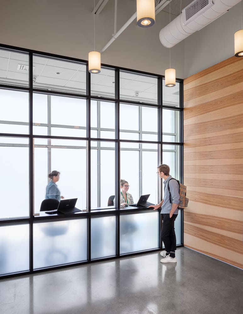
• lncorporate an identification checkpoint at the entrance without compromising the overall design integrity or customer experience
• Integrate numerous security systems and features into the design program as seamlessly as possible
Design Solutions – Interior
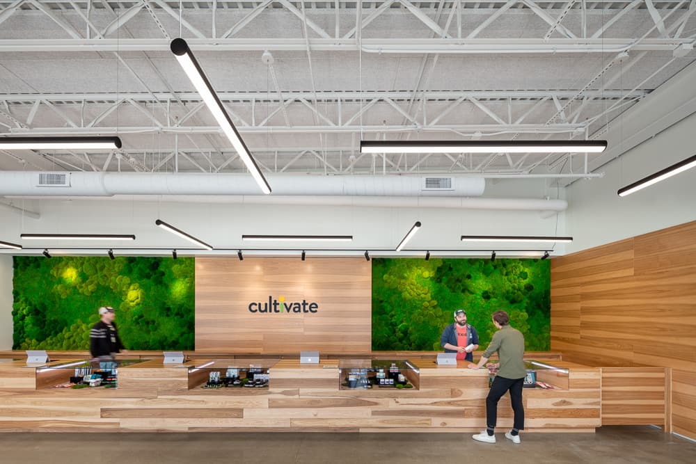
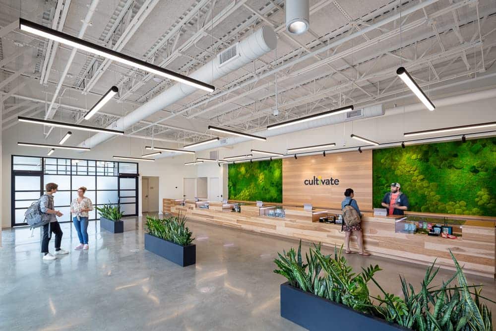
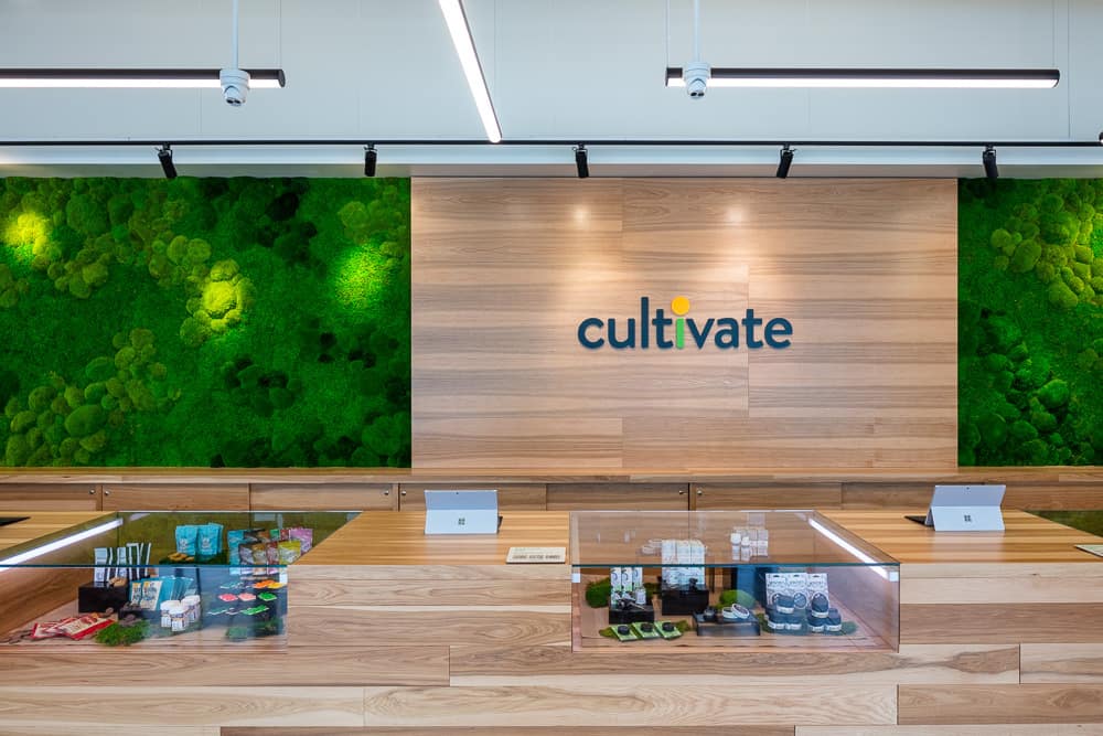
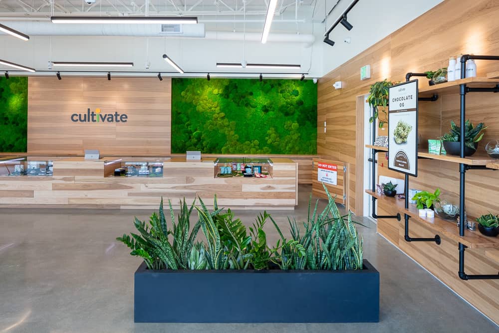
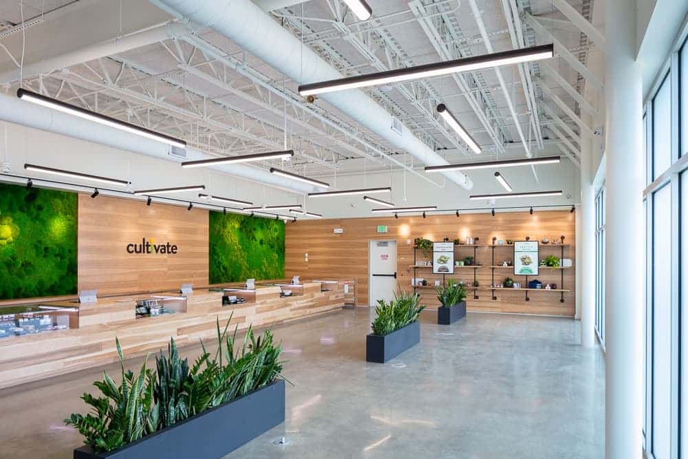
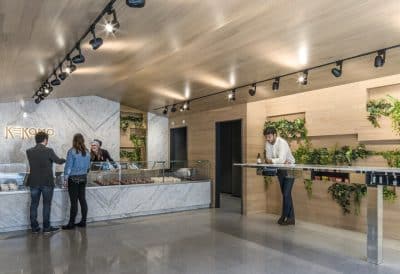
• The full height of the interior space is 15’. The visual datum is established at 9’ 8” by aligning the top of the Hickory veneer wood paneling on the walls with the drop of the suspended LED lights and the height of the bank of windows. With the exposed mechanics above the visual datum line, the result is a more intimate yet still spacious single room retail environment.
• Overhead suspended 1” x 6” LEDs create a subtle but distinctive visual grid by being hung in an alternating and repeated pattern.
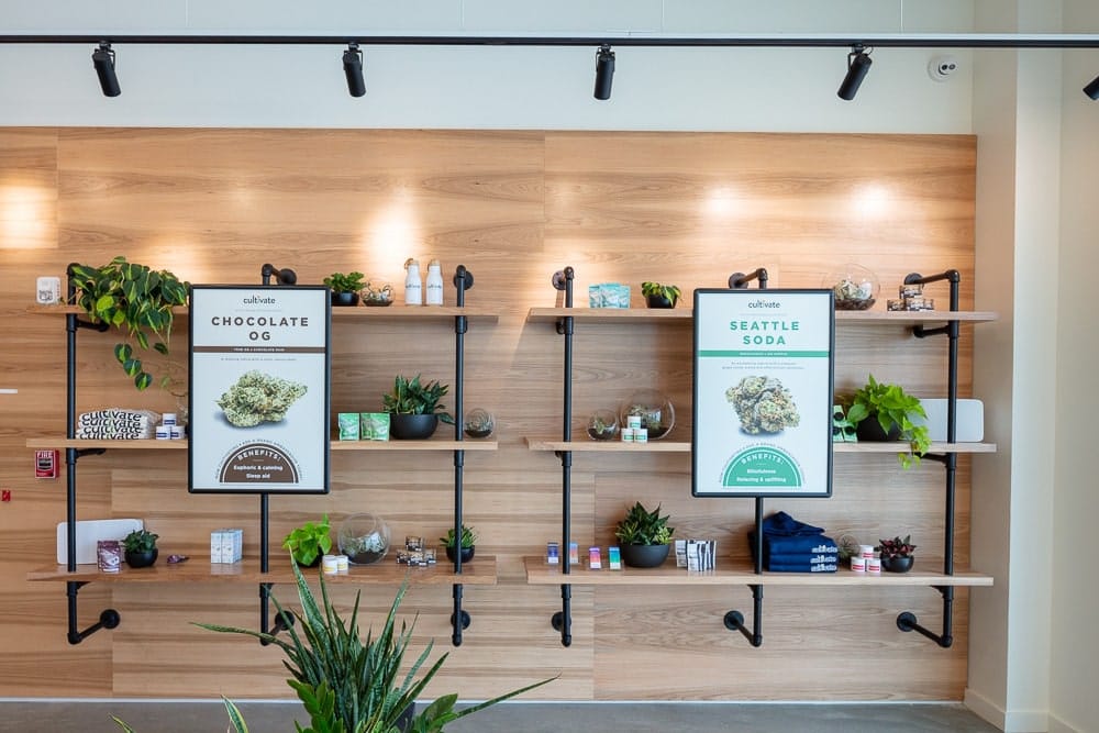
• Hickory veneer wood paneling reads like planks with alternating tonality which creates a visual texture and depth for the walls
• Counters framed with the same Hickory veneer to maintain consistency within the materials palette
• As a more inclusive solution all of the counters are designed to be ADA compliant as opposed to having only one dedicated counter
• Custom design display cases with interior lighting and translucent safety glass with pullout drawers
• Use of simple materials – like concrete, wood and metal – to create an environment that is approachable, yet through the detailing is sophisticated and professional
• Black mullions frame the frosted glass and clear glass windows
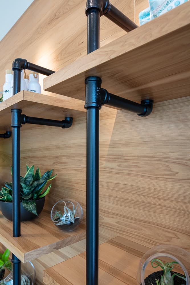
• Metal planters are matt finished in black
• Support the concept of incorporating live plants, to relate to the brand, with custom designed shelving units where living plants are placed
• Polished concrete floors and exposed mechanics in the ceiling read as industrial elements but present as clean and sophisticated
Design Solutions – Exterior
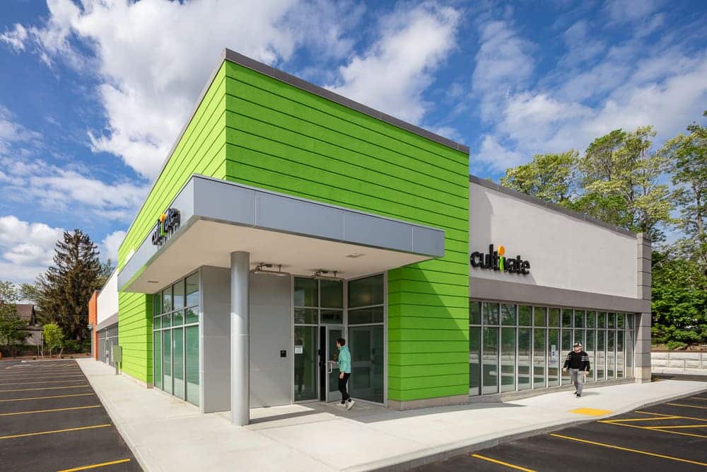
• Identifiable visual cues were created with a color block and a mixture of textures. The green pre-cast horizontal slates create a block of vibrant color for the corner of the building and announce the entrance. A band of cream stucco defines the upper register of the one-story building and provides the backdrop for the brand logo. A bank of windows defines the lower register. Horizontal concrete structural elements are painted grey.
• The entrance is also defined by a canopy framed in metal fascia and a steel column with a background of aluminum siding on the façade from ground to canopy.
• The entrance canopy houses suspended outdoor heaters to accommodate customers during the security and identification checkpoint.

