Architects: Estudio Pedro Feduchi
Project: Duplex Penthouse Renovation
Location: Benasque, Huesca, Spain
Photography: Courtesy of Estudio Pedro Feduchi
At first we found a typical weekend apartment in the Aragonese Pyrenees with sloping ceilings lined with pine wood, which we wanted to completely renovate. From the beginning it was sought that the reform maintained the original aspect of a refuge, avoiding the most impersonal aspect of new constructions, despite the result of the reformation should had being a practical, modern, bright and cozy apartment that should be able to accommodate different situations, from a quiet weekend to share in couple to a multitudinous skiing trip for their sons.
The duplex penthouse renovation was designed by Estudio Pedro Feduchi, a small studio specialized in design houses and directed by the architects Pedro Feduchi Canosa and Juan Gimeno Ramallo. In their study located in the center of Madrid (Spain), the projects are slowly conceived, avoiding the use of standard or preconceived solutions with the aim of design “tailor made” spaces, specifically conceived for their clients. This qualities are transmitted to their projects as can be appreciated in this apartment.
In this case, the client’s needs were ambitious, considering that it was an apartment of only 90 square meters in which they had to fit the following program: large living room with fireplace and TV for accommodating up to six people, dining area with expandable table for up to ten guests, small living that take advantage of the views of the upper floor, master bedroom and the possibility to accommodate up to eight people if necessary with their corresponding ski equipment.
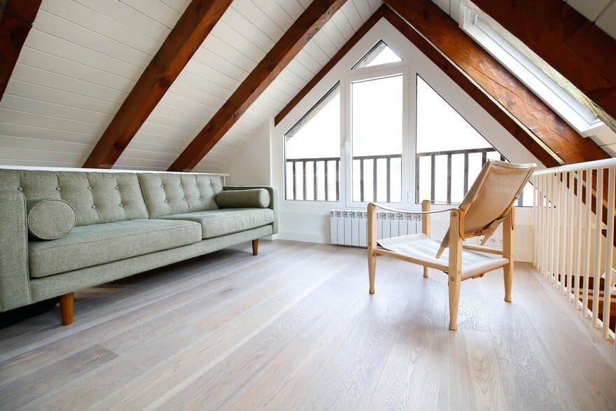
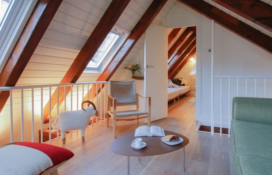
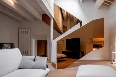
The solution required a completely redesign of the spaces, more orderly and minimalist to take advantage of all the space available, even those areas where the sloping roof did not give enough height for standing. With this idea, the apartment plant is rearranged creating a central space in two levels visually connected to each other through two floor openings.
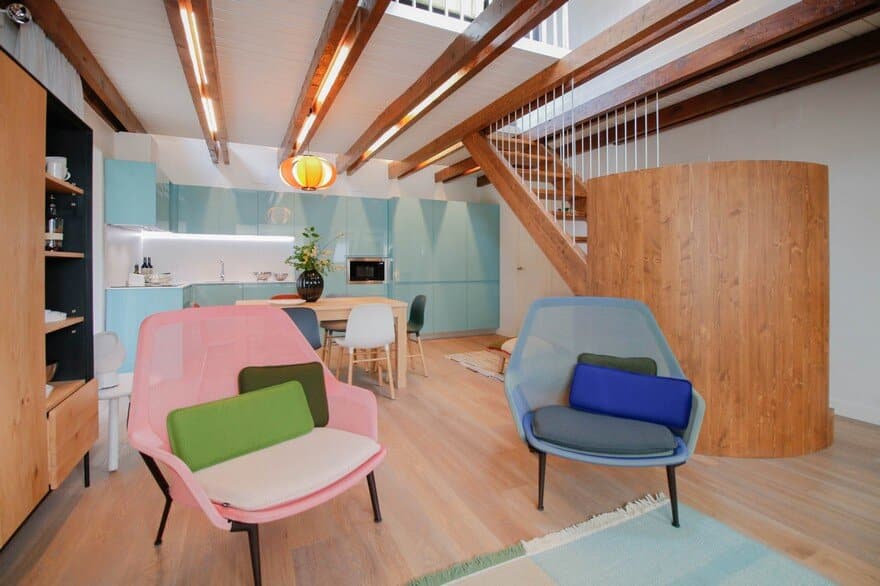
The original staircase is replaced by a new one that shows itself as a sculptural and dividing element, visually delimiting the part of the hall out of the living room, thus reinforcing the sense of continuous space achieved with double heights. The central space host the living area, dining area and kitchen area in a unique space from which you can access the rest of the rooms: master bedroom and bathroom on the main floor and “refuge bedroom” on the high floor.
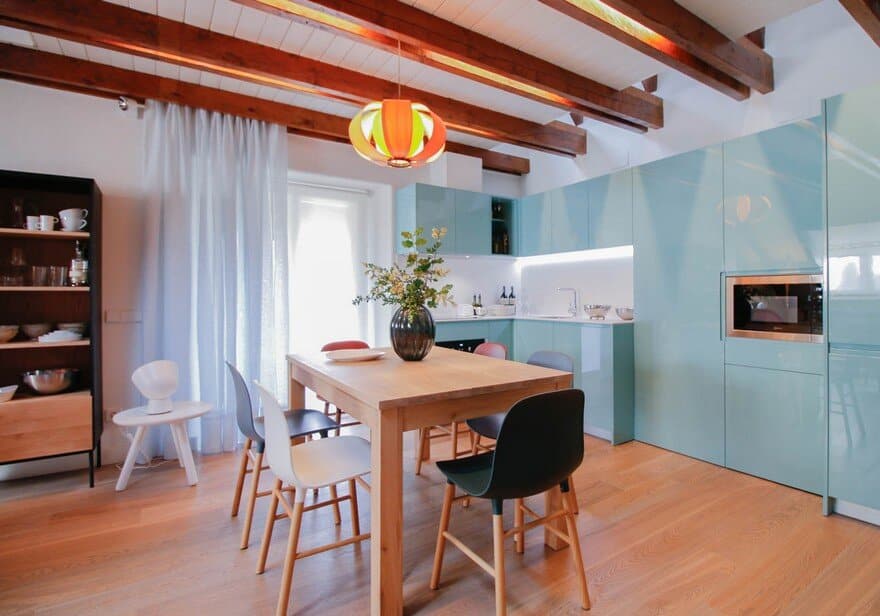
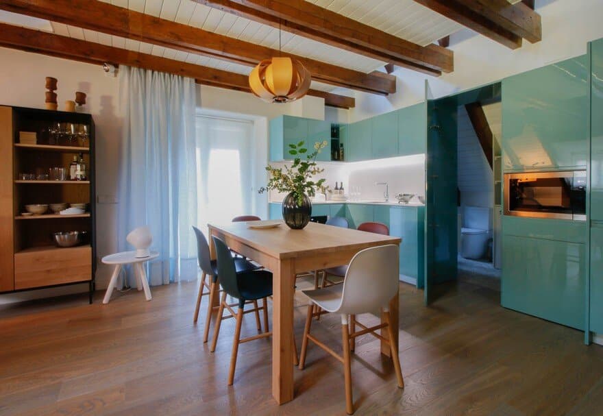
The kitchen occupies one of the corners of the central space, is thought as a minimal kitchen but it is equipped with everything necessary to service a family meal. The turquoise color gives the kitchen a great presence in the house and makes a counterpoint with the predominant image of a rural cottage.
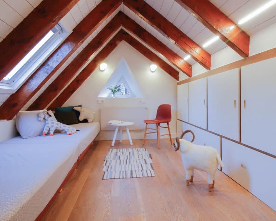
The bedroom on the top floor has a sloping roof with wooden beams that take us back to the idea of the mountain shelter, it can be hosted up to four people in this dormitory thanks to a large wardrobe that is built taking advantage of the lower part of the roof and in which two of the beds are hidden when they are not necessary.
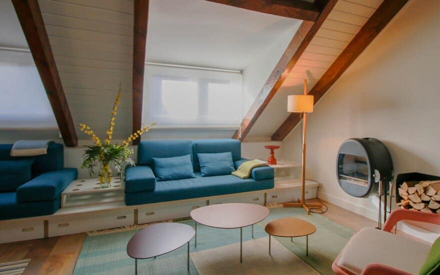
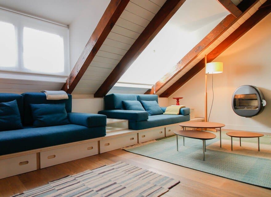
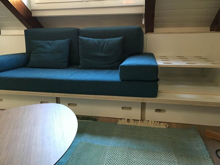
In order to accommodate eight users during the ski season, two beds were still missing from the main bed and from the four beds in the “shelter bedroom”. The sofa was designed to solve this lack, so that it could be transformed into bed if it would be necessary. The design consists of a perforated board on which the cushions and three boxes are placed, these elements can be configured to make two sofas or two beds with bedside tables. Underneath the board, five storage drawers were placed to contain the bedding that allows to reverse the improvised bedroom to its original state of living room with the minimal effort.
The storage capacity of the house was another of the functional aspects that it was intended to improve, in order to achieve it was endowed with a three pieces closet at the entrance of the apartment, painted in turquoise continuing with the image of the kitchen in which could be stored the mountain clothes. The capacity of this large closet added to the many that were available taking advantage of the lower areas of the roof (headboard in master bedroom, drawers in sofa and large closet in the “shelter bedroom”) is enough to accommodate the house clothes and suitcases of the travellers.
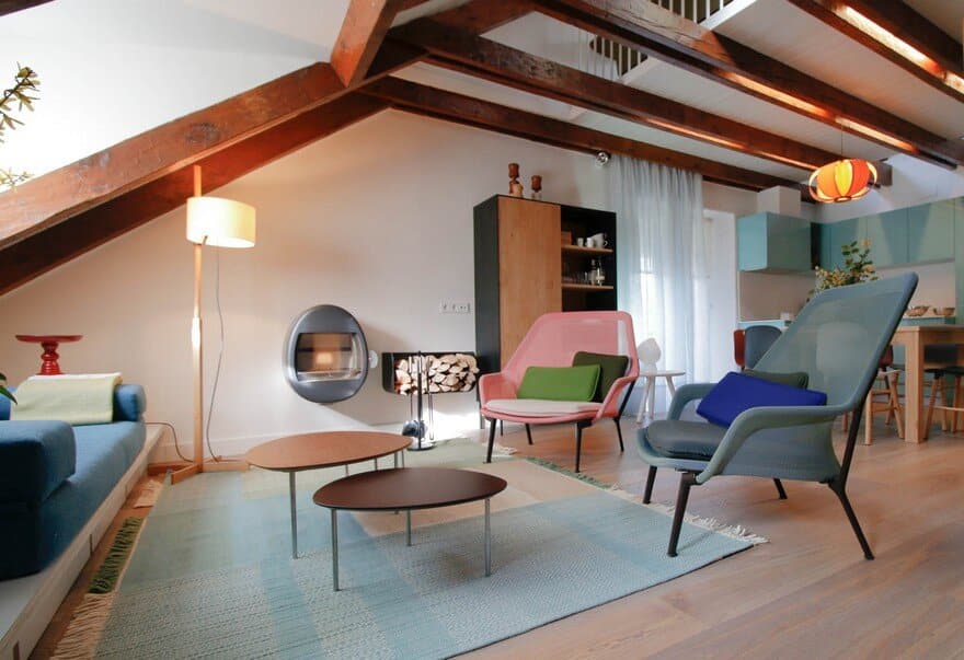
Special attention was paid to lighting in this reform. On the one hand, natural lighting was improved by adding openings on the roof and painting the ceiling between beams in white color. On the other hand they worked with the electric lighting placing indirect lights, with strips hidden between the beams and projectors highlighting the changes of the materials. There was also a careful selection of lamps such as the one in the dining room which is a classic of the catalonian design conceived in wood by José Antonio Coderch which gives great warmth to space.
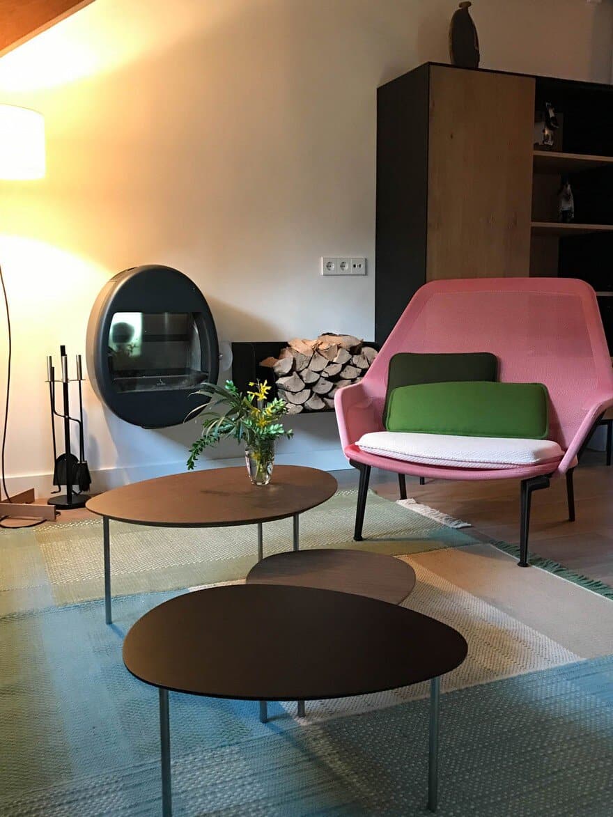
The rest of the furniture and equipment was especially selected trying to reinforce the cozy and bright atmosphere, as is the case of the stove by Scan and the seats of Vitra that give comfort and feeling of home to the living area, while the sideboard and the extendable table by Ethnicraft and the plastic chairs in different colors by Normann Copenhagen give character to the dining room.

