Designer: Faber Design & Architecture
Project: Lasan Restaurant / Indian Restaurant
Location: Birmingham, United Kingdom
Area: 270m2 (2906sq.ft)
Photography: Courtesy of Faber Design
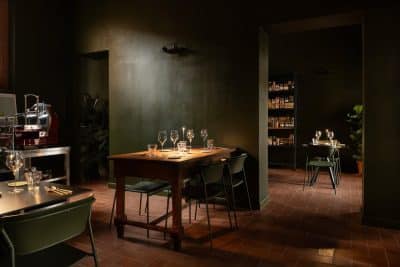
If you’re looking for your typical Indian restaurant, look elsewhere, because thanks to an extensive makeover, Lasan is anything but average. Famously the winner of Gordon Ramsay’s the F Word in 2009, it has been delighting Birmingham diners since 2002 from its home in the historic Jewellery Quarter.
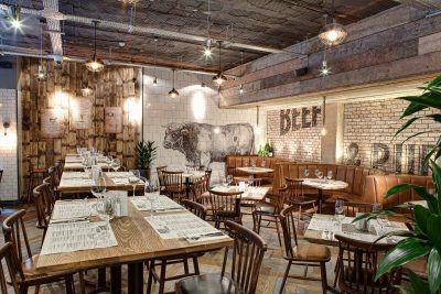
The agency responsible for its recent transformation, including a completely redesigned (and relocated) bar area, is Faber Design & Architecture. Specialising in interior design and branding for the F&B sector, Faber works with bars, restaurants and hotels across the UK to create unique, memorable and cohesive design concepts. Led by creative director Tony Matters, a designer with almost 20 years’ experience, Faber has “completely reimagined what was a tired space lacking a clear identity, and created an elegant, stylish restaurant and bar, centred around the customer experience,” says Tony.
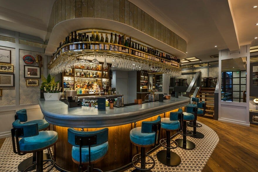
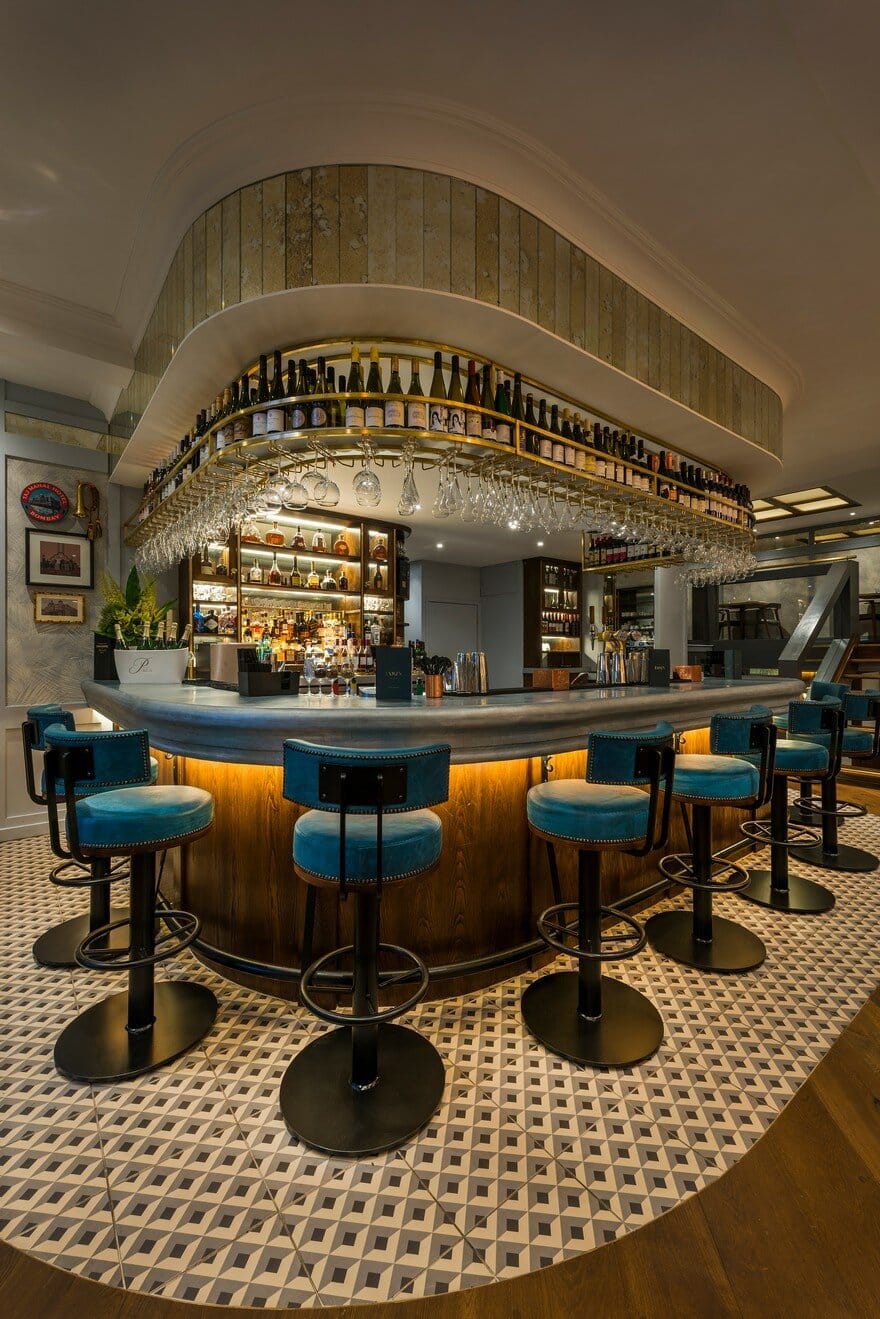
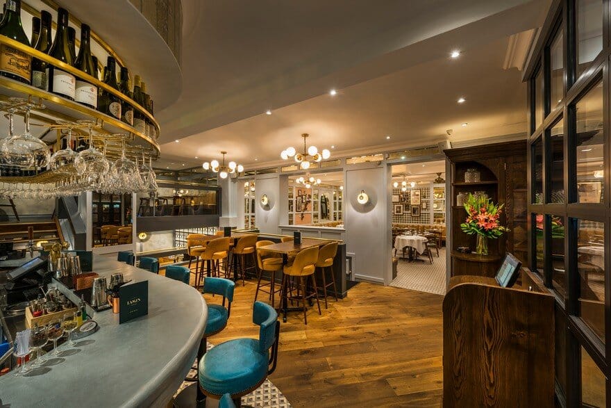
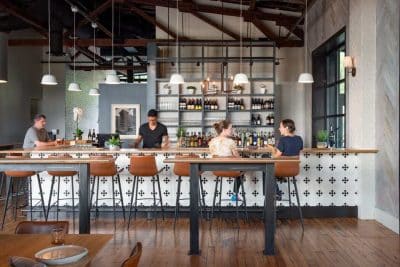
A key part of this customer-focussed metamorphosis was a total rethink of the bar area. Originally located in the main dining room, the layout gave the impression it was for diners only. In its new position, the dramatic U-shape design with nostalgic brass detailing has become a real focal point. It’s one of the first things guests see as they enter the restaurant, cultivating a sleek, cocktail-bar feel as you walk in. This new layout has also enhanced the overall experience for diners by creating a more peaceful environment to enjoy dinner, away from the hustle and bustle of bar traffic.
Lasan may have had a complete refurb, but Instead of that shiny, pristine feel you usually get from a newly refitted venue, it somehow feels as though it has always been this way. “We wanted a timeless space which would appeal to all ages,” explains owner Jabbar Khan, “where you could be a youngster or a more mature person, but still feel you are in the right place. That comes with something that is designed to be timeless, not to fit in with a fad. That’s what good design should deliver.”
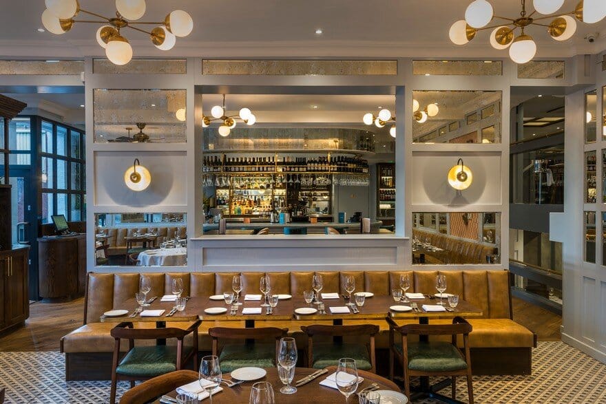
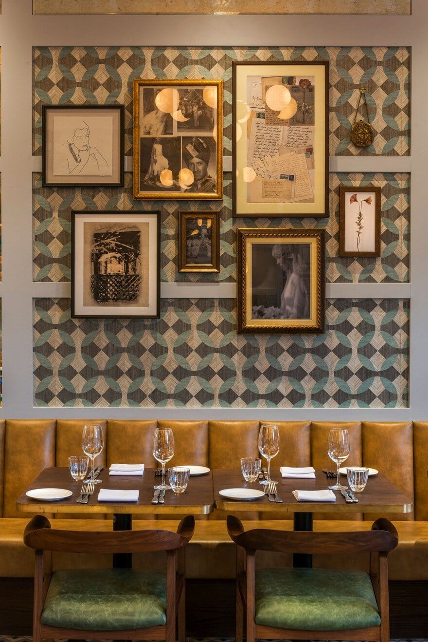
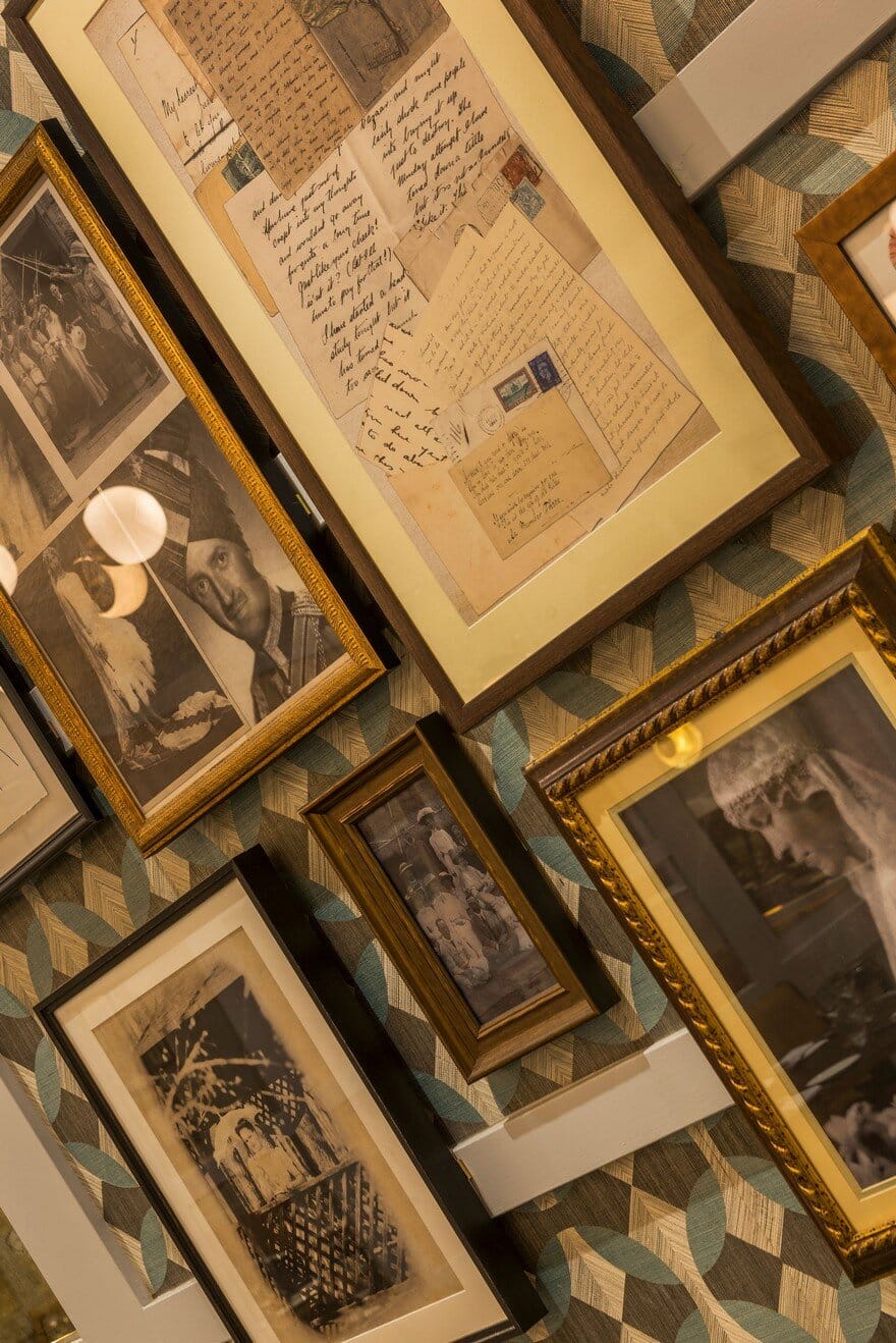
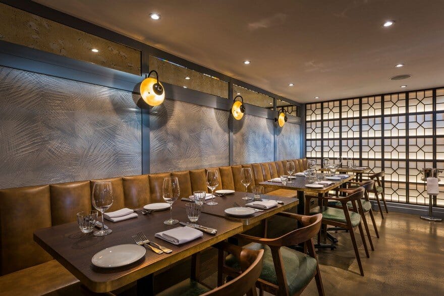
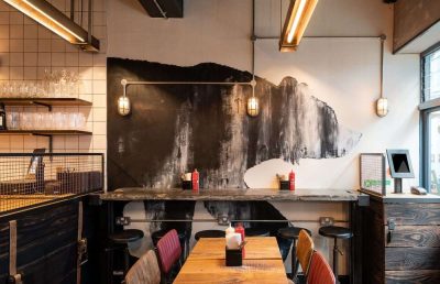
This sense of authenticity and classic elegance is exactly what Faber was trying to achieve with the redesign. “We wanted to create a sense of history and a design that would really stand the test of time,” says Tony. “We achieved this by choosing classically inspired lighting and combining traditional hardwood flooring with deco-style geometric tiling. We also used luxurious but elegant materials such as marble, brass and wood to provide that sense of durability and opulence you associate with older buildings. Even the wall art tells a story and adds to that feeling of longevity.”

