Project: Flipped House
Architects: Atelier RZLBD
Project team: Reza Aliabadi, Arman Azar
Location: Scarborough, Toronto, Ontario, Canada
Area: 2300 sqft / 215 m2
Year 2017
Photography: Borzu Talaie
Text by Atelier RZLBD
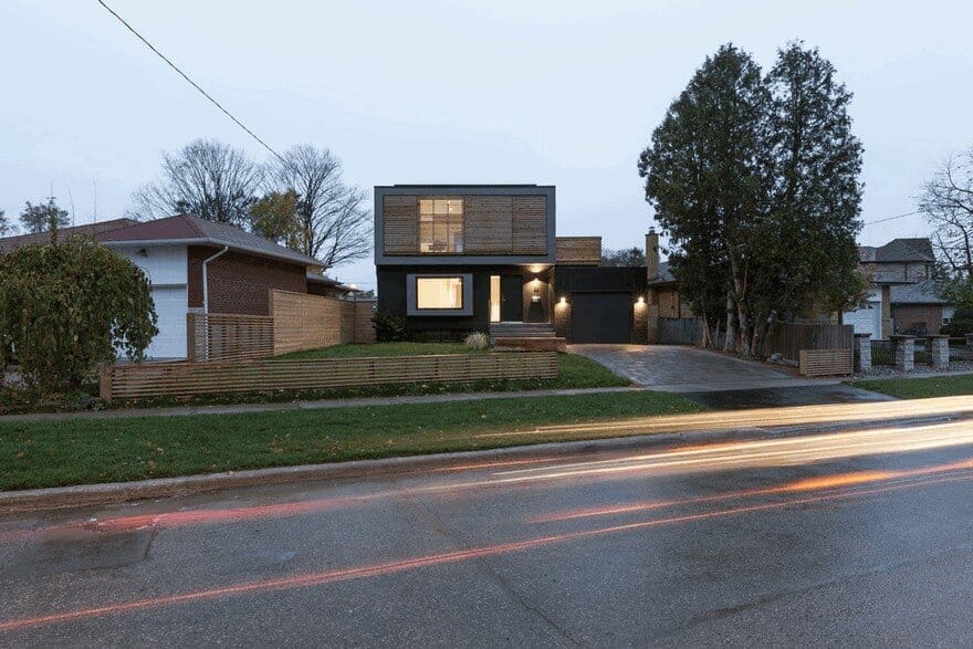
The product of a gut renovation and second-storey addition to an existing brick bungalow on the south-west edge of the Knob-Hill Park in a residential neighbourhood in Eglinton East on the border between Toronto and Scarborough, Flipped House is a two-storey property designed for a developer looking to offer real estate buyers a modern, turnkey home in a neighbourhood dominated by more traditional architecture.
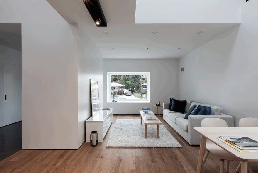
The project gets its name from its unconventional “flipped” layout. While a typical dwelling keeps all public-facing spaces confined to its main floor, with private areas like bedrooms sequestered upstairs, Flipped House instead adopts a configuration that divides its public and private zones on either side of a vertical plane. As a result, the home’s den, kitchen, dining, and living rooms are all located on its street-facing northeast side, while the house’s three bedrooms span both levels of the building’s more secluded southwestern end.
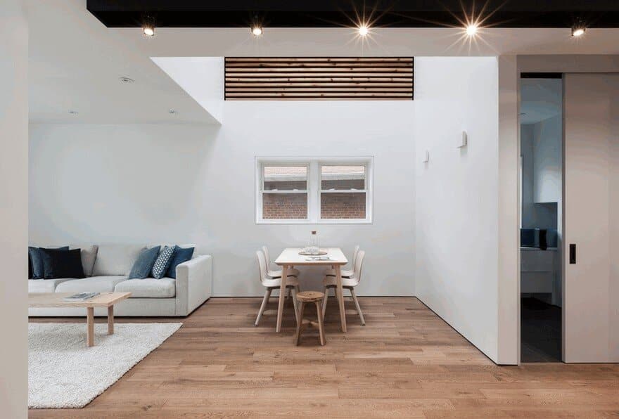
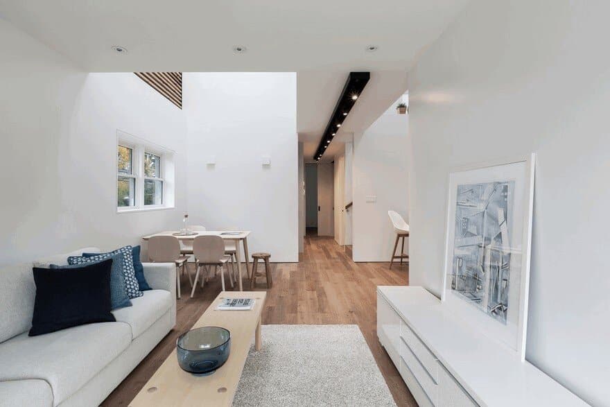
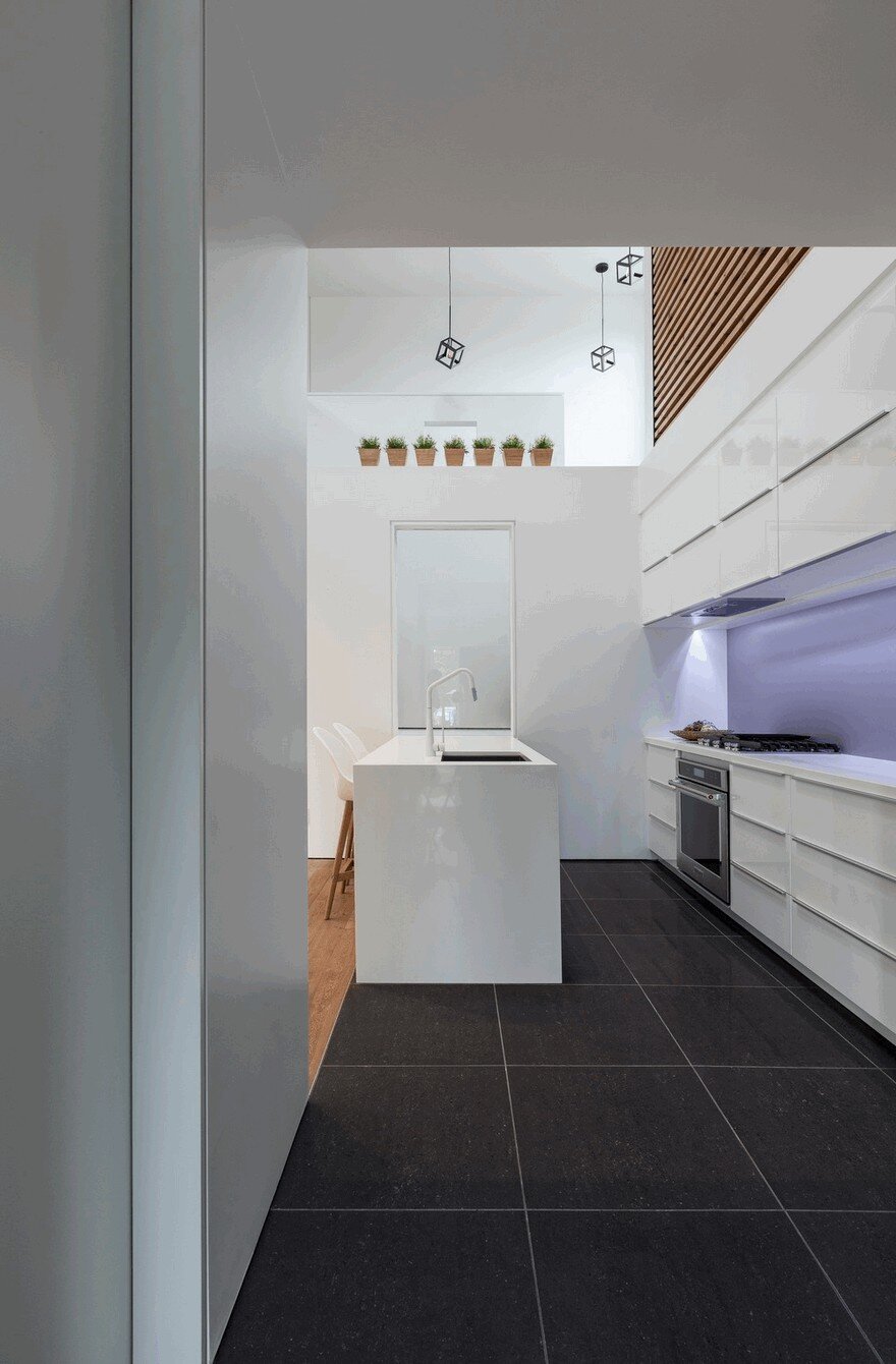
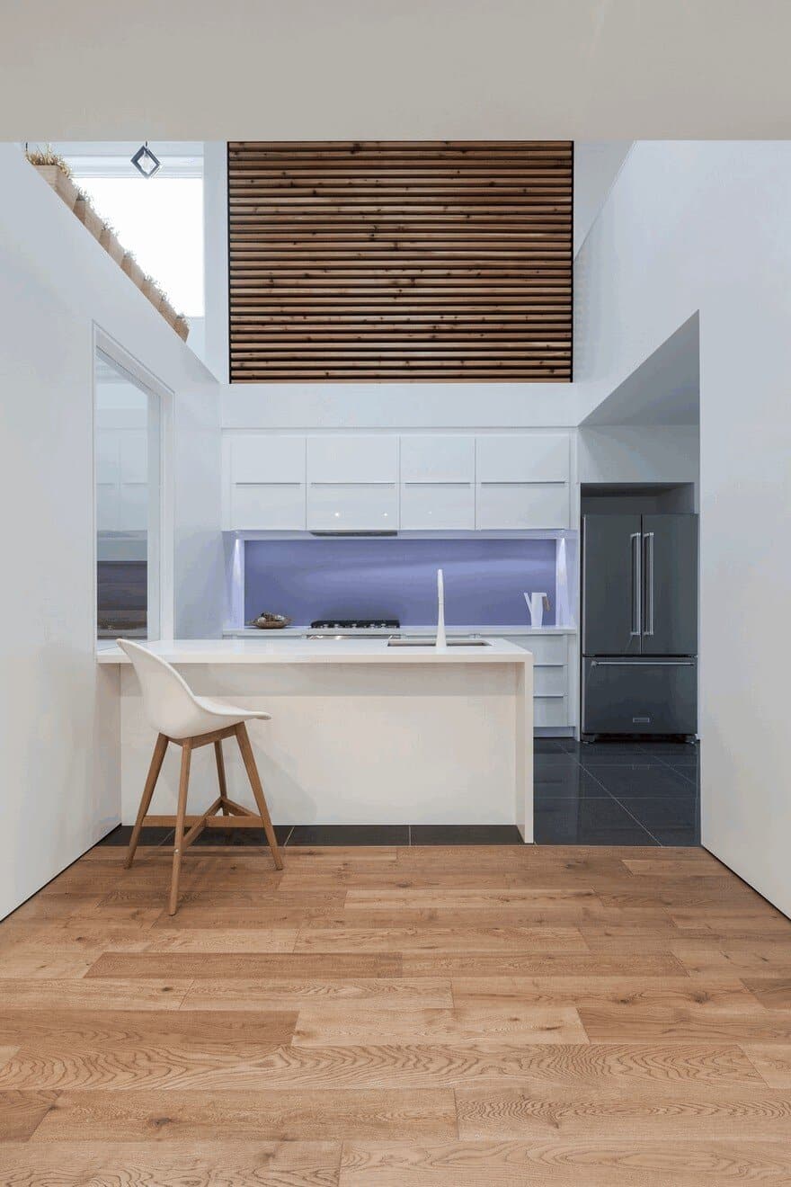
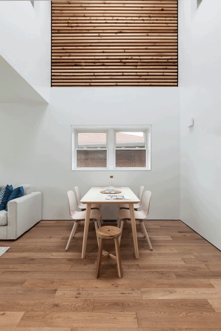
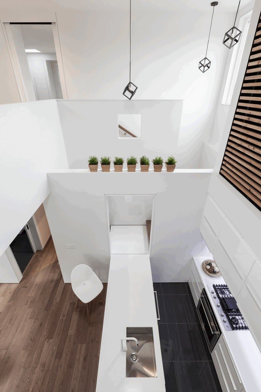
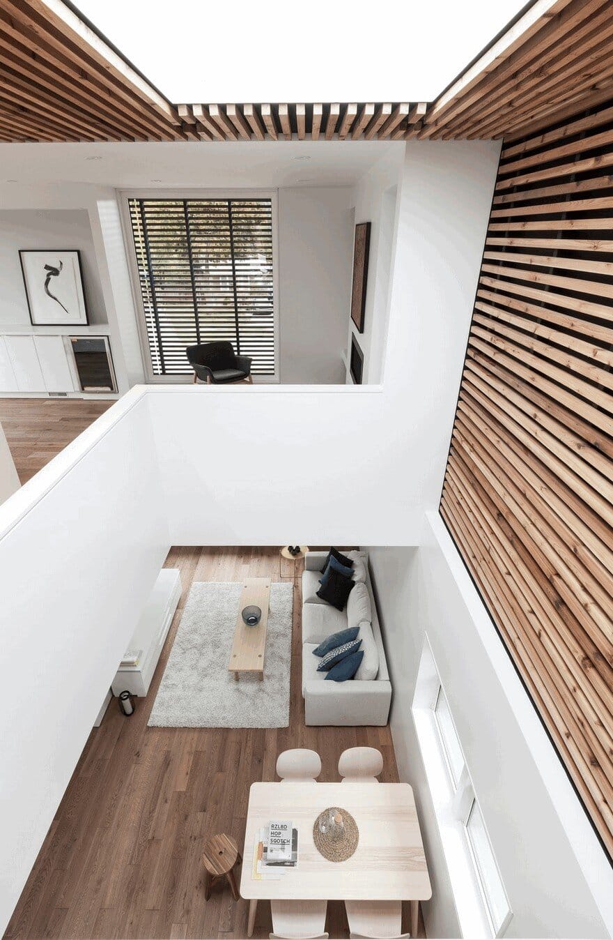
The home’s varying ceiling heights work to communicate this symbolic dividing line. The linked first-floor kitchen and dining room are double-height spaces, with the ceiling then dropping down to single-storey height as one enters the hallway moving towards the residence’s more intimate back bedrooms.
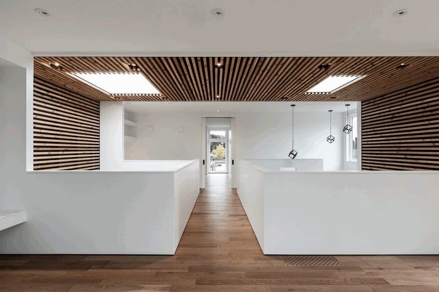
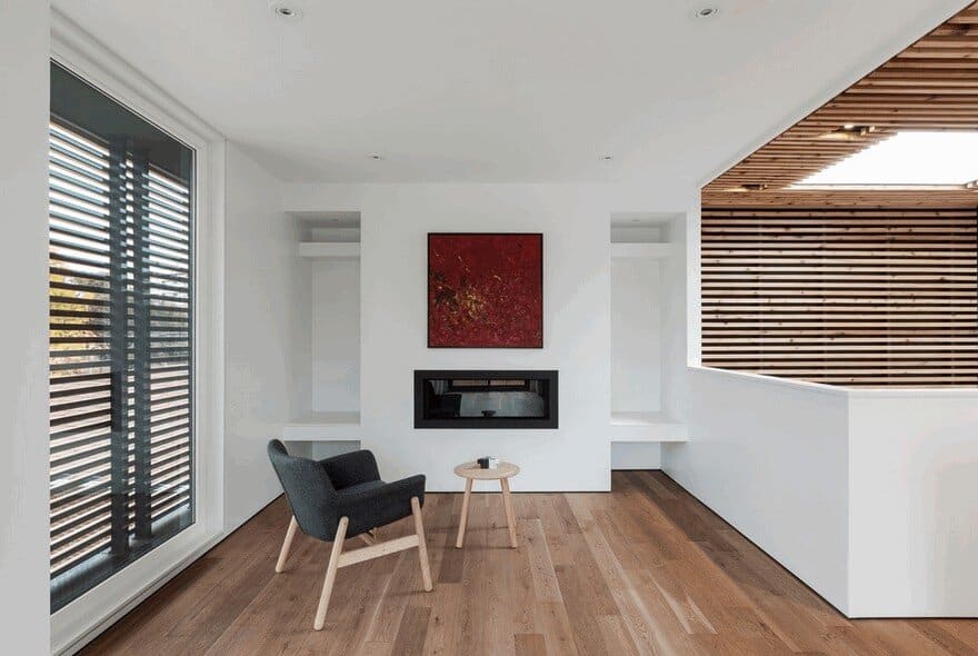
Knotty cedar slats surround the linked kitchen and dining room, wrapping up the side walls and onto the ceiling above to create a sense of warmth and grandiosity — a feeling further heightened by the two skylights that top this atrium. Passing under this wooden ceiling feature is the second floor’s bridge corridor.
Overlooking the double-height dining space to one side, and the kitchen to the other, this interesting architectural feature is used to emphasize the home’s secondary axis along its key circulation route. On the first floor, the base of this bridge is fitted with a long black light track that visually accentuates the linearity of the path it’s positioned along.
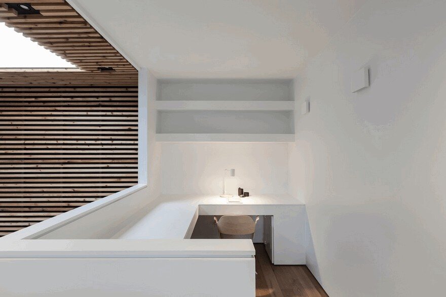
After crossing this bridge passageway in the upstairs addition, one arrives to a flexible family room. This carries on to a small wooden patio built atop the existing garage. At the bridge’s other end is an airy home office providing desk space for two. Moving southwest from here, the home again becomes increasingly private — one first enters the master bedroom, complete with a walk-in closet and his-and-hers skylights above the two nightstands, then turns a corner into the ensuite. A bathtub is given pride of place in the centre of the room positioned in front of a generous window, with the shower and water closet concealed in symmetrical niches at the room’s western end.
Throughout, the project uses geometric volumes to play with the boundaries between its various spaces. The home’s kitchen island, for instance, extends to become a landing for the adjacent staircase. As one continues to the staircase’s next flight, a small cutout in a partial-height partition offers a view northeast that aligns with the axis created by that landing and island.
Elsewhere on the first floor, a small powder room is enclosed in a free-standing volume near the front entrance that helps to delineate the house’s mudroom from the adjacent den area — a transition further played up by a change in flooring materials from tile to oak.
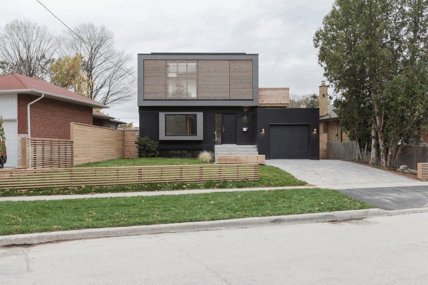
In contrast to the home’s warm, light-soaked interiors, the property’s dark front elevation creates the impression of a strong, fortified abode. By maintaining the brick enclosure of its predecessor — now painted black — the house required no excavation, making it a more affordable and sustainable solution than a design that would have required significant demolition and starting new construction from scratch. With the exception of one large window installed in the pop-out volume that extends out from the living room, all of the main-floor and basement windows are carried over from the original structure.
Maintaining the original footprint of the structure it replaces also keeps Flipped House sensibly sized relative to its neighbours. A slatted screen on the second storey is installed to distort the scale of the property and ensure that the structure reads more like a monolithic object than a typical home. New construction — including the first-storey living room pop-out, and the second storey addition — is distinguished in grey stucco to chart the dwelling’s evolution.

