Project: Greenacres Residence
Architects: Austin Maynard Architects
Project Team: Andrew Maynard, Mark Austin, Natalie Miles
Location: Newcastle, New South Wales, Australia
Area: 310.0 m2
Year 2018
Photographer: Tess Kelly
Description by architect: It takes a lot of effort be a good neighbour and it’s often a thankless task. Austin Maynard Architects are extremely proud to have successfully walked the tightrope with Greenacres, to deliver the maximum outcome for our clients without negatively impacting their neighbours.
In brief
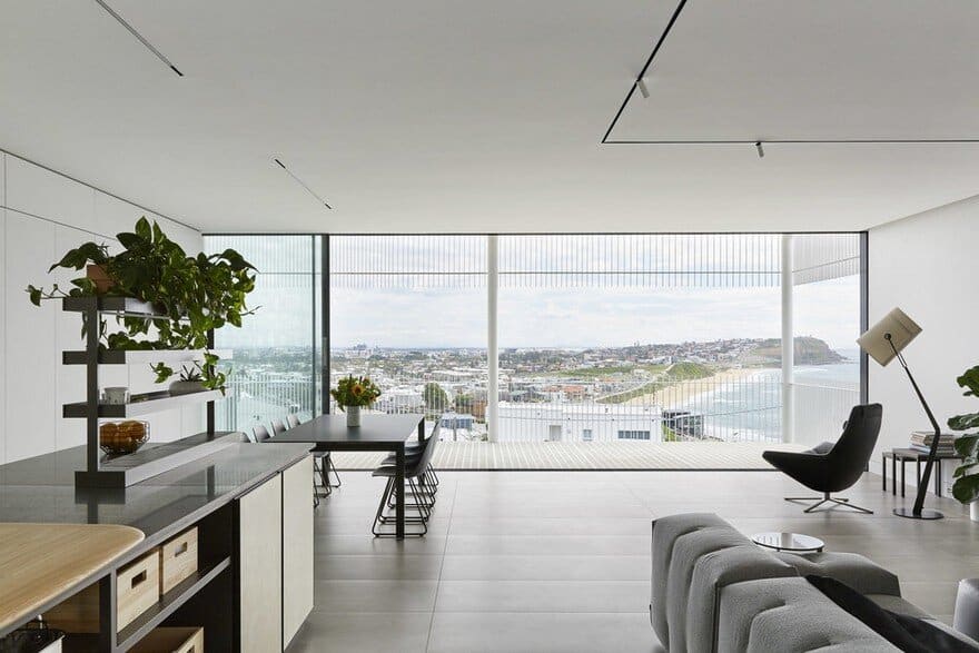
Greenacres Residence is Austin Maynard Architects first completed project in New South Wales. Unable to save the original dilapidated house, a new home was constructed on the steep block, a topography that set new and exciting challenges. The varying heights created the opportunity for multiple platforms to view the expansive outlook over the ocean, the Merewether Ocean Baths, and the city of Newcastle.
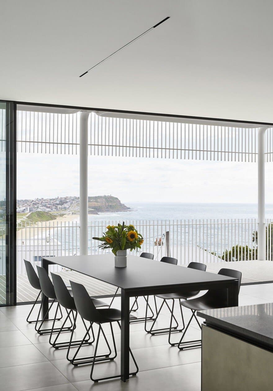
In their brief the owners, Basil and Jo, asked for a family home that they could grow old in, with a lift, lots of light, sleek, clean lines and, they tentatively requested: “a window with a view if possible.” Austin Maynard Architects designed them a home which captures the views from almost every space within and around the house.
The what
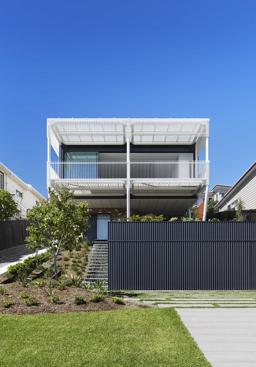
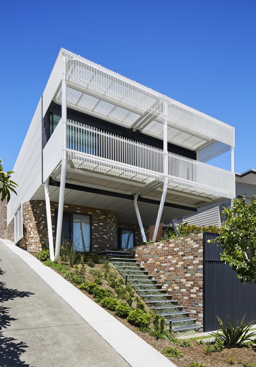
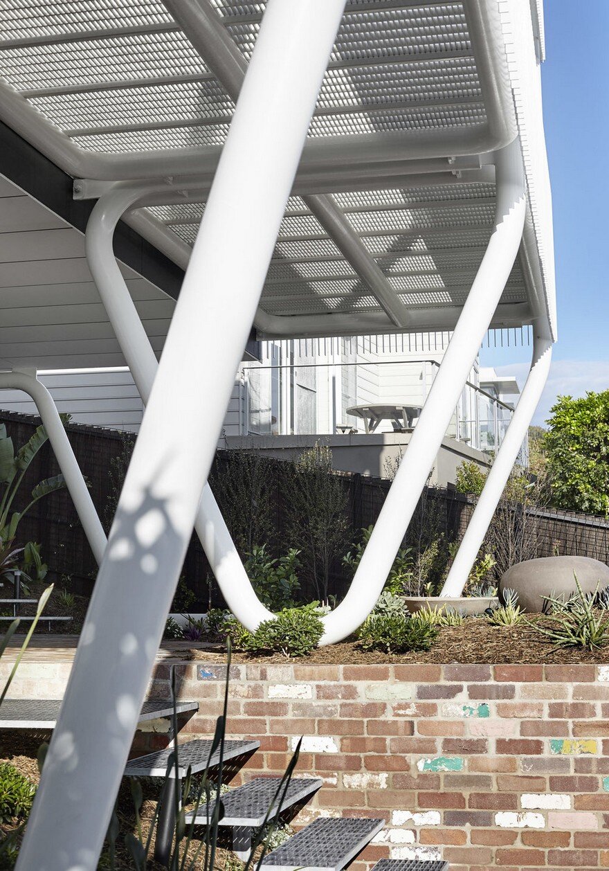
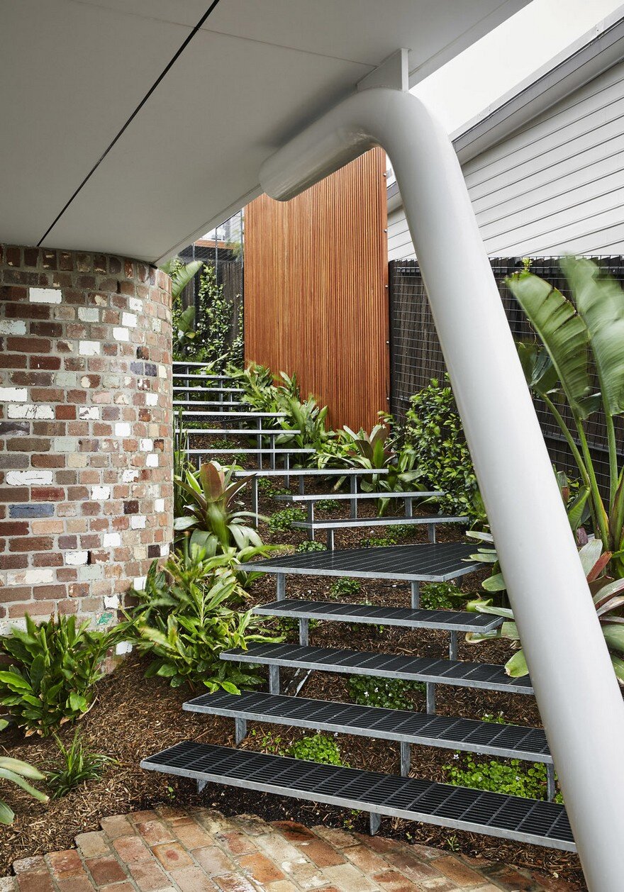
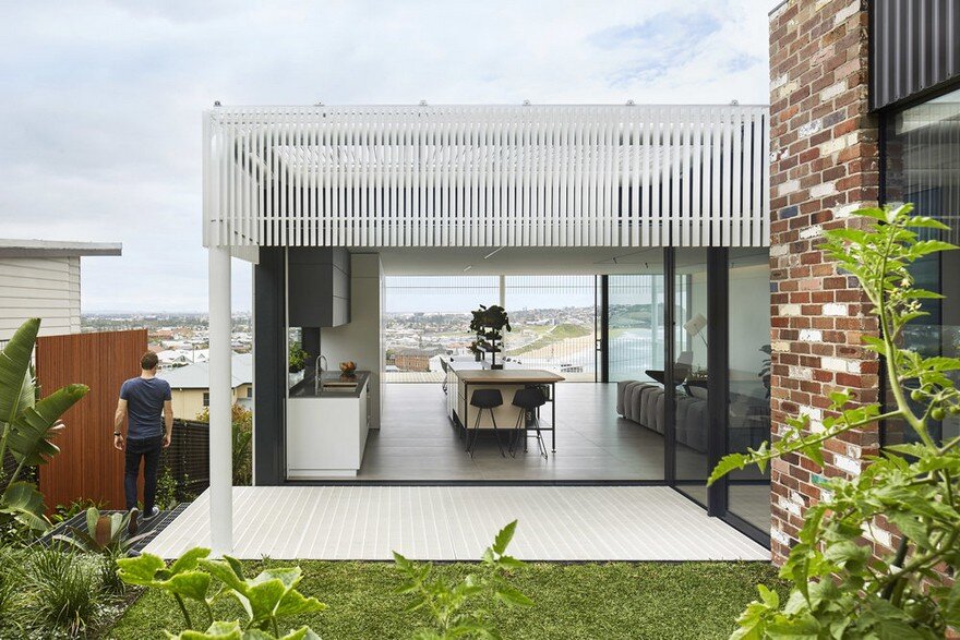
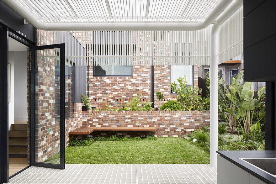
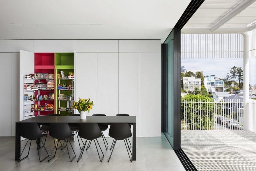
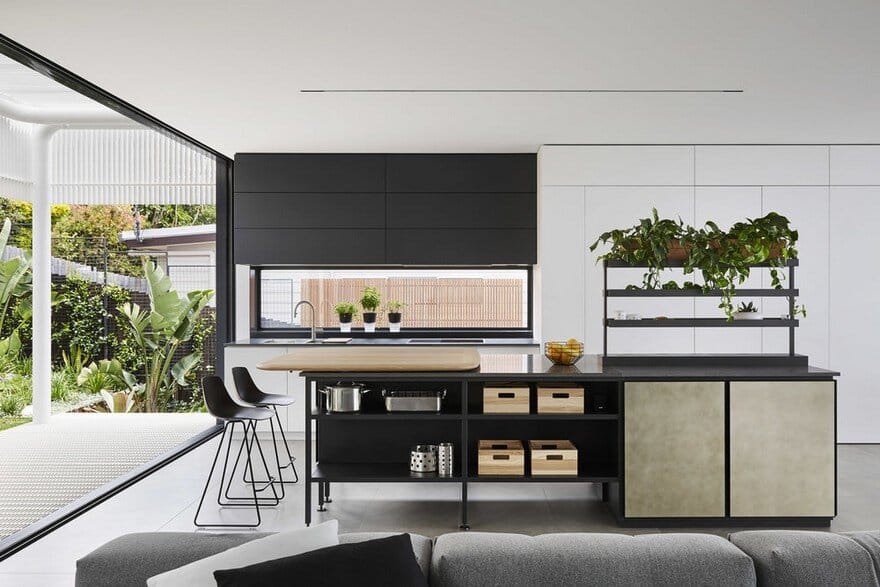
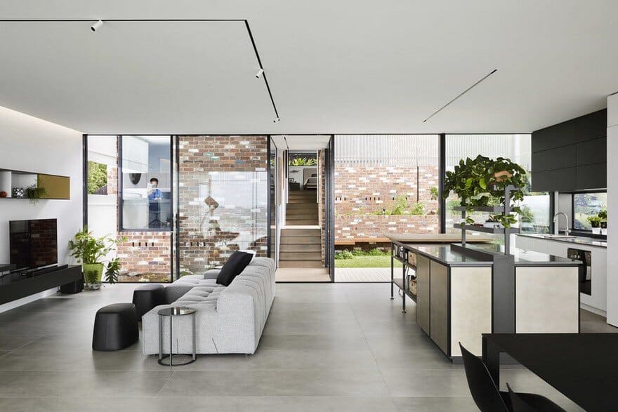
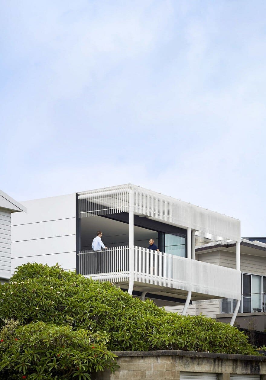
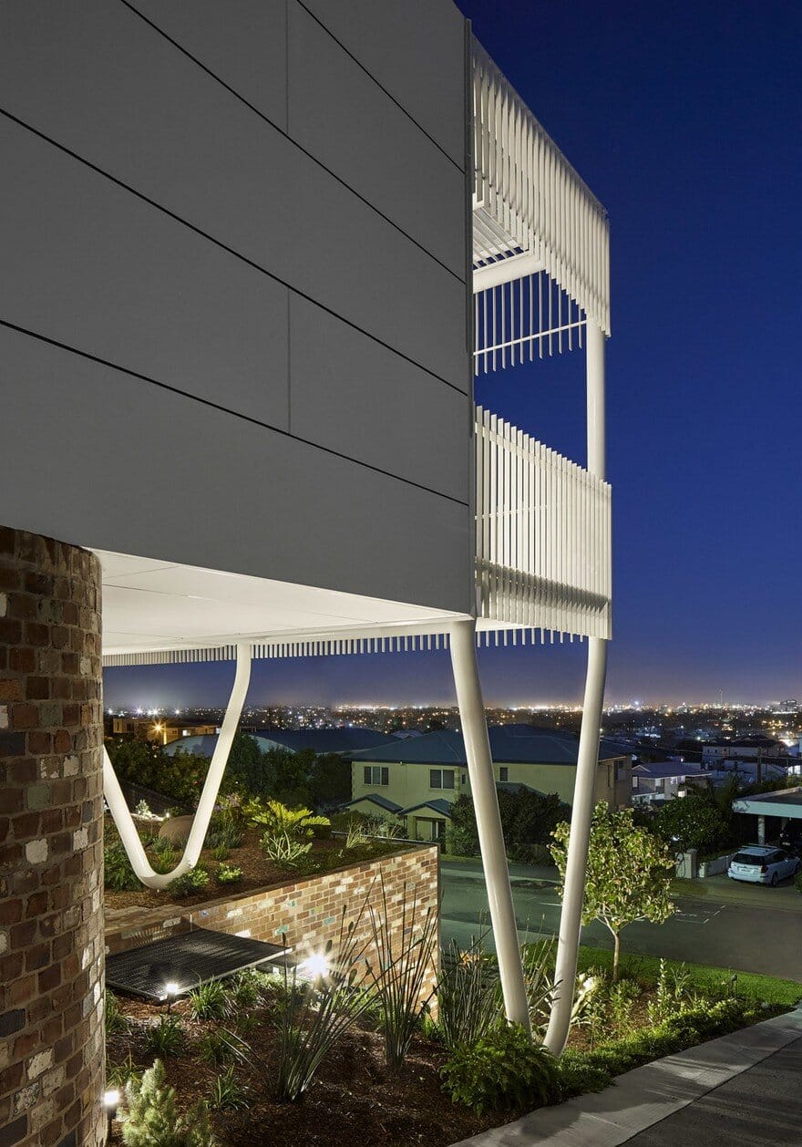
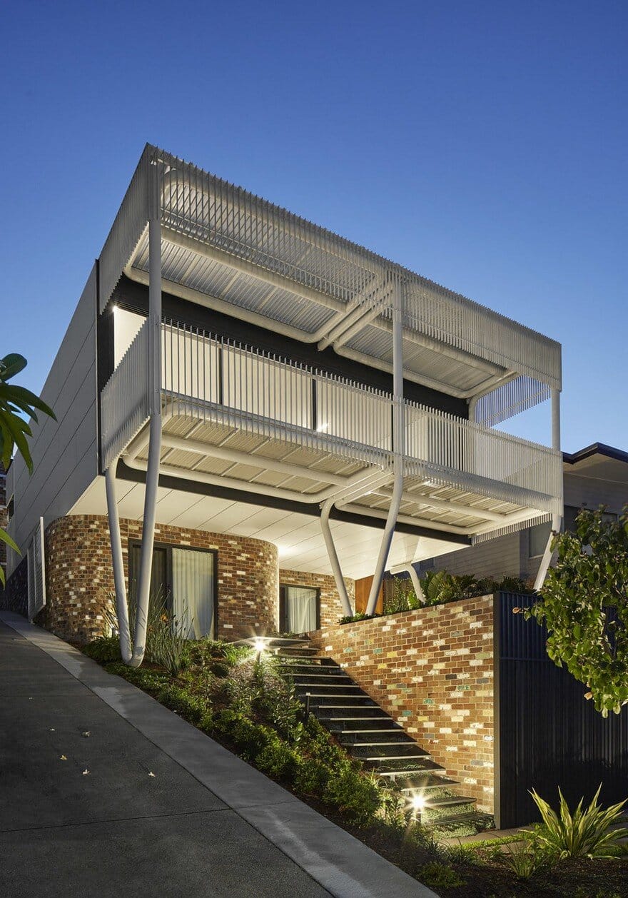
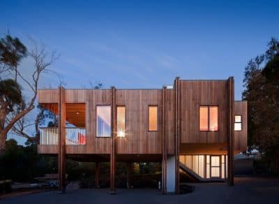
Set only metres from the ocean cliffs of Merewether in Newcastle, Greenacres residence responds to both site and location. Stepping down a steep gradient at three levels the house works with the landscape as it terraces down the hill towards the street. The garage is buried at the base of the property, with the entry path and garden weaving beside, up and over the top, through the green roof. The design of the driveway is landscaped to reduce the impact of a large expanse of hard surface in front of the house. A simple, white rectangular form, propped on three giant steel ‘paperclips’, houses the kitchen/ living and dining area, with two bedrooms and a bathroom beneath. At the back of the block is the parent’s bedroom, with a walk-in-robe, ensuite and a study – quiet and private. In the garage a lift provides direct access to all three floors, concealed within the kitchen cabinetry at the third floor level.
Contrast
Inspired by the macrobinoculars in Star Wars: The Empire Strikes Back, the white suspended living zone was designed to bring the views into focus, like a lens, framing the vista. Capping the end is a light and transparent balcony, with all five sides – the fibreglass floor and linear arrangement of the battened ceiling, balustrade and sides, drawing the eye out.
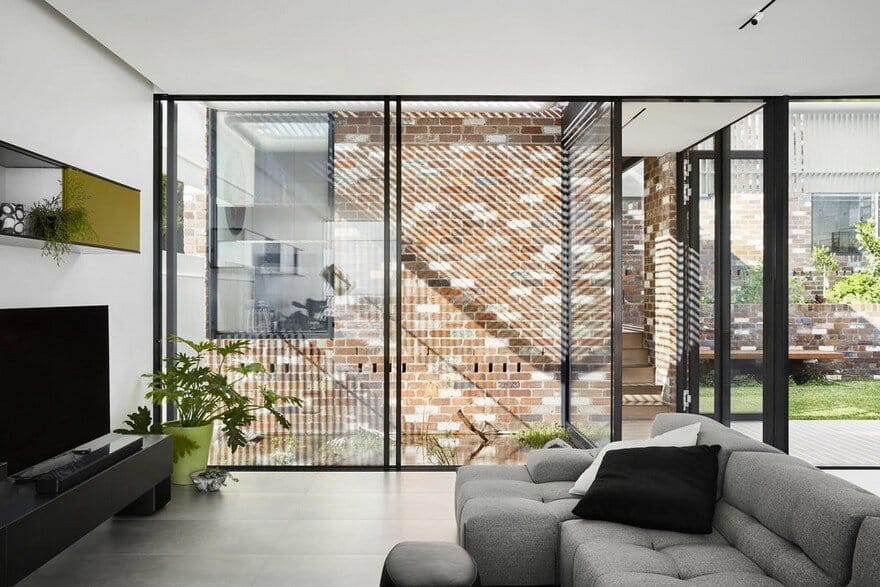
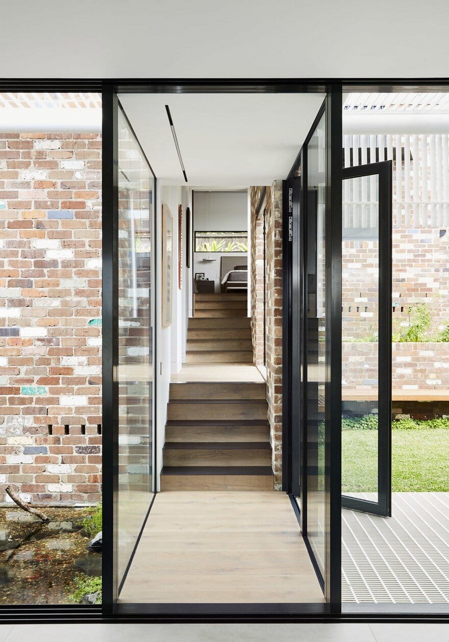
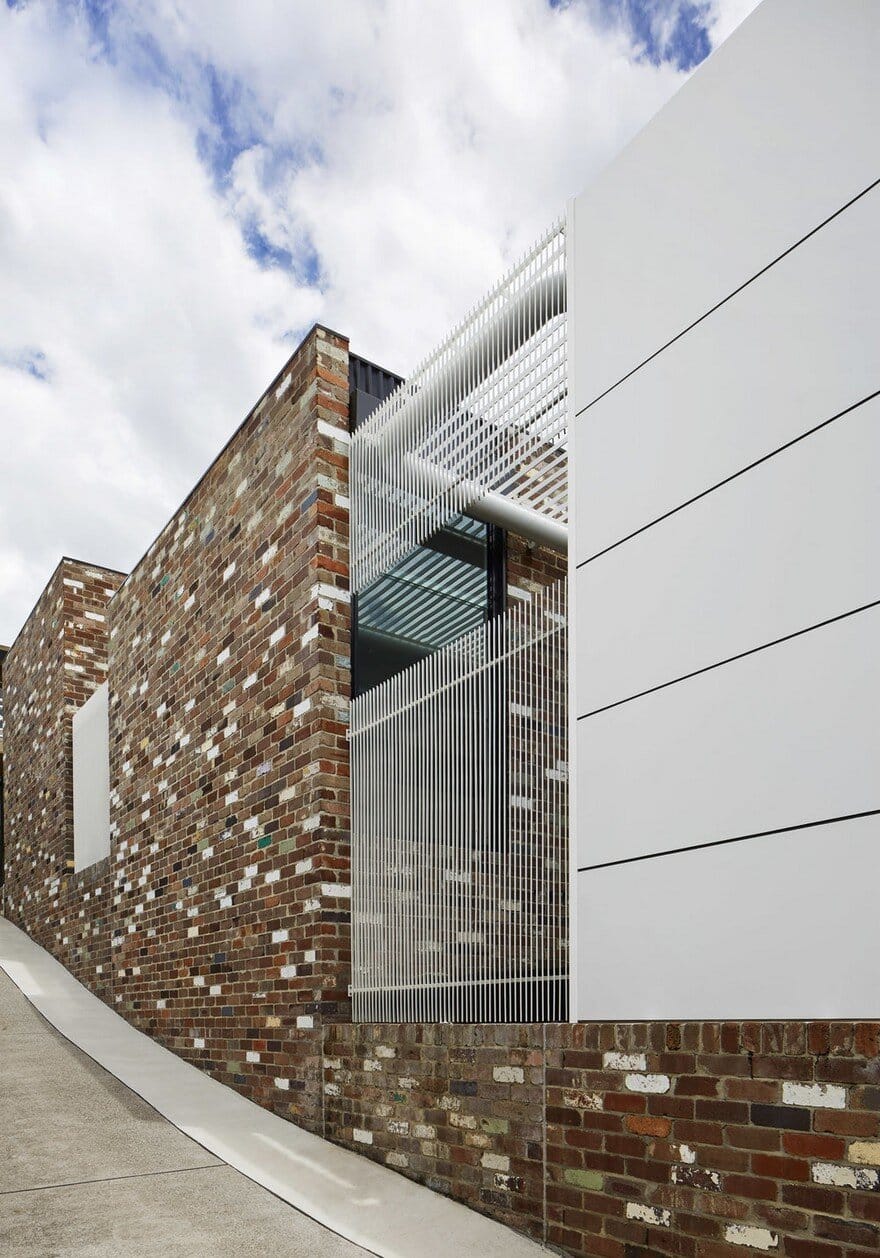
The sci-fi associations extend further, as the white box appears to be a different study entirely, hovering or docked to an industrial brick base. The contrast is stark. The recycled bricks, a colourful mixed palette bearing approximately 20% graffiti, provide colour, character and a sense of past. Earthy, textured, heavy and robust. Resting on this brick plinth, is the extruded form, a clean, white steel and panelised, machine-made form.
Neighbours
Greenacres Residence is situated on one of the most sought after streets in Newcastle. It’s a street that terminates in a cul-de-sac, with a park bench overlooking the sandstone cliffs. It’s quiet, high up and every house on the street strains to capitalise on the incredible vista, often at the expense of someone else. Greenacres Residence has been carefully designed to nestle into the hills of Merewether without impacting on the neighbours’ views any more than the original house did.
The house does not project forward beyond the neighbours to steal extra ocean view. The extruded form is not heavy or bulky. It neither dominates nor does it obscure, instead it is light and transparent. Where the roof of the original house was pitched, the new house has a lower flat roof, giving the neighbours at the rear of Greenacres more ocean to look out on.
The view
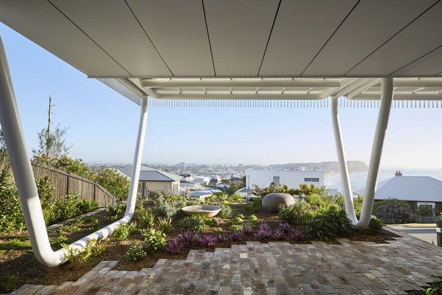
Build a house in front of an ocean and everything becomes about the view. At Greenacres Austin Maynard Architects not only captured the view from the living space, but also from the rear of the building and every space in between. Careful design thought ensured the house didn’t get in the way of its own view.
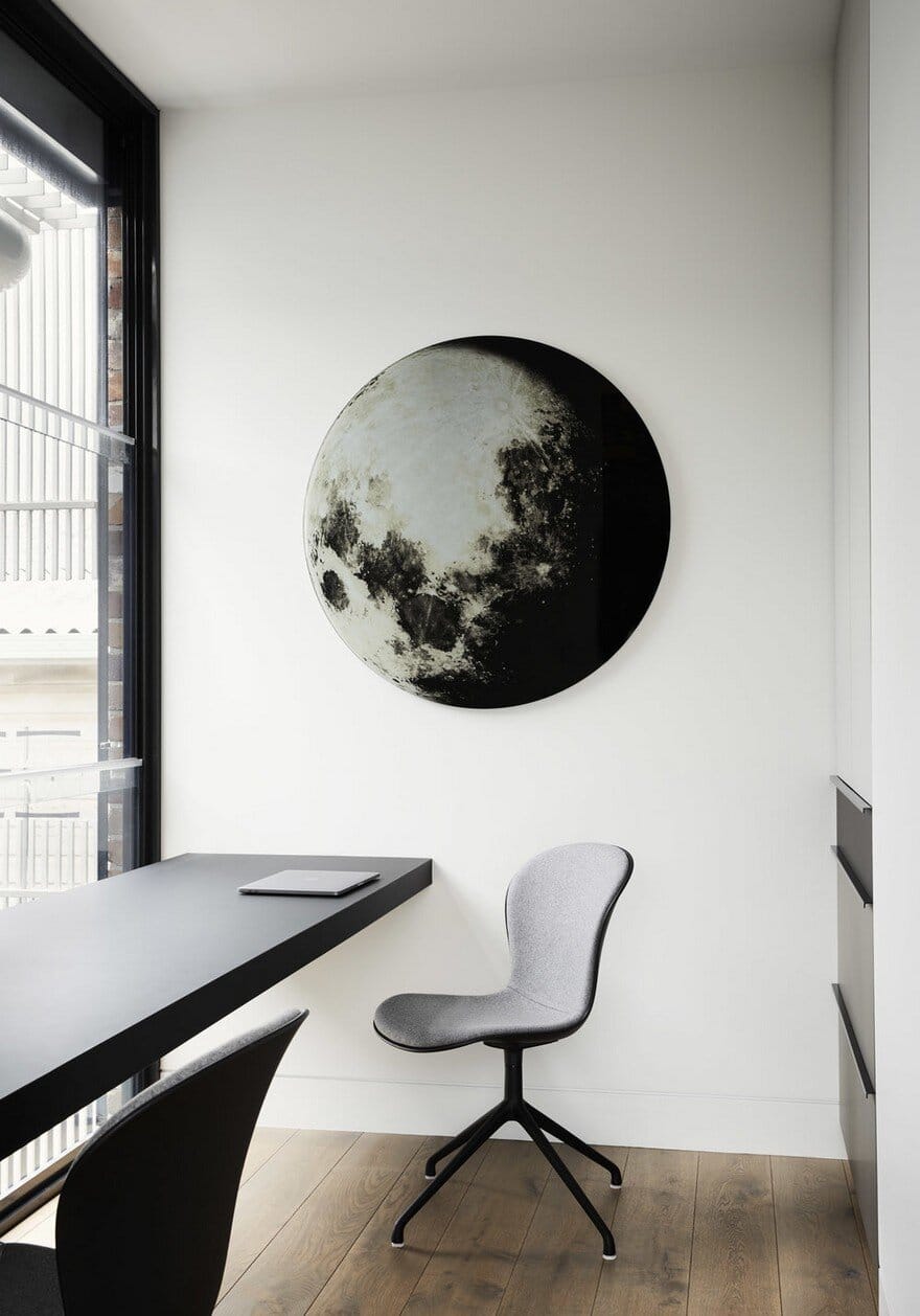
The deliberate transparency means that even whilst sitting in the back garden or working from the study in the master bedroom, you can still see the ocean. Even in the very last room on the block, the shower, through the rear garden, and through the house there are unimpeded views of the ocean to the right, and the city to the left.
Sustainability
Great care was taken not to bench the site but to work with the landscape, reducing excavation and impact on the natural topography. The design also ensured minimal landfill and the knock on effects of water table disruption. Locally sourced recycled brick was used throughout the house. Orientation, window shading, attention to cross ventilation, together with a central fish pond, aids passive cooling and reduces the reliance on mechanical ventilation. All windows are double glazed and protected from the northern and western sun. Water tanks have been buried in the garden, providing ample water for the gardens and the toilets. High performance insulation is everywhere. The transparent balcony allows light to permeate into the ground floor bedrooms, thus reducing the need for artificial lighting during the day.

