Project: House in Center of the Country
Interior Designer: Odelia Barzilay
Location: Central Israel
Property: 180 sqm
Owners: A couple, their three children and one dog
Photography: Einat Dekel
This house is a vivid proof that with the correct use of color and materials, things can come together to form a breathtaking picture.
Some will say that in business, the best marketing strategy is “word of mouth”. In the design world, when a client loves a property they saw, and asks the homeowner for the designer’s details in order to contract their services, it is a great compliment indeed. “The client saw an industrially-styled property that I designed in the past, and reached out to me”, says designer Odelia Barzilay. “She wanted a house with character, not a clean and minimalist one. She loved the industrial style but at the same time didn’t want her home to feel too industrial or modern, but rather a combination, partly light and partly dark. It was important to her to express creativity throughout the design, and so we created an eclectic house that combines a variety of styles. We took the best elements most suited to the client and the house, from different styles”.
In fact, when the work started, it was the client’s joint project with her sister as they decided to build the property as a duplex, with similar planning, yet different interior design.
“The properties were built mirroring each other, but in completely different styles. my client wanted an eclectic design, whereas her sister was after a vintage country style”, continues Barzilay. “I worked on both plans in parallel. On the one hand, it made things easier because everything was the same, but on the other hand, it was at times confusing, because I constantly needed to alternate sides. The process itself was enjoyable, particularly because the houses were designed to be different from each other, with the exception of the architectural planning, which was identical. The differences lay in the interior. for example, one kitchen is black and modern, the other is pale and country-like”.
The outbreak of the Covid-19 pandemic impacted the client’s sister’s business, and she had to stop the design process for her part of the property. “Some work is still needed on her house, but we designed a good enough infrastructure, that would allow us to easily complete the works when the time is right”, promises the designer.
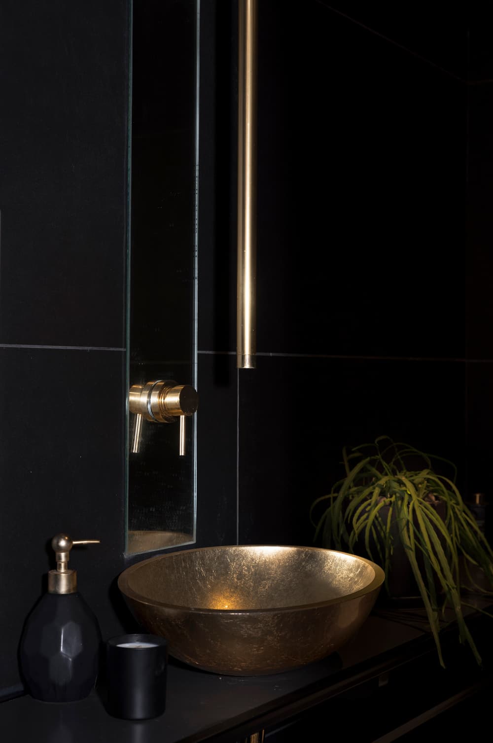
Bringing the focus back to this project and its dominating colors, “the client loves gold and asked me at the offset whether that scared me”, recalls Barzilay. “I told her: not at all! And explained that I can work with any color or material. The secret is in the amounts and usage. if the balance is right, everything comes together”. Thus, we can see the introduction of gold straight away, as part of the entrance door.
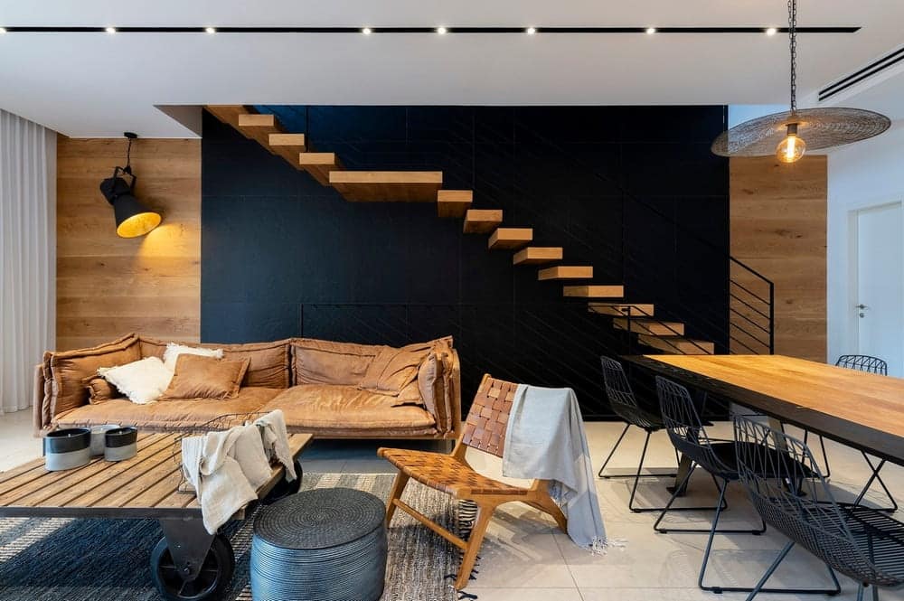
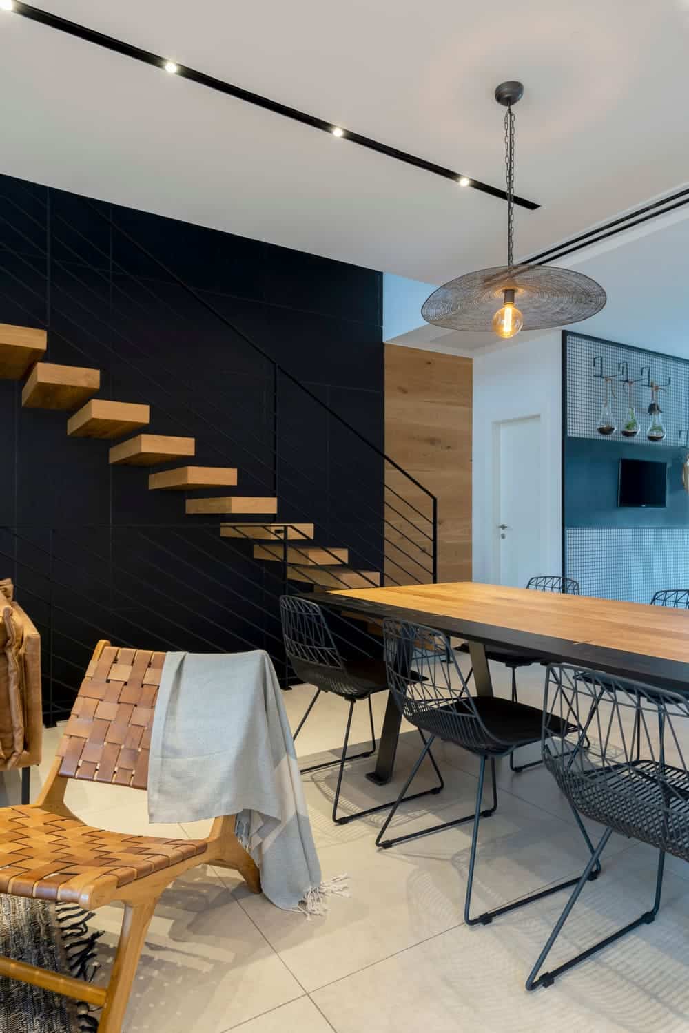
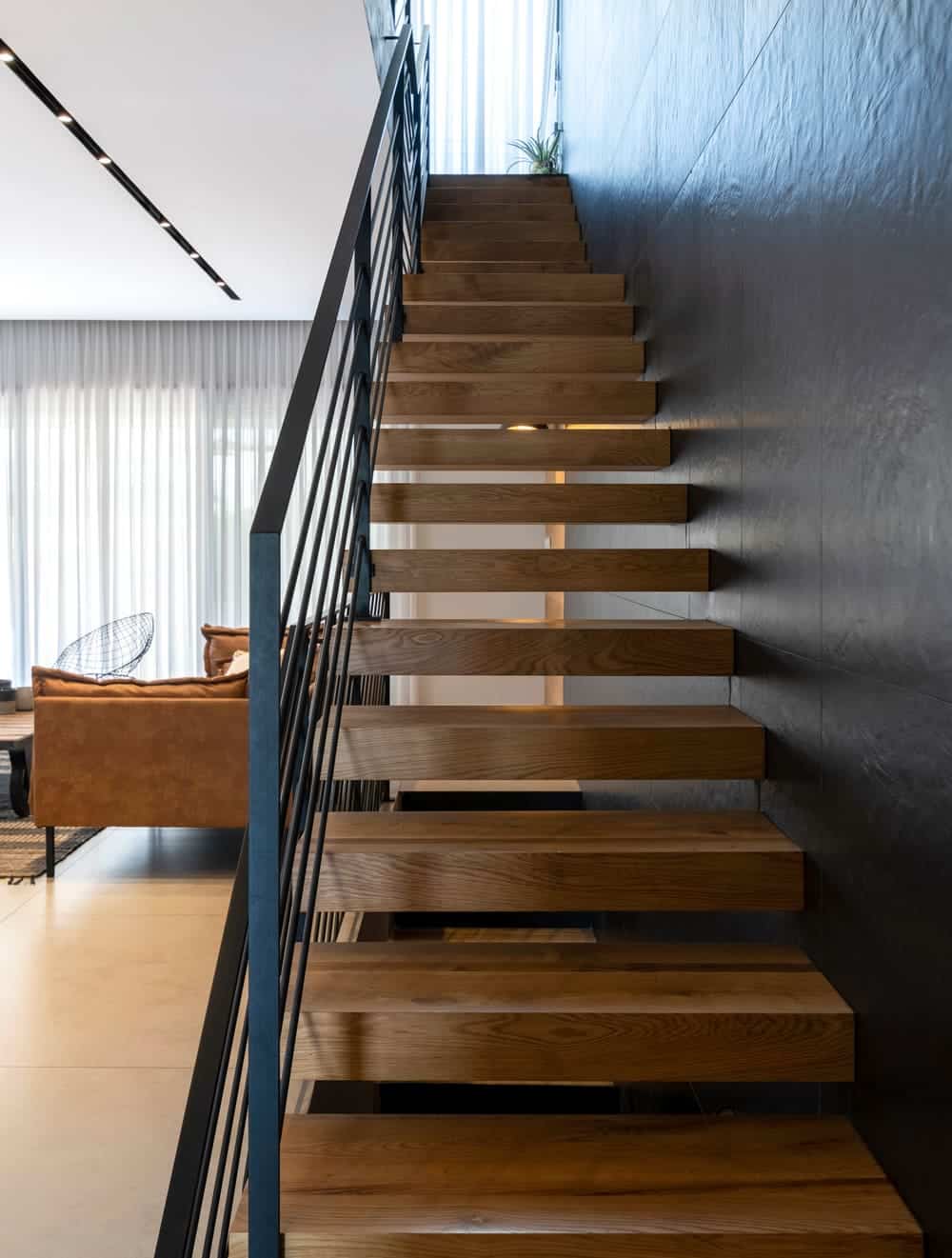
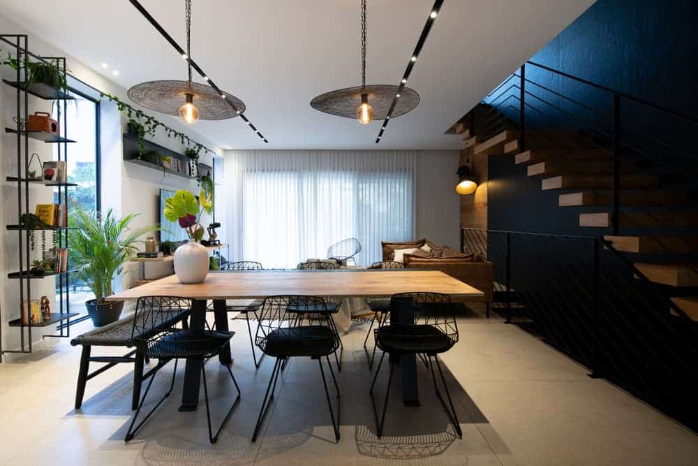
The front door is an impressive one, colored black with a gold handle. Upon entry we can see the stairwell that, as to the client’s request, was designed to create drama and interest. This very large wall has black tiles, creating a grid-looking texture, on top of which the floating staircase was fitted. What creates the dramatic effect is the combination of materials, lighting, and vertical positioning. “I wanted the first impression upon entry to be bold and with a great impact”, explains the designer. This is something the client really liked from a previous project of mine, that included a similar dark and dramatic wall”.
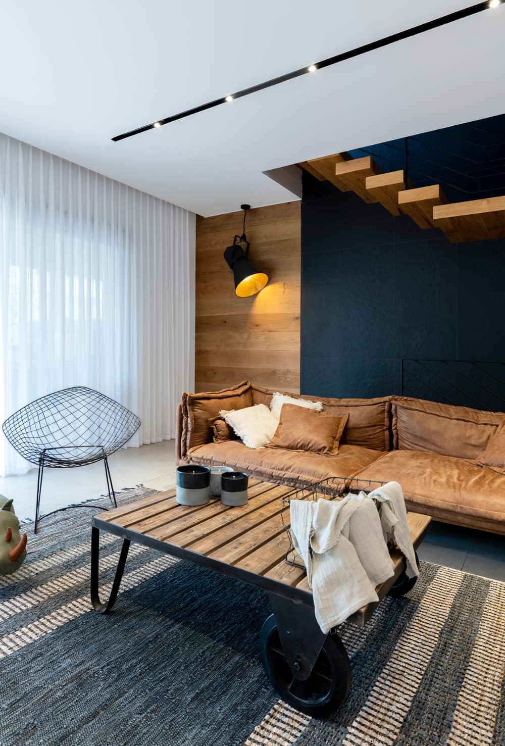
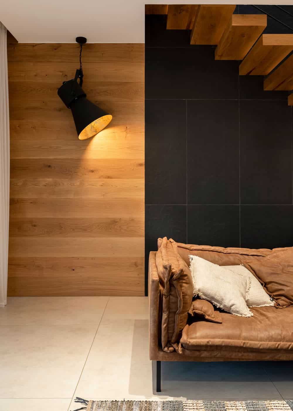
“The combination of colors continues with an industrial black & gold screening projector, that projects against the main wall. The side walls are covered in wood cladding and together with the wooden stairs, the concrete effect grey flooring, and the black tiles – create a successful combination that injects a lot of warmth into the property. The entire property was designed with a palette of camel browns, grey and black. For example, the camel brown sofa creates a contrast with the black wall behind it”
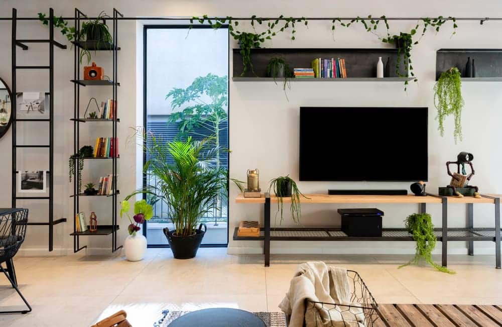
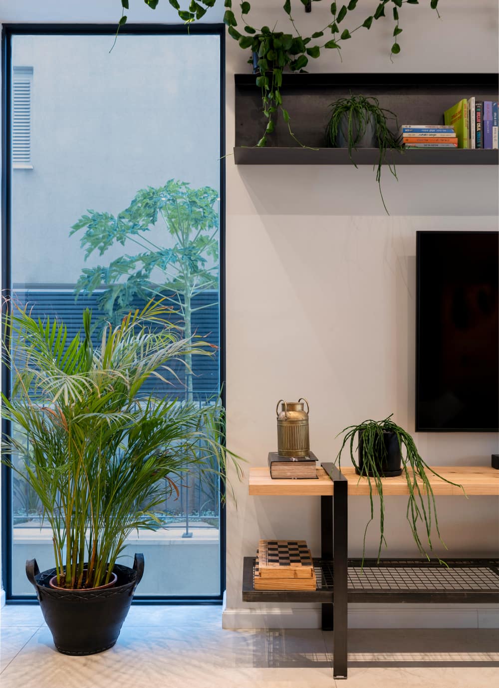
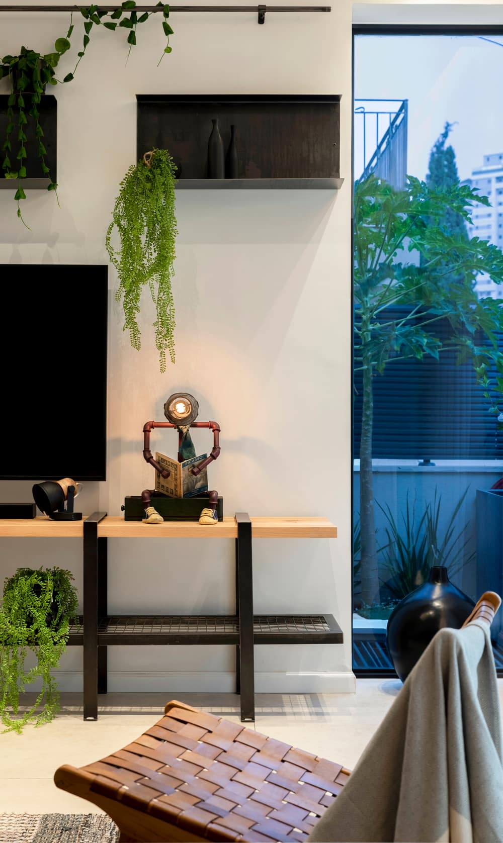
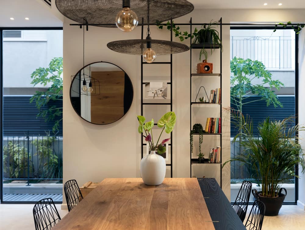
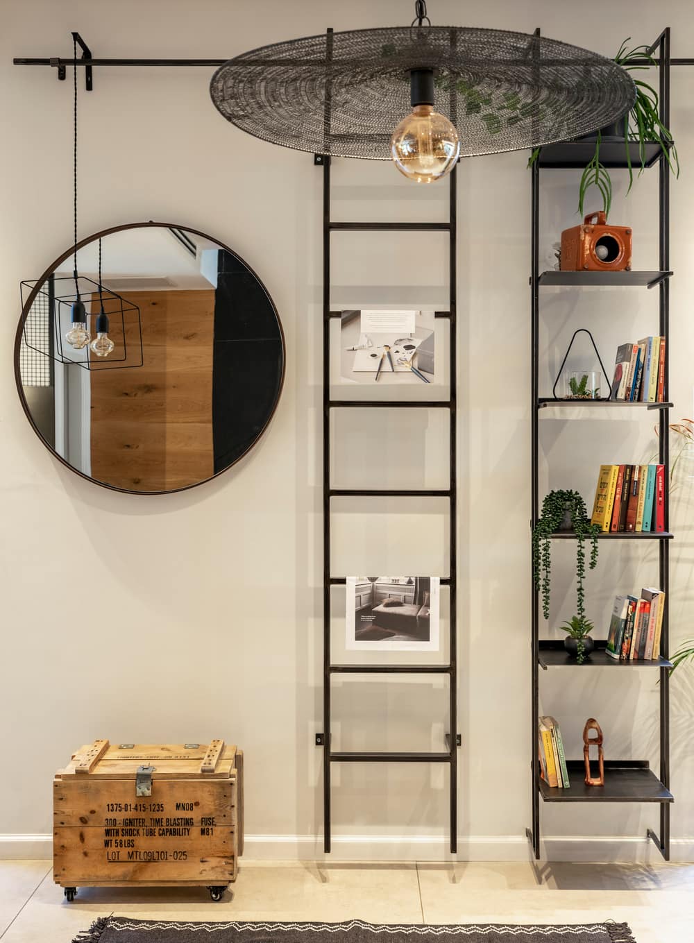
The uniqueness of the project can also be seen on the TV wall. “Beautiful windows were fitted into the wall and I wanted to create something interesting rather than using a conventional TV sideboard. The windows divide the wall into two sections, to the left we fitted a long narrow bookcase with a ladder, and round mirror at the end of it. To the right, I positioned the TV on a wood and metal console, above which a raw steel shelf was fitted. In fact, this whole wall is full of raw materials. Across the top of the wall, we hung a long pole that brings the two sections together and is used to hang trailing plants. The use of raw materials gives the property the look we were hoping to achieve” says Barzilay.
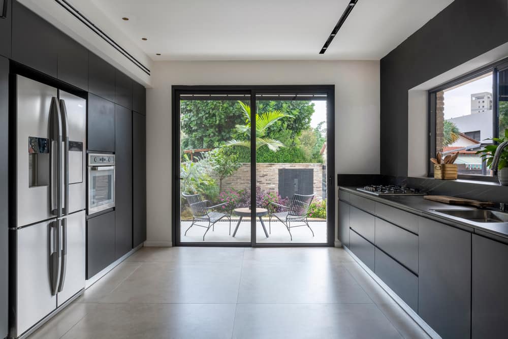
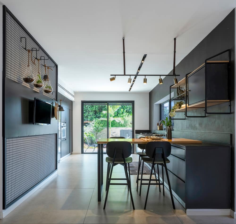
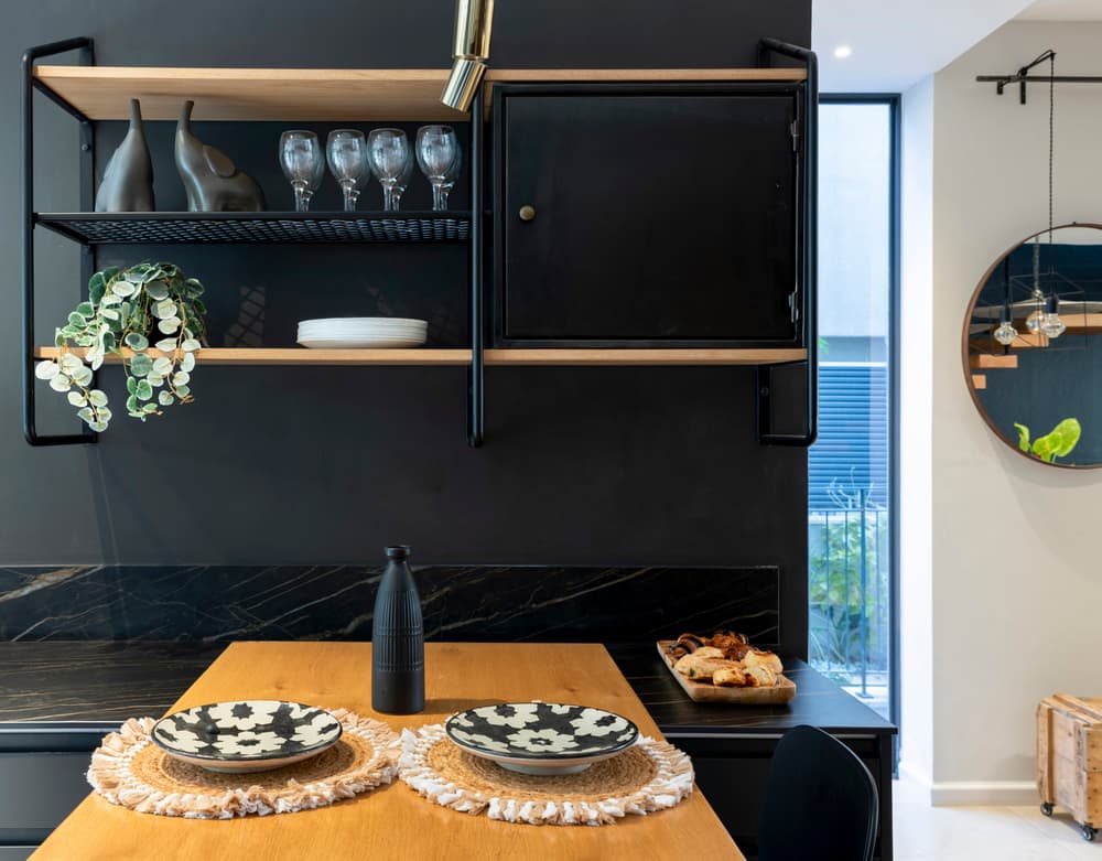
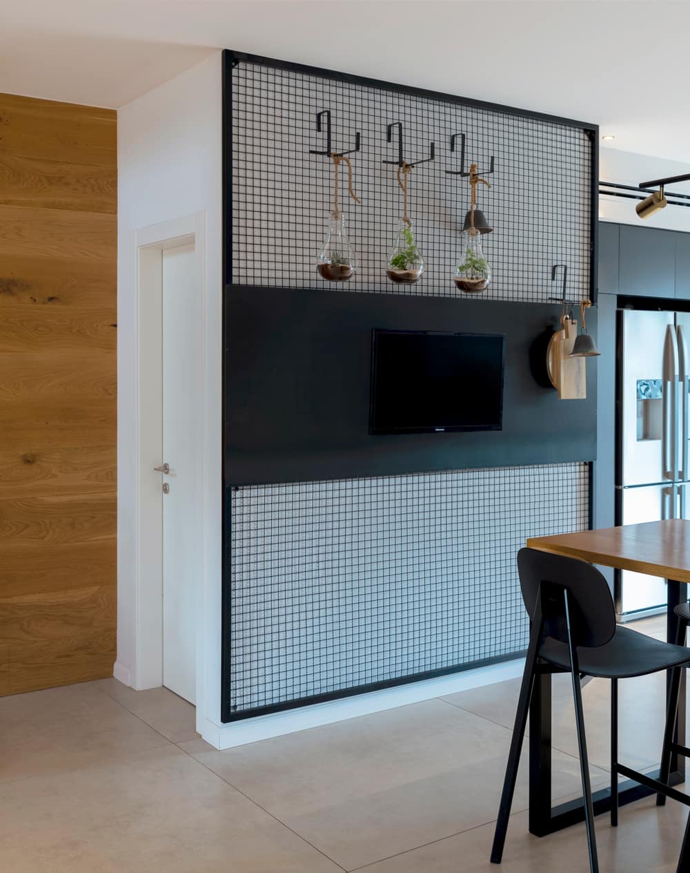
The style continues through to the kitchen with the use of similar colors and materials. “We designed the kitchen in a modern dark style and colored the wall in a graphite color. In order to add warmth, we incorporated wood into the hanging unit, as well as the countertop. The client asked for the plan to incorporate a small every-day seating area with a TV. On the other wall I wanted to incorporate something more industrial but not too heavy, so I created a netted wall, to which hooks with plants are attached, as well as space to place chopping boards and other kitchen accessories. The kitchen is very bright, as is the rest of the space that enjoys an abundance of daylight, thanks to the many windows all around.”
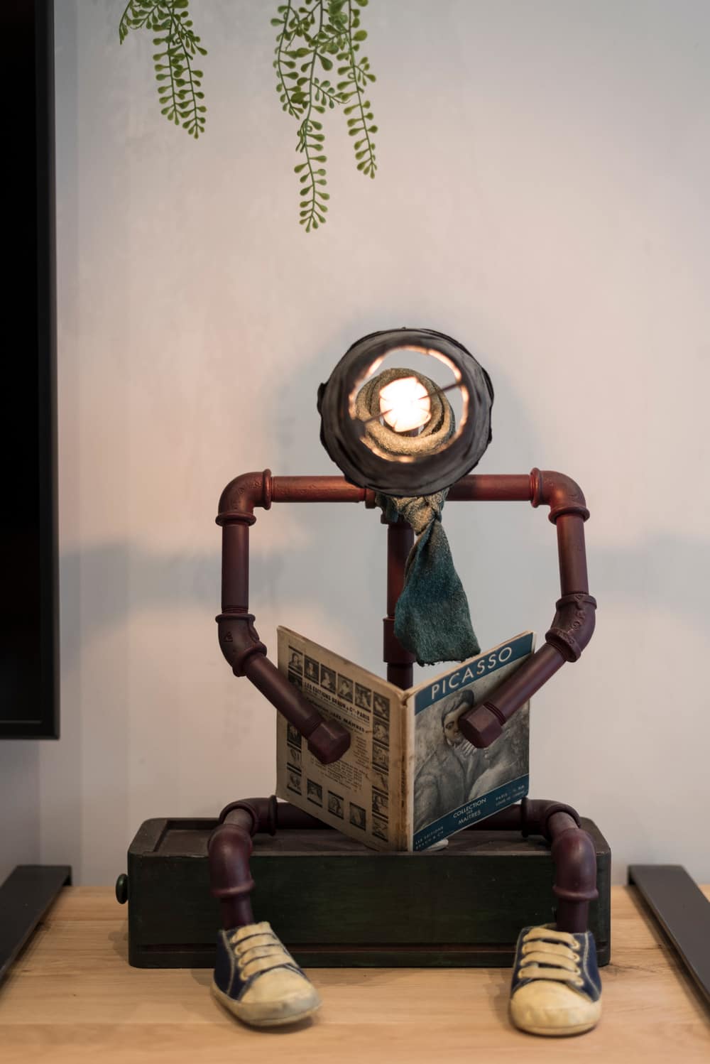
One of the things that stand out the most in this property is the use of unique items that reflect the client’s design preferences and choices. “I needed to understand my client. She has a more conservative style, but the property is, nonetheless, a very boldly designed one. Industrial, but in an understated way”, explains Barzilay. “We chose special decorative items, such as a light fixture on the bar in the shape of a reading man, that we sourced from the studio of talented young designers in Tel-Aviv. All the pieces are very unique, and we made use of items that you wouldn’t normally find elsewhere, such as the library which is made of one narrow long unit and the ladder fitted at the end of it. Whether it be a chair, a wood and steel coffee table on wheels, or a hippopotamus seat for the children, each item was very carefully and thoughtfully curated.
“The challenge was to link each of the items sourced to a very specific overall design outcome”, says the designer. “which I am pleased to say was a challenge we successfully met. The client loves the end result”, she summarizes.
From each corner of the house a different and interesting view can be seen. Each area has elements that grab attention. The floating staircase at the entrance to the property, the TV wall combined with the ladder bookcase, the long steel pole and mirror, and the netted wall in the kitchen – each an individual piece in its own right, but at the same time they all work together in harmony in terms of compositions, color and material that flawlessly complement each other.

