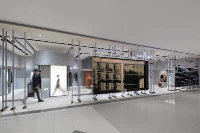
Project name: HUAYI SPACE Showroom
Location: No.18, Langbei Six Industrial Area, Longgang District, Shenzhen, China
Area: 1,178 m2
Completion time: April 2019
Finishing design: Co-Direction Design
Decoration design: Co-Direction Aesthetics
Main materials: gray stone material, textured paint, wood veneer, wooden flooring, black steel
Photography: Zhang Chao
I. Ordinary site / Huayi Space Showroom
The project is a furniture showroom, situated on the first floor of a factory building in Shenzhen, China. The building, not designed by architects, is very ordinary and has a low profile, without any special features other than functionality. In general, architects usually tend to incorporate various non-architectural elements into the buildings they designed, such as artistic and cultural elements, which can bring out either positive or negative effects.
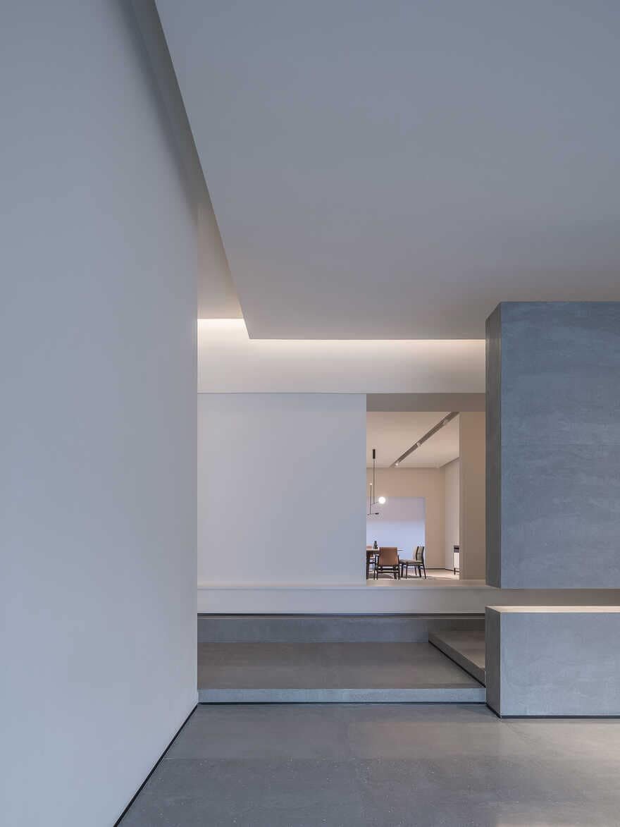
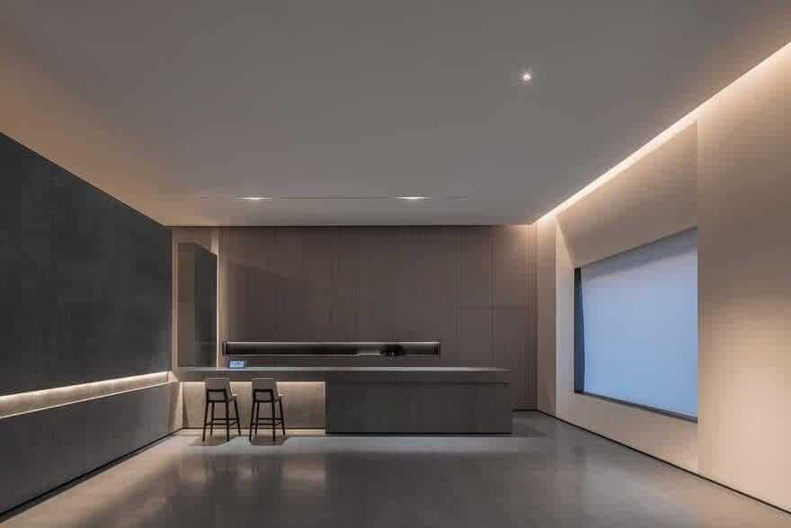
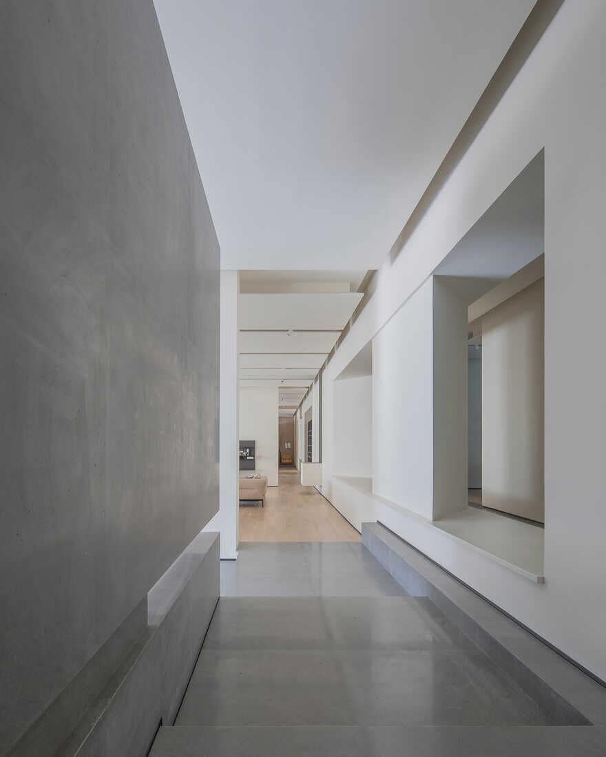
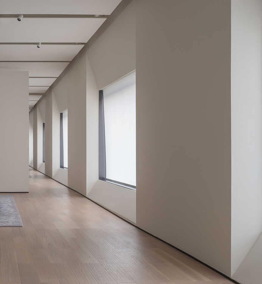
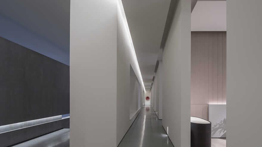
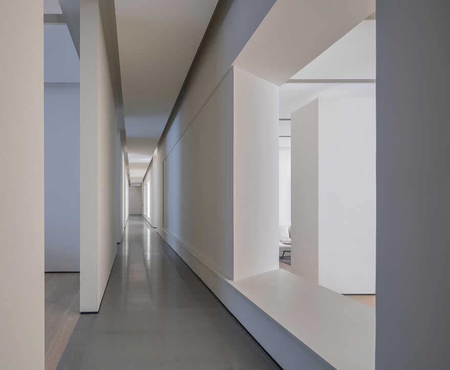
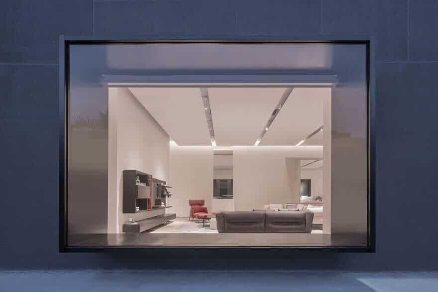
However, the ordinariness of this factory building greatly touched and inspired us as approaching the interior design. We respected and made the best of basic elements in the original architectural space, including beams, columns, window and door openings, etc., to reshape it. For instance, the row of columns was tactfully utilized to form an interesting corridor, and the orderly window openings were transformed into “light boxes” that connect the inside and outside space.
II. Container
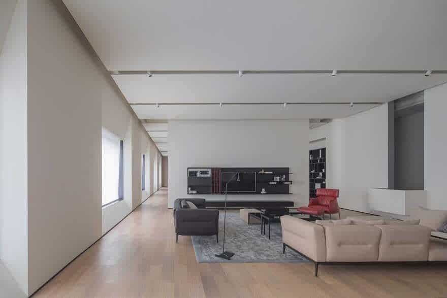
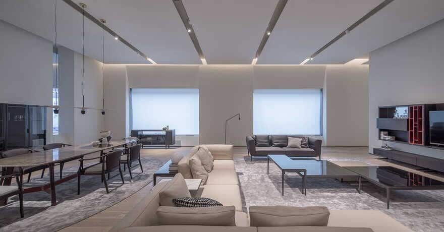
After visiting the site, we decided to make it be what it’s supposed to be: a container. With a tranquil and peaceful ambience, the space is not the “protagonist” but plays a supporting role of serving for the displayed furniture and visitors.
It needs to be capable of stimulating visitors’ emotions in an invisible but perceptible manner.
III. Transition
In Chinese classical gardens, forms and arrangement of details, such as a tree, a stone and water, all follow strict aesthetic standards.
Besides, another important feature of Chinese gardens is the skillful utilization of lines and transitions of space. If people step into a traditional garden, all the scenes cannot be seen at a glance. Nevertheless, twisting circulation routes and unexpected transitions of space help lead them to explore it, and present a series of perfectly composed and framed glimpses of scenery, such as a view of a pond, of a tree, of a rock, of a corridor, or of a pavilion, etc. Though seemingly disorderly, Chinese gardens are awash with order.
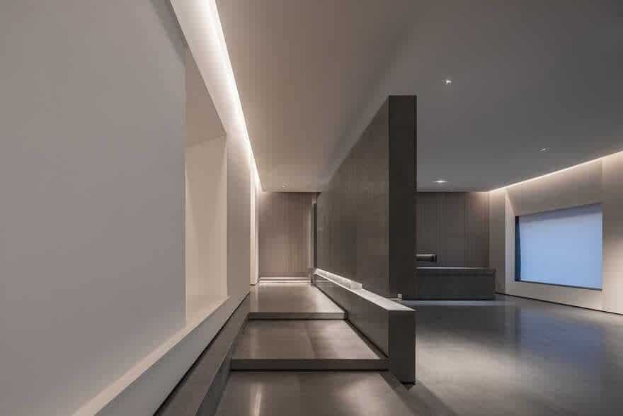
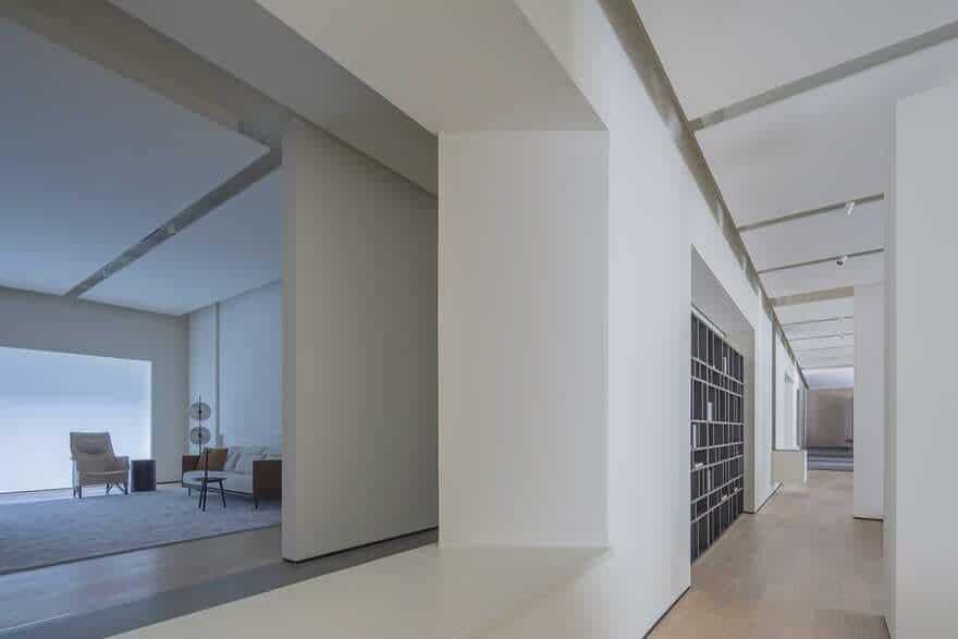
We think gardens and showrooms are very similar, both focusing on guiding people to explore the space and discover unexpected surprises. For this reason, we drew on the design of Chinese classical gardens, and worked to add subtle circulation routes to the interior, which link different areas in a unique way.
Through incorporation of order into the space and reorganization of interior structures, we intended to create immersive and varying experiences for visitors. A series of transitions of space present different scenes, provide an interesting journey of exploration, and evoke change of emotions. It’s a pure space, and what make it unique are the subtle order and lines.

