Project: Kite Apartment
Architects: Giuliano Marchiorato Arquitetos
Location: Curitiba, Brazil
Project size: 159 m2
Completion date: 2019
Photography: Eduardo Macarios
Text and photos provided by Giuliano Marchiorato Arquitetos
Pipa =Kite
It is composed of an armed wooden structure that supports a paper plane. The movements and color of the kites were messages transmitted from a distance. that launches in the wind, light and minimalist. wood, color and wind. any resemblance to architecture is mere coincidence, or not.
The kite apartment arose from the desire of a young couple to have a young and contemporary apartment, lovers of architecture and design, the briefing was clear, wood, lightness and color.
How is the project unique?
The apartment Pipa finally becomes an apartment with a formal rigidity and finishes that in the vision of the minimalist architect becomes the basis of a contemporary dwelling. Signed Brazilian art and design pieces add a sense of belonging to the place and admire the local arts. The joy and youth is translated in the punctual colors, taking off the apartment of labels, becoming unique light and special in the context, like a kite in a clear sky.
What was the brief?
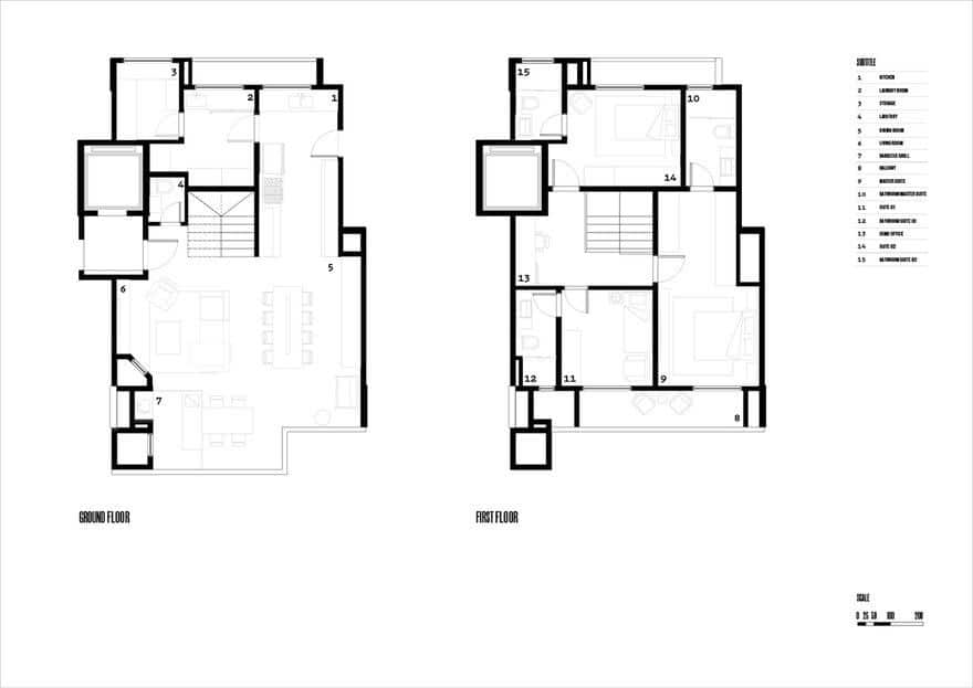
The 159m2 duplex apartment, located in a prime area of Curitiba, was the base of the architect Giuliano Marchiorato’s drawing board.
We found an apartment with a floor plan with well-spaced environments but with some minor problems. The staircase leading to the upper floor was poorly installed, and there were rooms of dependence on employees that made it unnecessary for a cosmopolitan life of the couple.
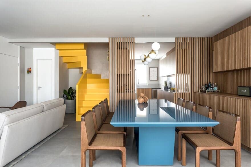
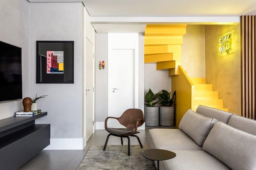
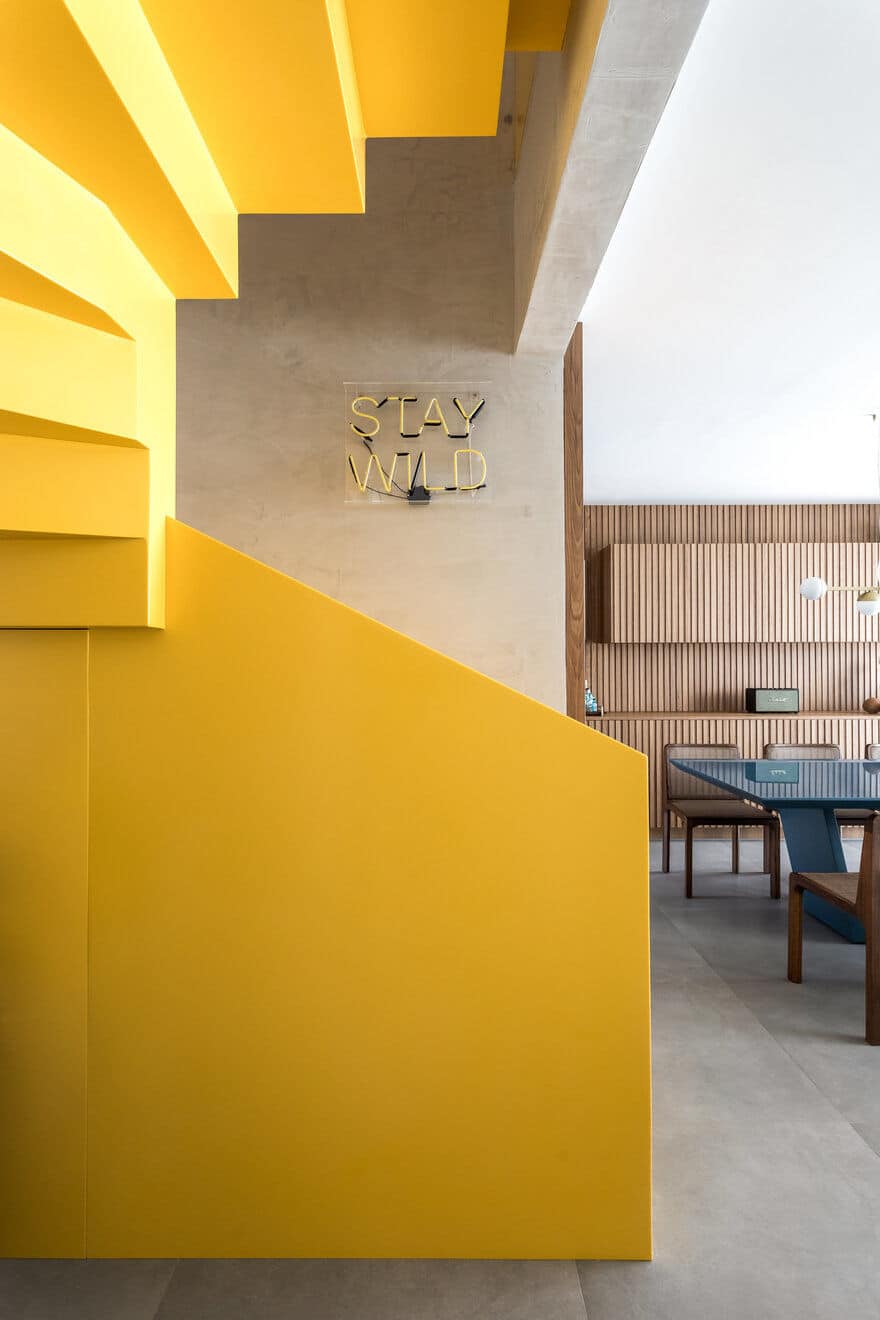
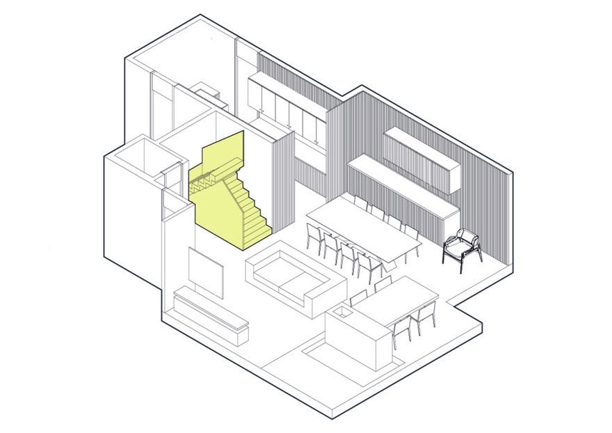
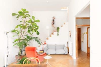
“From the problem we unraveled the solution, to create from the staircase poorly implanted the heart of the project, with references of great architectonic works we designed a unique staircase and never seen in Brazil. synthetic for solid surfaces, composed of acrylic resin of aluminum hydroxide)
The staircase is a single piece, without joints, encrusted between walls with its color that looks attentive, yellow alluding to Brazilian’s and contemporaneity. “
What were the solutions?
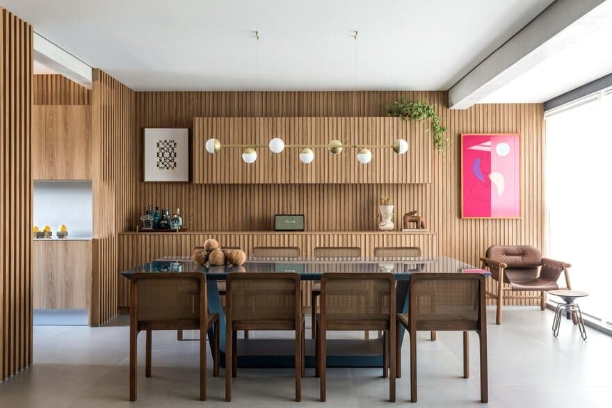
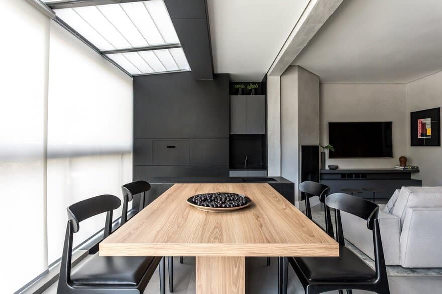
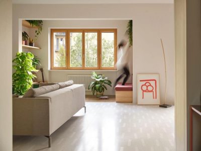
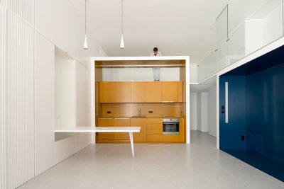
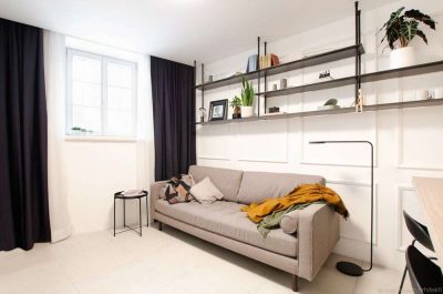
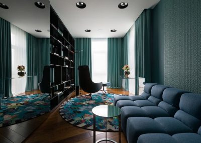
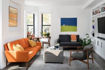
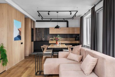
The social area is fully integrated reinforcing the idea of a cosmopolitan life and is based on elements such as slatted wood in laurel-freijó and a palette of monochromatic color of ashes for the Brazilian design furniture to shine in the space, it is worth noting that all furniture Loose is composed by Brazilian design signed as Jader Almeida, Bola Studio, Bruno Faucz, Ana Neute, among others. Still on the social area, the balcony and barbecue were integrated into the internal area of the apartment forming a black block of black granite.
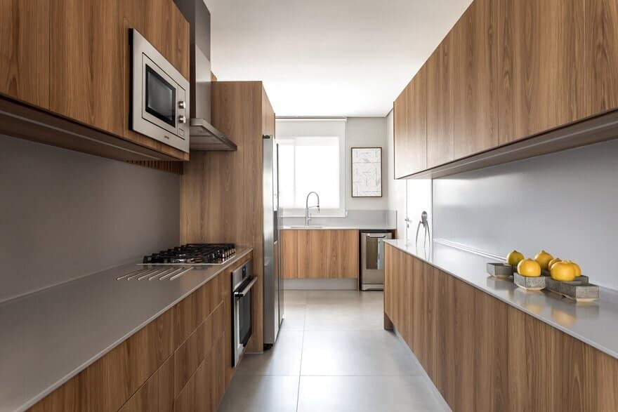
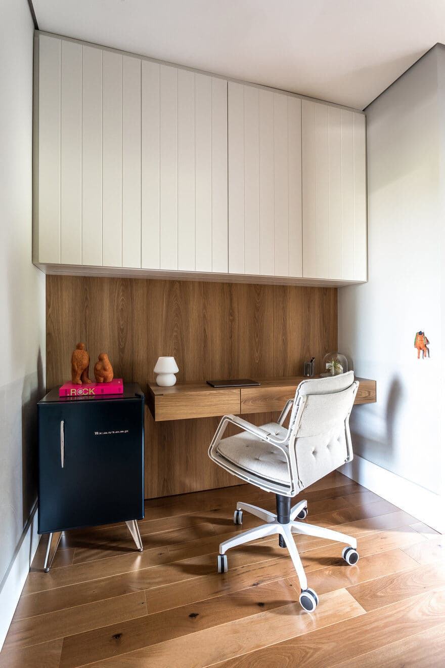
The kitchen is integrated into the social area, with wood tones and gray Corian, following the idea of few elements. The architect draws the furniture completely without handles and a wooden brise so that it has some privacy to the dining area. The intimate area is comprised of 3 suites and a home office as soon as the stair steps end.
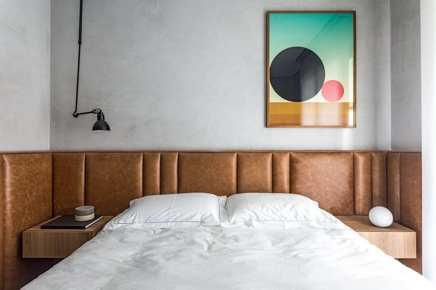
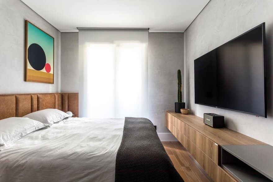
The master suite follows the main elements of the apartment, but with some peculiarities, the headboard in natural leather estonado in brown color bring the necessary comfort, the cement walls allude to the cosmopolitan life of the couple. Design pieces like the French Lampe Gras ceiling lamp so the touch of refinement to the room.
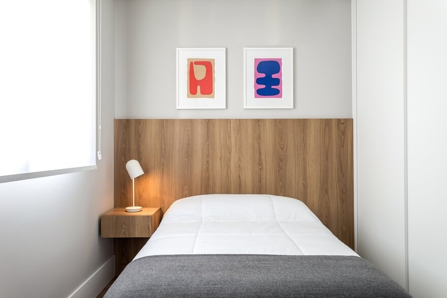
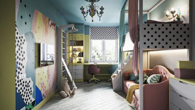
The other hourly suites are designed for guests, but the architect and clients have already designed furniture that can be easily adapted for future children, such as the case of the suite 01 that has been designed to be a baby changer.
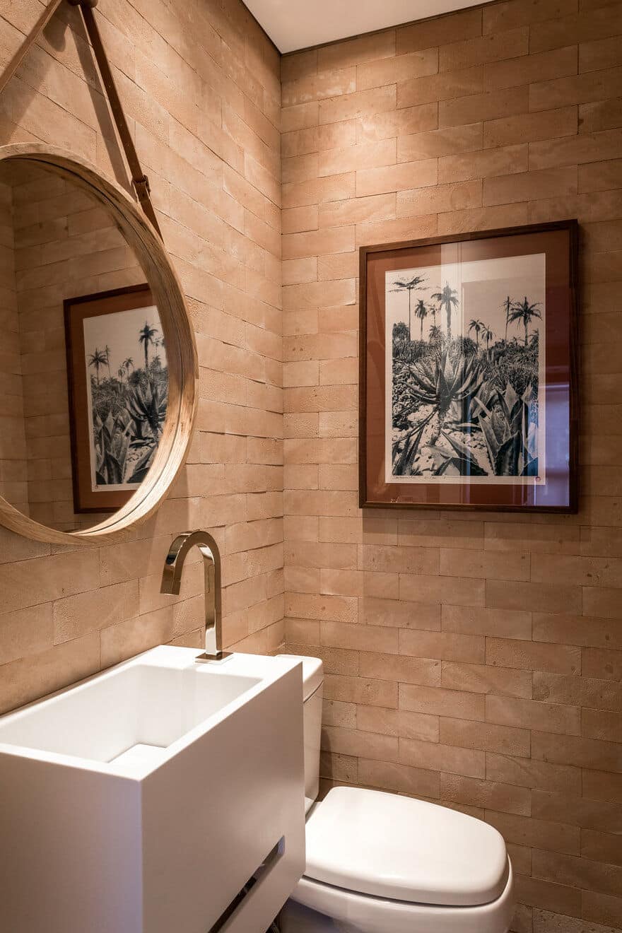
The apartment is surrounded by works of art, a mix of great local artists like Carlos Eduardo Zimmerman, APOC Studio, Toco-oco and pieces panned in the trips of the couple to countries Africa, Europe and Middle East.

