Project: Klinker Apartment
Architects: Colombo and Serboli Architecture
Team: Andrea Serboli and Matteo Colombo
Contractor: Global Projects
Location: El Born, Barcelona, Spain
Year: 2019
Photo Credits: Roberto Ruiz
The Klinkers are a young family of four, residents of Coronado, California, though Marta is originally from Barcelona.
The apartment is located in a nicely featured art nouveau building in hip Born neighbourhood, on the top floor. Clients came to CaSA after a terrible experience: after purchasing the property in order to have a holiday apartment in Barcelona, Marta (an interior designer) wished to refurbish it with her design, partially inspired by CaSA’s projects and relying on a contractor. Disgracefully only one day before inauguration a big explosion burned the flat down, along with a great part of the works recently completed, leaving our clients’ budget to a low and damaging severely some of the property’s ancient features.
One year later they contacted CaSA from Coronado, deciding to refurbish it once again, from a distance.
The property needed a major update, after the unfortunate events.
The initial brief was to provide a budget-friendly project, due to the loss of the investment in the first burned-down rehabilitation. A clever use of materials was mandatory, as well as making the most of the existing distribution and installations. In spite of that, the Klinker apartment had to look dramatically different by the end of the works. Once setup the project’s essentials, other special elements could be evaluated separately and added to it.
Both clients and architects wanted the historical features to be preserved or rescued and highlighted, making the most of high ceilings, decorative features, floors, windows, doors.
Architects received the apartment empty. Walls and ceilings, blackened by the fire, needed special care. Most walls had to be scrapped to bricks and newly finished and some of the original art nouveau ceiling features restored or even reproduced and replaced.
Concept and layout
The initially tight budget restrained architects from demolishing or changing layout and obliged them to keep the existing installations. The challenge was to take the given spaces and make new sense of them, change the meaning and uses without moving walls, a new interpretation of spaces.
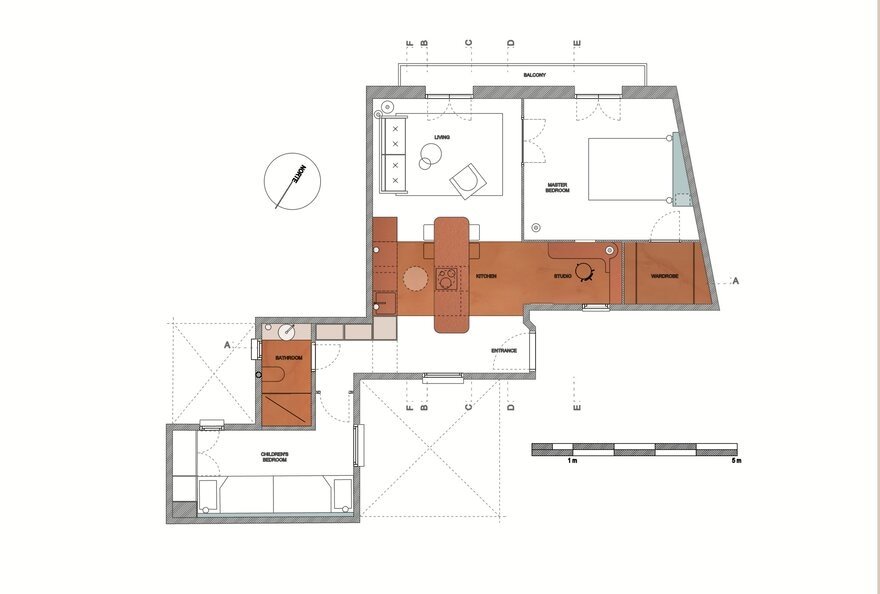
The original layout already included an open kitchen, living, two bedrooms (for parents and kids) and a small bathroom. Project-wise, most of the thought had to go into making sense of the main area, in order to order the rest of the project. This central area had kitchen installations on the back wall, and a recessed, dark area in the opposite that in the previous project hosted a small dining area.
The earlier demolitions also left the space within the entrance/kitchen/living area with a patchwork of 5 different types of floor tiles, looking fragmented and messy.
An unavoidable structural beam was added across one side of the kitchen.
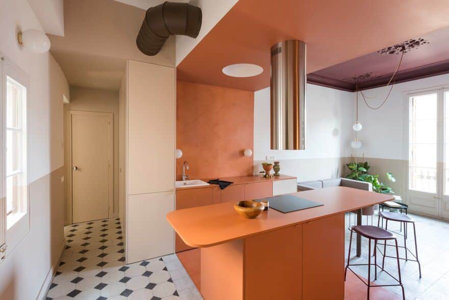
Architects decided to treat the central area as a colour-block. This brick-like core orders the space around itself, embodying several functions (kitchen, dining, studio). Funnily enough, the family name recalls clinker brick blocks, clay bricks that are exposed to excessive heat during the firing process, resulting in a shiny surface.
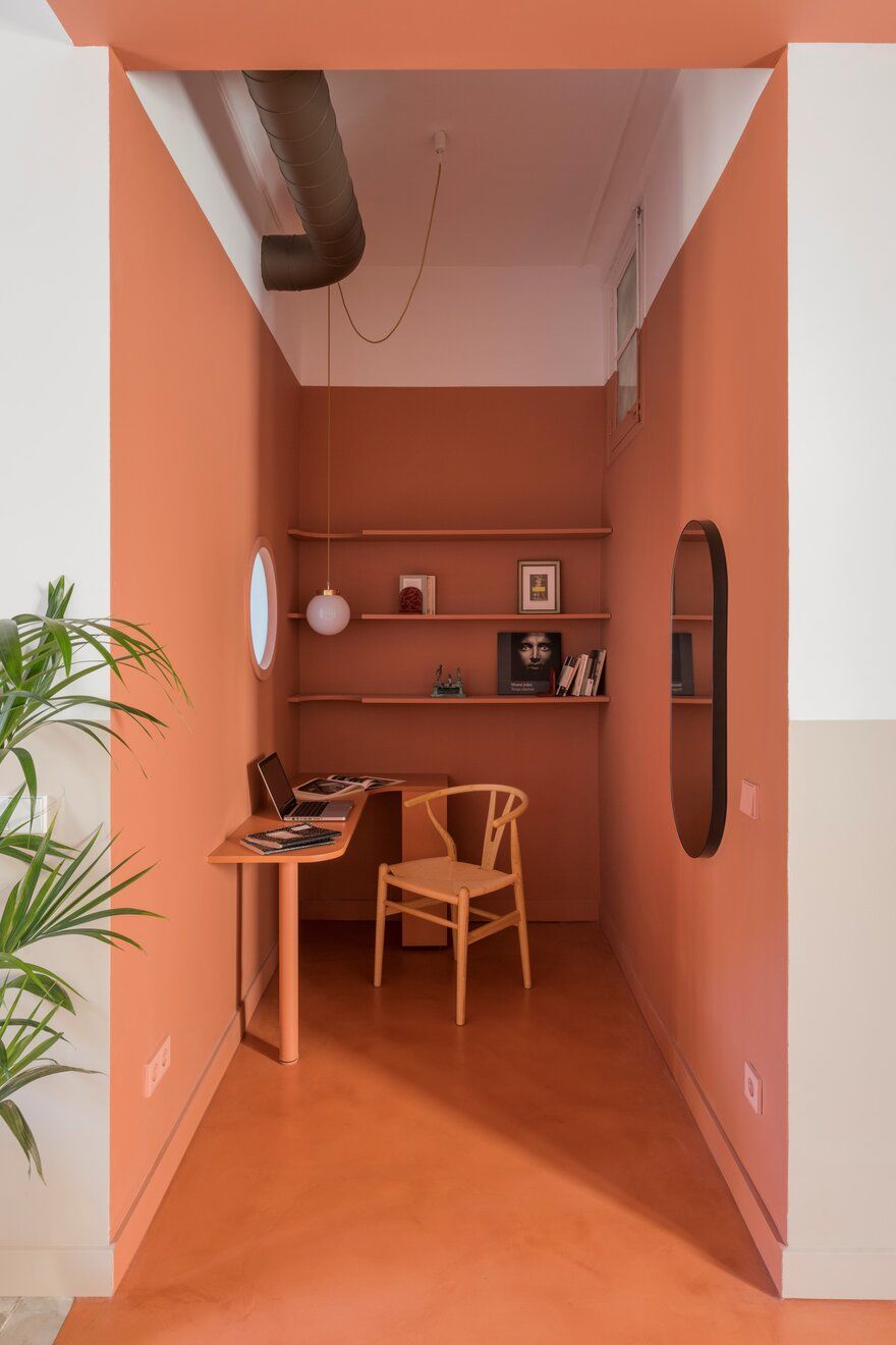
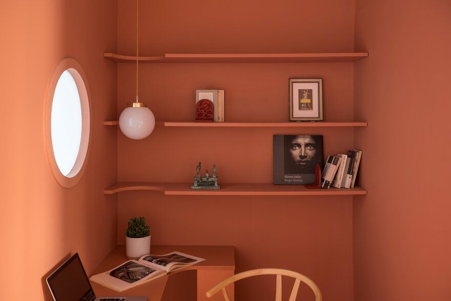
To create this distinct area, the architects decided to dip the whole space in a rich terracotta colour, including the recessed area that will be use as a quiet studio corner. The whole ceiling area above the kitchen was dropped, disguising the beam and the air conditioning ducts.
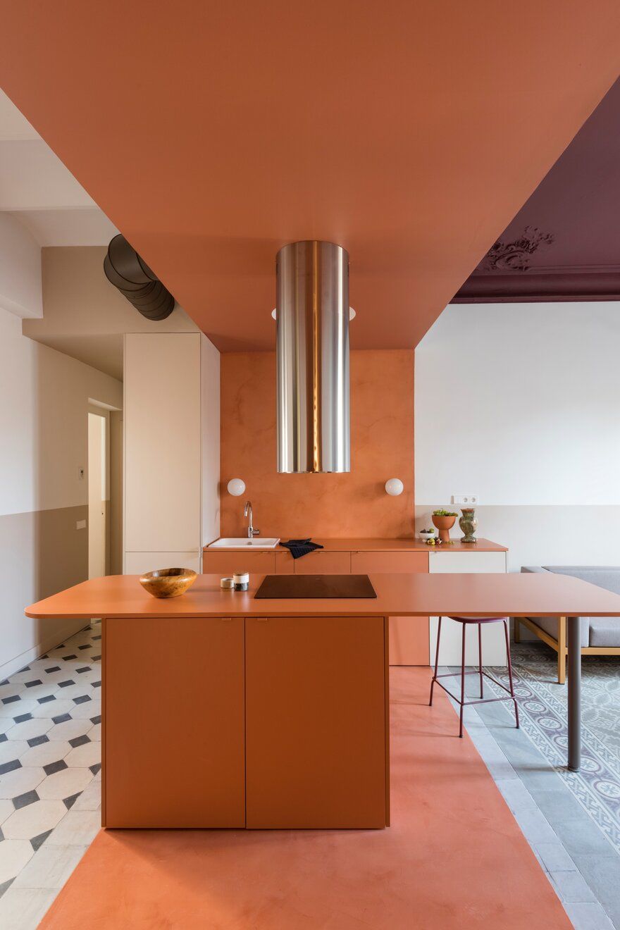
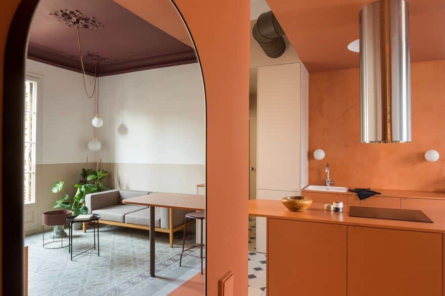
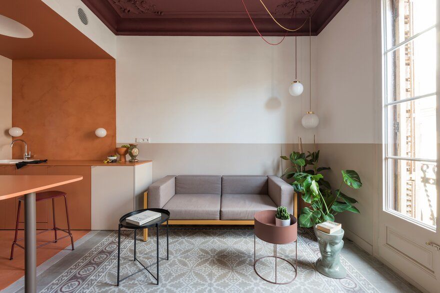
Micro-cement floor of the same hue cover three different types of tiles (the least interesting ones), unifying the block and highlighting the adjoining floors, of greater value, of entrance and living room. The same earthy tone is used for the micro cement backsplash wall, the ceiling, the kitchen cabinets including the long, round- edged central island, as well as for the studio area, desk and shelves. The result is a colour-block area that makes a distinctive statement at the core of the Klinker apartment.
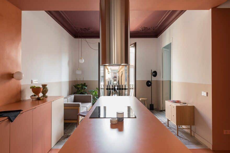
A long kitchen island doubles as dining table, in axes with the windows and the lane it faces onto. Shiny, steel, kitchen fan cylinder overhauls above the hobs. A bespoke, white plaster dome above the work area disguises a spotlight, replacing a ceiling lamp. Small globe appliques are placed on the backsplash.
The studio area is nested in a recessed space opposite to the kitchen, with bespoke desk and shelves cut with a circular shape to allow a small globe pendant lamp to hang on them, all in the same colour. A porthole window punctures a wall, bringing a dash of natural light into the space.
A holiday apartment allows for more daring colour choices. Architects picked a soft palette for the Klinker apartment. Outside of the brick-coloured core, walls are white to maximize light.
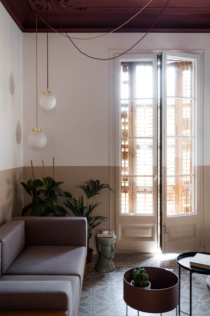
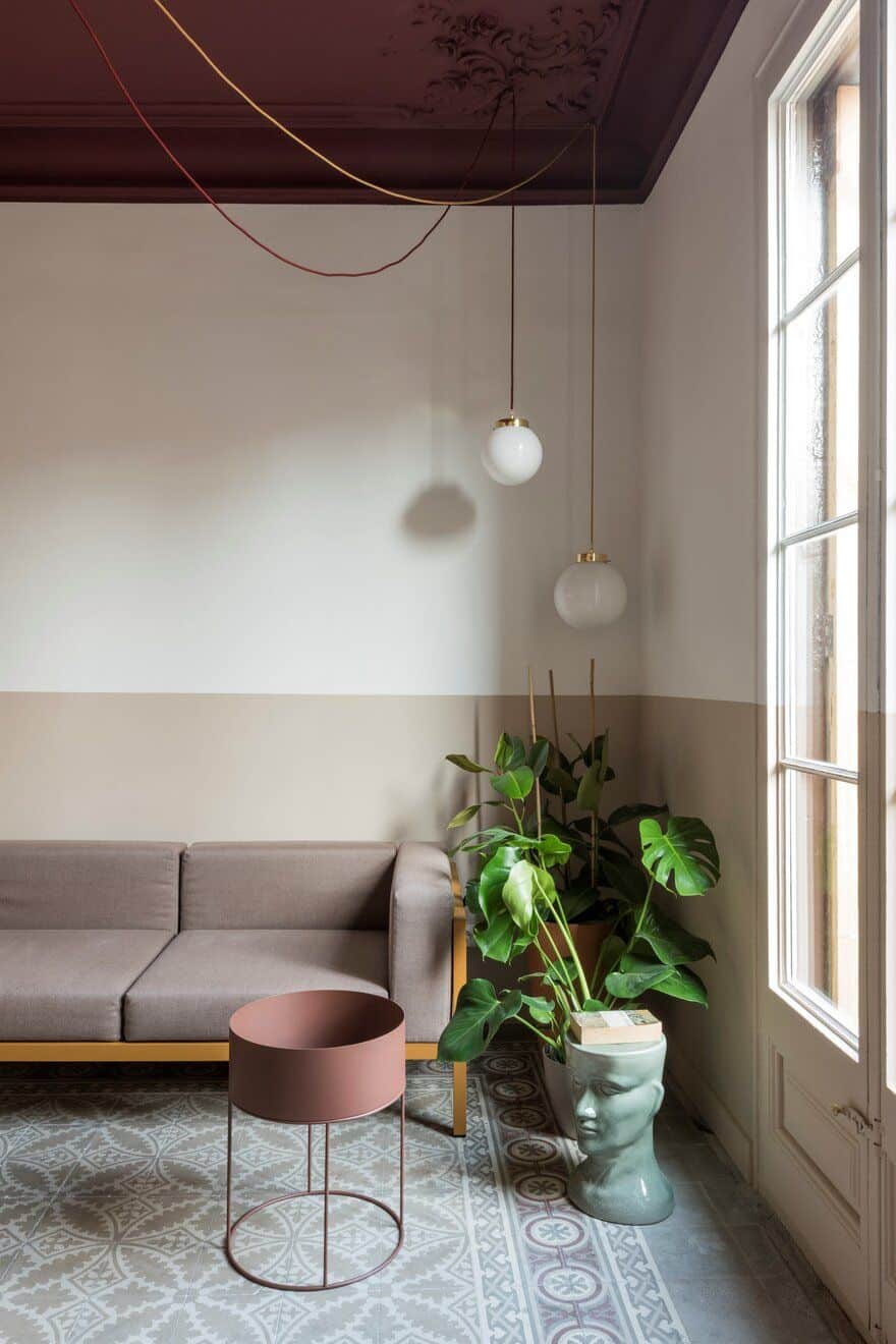
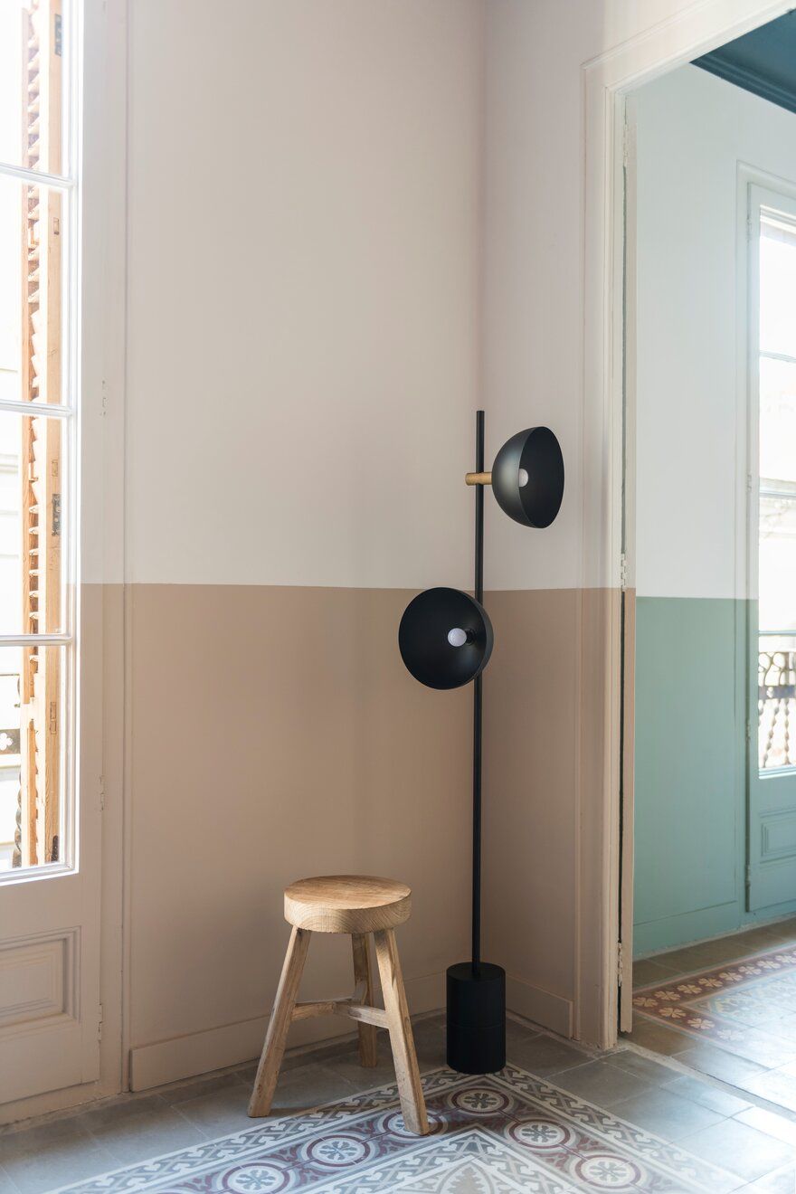
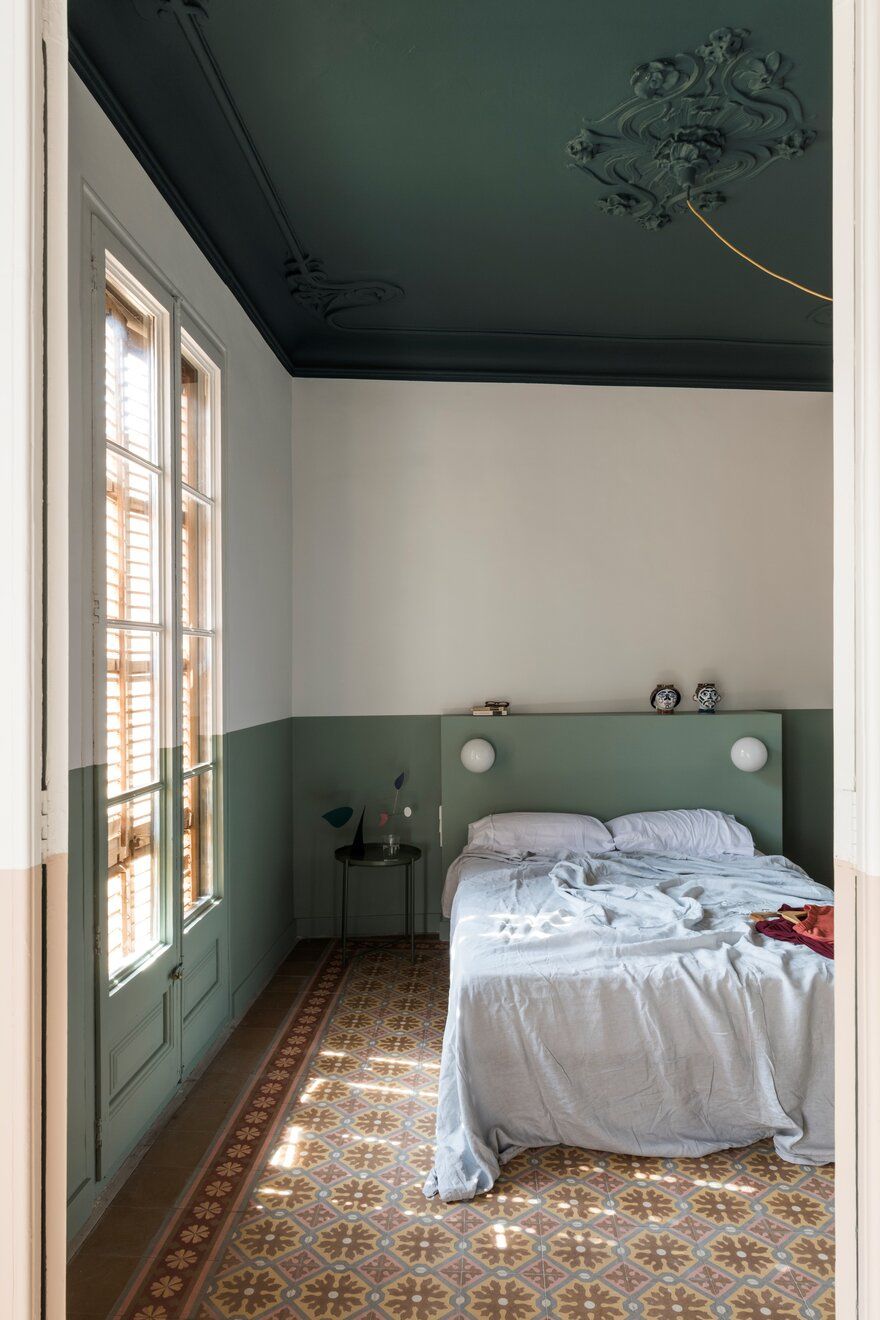
Even so, a valance runs around walls, doors and windows, giving an artificial horizon, visually widening spaces, in an otherwise vertically proportioned property. This fringe has been chosen based on the spaces and in relation to the colourful, original hidráulico floors: a more neutral sand brings warmth through entrance and living (unifying the spaces on both sides around the the kitchen block), making the burgundy and greys shades of the living floor stand out; a cooler light green colour was chosen for the bedrooms.
Ceilings have also been painted in colours: an off burgundy for the living, a dark teal for the bedrooms. The art nouveau corner plaster motifs have been restored. In the living room one of the corners had to be replaced cause of fire damage, after making a new cast of the moulding.
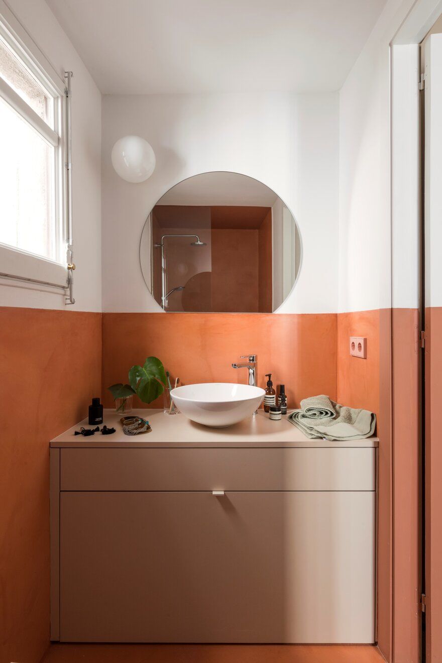
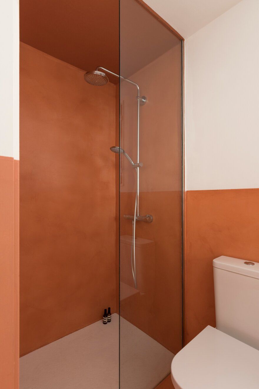
The bathroom is also treated with the brick-red micro-cement, again the valance and invading the shower space.
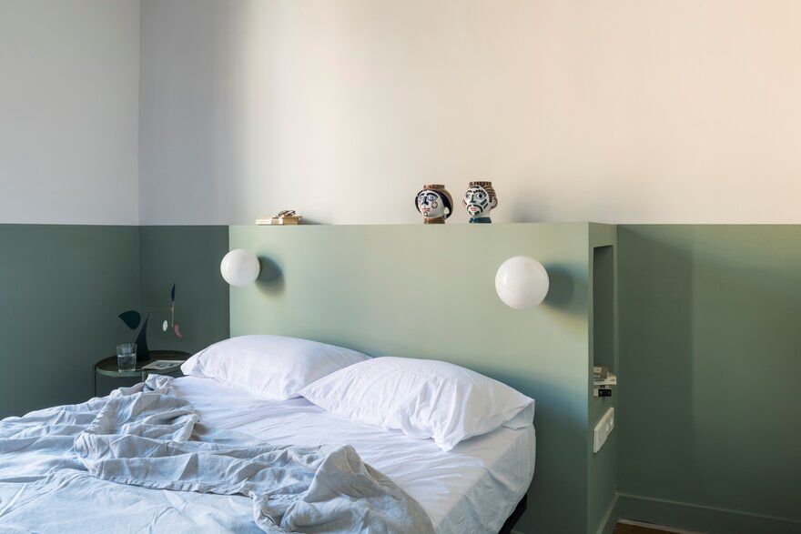
Bedrooms are simple and clean. In the master bedroom the colour fringe becomes a volume, forming the bedhead that embodies globe lights, light switches and sockets and a niche on the side where a bedside table cannot be placed.
The bedroom also features the porthole window that brings light into the studio. The bedroom has access to a small walk-in wardrobe that is part of the brick coloured block.
The children’s room has a built-in wardrobe that follows the wall colours.
All fixed furniture is bespoke. Cabinets in kitchen, bathroom, corridor and bedrooms have custom-made door handles, lacquered in colours that match their surfaces.
In the dining island, stools Edge30 by HAY. The living room has a Kettal Landscape sofa with mustard coloured frame and mink cushions, a planter by FermLiving and a Handvärk lamp by Studio Floor.
Lights throughout the Klinker apartment are done with hanging and sconces globes. All wall paints are chosen between shades of producer Benjamin Moore.

