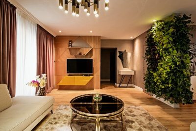
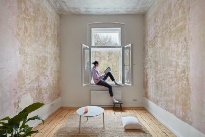
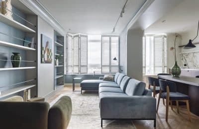
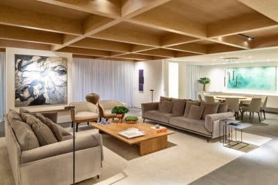
Located in the city of Pern, Lagenhet apartment was designed by Russian studio AllartsDesign.
The owner of this apartment is a prosperous business woman, loves to travel, cook and entertain guests. Recently acquired light and one-room apartment on the 22nd floor in the city of Perm. “I started with, asked his good friend from AllartsDesign, Russian designer Artemy Saranin, help me to develop the project,” – says the hostess.
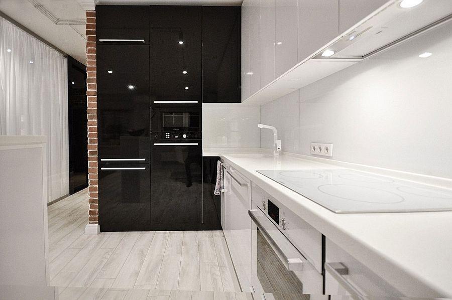
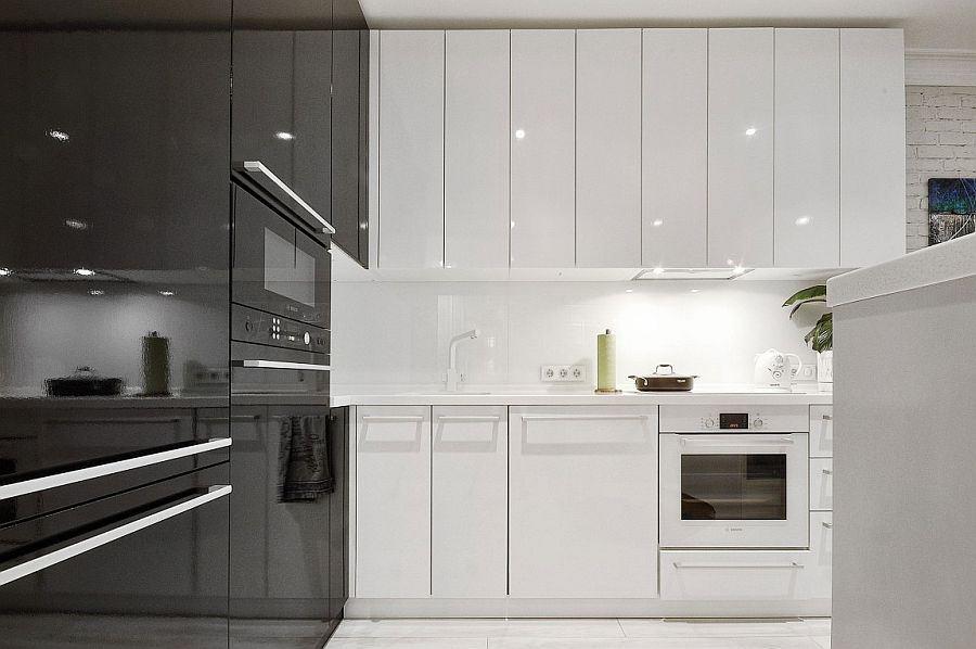
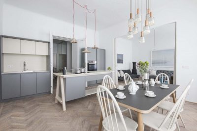
Constantly visiting in Europe, the owner wanted the design of his apartment with a European flavor. In the atmosphere, which could have been spending a lot of time with guests, have a bright bedrooms, a spacious kitchen and a mix of modern trends and Scandinavian notes. Future interior should be light and airy, as well as insolation in all areas. The task was inexpensive means to create a modern apartment with minimal forces.
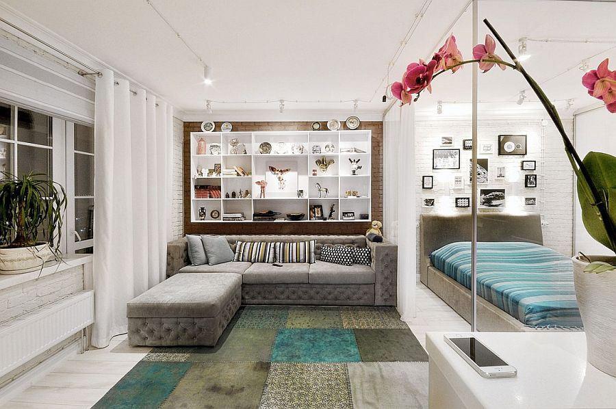
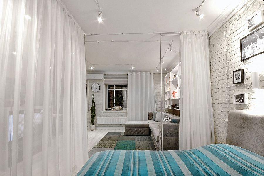
Thinking layout, we have tried to fulfill all the wishes of the owner. Firstly the apartment was only 2 windows, and the task was to have natural light in the bedroom, the kitchen and the living room as possible. Secondly needed a large wardrobe, in which it would be possible to hide all unnecessary in the interior, but right at home. And just as there was a problem of a small bathroom, which is required to locate the washing machine, toilet with sink and shower.
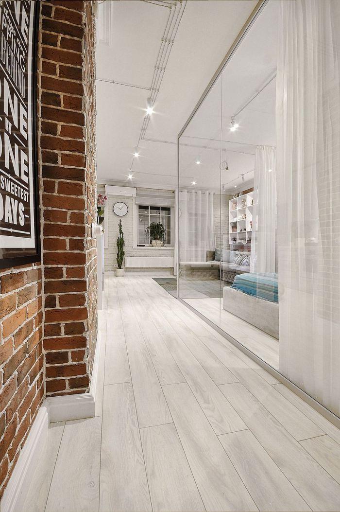
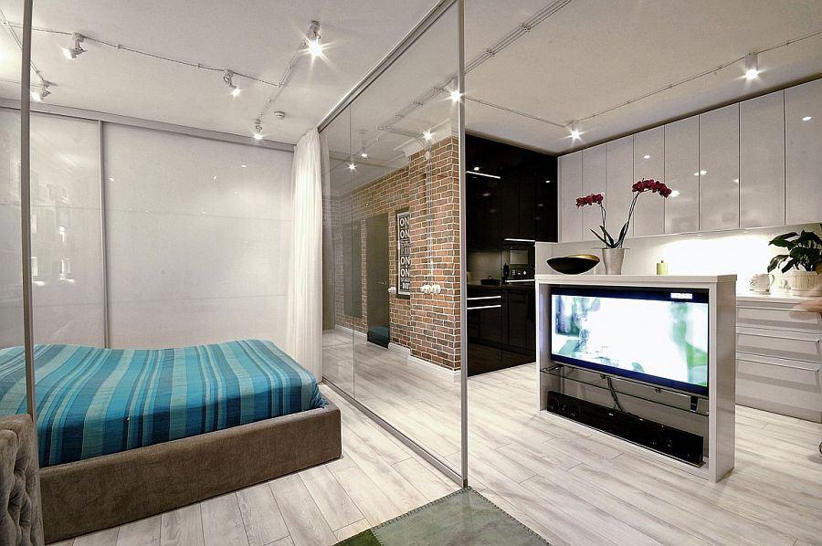
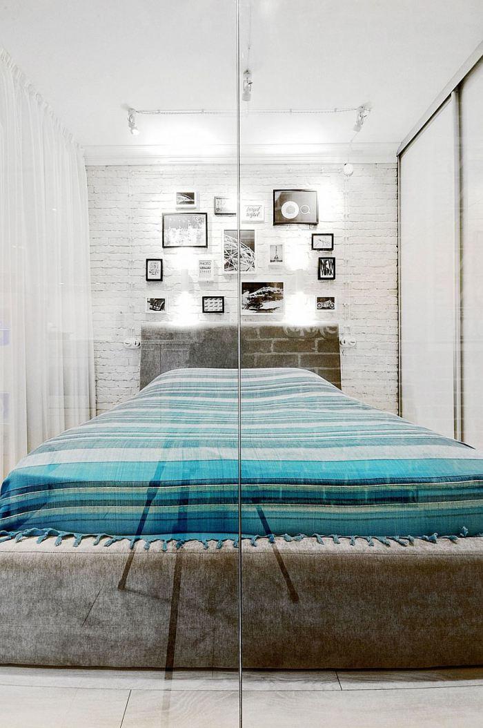
The division of areas into zones we made of glass – for sale on the perimeter light curtains. We’ve got to transform a common space in the cozy space playing lighting in the bedroom, you can get the effect of soft box, or simply push the curtain bedrooms – reduce the time to tidy.
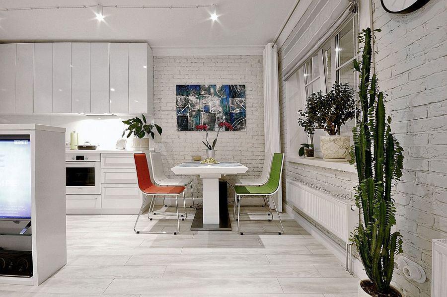
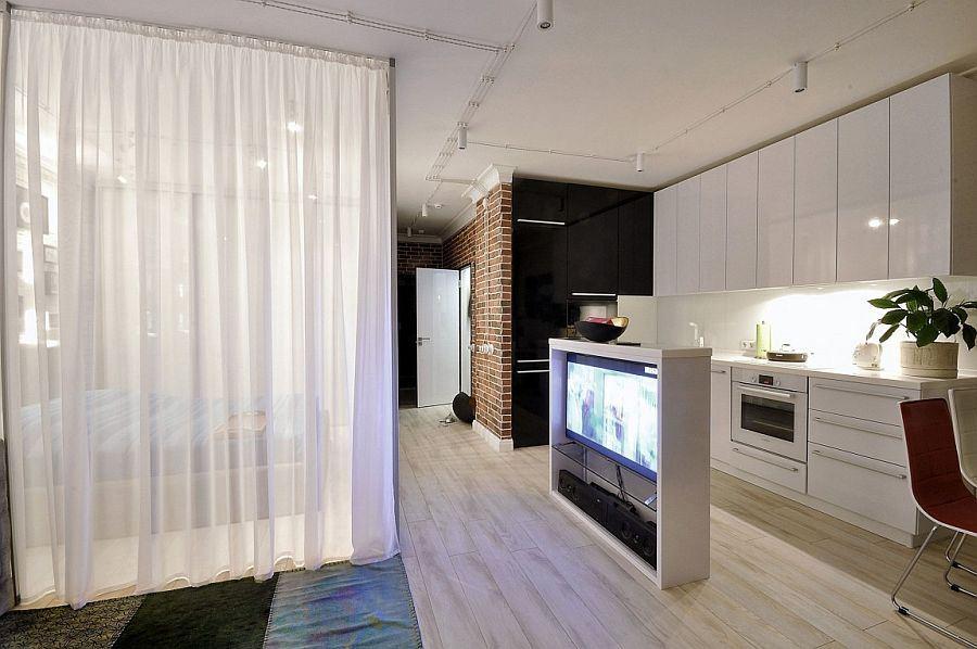
Originally proposed layout did not fit into the new concept. The hostess decided to redevelop, we have successfully placed: dressing room, sleeping area, which already is sunlight. Kitchen we appartment. And in order that you can watch TV from the bedroom and living area – we set the bar, which is mounted in the very screen, thereby dividing the area indicated by dots and functionally.
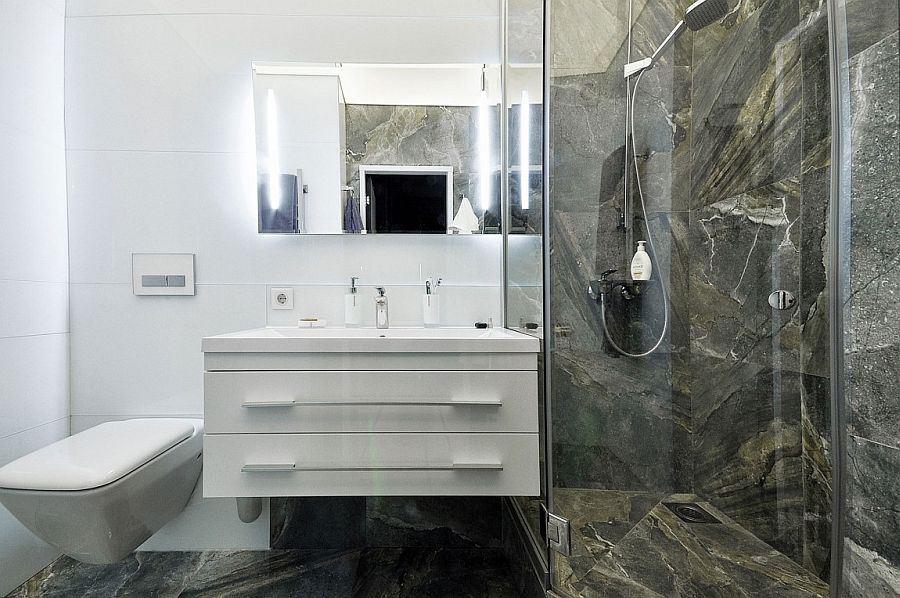
We shared a bathroom on the functional areas. On the right, on the podium, we put the washing machine, and a large water heater, which is hidden behind the mirrored door. Directly opposite the entrance, we supply more, for the room sink, which allowed us to get away from small volumes, creating the effect of space. The color palette, as planned, done in bright colors to create a color contrast accents in furniture and textiles – which is convenient to change with little investment, rather than to repaint the walls and spend the time and money.
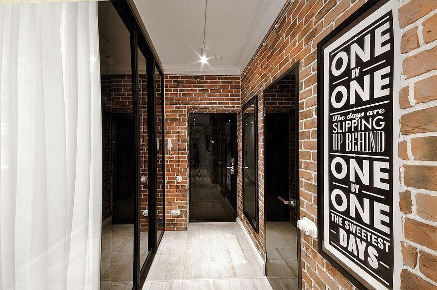
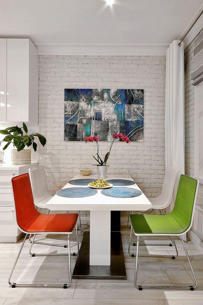
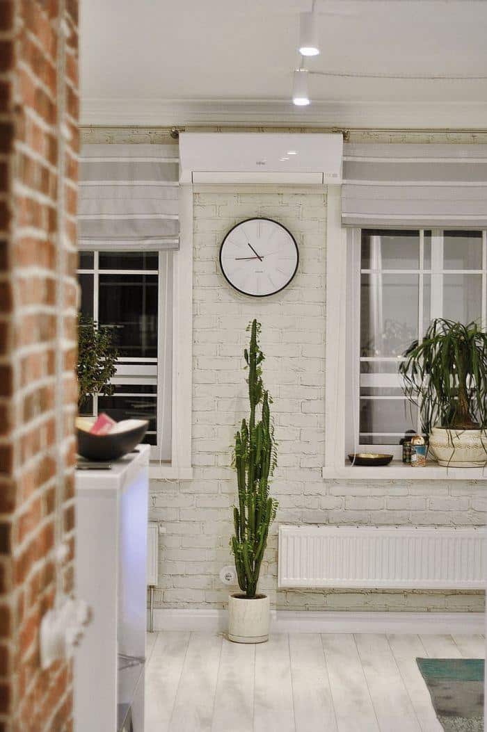
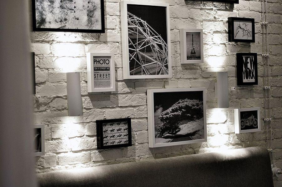
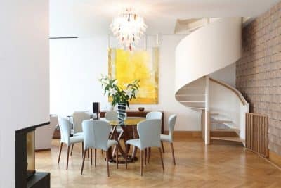
The decoration studios we used natural materials. Floors, we have made of bleached, aged ash planks and put “in Extension” wall – soundproofed from neighbors and glued brick by doing it in different colors. The corridor is made of bricks as well, making it easy to clean the surface from contamination. The ceiling of the economy and to support the overall style – just embellishing – thus we have kept high and saved again on the finish.
Bathroom we made half-painted white glass and shower area formalized natural marble. Interior doors we made to order from black Hardened glass, glued it to the plywood base, under the pens were originally filmed templates – further on them were drilled hole diameter required. Upholstered furniture we bought in Europe, the scenery from KAREDESIGN.
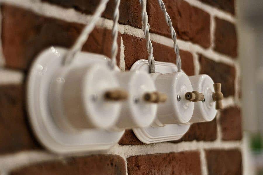
Wiring is made of retro cable in white color, and layout graphically drawn up on the walls and ceiling. Dynamic space is not overloaded with unnecessary details due to a successful integration of all necessary equipment and storage systems. Glossy surfaces reflect sunlight and along with soft lighting and create an atmosphere of undoubted comfort. All built-in furniture, doors are made specifically for this project, which gives it even more unique.

