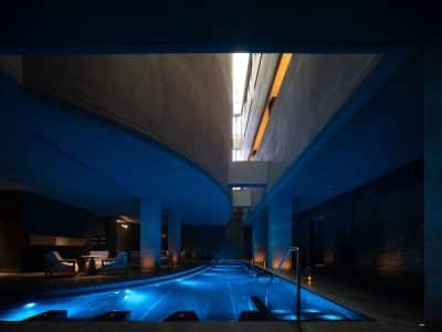
Project name: Memory Hotel of Beijing
Architecture Firm: QSY Interior Design Office (Beijing)
Lead Architect: Wang Xiaofei
Design Team: Liu Shulong, Dou Shuai
Woodwork Team: HARZ Furniture
Copper Artware: Jiude Copper Supply
Lighting Design: Benzhi Lighting
Project location: No.59 Zhenxing Road, Changping District, Beijing, China
Completion Year: 2018
Gross Built Area: 2500sqm2
Photo credits: Shi Yunfeng
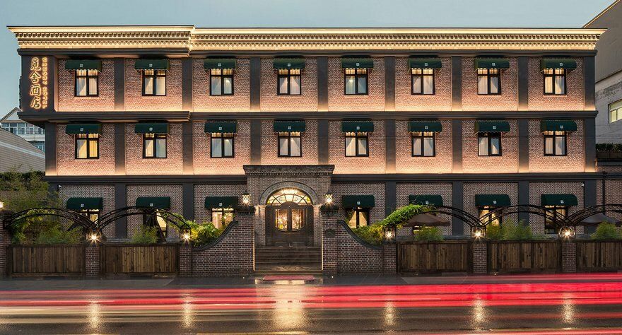
Architecture serves as witness to historical changes. Memory Hotel locates in Changping District of Beijing City. It is designed by Wang Xiaofei, the founder of QSY Design Office. The hotel demonstrates contains various special features in regards to culture, art, and architecture.
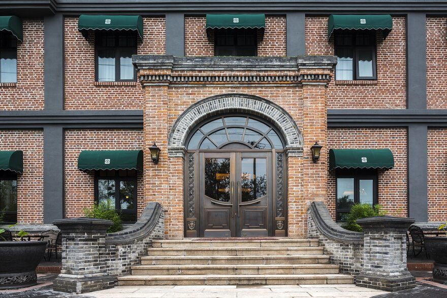
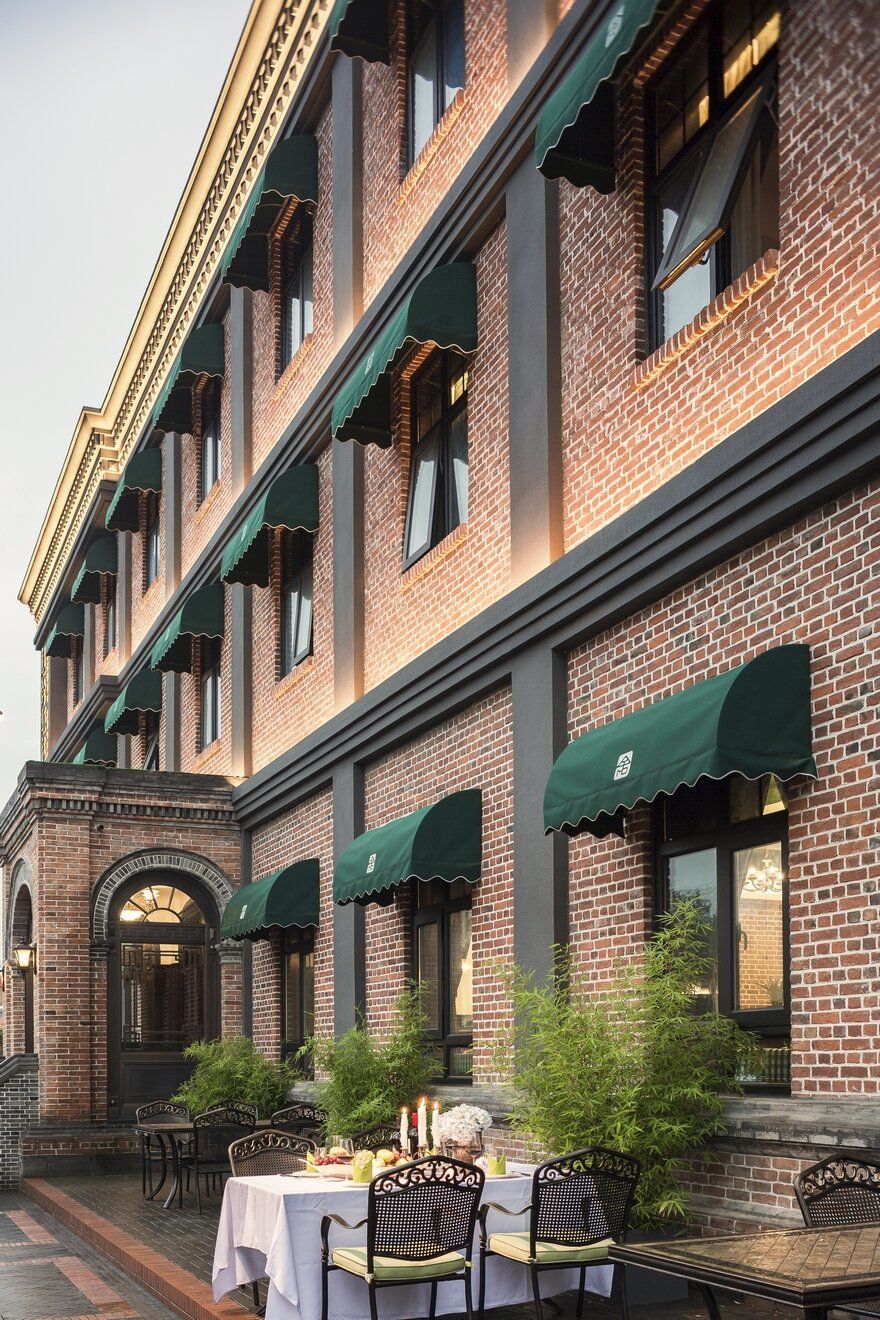
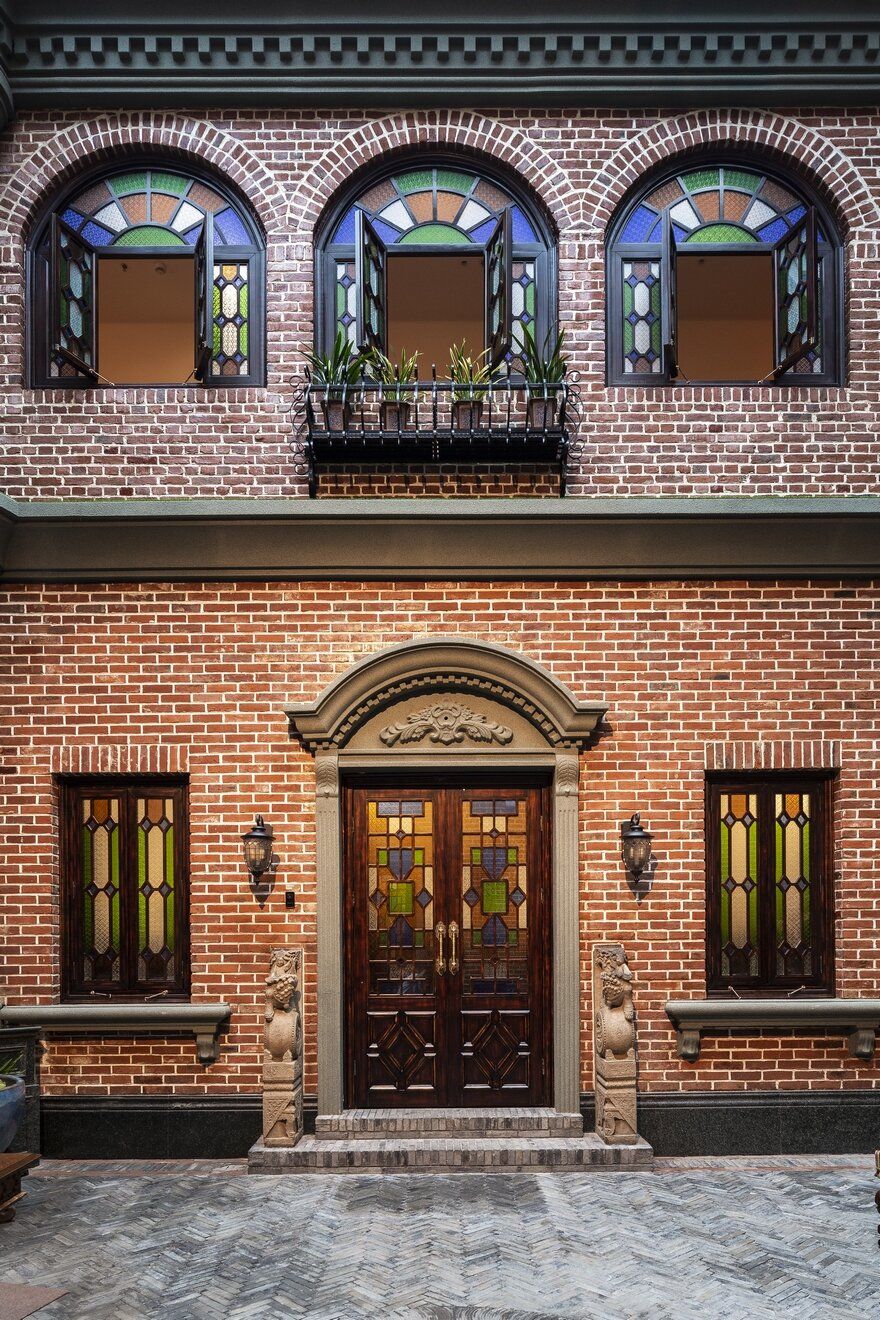
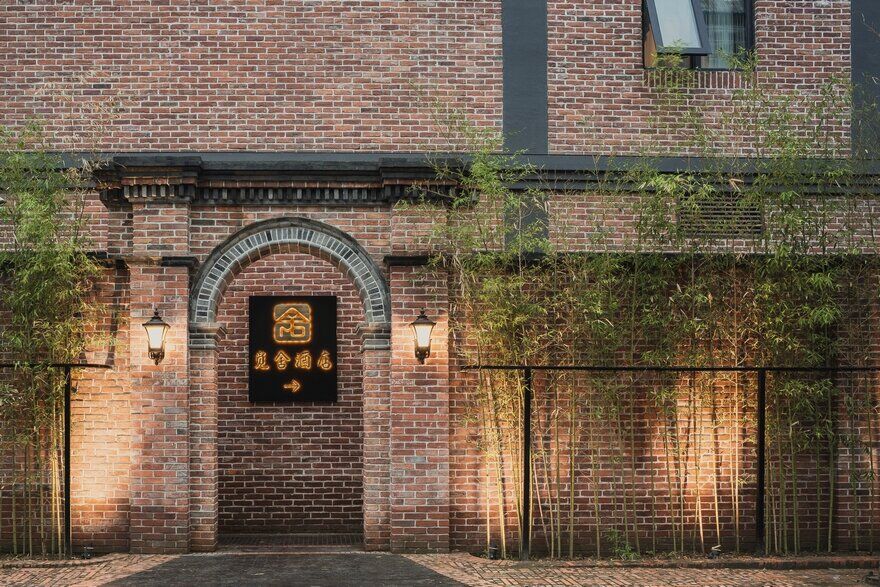
Wang believes the hotel should maintain perfect integration between inspiration and presentation. The inspiration of the architecture came from buildings in Republic of China period. Such buildings retain traditional Chinese style while absorbing western elements, showcasing the transition period into modern era. The red bricks of the exterior are clay bricks from ROC period, capturing unique historical sensation.
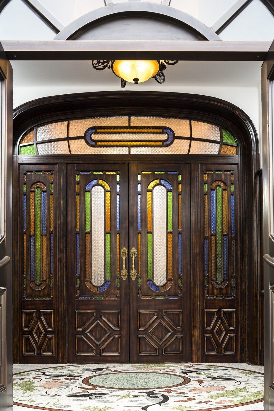
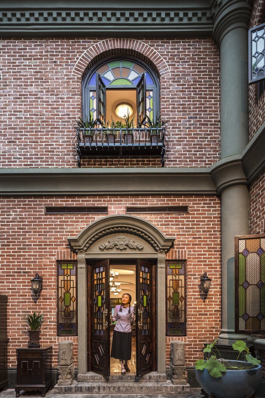
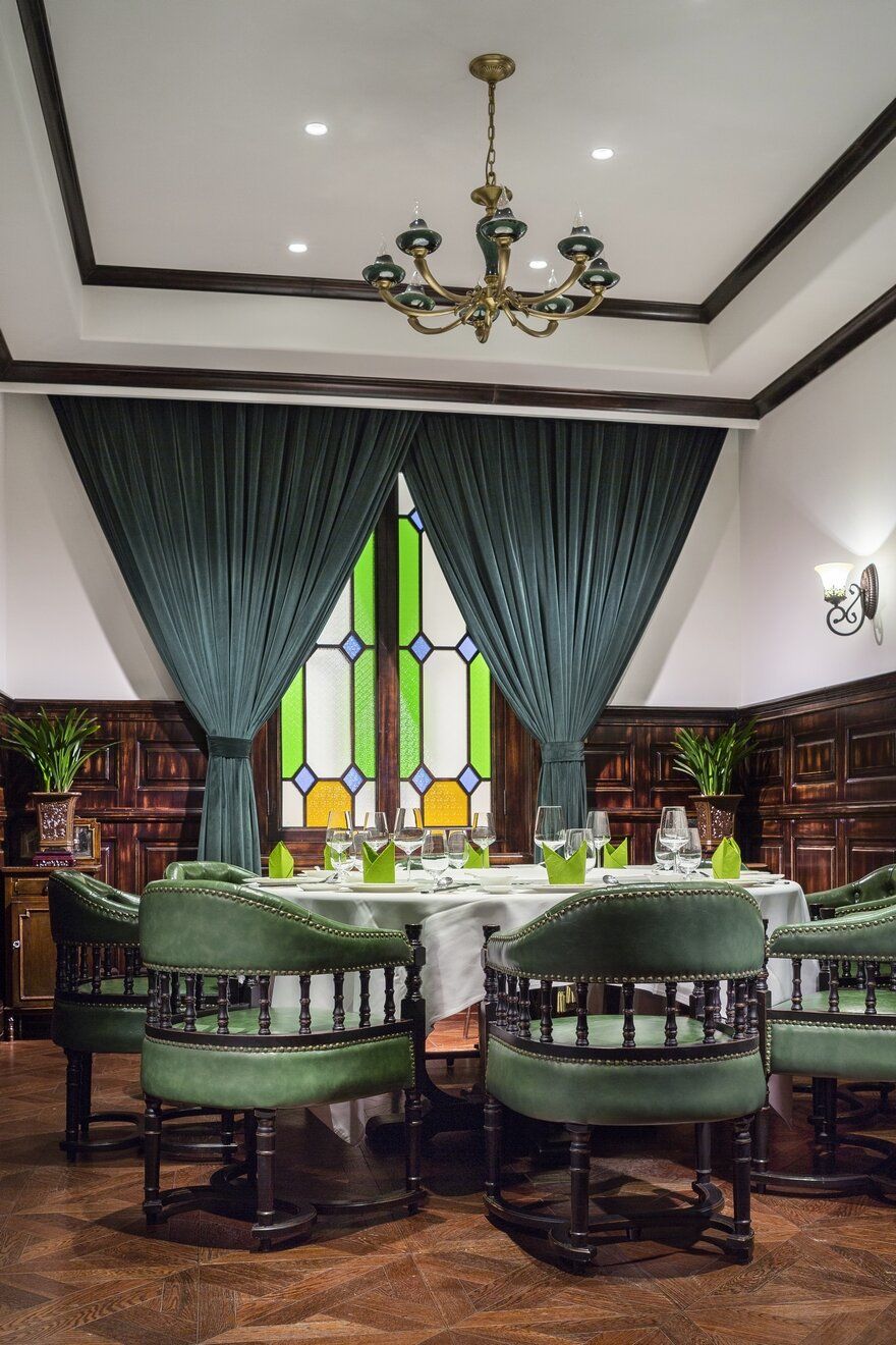
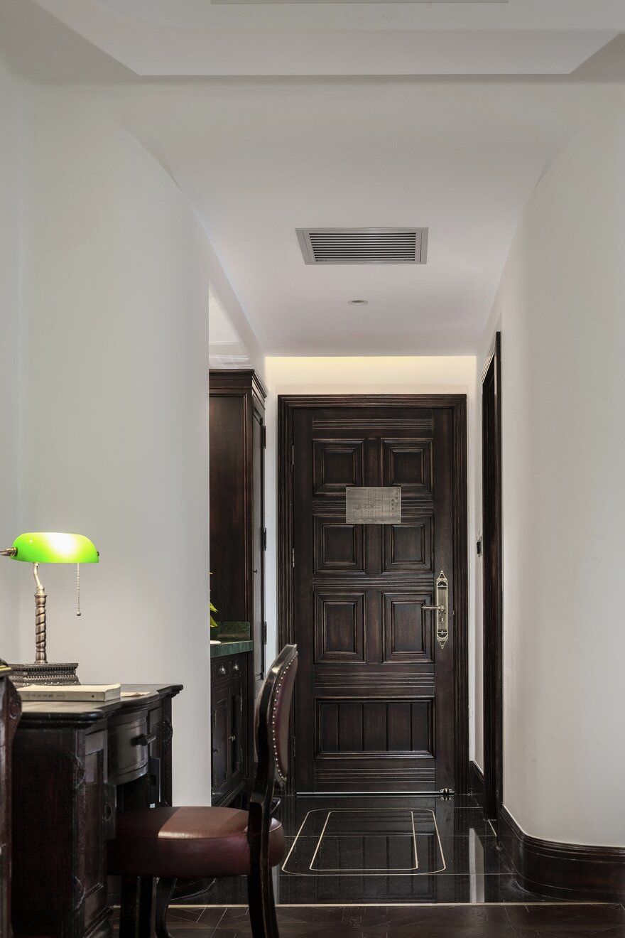
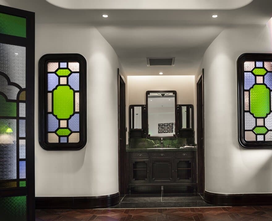
The designer intentionally placed a hallway at the entrance, reminding visitors that they are separated from outside world. The unique door is crafted specifically for the interior space, with mosaic glass embedded on it.
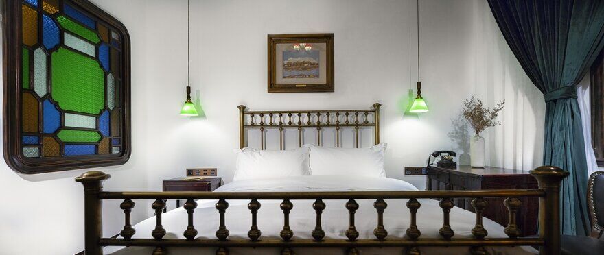
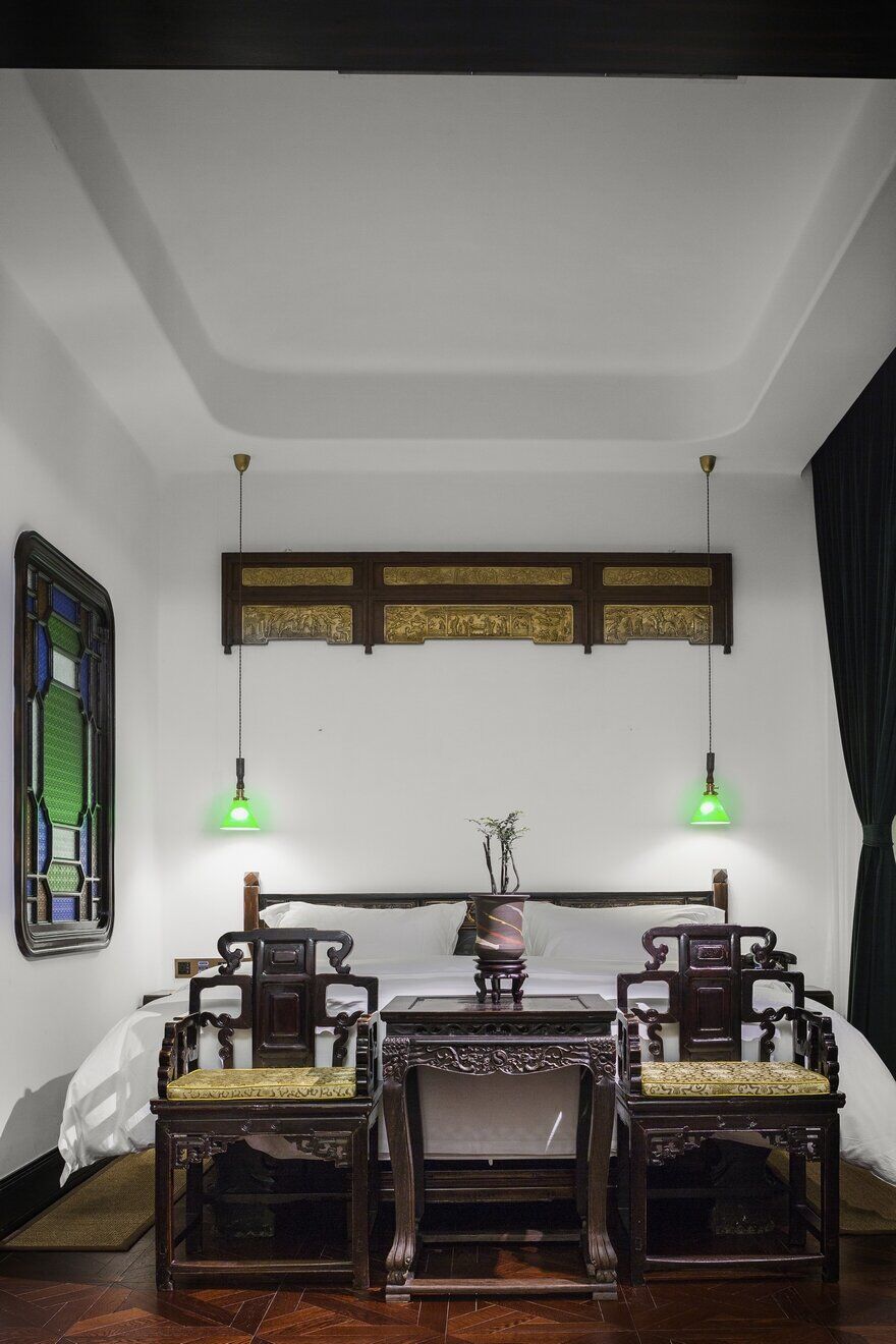
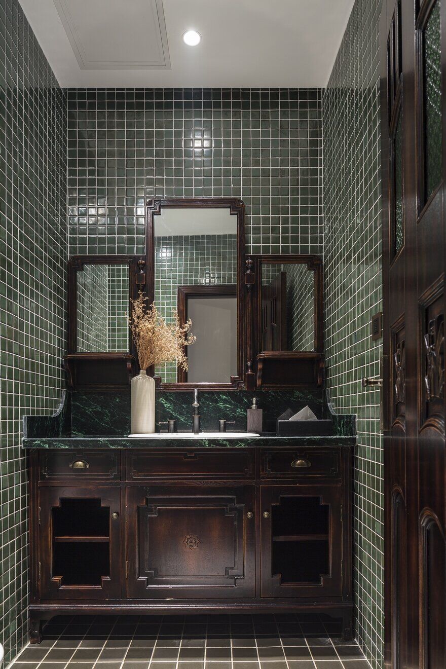
Visitors may observe more than three hundred pieces of aged furniture in the space.
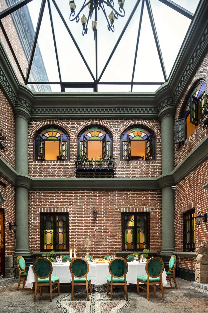
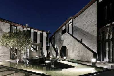
The hidden garden becomes a relaxing place for visitors.
The tall arch surrounds the garden, which faces the gate.
Exquisite windows of various sizes have been through meticulous test, guaranteeing the lighting ability, comfort, and design aesthetic sense to the space.
Bar locates above the garden, while its outdoor zone provides excellent view. The shape of pyramid integrates perfectly with red bricks, which becomes the favorite scene of the designer.
It would be sad for an ancient Asian city to lose its own artistic features. Wang intends to harness the essence of ancient arts, and improves upon it.
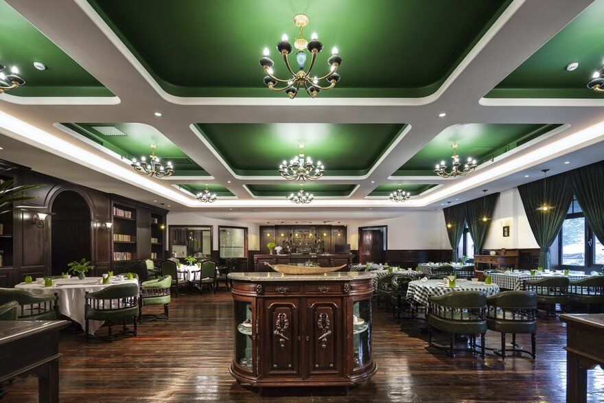
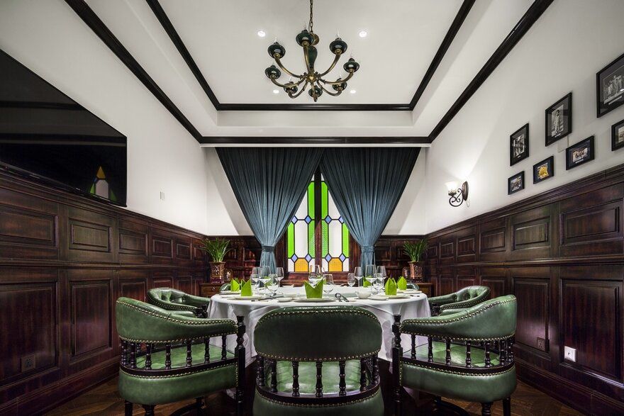
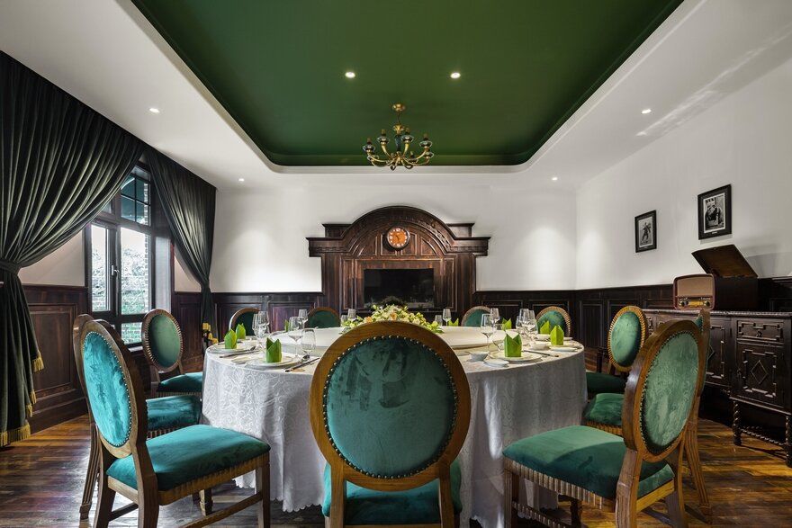
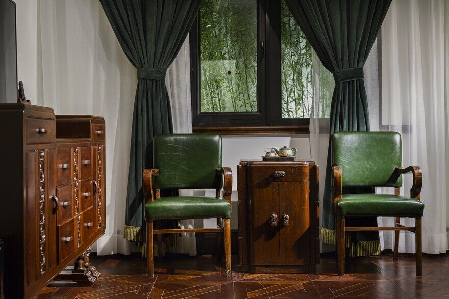
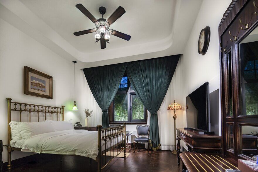
The original colors of the materials are preserved, such as the color of wooden floor and wall, in addition to green, which gives the space a natural element.
Space should be natural and cultural at the same time. Designer should base their creations on details of material, color, and circulation.
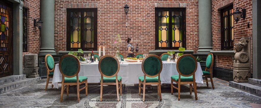
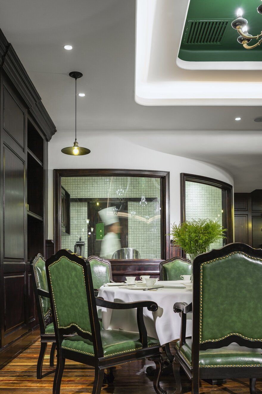
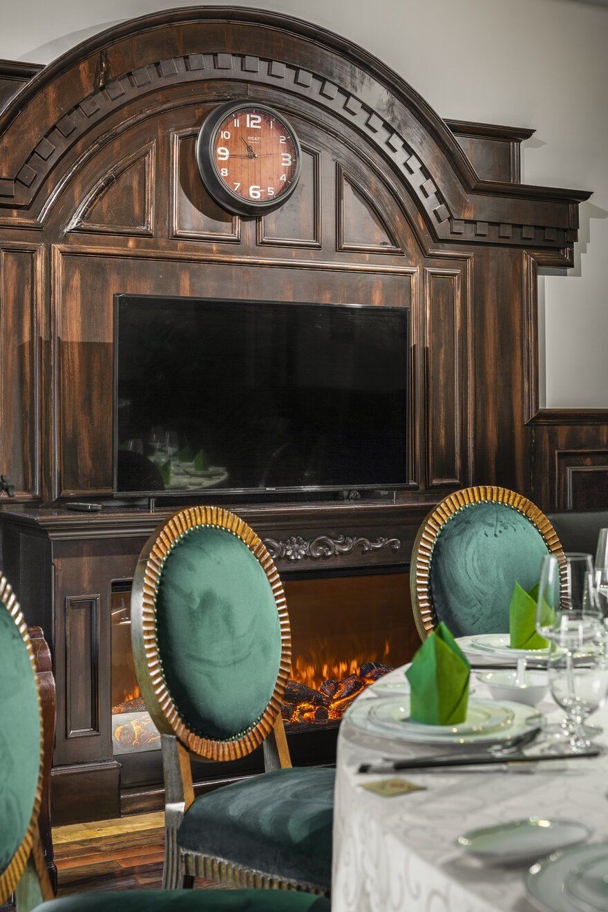
Malachite green shutters echoes the green of chair. The symmetrical grid pattern of the window frame further enhances the elegance of dining.
The general color tone expands throughout the dining hall, which maintains the wholesomeness of the design. The space also retains beauty of traditional objects.
The designer said, “Liberate and diversify the space.” He renounces modern and fixated designs, throwing away formatted works, and created a comfortable design that is both ecological and sustainable.
In addition, arched wall lessens visual sharpness, while round corners and windows create a sense of comfort, dissolving fear toward unfamiliar environment.
All windows are uniquely crafted that if they are closed in any space, exterior sounds would be completely blocked. The design of the courtyard offers the sight of plantation to the room, and provides clean air.
To designers, it is important to incorporate human sensation into the design, regardless of the complexity of work.

