Project: Palau Apartment
Architecture: Colombo and Serboli Architecture
Location: Barcelona, Spain
Area: 80 m2 + 18 m2 mezzanine
Year: 2022
Photo Credits: Roberto Ruiz
Text by CaSA
Palau Apartment is located on the third floor of an ancient building nearby the famous Palau de la Música in the heart of Barcelona. The client is a young Italian fashion designer that fixed his residence in the Catalan capital.
Visiting the property, the architects were immediately struck by the open space proportions and five-meter high ceilings. Accordingly, the architects proposed a more daring refurbishment then the one initially envisioned by the client that was focused only on a new bathroom and closet.
The project highlights and embodies several charming existing elements such as the massive wooden beams and wooden floors, the mezzanine overlooking the living area, and the two-floor metal windows. A solution was needed to rationalize a very compact bathroom and substitute stairs to the second level due to structural problems.
The property is extremely quiet, overlooking silent courtyards of the old part of Barcelona.
The client looked for an equally calm, neutral palette of materials and colors and preserve and enhance the property’s atmosphere and to “keep it simple and warm”. The designs solutions are informed by the client’s desire to keep the appeal of original elements and weathered materials.
The architects decided to face the project through a ‘wabi-sabi’ approach that could easily incorporate original features and imperfections, while retaining the charm of the Palau apartment.
Shapes are simple, bold, with recurring basic forms: squares, circles, spheres – while sturdy solid surfaces were used to combine the monumental language of existing elements.
The architects immediately found a resemblance between the apartment’s spaces and the architecture of Luis Barragán, always a reference for the firm. The work of Carlo Scarpa is also suggested in the sculptural stairs and furniture piece, central to the space, that defines the whole project.
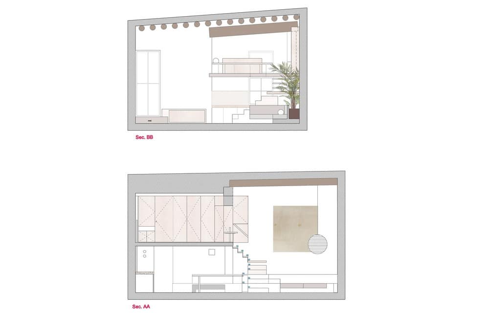
The concept is built around the idea of a multifunction block, a layered central element, around which the space and activities develop. The layout has been kept completely open, loft-like.
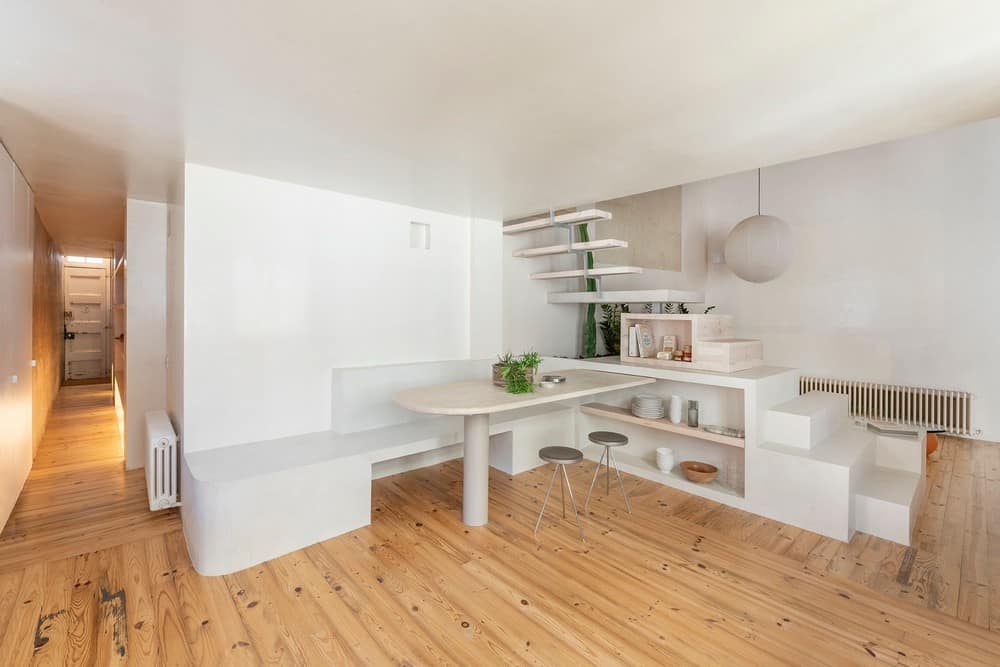
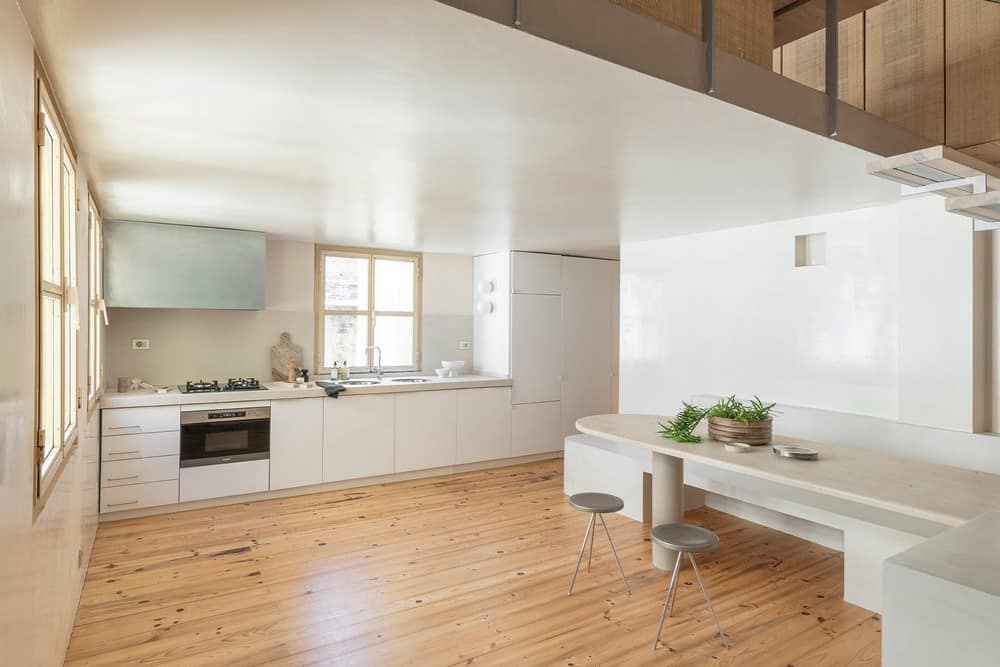
The existing entrance corridor is narrow, but sided by a bookshelf and a featuring a rough wall displaying layers of previous ancient stucco. It, leads to the kitchen space, wide and bright with square windows overlooking planted courtyards.
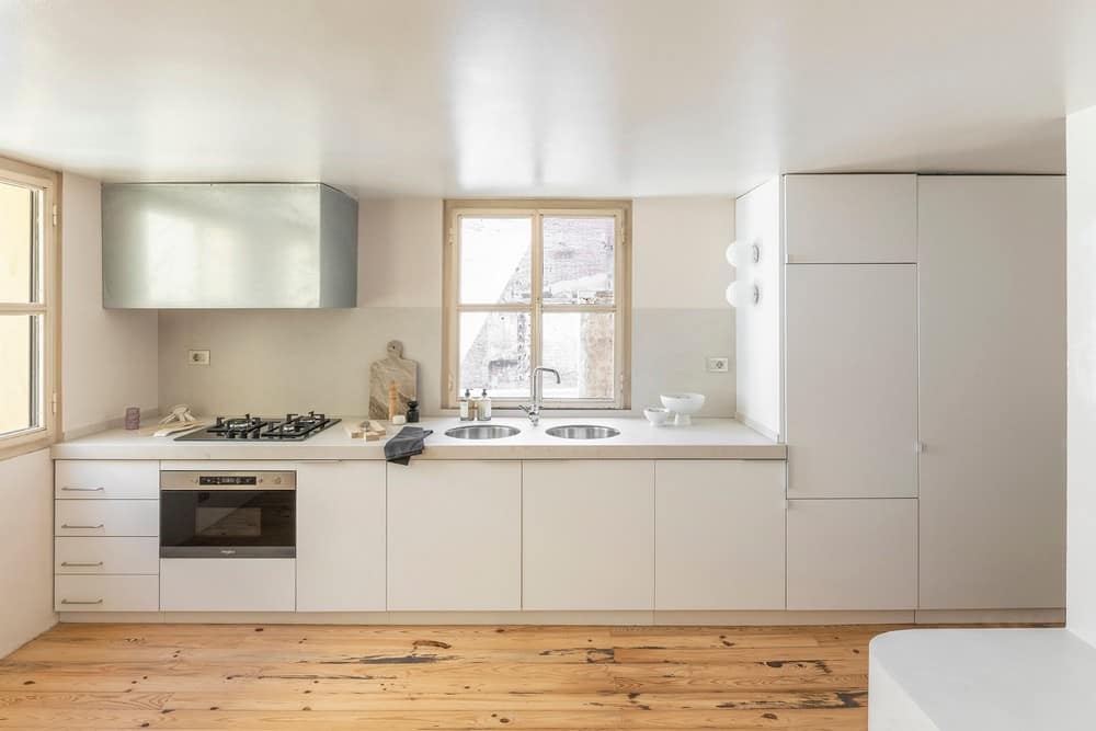
The kitchen is simple and white, with porcelain countertops and backsplash, globe lamps and a bespoke brushed steel kitchen hood above the hobs.
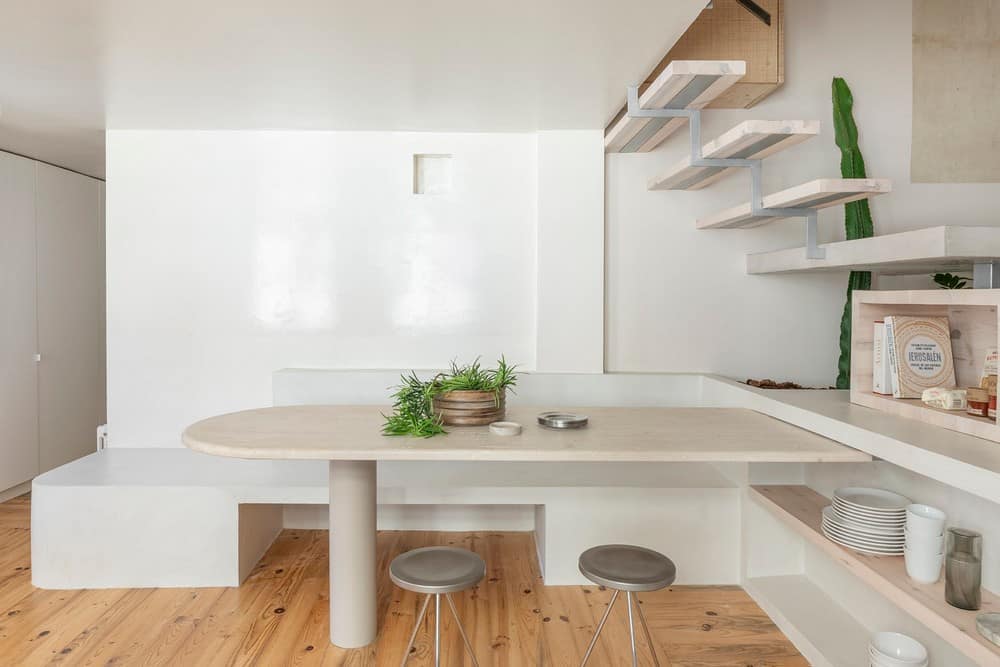
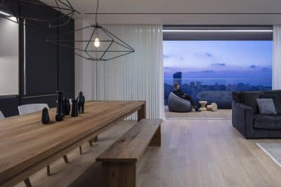
The dining area grows out of the central stair element. On the kitchen side the block contains niches, and openings and shelves for to contain tableware and a pantry. A massive, arch-shaped slab of travertine marble protrudes out of the block to create a one-legged dining table and bench.
A little square niche hides a spotlight, a disguised sconce.
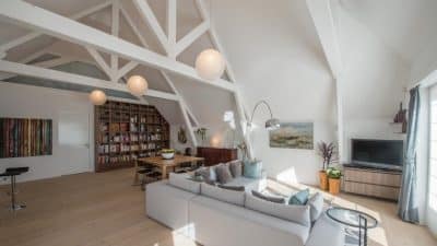
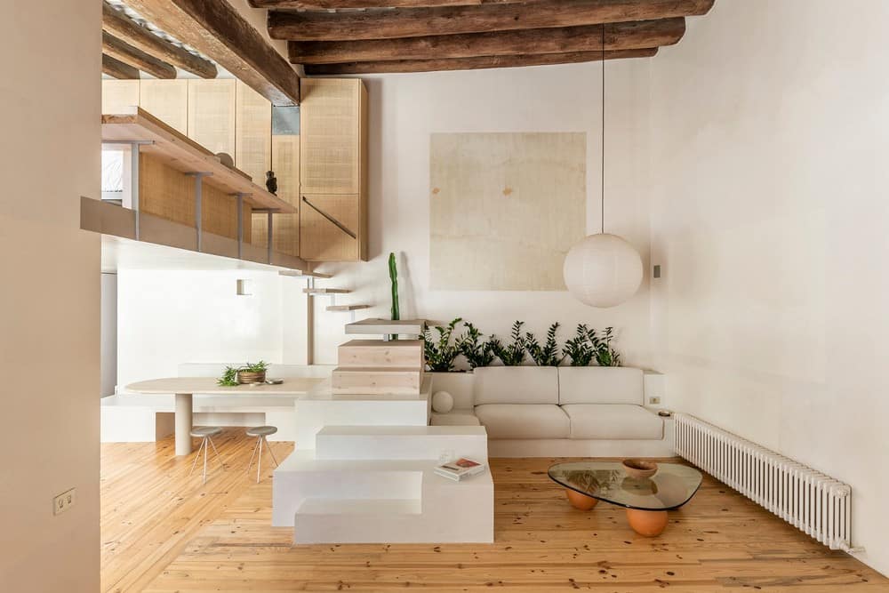
Once passed the multi-purpose stairs-block, a double height space opens up, the living area. This is a very airy space with its five meters height and monumental, ancient timber beams.
The stairs plinth forms a made to measure masonry sofa: the L-shaped seat, with bespoke cushions in a tactile bouclé fabric.
Its backrest doubles as a planter to be filled with houseplants crowning the simple sitting. Hovering above the area is the sphere of a delicate paper lamp, a Japanese reference.
A big, square patch of ancient stucco was preserved atop of the living seat, adding layers of history to the space.
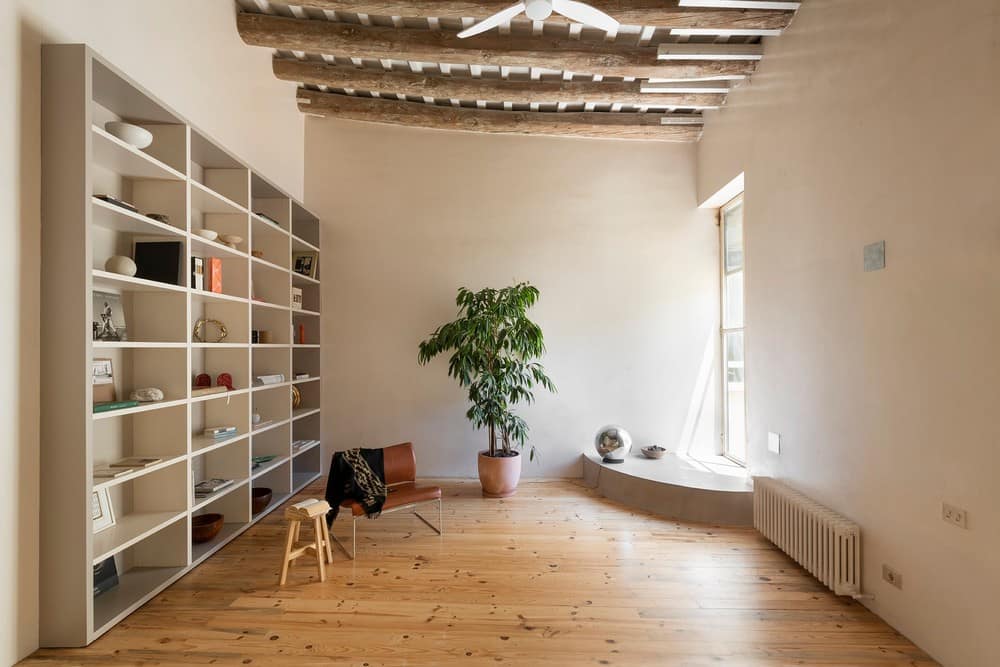
The living area has a double height corner window, at whose feet a round plinth has been built, covered in micro cement, generating a special corner in the natural light of the window, with views on the courtyard, perfect for reading.
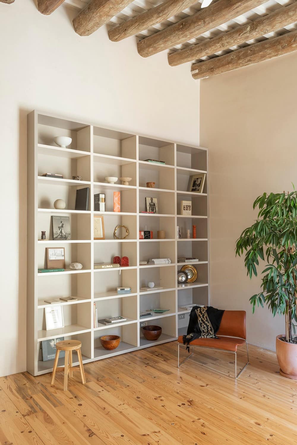
Opposite this window, a solid, wide, 3,5m height bookshelf in neutral colors will slowly host the client’s collection of objects and books.
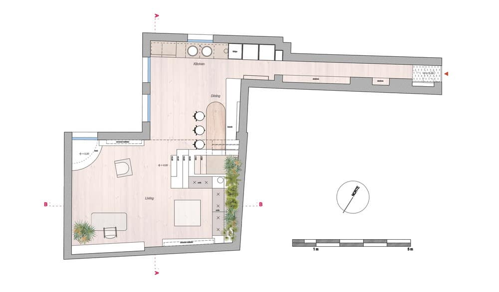
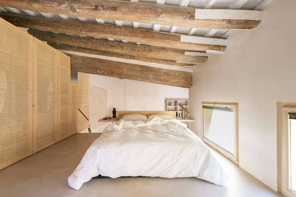
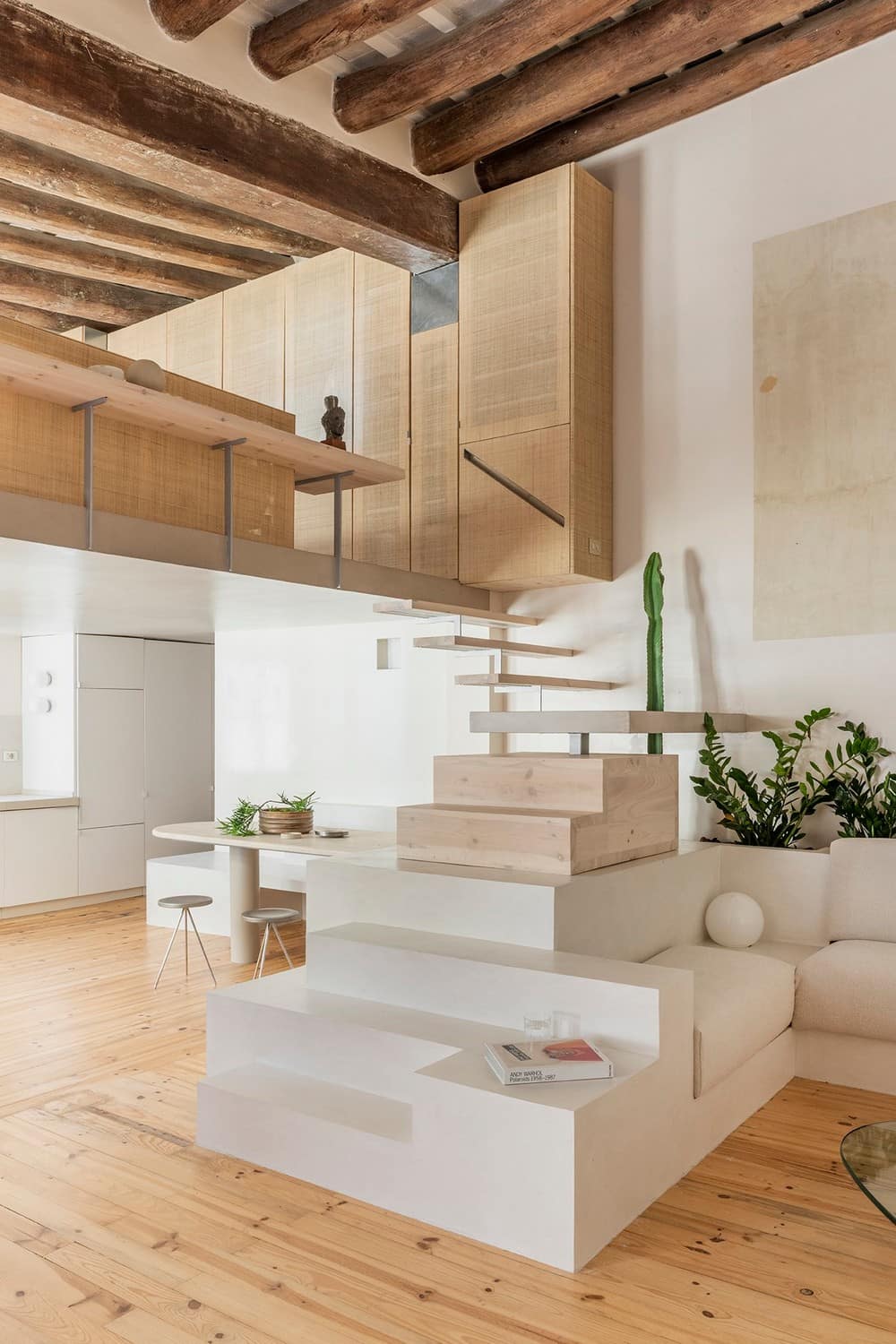
The stairs are conceived as layers of materials, connecting the two levels, getting lighter as they go up. The initially solid plinth is surmounted by steps as a wooden box.
Then stairs bend into a suspended micro- cement landing with a half-circle shape cut out that allows a taller plant to grow through it.
The last few steps, in light color wood are floating atop, doubling as light source above the dining table, thanks to a trim of LED lights.
On the second level, the bedroom area is open onto the living. A wicker panel functions as both headboard and balustrade.
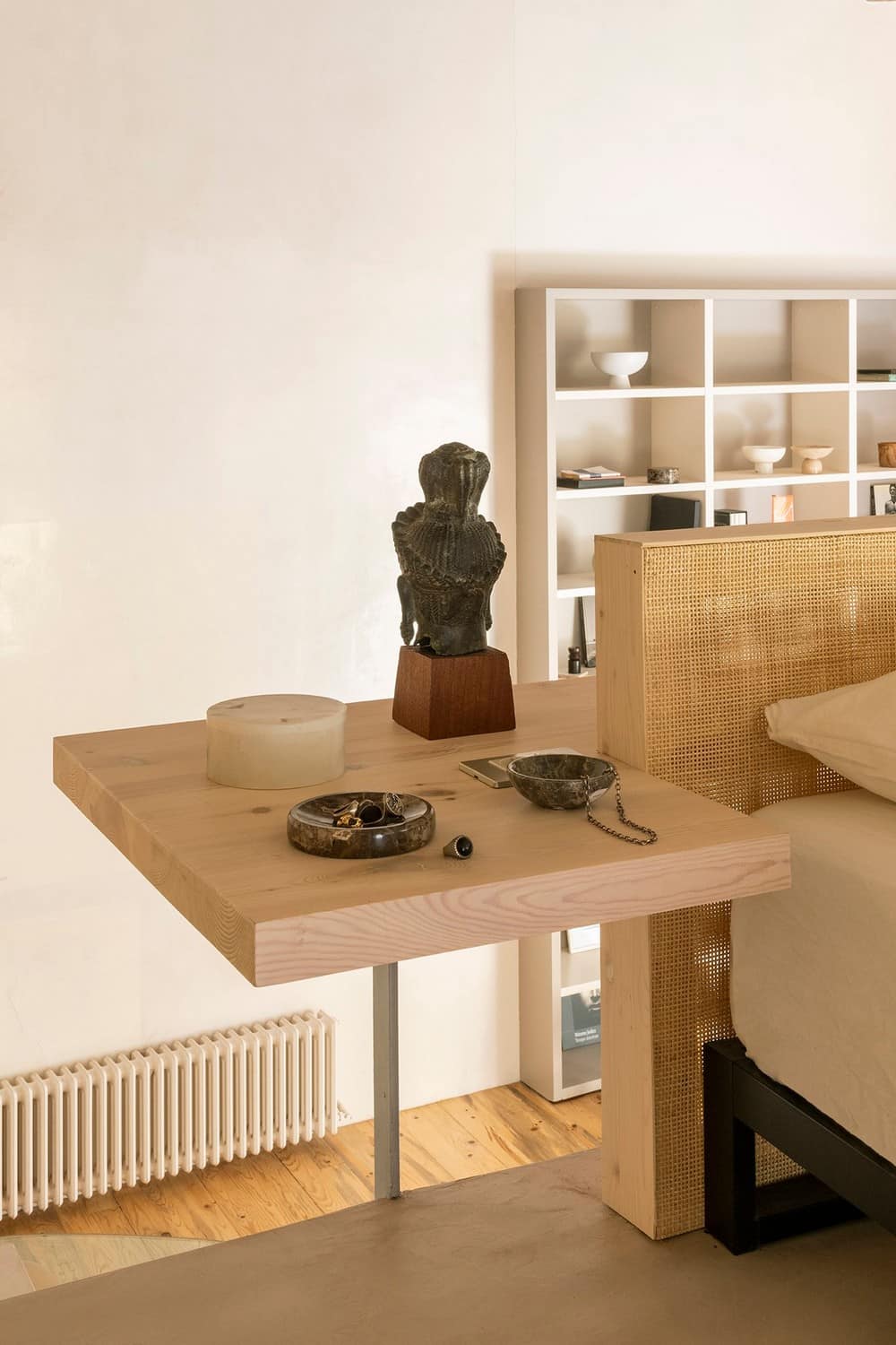
Around it runs a ledge, suspended in the double height space – a quote from Halston House, the 1960s Paul Rudolph’s project in New York. This forms two bedside tables at the extremes, as well as a display shelf for special pieces, overlooking the double height space of the living area.
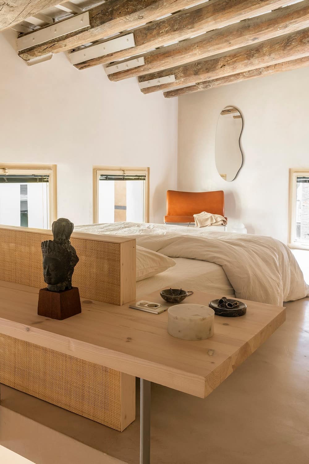
The closet dominates this space, as a warm monolith, clad in woven wicker screens. One of these screens hides the door to a compact bathroom, while another conceals a washbasin in a mirrored box, placed within the bedroom to save space un the restroom.
A third wicker panel embodies the stairs handrail, through a diagonal cut.
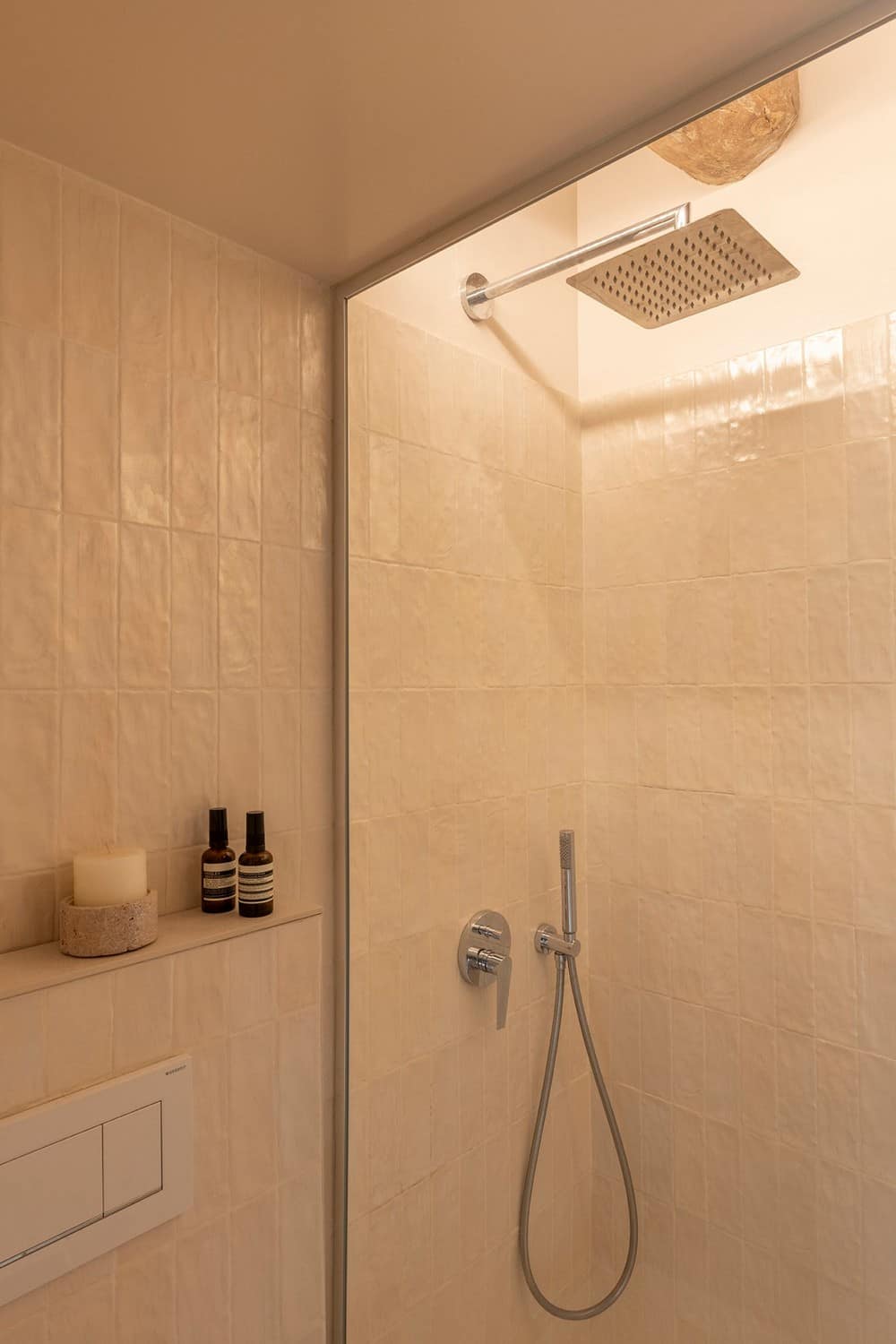
The bathroom is covered in vertical ceramic tiles with an elegant nacre finish, adding a new texture to the matt-to-shiny palette of neutral shades of the Palau Apartment.
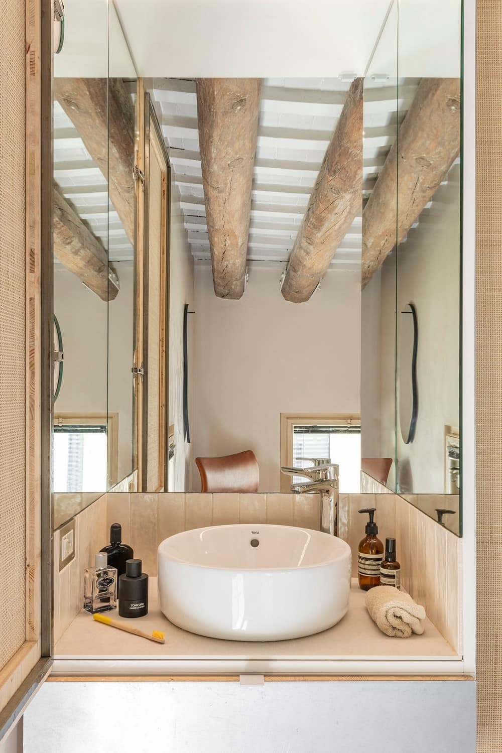
The architects played with different finishes – from glossy to rough – the otherwise neutral palette.
Materials have been selected with, tactile, texture-based criteria: white micro-cement for the stairs and seats block, light natural wood, woven wicker panels, etc. Enamelled painted walls reflecting the light contrast with matt micro-cement, rough travertine slab and porcelain kitchen tops. A textured bouclé fabric was picked for the seat cushions. Brushed steel details complete the palette, like in the bespoke cooker hood.
The simple furnishings (that will be expanded by the owner) include a low glass table with terracotta sphere feet as well as vintage pieces like the steel three legged stools of the dining table, and two leather seats.
