Project: Penthouse in Prague
Architects: petrjanda/brainwork
Author: Petr Janda, lead architect
Design team: Anna Podroužková, Maty Donátová
Location: Prague, Czech Republic
Gross Floor Area: 358 m²
Usable Floor Area: 275 m²
Completion year 2020
Photographer: BoysPlayNice
Idea
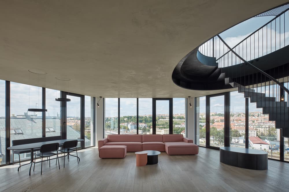
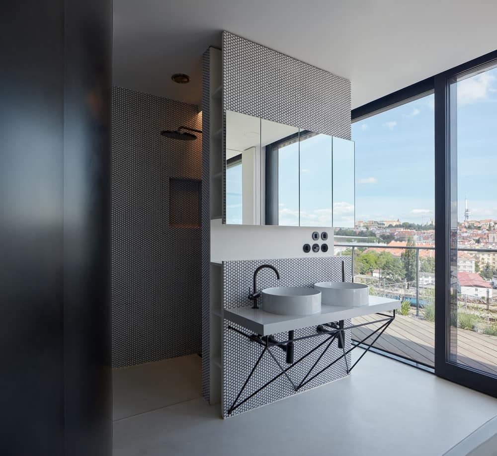
The main idea is to blur the boundaries of the apartment and emotionally draw the city into its interior. The space of the apartment is not limited within the physical layout, the city surrounding the building becomes part of it and the added facade glazing only maintains the comfort of the indoor climate, connecting the city into an extended peripheral perception. The original apartment was rebuilt into a penthouse: a house on a house.
The site plan concept is based on the character and potential of the “site”; in this case, two roof-top floors in a corner house on the border of a built-up area that opens across the valley into the extensive context of distant views.
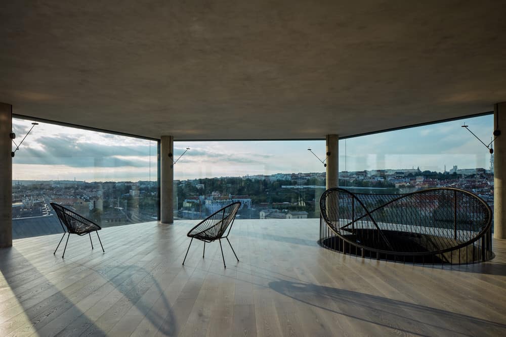
The architectural design draws on the unique superposition of the penthouse above all surrounding buildings and takes advantage of the panoramic view. It revises the impact of the compromising reconstruction done by a developer towards the original genius loci of the building, clarifying all the detailed relationships between the exterior elements, especially in the large-area glazing in the upper floor of the tower, allowing a spectacular view from all windows with minimal division of individual glazed areas. As it is not possible to work with the historical connotation in the part of the building we designed (it is a superstructure, partially re-created corner tower of the original water reservoir with added wings) and it is a reconversion for typologically different use (housing), we do not work with the debatable “industrial” character of the building or with aestheticism with clear loft features. The leitmotif is the free and continuous flow of the interior throughout the space and its endless optical continuation into the surrounding city.
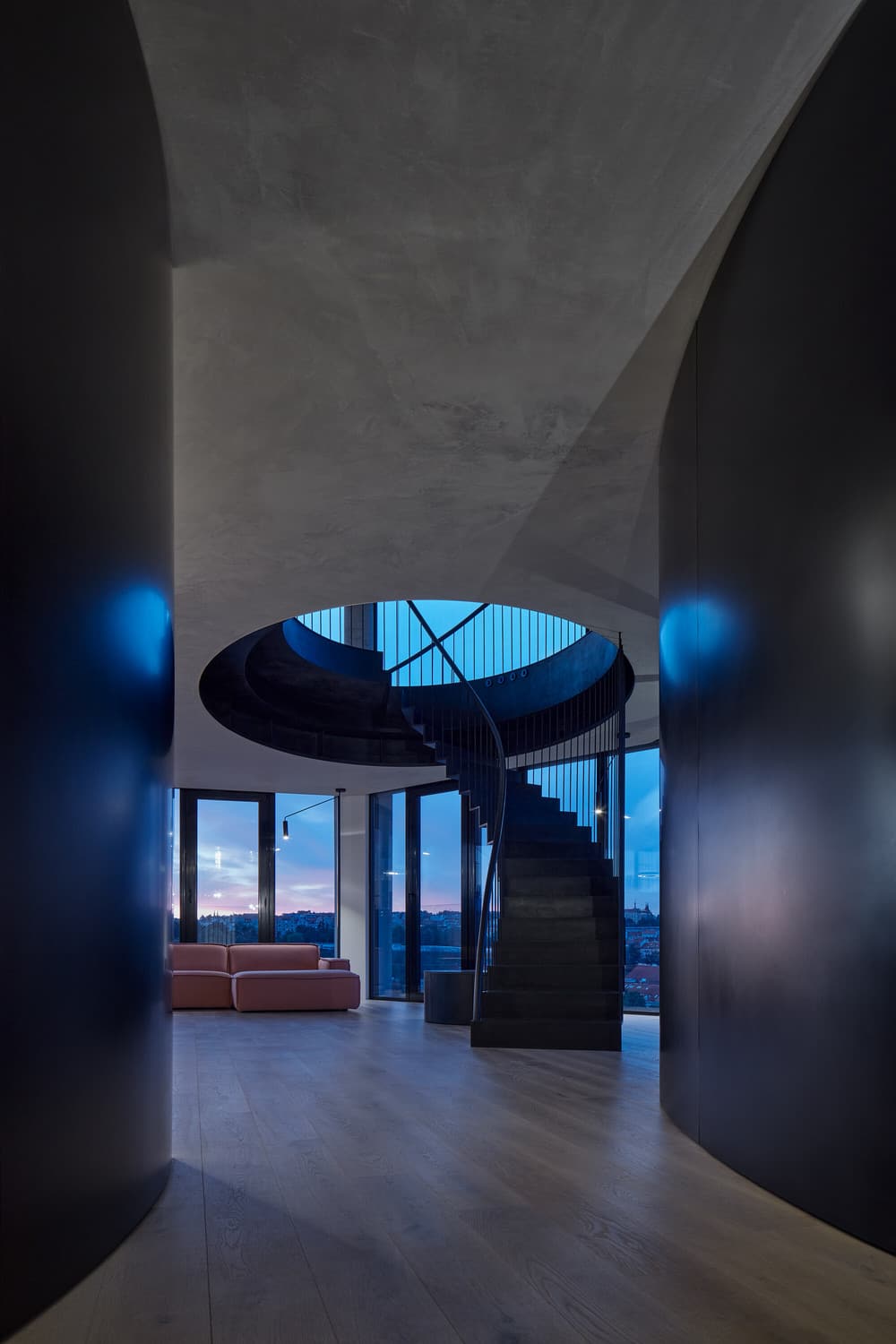
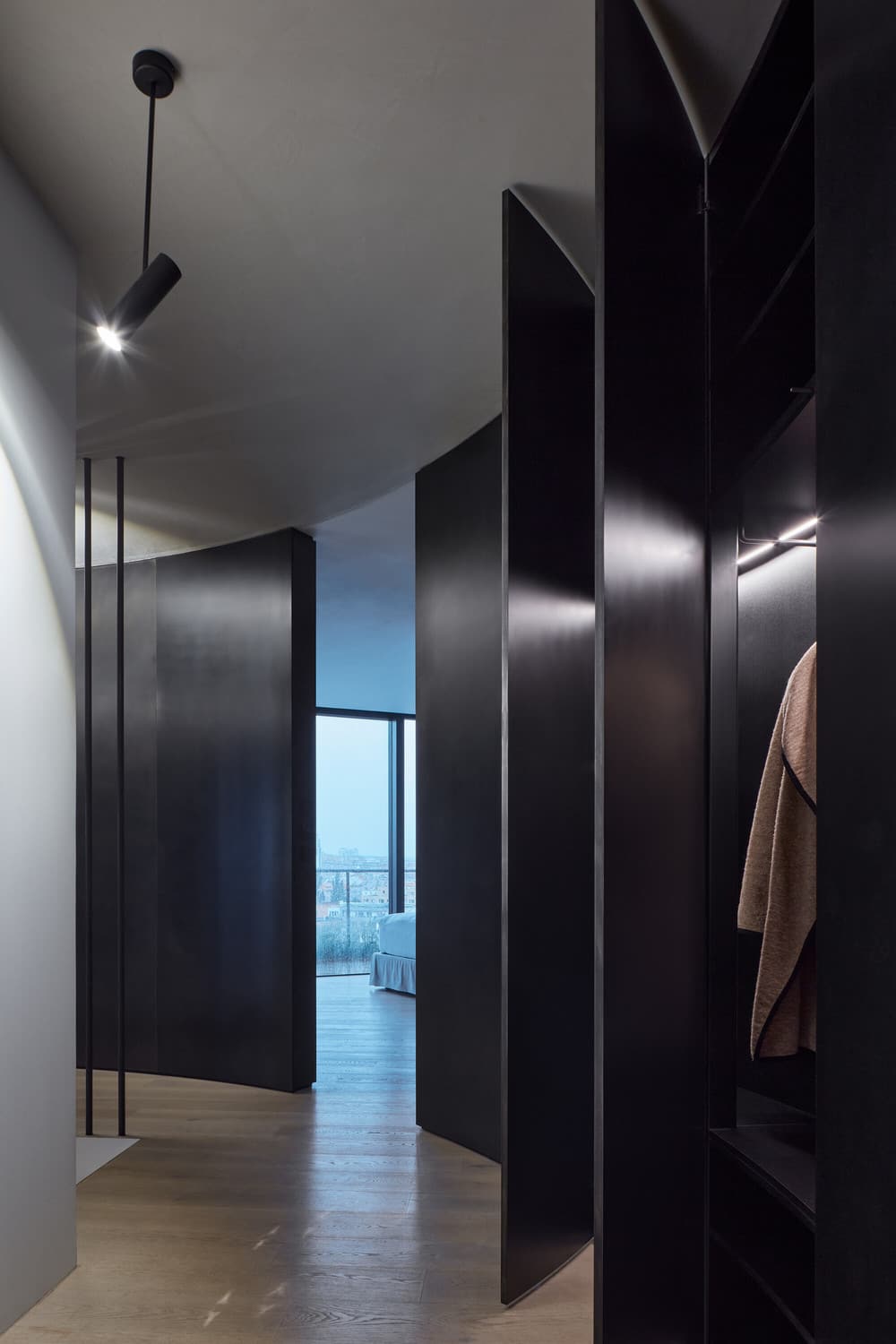
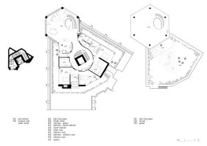
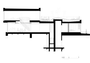
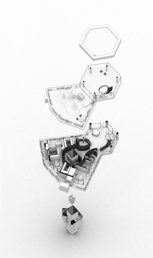
The layout articulates the division of the apartment into private and social zones, balancing the full and empty spaces separated by the steel membrane of the undulating partition orbiting the elevator and the entrance staircase. Behind this membrane, all of the private rooms, with their own perimeter terrace, are hidden. The tension between the entrance bay surrounded by a steel partition and the endless free space of the tower becomes the basis of the natural dramaturgy of movement in the apartment. Although the penthouse is primarily extroverted, its user comfort can be modulated into an intimate space by drawing the screens and curtains.
The membrane of the main partition, going smoothly through the apartment, creates a private world behind it, hidden from the sight of visitors, and keeps the division intuitively readable only for the inhabitants of the apartment. The private part is divided into individual living sections (master bedroom and children’s rooms), with its own “protected” world and unique view and contact with the city landscape. It maintains a “splendid isolation” section for parents, with a master bedroom, walk-in wardrobe and bathroom, and separates the children’s section.
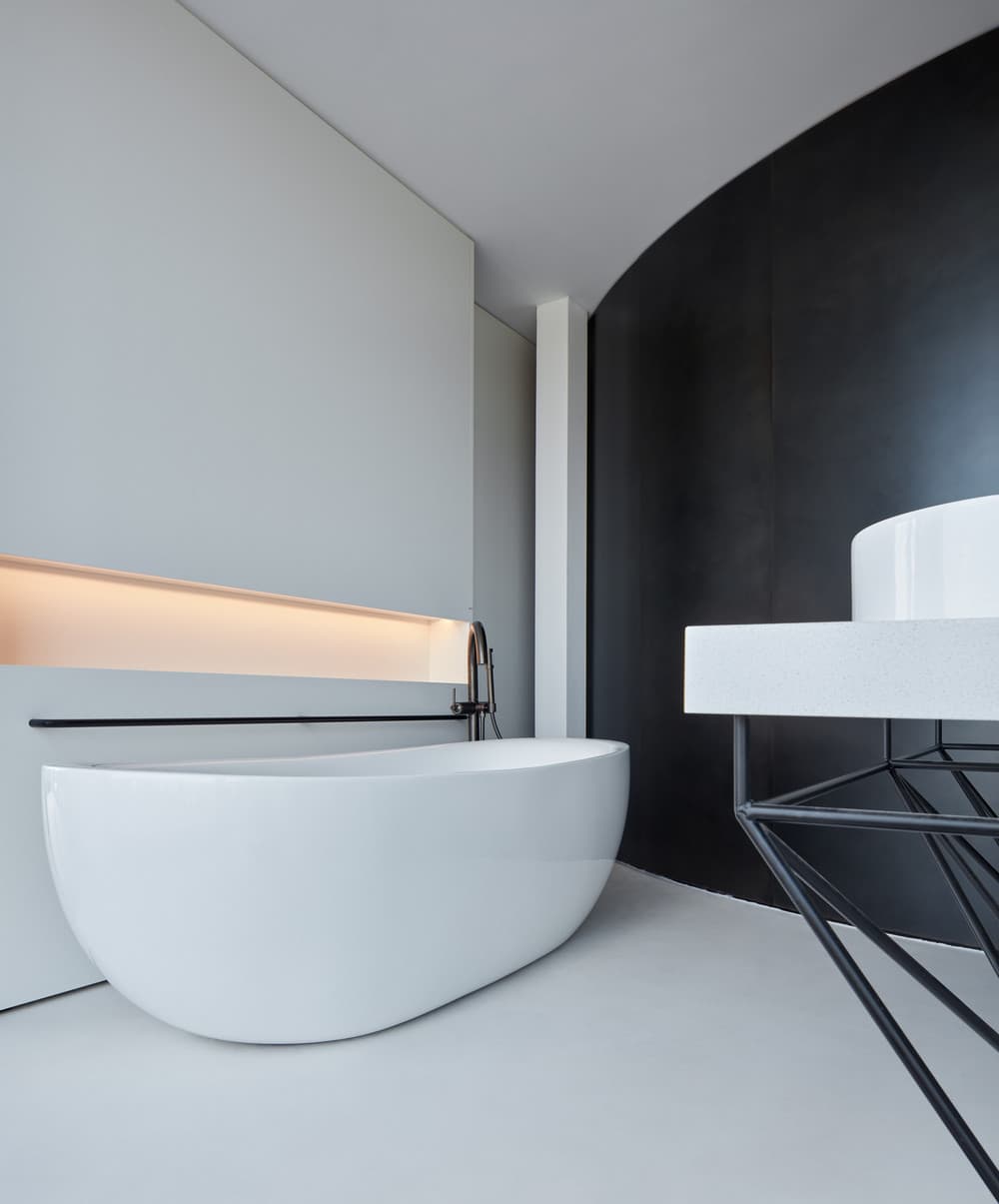
The adjoining terraces follow this basic logic and are naturally divided by contacting each of the rooms in a different direction, with a different façade. The master bedroom is connected to a bathroom with solitary bath and hidden niches with toilets and showers and is accessible through the hall with a library adjoining the walk-in wardrobe. The children’s section, consisting of two separate children’s rooms, is accessible from the corridor bay through a hall with a bathroom.
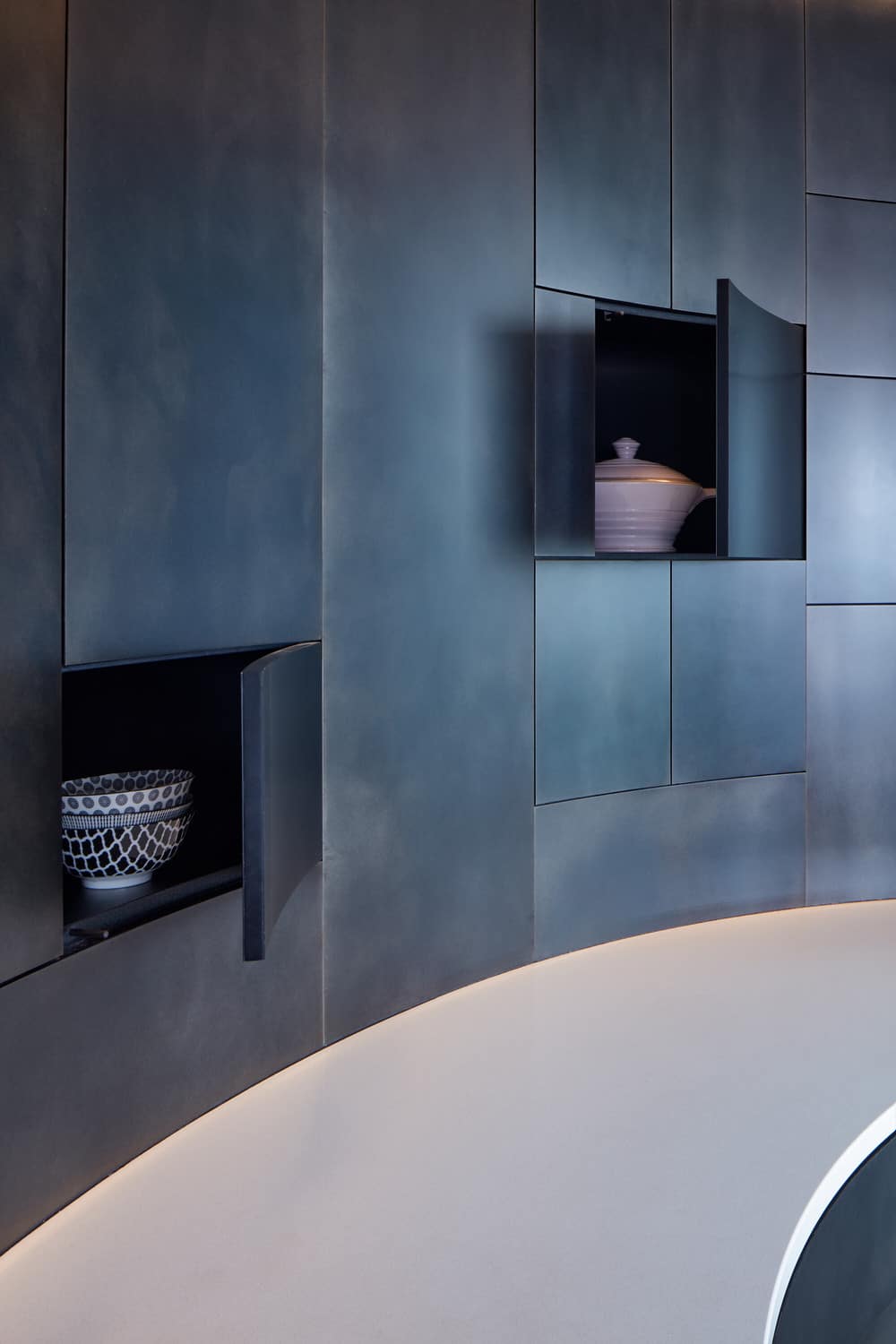
The apartment can be entered through either the staircase orbiting the elevator shaft or the barrier-free lift into the corridor bay surrounded by a steel wall containing built-in wardrobes and shoe cabinets and doors to all private parts. The doors are hidden in the steel wall and can be opened by invisible recessed no-handle mechanisms; the wardrobes, by push-to-open mechanisms.
The living space of the tower works with the dramaturgy of gradual discovering and opening the space from the entrance bay towards the panoramic open living space connected through both floors. The structural floor-to-ceiling glazing on the lower floor follows the pattern of the apartment below and is complemented by French windows, while the glazing on the upper floor has no pattern. Each of the five sides of the tower is made of one single 4-glass pane, bonded structurally only in subtle corners of mutual contact; the sixth side is divided into three identical sliding components that connect it with the roof garden.
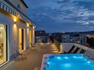
The garden is connected to the interior by a wooden terrace shaded by a retractable awning integrated into the facade. The garden is designed around a central hill above the elevator shaft, allowing a higher layer of substrate for intense greenery (seemingly “self-seeding” birch trees). Towards the edge, it changes into grass and flowerbeds formed by compositions of ornamental and agricultural vegetation with edible fruits. Around the edge of the roof is a subtle steel railing with a rope string not visible in the tall grasses and perennials.
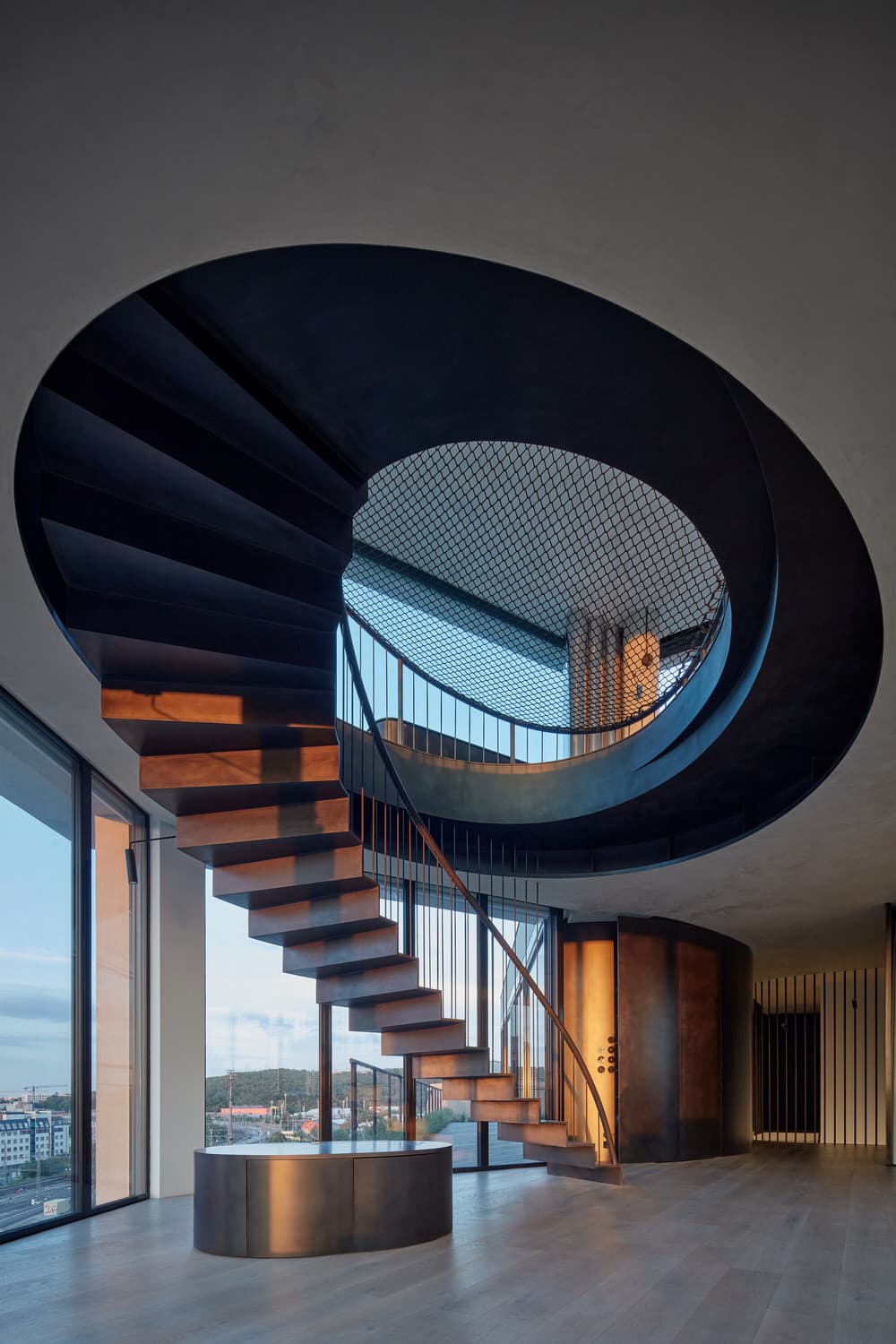
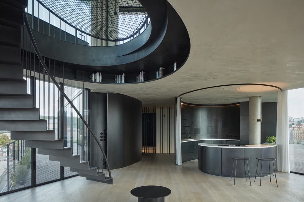
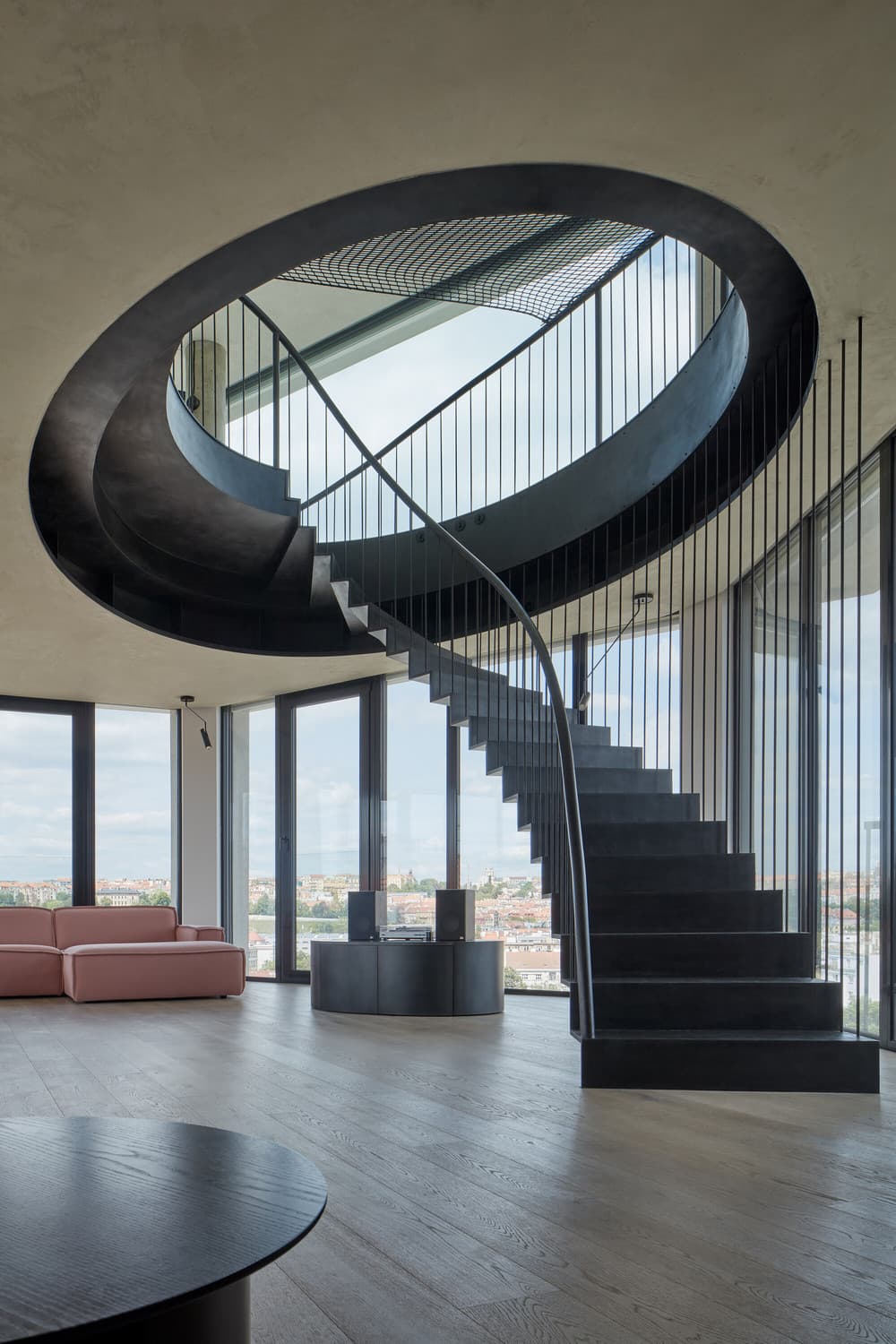
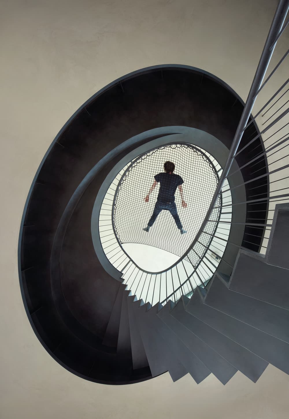
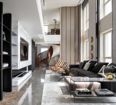
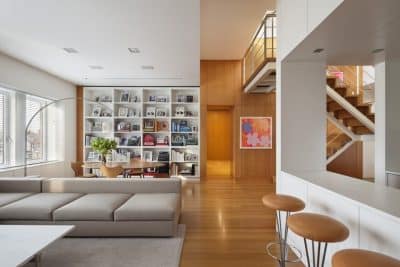
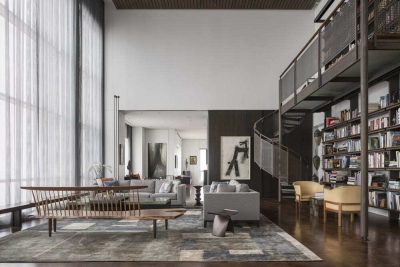
The terraces on the lower level of the apartment are made of wooden decks with the planks following the pattern of the interior floor. They are lined with flower boxes with grasses and herbs. A suspended steel staircase sculpturally inserted into an elliptical cut-out in the ceiling creates the dominant element of the two-storey living space. The staircase hides a library in the space created by the plastic shaping of the ceiling.
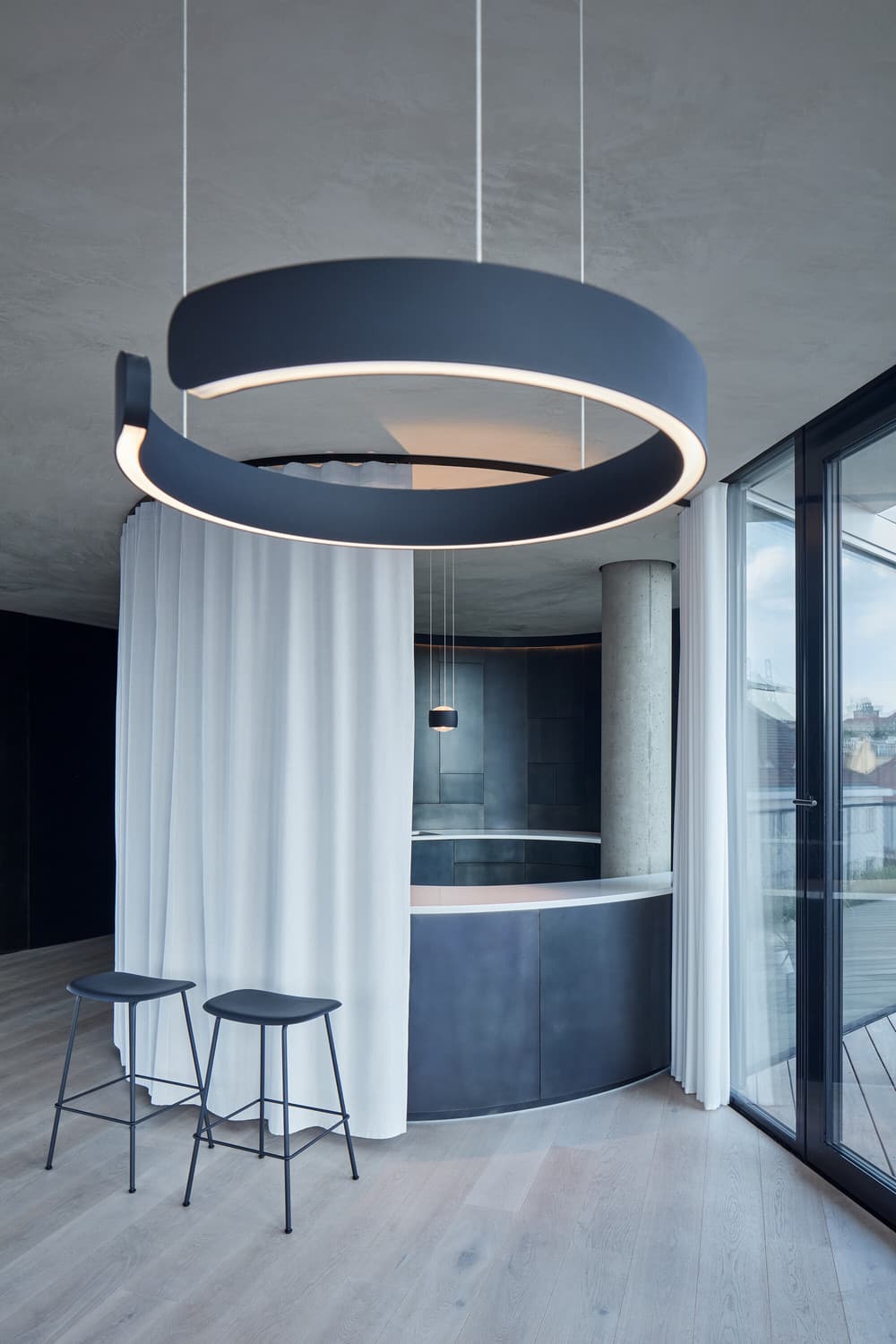
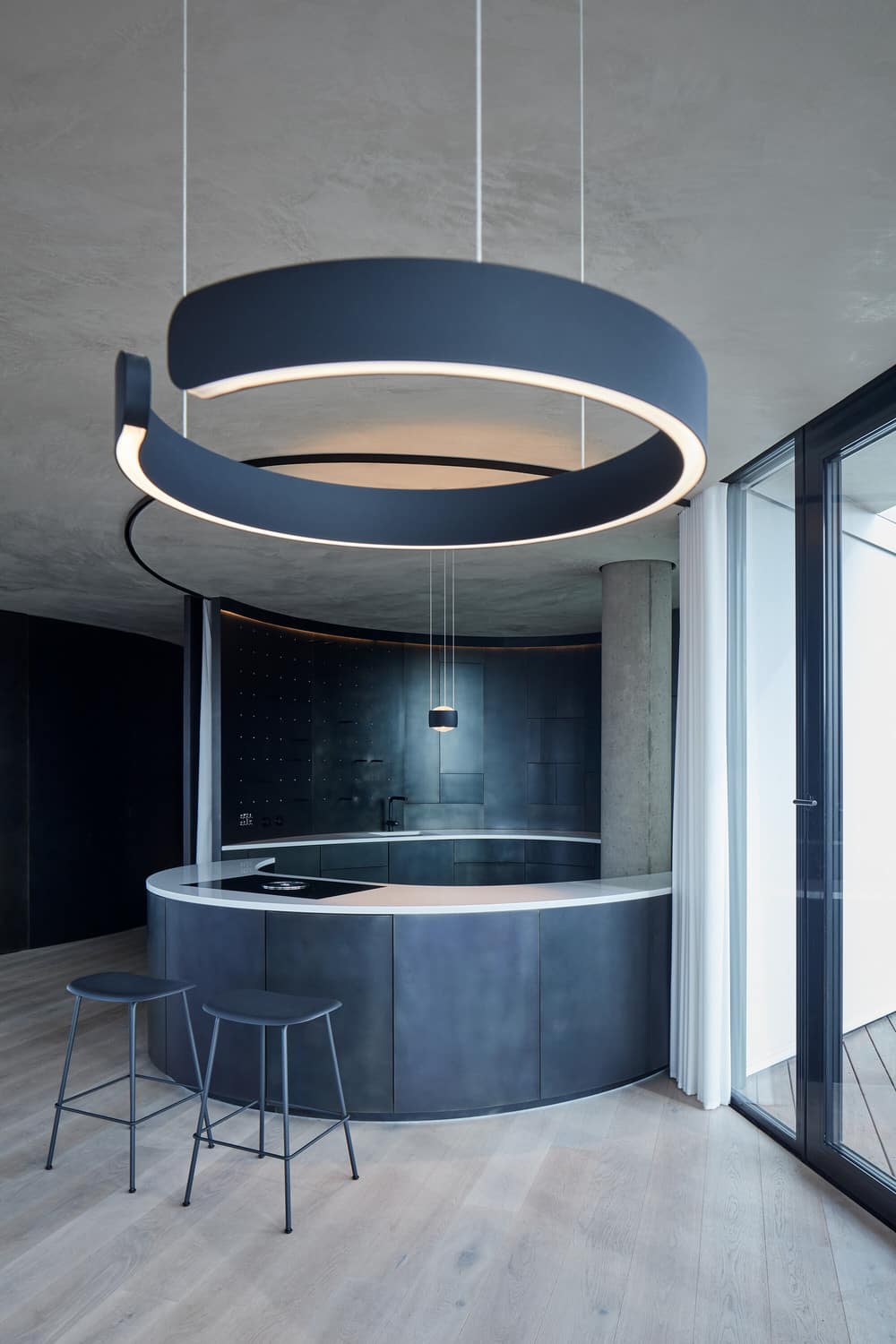
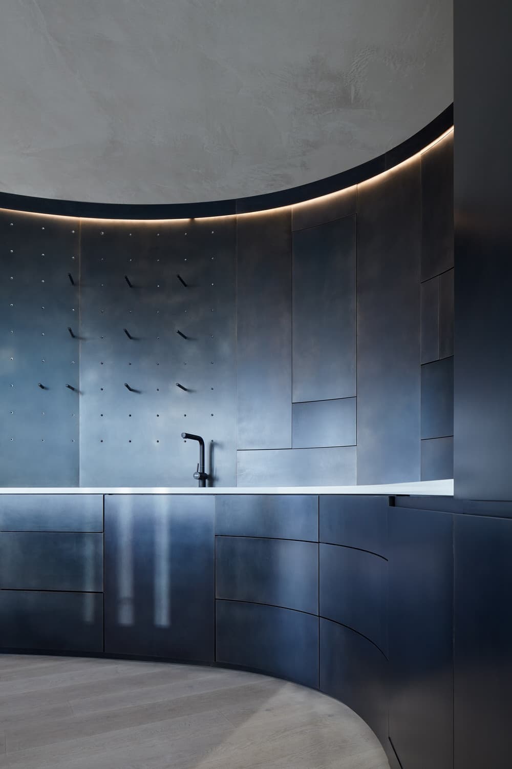
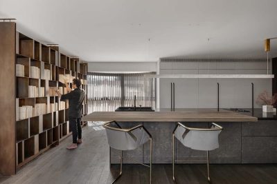
The kitchen follows the continuous shaping of the entrance partition and is designed as a solid back and a “floating” island, creating an integral composition flowing to the lower part of the living space with dining table and seating furniture. The kitchen is connected to the rear kitchen room and pantry, accessible from both the kitchen area and the hallway. This module is connected to the laundry and utility room, accessible through a steel partition via a hidden door. In the opposite part of the kitchen bay, there is a guest bathroom hidden behind the round wall, accessible directly from the social part of the apartment. The toilet and the shower are placed in niches using the same method as in the other bathrooms.
Structure and materials
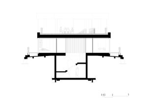
Structurally, it is a client reconstruction of the rough structure by means of major reconstruction, including significant interventions in the layers handed over in the shell-and-core state. As part of the intervention, the perimeter cladding done by the developer was completely removed and replaced with atypical large-format glazing using structural four-pane glazing with corresponding shading by large screen blinds, optimizing heat gains and losses and ensuring maximum user comfort, together with the indoor climate control system. All partitions were removed to create a continuous layout. As it was taken over during the building process, the design respects the existing load-bearing structures (with the exception of one column, which was replaced) and integrates them into the layout, simplifying the installation cores by merging and leading them in the floor and ceiling using the residual spaces (below the entrance staircase) as a technical base.
The materials used correspond to the light and mostly white space and its division into two “worlds” by a dominant dark steel partition. Its surface is treated from both sides using etching, sanding and polishing on a hot-rolled black steel sheet sandwiched on a wood-fibre board. All of the doors and openings are frameless, cut into the continuous surface of this partition. The floor is made of wide planks running perpendicular to the main facade through the entire apartment and continuing to the planks on the terraces. The ceilings are finished with a fine texture, including the recessed parts of the lights and air conditioning and integrated covers for hanging swings and other elements on the upper floor. The railing of the interior staircase creates a rising and descending curve so as to interrupt the panoramic view as little as possible and equipped with a hammock with access to the place where the handrail touches the floor. The space is lit using diffused reflected light and hidden lines lining the curves of the partitions.
Technological design
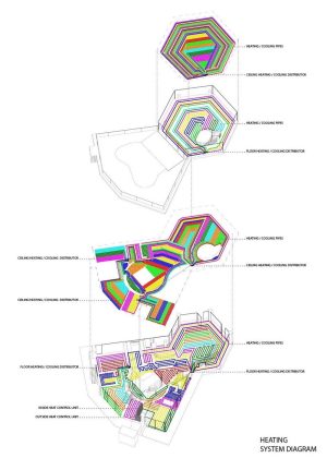
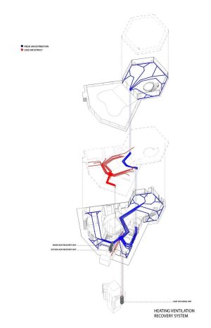
The project works with a high-end technological solution corresponding to the most progressive standard currently achievable. The technologies are intentionally concealed, and therefore, practically invisible, and remain a hidden force in the apartment’s background. The indoor temperature control is based on low-temperature transmission; the temperature changes are not perceivable. The system creates an ambient climate and maintains a comfortable temperature without the obvious flow of air during its exchange. The hidden heating and cooling distribution is integrated into the floors and ceilings, and the air-conditioning distributed through the slits lining the windows is also almost invisible and does not distract from the visual design of the apartment. The primary energy source is an air-to-air heat pump hidden in an acoustically separated shaft on the terrace. The maximally open façade is complemented with large exterior screens in white that shade sunlight and remain transparent from the inside, even when closed, to maintain contact with the city.
Suppliers:
Interior — GIGA LINE, EFF
Glazing — OBSIDIAN
Steel staircases and railings — Kurel
Floors — EMPIRI Wood Design
Surfaces — Domus Aurea
Exterior surfaces — SALKOMA
HVAC — Active Elements
Lights — ATEH
Shading — DIAMOND DESIGN
Construction work — SVP STAVEBNÍ
Products:
lights — Occhio, Nowodvorski, One Light
switches — Berker
handles — M&T
taps — Grohe
floor boxes — Stakohome
sanitary equipment — Kolo, Polysan
kitchen equipment — Bora, Siemens

