Project: Polyphonic Apartment
Interior Design: OpenIdeas
Location: Surat, India
Project size: 6000 ft2
Completion date 2020
Photo Credits: Ishita Sitwala
Text and photos: Courtesy of OpenIdeas
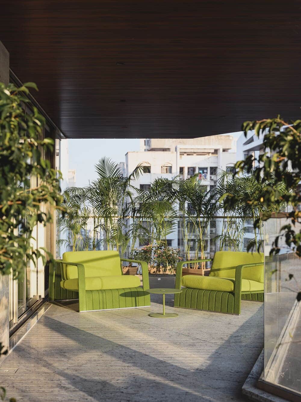
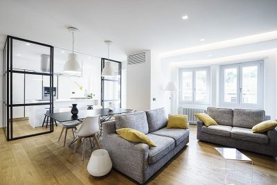
This was a home to be created for a purveyor of furniture sourced from the international market. Italy was a favorite stopping ground, and the European aesthetics, he found, resonated greatly with him. The client asked us to create an environment that could serve as a showcase for the different brands he was associated with in a setting with distinct western sensibilities.
While the fundamental objective was to present a curated mix of International brands, we wanted something more out of the space. Treating it like mere display with aesthetic, if soulless, juxtapositions was out of the question. Our aim was to create a narrative that would be characterful and memorable.
What were the key challenges?
The desire to deliver something beyond the brief for this young family of four was instrumental in shaping the project. But before that, we had to decided just what we’d take from the brands. Given the multitude of options open to us for procuring the interior elements, this task was a painstaking one, requiring a lot of research. We had to decide what to take, as well as what not to take. Both became crucial to the success of this project. Then, this selection — which largely fell within the modern ambit — was meshed with vintage finds so that the space looked more ‘home’ and less ‘showplace’.
What were the solutions?
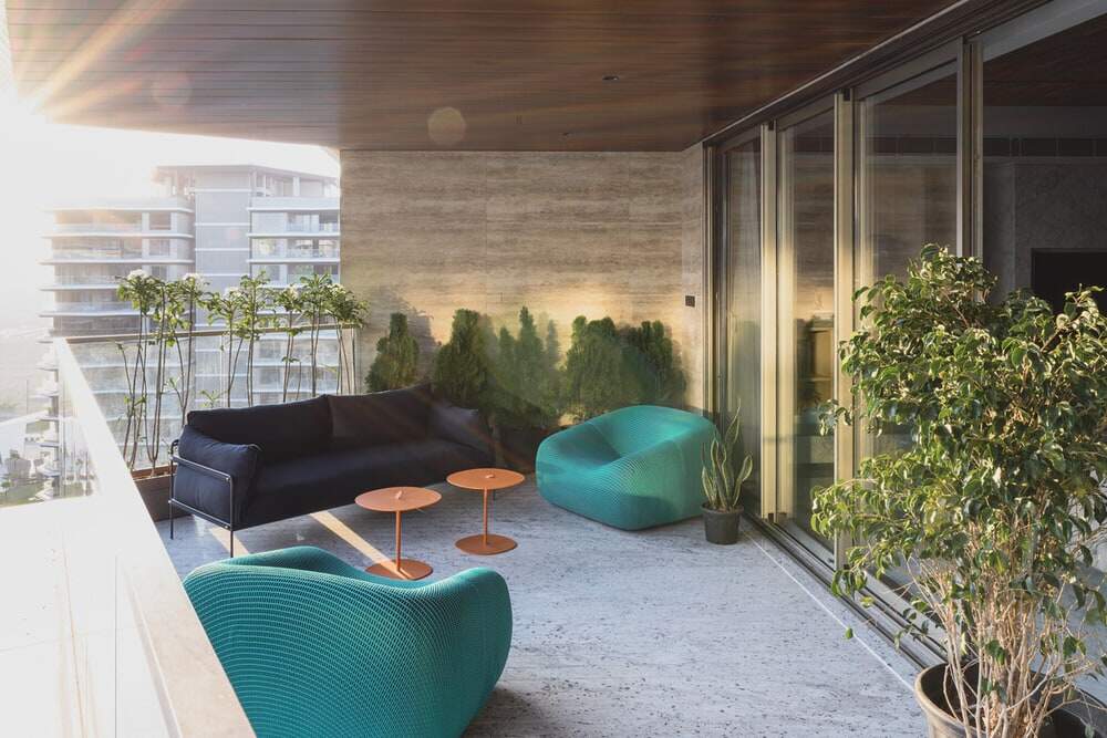
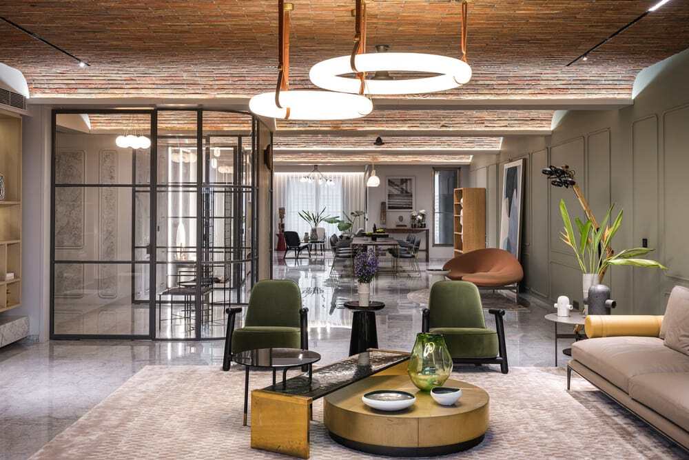
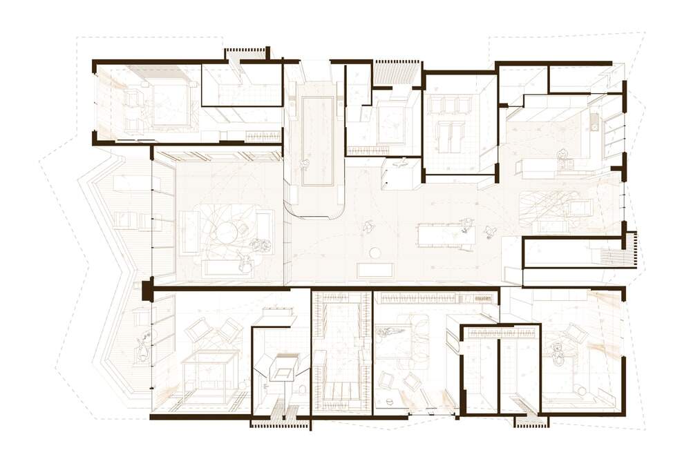
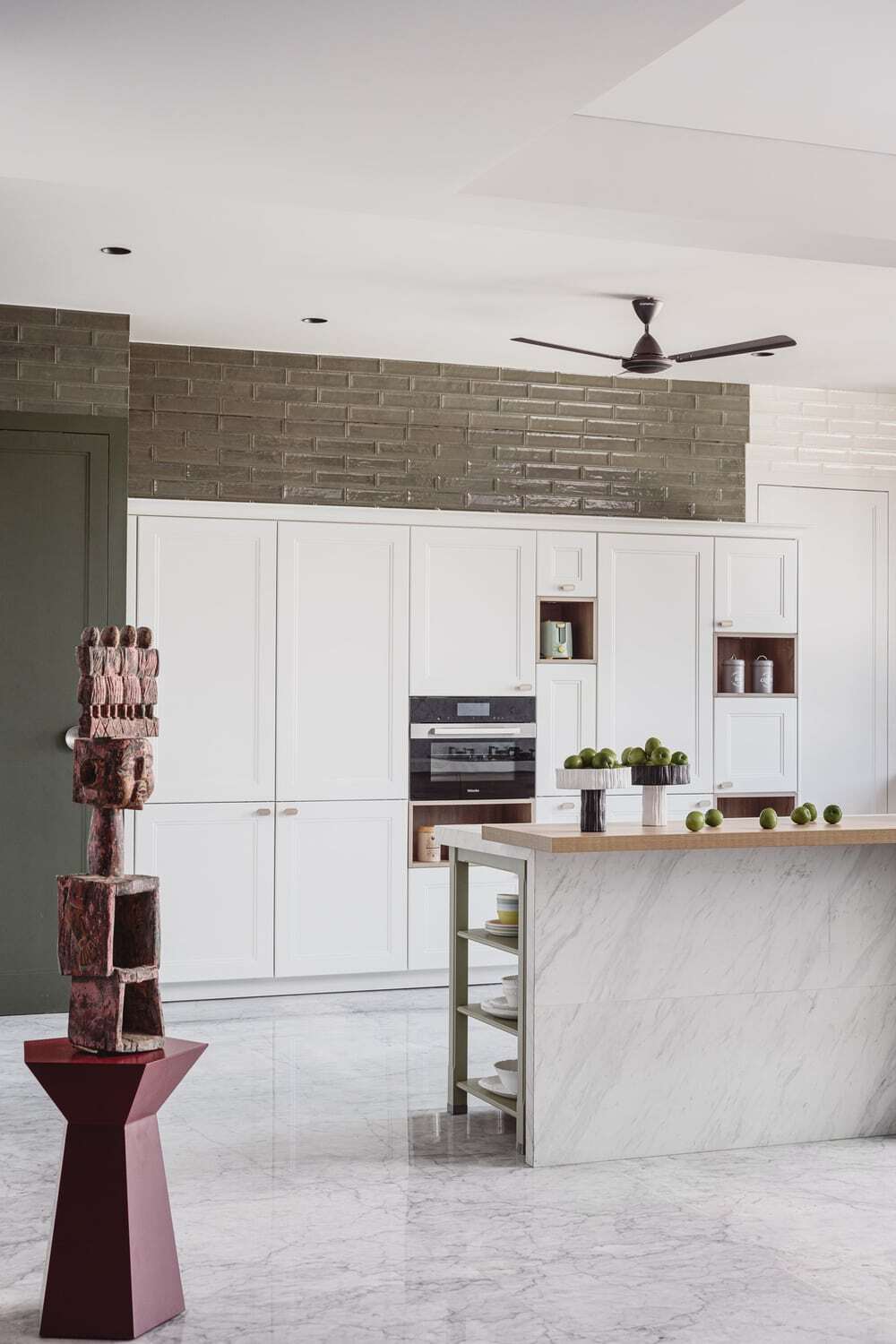
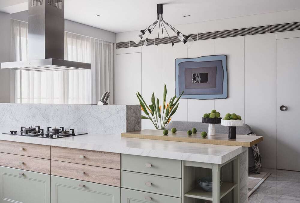
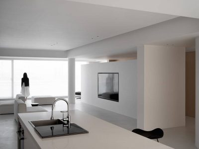
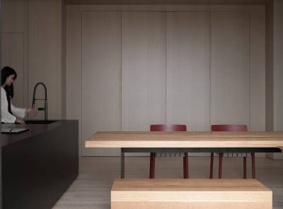
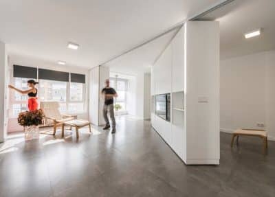
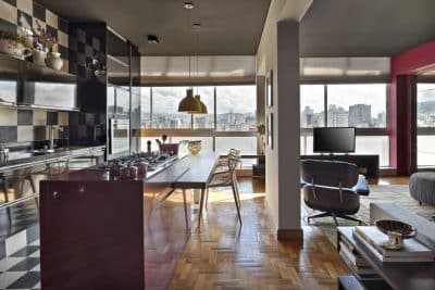
The footprint of the Polyphonic Apartment was appreciable. But we had to leveraged this trait to establish a sense of space, something that the family desired. The bedroom units were whittled down to four, and the remaining three went into creating expansive areas and a family room. Naturally, walls were taken down and rooms merged in this process. This fulfilled the family’s desire for openness and expanse. For instance, now the interrupted length of the public zone till the balcony is an appreciable 75 ft. An open kitchen serves as the heart of the home, allowing the lady of the house to be more connected to the proceedings and oversee the children’s activities. And the foyer and the Pooja area are sheathed in glass, to keep the sense of space intact.
What is the visual vocabulary and materiality of the Polyphonic Apartment?
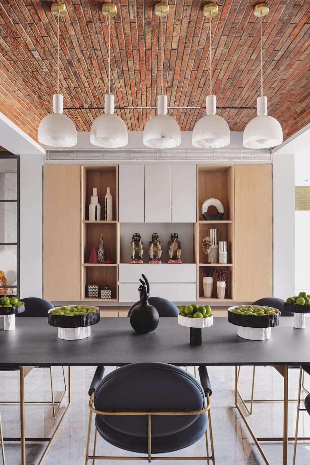
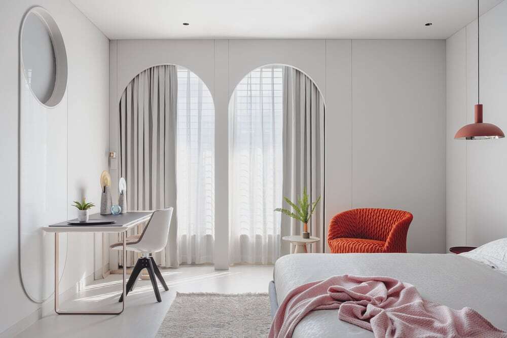
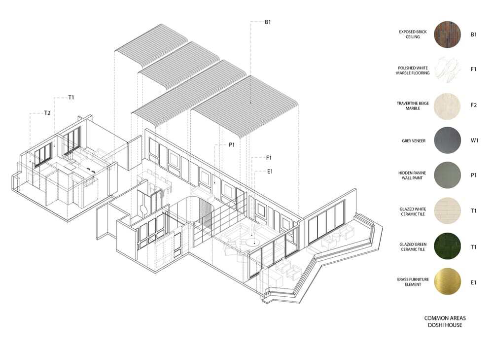
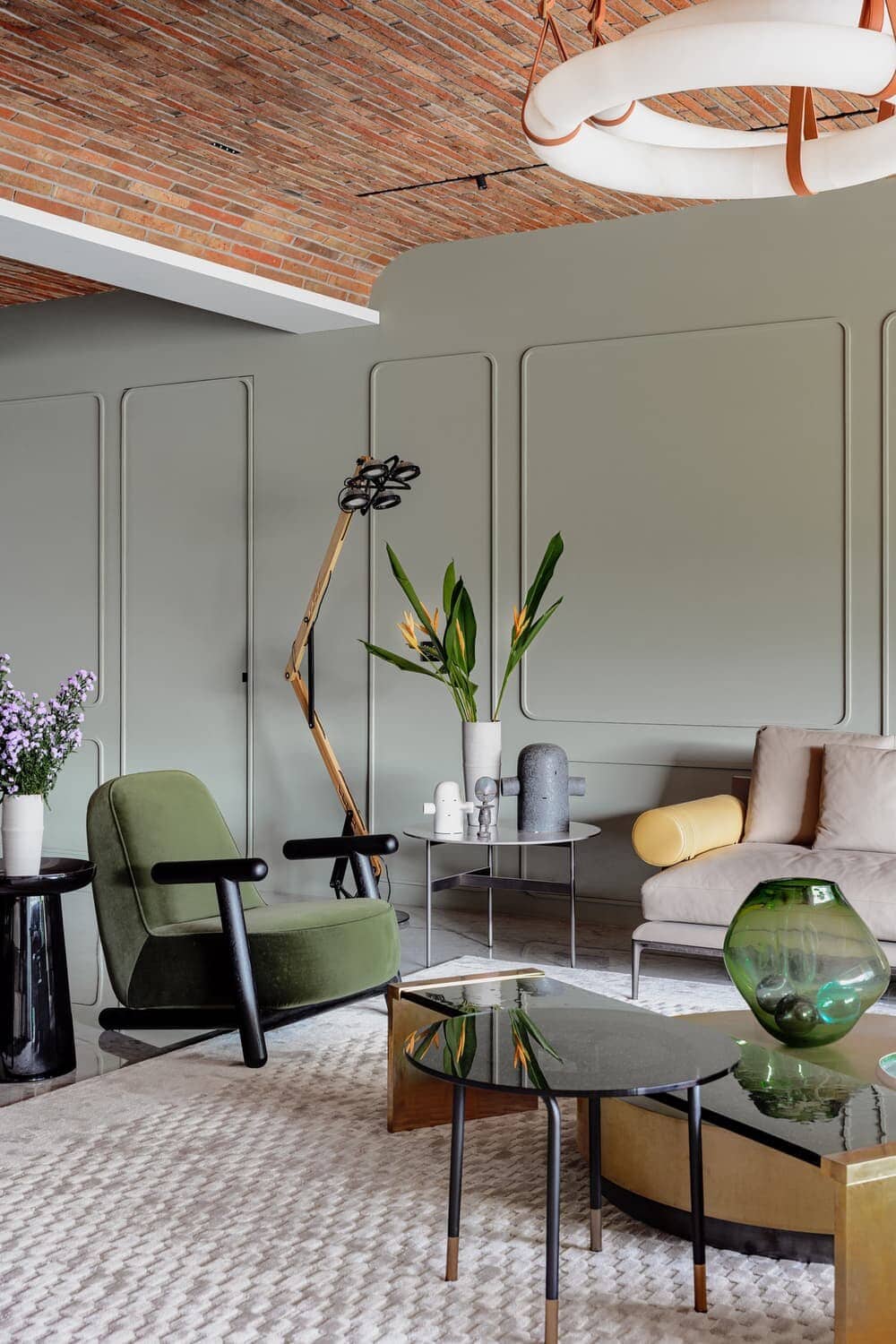
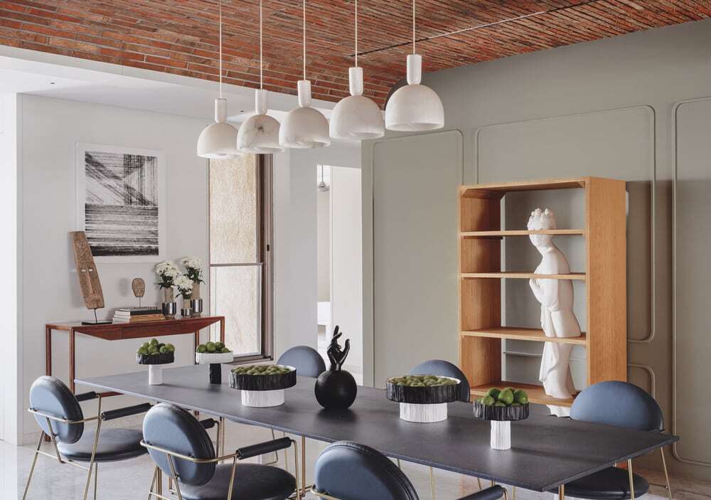
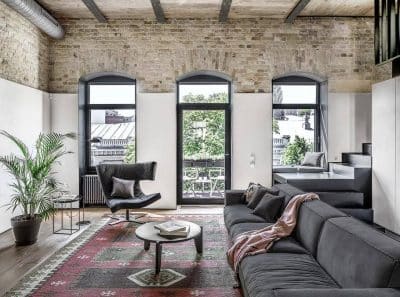
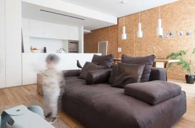
The idea of what this home would look like simmered with us and the client over a period of time. We made time for this project on business trips taken together — inspirations were taken note of, thoughts and imagery was pinned down for future reference. Arches were immediately sanctioned for the project. Elsewhere, we noticed expanses of slim exposed bricks that went wonderfully with the vintage flavour we wanted. Vaults was another form that was checked off in the list of desirables.
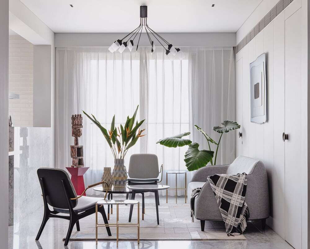
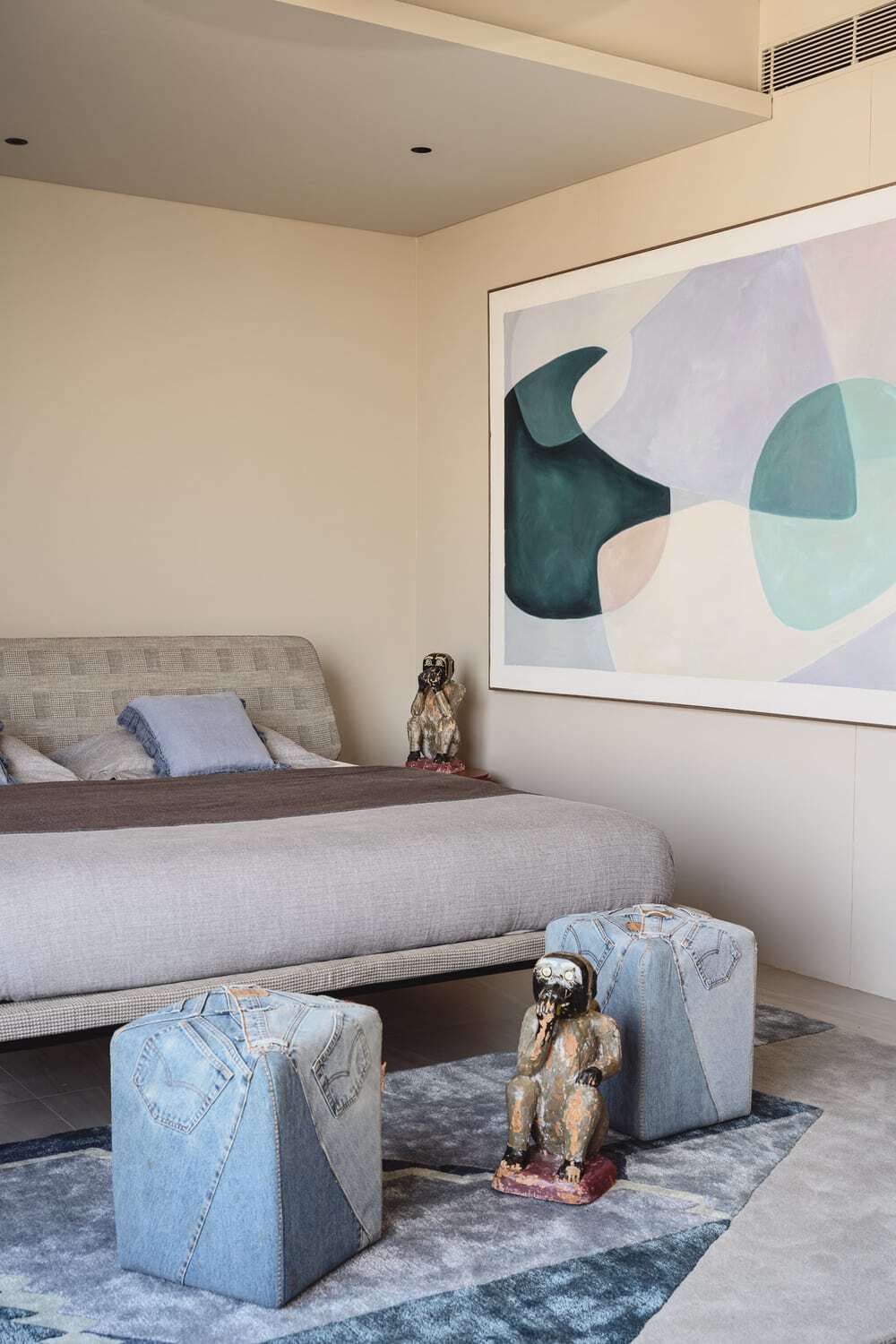
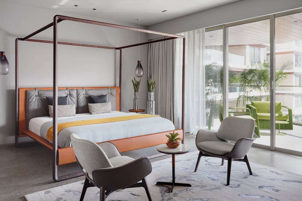
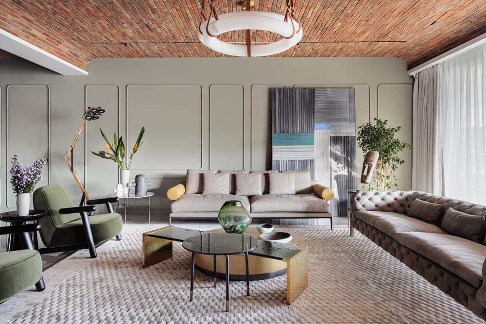
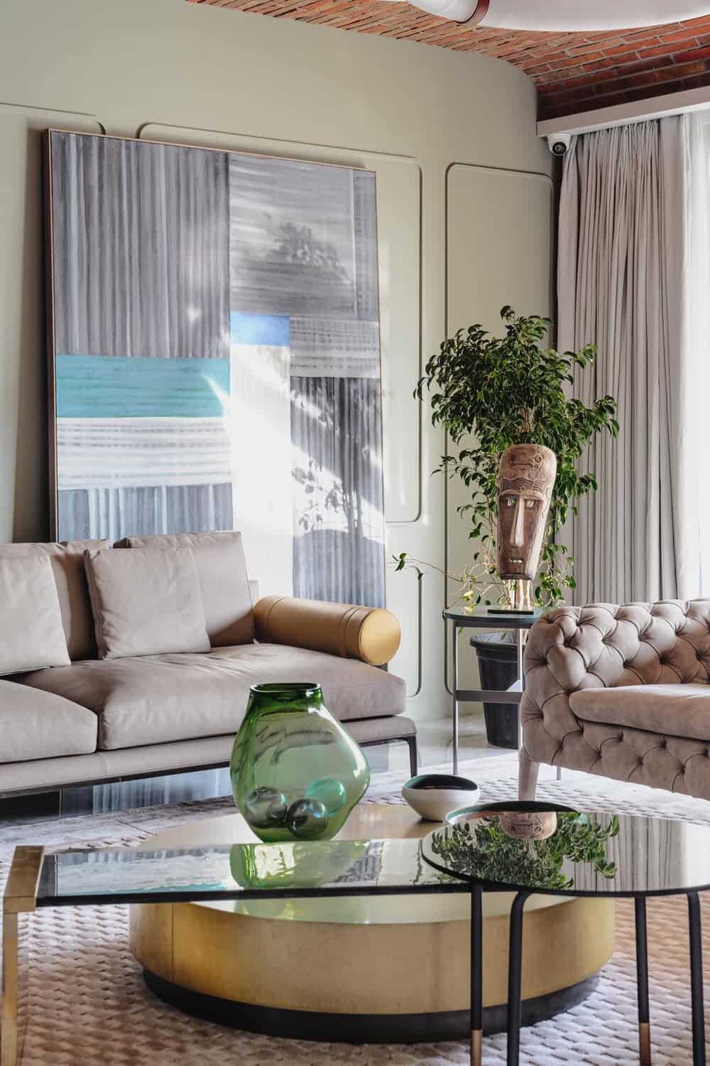
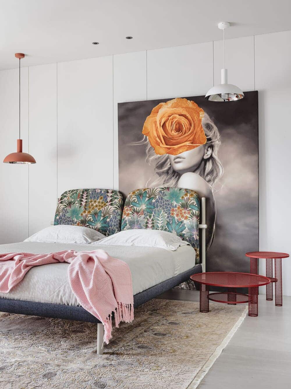
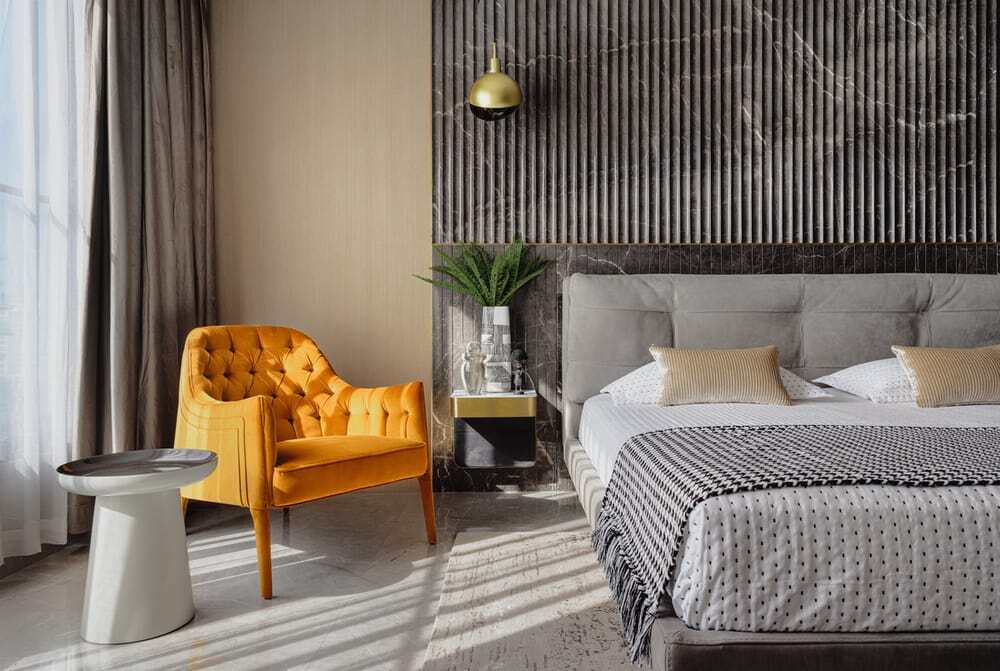
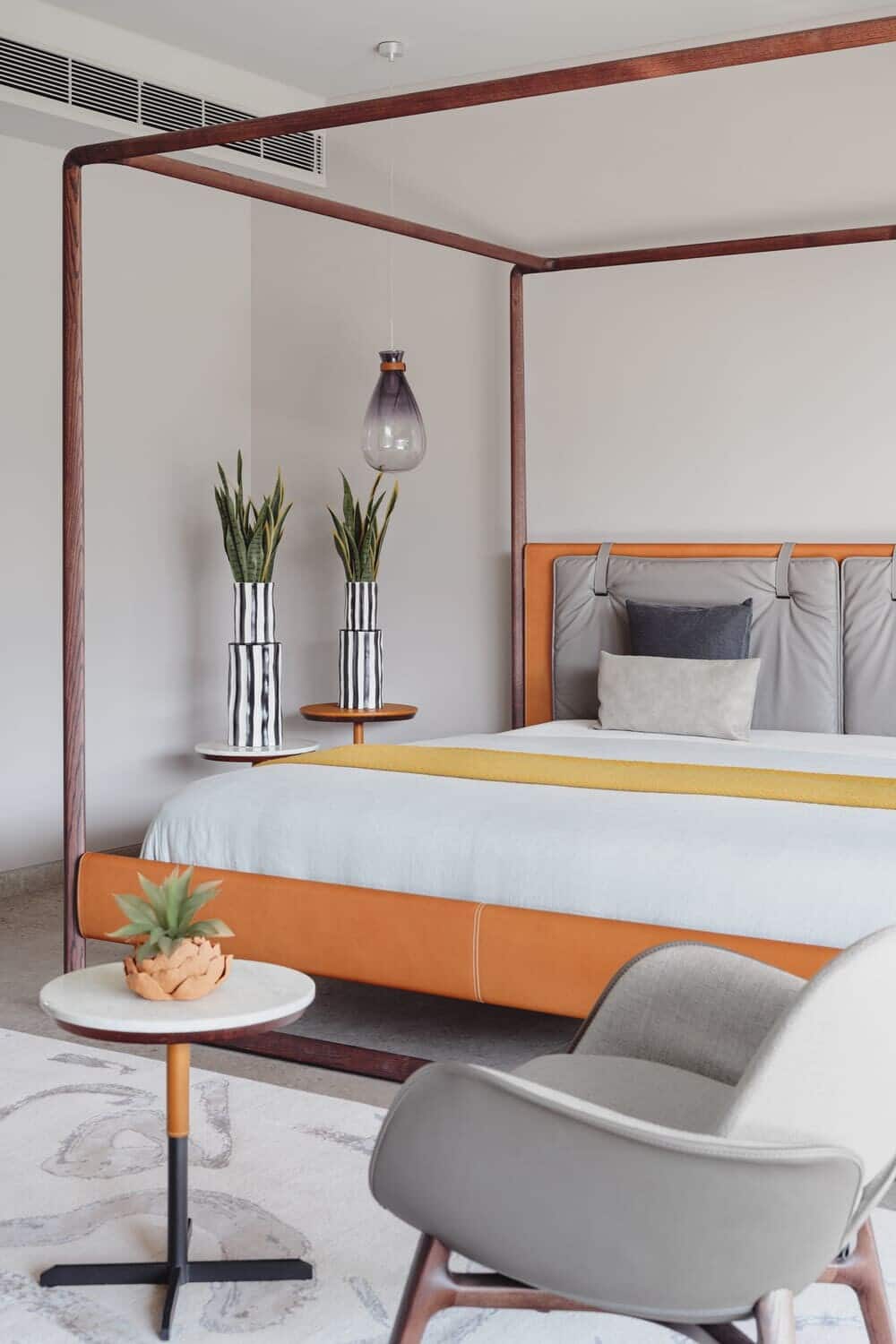
The shell is rendered in pale, gentle shades, with the drama being enacted by the furniture and furnishings through bold forms and tactile textures. Art contributes to the theatrical effect — large canvases propped against the wall act as striking backdrops to tasteful arrangements. The drama is mellowed in the private spaces, which are articulations tailored to individual preferences — a young girl’s space with an Amazonian rainforest print on the bed-head and an edgy feminine photo; an empty canvas of a boy’s room waiting to be filled with his personality; a sophisticated natural stone fluting on the bedroom that hosts the client’s parents…
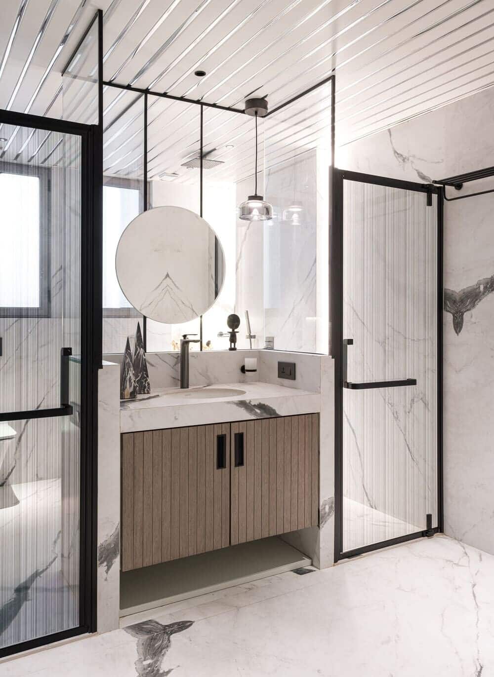
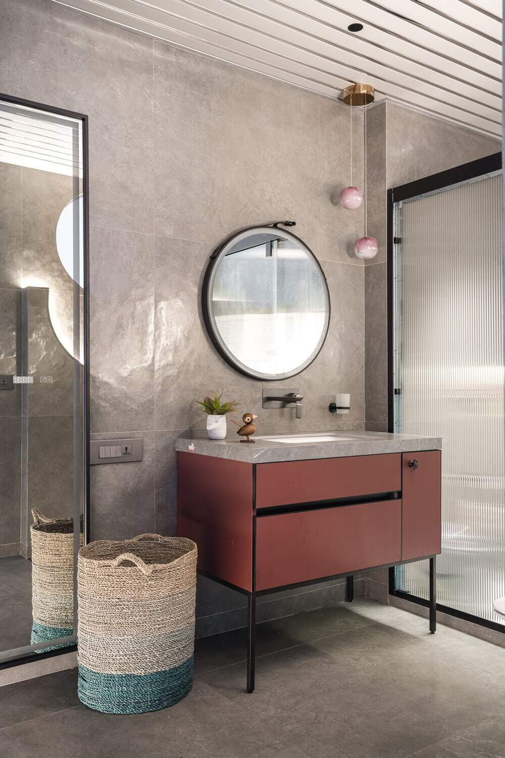
We had a monitor this selection carefully given that the lion’s share of the budget was being allocated to procuring the best of furniture and accessories (such as light fixtures) from the international markets. So while statuario marble makes a milky, luminescent and veined presence in the public zone, the privates areas are pragmatically clad in tiles that mimic marble. Walls largely are lined in painted MDF panels. The public area sees a series of brick-lined ceiling vaults. Most of the area rugs and carpets have been sourced from Jaipur Rugs.
