Project: Ramat Gan Apartment
Interior Design: Kan Design Studio
Lead designer: Amit Kedar
Location: Israel
Photo: Eran Turgeman – Photography Studio
Home styling for photography: Hila Levy – Funiki – Design and Home Styling
Lovely customers, whose children had grown up and moved out, decided to completely renovate their existing apartment in Ramat Gan. The renovation of the apartment involved a comprehensive dismantling of the entire apartment’s infrastructure due to a pre-existing plumbing issue, which also acted as a catalyst for the renovation.
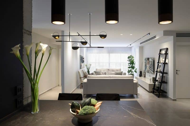
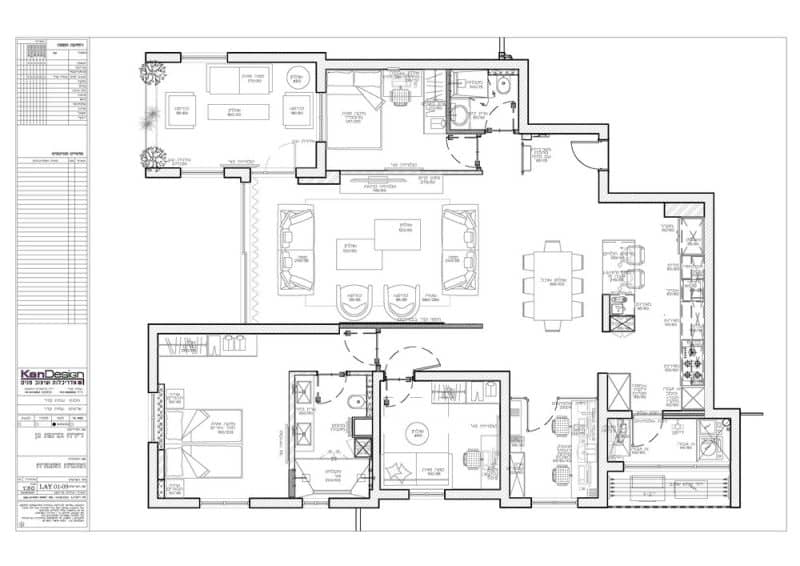
The Ramat Gan Apartment was dismantled and reassembled with a new design that is more open and bright. Walls were removed, and significant plaster depressions from past air conditioner installations were eliminated, which helped achieve a new sense of height in the apartment.
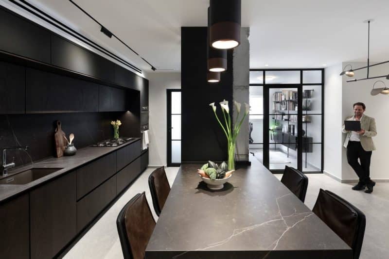
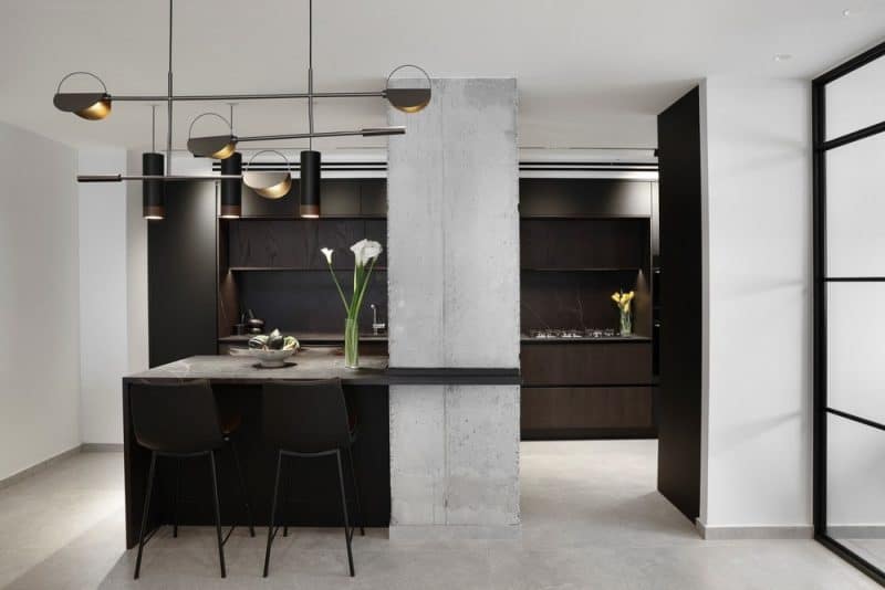
Originally, the apartment was sectioned off with walls, including the kitchen and the office, which were closed off with doors. During the renovation, these walls were taken down, leaving only an exposed concrete pillar that was previously concealed within the walls. It was decided to leave this pillar in its pristine form as a bare and visible concrete pillar, choosing not to cover it again with plaster. The office, which was next to the kitchen and laden with various types of shelves, was also opened up.
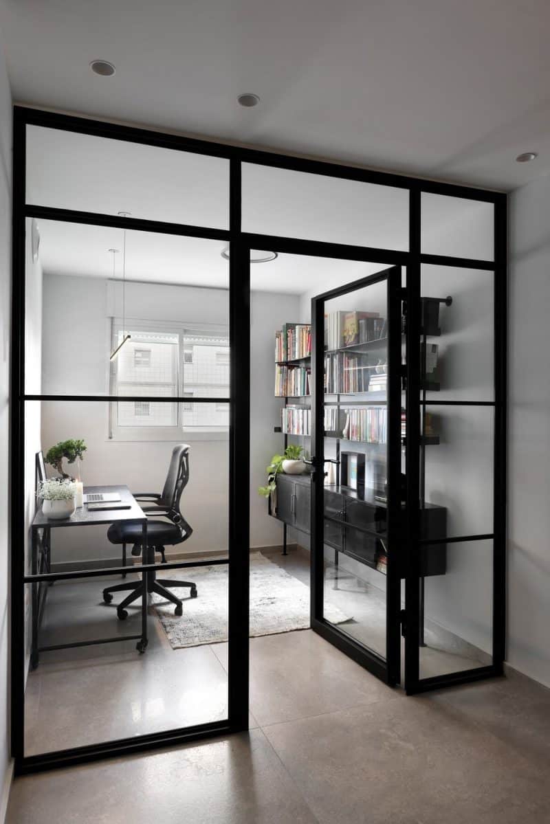
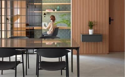
The office, utilized by the apartment owner who works in high-tech and often works from home, was completely redone, including new communication and electrical infrastructures. Furniture positions were changed, and an aluminum profile wall with transparent glass replaced the previous wall, making the space brighter and more integrated with the house. Yet, it still allows for privacy when the door is closed during work.
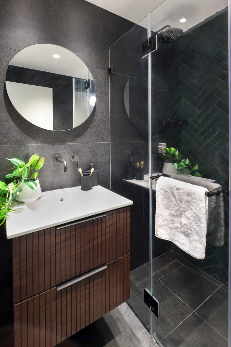
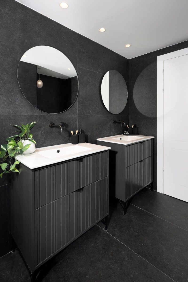
The master’s closet and master’s shower were completely disassembled and transformed from two small, narrow rooms into a longer and wider rectangular room, serving as a double bathroom for the parents. Inside the shower, two separate bathroom units were installed, along with two vanity cabinets with individual faucets and mirrors. The bathroom’s design features a black tile floor with greenish glass tiles in the shower area, adding a unique tone to the room. The carpentry for the bathroom cabinets was crafted from wood in a black shade, designed as slats with slots.
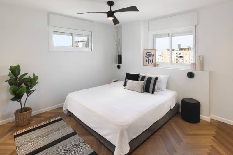
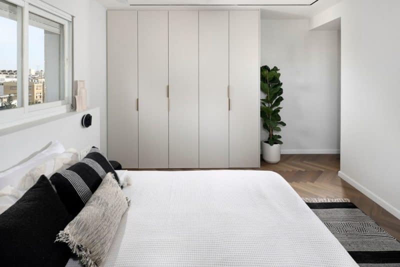
The destroyed closet, previously connected with the shower, was turned into a larger wardrobe within the bedroom itself. The bedroom was upgraded with fishbone parquet in a brown oak shade, and the bed was reoriented by ninety degrees. New ceiling light fixtures with a fan were installed, alongside the air conditioning vent in the room, which connects to the air conditioner in the plasterboard in the master shower.
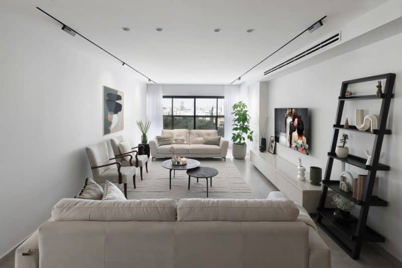
In the living room and throughout the rest of the house, a new large gray floor was laid, which opened up the space and introduced a more modern atmosphere. All large plaster structures were removed, and a smooth, straight ceiling was designed for most of the living room and entrance, except for one corner designated for the air conditioner. Modern lighting fixtures in the form of sunken accumulation stripes were installed, with black stripes chosen for sunken and semi-prominent light fixtures. The other fixtures, round and white, blend seamlessly into the ceiling.
The living room window and the exit door to the balcony were replaced with new black frames with transparent glass that allows more light to enter and fewer partitions than before. This enhancement allows for an expanded view from the entrance when the curtain is drawn aside.
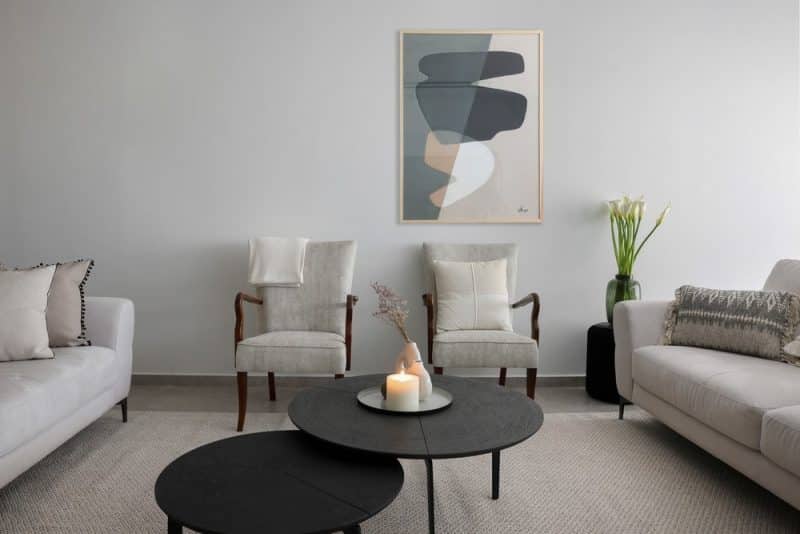
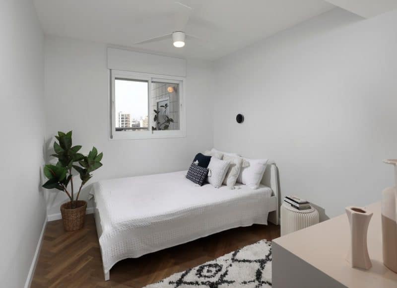
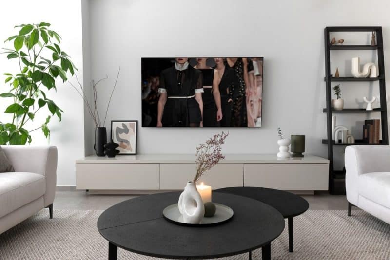
A large, beautiful carpet and new light-colored furniture were purchased for the house, except for the black living room tables and bookshelves. Two armchairs were reupholstered and taken from the grandmother’s house, who passed away during the renovation. The adjacent bedroom was converted into a guest room or a room for one of the daughters, a student who stays over on weekends. This bedroom was also updated with fishbone parquet and designed to incorporate an air conditioner with lighting above a low wardrobe.
Adjacent guest services were expanded at the expense of an existing room, transforming a small guest toilet into a bathroom that includes a shower, toilet, and a wider sink. The floor matches the master bathroom’s black tile, and the shower walls are covered with the same tile, except for the wall facing the entrance, which features dark green fishbone tiles. The bathroom cabinet’s carpentry was designed from wood in the form of slats with slots.
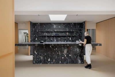
The kitchen was reopened with a new glass door framed in black aluminum at the end and a laundry room behind it. The kitchen was completely redesigned with two parallel straight bars. One side features the kitchen itself, with tall cabinetry and a central marble workspace in shades of black and dark oak. Across from it, a parallel lane includes a large double fridge area, a lighted cabinet with glass doors for decorative items, and a bar counter with seating chairs, while on the outside, two more bar stools continue the marble wrapping around the concrete column, serving as a narrow shelf for accessories.
The Ramat Gan Apartment underwent a fundamental change, with walls removed and rebuilt, bathrooms remodeled, and all electrical and plumbing systems replaced. The air conditioning system was entirely replaced, and the old plaster walls and blinds were dismantled, resulting in a minimalistic redesign. New kitchen furniture and a general overhaul gave the apartment a new, bright, and cleaner look. The tenants, who love their neighborhood and the building, left satisfied, feeling as though they are living in the same community but in a brand new home.
